1 Comment

Charadium II, I Love You!

There are only a handful of games on my iDevices that have withstood the test of time and clung to my home screen. Some of these games include Carcassonne, Plants vs. Zombies, Orba, Tiny Wings and now Charadium II. Charadium is a classic Pictionary type game where players take turns drawing a word and guessing each other’s creations for points. There are a bunch of games of this genre in the App Store, but Charadium is far and away the best of breed I’ve played, and much of that is due to the attention to detail developer On5 has put into the app.

There are two main modes of play, Classic and Ping Pong. Classic lets you join a room with other random players or friends and compete in a round-robin, timed competition to guess words. The play is fast and furious and tons of fun. Drawings don’t have to be pretty they just need to communicate quickly. The faster someone guesses your word, the more points you will score. The other mode, Ping Pong, is my favorite when playing Charadium. Here you play with a friend and take turns drawing words from a list of three choices (easy, medium and hard). The harder the concept to draw, the more points you’ll net, but you also risk your opponent not guessing correctly at all. Incorrect guesses hurt your overall point total and can push your opponent to victory. I love Ping Pong games because they are not timed, you can play multiple games at once (like Carcassonne), and you get to choose the difficulty of the word to draw. Also, you’re not usually playing against random strangers so cheating (drawing words) is not an issue.

On5 makes a free and paid version of the app so you really have no excuse not to give it a try. Of course even the $2.99 iPad version is well worth the price and gives players full access to fun extras like more colors, more brushes and of course, no in-app advertising. This is a similar model we use at the Iconfactory for Twitterrific and it really is the best of both worlds. Charadium is also a great example of an app that improves measurably with each new update. In recent point releases, the game has added new brushes, new colors, the ability to play back all drawings (LOVE THIS), saving drawings to the camera roll and much more. There are still a few features I hope On5 adds like a paint bucket to quickly fill large areas with color, and a “Redo” command as well as undo, but overall the game play can’t be beat. Perhaps the App’s biggest failing, if there is one, is the need for greater stability. Ping Pong games sometimes get stuck and won’t advance, drawing previews are not always available or in-game chatting won’t dismiss. If the developers can find a way to make Charadium a bit more reliable, it would become one of my all-time favorite games for iOS.

If you love to draw, are looking for a fun, social game you can play in your spare time or like seeing how other players solve visual problems, Charadium II is for you. I enjoyed the game so much I bought a Cosmonaut Stylus from Studio Neat for my iPad just so I could draw better while playing. No matter what your level of artistic skill, there’s something for everyone to love in Charadium. Check it out!

1 Comment

You’re Gonna Need a Bigger Screen

Well not necessarily a *bigger* screen, but you will need one that sports more pixels per inch. That is to say if the predictions about the iPad 3 are true then your current desktop setup is about to feel very inadequate when developing for Apple’s mobile operating system, iOS. How so? It turns out that the new iPad’s predicted native screen resolution of 2048×1536 is larger than will fit comfortably on any of Apple’s current desktop hardware. At the Iconfactory I use a dual-display setup of a 30″ Cinema display and a 27″ iMac. Even my 30″ doesn’t support enough pixels to view the iPad 3’s screen (particularly in portrait) and that’s a problem.

When designing or coding for the iPhone and iPad, it’s critical to be able to view your work at a 1:1 ratio. It’s best not to view a Photoshop mockup or Xcode simulator window by zooming out, or compressing the pixels to fit the screen. Doing so makes it difficult to tell when interface elements like buttons, tabs and fields properly align or are positioned correctly. I could go into a long explanation of how the math for all of this works out, but TUAW’s Richard Gaywood and App Cubby’s David Barnard have already done that in fine style. If you’re interested in the ins and outs of screen resolutions then head on over and check them out. For my part, I just want to know how long I’ll have to limp along designing for a screen resolution I cannot see 1:1 without having to scroll around. David suggests that Apple won’t be in any particular hurry to bump up the resolutions of their desktop offerings and I have to say I agree with him.

To Apple, the customer comes first not the developer, which is how it should be. Higher resolution displays will eventually be a great selling point for new desktop Macs (and will solve developers’ iPad 3 problems), but they will undoubtedly take time to bring to market. Recent discoveries in Mountain Lion bolster the theory Apple has been planning higher density displays for some time but that doesn’t mean Tim Cook will be announcing them on March 7th. So if you’re a developer like me, be prepared to feel a bit cramped for a while. How long is anybody’s guess but I wouldn’t hold my breath.

6 Comments

For a Small Fee

There’s been increasing talk about how unscrupulous developers have gamed the App Store in recent weeks. Typically, shady devs will submit apps to the store that have similar names and app icons to top ten titles and in the confusion (and perhaps the additional hype from all the attention) users download these “scam” apps and push them ever higher. For honest developers who play by the rules, it’s a serious problem, and one that Apple needs to do a better job addressing.

There’s another way to get your app into the App Store’s Top Ten list however. With enough money, and a faulty ethical compass, you too can be sitting pretty atop the mountain of App Store competition. This morning the Iconfactory’s webmaster account received the following email from an address in China. The person (or persons) purported the ability to get your app to the top, fast. We were just one address of perhaps 100 or more in the “To” field including lockerz.com, skout.com, tumblr.com, okcupid and many more. Why they didn’t bcc the list is beyond me, but at any rate for a mere $10,000 USD, using thousands of “legally” registered iTunes accounts, they will download your app and help boost it into the top ten. How long it stays there just depends on how much you’re willing to pay.

We have large quantity of USA ,UK,CA itunes accounts, registered legally, we can promote your free app in the US, UK, CA store.Don’t waste time in promoting,leave it to us! We are professional team for you and we are the most powerful team for app promotion in China.

10,000 downloads in one store, need 1000USD

If you want the ranking, here is the price list for weekday only,please check:
—————iPhone app———————
US top10 24 hours 10000USD
US top10 48 hours is 15000USD
US top10 3 days is 20000USD
Each additional day the need to increase $ 5,000, up to 5 days,only for weekday

UK top10 24hours 3000USD
UK top10 48hours 5500USD
UK top10 3days is 8000USD
Each additional day the need to increase $ 2,500, up to 5 days,only for weekday

CA top10 24hours 2500USD
CA top10 48hours 4500USD
CA top10 3days 6500USD

————–ipad app only for separate app———————
US top10 24 hours 4000USD
US top10 48 hours is 6000USD
US top10 3 days is 8000USD
Each additional day the need to increase $ 2,000, up to 5 days,only for weekday

UK top10 24hours 1200USD
UK top10 48hours 2200USD
UK top10 3days is 3200USD
Each additional day the need to increase $ 1,000, up to 5 days,only for weekday

CA top10 24hours 1000USD
CA top10 48hours 1800USD
CA top10 3days 2600USD

Weekend day, subject to 20%

The problem of scam apps seems like a relatively easy one to solve compared to this sort of App Store gaming. Apple should simply do a better job identifying and rejecting offending scam apps at the review level. But with enough legitimate iTunes accounts there’s no real way for Apple to identify “fake” downloads from real downloads and keep bogus apps from rising to the top. Perhaps if it happens often enough Apple can develop algorithms to help identify offending accounts and close them, but I’m skeptical.

It seems clear that a re-work of the entire top ten system is in order, and not just because of the recent rash of scamming. Some apps like Angry Birds can stay atop the Top Ten list for months on end making it harder for other awesome, smaller apps to see the light of day. Perhaps Apple’s recent purchase of Chomp will help solve the problem of discoverability, but until then unfortunately there will always be shady individuals willing to prey on people’s greed and desire to succeed.

UPDATE: Matt Ryan over on LockerGnome reports a possible explanation for how these app “promoters” can secure thousands of iTunes accounts to artificially inflate apps – they steal them. Both Ryan’s PayPal and iTunes accounts were hijacked and then used to download copies of an app called iMobster. It should come as no surprise that when the promoter says he uses thousands of “legally registered” iTunes accounts, he means it except they’re not his. So not only do devs fork over tens of thousands of dollars, they’re most likely doing so to criminals who hijack legitimate iTunes accounts and milk them dry until they are caught and shut off. Alarming to say the least.

29 Comments

Twitterrific’s Tough Love

When you love someone it’s hard to say no to them. You’ll usually do anything to please that person even if it goes against your better judgement. The inability to say no can also extend to the realm of software development. Companies can get so caught up in the desire to give users the best and brightest features they forget about the dangers of feature creep. They forget about good design. Such was the case with Twitterrific for the iPhone.

Somewhere during Twitterrific’s evolution from the desktop to the iPhone, we forgot how to say no. We said yes to too many of the latest features, 3rd party services and user requests. Eventually this “leap before you look” approach increased the complexity of the user interface and made the app’s settings too confusing for even us to figure out. A growing chorus of users told us the app was too hard to understand. We had lost our way.

The announcement of the iPad changed all that. Constrained by the 60 day launch deadline, we set about to create a fresh version of Twitterrific that would be dead simple, include all of Twitter’s core features and be a joy to use. The result was Twitterrific for iPad which is now available on the App Store. Many of the extraneous features from the iPhone version were initially removed including *all* of the app’s settings. There are no layout controls, body text compression, address book, themes and no tap shortcuts. What we present in exchange is simply the most friendly, easy to use Twitter client available anywhere. Like the iPad itself, Twitterrific is now designed for the masses. Those fabled 80% of users that Steve Jobs mentioned at the product’s launch are now our target audience. Early reaction to Twitterrific for iPad has been very positive. The app is decidedly easy to use and has a feature set that the majority of users want.

The result is a strong user experience that is influencing our efforts on the iPhone as well as the new upcoming Mac version of Twitterrific. Having eventual parity across all versions of the application will cut down on technical support requests and free up our development time, resulting in more regular updates and bring Twitterrific to a wider audience. Will we bring back some of the most heavily requested features? Yes, versions 1.0.1 and 1.1 for iPad have already added requested features like 3rd party push, reply all and picture uploading.

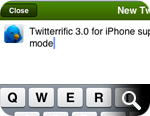
Twitterrific 3 for iPhone benefits from all the work that has already gone into the iPad including: proper retweets, lists, saved searches and more. Add to this the long-awaited full landscape support that our users have been crying out for and Twitterrific is a whole new experience on the iPhone. All these things aside, rebooting the app in this fashion has allowed us to evaluate each feature on its own merits. Free of the pressure to include everything but the kitchen sink, Twitterrific now starts fresh and will gain new users. Once all the versions are in sync, we can concentrate on bringing updates to Twitterrific across all platforms simultaneously. This will hopefully allow us to avoid the pitfalls of having one version wildly out of sync with the rest (like the current Mac version).

In the end, this approach benefits both the customer and the Iconfactory and makes for less frustration. We realize that some current users of Twitterrific for the iPhone may lose a few of their favorite features as we move towards these new versions. Some may even seek out other Twitter clients as a result and if that’s the case, I’m okay with it. It’s impossible to please everyone, so we’ve decided to focus on those like us who want a streamlined and straightforward Twitter experience. Our days of trying to be the everything-under-the-sun Twitter client are over. Tough love has taught us saying “no” leads to beautiful things. The best is yet to come, I hope you’ll join us.

Related posts:

For more information about the changes coming to Twitterrific, be sure to check out David Lanham’s post on optimizing the user experience (including more screen shots from version 3 for iPhone) as well as Craig Hockenberry’s piece on why simplifying a design is so important. Thanks!

3 Comments

iFavorite Things

Unless you’ve been living on the far side of the island for the past 3 months, you’ve probably heard of the iPad. You’ve probably already read more than your fair share of reviews of the device and what to expect from Steve’s latest magic marvel. Two of my favorite reviews so far are Jason Snell’s wonderfully complete write up as well as Sean Blanc’s take on the iPad. However, rather than pile on my own full review I thought I’d go with the “less is more” approach. Here, in no particular order, are my favorite and least favorite things about the iPad. You’re milage may vary.

Good – The screen. It’s sharp, lush and super crisp.

Bad – The smudges. This thing shows fingerprints like a poor man’s crime scene.

Good – Speed. Holy crap this thing is fast. Apps launch, Safari scrolls and zooms, home screens load all tremendously fast. If you own an iPad and yours isn’t blazingly fast, you’ve either jailbroken it or offended it in some way. This thing flies.

Bad – The weight. It weighs about .5 – .75 more lbs than I would like. It’s not a huge deal, but holding it in one hand will quickly give you a workout. This is undoubtedly the handiwork of the super-long battery life which helps me deal, but I hope iPad 2.0 weighs less.

Good – Did I mention the battery life? It’s like crazy nutty awesome. I sat with my iPad on last night for about an hour using Twitterrific and Safari and went from 100% to about 97% battery. The iPad is doing some crazy ass power management.

Good – iBooks. The application is beautiful, thoughtfully designed and a joy to use. Almost makes me want to read more. Almost.

Good – Blue tooth keyboard pairing. This to me, is the killer feature. Once paired with my Apple wireless bluetooth keyboard my iPad effortlessly became a mini Twitter station next to my iMac. The keyboard can wake the iPad from sleep without the need to unlock and the function keys even control the iPad’s brightness, volume and media controls (play, ff, pause, rewind).

Good – Apps. There are tons of great apps out there for the iPad. In no particular order, my favorite apps so far include Articles, Things, Epicurious, At Bat 2010, Deliveries, Instapaper and my favorite of course is Twitterrific.

Holding and using the iPad makes all the difference in the world. Pictures, even video doesn’t do the device justice. It feels natural to manipulate and beats the hell out of a laptop for casual surfing, tweeting and replying to email. In the game department, the iPad will give all other mobile gaming platforms a serious run for their money. Watching movies & TV shows is light years better than watching them on my iPhone.

Overall the iPad is yet another feather in Steve Jobs’ and Apple’s cap. Even if I didn’t develop apps for a living, I’d still buy one for myself because its just so darned fun and effortless to use. The iPad is certainly a game changer and if nothing else has proven that despite Microsoft’s failed efforts to the contrary, tablet computing can be successful. Check it out.

My Most Anticipated of 2010

With so much to look forward to in the coming year, I thought I would assemble a list of just some of the things I’m anticipating most. All of the things on my list have been in development for a very long time, and all of them are coming to a head in 2010. If you’re like me, then you know at least a one item on this list, if not then hopefully you’re in for a few pleasant surprises.

• • •

Star Trek Online

Video Games

When Star Trek Online finally beams down in February of 2010, the game will have been in development for over 6 years. This massively multiplayer online role-playing game (MMORPG) has the potential of being the best online experience since Blizzard’s hugely popular effort, World of Warcraft. Players will be able to command their own starships, explore strange new worlds, and team up to defeat classic Star Trek enemies such as the Borg and Klingons.

Historically, video games based on the Star Trek franchise have not been widely successful. I have a feeling that Star Trek Online is about to change all that. How do I know? I’ve played it. That’s right I’ve sat in the Captain’s chair and I am here to say STO is a winner. I can’t divulge much due to the closed beta NDA except to say that Cryptic Studios has managed to capture this Trekkie’s heart with their incredibly fun and detailed futuristic universe. Star Trek Online enters public beta in January of 2010. Unfortunately no Mac or Linux version is planned for launch, but there is a logical alternative. If you own a fast Mac and aren’t afraid to run Windows via Boot Camp, there’s no reason you can’t go where no one has gone before. Make it so!

• • •

The Pacific

Television

From Producers Tom Hanks and Steven Spielberg, the team that brought us the Emmy Award winning miniseries, Band of Brothers, comes The Pacific. I first wrote about this HBO 10-part drama back in April of 2007 and have been waiting for it ever since. The original Band of Brothers was a tour de force showcasing the gritty realism and heroic courage of WWII in Europe. The Pacific aims to tell the story of a small group of Marines in the Pacific theater of battle and includes an almost entirely unknown cast of actors.

The Pacific is based on two memoirs of U.S. Marines: With the Old Breed by Eugene Sledge and Helmet for My Pillow by Robert Leckie. The series will tell the stories of the two authors and Marine John Basilone, as the war against the Empire of Japan rages. According to Wikipedia, the series will feature well-known battles involving the 1st Marine Division, including Guadalcanal, Cape Gloucester, Peleliu, and Okinawa, as well as Basilone’s involvement in the Battle of Iwo Jima. While Band’s battle scenes rivaled anything on the silver screen, it was always the thoughtful stories of the men who fought and died for their country that made the series so compelling. The Pacific is set to air on HBO in March of 2010.

• • •

The Return of Futurama

Television

You just can’t keep an animated robot and his hilarious best friends down. After a pre-mature cancellation by Fox in 2003, Futurama found new life in syndication thanks to Cartoon Network’s Adult Swim and Comedy Central. The show’s creators, Matt Groening and David X. Cohen teamed up and briefly brought Futurama out of deep freeze with the release of 4 straight-to-DVD movies, the last of which was released in early 2009. On June 9th, 2009, Comedy Central announced that they had picked up the show for 26 new half-hour episodes which are due to start airing in mid-2010.

I’ve been a personal fan of this deeply funny show since the first day it aired on Fox. While I have enjoyed the DVD films, the 1.5 hour format really didn’t suit Futurama and the stories lost focus. I’m confident that returning to the 1/2 hour format will make all the difference as the writers, producers and voice actors once again lift us to new heights of geek-filled fun. Plus, I’m dying for new material for my Futurama icon sets!

• • •

Super Mario Galaxy 2

Video Games

When it was released in November of 2007, Super Mario Galaxy quickly became hailed as one of the greatest video games of all time. As the flagship title for the new Nintendo Wii, Galaxy brought the beloved Mario series to a whole new level. The game challenged gamer’s preconceptions of 3D level design as Mario dashed and jumped around and across entire planets on his hunt for Power Stars. Adding to the game’s impact were the over 20 fresh and epic musical tracks scored by composer Koji Kondo. Although few sequels live up to the thrill of the original, knowing Shigeru Miyamoto as they do, Nintendo fans everywhere are anxiously awaiting Super Mario Galaxy 2’s appearance sometime in 2010. Count me among them.

• • •

Apple iPadd

Technology

Rumors of the mythical tablet computer from Apple have been swirling for the better part of a decade, but it wasn’t until the iPhone came along that the possibility of such a device seemed real. Add to that slips of the tongue from newspaper and magazine publishers, supposed patent filings and oodles of fake mock-ups and suddenly rumor becomes reality. If speculation is to be believed, then the iPadd (my pet nickname for the device ode to the ubiquitous tablet computers from Star Trek) will arrive sometime in March or April for under $1,000.

When all is said and done, the bigger question might be why is Apple making a tablet computer in the first place? The answer seems to be to do for books what the iPod did for music, that is to revolutionize it. Steve Jobs is apparently setting Apple up as the direct competitor to the hugely successful Kindle from Amazon, and that’s just fine with me. Call me crazy, but I think if you’re going to let users download and read books in bed, that device should have built-in backlighting. Oh, and color would be great too.

I could easily see my trusty iPadd coming in handy while I watch TV to tweet a snarky comment or to look up a movie reference. I could also see myself propping up the device on a nifty stand to display the recipe du jour as I cook. Oh yes, if and when the iPadd comes, I’ll probably find a way to talk myself into needing it along with millions of other consumers. Curse you Steve Jobs!

• • •

TRON Legacy

Movies

This long-awaited sequel to Disney’s original TRON has geeks everywhere spazzing out. The story follows Flynn’s son Sam as he attempts to track down his missing father. Inside the cyber world audiences first visited in 1982, the programs have become more advanced, video games more violent and cyberspace more deadly.

The sequel will feature original TRON stars Jeff Bridges as Kevin Flynn and Bruce Boxleitner as Tron himself. Given the advancements that have been made in computer special effects in the past 28 years, TRON Legacy promises to be a visual spectacle unlike anything movie goers have ever seen. Disney has scheduled the release date of the film as December 17th, 2010, a year and a few days from when I write this. Only time will tell if it’s worth the wait.

• • •

6 Comments

Orba: My New iPhone Obsession

Every once in a while you run across a piece of software that’s so elegant and well done it makes you smile from ear to ear. Orba, the new free puzzle game from Kieffer Bros. is such an application. Released for the iPhone and iPod touch in late November, Orba is a great example of casual gaming in the spirit of Bejeweled or Tetris.
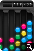
I love games that can be explained in 25 words or less and Orba’s just such a game. Clear as much of the board as possible by tapping chains of three or more same-colored orbs. The bigger the chain, the more you score. The premise is simple, but after playing just a few games it quickly becomes apparent tap mashing won’t get you very far. Each game starts with only 3 colored orbs shown on the board, so creating long chains of like colors is relatively easy. As you progress, more and more colors are introduced and it becomes quite difficult to clear enough of the board to be able to continue. When no chains can be cleared, the game is over.

As is the case with much of the software that lives on my iPhone, I first discovered Orba via a tweet from a friend, Jason Snell of Macworld. Since I know all too well how important it is to get the word out about great iPhone apps, I’m only too happy to recommend Orba to all of you iPhone and iPod touch users out there.

The game’s user interface is drool worthy. Everything about the game’s design just seems right from the user interaction and the help screens to the friendly “Hello Again.” message that greets you every time you begin. The UI is minimal, but elegant and does a wonderful job of not getting in the way as you play while still looking freakin’ cool. About the only thing I probably would have done differently are some of the sounds. They too are minimal, almost to a point of being non-existent. Despite the audio nit pick, the designers at Kieffer Bros have a well-earned reputation for beautiful software and their work on Orba is no exception.

As a causal gamer, I was surprised and delighted to find that Orba was being offered on the App Store absolutely free. As a fellow developer of iPhone titles, I would have gladly paid upwards of $4.99 for this wonderful piece of art masquerading as a casual game. Since my parents always taught me never to look a gift horse in the mouth, I won’t say any more regarding the decision to give away Orba except to say “Thank you” to the folks behind the orbs. I’ve already gotten many hours of enjoyment out of the download, and that will most likely continue for some time.

I love that I can play this game for a few minutes or hours on end, pause and come back at will. Since there is no time constraint, the only pressure to achieve higher scores are the ones you impose on yourself. Orba doesn’t have online scoreboards or social network boasting, but it doesn’t have to. It is what it is. If you’re looking for a well designed, friendly and casual game for your iPhone, Orba just might be the game for you. Head on over to the App Store, download a copy and let me know when you break the million point mark.

UPDATE: Of course on the very day I decide to publish this post, Orba goes from free to 99¢. I’m actually glad they made it paid since it’s worth 4-5x what they are asking for. You can still try the first 12 levels for free by downloading Orba lite so no harm, no foul.

100 Comments

Losing iReligion

A great deal has been written about the App Store, both good and bad, and much of it comes from developers I know and respect. It almost seems pointless to add my own thoughts to those who are more widely known and respected than I am, but given how my feelings have evolved regarding the App Store recently I think it’s worth a shot. If what I have to say gives a potential iPhone developer reason pause and re-examine their entry into the space then it will have been worth it.

The App Store is broken. I know from the outside glancing in, it may not look that way but it is. It also doesn’t seem like it’s broken from Apple’s point of view since the store and its tens of thousands of software titles have helped place the iPhone firmly at the head of the smart phone industry. But speaking as a small developer who’s been releasing Mac software for over a decade, the App Store is broken. The ironic part is that if you had asked me this a few months ago I would have denied it with my dying breath.

Since it first launched in July of 2008, the App Store has been evolving and changing to suit the needs of both Apple and consumers. Unfortunately for developers many of these changes have hurt more than they have helped. The utter race to the bottom of the pricing structure by thousands of developers has created tremendous pressure to set applications at either free or near free price points. I know this first hand because when Twitterrific for the iPhone first debuted we set it’s price at $9.95 which, by today’s App Store standards, is almost unheard of. It wasn’t long before lagging sales and increased pressure from competition forced the Iconfactory to lower the application’s price to $3.99, still “expensive” by App Store standards. Not only was the price lowered, but the feature set was more than doubled and yet many users still complain it costs too much. While these changes represent perks for users, it also means that sustaining profitability for a given piece of software in the App Store is nearly impossible unless you have a break-away hit.

This leads me to the next point of failure for the App Store – visibility. Everyone has heard about the so-called “gold rush” certain developers have experienced. Flight Control’s 1.5 mil sales record. Trism’s incredible $250,000 short-term bonanza. But for every one of these lottery wins in the store, there are hundreds, if not thousands of developers who see little if any return on their investments of time and money. What’s worse, the success or failure of a particular piece of software in the App Store depends as much on Apple deciding to feature your creation as the creation itself. One can shift the tables in one’s favor with a sizable advertising budget, but many of us like the Iconfactory don’t have such generous resources at our disposal.

When the Iconfactory & DS Media Labs released our latest iPhone game, Ramp Champ, we knew that we had to try and maximize exposure of the application at launch. We poured hundreds of hours into the game’s development and pulled out all the stops to not only make it beautiful and fun, but also something Apple would be proud to feature in the App Store. We designed an attractive website for the game, showed it to as many high-profile bloggers as we could prior to launch and made sure in-app purchases were compelling and affordable. When the moment came, Ramp Champ shot up the charts quickly but just as quick, it hit a brick wall. Within days the app that had peaked at #56 on the top paid chart fell off the top 100 despite receiving praise from users and reviewers alike. The lack of store front exposure combined with a sporadic 3G crashing bug conspired to keep Ramp Champ down for the count.

A new version that corrected crashing was completed quickly, but once again the App Store reared it’s broken head as the review process kept the fix out of user’s hands for almost two weeks. By this time it was too late and momentum had been lost. Despite a “What’s Hot” feature by Apple in the App Store, Ramp Champ’s sales have not lived up to expectations for either the Iconfactory or DS Media Labs. What’s worse, many of the future plans for the game (network play, online score boards, frequent add-on pack releases) are all in jeopardy because of the simple fact that Ramp Champ hasn’t returned on its investment.

In order for a developer to continue to produce, they must make money. It’s a pretty simple concept and one that tends to get lost in the excitement to write for the iPhone. It’s difficult for me to justify spending 20-50 hours designing and creating new 99¢ levels for Ramp Champ when I could be spending that time on paid client work instead. I would much rather be coming up with the sequel to Space Swarm than drawing my 200th version of a magnifying glass icon. But I’d also like to have some assurances from Apple about reducing the length of the App Store approval process, having the ability to respond to factually incorrect iTunes reviews, not be limited to 100 beta testers, or that large, prominent developers won’t always get preferential treatment. In short, I’d like to know things will be fixed and I don’t mean merely posting a page of marketing text in iTunes Connect.

It is a truism that everyone who creates content is a control freak. From fine artists that decide what gallery their work will hang in, to architects who scratch tooth and claw with stubborn clients about what materials will be used in construction. Software developers are no different. We all want as much control over our creations as we can possibly have and the App Store in it’s current state has removed a significant level of control from our hands. I’m not ready to throw my lot down with those who have renounced the platform just yet, but unless some significant changes come very soon, myself and others like me will have no choice but to focus our development efforts elsewhere.

UPDATE: Several developers have contacted me and told me privately that they think it isn’t so much the App Store that’s kept Ramp Champ from being a success as it is the game itself. Given the fact that Freeverse’s newly released and shallower ‘Skee Ball’ currently sits at #6 in Top Paid apps in the store, part of me wants to agree. I could second-guess myself about what didn’t go right with Ramp Champ but in my heart of hearts I know RC is better than 90% of the games that get to the top of the list. I have to keep telling myself that what doesn’t kill us will make us stronger in the end. Hopefully.

UPDATE II: Seems I’m not the only one cooling to the idea of developing for the iPhone. Macworld’s Dan Moren reporting from the C4 independent developers conference says many of the developers are frustrated at their lack of control in the App Store. I’m glad to know I’m not the only one.

UPDATE III: Marco Arment has written an excellent piece that addresses my post. I agree with much of the analysis there and tend to think that their may indeed be “two App Stores” so to speak. As a result of suggestions from both Marco and the commenters here, Ramp Champ’s vague app store description has been re-written and new screen shots posted to show more content. Thanks to everyone who suggested these changes, I think they will definitely help sales.

9 Comments

Mr. Jobs, Domino’s Calling!

I’ve recently discovered creating a successful iPhone application is a lot like baking a pizza. Take the best ingredients, like skillfully crafted code, bold and flavorful interface design and combine with a dash of love and you may end up with a delicious dinner. Unfortunately for App Store developers, once you’ve rolled the dough, spooned the sauce and added the toppings, the delivery process itself can often be frustrating.

Apple’s process of getting apps reviewed and posted to the App Store leaves much to be desired. Once submitted, we developers must sit back, cross our fingers and hope everything is in order so that the “pizza” makes it to your device in a timely fashion. One of the criticisms of the App Store in recent months is that it can take more than 2 weeks to have an app make it’s way through the review process, sometimes only to end in rejection. When this happens, the problem must be corrected, the app resubmitted and the developer goes to “the back of the line” and starts all over again.

Since most developers would rather have too much feedback rather than too little, one way to ease the pain of the review process would be to add more feedback. Developers love feedback, whether it comes in the form of bug reports, reviews, emails or simple sales figures. In the world of home pizza delivery, when it comes to awesome feedback, no one beats Domino’s.

When a customer orders a pizza from Domino’s online, they receive instant feedback on the status of their order via Domino’s über-cool pizza tracker. The tracker tells you where in the cycle of delivery your pie is, what time it started the last phase and who’s currently working on it. It may sound corny, but this is exactly the kind of feedback developers need when submitting software to the Apple App Store. Imagine a meter that outlines each part of the approval process with time and date annotations for each step. The App Tracker would be of enormous assistance to developers, ensuring proper completion of each part of the submission process. A developer could track their “pizza” as it made its way to the store and get a better sense of when to expect final delivery. It could also help Apple internally so they know what phase a particular application was last in if a problem arises.

Such a system would allow companies to better plan their product’s marketing efforts and direct their resources more efficiently. Not to mention reduce the level of stress associated with being left in the dark regarding your application’s approval. Apple recently implemented a small counter for developers to let them know what the average approval time for their applications are in iTunes Connect. This was a great first start, but I suspect that with a bit of love, and a few lessons from the folks at Domino’s, getting through the app store approval process could be as easy as pie.

8 Comments

Losing Control

Anyone who’s worked for themselves knows the satisfaction of being in control of your own destiny. The perception that by sheer force of will and hard work, you can be successful at what you do. Those who take on the challenge of owning their own business are often considered “control freaks” and more often than not, perfectionists. I never really realized just how much of a control freak I was until this past weekend when, completely without warning, I had none.

Last Friday, the Iconfactory’s popular Twitter client, Twitterrific, fell victim to the so-called Twitpocalypse bug, which caused the mobile version of our application to suddenly stop working. Thanks to the efforts of our talented engineer, Craig Hockenberry, a fix for both versions of the client was submitted to the App Store within a day. To Apple’s credit, the free version of the fix was approved swiftly and allowed the majority of our users to continue tweeting with minimal interruption. And although the Premium version of the application was also approved in record time, the displeasure from our user base, not surprisingly, came even quicker.

From the moment the bug hit, both Talos and I had begun monitoring tweets of users mentioning Twitterrific in their posts. What started as a trickle, soon turned into a deluge of upset and frustrated users. We began responding to individual tweets and Travis, our project manager, responded to support emails. The Iconfactory is a small company, we’re not Adobe or Google or even the Omni Group. All three of us did our best to let users know what was going on, and thanks to hundreds of RTs, word started to spread about the bug and our efforts to combat it. Unfortunately, Twitter is a very big community and it was impossible to personally respond to everyone. Even now, there are many people on Twitter who don’t know why their copy of Twitterrific isn’t functioning and there is very little I can do about it.

The best we could hope for was that the majority of users followed @twitterrific and would eventually receive news about the fixes. The troublesome part is that although I know the majority of users now have a working version, I still feel uneasy knowing there are potentially thousands that don’t even know about the fix. Part of this is due to the lack of communication channels, and part is due to the nature of the App Store approval process. As developers, we must turn control of our applications over to Apple to have our iPhone software published. This process can take days or weeks and until it runs its course, our hands are quite literally tied. By the time updates are published it may already be too late.

All of us at the Iconfactory count ourselves lucky that Apple recognized the seriousness of the bug we were facing and pushed through the Twitterrific updates as quickly as they did. We know we messed up and we thank the App Store team for helping to pick us back up off the floor. That being said, I didn’t sleep much in the days after the bug hit because there was a part of me that knew hundreds of tweets were flying by every hour from Twitterrific users I was powerless to help. As with most control freaks this usually means even more work, more testing and more diligence to guard against these kinds of catastrophic failures in the future. But that’s okay with me since I’m not anxious to give up this level of control, or sleep, ever again.

2 Comments

Greensboro Joins the Cult of Mac

After several false starts, months (even years) of waiting, and disputes with their retail neighbors, the new Greensboro Apple Store finally opened this past weekend. Although I’ve done my fair share of waiting in line for openings, this time things were a bit different. The level of excitement and enthusiasm as we stood in line Saturday morning was surreal. We arrived a little after 7am and were about 20 people from the front of the line. We came prepared and dressed in layers to keep warm.

The morning was spent swapping Mac stories and meeting new people. The day before a group of my friends and I from the Iconfactory stopped by the unopened store and happened to run into a WXII News crew. They had asked us why we were looking forward to having our own Apple Store and we even managed to get in a plug for Twitterrific.

When the moment of truth arrived and the doors finally opened, we were greeted like rock stars courtesy of the whoops and cheers from the store employees. After running down the line and high-fiving over 20 people, I can start to understand why some think Mac users are part of a geeky “cult”. We browsed the hardware, and Talos even ended up becoming the 1st official paying customer in Greensboro. After about 30 minutes we made our way to the exit, went outside and was greeted with our first real glimpse of the true size of the line waiting to get in. Checking out the photo essay from the News & Record it’s easy to see just how many people had come for the opening. Absolutely incredible.

While the store opening itself was a wonderful and throughly geeky experience, I’m more gratified to finally have a place locally where I’ll be able to go and purchase new Apple hardware, learn new software and have repairs made. The staff at the Apple store are always on call to help users with any need and I plan to avail myself of their hospitality every chance I get. From all of us, to all of you, welcome to Greensboro, Apple!

3 Comments

Greensboro Apple Store Opening Set

According to an unofficial announcement in the News & Record, the date for the opening of the Greensboro Apple Store has been set as Sat., February 21st. The new Apple store at the Shops at Friendly Center is reported to be North Carolina’s largest and promises to be a Mecca for Apple fans across the triad. All this is conjecture of course since there has been no official word from the Apple retail website.

Center hours are from 10am – 6pm on Saturdays, so I think it’s safe to assume the new store will open at 10am that day. I and a bunch of the guys from work will definitely be attending the opening so perhaps we’ll see you there. Just watch for the gaggle of geeks wearing the Iconfactory t-shirts. Just one more week folks!

3 Comments

Greensboro Apple Store Update

Yep, it’s still there and it’s still being worked on. The only visible difference on the facade of the future home of the Greensboro Apple Store is the corporate logo and URL that’s been added in the past week. My friends Anthony, Louie and David managed to sneak a peek inside when nobody was looking and reported that the Genius Bar logo is on the wall, and the interior is coming along. They said it seemed “big”, but I’m dubious since there’s no displays, shelves, etc yet.

At any rate, if the word on the street is true, hopefully sometime in February we’ll have a new place to go and buy shiny new Apple hardware in Greensboro. All of us at the Iconfactory can hardly wait. You can be sure we’ll be right there in the front of the line when the store opens. If you want to see the latest pictures of the store, head over to my Flickr page for some pictures that no one but Apple junkies would find thrilling.

UPDATE: A little bird, no not that one, told me that the Greensboro Apple store should be done and open by Valentine’s Day. Keeping my finger’s crossed!

6 Comments

Things I Learned at Macworld

Unlike most of the people I follow on Twitter, Macworld 2009 was my first expo in many years, and the only one where I’ve been one of the exhibitors. The week was fun, exciting and a lot of work. Now that I’m back home in Greensboro, I thought I’d impart some of the knowledge I gained during my experience. In no particular order, here are a few of the many things I took away from my trip to Macworld 2009:

• Expo food is over-priced – Ya know how they charge like $4.00 for a bag of popcorn at the movies? Macworld is like that but a x1000 worse. A pathetic bologna sandwich and a bottle of water came to $12.50.

• Floris Natural Benefits Soap – The Intercontinental San Francisco had some of this product line in our room and I couldn’t get enough of it. I must try and track down the Jabon hand soap for use at home!

• Craig has groupies – I mean I knew people loved Craig, but I didn’t realize they would actually wait in line to talk to him. Every day on the show floor was filled with people waiting to chat with Mr. Hockenberry, they just couldn’t get enough of him. All of that attention made me realize just how proud I am to be able to work with him.

• Mel’s Diner has the best lemonade – I’ve drank a lot of lemonade in my time, but the lemonade I enjoyed at Mel’s during the expo was, without a doubt, the best I’ve ever had. In my life. The perfect blend of sweet and tart that should not be missed.

• Chairs are precious – Our kiosk at the show only had one chair. I was told that to rent another for the week it would have cost $200. After spending almost 7 hours on your feet $200 didn’t seem that bad. When some bastard stole our one chair on Friday morning, we almost had a freak out. Luckily Travis was able to procure another in short order.

• Rickshaw computer bags – New product. CEO and owner gave me a demo of the bag and had me sold at like the 5th feature. If you are in the market for what could be the best computer bag you’ll ever own, check them out.

• Basil Thai on Folsom – Of all the wonderful places we ate while at Macworld, this little restaurant on Folsom Street was the best. From the appetizers to the wonderful desert and everything in between, it was to die for. Ged gives Basil Thai 5 stars!

• Meeting people – By far the best part about Macworld was simply meeting everyone. Tweeting with people is great, but Macworld reminded me that face to face contact can’t be beat. I met so many awesome people at the expo I can hardly keep track of them all. I especially enjoyed meeting the TUAW crew including Mike Rose, Christina Warren and Nik Fletcher. Other notable Mac heads I met during my week in San Fran included: Arlo Rose, Dan Moren, Rick Yaeger, Chris Pirillo, Rich Seigel, Michael Simmons, Scott McNulty and Arne Fismen.

3 Comments

Market Yourself An iParadigm

John Gruber over at Daring Fireball links to an intriguing piece by Paul Kafasis on the state of the App Store. The post compares Walmart’s strategy to sell disposable, cheap goods to those of App Store “ringtone” developers which are forcing down prices. My friend and business partner, Craig Hockenberry wrote about this very topic a few weeks ago in a piece that put him in the crosshairs of quite a few people.

After Craig’s piece was published, and indeed after reading the post by Kafasis, some are under the impression that more expensive “AAA” apps are doing just fine thank you very much. The theory goes that one only has to look at the App Store top 10 list to understand it’s not price that gets you into the top 10, but quality. This, plus marketing on the part of the developer are all that’s needed to boost your software into the top 10 of the App Store. Reading through the comment thread at Inside iPhone it all seems so simple. All a developer has to do is market their app and the rest will take care of itself! Why didn’t I think of that?

The part I love the most is that the people making the “just market your app!” comment have no real idea how much effective marketing costs. Oh sure, you can go far on viral and word-of-mouth marketing, but it all pales in comparison to even a small banner graphic in the App Store. The Iconfactory could spend tens of thousands of dollars buying up targeted advertising space to promote Frenzic, but it still wouldn’t be 1/10 as effective as the front page graphics that Dropship, Marley and Texas Hold’em are enjoying (for free) as I write this. Not only that, but I have no way to track metrics for advertising pointing at Frenzic in the App Store. I can’t gauge how effective a $75 blog ad versus a $2,600 DF sponsorship is because Apple doesn’t currently give me stats of people clicking through to my software. Anyone who says “Just market it!” doesn’t have a solid grasp on how the App Store works.

Another example is Rolando. People are holding this app up as the ultimate example of a quality, non ringtone app that is enjoying success in the store. It is true that Rolando is a fantastic game worthy of the top spot it once held. It is also true that Apple promoted Rolando from DAY ONE in the App Store with major graphics both in iTunes and on Apple.com. All that exposure helped to get Rolando into the top of the store when it launched. But its $9.99 price point is like an anchor. As I write this, Rolando sits at #30 in the top 100, and #10 in games. Let me repeat that. #10. In games.

So what is in the App Store top 10 right now? iFart Mobile is number one which is still riding high on a wave of PR thanks to being originally barred. Crash Bandicoot, which is featured in national Apple television spots is #2. Tetris, perhaps the most well-known video game in history, is #3. Three more ringtone apps come in as 4, 5 & 6 including the months old iBeer. Touchgrind, which also enjoyed prominent Apple billing, is #7. Bejeweled 2 is number 8, PocketGuitar ($.99) is #9 and SimCity rounds out the top 10. All of these apps either enjoyed uncommon press exposure, have a nationally known brand or are priced at $.99. Quality definitely plays a role in getting to the top, but price and “Apple love” play a larger part.

Does this all mean that developers like myself will abandon making quality iPhone applications like Twitterrific and Frenzic? Of course not. I just wish that people who think they know how the App Store works would admit that they really don’t. The App Store is still in flux and much is unknown. What I do know however is that there are key factors to getting to the top of the store, chief among them being price and exposure from Apple. No amount of 3rd party marketing, done on a small developer’s budget is going to change that simple fact. What’s worse (or better, depending on your point of view) is once you are in the top 10, even if you’re app is a “limited utility” ringtone app, because you’re in front of millions of eyeballs both on the device and in iTunes, you’re bound to stay there.

I don’t know exactly how to fix the App Store, but everyone I’ve spoken with agrees that it needs fixing. If not fixing, at least a change in how it favors certain apps while hindering others. The more we talk about this stuff, the better it will be for both developers and customers alike.

2 Comments

Time Keeps On Slippin’

Inspired by a recent tweet from my friend Craig, I’ve sat down and thought about the various forms of media / technology transitions that I’ve personally taken part in. This list is amplified by the fact that my 39th birthday is coming up and for some reason, I’m keenly aware of my age.

How many of these evolutions have you experienced? Do you have others you could add to the list? If so, I encourage you to post them in the comments section. Are these changes painful reminders or fond remembrances? You’ll have to decide that for yourself.

• • •

vinyl > 8-track > cassette > CD > MP3

Walkie talkies > rotary > touch tone > cordless > cell

Finger paint > crayon > Lite-Brite > Etch-A-Sketch > Magna Doodle > WACOM

8″ floppy > 5 1/4″ > 3 1/2″ > SyQuest > Bernoulli > ZIP > removable

Apple IIe > IIgs > IIvx > Performa 6400 > Powermac G3 > PM G4> Dual PPC G5

Mattel Football > Merlin > Quiz Wiz > Game Boy > Nintendo DS > iPhone

Laserdisc > VHS > DVD > Blu-ray > Bit Torrent

Coca-Cola > “New” Coke > Coca-Cola Classic > Coke 2 > Coca-Cola Classic > Coke Zero > Coca-Cola Classic

Rubylith > Letraset > Pagemaker > QuarkXPress > InDesign

Adventure > Ultima > Bard’s Tale > Moria > Diablo II > World of Warcraft

Dewey Decimal > microfiche > Encyclopedia Britannica > Wikipedia

Odyssey > Atari 2600 > Intellivision > Nintendo ES > SEGA Genesis > Super Nintendo > Playstation > N64 > Game Cube > Wii

serial > SCSI > USB > Firewire > USB2 > WiFi

Play-Doh > Tinkertoys > Lincoln Logs > Erector Set > LEGOS

27 Comments

Why Icons Matter

I can’t tell you how many times in the course of my career as an icon artist that a client considered their icons to be an after thought. After spending hundreds of man hours and pouring thousands of dollars into software development, some clients just refuse to devote the attention needed to the glyphs that act as both button and branding. At the Iconfactory, we try and educate clients about the importance of icons and how they strengthen a company’s brand as well as communicate a product’s core concepts quickly and easily. It may sound like marketing fluff, but years of experience have taught me it’s the truth.

So when it comes to designing our icons for our own software products, we almost always end up obsessing over them. The redesign of the application icon for xScope went through nearly 20 different revisions before we settled on a final version. This time around, the drama was caused by the new icon for Frenzic for the iPhone.

Standing Out From The Crowd

When it came time to design the icon for Mobile Frenzic, we knew we wanted to use a 2D translation of the OS X version from the desktop. However, unlike Mac desktop icons which have a canvas size of 512×512 pixels, iPhone and iPod touch app icons are limited to 57×57 and look best when designed straight on. At first we decided to translate Frenzic.com’s fav icon which was a pie of green and orange wedges on a glossy black base. Early beta versions of Mobile Frenzic used this icon, but there was a problem. It just wasn’t eye catching.

Our artist, David Lanham, went back and added a neon-like inner glow that gave the impression of the icon being lit from within, like it was a piece of plexiglass. The results were effective and with the addition of a high-tech circuit board motif, I knew we had a winner. The icon both stood out on the iPhone’s home screen and did a wonderful job of branding “Frenzic” on the device. Despite these successes, there were those among us that thought it stood out a little too much.

As artists, we often get butterflies the first time we show a client our designs. In this case, the “client” was Frenzic creator and lead programmer, Wolfgang Ante. We’ve had a close working relationship with Wolfgang for years and even though he almost always loves everything we do “out of the box”, he was hesitant about the icon’s treatment. Both he, and our own lead programmer, Craig Hockenberry played devil’s advocate and thought that the glowing, high-tech icon might be too dissimilar to be effective. The design didn’t seem to follow conventional wisdom for iPhone app icons and we debated the pros and cons of the design.

In Expertise We Trust

The great thing about working at the Iconfactory is that we play to each other’s strengths. While I may have ideas about how a particular software feature might work, I trust in the skill and expertise of Craig and Wolfgang to pull off the actual programming. I often put my faith in their hands when it comes to coding, and likewise, they do the same for us when it comes to design. This is more than I can say for many of our clients who think they know best when it comes to icon design. Despite a client’s lack of experience of how icons communicate, where they are seen, or the technical details needed to pull them off, I often get lectured on how they should be rendered or what form they should take.

So, in their wisdom, Wolfgang and Craig set their hesitations aside and let the designers do their job. The result was a unique and compelling application icon that was simple to understand, easy to spot and visually unique from all other iPhone application icons. Maybe its even helped sell a few extra copies at the same time.

All too often icons are treated as second-class citizens, especially in the App Store. Lately, developers have taken to plastering “SALE” or “60% OFF!” within their icons. They’ve become lazy and let the iPhone software mar their design with glossy highlights which obscure efforts to brand their software. They use dull colors or pile on heaps of detail that just adds unwanted noise to an already cluttered array of choices. After the flashy ad pitches have faded, the icon still has to live on the user’s device and is often the first line of interaction with the product. Fight the urge to cheapen your brand and instead give your icons the love and attention they deserve. You’ll still sell boat loads of copies and your users just might end up thanking you at the same time.

5 Comments

Apple Freak

Lately I’ve found myself addicted to apples. No, not the kind that I usually write about, but an actual piece of fruit. You know, the kind you eat? I only recently discovered Gala apples and ever since I first had one at Panera Bread a few months ago, I can’t get enough of them. Ask any of my friends if I’m the type of guy that can be seen with a heart healthy snack in his hands and they would likely belly-laugh and tell you to go away.

Lately I’ve been warming up to the idea of eating more fruits and vegetables and the unassuming Gala apple has been leading the charge. If you’ve never had one, next time you’re in the produce section try and pick one up. They are softer than most apples with a thinner skin and a slightly sweeter taste than most. Developed in New Zealand in the 1920s by orchardist J.H. Kidd, Gala apples are a cross between a Golden Delicious and Kidd’s Orange Red. They resist bruising and are quite easy to eat. Even if you don’t particularly enjoy apples give them a try. They’ve easily become my new favorite snack and they could become yours too.

2 Comments

RIM: What, me worry?

There are very few surprises left in the world, so when something outside my experience comes along, I prick up and take notice. Lately the shock of the new comes in the form of commercials from Research In Motion (RIM), makers of the BlackBerry line of smart phones.

Before April of 2008, RIM never saw fit to advertise its products or services to the general public, instead relying on its core business of Enterprise users to carry them to profitability. Despite calls from BlackBerry surrogates to build brand awareness, RIM was content to go about their business confident that nothing could erode their firmly entrenced army of “CrackBerry addicts“.

Then came the iPhone.

When the iPhone was released in June of 2007, RIM CEO Jim Balsillie shrugged off Apple’s entry and denounced the iPhone as a light-weight consumer device that would have little, if any effect on their core business market. At first this might have been true, but as the success of the iPhone grew and owning a smart phone became “cool”, even Research In Motion could see the writing on the wall.

In June 2008 Apple released the second generation iPhone, the 3G and again the media reported that RIM “wasn’t worried” about the iPhone. Deon Liebenberg, regional director for RIM actually said that the iPhone’s release would be good for BlackBerry since “BlackBerry will offer a serious [Enterprise] solution that Apple can’t.” Strangely enough these comments came just about the time RIM aired its first consumer commercial to the public.

In September Research in Motion missed sales targets for the BlackBerry device despite having recently expanded their product offerings. The addition of new (and potentially confusing) models to its already complex product line includes a phone with no physical keyboard, something that Co-CEO Mike Lazaridis had publicly stated wasn’t for RIM. Now come commercials that profess the BlackBerry to be more than just a tool for corporate email and Enterprise calendering. RIM wants to be hip.

In the end, all of these developments increase competition, and that is a good thing. It spurs innovation, lowers prices and gets companies like RIM and Apple off their complacent asses to develop and market better products. RIM’s recent moves will hopefully spark improvements to the iPhone as well as encourage Apple to correct service problems with Mobile Me. But the next time you hear an arrogant CEO brush off Steve Jobs, Apple or the iPhone just remember to take what they say with a huge grain of techno-salt. They probably have a commercial in the wings ready to advertise the stuff they just railed against.

UPDATE: Apple released its financial information for Q3 in 2008 this week and in terms of total revenue, Apple’s iPhone has outsold RIM’s Blackberry handily. Not bad for a company that has only been in the smart phone market 15 months.

2 Comments

Greensboro Apple Store Update

Back at the end of July I took a picture of what I was sure was the future home of the new Greensboro Apple Store. Unlike my first guess, I was sure this time I had the actual location of the retail space and submitted it to The Unoffical Apple Weblog. The fine TUAW folks indulged my Jimmy Olsen fantasies and posted the picture to the cheers of Triad Apple fans. Unfortunately, last week Talos found out that the store in the picture will in fact be a new William Sonoma and not the Apple Store. So much for that Pulitzer Prize I was gunning for. Now comes this video from Greensboro WXII News 12 stating that the Greensboro Apple Store is indeed delayed until February of 2009. A major bummer to be sure, but if what the reporter in the piece is saying is true, then we have a good reason for the delay. I’ll take a larger Apple Store if it means we have to wait a bit longer. Must. Be. Patient.