Twitterrific’s Tough Love
When you love someone it’s hard to say no to them. You’ll usually do anything to please that person even if it goes against your better judgement. The inability to say no can also extend to the realm of software development. Companies can get so caught up in the desire to give users the best and brightest features they forget about the dangers of feature creep. They forget about good design. Such was the case with Twitterrific for the iPhone.
Somewhere during Twitterrific’s evolution from the desktop to the iPhone, we forgot how to say no. We said yes to too many of the latest features, 3rd party services and user requests. Eventually this “leap before you look” approach increased the complexity of the user interface and made the app’s settings too confusing for even us to figure out. A growing chorus of users told us the app was too hard to understand. We had lost our way.

The announcement of the iPad changed all that. Constrained by the 60 day launch deadline, we set about to create a fresh version of Twitterrific that would be dead simple, include all of Twitter’s core features and be a joy to use. The result was Twitterrific for iPad which is now available on the App Store. Many of the extraneous features from the iPhone version were initially removed including *all* of the app’s settings. There are no layout controls, body text compression, address book, themes and no tap shortcuts. What we present in exchange is simply the most friendly, easy to use Twitter client available anywhere. Like the iPad itself, Twitterrific is now designed for the masses. Those fabled 80% of users that Steve Jobs mentioned at the product’s launch are now our target audience. Early reaction to Twitterrific for iPad has been very positive. The app is decidedly easy to use and has a feature set that the majority of users want.
The result is a strong user experience that is influencing our efforts on the iPhone as well as the new upcoming Mac version of Twitterrific. Having eventual parity across all versions of the application will cut down on technical support requests and free up our development time, resulting in more regular updates and bring Twitterrific to a wider audience. Will we bring back some of the most heavily requested features? Yes, versions 1.0.1 and 1.1 for iPad have already added requested features like 3rd party push, reply all and picture uploading.
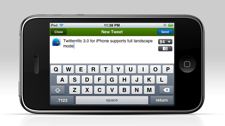
Twitterrific 3 for iPhone benefits from all the work that has already gone into the iPad including: proper retweets, lists, saved searches and more. Add to this the long-awaited full landscape support that our users have been crying out for and Twitterrific is a whole new experience on the iPhone. All these things aside, rebooting the app in this fashion has allowed us to evaluate each feature on its own merits. Free of the pressure to include everything but the kitchen sink, Twitterrific now starts fresh and will gain new users. Once all the versions are in sync, we can concentrate on bringing updates to Twitterrific across all platforms simultaneously. This will hopefully allow us to avoid the pitfalls of having one version wildly out of sync with the rest (like the current Mac version).
In the end, this approach benefits both the customer and the Iconfactory and makes for less frustration. We realize that some current users of Twitterrific for the iPhone may lose a few of their favorite features as we move towards these new versions. Some may even seek out other Twitter clients as a result and if that’s the case, I’m okay with it. It’s impossible to please everyone, so we’ve decided to focus on those like us who want a streamlined and straightforward Twitter experience. Our days of trying to be the everything-under-the-sun Twitter client are over. Tough love has taught us saying “no” leads to beautiful things. The best is yet to come, I hope you’ll join us.
Related posts:
For more information about the changes coming to Twitterrific, be sure to check out David Lanham’s post on optimizing the user experience (including more screen shots from version 3 for iPhone) as well as Craig Hockenberry’s piece on why simplifying a design is so important. Thanks!
Great post, Gedeon! One of the things that I love about the Iconfactory is the meticulous care you guys put into thinking about how to do software right.
It’s good to hear what’s happening with Twitterrific for iPhone. The iPad version is probably my favorite Twitter experience on any platform, so it will be nice to see the iPhone version come into sync with it.
We’re all dying to hear some more news and see some sneak peeks at the new Mac version! There is a big hole to be filled there, and I’m sure you guys are up to the challenge.
So happy to hear that you guys are going with a streamlined approach. Twitteriffic 2 for the iPhone I found wildly intimidating; the iPad version has been a breath of fresh air. Best of luck!
so looking at this post and also http://dlanham.com/2010/05/redesigning-twitterrific it looks like the iconfactory is bringing twitterrific back to the dark ages.
Gotta tell you a story:
Sat down today and tweeted a couple things from the new Twitter app, and also from twitterrific. Have to say, liked twitterrific better. Probably because I’m more used to it, but who knows. Love the “business plan” style approach to your 3 pronged article.
It’s been reported that when iphone OS 4 hits, OS 3 users of first and 2nd generation phones will be forgotten, that we’ve seen the last OS3 update. As you make improvements to the best twiiter client out there, please don’t forget us cro-magnon first-gen users, guys!
Best,
D
So will you be able to filter by distance with the update?
I really hope so.
Thats a huge drawback for the iPad app version.
It’s the only reason its not my 1 stop twitter shop.
I’ll have to just not upgrade the app if distance filtered searches are not in there.
I love everything else though!
One thing I hope stays in Twitterrific 3 for iPhone is the dark theme.
One thing I hope gets introduced in Twitterrific 3 is a “Reply All” function.
That’s all I’d like to be included in 3 and I will stay with Twitterrific.
I am open to changes but the thing that sets your app apart from others to me is that I can mark tweets to read later without having to use a third party application such as read it later or instapaper. This is perfect for me as I follow a lot of news papers and science blogs and don’t have time to read them straight away. If this simple feature is removed I may have to try and find an app which allows it, though so far yours is the only one.
I’m really excited to see this new twitterific regardless.
I have downloaded Twitterrific 3 and I’ve got to say I’m disappointed.
Far from simplifying things, it feels more difficult to even do the basic things like reply to a tweet. To reply, you now have to tap the tweet, hit the reply arrow and then hit ‘reply’. Three taps to reply!!! It may seem a little thing but replying is probably the main thing people do on Twitter. Also once you have hit ‘Send’ you then have to hit ‘Done’ to get back to your timeline.
Twitterrific seems more complicated now.
I have reverted back to v2 at present but I am actively looking for a different App to use.
Same here, I really liked the ability to filter by distance as well as mark tweets. The most disappointing thing was that you now have to pay to manage multiple accounts. I also miss being able to save searches, so many good features have been lost.
Andrew, nearby tweets (geolocation) is one of the features we’ll be bringing back, but we want to design it so it works well and looks right. Not sure what you’re talking about in regards to searches. You can save searches in the sidebar in version 3 right now.
So Ged, no thoughts about my comments on Twitterrific 3?
My mistake Ged, I was used to the searches not being tied to a particular account. Will you be bringing back marking of tweets?
Andrew, marking of tweets may return once we get the Mac version done and then add the ability to sync between versions. Until that happens, there is little point of having them. Marked tweets on one version don’t show up on another and this would simply frustrate users instead of help them.
Bigblue, we want shortcuts back as badly as you do and indeed the upcoming 3.0.1 takes some steps to make navigating around better including the ability to tap directly on links, usernames and tags from the timeline. Shortcuts are more tricky because of the nature of core text and the way the timeline is rendered.
We know its not as fast as it used to be, but the trade off in simplicity was worth it in our opinion for new users. Hang in there, thanks.
I loved the old version (bought it)… I’ll check out Twitterrific in say 6 months… For now I’m using Osfoora which is even better (for me) than Twitterrific 2. 🙂
Ged:
The marking of tweets made lots of sense to me. I don’t have an iPhone so I can’t use a service like Instapaper when I’m away from a wi-fi connection. I would refresh my feed in the morning, read it over on my commute to work and mark off tweets that I’d want to check out later when I had a connection at home.
Honestly, it was the thing that set your program apart for me from the others.
I don’t have the desktop client working so waiting for Mac support isn’t important for me. Marking tweets for later perusal later on is.
Since I shouldn’t hold my breath for this feature’s return, does anyone know of another ipod / iphone app for Twitter that will allow me to mark tweets off for later viewing?
If it returns, I’ll be back to using Twitterrific. I liked it. It was everything I wanted in a twitter app.,, Until you took this feature out.
Corey,
We liked marking tweets too, although we were unsure how many users actually used that feature. We now know that there were quite a few. At any rate, if we had kept marking tweets but didn’t have a way to sync them across devices, that would have been next to useless. Tweets you marked on your iPhone wouldn’t show up as marked on your iPad. This would have led to more frustration for users and we would have been yelled at for this as well. Given that, we decided to remove marks until such time as we can get them synced across all devices. Then they’ll most likely return.
Hope this helps.
+1 for bringing back marking tweets. Still find I am missing the feature since switching to T3 when it was released 🙂
Ged:
Good to know that the feature will someday make a return. I’ll gladly come back to use Twitterrific when the feature is available (and maybe sooner if I can’t find a client that does this for me in the meantime. Like I said, I really like your product, you simply took out the feature that I liked most about it)
Not being able to sync between devices doesn’t matter to me so much as the ability to use the “marked tweets” feature to view articles for later reading while offline. (so I wouldn’t go so far as claiming the feature to be “useless”- I certainly found a use for it)
In my scouring the net for other clients that have this functionality, I found several people who were either looking for the same feature, excited that v2 had it or were dismayed that v3 lost it (I’d be happy to link them to you if you need further proof that this feature is sorely missed from v3).
And to the people out there that complain that the feature doesn’t sync across devices: Honestly, isn’t it better to have it and not need it than need it and not have it?
Thanks for your time, Ged!
+1 to the marking of tweets.
Most irritating that I no longer have that function – I used to use it to flag interesting tweets that I wanted to go back to and look at in more detail if I had time.
I don’t sync my devices, so I didn’t care that it wasn’t syncable. Perhaps if I had Twitteriffic on my home computer I’d be vaguely interested in the possibility, but I only sync with my Mac when I have new podcasts to download.
i loved twitterrific 2 on my iphone so much. even though it lacked some of the recently added features that other clients have i persisted in using it right up until it was impossible to do so (oauth changeover). i have to say, i’m immensely disappointed in v3 on the iphone. i absolutely respect your approach on this, and i understand your philosophy. if you lose some long-time users, so be it.
but i have to say, i think the app is dramatically *un-streamlined*. it may be more obvious, and i can see why that’s a good thing. i’m a web/ui designer, so i get it. i really do. but twitterrific was like an extension of my brain in a way i don’t think the new version can be. it all comes down to too many taps and screens. going back and forth to see timeline, filter by @replies or dm’s, etc. it’s too much, and all the taps and little delays add up to a frustrating experience that feels laborious. it’s not empirically a lot more time or effort, but it really feels like it.
a few examples of things i *loved* that are gone:
– tap on tweet to select it. i just want to select, i don’t want to go to a new screen dedicated to that tweet. i’ve never liked this behavior in any client. it takes the tweet out of context and has always seemed unnecessary. i want to *select* and then *act*. not select/slide/view options/choose option/act. it’s subtle, but it’s huge.
– filter from the menu bar. it’s basic and a lot of clients use this approach. just makes sense to me. a separate view for timeline/replies/dms etc etc is perfect for the ipad when i can see both at the same time. not good on the iphone where i have to constantly go back and forth. there are three areas i want to look at very often and very easily, and now it’s multiple taps that change screens to go between them.
– tweet/reply button. this was always one of my absolutely favorite features. it converts to a reply button when a tweet is selected, and the tabs to change what i’m doing when composing were brilliant. it always felt seamless and like there was a great flow. like things folded elegantly into other things. power without undue complexity. that is lost.
– double-tap for conversations. again, a simple, elegant solution to allow the user to access a lot of information with little effort and little mental gear-shifting.
– wonderful ui touches. just delightful little details that always made me feel like i was using an app made by *someone*. it had character.
these are just some of the reasons i loved twitterific. and not only were these things well-done, many features in the app were unique to twitterific. i always thought it had a strong sense of style and an opinion, rather than being sort of cookie-cutter, like so many of the twitter clients are.
anyway, sorry to go on. i’m looking for another client now, that will at least do some of these things in a similar fashion. i don’t hold out much hope that i’ll get closer than 75%, and there’s nothing else with the style and flair of twitterrific, as far as i know. perhaps i’m in the minority, but i’m really going to miss the old bird.
I have not used twitterific in some time. After reading your post(s) and trying it out again I am impressed with v.3. The old app was confusing. V.3 is much more intuitive, seems easier to use and less maddening than the official client/tweetie (which has become more bloated of late). Your instapaper integration is the best I have come across. Seamless. Great work!