How Broken is Discovery on the App Store? This Broken.

Much has been made over the years about how the App Store could be improved for both developers and customers. Areas like interactive reviews, trial periods, an App Store VP and paid upgrades are all important. One of the key areas many agree is the biggest problem Apple has yet to correctly address is discovery. For small developers like myself, a potential customer’s ability to find your app on the App Store is critical. If customers can’t easily discover and download your software, your app (and indeed your business) has little chance of survival.

The App Store now has over 1.2 million apps available to consumers and with such a wide range of products, it’s more important than ever people are able to quickly find and what they are looking for. Developers have known for years that searching for something in particular doesn’t always yield the results you’d expect, but often it’s downright ridiculous.

Take Twitterrific, the 3rd party Twitter client that my company, The Iconfactory, created back in 2007 and released on the App Store in 2008. Twitterrific was there at the launch of the App Store and the latest iteration, version 5, is available even today, seven years later. Despite many 3rd party Twitter apps going the way of the dodo, Twitterrific, Tweetbot and a few other hearty Twitter clients have survived and sometimes even thrived. This despite Apple’s search results, which bear little resemblance to what a typical user might expect when searching for a simple, straightforward term like “Twitter” on the App Store.

The following list was generated by a manual App Store (iPhone) search on Nov 15th, 2014 for the term “Twitter”. To make the list easier to parse, I’ve called out all apps that allow a user to directly read AND post to Twitter in bold. Everything else is either a game, a utility, or some other social network enhancement. The official app from Twitter is naturally the first result, but the next actual Twitter client (Hootsuite) doesn’t appear on the list until #20 and the next one after that comes in at #62. Even the mega-popular Tweetbot isn’t returned in the results until position #81 and even then, the older v2 of Tweetbot (for iOS 6) comes first. Where’s Twitterrific? Although it contains the word “Twitter” in the app’s name, Twitterrific isn’t seen in the list until you scroll all the way down to #100.

1. Twitter
2. Instagram
3. Framatic
4. Tweegrow
5. Pick Jointer
6. Happy Park
7. Crop Pic
8. Wayze Social GPS
9. Flipboard
10. InstaCollage Pro
11. Symbol Keyboard
12. Find Unfollowers
13. Cool Fonts
14. Symbolizer
15. Big Emoji
16. Get Followers
17. Framatic Mess
18. Alarm Clock HD
19. Textgram
20. Hootsuite
21. Emoticon Art
22. Textizer Fonts
23. 4 For Follow
24. Pixable
25. Just Unfollow
26. Unfollow for Twitter
27. ColorEffects
28. Photobooth
29. G-Whizz
30. New Cool Text
31. Google+
32. Step
33. Tweetcaster for Twitter
34. Vine
35. Camera Awesome
36. InstaEffect Effects
37. Emoticons and Emoji
38. TwitBoost Pro
39. PickGram
40. Insta Scrapbook
41. SpaceEffect
42. Orbs
43. MB2:YouTube
44. Facetouch HD Light
45. Paper Toss Friends
46. Vodio
47. Frame UR Life
48. HayWire Text Free
49. Nimble Quest
50. InstaCollage Pro
51. TweetBoost Pro
52. Right Behind
53. Emoji>
54. Follow Tool for Twitter
55. Color Cap
56. Emoji for iOS 8
57. Camera+
58. Emoji Emoticons
59. Text2Pic
60. Emoji 2 Emoticons
61. Fonts-Cool Font Maker
62. Echofon Pro
63. LiPix Pro
64. Alarm Clock HD
65. Smilebox Moments
66. Everypost for Social Media
67. Google Apps Browser Plus
68. Clipchat
69. VPN Express
70. ÜberSocial for Twitter
71. You Doodle
72. TweetBot 2 (iOS 6)
73. Stocks Live
74. Stocks Live Essentials
75. GameFly
76. Trendyful
77. Oz Quake
78. Buffer for Social Media
79. Yahoo! News Digest
80. Wefollow for Twitter
81. TweetBot 3
82. Photo Notes HD
83. Emoji Art and Text
84. Find Unfollowers Pro
85. Followers for Twitter
86. Follower Boost for Twitter
87. Color Effects FX HD
88. Double Ball
89. TwitGrow for Twitter
90. Twittelator Pro (iOS 6)
91. Emoji Art
92. TwitBoost Pro for Twitter
93. Jedi Lightsaber
94. Get Followers for Instagram
95. Aqua Emoji Keyboard
96. Bloomberg
97. Emoji for Messaging
98. Facely HD for Facebook
99. Timehop
100. Twitterriffic 5
101. IFTTT
102. FollowBoost for Twitter
103. Hyperlapse for Instagram
104. Freebie
105. PhotoFrame
106. Text Pics Free
107. Funimate
108. Followers + for Twitter
109. Emoji Keypad
110. Follower Plus
111. TweetBoost
112. Wow Followers for Twitter
113. Table Top Racing
114. TwitBird Free for Twitter
115. Singing Texts
116. Dice World 6 Free
117. Cool Frames and Picture Effects
118. Bamboo Wallet
119. JustFollow for Instagram
120. Twitter Check
121. TurboBoost for Vine
122. PhillyD Official
123. Hybrid Fonts
124. Mixgram
125. Color Zen
126. Keyboard Pro
127. Symbol Keyboard
128. Tweetlogix for Twitter

148. Echofon for Twitter

167. TweetList (iOS 6)

Every app in bold on this list should precede every other app (save the official client) in the results. This is especially true of apps that are not optimized for iOS 8, yet some apps built for iOS 6 (not iOS 7, 6!) come first. Why? Why games appear on this list at all is a mystery, they are by far the least relevant and don’t even get me started on #18 “Alarm Clock HD” and #93 “Jedi Lightsaber” (really?). Twitter’s own Vine app doesn’t appear here until #34 and some would argue it should be result #2, and rightfully so. It’s obvious that Apple’s search algorithm needs adjusting so it’s weighted not towards downloads or popularity, but relevance.

Finding apps for a small niche category like Twitter clients is relatively easy. Imagine how hard it must be to find a particular game in the vast wilderness that is the App Store if you don’t know exactly what you’re looking for. Until Apple decides to take definitive steps to improve search results, either via human curation, or by lowering dependencies on popularity, easy discovery in the store will continue to be a major problem. Unfortunately for small developers who need paying customers to survive, time is quickly running out.

***

PS – One thing I learned while compiling this post is that there are a lot of apps that purport to help you boost your follower count on Twitter. Like tons. That and emoji apps. Who doesn’t like emoji though? 🙂

PPS – One of the ways developers let Apple know that something is broken is by filing Radar reports for a given bug or improvement. Lots of developers have filed radars for the App Store’s irrelevant search results including Radar #18265234 from Simon Booth. In his report, Simon describes just how badly a search related to his music app Smilophone returns results. If you’re an Apple dev, dupe his radar, hopefully it will do some good.


Troubleshooting Broken App Store Downloads

For the past several weeks I was unable to download any app, paid or free, from the iOS App Store. Every time I tried, once I tapped the button to buy an app and input my iTunes password, the App Store would display the progress indicator as if it was about to download and then return to its default state. The app itself was never downloaded to my device.

At first I thought it was a temporary problem that would resolve itself. I tried restarting my iPhone and iPad (it was happening on both of my iOS devices) several times but that didn’t fix the issue. I tried signing out and back into iTunes via iOS Settings, but that didn’t seem to fix the issue either. I waited several days and tried again and again with no luck. My patience finally ran out and I made an appointment to see an Apple genius at my local Apple Store and thankfully he helped me resolve the issue. I thought I would share the steps he took with me for all those out there that might be having the same problem.

Here’s how he corrected the issue and got me back downloading apps on iOS:

1) Open iOS Settings > iTunes & App Store > tap your Apple ID and sign out

2) iOS Settings > General > Reset > Reset Network Settings

NOTE: This step will clear all of your current network settings including wifi passwords. You’ll have to re-sign back into all of your saved networks, but unless you have a ton of them, it really isn’t a big deal.

3) Restart your iOS device

4) Re-connect to your current network by re-entering your password

5) iOS Settings > iTunes & App Store > log back into your Apple ID account

If all goes as well as it did for me, you should now be able to download any and all apps from the App Store once again. Before you go through the steps of resetting the network connection completely, you might simply want to try logging out and back into your Apple ID first. The genius told me that this sometimes solves the problem, as does logging out and back into your account from another (different) device like a Mac.

Hopefully this process will work as well for you as it did for me and save you a trip to the Genius Bar. Good luck!

Weird Al’s Word Crimes

Weird Al has a new album out this week and to celebrate he’s releasing a bunch of new videos, one a day for eight days. Today’s release, Word Crimes, is sheer brilliance. This educational ear worm gets added to my list of Weird Al songs that I actually like better than the originals. Other entries on that list include eBay, The Saga Begins and A Complicated Song. Word Crimes’ video features fun and fast-moving kinetic typography that I had to watch over and over to catch all the jokes. I bought Al’s album, Mandatory Fun earlier today on iTunes and it’s already one of my all-time Al favs. If you’re a Weird Al fan be sure to check it out!

30 Comments

Fixing Home Sharing’s TV Troubles

iTunes Home Sharing is a wonderful feature that’s designed to let you share media libraries between multiple Macs, iOS devices and Apple TV. If you have Home Sharing turned on and a solid Wi-Fi connection, you don’t need to fill your iPad with movies and TV shows you’ve downloaded to watch them. Simply connect to your Mac’s media library via the Videos app, select the shared library and iTunes will present you with a list of all of your movies and TV shows. I own lots of TV show episodes, some I’ve ripped from my DVDs and some purchased directly from iTunes. Home Sharing should allow me to get quick access to all of them any time I want. At least that’s the theory.

The Problem

When browsing music and movies via iTunes Home Sharing, media is displayed as one would expect. Movies are listed alphabetically by title and music arranged into playlists that can be navigated and played easily either via Apple TV or an iDevice. Unfortunately, TV shows are a whole different story. TV shows don’t always display in the proper order when browsed on Apple TV or iDevices via Home Sharing. Furthermore, certain TV show seasons will display multiple times or even worse, simply not appear at all. When this happens, it’s impossible to select the series and episode you want to watch making Home Sharing effectively useless. So what’s going on?

The Cause

I recently spent several long nights experimenting with my iTunes media library learning what was causing some TV shows to appear multiple times, others appear out of order and some just not at all. I read several support threads at Apple that explained how a TV show’s meta data can confuse iTunes’ Home Sharing feature if not set correctly. What is metadata? It’s the information that is assigned to a file in iTunes such as the show’s title, season number, episode ID and so on. Selecting a song, movie or TV show in iTunes and then getting information on it (cmd-I) will reveal the file’s metadata and allow you to edit it.

The root of the trouble seems to be that unlike movies which are stand alone entities, and songs, which can be part of an album, TV shows are not only broken down by series title (the TV version of an “Album”), but also by season. This two-tierd level of sorting can be extremely confusing for the user since it’s not always obvious how iTunes decides what comes first, second, third and so on. In addition, there appears to be a quirk in iTunes where if values of a television show’s metadata (like episode ID) conflict with other episodes of that same TV show, the series simply won’t display in Home Sharing. Finally, to make matters worse, often times the metadata of a TV show isn’t set consistently by the publisher from season to season or even from episode to episode. Mis-numbered or conflicting episode ID’s, especially within the same TV series across multiple seasons, throws iTunes into a tailspin and leads to problems.

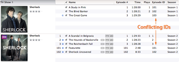
In the above example you can see that I have downloaded two seasons of the BBC series Sherlock. Both season 1 and season 2 have the correct season metadata set, but the individual episodes have duplicate episode ID’s. Season two’s episode ID’s are labeled “1, 2, 3, 101 and 102” when they should be labeled “201, 202, 203, 204 and 205”. Because the season 2 episodes use ID numbers that conflict with those in season 1, Home Sharing freaks out and in this instance displays the series out of order. Making matters worse, some publishers include the season number in the name of a show’s title, like “The Walking Dead; Season 2” which causes problems when an iPhone or iPad polls for how to display the program.

Lastly, the strangest thing I learned in my investigations was that it appears improperly labeled metadata for one show can affect the display properties of a completely different television show as well. So until you correct the metadata of every single TV episode in your iTunes library, random problems may persist when trying to display them. It really makes no sense, but in my testing this was the case.

The Fix

The solution to the problem lies in making the show’s title, season numbers and episode ID’s logical and consistent throughout your entire iTunes library. If you have a fairly large collection of television show episodes it will take you some time to edit them and correct the display problems, but it is indeed fixable.

Follow these steps:

• Select tv episodes (one at a time or in batches) & press command-I
• Select the “Info” tab
• Set the show’s “Name” field to the title of the episode itself
• Set the “Album” field to the name of the series

Note: When naming a series with multiple seasons, it’s important to use the same naming on each episode. For instance, don’t name one episode’s Album “The Big Bang Theory” and another’s “Big Bang Theory”. Pick a naming convention and use it for all episodes of that television program to help eliminate problems.

Next:

• Select the “Video” tab
• Set the “Show” field to the name of the series (the same one used in the Album field) & remove any qualifiers like “Season 1” etc
• Set the “Season Number”, episode ID and episode number to their proper values

Note: When setting episode ID’s, each one should be unique to that series. Typically, 101 would be season 1, episode 1. 202 would be season 2, episode 2 and so on. It’s crucial that each episode within each TV show has a unique, and logical ID number or the show won’t display correctly and could affect other show’s listings as well.

Lastly:

• Select the “Sorting” tab
• Make sure that the Album name matches that in the Video tab
• As a precaution I also removed any information contained in any of the sorting fields of this tab. The album name seems to be enough for iTunes to find and display the show correctly so the rest is unnecessary

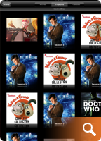
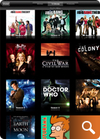
Once you have updated all of the metadata on all of your TV shows, each series should appear only once and in the proper season order in Home Sharing. You may need to exit and kill the video app, relaunch it and re-connect to your shared media library to actually see the changes take effect. If a show is still out of order, or doesn’t appear, then an offending bit of metadata is still out there. You’ll need to hunt it down and correct it, but when all is said and done your TV show library should look something like this.

Conclusions

As frustrating and time consuming as this process can be, seeing a properly ordered, shared TV show library is extremely satisfying, especially if you’re as obsessed with organization as I am. I’d write a developer radar report for these issues but honestly, I’m not even sure why it occurs, or even if it’s really a bug. It seems more likely iTunes is just finicky about logical, non-conflicting metadata. Unfortunately, each file has so many fields of data it’s difficult to tell which one should be set to what value, resulting in user frustration. The good news is that armed with the information above, and a little patience, you too can whip your Home Sharing library into tip-top shape. Just be sure to bring along some popcorn and a sense of humor.

29 Comments

Twitterrific’s Tough Love

When you love someone it’s hard to say no to them. You’ll usually do anything to please that person even if it goes against your better judgement. The inability to say no can also extend to the realm of software development. Companies can get so caught up in the desire to give users the best and brightest features they forget about the dangers of feature creep. They forget about good design. Such was the case with Twitterrific for the iPhone.

Somewhere during Twitterrific’s evolution from the desktop to the iPhone, we forgot how to say no. We said yes to too many of the latest features, 3rd party services and user requests. Eventually this “leap before you look” approach increased the complexity of the user interface and made the app’s settings too confusing for even us to figure out. A growing chorus of users told us the app was too hard to understand. We had lost our way.

The announcement of the iPad changed all that. Constrained by the 60 day launch deadline, we set about to create a fresh version of Twitterrific that would be dead simple, include all of Twitter’s core features and be a joy to use. The result was Twitterrific for iPad which is now available on the App Store. Many of the extraneous features from the iPhone version were initially removed including *all* of the app’s settings. There are no layout controls, body text compression, address book, themes and no tap shortcuts. What we present in exchange is simply the most friendly, easy to use Twitter client available anywhere. Like the iPad itself, Twitterrific is now designed for the masses. Those fabled 80% of users that Steve Jobs mentioned at the product’s launch are now our target audience. Early reaction to Twitterrific for iPad has been very positive. The app is decidedly easy to use and has a feature set that the majority of users want.

The result is a strong user experience that is influencing our efforts on the iPhone as well as the new upcoming Mac version of Twitterrific. Having eventual parity across all versions of the application will cut down on technical support requests and free up our development time, resulting in more regular updates and bring Twitterrific to a wider audience. Will we bring back some of the most heavily requested features? Yes, versions 1.0.1 and 1.1 for iPad have already added requested features like 3rd party push, reply all and picture uploading.

Twitterrific 3 for iPhone benefits from all the work that has already gone into the iPad including: proper retweets, lists, saved searches and more. Add to this the long-awaited full landscape support that our users have been crying out for and Twitterrific is a whole new experience on the iPhone. All these things aside, rebooting the app in this fashion has allowed us to evaluate each feature on its own merits. Free of the pressure to include everything but the kitchen sink, Twitterrific now starts fresh and will gain new users. Once all the versions are in sync, we can concentrate on bringing updates to Twitterrific across all platforms simultaneously. This will hopefully allow us to avoid the pitfalls of having one version wildly out of sync with the rest (like the current Mac version).

In the end, this approach benefits both the customer and the Iconfactory and makes for less frustration. We realize that some current users of Twitterrific for the iPhone may lose a few of their favorite features as we move towards these new versions. Some may even seek out other Twitter clients as a result and if that’s the case, I’m okay with it. It’s impossible to please everyone, so we’ve decided to focus on those like us who want a streamlined and straightforward Twitter experience. Our days of trying to be the everything-under-the-sun Twitter client are over. Tough love has taught us saying “no” leads to beautiful things. The best is yet to come, I hope you’ll join us.

Related posts:

For more information about the changes coming to Twitterrific, be sure to check out David Lanham’s post on optimizing the user experience (including more screen shots from version 3 for iPhone) as well as Craig Hockenberry’s piece on why simplifying a design is so important. Thanks!

3 Comments

The Spirit of EPCOT

Being a huge EPCOT Center nut, I thought it might be fun to check out some of the tracks from the park’s soundtrack set to Magnetosphere. The video you see here was one of the best. The iTunes visualizer has somehow captured the feeling I get when I think about Disney’s Experimental Prototype Community of Tomorrow in flowing bands of shape and color. This is also my first experience using Vimeo and I’m encouraged. The service didn’t munge the video as badly as YouTube did, and it gave me an actual progress bar while uploading, which is a real plus. I love what happens after the 1:50 mark. The sweeping horns and strings really bring the visualizer to life. Enjoy!

5 Comments

Embarrassing Auditory Confessions

They say confession is good for the soul, and since I’ve never had any problem with revealing my inner likes and dislikes, I jumped at the chance to join in on the fun of the latest group blog proposed by my friend Dave Caolo. This time around are songs that for one reason or another, you would be embarrassed to admit to liking in mixed company. I must say however that part of the reason I decided to throw my hat in the ring, was that it gave me the excuse to create the image you see above. What do Britney Spears and Bigfoot have in common? Well, read on my friends and find out!
• • •

Merry Go Round

The Brady Bunch

I’m not ashamed to say that I have an entire iTunes playlist devoted exclusively to the perky tunes of those crazy Brady kids from my youth. Back in the 70’s the TV network suits figured the child actors of The Brady Bunch needed to compete with The Partridge Family and the Brady Six was born. Who among us can forget classics like Time to Change or Sunshine Day? Good times. Of all the Brady tracks I have however, Merry Go Round has to be the most sugar-coated piece of hippy jerky in the entire lot, and I love it! For some reason I can listen to Eve Plumb hit off-key notes until the cows come home and I just don’t care. Take a listen, but beware, the song is a total ear worm. Once I hear it, I usually can’t get it out of my head for days.

• • •

You Drive Me Crazy

Britney Spears

Ah Britney! Back in the day, this familiar teen-pop queen commanded respect and actually worked her ass off to become successful. One day I broke down and bought You Drive Me Crazy for no apparent reason other than it was stuck in my head. To me, all of Britney’s songs sound somewhat the same (beat, rhythm, breathy lyrics), so I only own one… and this is it. I’m kinda ashamed to even have the one track in iTunes, but every time it comes up on random play, I relive a little part of 1999 and think back fondly on what Britney used to be. Ah Britney!

• • •

Wannabe

The Spice Girls

Everyone says they hate the Spice Girls, but I think secretly, everyone really loves them. I find the bulk of their songs incredibly infectious, bubbly and the perfect pick-me-up when I’m down. Their music is like watching a summer popcorn flick – a meaningless plot combined with a pulse-pounding soundtrack and dazzling special effects. It’s not academy award winning material, but it’s still a great time. I mean, how much more fun can it get than this:

“Yo, I’ll tell you what I want, what I really really want,
So tell me what you want, what you really really want,
I’ll tell you what I want, what I really really want,
So tell me what you want, what you really really want,
I wanna, I wanna, I wanna, I wanna, I wanna really
really really wanna zigazig ha.”

• • •

America

Neil Diamond

If there is a more idealistic, or emotionally manipulative song in this world, I can’t think of one. I first heard America when I was 11, right around the time the classic Saturday morning cartoon School House Rock became popular. I think the SHR connection helps explain why I find this song so darned great. After all, it was SHR that taught me to love catchy songs about history like The Great American Melting Pot and The Preamble. Diamond’s America is like a top 40 School House Rock song on steroids. At least, that’s what I keep telling myself.

• • •

Love Theme from Boggy Creek

Charles B. Pierce

Ask any of the guys at the Iconfactory and they’ll tell you I’m obsessed with bigfoot/sasquatch/yeti and have been ever since I was a child. This embarrassing music track is one of my own making since it was impossible to purchase the soundtrack to the movie from which it came – The Legend of Boggy Creek. The song tells the funky tale of the Fouke Monster (bigfoot) and his lonely plight among the other creatures of the swamp. The song, like the movie, is cheesy, low-budget and so bad it’s good. I bust it out every year around Halloween, much to the dismay of my patience-filled wife. And now you know what Britney Spears and Bigfoot have in common – my twisted sense of musical tastes.

• • •

Other blogger’s musical confessions:

1. Living in the Now – Get the Funk Up!
2. Sharp Corners – Sing a Song of Sixpence
3. Hardcore Geek – The songs I hate to love

12 Comments

The Little Blue Bird That Could

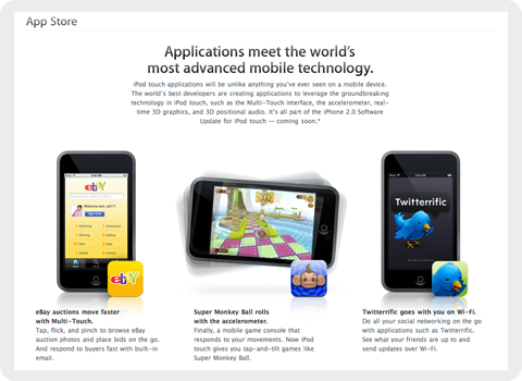
Today, at Apple’s World Wide Developer Conference in San Francisco, the computer maker unveiled its plans for the next generation of iPhones as well as a sneak peek into third party applications headed our way. Due to hit public airwaves July 11th, Apple’s new iPhone/iPod Touch “App Store” as it’s being called, will allow users to purchase third party mobile applications directly over the air. I speak for all of us at the Iconfactory when I say we were just as surprised and delighted as you probably were to find our very own application, Twitterrific, featured heavily on Apple’s website.

It seems after flying high and far, sometimes to shady destinations, the little blue bird has finally gone legit. I don’t think any of us at the factory realized just how popular Twitter, and in turn Twitterrific would become in this past year. We’ve been making various software applications for a decade now, and in all that time, none of us would have expected such an unassuming little app to become our most well recognized piece of code. Twitterrific’s success speaks volumes about the fine work of the folks over at Twitter, and the hunger for today’s users to stay in touch with friends, relatives and co-workers via new media like social networks.

We’re very pleased the Mac community took to Twitterrific so well and helped make it the success it is today. We’re looking forward to bringing the application to a whole new generation of users for the iPhone and iPod Touch, and would like to extend our thanks to Apple for giving the blue bird such a fine new home. We feel both excited and privileged to be a part of the new App Store and are committed to bringing our users the best software we can offer. We look forward to these first steps on what is sure to be, a fun journey for both users and developers alike.