Twitter Identity Transference Syndrome (TwITS)
If imitation is the sincerest form of flattery, then the Iconfactory must be smelling of roses! It seems like every week there is a new application or mash-up announced to support that micro-blogging social network of choice, Twitter. This in itself isn’t a big deal, in fact its wonderful since more third party apps means increased longevity for Twitter and its users. But lately I’ve begun to notice a strange trend with these applications. More than a few have made the design choice to base their identities around that of a blue birdie. Makes sense right? Twitter’s logo is a blue bird, so it’s just a skillful play on metaphors, right? The problem is that Twitter’s identity is not a blue bird, it’s a logotype.
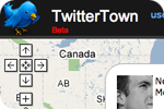
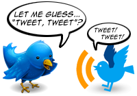
Over the past several months I’ve witnessed a strange kind of identity transference occurring within the Twitter community. Many people have come to associate the Blue Bird mascot of Twitterrific as representing Twitter itself. I’ve watched this unfold over time and I have to say it’s fascinating. Since the launch of Twitterrific preceded the explosive growth of Twitter at the SXSW conference in early March of 2007, Twitterrific’s icon (designed by David Lanham) was an easy symbol for people to identify directly with Twitter. David designed the bird as fun, visual play on the name “Twitter” and the birdie has helped the app become quite memorable. Several Twitter applications have taken the notion of the blue bird and flown with it including TwitBin, Twitterroo and perhaps the most direct usage courtesy of TwitterTown. We’re actually honored that so many people have found inspiration from Twitterrific, both in its icon as well as its user interface.
The syndrome does have its downsides. Many people think that Twitterrific is the official Mac desktop client of Twitter, which it isn’t. When people have problems posting via the API, they naturally think it’s a problem with Twitterrific, not Twitter because they didn’t post their tweet via the web, they posted it via the desktop. It is true that the relationship between any desktop application and Twitter itself is tight. It has to be for applications to function properly and give users the Twitter experience they are looking for. But when problems arise, fingers get pointed and they don’t always aim in the right direction.

It can’t all be peaches and cream for the gang at Twitter either. From their point of view, third party apps like Twitterrific and Twittervision support their efforts, but they also dilute their brand. There is a real danger of the proper noun Twitter becoming just a generic term that people will start to use as an adjective or even worse, a verb! Google is deeply entrenched in an effort to get users not to use its name as a verb for fear of its trademark slipping into the public domain. It has happened before with the trademarks Kleenex and Xerox and I can see it happening with Twitter all too easily. To their credit, the gang at Twitter has been very easy going about how their service’s name has been used, and sometimes abused, all in the name of third party development.
There are always two sides to any coin. It’s strangely satisfying that we have been able to inadvertently influence the look and feel of several Twitter based projects. We’re delighted that Twitterrific has been so well received that others look to it as a kind of “Twitter template”. The flip side is that in the minds of many people, our creation is one and the same with Twitter itself. As the lines blur between the Twitter service and all of its spin-off apps, at what point do all these cute blue birds pull a Hitchcock and end up scratching, pecking and biting the hand that fed them? Only time will tell.
The lowercase “w” does not get you off the hook for that acronym, Ged.
It simply points to the wider problem of logo design in general. I haven’t got round to writing about public conceptions of logos yet, it was going to be Mondays post, seems you beat me to it.
http://nergalicious.wordpress.com/
Aren’t the Twitter people a bit late to stop it from becoming a common verb? Like, several centuries too late?
http://www.m-w.com/dictionary/twitter
To be honest though, the Twitter logotype is really really poor.
Might have something to do with that
It’s amazing how a user community will fill in gaps when they’re needed. When I read this it struck me that Twitter’s visual language has no ‘shortcut’ element to stand for itself. Ma.gnolia had the same issue when we launched – we had a nice full logo but nothing that people could use in a compact space to represent. What happened next was out of our hands before we knew it – people started using the center of the flower in the logo, and within a few months it was popping up all over the place – on websites, in 3rd party apps.
If you don’t provide the imagery that people need for various uses, they’ll make their own. In this case, a new association is being made out of the need for some kind of shortcut icon. I agree – it’s fascinating to watch.
Of course “twitter” will become a verb. It _is_ a verb!
Are you saying Kleenex slipped into the public domain as a result of being used as a verb? I’ve never heard Kleenex used as a verb.
Matt: Seemed to work okay for Leo and company!
Blain: Point well taken. I didn’t hint at this, but I think this is the reason why they actually don’t care about people using “Twitter” in the names of third party apps. They can’t trademark a common word like this, so they have thrown caution to the wind and allowed all types of usage. Perhaps a poor initial choice on their part to select something that could never be protected, but that is for them to decide, not me.
Peter: I don’t think its “poor”, it’s just not memorable. You can’t associate it with the service well because its just a function of stylized typography.
Interesting point going down here.
Many famous brands have relied on a logotype for recognition – and done very well with it – Epson and Intel and others still do.
But there is something going down here that some people seem to be missing, “hard products” have real life presence that can keep that identity in your face… Sony’s logotype is there every time you go to the TV or stereo – same goes for Samsung or Indesit and a host of others.
Web and desktop apps/services are different though, like it or not we are (mostly) conditioned to link them to those little coloured [square] icons that we use everyday to stand for them – these are the “reinforcement” that comes home every time we use that app or service. Sure some apps change Icon every so often, but reinforcement soon drives home the new association (and big apps usually are careful to “evolve” their icon – Adobe are a bit odd there but I guess heavy Adobe users are not going to change alliance over a new Icon…)
The Twitter logotype is not any worse or weaker than a lot of big and well recognised ones but it is not something that is reinforced, the twitteriffic blue bird is – every time someone looks for the app they see it.
Todd’s comment makes the same point – people have skipped over the full logo in favour of the “iconic” flower.
Ged:
Would it not have failed as logo then?
Therefore be a poor logo.
“more third party apps means increased longevity for Twitter and its users” — Twitter apps are the key to eternal life? Sweet!
So you guys are angling for an acquisition of the Twitterrific app by Twitter (or whoever acquires them), and you’re subtly encouraging that by making blog posts like this pointing out that they’ll not only get an app, but they’ll get a decent corporate identity (which they should have come to you for in the first place).
Chris – Interesting hypothesis, but if we had really wanted to influence the guys at Twitter to “buy” Twitterrific, we sure didn’t need this blog post to do it. We’ve had their ear ever since Craig first started work on Twitterrific. They’ve always been willing to help us when it came to technical issues with the software so its not like Twitterrific is unknown to them.
As far as corporate identity goes, I can’t speak to their plans or future direction. I simply watched a bunch of blue birds cropping up in Twitter software releases and on the web and though it merited a blog post. Hope this helps.
Cool article I have to admit. Although I see the point, I don’t see the “negative” part of it. It’s not an identity transference syndrome what’s going on with “twitter”, in this case it’s different.
An identity transference syndrome it’s what’s going on, what happened and what happens with Apple© and the Mac community, and let me explain this…
– The “made easier”, the “introducing…” and the “rethinked” are all “slogans” from Apple. And there’s always a new small-application that uses it.
– The Myriad font was originally used by Apple© when it replaced the Old Gatineau condensed font. And then again, the Mac community started to use it.
– And all of the new web2.0 effects (shadow, reflect, refraction, glass, candy etc.) were adopted from the Apple new “look and feel” introduced with it’s new OS a few years ago.
What happened with “twitter” it’s way different IMO. Happened that “twitter” is a logotype, which lacks (indeed) of an “isotype” (image/icon). The very first cool app for Twitter was released by Iconfactory©, which made a new concept for the Twitter’s service name. As we all know an image could be much easier to identify than an word/name or font. That’s why Microsoft is using Segoe UI for it’s new “Vista” look and feel and not Myriad like Apple©. But wait… is there any difference between those two very-similar-fonts? There are, but believe me, the end “user” (understood as “opposite” of “designer geek”) will not notice them.
Happened that it’s way too much easier for the public to think about a blue bird when it thinks of “twitter” , rathen thank thinkin’ of… wait… was it Helvetica rounded again used in the “original” Twitter logotype? I guess so… I agree with Ged, the “twitter” logotype isn’t poor, but it’s well, a little bit memorable.
It’s extremely interesting what’s happening, but it’s not negative. It’s a process of “creating” an “identity” (which Twitter hasn’t developed yet – or at least strongly) but not stealing or transferring from one place to another. No matter how made first what, now the “twitter” community is “related” and doomed (well that’s a little bit tragic 😉 to a bird (a blue one), and THAT is what it take to buil an identity!
They’re all similar (but different at the same time), and they’re all related: twitter, Iconfactory, twitbin, twiteroo and of course, Silvestre… which is the one character missing in this whole identity debate 😉 but who cares? if they are all part of the same thing which is constantly growing and still taking shape (the shape of a bird, to be redundant).
Saludos from Argentina! > Antonio.
If me using it for my tweets on the sidebar of my site is in violation please let me know via e-mail. Don’t just reply in comments here as I will not have time to keep checking for updates.
– Joseph Crawford
Joseph,
We’re not so concerned about personal sites like blogs, we’re more looking for commercial sites that use the logo. No worries.
Looks kind of like a bluebird