Star Trek: Next Gen Wallpapers for iPad

iPad_LCARS_Hero

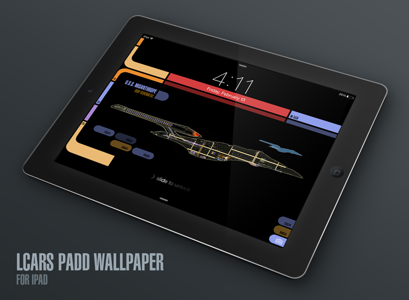
A few months ago I released several iPhone wallpapers that Star Trek fans have really been enjoying. The response to these LCARS-style graphics was tremendous and almost immediately I started receiving requests for iPad versions of them. The problem was there’s no way to design a square LCARS wallpaper that works both in portrait and landscape mode on the iPad. All of the major elements on-screen (the time, date, slide to unlock & camera icon) are positioned differently when you rotate your device.

A big part of the charm of the iPhone LCARS wallpapers is that the iOS elements flow right into the design and become part of it, but this just isn’t possible to do with a single image for iPad. The solution was to not even try and to design separate wallpapers that can be used in either landscape or portrait, not both. The result is the landscape Next Gen iPad versions I’ve created here. I may create portrait versions at some point, but the majority of iPad owners use the device in landscape mode primarily so that’s what I went with.

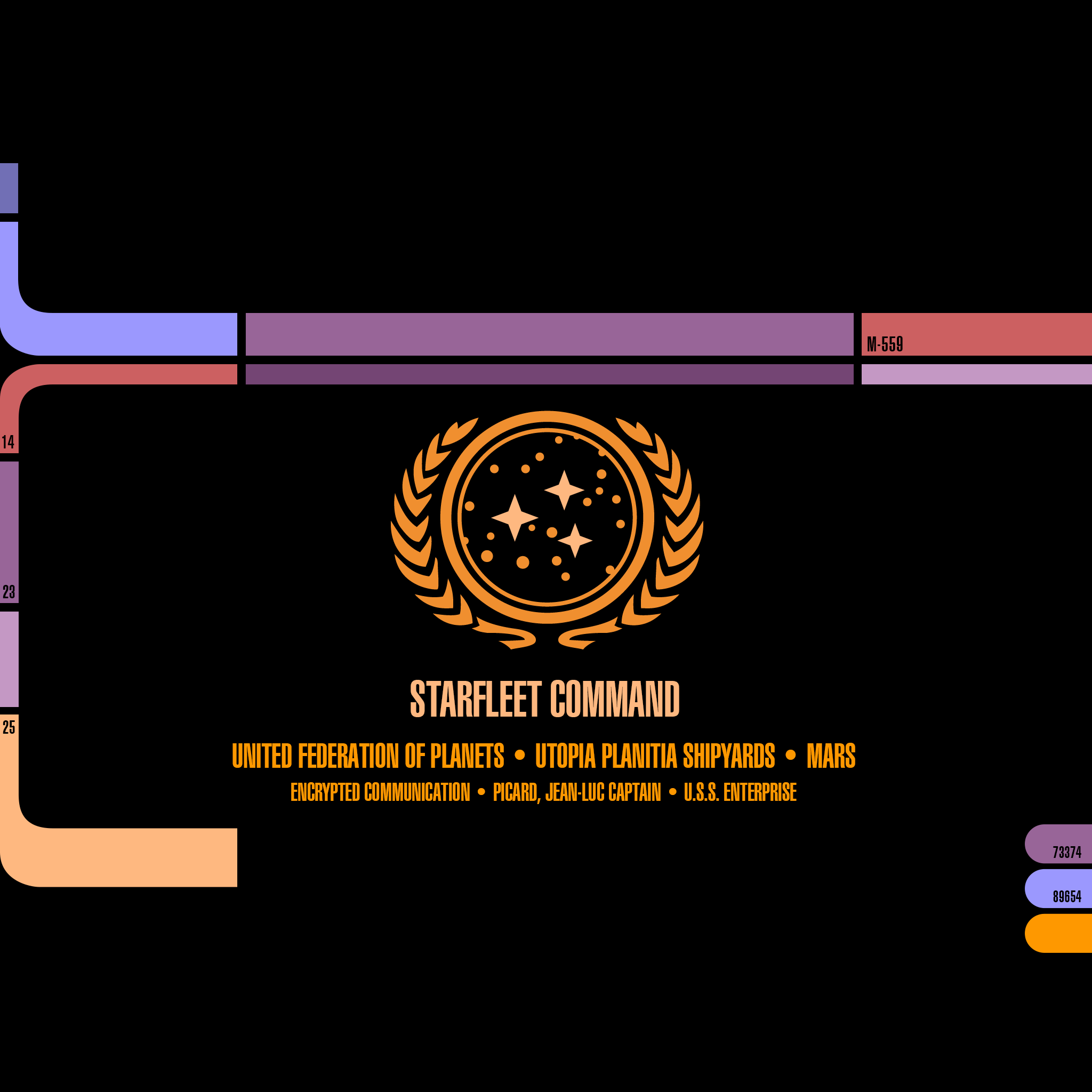
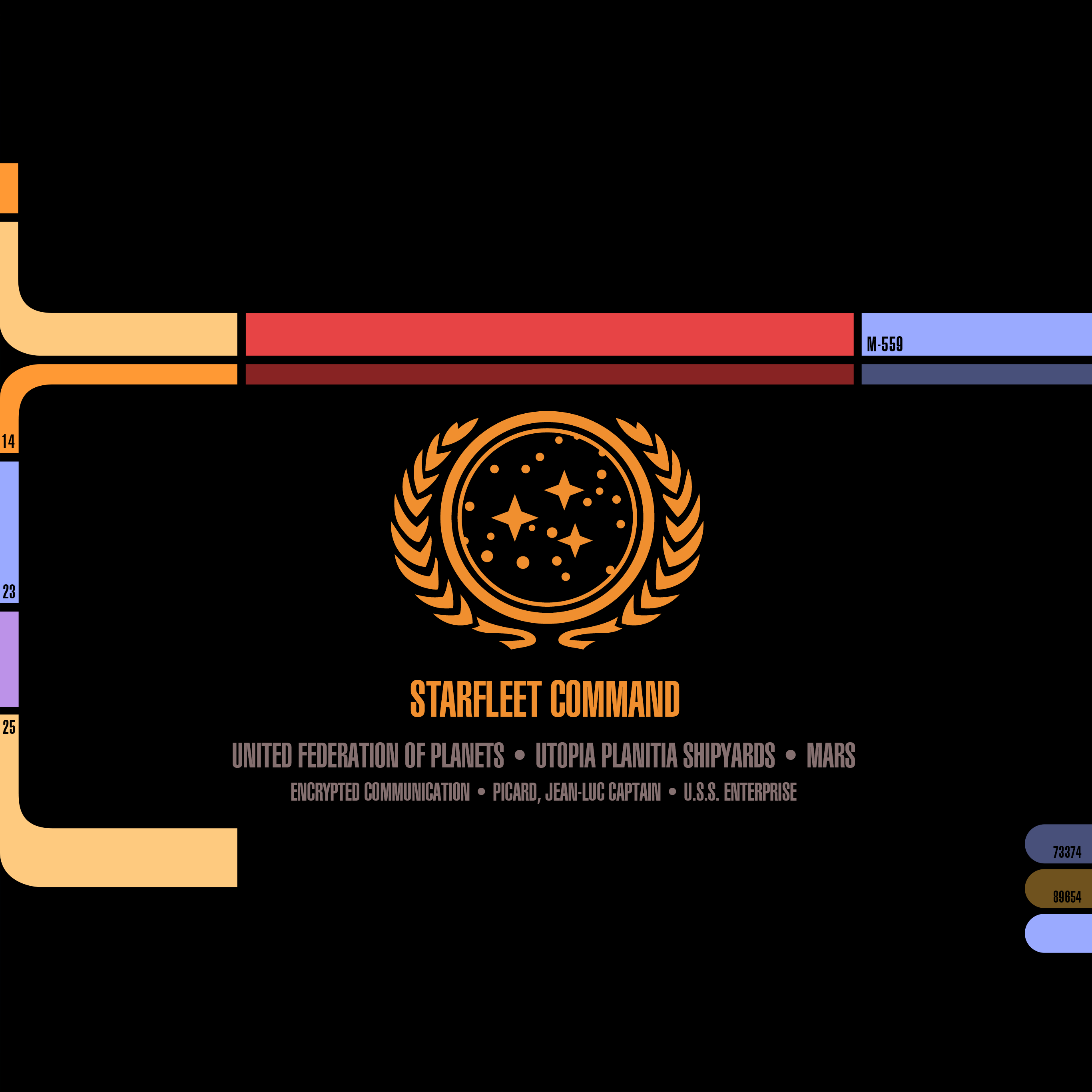
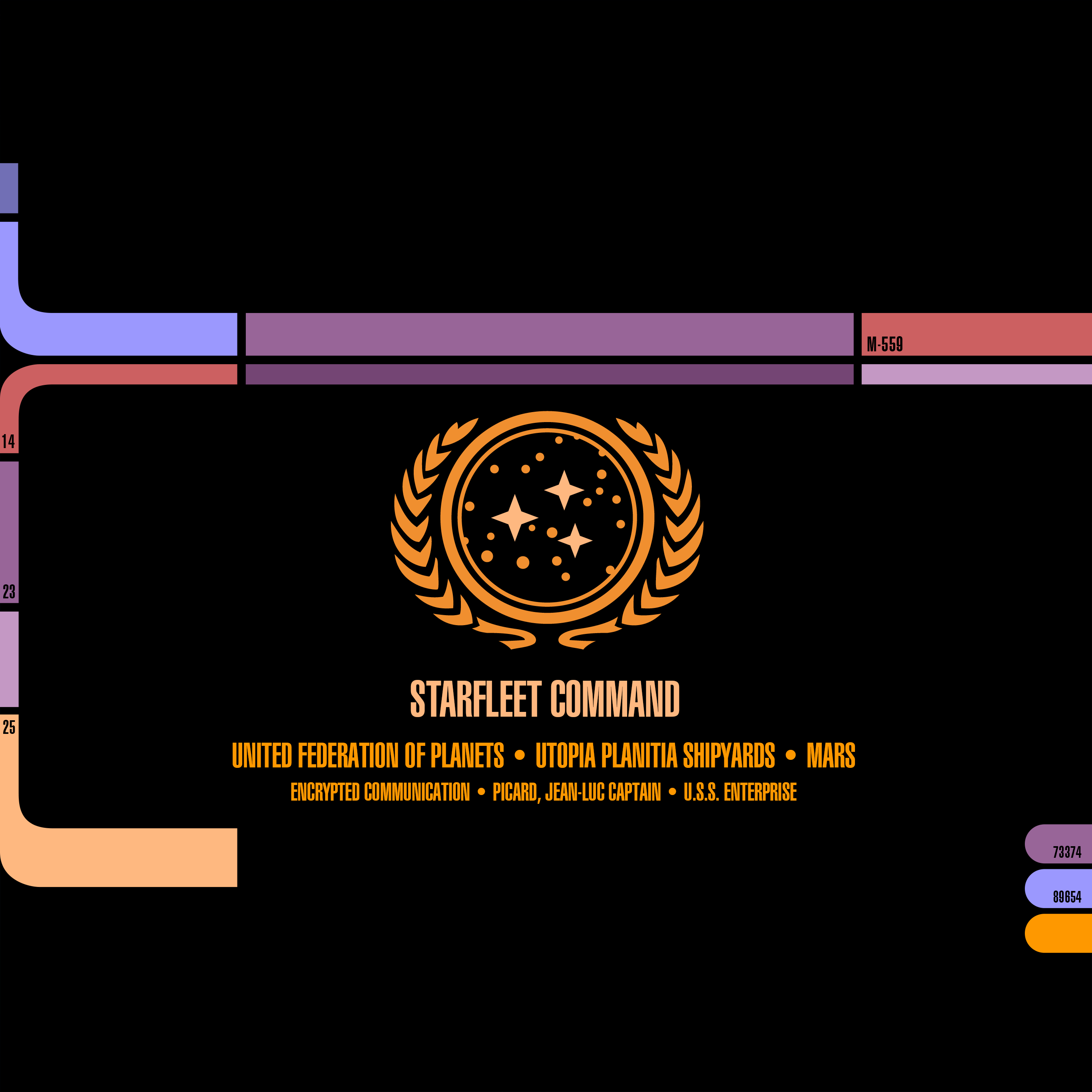
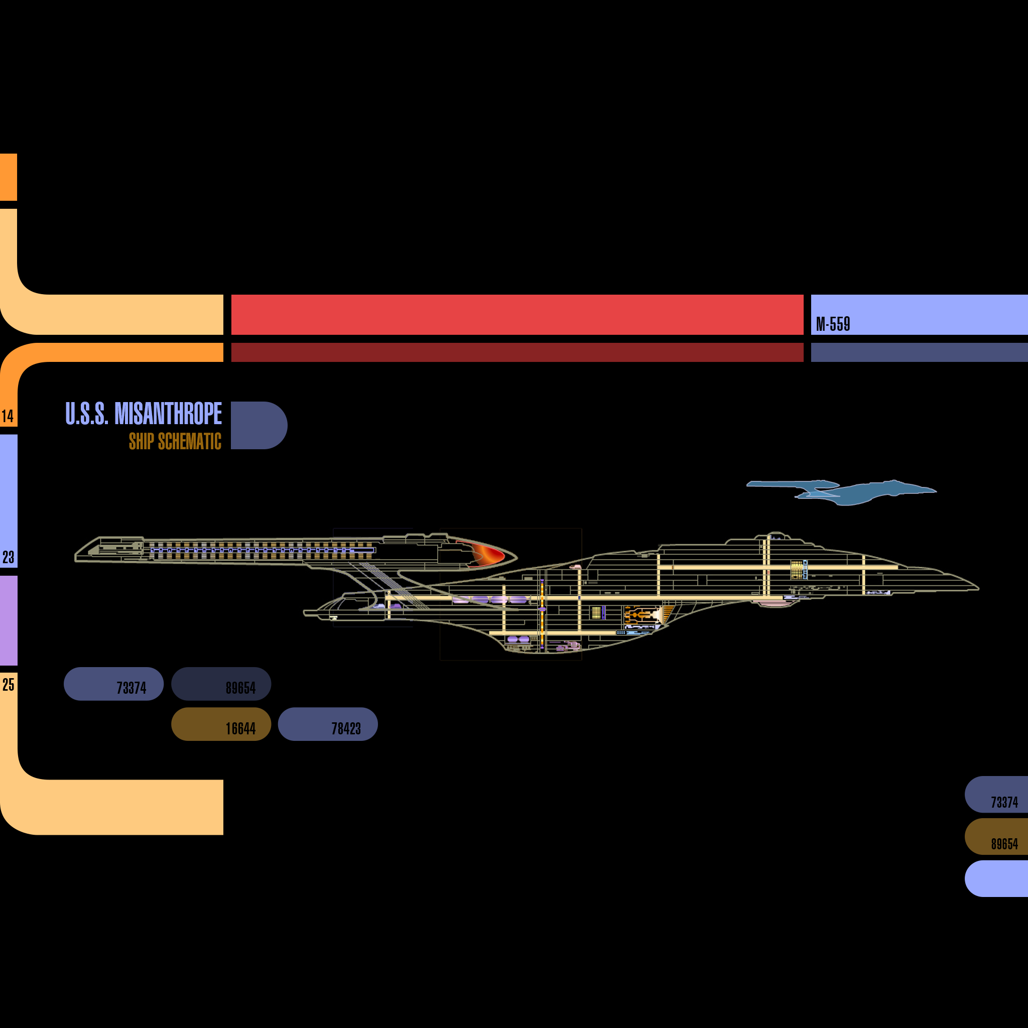
I’ve been a huge fan of Star Trek Production Designer, Michael Okuda since day one and like the iPhone versions, this project is my ongoing way of saying “Thank you!” for the wonderful, futuristic operating system that Next Gen fans know and love as LCARS. With these new iPad versions, you can definitely feel like you’re using a real Next Gen PADD when you unlock your tablet, it’s super fun!

How to download and apply the wallpapers on iOS 8:

1) Click to view the version of the iPad wallpaper you like best:

• iPad landscape – Original / TNG Colors
• iPad Pro landscape – Original / TNG Colors
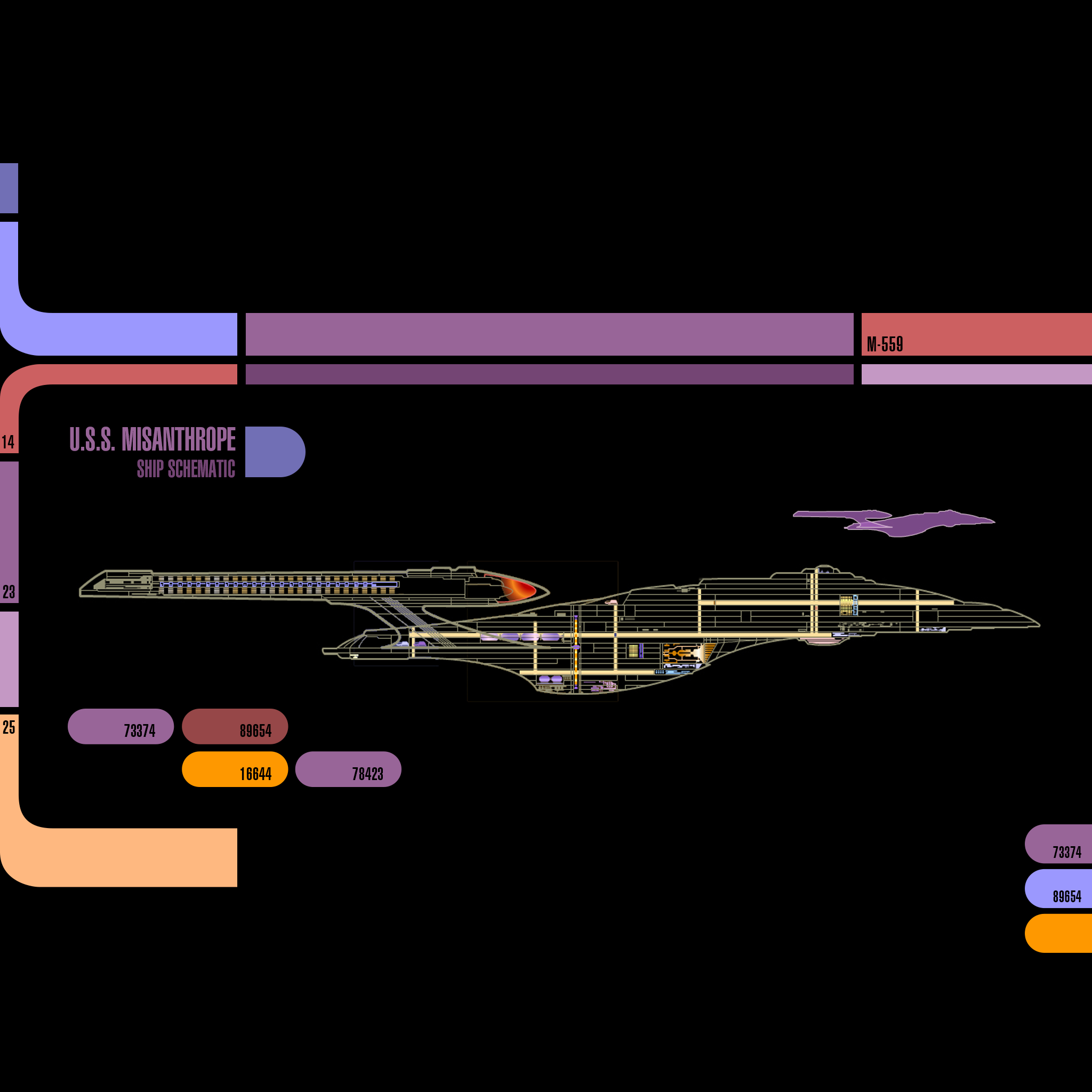
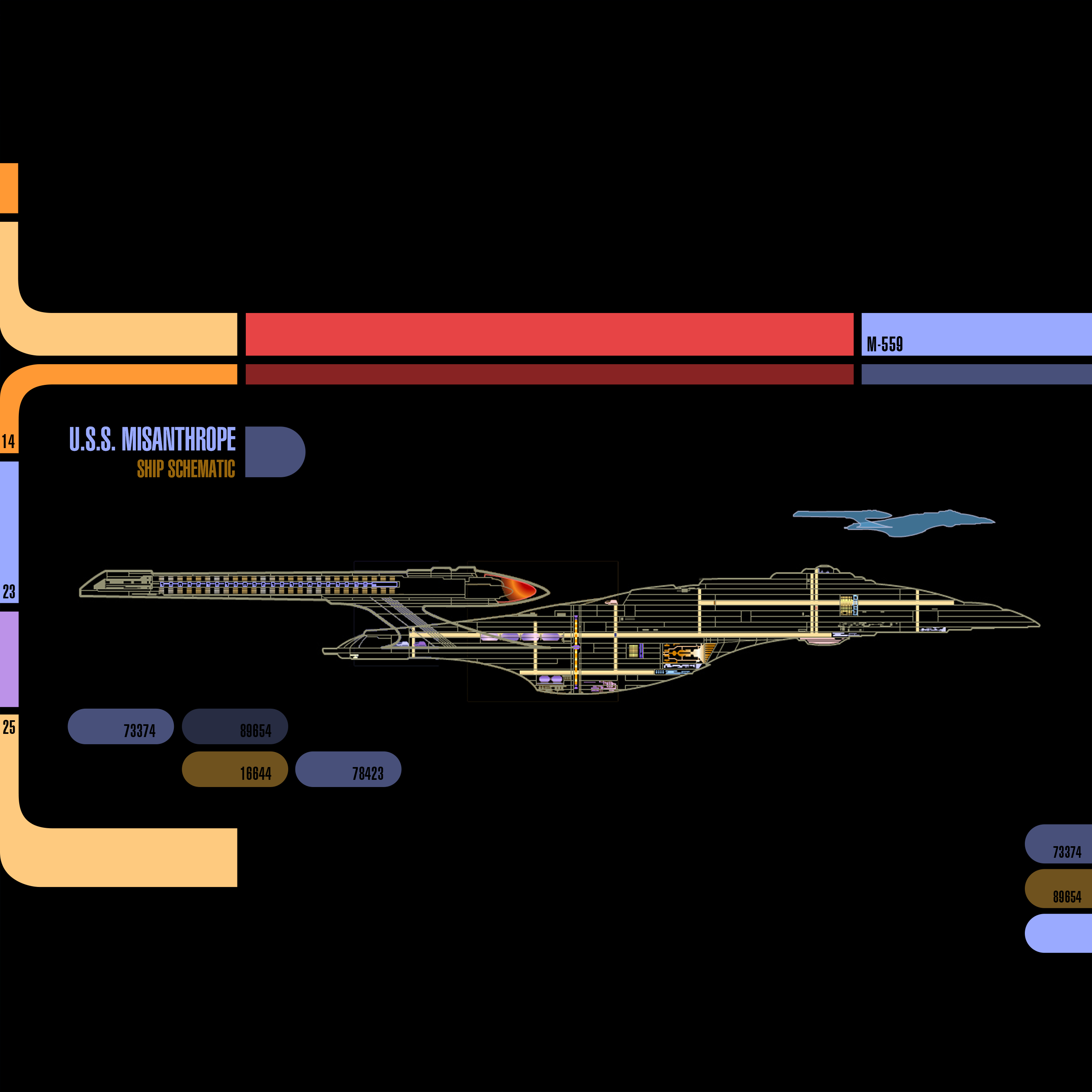
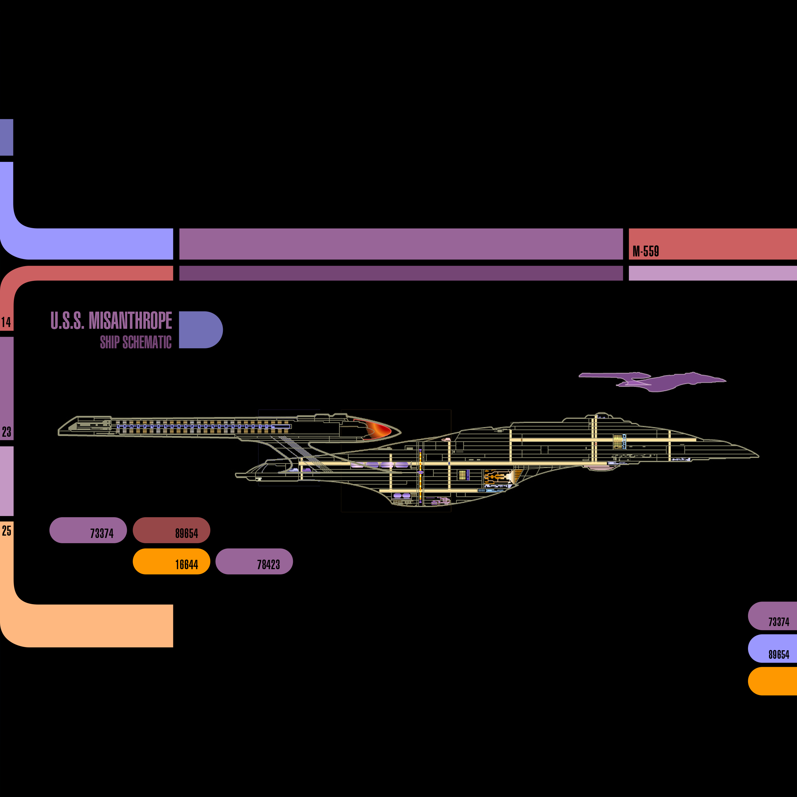
• iPad landscape (Starship Schematic) – Original / TNG Colors
• iPad Pro landscape (Starship Schematic) – Original / TNG Colors

2) Tap & hold on the image in mobile Safari & save it to your photo library

3) Open Photos, view the image then tap the Share button in the lower left

4) In the Share menu tap Use as Wallpaper

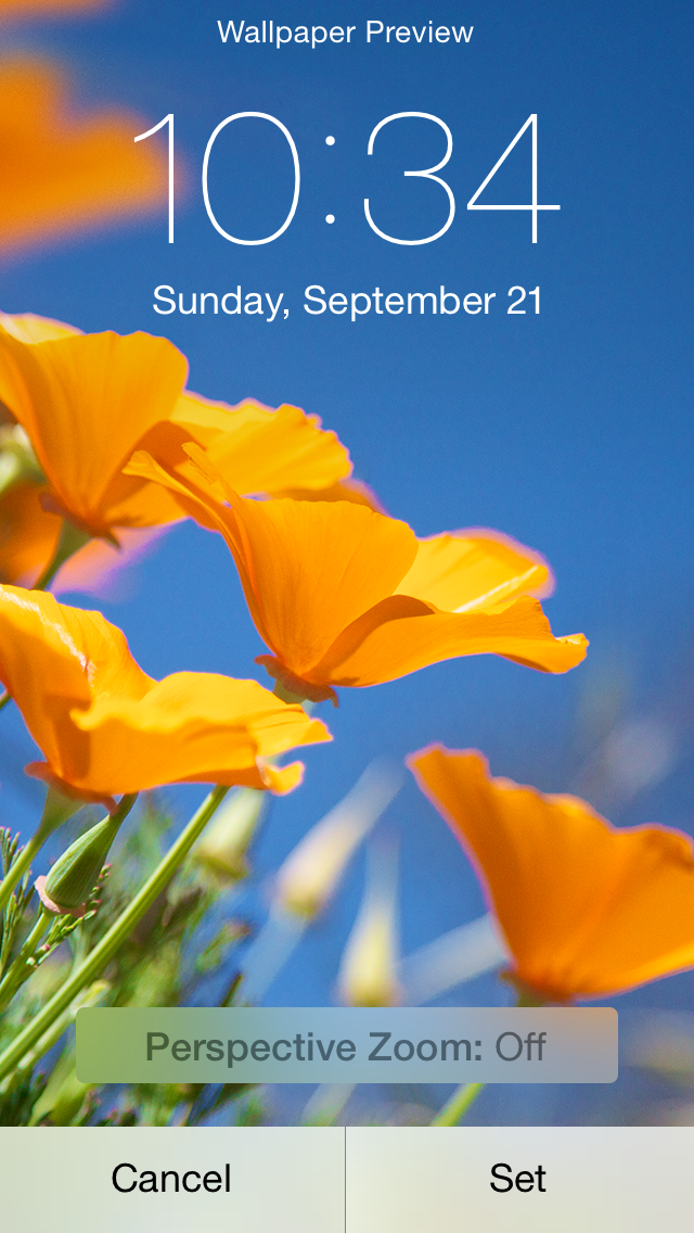
5) Pinch Zoom OUT on the image to size it exactly to the screen

6) Turn Perspective Zoom OFF

7) Position the image so the Lock Screen’s date line is centered inside the thinner, red upper bar

8) Tap Set > Set Lock Screen

That’s it! Sleep/lock your iPad and the next time you activate it, you can pretend you’re Captain Picard himself receiving an important message from Starfeet Command. I hope you enjoy this fun treat & help spread the word via Twitter and Facebook.

Be sure to visit my Goodies page to download other fun desktop wallpapers for iPhone, iPad & Mac. Engage and enjoy!

UPDATE: Added new sizes of both variants of the LCARS lock screen for the new iPad Pro.

How Broken is Discovery on the App Store? This Broken.

Much has been made over the years about how the App Store could be improved for both developers and customers. Areas like interactive reviews, trial periods, an App Store VP and paid upgrades are all important. One of the key areas many agree is the biggest problem Apple has yet to correctly address is discovery. For small developers like myself, a potential customer’s ability to find your app on the App Store is critical. If customers can’t easily discover and download your software, your app (and indeed your business) has little chance of survival.

The App Store now has over 1.2 million apps available to consumers and with such a wide range of products, it’s more important than ever people are able to quickly find and what they are looking for. Developers have known for years that searching for something in particular doesn’t always yield the results you’d expect, but often it’s downright ridiculous.

Take Twitterrific, the 3rd party Twitter client that my company, The Iconfactory, created back in 2007 and released on the App Store in 2008. Twitterrific was there at the launch of the App Store and the latest iteration, version 5, is available even today, seven years later. Despite many 3rd party Twitter apps going the way of the dodo, Twitterrific, Tweetbot and a few other hearty Twitter clients have survived and sometimes even thrived. This despite Apple’s search results, which bear little resemblance to what a typical user might expect when searching for a simple, straightforward term like “Twitter” on the App Store.

The following list was generated by a manual App Store (iPhone) search on Nov 15th, 2014 for the term “Twitter”. To make the list easier to parse, I’ve called out all apps that allow a user to directly read AND post to Twitter in bold. Everything else is either a game, a utility, or some other social network enhancement. The official app from Twitter is naturally the first result, but the next actual Twitter client (Hootsuite) doesn’t appear on the list until #20 and the next one after that comes in at #62. Even the mega-popular Tweetbot isn’t returned in the results until position #81 and even then, the older v2 of Tweetbot (for iOS 6) comes first. Where’s Twitterrific? Although it contains the word “Twitter” in the app’s name, Twitterrific isn’t seen in the list until you scroll all the way down to #100.

1. Twitter
2. Instagram
3. Framatic
4. Tweegrow
5. Pick Jointer
6. Happy Park
7. Crop Pic
8. Wayze Social GPS
9. Flipboard
10. InstaCollage Pro
11. Symbol Keyboard
12. Find Unfollowers
13. Cool Fonts
14. Symbolizer
15. Big Emoji
16. Get Followers
17. Framatic Mess
18. Alarm Clock HD
19. Textgram
20. Hootsuite
21. Emoticon Art
22. Textizer Fonts
23. 4 For Follow
24. Pixable
25. Just Unfollow
26. Unfollow for Twitter
27. ColorEffects
28. Photobooth
29. G-Whizz
30. New Cool Text
31. Google+
32. Step
33. Tweetcaster for Twitter
34. Vine
35. Camera Awesome
36. InstaEffect Effects
37. Emoticons and Emoji
38. TwitBoost Pro
39. PickGram
40. Insta Scrapbook
41. SpaceEffect
42. Orbs
43. MB2:YouTube
44. Facetouch HD Light
45. Paper Toss Friends
46. Vodio
47. Frame UR Life
48. HayWire Text Free
49. Nimble Quest
50. InstaCollage Pro
51. TweetBoost Pro
52. Right Behind
53. Emoji>
54. Follow Tool for Twitter
55. Color Cap
56. Emoji for iOS 8
57. Camera+
58. Emoji Emoticons
59. Text2Pic
60. Emoji 2 Emoticons
61. Fonts-Cool Font Maker
62. Echofon Pro
63. LiPix Pro
64. Alarm Clock HD
65. Smilebox Moments
66. Everypost for Social Media
67. Google Apps Browser Plus
68. Clipchat
69. VPN Express
70. ÜberSocial for Twitter
71. You Doodle
72. TweetBot 2 (iOS 6)
73. Stocks Live
74. Stocks Live Essentials
75. GameFly
76. Trendyful
77. Oz Quake
78. Buffer for Social Media
79. Yahoo! News Digest
80. Wefollow for Twitter
81. TweetBot 3
82. Photo Notes HD
83. Emoji Art and Text
84. Find Unfollowers Pro
85. Followers for Twitter
86. Follower Boost for Twitter
87. Color Effects FX HD
88. Double Ball
89. TwitGrow for Twitter
90. Twittelator Pro (iOS 6)
91. Emoji Art
92. TwitBoost Pro for Twitter
93. Jedi Lightsaber
94. Get Followers for Instagram
95. Aqua Emoji Keyboard
96. Bloomberg
97. Emoji for Messaging
98. Facely HD for Facebook
99. Timehop
100. Twitterriffic 5
101. IFTTT
102. FollowBoost for Twitter
103. Hyperlapse for Instagram
104. Freebie
105. PhotoFrame
106. Text Pics Free
107. Funimate
108. Followers + for Twitter
109. Emoji Keypad
110. Follower Plus
111. TweetBoost
112. Wow Followers for Twitter
113. Table Top Racing
114. TwitBird Free for Twitter
115. Singing Texts
116. Dice World 6 Free
117. Cool Frames and Picture Effects
118. Bamboo Wallet
119. JustFollow for Instagram
120. Twitter Check
121. TurboBoost for Vine
122. PhillyD Official
123. Hybrid Fonts
124. Mixgram
125. Color Zen
126. Keyboard Pro
127. Symbol Keyboard
128. Tweetlogix for Twitter

148. Echofon for Twitter

167. TweetList (iOS 6)

Every app in bold on this list should precede every other app (save the official client) in the results. This is especially true of apps that are not optimized for iOS 8, yet some apps built for iOS 6 (not iOS 7, 6!) come first. Why? Why games appear on this list at all is a mystery, they are by far the least relevant and don’t even get me started on #18 “Alarm Clock HD” and #93 “Jedi Lightsaber” (really?). Twitter’s own Vine app doesn’t appear here until #34 and some would argue it should be result #2, and rightfully so. It’s obvious that Apple’s search algorithm needs adjusting so it’s weighted not towards downloads or popularity, but relevance.

Finding apps for a small niche category like Twitter clients is relatively easy. Imagine how hard it must be to find a particular game in the vast wilderness that is the App Store if you don’t know exactly what you’re looking for. Until Apple decides to take definitive steps to improve search results, either via human curation, or by lowering dependencies on popularity, easy discovery in the store will continue to be a major problem. Unfortunately for small developers who need paying customers to survive, time is quickly running out.

***

PS – One thing I learned while compiling this post is that there are a lot of apps that purport to help you boost your follower count on Twitter. Like tons. That and emoji apps. Who doesn’t like emoji though? 🙂

PPS – One of the ways developers let Apple know that something is broken is by filing Radar reports for a given bug or improvement. Lots of developers have filed radars for the App Store’s irrelevant search results including Radar #18265234 from Simon Booth. In his report, Simon describes just how badly a search related to his music app Smilophone returns results. If you’re an Apple dev, dupe his radar, hopefully it will do some good.

You Just Lost A Customer

News today that some businesses have begun disabling the NFC readers in their retail locations so as block customers from using Apple Pay. When I read this, I have to say it filled me with rage. I don’t yet own an iPhone 6 or 6 Plus, but I will soon and one of the reasons why I’ve been looking forward to owning one is the secure, easy transactions that Apple Pay represents. Now we learn that a group of merchants wants to introduce their own payment processing system, one that favors the merchants by eliminating credit card fees, but is most likely far less secure, and most certainly more difficult or confusing to use.

If you’re an iPhone owner who’s as upset as I am, I’ve designed this helpful flyer that you can print a stack of and hand to the clerk at CVS, Rite Aid or anywhere else that refuses to accept Apple Pay. Simply put, you’re telling them that you’re going to take your business elsewhere until they come to their senses and accept your money via Apple Pay. Why any business owner would actually refuse a customer’s money in this economy is bewildering to say the least, but we need to let the corporate owners know we have choices and we chose not to give them our money.

Download the PDF version. If you want, sign your name at the bottom and then see they get into the hands of businesses in your area that insist on doing what’s better for them, instead of what’s best for the consumer.

You can also contact CVS and Rite Aid electronically and tell them that they need to support Apple Pay or risk alienating millions of iPhone users. The more our voices are heard, the harder it will be for them to ignore us.

You’ve Come a Long Way, Ollie!

While preparing for the onslaught of technical support that accompanies new releases of our most popular app – Twitterrific, I was curious about just how many updates we’ve actually released over the years. I looked back through the app’s version history as well as a fun timeline of Iconfactory software releases I created a few years ago to find this week’s 5.8 update is the app’s 50th since its launch in the summer of 2008.

If you had told me back then that we would still be coding and improving the little blue bird that could almost seven years later, I probably would never have believed you. Back then Twitterrific 1.0 was a fun, but unproven app for the then newly released iPhone from Apple. It was released along with the launch of the brand new App Store where users could browse hundreds (yes hundreds) of apps for their shiny new phones. At that time there was no official Twitter mobile client, I’m not even sure there were ANY other Twitter apps in the store at launch*.

Fast forward to 2014 and 50 updates later and we arrive at v5.8 for iOS 8. Given the rocky history 3rd party developers and Twitter have gone through the last few years, I’m honestly surprised we’re still here today. Over the years Twitter has focused more and more on controlling their own user experience and branding. This meant imposing design and interaction guidelines on 3rd party devs like the Iconfactory as well as capping the number of total users who can actually own Twitterrific. Thankfully, since Twitterrific was there at the very beginning, our token pool (at least on iOS) is quite large and we can afford to continue developing the app as long as it makes money. The same can’t be said for so many other smaller 3rd party Twitter developers who have either given up or sold their apps to other larger developers. One of the reasons why the Mac version of Twitterrific still hasn’t been updated is due to the limited number of user tokens available to us on the Mac platform, a policy I sincerely hope Twitter re-examines one day.

When I think of all the hard work, hand-wringing and ultimately, satisfied customers, Twitterrific has gone through over the years it really boggles my mind. Knowing that so many people use and love something you’ve created day after day is a wonderful feeling. You keep downloading and sending us positive feedback, and that motivates us to refine and improve the app. Twitterrific would never have flown as far and wide as it has if it wasn’t for all of our loyal customers, and for that we are truly thankful. If you’ve not tried Twitterrific in a while, I invite you to check it out. Everything old is new once again!

* There was at least one other 3rd party Twitter app in the store at launch – Twinkle.

Troubleshooting Broken App Store Downloads

For the past several weeks I was unable to download any app, paid or free, from the iOS App Store. Every time I tried, once I tapped the button to buy an app and input my iTunes password, the App Store would display the progress indicator as if it was about to download and then return to its default state. The app itself was never downloaded to my device.

At first I thought it was a temporary problem that would resolve itself. I tried restarting my iPhone and iPad (it was happening on both of my iOS devices) several times but that didn’t fix the issue. I tried signing out and back into iTunes via iOS Settings, but that didn’t seem to fix the issue either. I waited several days and tried again and again with no luck. My patience finally ran out and I made an appointment to see an Apple genius at my local Apple Store and thankfully he helped me resolve the issue. I thought I would share the steps he took with me for all those out there that might be having the same problem.

Here’s how he corrected the issue and got me back downloading apps on iOS:

1) Open iOS Settings > iTunes & App Store > tap your Apple ID and sign out

2) iOS Settings > General > Reset > Reset Network Settings

NOTE: This step will clear all of your current network settings including wifi passwords. You’ll have to re-sign back into all of your saved networks, but unless you have a ton of them, it really isn’t a big deal.

3) Restart your iOS device

4) Re-connect to your current network by re-entering your password

5) iOS Settings > iTunes & App Store > log back into your Apple ID account

If all goes as well as it did for me, you should now be able to download any and all apps from the App Store once again. Before you go through the steps of resetting the network connection completely, you might simply want to try logging out and back into your Apple ID first. The genius told me that this sometimes solves the problem, as does logging out and back into your account from another (different) device like a Mac.

Hopefully this process will work as well for you as it did for me and save you a trip to the Genius Bar. Good luck!

Muting Messages in iOS 8

One of the most useful (and hidden) features I’ve come across in iOS 8 is the ability to mute IM threads in Messages. Think of it like Do Not Disturb but on a case by case basis. I first noticed it by accident when a tiny crescent moon icon appeared next to one of my IM threads and so I Googled it to figure out what exactly it was.


When do not disturb is turned on for a particular message thread, you won’t be notified when that person(s) replies via text or iMessage. This can be really great if you want a way to ignore a person or group discussion that’s gotten out of hand. It can also be really frustrating if you happen to activate it by accident as I apparently I did without realizing it (or perhaps a bug in iOS 8?).

To turn Do Not Disturb for individual message threads on or off, tap the Details text at the top right of the Messages window to open that thread’s detail view. Next, scroll down to Do Not Disturb and toggle on or off as desired. When this feature is turned on, you won’t receive notifications when the person sends text messages or IM’s and you can go about your life notification free.

The Details view also gives you quick access to all the images that person has shared with you, as well as the ability to share your location information with the people you’re chatting with which is a nice feature as well.

The more I play with iOS 8, the more little things I find that truly set it apart from iOS 7. It’s wonderful that Apple is giving us more control over our digital world, I can’t wait to see what else is in store.

PS – I love Louie to death and would never mute his IM’s. He was gracious enough to let me use our conversation as an example. Thanks Louie! 🙂

iOS 8 Favorite Features

On the surface, users coming from iOS 7 may not notice the myriad of changes and improvements Apple has made in their latest mobile operating system, iOS 8. Visually, iOS 8 is almost identical to its immediate predecessor, but under the hood there’s a great deal to like and even some to really love.

Much has been written about the new OS, but now having used it for a few weeks, I thought I would write about my own personal observations from the user’s perspective. I could write an entire other post about the good and bad parts of iOS 8 as they relate to developers (and perhaps I will), but for now, here are the parts of the new operating system that I’ve been enjoying the most.

3rd Party Extensions

Without a doubt, iOS 8’s single greatest feature is the ability to extend the system via 3rd party extensions. Early iPhone adopters will probably remember what the device was like before the advent of the App Store – it was cool, but killer apps made it a “must have”. I liken extensions in iOS 8 to that early invitation of 3rd party devs to the iPhone party. The most well received extension so far as been Agile Bit’s amazing security utility, 1Password. Thanks to iOS 8’s extensions you now can access your secure passwords directly within apps reducing friction and making your information more secure.

Other notable extensions include PCalc’s Today View which gives you handy computation abilities right from your iPhone’s lock screen and another personal favorite of mine – Add to Wunderlist which lets you add web pages directly to new or existing lists. Perhaps the most exciting part is that we’re just in the early days of iOS 8 extensions so we’re only seeing a fraction of the potential that 3rd party extensions represent. More great stuff is sure to come and I for one am very excited.

Directly Replying to Notifications

Swipe left on a notification on your device’s lock screen or downward from a notification within iOS 8 itself to reveal the ability to reply directly to instant messages. I have to admit that I’ve found myself using this one more and more. It saves so much time being able to reply directly it’s incredible. This is one feature I really wish Apple had implemented earlier, but I’ll surely take it now that it’s here.

Siri’s Visual Feedback

Apple’s digital assistant, Siri, has taken a cue from other popular voice-activated services like Google Voice Search and now displays helpful visual feedback when dictating text or commands in iOS 8. This really comes in handy when you have long blocks of text you want to enter and can see in real time how well (or how badly) you’re doing. It’s still not as fast or precise as Google’s version, and I don’t know how Siri stacks up against Windows Phone’s new assistant, Cortana, but it’s a big improvement none-the-less. Siri’s real-time dictation even works within 3rd party apps like Twitterrific, which was an unexpected and delightful surprise!

Perspective Zoom: OFF

Remember the old “Genie Effect” from Mac OS X where minimizing an app would make it snake down into the magic lamp of the Dock? It was kinda neat the first few times you tried it, but if you were like millions of other OS X users, you probably turned it off pretty quickly. The 3D parallax effect in iOS 7 was the Genie effect reborn for iPhone and was one of the very first things I turned off when I went from iOS 6 to iOS 7.

Now, thankfully in iOS 8 you have even greater control over the parallax effect and can turn it on or off for just the Lock Screen, the Home Screen or both. When you go into Settings > Wallpaper and choose an image to use as your Lock or Home screen, iOS 8 gives you the ability to turn Perspective Zoom on or off when you confirm the choice. Why anyone would choose to leave it turned on is beyond me, but at least now you have granularity when it comes to these cutting-edge, effects that can cause motion sickness in some people. Yay!

Recent Contact List

With fewer and fewer people using the built in Phone app, Apple wisely added a row of recent & favorite contacts to the top of the multi-tasking view. This handy list of people and places you’ve called, IM’d or written is a great way to initiate contact with them quickly and easily.

The only downside is that since I’m seeing their faces a whole lot more, I feel compelled to assign all my contacts decent looking photos for their avatars. Needless to say, not all of my friends have great pictures of themselves and this, as they say, has proven to be “challenging” to say the least. I guess we can’t all look like models from a GAP ad :-/

There are still more than a few rough edges that need sanding in iOS 8. Transition animations can be jerky, apps are prone to crash more often than in iOS 7 and devices can have problems staying connected to local WiFi networks. If history is any indication however, Apple should iron out these wrinkles in pretty short order. In the meantime there’s plenty of cool, useful new features in iOS 8 to keep all of us busy for some time and we haven’t even experienced Apple Pay or Continuity yet. The best, I suspect, is yet to come.

The Only Thing I’ve Ever Wanted

As the days and hours march inexorably towards the launch of Yosemite and iOS 8 this fall, I find my thoughts turning more and more to the fabled and much-rumored iWatch. I’ve been trying to think of what Apple could possibly offer in such a wearable device that might get me to jump in and buy one if it will indeed exist. I don’t need a time piece, I haven’t actually worn a watch in years. I stopped wearing them around the time the iPhone came out, as I’m sure many people did. I’ve read the pitiful reviews of Samsung’s early efforts with smart watches and unsurprisingly was less than impressed. Even if the design of these devices was more elegant and sleek than they currently are, the feature sets just wouldn’t be enough for me to wear both a smart watch and carry around my trusty iPhone.

In order to be desirable, Apple’s iWatch has to fulfill a need that I currently don’t know I have. While this sounds like typical Apple fanboy BS, strangely enough it actually does make sense. Steve Jobs once famously said “It’s not the customer’s job to know what they want.” and I firmly believe this. One thing that Apple does, perhaps better than any other company on the planet, is to elicit desire in people for their products. They do this by identifying key customer needs, and then meticulously design a simple and elegant solution. One so beautiful and easy to use the public doesn’t understand why it hasn’t been there all along. I really think this will be the case with the iWatch. Some of these feature sets have been speculated since day one. Perhaps some kind of intelligent notification system, health monitor or location aware smart assistant are in the cards but again, I’m not sure any of these would make me crave it.

I am sure the iWatch will not replace a user’s iPhone. The margins on these devices just won’t be high enough for that kind of strategy. Logically, a wearable iDevice would extend the functions of your iPhone (or Mac) to give you more control over your digital life. I just sat down at my Mac, so don’t send that IM to my iPhone, iPad and Mac, just my iPhone. Wouldn’t that be great? Yeah it sure would but it could also be done by simply making your iPhone smarter. My phone goes everywhere I go, I don’t need something like an iRing for that.

Unfortunately that leads us back to square one and perhaps it’s for the best. Trying to outguess Tim Cook’s Apple may be a fun diversion for bloggers and tech mavens but personally I’d rather give the talented folks at Apple the benefit of the doubt. I’m confident that if and when the iWatch does arrive it be simple to use, beautiful to look at and most of all make perfect sense. As Futurama’s Philip J. Fry once said, “Whatever is in there, it’s the only thing I’ve ever wanted!” You took the words right out of our mouths, Phillip.

1 Comment

Go Buy Monument Valley. Now.

Chances are you’ve probably already heard all about the stunning new game from developer ustwo – Monument Valley that was released today. If the game is new to you, then let’s just clear the air right now – go buy it on the app store for your iOS device. Now. This is one of those instances where a piece of software is so stunningly beautiful, and provides such an incredibly rich experience, you’re really missing something if you take a pass. Here are just some of the things you’ll see in this amazing casual puzzler:

There’s a great deal to love in Monument Valley. From it’s rich, varied color palettes that change from level to level, to the extremely clever, M.C. Escher-like design of its levels, to the gorgeous soundtrack and audio effects, Monument Valley delivers at every turn. From the moment you start to play, it’s obvious how much love and attention the folks at ustwo have put into their creation. They’ve managed to design a complete gaming experience and bring it to you via the App Store for a minimal price. Too often games these days are filled with in-app purchases that prey on instant gratification to keep players interested. Monument Valley eschews all that in favor of creating a compelling, finite and beautiful environment for you to get lost in for a few hours of your life. The last few levels in particular are wildly inventive and especially challenging.

If you’ve read the reviews, then you probably know that Monument Valley’s play time is short. It took me a total of about 3 hours (off and on) from start to finish to complete all of the levels, and for some, that length may be a deal breaker. If you feel that way I have news for you – many awesome things in life are short but that doesn’t make them any less worthy of your time or money. You’ll probably spend more on your next meal out than you would on Monument Valley but that doesn’t mean you can’t enjoy both while they last. The game creators have said they focused on making a concise title that can be completed in a short amount of time on purpose. While this may be true, it doesn’t really matter to me because I know if the game is a success (which I certainly hope it is) then we’ll probably be seeing a great deal more of the mystical world of Monument Valley. Show your support of their efforts to bring you something wonderful and head over to the App Store and buy it, gift it and help spread the word by leaving a review today.

2 Comments

Ollie Flies Free(mium)

Today marks a new beginning for Twitterrific, the venerable third party Twitter client from the Iconfactory. Today we’re announcing the app is now free to download from it’s normal price of $2.99. We’ve added several in-app purchases to the app to help cover the cost of push notifications and tweet translation, but the bulk of the revenue to continue development will now come from Deck Network ads that will appear above the timeline. Twitterrific has been available in the App Store since day one and we’ve experimented with both paid and free revenue models. Why are we returning to the freemium model now? Simply put, we’re hoping that by making the app free to download and use, we’ll get Twitterrific into the hands of thousands more people and those additional users will help support development via the increased ad revenue far into the future. The best part is that thanks to new App Store receipt handling in iOS 7, existing paid users are grandfathered into the new model and don’t have to restore any purchases. The app, with all it’s features, just works.

There are lots of risks with moving to this type of revenue model, but version 4 of Twitterrific was by far our most successful and that version was supported by ad revenue from The Deck. No doubt levels of support will increase dramatically for us but that’s part of the trade-off of having successful, thriving software. I’m also personally curious to see if moving to the free model and increasing the app’s downloads by at least 1 or 2 orders of magnitude will improve Twitterrific’s search results in the App Store. Having the very first 3rd party Twitter app in the App Store returned after non-twitter clients in a search has never seemed right to me. If you’ve never tried Twitterrific in the past, there’s no reason left not to give it a go now and we also hope you’ll help us spread the word!

The Rise of Mobile Games

The rise of mobile gaming is of interest to many people, both technology lovers and historians. In the last 20 years mobile gaming has really taken off, especially gaming on tablets. Whether it be Angry Birds or poker, the majority of us have played on a mobile device. This info-graphic from www.jackpotcity.co.uk details the rise in mobile gaming in geeky fashion. It’s impossible to say for certain what the future of mobile gaming holds, but from the looks of it, it’s going to be exciting. Click the image to see the entire info graphic.

The Bezel’s the Thing

It doesn’t take tea leaves or even a leaked report from the Wall St. Journal to figure out Apple will probably release a new model of iPhone with a larger screen later this year. Users have been begging for more screen real estate, especially with the increased attention of larger-screened devices like the Samsung Galaxy. Also, Apple typically does full product revisions on a 2-year cycle which just happens to hit for the iPhone this fall. All of these factors may create the “perfect iStorm” that users have been patiently waiting for. From a personal standpoint, I would love an iPhone with something around a 4.75″ screen because the older I get, the more I seem to squint and miss-tap at the tiny interface elements of my iPhone 5c.

The report from the Journal seems to hint at two new sizes of iPhones, one somewhere around 4.75″ and another, larger device possibly measuring 5.5″ diagonally. I freely admit that speculating about the screen sizes of these non-existant devices is mostly wishful thinking, but that’s part of the fun. What would your ultimate iPhone look like? What size screen would it sport and more importantly, what’s the new form factor going to be like? For all the talk about screen size, I think the more important aspect of the next iPhone will be the design of the bezel. The bezel is the border around the screen that offsets the display from the edge of the device. Recent rumors suggest that the new iPhone 6 will have little or no bezel between the screen and the left and right edge. If true, this is a far more exciting development, at least for me, than just upping the screen size.

It’s no secret that the industrial design team at Apple has long sought to create a display that’s essentially a continuous piece of solid glass, edge to edge when held in the hand. Such a design would result in a screen that seems to end where your hand begins. Now with advances in Sapphire glass technology and with 7 years of experience under Apple’s belt, the dream of a nearly invisible bezel may soon become a reality. Removing the bezel won’t be a slam dunk however, as there are most certainly software considerations that need to be worked out. Accidental taps and swipes at the edge of the screen would probably increase without some kind of UI “neutral zone” at the perimeter of the display. Designing protective cases that don’t interfere with touching or swiping would also be a challenge, but hardly impossible.

If the rumors are true and the iPhone 6 will have a bezel of around 1mm, it will certainly make for a stunning, refreshed visual appearance at a time when the iPhone seems stagnant. Apple’s supporters note the company is selling record numbers of iPhones even though the form factor hasn’t changed for several years and that is true. It is also true however that users have been hungry for larger devices as well as ones that look and feel different from the existing models to help set them apart from their peers. From the stunning introduction of the retina display to the increased security and cool factor of Touch ID, Apple fans love owning the new hotness. Come this fall, I’m willing to bet a big part of the “heat” won’t be what Apple has added, but rather what they’ve removed – the bezel.

7 Comments

iObservations

This week I finally upgraded to a brand new iPhone 5c after almost 2 full years of use on my trusty iPhone 4s. I’ve now spent a couple days with the new device running iOS 7 and wanted to share some random observations (both good and bad) for what they’re worth. As with anything, your milage may vary.

The Good

AT&T LTE – I mean just look at it!

Siri’s new voice – It’s so much better than before. Feels very Star Trek.

New ring and alert tones – There’s been some fun made of these but overall I really like them. The majority have a light, fun feel that seems to fit perfectly with the new iOS 7. My ringtone is currently set to Sencha and my alert tone is Chord. Groovy!

OS 7’s folders – Worlds better than the one in use in iOS 5 & 6 the new folders are clean, easy to manage & hold more apps.

Background refreshing – We implemented it in Twitterrific and I can already tell it will be one of my favorite features of the new OS. Having content ready for you when you wake the device is killer. Jury’s still out on how it will affect battery life however.

The feel – The feel of the 5c in the hand is just as I imagined it would be. It has the smooth, comfy feel of the 3gs without the extra bezels. It feels rock solid in your hand, not like you’d expect from a plastic phone.

Use of color – Much has been made of the, let’s just say “bold” use of color in iOS 7, some good, but mostly bad. Personally I love it. I love the way your wallpaper setting for instance changes how interfaces like the dialer screen looks. Make an overall change here and the whole user experience feels fresh. Bravo Apple.

Command Center – Being able to turn off blue tooth at will as well as quick access to a flashlight (don’t laugh, it’s useful!) is just great. I can’t wait until I have a use for sharing a file via AirDrop.

Multi-image emails – The ease of use selecting multiple images from your camera roll to attach to a single email is simply fabulous.

The Not-So-Good

Missing share buttons – Apple removed the ability to tweet and post to Facebook right from Notification Center for some reason. I’m not sure why, but this was a great way to quickly get a tweet out without any fuss. You can still do it via Siri, but it’s too prone to errors. Hopefully these controls will be coming back.

Multiple chargers – I like the new smaller, 10 pin charger but my iPad 3 still uses the old 30-pin version. This means I have to keep two different kinds of cords around my home to charge my devices. This stinks. Speaking of charging…

RIP iHome Clock – It will no longer work with my new iPhone 5c’s 10-pin charger port. This makes me very very sad.

RIP Olloclip – Designed for my iPhone 4, my Olloclip is now a useless hunk of metal and glass sitting on my desk. Again, sad.

The feel – Yes, I love the feel of the new 5c, but even though it feels super awesome, it’s also super slippery in the hand. As my wife said, it feels like it’s “coated in butter”. I immediately went out and bought an ugly Apple case for it simply because I just knew I’d eventually drop it. I hate to cover the wonderful plastic up but i’m scared it will slip right out of my hand. I sat it on the arm of my couch and watched it sloooowly slide right off into my lap. It’s crazy smooth.

Ugly icons – I realize I’m being a kind of icon snob here, but I just can’t warm up to the horrible Settings and Safari icons. The fact that they are two of the most important destinations on my iPhone means I have to look at them all the time and I just cringe when I do. Really hope the designers at Apple re-visit these at some point.

Overall I’m extremely happy with with my iPhone upgrade. There’s no doubt that it was time to replace my 4s. The only real choice was if I wanted to move to a 5s or a 5c. I’m extremely happy with how the new phone feels in my hands. The plastic case is top notch and doesn’t have the kinds of beveled edges that made my 4s hard to pick up and hold. Will I miss the finger print scanner, better camera and 64-bit processor of the 5s? Probably, but I’m betting a year from now we’ll see a new model that will have all of these things plus a larger screen and maybe the awesome case of the 5c. If you currently own an iPhone 5, then the 5c may not be the way to go, but if you’re like me coming from the previous model, you just might consider taking the colorful path to plastic town.

4 Comments

Why I’m Buying an iPhone 5c

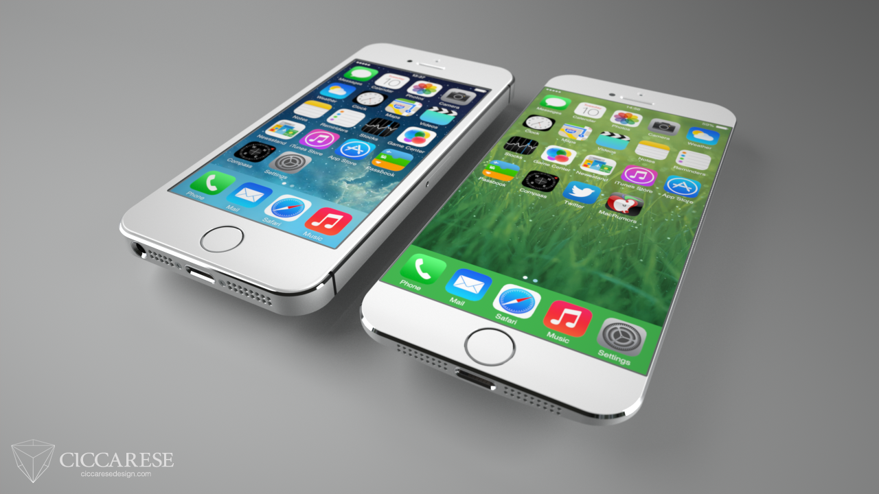
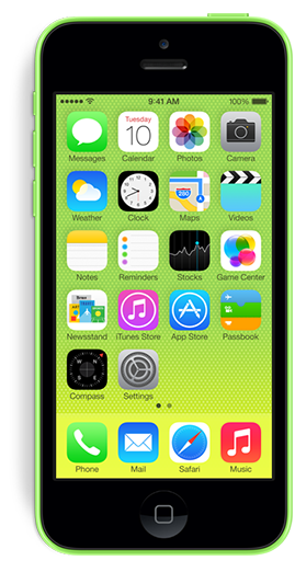
I’ve owned an iPhone 4s for almost 2 years now and had been patiently awaiting the successor to the iPhone 5 until this week. When the 5 was first introduced, I was off-cycle for a discounted upgrade from AT&T and when I finally was eligible I thought I might as well just wait and see. I was hoping the increasing popularity of larger-screened smartphones would encourage Apple to release at least an iPhone with a 4.6″ screen in their next rev, but as I tweeted this past week, it seems Tim Cook’s pigs have yet to fly.

Now I have a choice to make. I can go with the fancy new iPhone 5s, complete with 64-bit hardware, a greatly improved camera and a cool fingerprint scanner, or I can “settle” for a 5 wrapped in a lickable, candy-coated plastic shell, the iPhone 5c. The gadget freak in me says to go with the snazzy 5s. After all, its increased speed would hold up better over the next 1.5-2 years and the pictures I took would no doubt be greatly improved from those I snap now. The 5s is more expensive, but that wasn’t the deciding factor, at least not for me.

I’ve chosen to go with the iPhone 5c for a couple reasons, but mainly because of comfort. For my money, the most comfortable smartphone to hold and use was the iPhone 3GS. Its slightly rounded back, smooth plastic construction and tight edges made it a joy to hold and use. When the iPhone 4 was introduced, I really didn’t like the device’s form factor. The metal band creates sharp edges that fatigue the fingers and collect dirt. In addition, to me the device is *too* thin to hold safely without a case. The new iPhone 5c’s smooth curves, and seamless sides call out to the scifi geek in me and the colors, oh the colors! It’s much more streamlined, minimal in appearance and seems easier to pick up off the table. I must admit however, if I could have the 5s’ guts inside the smooth, plastic shell of the 5c, I’d opt for that in a plastic heartbeat.

I know that no matter which model I pick, either will be a great upgrade from my 4s. Although it’s served me well these last two years, I’m more than ready for the increased screen size, faster processor power and increased battery life of a new iPhone. With any luck, around this time next year Apple will be introducing a 4.6″ iPhone that will sport an all new form-factor as well as all the neat-o gadgets that are sure to make the iPhone 5s a huge success. In the meantime, unlike Kermit, it’s easy being green.

PS – iOS 7 is awesome, you’re gonna love it!

25 Comments

Watershed Moment

Ever since Apple announced iOS 7 at WWDC, developers have been coming to grips with what the new operating system will mean for them. There’s little doubt iOS 7 represents a huge opportunity for developers to get their updated products in front of massive numbers of new users almost overnight. But there’s another opportunity here for developers, one that’s been largely ignored up until now – paid upgrades. To be more precise, all new, iOS 7 paid versions of existing applications.

I’m sure many users are expecting developers of popular applications to simply update interface elements, compile some code and easily drop a brand spanking new version of their app onto the App Store for free. There’s little doubt that the majority of iOS 7 updates to existing apps will be free (which will please Apple), but I suspect there will be a surprising number of developers who will use the launch of the new operating system to completely re-boot their app, and why not? The visual and interactive paradigms iOS 7 mark a natural breaking off point and a perfect opportunity to re-coup costs. Some existing paid apps might even adopt an iOS 7 only strategy which means they’ll have no choice but to charge again.

As any developer knows, software doesn’t magically grow on trees. Significant reworks of existing apps can represent hundreds of hours of development time and depending on the complexity of the apps in question, require much more than simply updating graphics. Taking full advantage of new APIs, designing new interactions and more can represent a healthy investment, time is money after all. At what point in the update process does a developer decide she needs to charge for it? How many users will be alienated by charging again? Will these users be offset by the *huge* influx of new people Apple brings to the table with the launch of the new OS?

Perhaps a better way to answer the question might be, how willing would you be to re-purchase your favorite apps if they are optimized for iOS 7? Look at your device’s home screen and go down the list of apps you use most and ask yourself if you could live without it once you upgrade. I think that most users (at least those that matter to developers) would answer that they would gladly pay again if it means having the latest and greatest version of their favorite apps, at least I would hope so.

With the full-priced launch of Logic Pro X, it’s now pretty clear Apple won’t be implementing a paid upgrade mechanism in the App Store. Developers are forced into either giving free upgrades for life, nickel-and-diming users with in-app purchases or occasionally launching new, paid versions of their apps. At the Iconfactory, we typically offer new paid version of our apps (xScope, Twitterrific) about every 18 months with many free upgrades in between. Though there are always users who will complain about having to pay for all-new versions, the vast majority know that in order for an app to survive and flourish, they occasionally have to do their part and support its development. Hopefully the upcoming wave of apps updated for iOS 7, both free and paid, will help people fall in love with their apps all over again.

UPDATE: Just when you thought there was hope, a new report out indicates that the average price of apps in the App Store is now at an all-time low of just $0.19. Consumers continue to expect world-class software experiences in exchange for basically nothing. The author says that the freemium model may be a “wiser business move” in the long run but I disagree. It is much harder to recoup the cost of development if you have to postpone revenue much beyond launch of your product, especially if you cannot even guarantee success. If the trend continues, I don’t see how developers can make a living on the App Store.

2 Comments

Owning Your App Store Review

There are basically two kinds of people who leave software reviews in the App Store. The first are users who genuinely want to add their voice to the chorus of users who have downloaded the software. They want to let other potential users know what they’ve learned in the hopes of helping them make an informed buying decision. They may encounter problems with the app, but overall they try to be open minded, fair and leave generally helpful reviews. If an app is good they generally say so. If a piece of software is poorly designed or implemented and deserves a low rating these users will go out of their way to describe why, which is great.

The second type of people who leave reviews do so for a simple reason – spite. They feel slighted by their purchase and want to do their very best to try and punish the developer in their small way by assigning a single star. They often accompany such reviews with unhelpful prose like “This app sucks, fix it!” or “Worst app I ever bought!” and so on and so on. These kinds of reviews are less than helpful to the developer of course, especially since Apple doesn’t currently provide a way for an app’s developer to easily get in contact with a review’s author.

As a developer, I’d love to be able to get in touch with both of these kinds of users to find out what I could be doing better with my software. Sometimes it’s possible to google someone’s App Store user name and track down a contact link, but more often it’s not. That’s why I recently decided I was going to start leaving my Twitter username in all my reviews I wrote on the App Store. Leaving a tangible point of contact for a developer gives them a way to reach out to you if you have specific issues with an app. Contacting them directly with your concerns is always best of course, but if you do leave a review, consider leaving your Twitter / contact info in the body of the review.

If you’re the type of user that wants to help improve an app, who wants to support the development of quality software through meaningful dialog, then owning your review would seem to be a no-brainer. And to all the one-star trolls who call the App Store home, I leave this sage piece of advice from my mom – If you can’t say something helpful, shut your damn pie hole!*

* I’m paraphrasing here

2 Comments

Olloclip: Up Close & Personal


The Olloclip is a handy 3-in-one lens attachment for the iPhone 4 and 4S that lets you take wide angle, fisheye or macro shots rather easily. The clip itself is small enough to fit in the palm of your hand or your pocket and is easily attached simply by sliding it directly over the lens of iPhone’s built-in camera. The Olloclip contains a funky fisheye lens on one side and a wide angle lens on the other. This wide angle lens can be unscrewed to reveal the macro lens which allows you to take super close-ups (12-15mm) which are great for getting shots of insects, fauna or surface textures.

I’ve been using my Olloclip for the past few months and I have to say I’ve really enjoyed it. I’ve always been interested in macro photography but didn’t want to spend hundreds of dollars on expensive SLR’s and associated lenses. While the images the Olloclip produces may not be National Geographic quality, I’ve found them to be quite good, and certainly good enough to satisfy my hobby. I initially bought the clip to photograph a few Swallowtail caterpillars who had made their home on some parsley I had planted. The shots came out so good, I was soon hooked and have found myself constantly looking for fun macro subject matter. Head over to my Flickr set of Olloclip macro shots to see some examples I’ve posted.

While the macro lens is by far my favorite feature of the Olloclip, the wide angle has also come in handy. I love being able to get a more complete image when snapping a picture of a room or a group of people with the Olloclip, although I have found that the resulting images seem dimmed at the very fringe of the optics. I’ve read that real estate agents LOVE the Olloclip’s wide angle feature and I can understand why. The fisheye lens is fun for unique occasions, but too funky for every day use. Every picture taken with the fisheye looks like you’re looking out a peephole, great as a novelty but the resulting images are too strange for every day use.

About the only downside I can see to the product is that it can only be used when your iPhone is naked. If you keep your iPhone in a case (even an extremely thin one) then you must remove it from the case in order to slip on the Olloclip. I completely understand why this is necessary, it just increases the time and effort it takes to get the shot you want, especially if you’re shooting a finicky subject like bugs. By the time you get your case off, the Olloclip on and the wide angle lens unscrewed, your butterfly may be long gone. I also wish it was “universal” in design and worked on both the iPhone and the iPad, although admittedly I don’t see how a single design could accommodate both devices.

The Olloclip started life as a Kickstarter campaign that raised the necessary funding and began production in June of 2011. It can be purchased in Apple retail stores or online for around $65 and is well worth the price. Considering similar SLR lenses will set you back hundreds of dollars, the Olloclip is a great way for amateurs to have their photographic cake and eat it too. Macworld gave the Olloclip four out of five mice, and the rating was well deserved. It’s a joy to use and has increased my love of digital photography by an order of magnitude. I highly recommend it.

1 Comment

Entrenched

Over the past few years, there’s been a significant increase in the polarization of people’s opinions in this country. More and more, folks are unwilling to put themselves in other people’s shoes, to see their side of the story or even just listen to what they have to say. Increasingly, we as a society are either unwilling or unable to compromise on important topics that affect the vast majority of us. I’m not sure where or when this started, but I do think much of it has to do with the Internet.

Since it came into wide-spread adoption, the Internet has been a way for people of widely varied viewpoints to express themselves on any number of topics. We can read, post, blog and tweet all from the comfort of our own homes and what we say is seen by hundreds, thousands or even millions of people. More importantly, when we say something online we do so from the relative safety of digital anonymity. Although some people hide behind pseudonyms online, these days it’s more common to see people representing themselves honestly and openly. Just because they do however, doesn’t mean that we “know” them or are friends with them or even have met them in real life and I think that is an important distinction.

When we sit down and have a conversation with our family, friends or even acquaintances, we often censor ourselves for the good of our relationships. We may think someone’s opinion isn’t valid or is something we consider to be foolish, but we probably won’t tell them that to their face. Instead we often try and steer those we disagree with towards mutual understanding, we give and take, we compromise. I love my family very much but I disagree heartedly with many of their political viewpoints. When I get into a discussion about these topics with them, I don’t call my Uncle an idiot or a bozo, I calmly listen to his opinion, and if I’m feeling feisty I’ll attempt to convey some opposing viewpoints. If he listens great, if he entrenches himself and refuses to hear what I’m saying I often change the subject and move on. I love him too much to risk hurting him or his feelings and so I censor myself to some degree. I firmly believe it’s for the best.

But when I frequent political blogs and forums and told I’m an “ignorant liberal” or when I tweet about Apple’s court victory over Samsung and am called a “typical Apple fanboi”, the people that do so have no pretenses about censoring themselves. Indeed, I too am more likely to let loose when I’m exchanging ideas and thoughts with someone I’ve only met online than I would if I were sitting with them face-to-face in a restaurant or coffee shop. Yesterday, Macworld editor Dan Frakes tweeted this about Apple’s original iPhone:

As soon as I saw that tweet, I knew Dan was in for an earful. I had tweeted several times on Friday about the $1.01B judgement against Samsung by Apple and was not prepared for the amount of staunch anti-Apple sentiment that flowed into my Twitter timeline as a result. It seems that in platforms, as in politics, people have firmly chosen sides. You’re either with us or your against us and for some reason there can be no middle ground. I make my living using Apple products and have enjoyed them for well over 20 years so I have a strong affinity for technology that comes out of Cupertino. I also like to think that I’m fairly objective and have criticized Apple when I strongly disagree with a position they take. Sadly, some don’t see it this way. Apple is either the perfect corporate citizen who can do no wrong or a demon that is out to destroy open standards and lock all smartphone users into walled gardens manned by underage Chinese workers from Foxconn.

The reality, of course, is somewhere in-between. Apple’s victory over Samsung can be right and just in accordance with U.S. patent law but that doesn’t mean they “invented rounded rectangles”. It also shouldn’t mean that you and I can’t have a friendly discussion on the topic without it devolving into the digital equivalent of the Jerry Springer Show. Admittedly, when we are so entrenched in our positions it is difficult to give up any ground, especially when one feels passionately about something. However, if we are to survive and flourish as a society and have meaningful conversations, we all need to try and make a concerted effort to climb out of our fox holes and meet somewhere in the middle.

3 Comments

Lost Cities Tips & Tricks

Lost Cities is a new game for iPhone from TheCodingMonkeys, publishers of the hugely popular
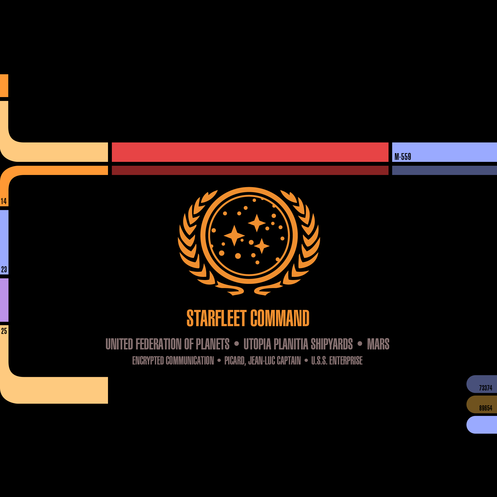
 Carcassonne. Based on the award winning card game by Reiner Knizia, Lost Cities takes elements of solitaire and combines them with vibes of Uno and Go Fish into a compelling game for two people or a single player vs any one of four AI opponents.

The game is easy to learn (I won’t go into the full rules here) thanks to the wonderful spoken in-game tutorials, but the basic object is to score points by playing cards of increasing value in any one of five, colored channels. Whichever player has the most points when all the cards from the draw pile have been played, wins. Since the Iconfactory did much of the graphical work for Lost Cities, I was generously given early access to the pre-release and have been playing a great deal this past week. I’ve learned a lot in that time and I wanted to share some of the insights I’ve had with would-be challengers.

Practice Against the AI

It may seem straight forward but playing the various computer opponents is a great way to get a feel for Lost Cities. Playing the AI means the game proceeds quickly since you don’t have to wait for a human friend to move. Getting into a rhythm in LC really helps you to understand how points are scored, cards are held or discarded and what to watch for.

Watch the Draw Pile

The game continues only as long as there are cards to draw so keep a close eye on the number of cards left in the pile in the lower right of the interface. When that number reaches zero, the game is over so it’s important to know how many turns are left. Don’t wait until the last few turns to play your big cards if you can help it. Also, remember that the number of turns is just about one half of the number of cards left in the deck. It’s easy to look at 18 on the deck and think you have that many turns left, but you really don’t, you have approximately 9!

Ditch the 2’s and 3’s

Unless you’re trying to make a run and score 8+ cards in a channel, you might want to start a channel with a 4 or even a 5. Low cards don’t yield many points anyway and probably won’t make a huge difference in the final outcome. This isn’t always the case of course, but games can easily be won by just playing the higher number cards alone.

Remember to Look Up

It’s easy to get so focused on what cards you have in your own hand that you forget to pay attention to what your opponent is doing. You’re not the only one at the table who has a strategy! Don’t forget to pay attention to what cards she is pulling from the discard piles or what color channels they seem to be favoring. You may be holding some great cards, but always remember Lost Cities isn’t just about scoring your own points, but also trying to block your opponent’s as well.

The Nitty Gritty

Don’t forget that you can re-draw from the discard pile if a card you previously got rid of is now needed. This can come in quite handy when cards of certain colors start to present themselves. Also, listen for the audio cues in the game like the little “tink” sound that lets you know a channel has just crossed the boundary from negative to positive point totals. Lastly, when playing the AI, don’t forget you can pause at any time and take a break. Maybe a refreshing drink or walk around the block will clear your head and help you crush Ms. Lindenbrock.

I love games like Carcassonne and Lost Cities because they combine elements of skill and luck in fun and engaging ways. They are also played at your own pace which is wonderful, especially in the age of first-person shooters and nerve-wracking puzzlers. TheCodingMonkeys have gone above and beyond to make Lost Cities both addictive and fun to play. It takes all of the best elements of Reiner Knizia’s original card game and adds wonderful features like automatic score keeping, tough AI opponents, beautifully rich graphics and and soundtrack that feels like it belongs in the cinema instead of a game. If you enjoy turn-based strategy or card games, I urge you to check out Lost Cities for the iPhone today. Enjoy!