 A great deal has been written about the App Store, both good and bad, and much of it comes from developers I know and respect. It almost seems pointless to add my own thoughts to those who are more widely known and respected than I am, but given how my feelings have evolved regarding the App Store recently I think it’s worth a shot. If what I have to say gives a potential iPhone developer reason pause and re-examine their entry into the space then it will have been worth it.
The App Store is broken. I know from the outside glancing in, it may not look that way but it is. It also doesn’t seem like it’s broken from Apple’s point of view since the store and its tens of thousands of software titles have helped place the iPhone firmly at the head of the smart phone industry. But speaking as a small developer who’s been releasing Mac software for over a decade, the App Store is broken. The ironic part is that if you had asked me this a few months ago I would have denied it with my dying breath.
Since it first launched in July of 2008, the App Store has been evolving and changing to suit the needs of both Apple and consumers. Unfortunately for developers many of these changes have hurt more than they have helped. The utter race to the bottom of the pricing structure by thousands of developers has created tremendous pressure to set applications at either free or near free price points. I know this first hand because when Twitterrific for the iPhone first debuted we set it’s price at $9.95 which, by today’s App Store standards, is almost unheard of. It wasn’t long before lagging sales and increased pressure from competition forced the Iconfactory to lower the application’s price to $3.99, still “expensive” by App Store standards. Not only was the price lowered, but the feature set was more than doubled and yet many users still complain it costs too much. While these changes represent perks for users, it also means that sustaining profitability for a given piece of software in the App Store is nearly impossible unless you have a break-away hit.
This leads me to the next point of failure for the App Store – visibility. Everyone has heard about the so-called “gold rush” certain developers have experienced. Flight Control’s 1.5 mil sales record. Trism’s incredible $250,000 short-term bonanza. But for every one of these lottery wins in the store, there are hundreds, if not thousands of developers who see little if any return on their investments of time and money. What’s worse, the success or failure of a particular piece of software in the App Store depends as much on Apple deciding to feature your creation as the creation itself. One can shift the tables in one’s favor with a sizable advertising budget, but many of us like the Iconfactory don’t have such generous resources at our disposal.

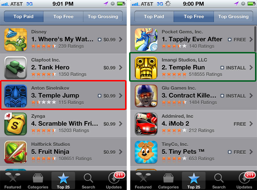
When the Iconfactory & DS Media Labs released our latest iPhone game, Ramp Champ, we knew that we had to try and maximize exposure of the application at launch. We poured hundreds of hours into the game’s development and pulled out all the stops to not only make it beautiful and fun, but also something Apple would be proud to feature in the App Store. We designed an attractive website for the game, showed it to as many high-profile bloggers as we could prior to launch and made sure in-app purchases were compelling and affordable. When the moment came, Ramp Champ shot up the charts quickly but just as quick, it hit a brick wall. Within days the app that had peaked at #56 on the top paid chart fell off the top 100 despite receiving praise from users and reviewers alike. The lack of store front exposure combined with a sporadic 3G crashing bug conspired to keep Ramp Champ down for the count.
A new version that corrected crashing was completed quickly, but once again the App Store reared it’s broken head as the review process kept the fix out of user’s hands for almost two weeks. By this time it was too late and momentum had been lost. Despite a “What’s Hot” feature by Apple in the App Store, Ramp Champ’s sales have not lived up to expectations for either the Iconfactory or DS Media Labs. What’s worse, many of the future plans for the game (network play, online score boards, frequent add-on pack releases) are all in jeopardy because of the simple fact that Ramp Champ hasn’t returned on its investment.
In order for a developer to continue to produce, they must make money. It’s a pretty simple concept and one that tends to get lost in the excitement to write for the iPhone. It’s difficult for me to justify spending 20-50 hours designing and creating new 99¢ levels for Ramp Champ when I could be spending that time on paid client work instead. I would much rather be coming up with the sequel to Space Swarm than drawing my 200th version of a magnifying glass icon. But I’d also like to have some assurances from Apple about reducing the length of the App Store approval process, having the ability to respond to factually incorrect iTunes reviews, not be limited to 100 beta testers, or that large, prominent developers won’t always get preferential treatment. In short, I’d like to know things will be fixed and I don’t mean merely posting a page of marketing text in iTunes Connect.
It is a truism that everyone who creates content is a control freak. From fine artists that decide what gallery their work will hang in, to architects who scratch tooth and claw with stubborn clients about what materials will be used in construction. Software developers are no different. We all want as much control over our creations as we can possibly have and the App Store in it’s current state has removed a significant level of control from our hands. I’m not ready to throw my lot down with those who have renounced the platform just yet, but unless some significant changes come very soon, myself and others like me will have no choice but to focus our development efforts elsewhere.
UPDATE: Several developers have contacted me and told me privately that they think it isn’t so much the App Store that’s kept Ramp Champ from being a success as it is the game itself. Given the fact that Freeverse’s newly released and shallower ‘Skee Ball’ currently sits at #6 in Top Paid apps in the store, part of me wants to agree. I could second-guess myself about what didn’t go right with Ramp Champ but in my heart of hearts I know RC is better than 90% of the games that get to the top of the list. I have to keep telling myself that what doesn’t kill us will make us stronger in the end. Hopefully.
UPDATE II: Seems I’m not the only one cooling to the idea of developing for the iPhone. Macworld’s Dan Moren reporting from the C4 independent developers conference says many of the developers are frustrated at their lack of control in the App Store. I’m glad to know I’m not the only one.
UPDATE III: Marco Arment has written an excellent piece that addresses my post. I agree with much of the analysis there and tend to think that their may indeed be “two App Stores” so to speak. As a result of suggestions from both Marco and the commenters here, Ramp Champ’s vague app store description has been re-written and new screen shots posted to show more content. Thanks to everyone who suggested these changes, I think they will definitely help sales.
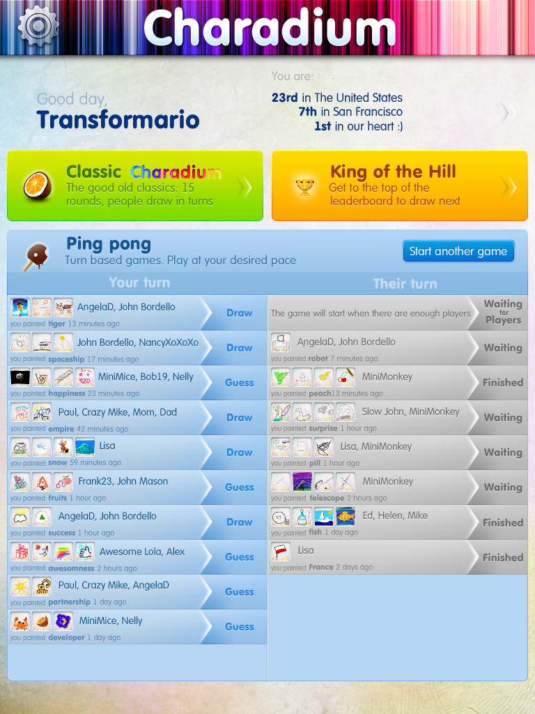
 There are only a handful of games on my iDevices that have withstood the test of time and clung to my home screen. Some of these games include Carcassonne, Plants vs. Zombies, Orba, Tiny Wings and now Charadium II. Charadium is a classic Pictionary type game where players take turns drawing a word and guessing each other’s creations for points. There are a bunch of games of this genre in the App Store, but Charadium is far and away the best of breed I’ve played, and much of that is due to the attention to detail developer On5 has put into the app.
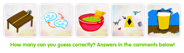
 Well not necessarily a *bigger* screen, but you will need one that sports more pixels per inch. That is to say if the
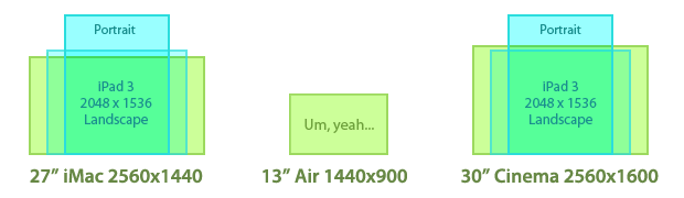

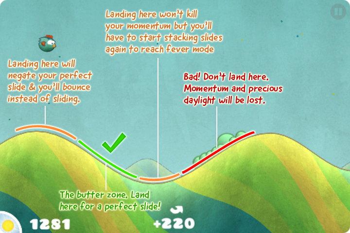


 Every once in a while you run across a piece of software that’s so elegant and well done it makes you smile from ear to ear.
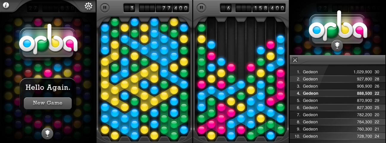
 I’ve recently discovered creating a successful iPhone application is a lot like baking a pizza. Take the best ingredients, like skillfully crafted code, bold and flavorful interface design and combine with a dash of love and you may end up with a
 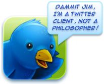 The recent release of


 There are very few surprises left in the world, so when something outside my experience comes along, I prick up and take notice. Lately the shock of the new comes in the form of commercials from Research In Motion (RIM), makers of the BlackBerry line of smart phones.

