Why Icons Matter
 I can’t tell you how many times in the course of my career as an icon artist that a client considered their icons to be an after thought. After spending hundreds of man hours and pouring thousands of dollars into software development, some clients just refuse to devote the attention needed to the glyphs that act as both button and branding. At the Iconfactory, we try and educate clients about the importance of icons and how they strengthen a company’s brand as well as communicate a product’s core concepts quickly and easily. It may sound like marketing fluff, but years of experience have taught me it’s the truth.
So when it comes to designing our icons for our own software products, we almost always end up obsessing over them. The redesign of the application icon for xScope went through nearly 20 different revisions before we settled on a final version. This time around, the drama was caused by the new icon for Frenzic for the iPhone.
Standing Out From The Crowd
When it came time to design the icon for Mobile Frenzic, we knew we wanted to use a 2D translation of the OS X version from the desktop. However, unlike Mac desktop icons which have a canvas size of 512×512 pixels, iPhone and iPod touch app icons are limited to 57×57 and look best when designed straight on. At first we decided to translate Frenzic.com’s fav icon which was a pie of green and orange wedges on a glossy black base. Early beta versions of Mobile Frenzic used this icon, but there was a problem. It just wasn’t eye catching.
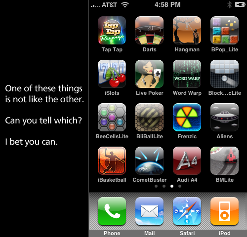
Our artist, David Lanham, went back and added a neon-like inner glow that gave the impression of the icon being lit from within, like it was a piece of plexiglass. The results were effective and with the addition of a high-tech circuit board motif, I knew we had a winner. The icon both stood out on the iPhone’s home screen and did a wonderful job of branding “Frenzic” on the device. Despite these successes, there were those among us that thought it stood out a little too much.
As artists, we often get butterflies the first time we show a client our designs. In this case, the “client” was Frenzic creator and lead programmer, Wolfgang Ante. We’ve had a close working relationship with Wolfgang for years and even though he almost always loves everything we do “out of the box”, he was hesitant about the icon’s treatment. Both he, and our own lead programmer, Craig Hockenberry played devil’s advocate and thought that the glowing, high-tech icon might be too dissimilar to be effective. The design didn’t seem to follow conventional wisdom for iPhone app icons and we debated the pros and cons of the design.
In Expertise We Trust
The great thing about working at the Iconfactory is that we play to each other’s strengths. While I may have ideas about how a particular software feature might work, I trust in the skill and expertise of Craig and Wolfgang to pull off the actual programming. I often put my faith in their hands when it comes to coding, and likewise, they do the same for us when it comes to design. This is more than I can say for many of our clients who think they know best when it comes to icon design. Despite a client’s lack of experience of how icons communicate, where they are seen, or the technical details needed to pull them off, I often get lectured on how they should be rendered or what form they should take.
So, in their wisdom, Wolfgang and Craig set their hesitations aside and let the designers do their job. The result was a unique and compelling application icon that was simple to understand, easy to spot and visually unique from all other iPhone application icons. Maybe its even helped sell a few extra copies at the same time.
All too often icons are treated as second-class citizens, especially in the App Store. Lately, developers have taken to plastering “SALE” or “60% OFF!” within their icons. They’ve become lazy and let the iPhone software mar their design with glossy highlights which obscure efforts to brand their software. They use dull colors or pile on heaps of detail that just adds unwanted noise to an already cluttered array of choices. After the flashy ad pitches have faded, the icon still has to live on the user’s device and is often the first line of interaction with the product. Fight the urge to cheapen your brand and instead give your icons the love and attention they deserve. You’ll still sell boat loads of copies and your users just might end up thanking you at the same time.
Excellent and very informative post. I really appreciate you going into details about icon design, and your rationale for making the choices you all do. I have to admit when i first saw the iPhone version of Frenzic’s icon, i wasn’t too sure about the glow around the edges. It seemed really different and quite strange. Don’t get me wrong it looked fantastic and alive! But it just didn’t seem to match anything i’ve been used to seeing coming from the Iconfactory.
I’ve slowly come around to really liking it though, and it is featured on my first home screen, next to Twitterrific. I’d love to see more of the concepts for it if you would be allowed to share.
The story seems incomplete. What did you do with the feedback from Craig and Wolfgang? How was the icon redesigned?
I like it! I’ll bet you set a trend.
Here, here!
I’m an absolute icon addict (I’m sure my Candybar library is small potatoes compared to the IF team, but still, it’s pretty insane) and I absolutely j’adore what true artists can do with limited pixels.
The Frenzic icon is actually one of my favorite. I have a second gen iPod touch, so I can’t jailbreak and get all the nifty user customizable themes (that’s honestly all I would really like to do), but you can separate the wheat from the chaff when it comes to developers that care about investing in icon resources and those that don’t. As more and more apps fill the phone or touch or dock or whatever, I think devs underestimate the power of a good, memorable and well designed icon. If it stands out (like the Twitterrific icon clearly stood out — see how it has been misappropriated, as you guys have covered before), I’ll remember to use it. I associate the program with the icon.
Frenzic for the iPhone/iPod touch looks great. Louie’s iPhone icons are equally fantastic (nice hire, btw!).
I personally love to see what can be accomplished in 3249 pixels.
David, basically the main thing we did was tone down the glow (if you can believe that). Originally the circuit board texture was not a part of the icon, but its inclusion was actually a good thing since it helped tie the icon into the new version better. That’s about all we did and eventually Craig and Wolfgang knew it worked and I think it grew on them quickly. By the end of the beta, they loved it (I think). 🙂
You know, when I first bought the app, I was rather impressed by the icon. I knew that the designer of the icon had put good effort to make the icon pop, and I think the upper/lower glow plus the color combo did just that.
However, it doesn’t quite stick out as much as you’d expect on my home screen. Frenzic is right next to Tap Tap Revenge on my screen, which also sports a glow-ish distinctive icon.
I personally went through many revisions while designing the icon for the Tickle app (which isn’t out yet). It was quite a pain!
I had this exact conversation with someone yesterday. It seems like so many apps, especially on the App Store, have really sucky icons. It seems like that’s the last thing developers/designers think about many times, but it’s the first thing I look at. If something has a nice-looking icon that’s unique or clearly looks like it was designed with care, I’ll give it a shot over something with a generic-looking or poor icon.
I think the App Store is an interesting case study in application development and design considering we’ve literally seen its birth and growth over time. One thing I consistently notice is that the best-designed apps are almost always the most functional and the most usable as well.
Great post!
Josh, if I’m any way typical then the problem with the icon is not that it wasn’t thought about until the end but that graphic design is outside my core competency. I started looking into the artwork almost as soon as I had a working prototype running.
I’m quite interested in typography and design, I’m just not very good at it myself! A lot of developers don’t like the “pretty stuff,” so paying for an icon to be designed for them would be an alien concept.
I tried and failed doing it myself. Using clipart/stock images didn’t work for other reasons. In the end my wife designed an icon for me.
Full story here: http://www.yummyapp.com/2008/09/artwork.html
@krye, It happens to me all the time. If icon is ugly, I can’t leave the app on my iPhone’s home screen.
Ged, thanks for the great article on icons.
A very informative article which I can really relate to as both a designer who has worked with many picky clients and also is currently designing icons for some iPhone apps (check us out – http://www.chillix.net). I have tried to keep my icons for our apps simple but stylish, making it as instantly obvious as possible as to what the app offers. I agree with Anton, if an Icon is bad it gets shifted along my home screens, I reserve the first 3 for apps with good functionality and awesome icons only. It pains me when I find a nice app with a horrid icon! Anyhow, I love the frenzic icon and am addicted to the game, well done guys!
“Lately, developers have taken to plastering “SALE” or “60% OFF!” within their icons.“
I think it’s funny that Frenzic is now 60% off, and has a sale label plastered on its icon. This diatribe is barely two weeks old, and already you are doing exactly what you preached against.
If you can’t beat ‘em…
Pot calling the kettle black? I see the latest update to the Frenzic app has a SALE banner emblazoned across it…
Так и без недостатков достоинства не так заметны 🙂
You are not “artists”, check out the definition in the dictionary…
You know, when I first bought the app, I was rather impressed by the icon. I knew that the designer of the icon had put good effort to make the icon pop, and I think the upper/lower glow plus the color combo did just that.
However, it doesn’t quite stick out as much as you’d expect on my home screen. Frenzic is right next to Tap Tap Revenge on my screen, which also sports a glow-ish distinctive icon.
I personally went through many revisions while designing the icon for the Tickle app (which isn’t out yet). It was quite a pain!
Ged, thanks for the great article on icons.
icons are great! thank you Ged!
Anyone that says icons don’t matter is a fool. An ugly icon could spell the death of any program. Is it just me? I’ve passed up app after app on the desktop as well as the iphone based on nothing more than the icon is ugly. Some icons I see look like the programmer spent no more than an hour on it. And I’m supposed to fall in love with their app?
Your icon is everything! It’s your first impression, it’s your handshake. Never give a weak handshake.