6 Comments

Things I Learned at Macworld

Unlike most of the people I follow on Twitter, Macworld 2009 was my first expo in many years, and the only one where I’ve been one of the exhibitors. The week was fun, exciting and a lot of work. Now that I’m back home in Greensboro, I thought I’d impart some of the knowledge I gained during my experience. In no particular order, here are a few of the many things I took away from my trip to Macworld 2009:

• Expo food is over-priced – Ya know how they charge like $4.00 for a bag of popcorn at the movies? Macworld is like that but a x1000 worse. A pathetic bologna sandwich and a bottle of water came to $12.50.

• Floris Natural Benefits Soap – The Intercontinental San Francisco had some of this product line in our room and I couldn’t get enough of it. I must try and track down the Jabon hand soap for use at home!

• Craig has groupies – I mean I knew people loved Craig, but I didn’t realize they would actually wait in line to talk to him. Every day on the show floor was filled with people waiting to chat with Mr. Hockenberry, they just couldn’t get enough of him. All of that attention made me realize just how proud I am to be able to work with him.

• Mel’s Diner has the best lemonade – I’ve drank a lot of lemonade in my time, but the lemonade I enjoyed at Mel’s during the expo was, without a doubt, the best I’ve ever had. In my life. The perfect blend of sweet and tart that should not be missed.

• Chairs are precious – Our kiosk at the show only had one chair. I was told that to rent another for the week it would have cost $200. After spending almost 7 hours on your feet $200 didn’t seem that bad. When some bastard stole our one chair on Friday morning, we almost had a freak out. Luckily Travis was able to procure another in short order.

• Rickshaw computer bags – New product. CEO and owner gave me a demo of the bag and had me sold at like the 5th feature. If you are in the market for what could be the best computer bag you’ll ever own, check them out.

• Basil Thai on Folsom – Of all the wonderful places we ate while at Macworld, this little restaurant on Folsom Street was the best. From the appetizers to the wonderful desert and everything in between, it was to die for. Ged gives Basil Thai 5 stars!

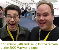
• Meeting people – By far the best part about Macworld was simply meeting everyone. Tweeting with people is great, but Macworld reminded me that face to face contact can’t be beat. I met so many awesome people at the expo I can hardly keep track of them all. I especially enjoyed meeting the TUAW crew including Mike Rose, Christina Warren and Nik Fletcher. Other notable Mac heads I met during my week in San Fran included: Arlo Rose, Dan Moren, Rick Yaeger, Chris Pirillo, Rich Seigel, Michael Simmons, Scott McNulty and Arne Fismen.
3 Comments

Market Yourself An iParadigm

John Gruber over at Daring Fireball links to an intriguing piece by Paul Kafasis on the state of the App Store. The post compares Walmart’s strategy to sell disposable, cheap goods to those of App Store “ringtone” developers which are forcing down prices. My friend and business partner, Craig Hockenberry wrote about this very topic a few weeks ago in a piece that put him in the crosshairs of quite a few people.
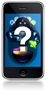
After Craig’s piece was published, and indeed after reading the post by Kafasis, some are under the impression that more expensive “AAA” apps are doing just fine thank you very much. The theory goes that one only has to look at the App Store top 10 list to understand it’s not price that gets you into the top 10, but quality. This, plus marketing on the part of the developer are all that’s needed to boost your software into the top 10 of the App Store. Reading through the comment thread at Inside iPhone it all seems so simple. All a developer has to do is market their app and the rest will take care of itself! Why didn’t I think of that?

The part I love the most is that the people making the “just market your app!” comment have no real idea how much effective marketing costs. Oh sure, you can go far on viral and word-of-mouth marketing, but it all pales in comparison to even a small banner graphic in the App Store. The Iconfactory could spend tens of thousands of dollars buying up targeted advertising space to promote Frenzic, but it still wouldn’t be 1/10 as effective as the front page graphics that Dropship, Marley and Texas Hold’em are enjoying (for free) as I write this. Not only that, but I have no way to track metrics for advertising pointing at Frenzic in the App Store. I can’t gauge how effective a $75 blog ad versus a $2,600 DF sponsorship is because Apple doesn’t currently give me stats of people clicking through to my software. Anyone who says “Just market it!” doesn’t have a solid grasp on how the App Store works.

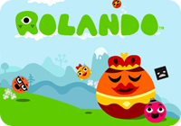
Another example is Rolando. People are holding this app up as the ultimate example of a quality, non ringtone app that is enjoying success in the store. It is true that Rolando is a fantastic game worthy of the top spot it once held. It is also true that Apple promoted Rolando from DAY ONE in the App Store with major graphics both in iTunes and on Apple.com. All that exposure helped to get Rolando into the top of the store when it launched. But its $9.99 price point is like an anchor. As I write this, Rolando sits at #30 in the top 100, and #10 in games. Let me repeat that. #10. In games.

So what is in the App Store top 10 right now? iFart Mobile is number one which is still riding high on a wave of PR thanks to being originally barred. Crash Bandicoot, which is featured in national Apple television spots is #2. Tetris, perhaps the most well-known video game in history, is #3. Three more ringtone apps come in as 4, 5 & 6 including the months old iBeer. Touchgrind, which also enjoyed prominent Apple billing, is #7. Bejeweled 2 is number 8, PocketGuitar ($.99) is #9 and SimCity rounds out the top 10. All of these apps either enjoyed uncommon press exposure, have a nationally known brand or are priced at $.99. Quality definitely plays a role in getting to the top, but price and “Apple love” play a larger part.

Does this all mean that developers like myself will abandon making quality iPhone applications like Twitterrific and Frenzic? Of course not. I just wish that people who think they know how the App Store works would admit that they really don’t. The App Store is still in flux and much is unknown. What I do know however is that there are key factors to getting to the top of the store, chief among them being price and exposure from Apple. No amount of 3rd party marketing, done on a small developer’s budget is going to change that simple fact. What’s worse (or better, depending on your point of view) is once you are in the top 10, even if you’re app is a “limited utility” ringtone app, because you’re in front of millions of eyeballs both on the device and in iTunes, you’re bound to stay there.

I don’t know exactly how to fix the App Store, but everyone I’ve spoken with agrees that it needs fixing. If not fixing, at least a change in how it favors certain apps while hindering others. The more we talk about this stuff, the better it will be for both developers and customers alike.

3 Comments

Switching Hats

Back on December 1st, I put on my artist’s hat and wrote a post about the importance of icon design and how it shouldn’t be taken for granted or seen as an afterthought. The post garnered a fair amount of exposure and I received a great deal of positive feedback from designers and developers alike on the importance of icon branding and standing out in the App Store.

Near the end of the piece, I offered up this unassuming little opinion which has caused me a fair amount of stress these last few days:

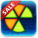
“Lately, developers have taken to plastering “SALE” or “60% OFF!” within their icons. They’ve become lazy and let the iPhone software mar their design with glossy highlights which obscure efforts to brand their software. Fight the urge to cheapen your brand and instead give your icons the love and attention they deserve. You’ll still sell boat loads of copies and your users just might end up thanking you at the same time.”

What is the source of my distress? Over the course of the past week, the Iconfactory and ARTIS Software jointly agreed to put our game Frenzic on sale for the Christmas holiday. From the moment we launched the product, we had always planned on temporarily lowering the price for the holiday rush. When I wrote the original post I was unaware of the importance the app’s icon plays in marketing an online sale. I’m guessing you can probably see where this is heading. As the app went on sale today, it reluctantly sported a new badge. The same type of badge that I railed against in my original post.

If you care as much about icons and design as I do, then you’re probably asking yourself how I could allow something like this to happen. At first I couldn’t figure it out myself, and then it became very simple. I took off my “designer hat” and put on my other one… the one that says “business owner”.

The business owner in me doesn’t wrestle with many of the lofty ideals that my inner designer aspires to. Being a partner in a successful company sometimes means doing what’s best for the health and growth of the business, especially in today’s unsure economy. It’s easy to criticize someone’s design decisions when you’re on the outside looking in. You think you’ve got everything figured out, but then your app starts to sink off the App Store and suddenly nothing’s as simple as you thought.

Although I initially resisted calls to slap a “For sale” badge on our icon, I came to realize that it was one of the most important ways to get people who had previously dismissed Frenzic due to its $4.99 price tag to take another look. The change may not affect sales at all, but on the other hand, it may help to get Frenzic in front of more people’s eyes than ever before. If that means that I have to eat a hefty helping of crow in order for us to maximize our exposure in the App Store, then I say pass the ketchup.

27 Comments

Why Icons Matter

I can’t tell you how many times in the course of my career as an icon artist that a client considered their icons to be an after thought. After spending hundreds of man hours and pouring thousands of dollars into software development, some clients just refuse to devote the attention needed to the glyphs that act as both button and branding. At the Iconfactory, we try and educate clients about the importance of icons and how they strengthen a company’s brand as well as communicate a product’s core concepts quickly and easily. It may sound like marketing fluff, but years of experience have taught me it’s the truth.

So when it comes to designing our icons for our own software products, we almost always end up obsessing over them. The redesign of the application icon for xScope went through nearly 20 different revisions before we settled on a final version. This time around, the drama was caused by the new icon for Frenzic for the iPhone.

Standing Out From The Crowd

When it came time to design the icon for Mobile Frenzic, we knew we wanted to use a 2D translation of the OS X version from the desktop. However, unlike Mac desktop icons which have a canvas size of 512×512 pixels, iPhone and iPod touch app icons are limited to 57×57 and look best when designed straight on. At first we decided to translate Frenzic.com’s fav icon which was a pie of green and orange wedges on a glossy black base. Early beta versions of Mobile Frenzic used this icon, but there was a problem. It just wasn’t eye catching.

Our artist, David Lanham, went back and added a neon-like inner glow that gave the impression of the icon being lit from within, like it was a piece of plexiglass. The results were effective and with the addition of a high-tech circuit board motif, I knew we had a winner. The icon both stood out on the iPhone’s home screen and did a wonderful job of branding “Frenzic” on the device. Despite these successes, there were those among us that thought it stood out a little too much.

As artists, we often get butterflies the first time we show a client our designs. In this case, the “client” was Frenzic creator and lead programmer, Wolfgang Ante. We’ve had a close working relationship with Wolfgang for years and even though he almost always loves everything we do “out of the box”, he was hesitant about the icon’s treatment. Both he, and our own lead programmer, Craig Hockenberry played devil’s advocate and thought that the glowing, high-tech icon might be too dissimilar to be effective. The design didn’t seem to follow conventional wisdom for iPhone app icons and we debated the pros and cons of the design.

In Expertise We Trust

The great thing about working at the Iconfactory is that we play to each other’s strengths. While I may have ideas about how a particular software feature might work, I trust in the skill and expertise of Craig and Wolfgang to pull off the actual programming. I often put my faith in their hands when it comes to coding, and likewise, they do the same for us when it comes to design. This is more than I can say for many of our clients who think they know best when it comes to icon design. Despite a client’s lack of experience of how icons communicate, where they are seen, or the technical details needed to pull them off, I often get lectured on how they should be rendered or what form they should take.

So, in their wisdom, Wolfgang and Craig set their hesitations aside and let the designers do their job. The result was a unique and compelling application icon that was simple to understand, easy to spot and visually unique from all other iPhone application icons. Maybe its even helped sell a few extra copies at the same time.

All too often icons are treated as second-class citizens, especially in the App Store. Lately, developers have taken to plastering “SALE” or “60% OFF!” within their icons. They’ve become lazy and let the iPhone software mar their design with glossy highlights which obscure efforts to brand their software. They use dull colors or pile on heaps of detail that just adds unwanted noise to an already cluttered array of choices. After the flashy ad pitches have faded, the icon still has to live on the user’s device and is often the first line of interaction with the product. Fight the urge to cheapen your brand and instead give your icons the love and attention they deserve. You’ll still sell boat loads of copies and your users just might end up thanking you at the same time.

4 Comments

What of Frenzic?

The launch of Apple’s App Store was one of those moments that developers live for. After weeks of coding, designing, testing, tweaking and debating, Twitterrific for the iPhone and iPod touch was released to overwhelmingly positive reviews. All of us at the Iconfactory, especially the big guy in Laguna, are all gratified that users seem genuinely happy with Twitterrific for the iPhone. Apple’s handheld hardware is a wonderful new development platform that’s bound to get better with time, and we were pleased to be present at launch.

However, throughout this whirlwind day, I kept receiving emails about another of our software products and why it wasn’t included in the App Store kick-off. That application of course, was Frenzic. More than a year ago, I posted on my blog asking users to write Apple in support of bringing a native version of our addictive Mac-based game to the iPhone. You showed your support for our efforts to bring the best possible version of Frenzic to the iPhone, and now thanks in-part to users like yourself, that native version is becoming a reality.

I’m here to tell you that Frenzic is definitely coming to Apple’s handheld party. Some of Craig’s coding buddies got an early sneak peek of Frenzic at WWDC, and it’s only gotten better since then. The mobile version of Frenzic is confirming my suspicions that this is how the game was always meant to be played. Placing pieces is fast, responsive and fun as all get out. There is a tactile sense of immediacy when playing Frenzic on the iPhone or touch that simply isn’t present in the desktop version. We still have tons of work to do, but trust me when I tell you it’ll be worth the wait.

In a way, I’m glad Frenzic wasn’t ready for today’s App Store launch. There are already tons of great games available for the iPhone. Pangea’s Enigmo and SEGA’s Super Monkey Ball both come to mind. Frenzic’s day will come, and when it does, all of us at ARTIS Software and the Iconfactory hope you’ll give it a try. The Mac desktop version’s slogan has always been “Addiction never felt so right.” Thanks to the App Store and iPhone, I think players everywhere are about to get addicted all over again. For now, hang tight and hone those reflexes. You’re gonna need it!