One Perfect Shot: TOS ‘The Man Trap’

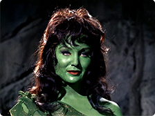
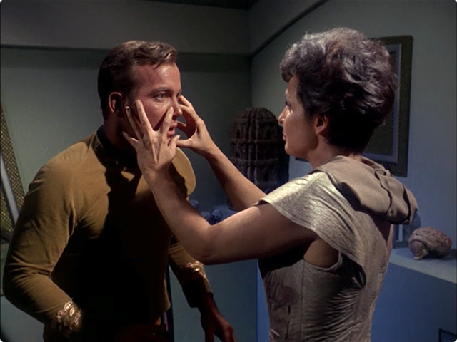
This episode of classic Star Trek always creeped me out as a kid, and with good reason. An alien creature who can assume the appearance of anyone, roaming the halls of the Enterprise in search of its next victim. The original series’ ‘The Man Trap’ oozes with mystery and horror and saves the best bit until the very end when the Nancy Crater, otherwise known as the Salt Vampire, reveals herself to the crew and the audience. Our perfect shot takes place just prior to that bizarre ending as Nancy has tossed Spock aside like a rag doll and has Captain Kirk firmly in her hypnotic gaze.

I always found it a bit of a stretch that Professor Crater could survive for almost two years alone on M-113 with Nancy and not get the salt sucked right out of him. Given how many crew members end up dead, you’d think her appetite was almost insatiable. Then again I guess it’s kinda like fasting for weeks, once you’re surrounded by food after having gone so long with so little, you kinda want to put your big pants on and sail right on into salt-town.

Next up is one of my least-favorite Star Trek episodes – ‘Charlie X‘. This should be interesting. :-/

One Perfect Shot: Star Trek’s ‘The Cage’

My good friend Dave Caolo has started something neat over on his Tumblr blog. He’s posting a definitive single frame or “shot” from each of episode of the classic TV show, The Twilight Zone and I gotta admit, it’s pretty cool. So cool in fact that Dave has inspired me to do the same with one of my all-time favorite TV shows, Star Trek: The Original Series. I’ll try to post one shot a day (although I’m pretty sure that won’t really happen) until I get through the entire three seasons. What I promise I will try and do is pick the most iconic, gorgeous and definitive shots from each of the 79 episodes of Star Trek and give a brief description of why I picked them.

Why Star Trek? Simply put, the show changed my life. It captured my imagination as a boy and never let go. Each week I journeyed to strange new worlds and in the process I became life-long friends with Captain Kirk, Mr. Spock and Dr. McCoy. It inspired me to do well in school, be tolerant of people’s differences and dream big. So where do we begin? Why, at the beginning of course! Our first entry is from the Star Trek pilot “The Cage”. Considered “Too cerebral” by the network suits at NBC back in the day, “The Cage” didn’t originally air as the first episode of Trek, but was later re-cut into the first season, two-parter The Menagerie.

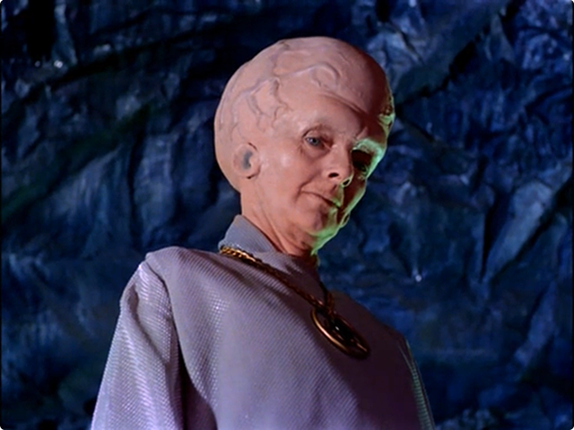
Our perfect shot is quintessential Star Trek, the sinister Talosian alien keeps a watchful eye over Captain Pike and the captured crash victim, Vina. I considered a shot of Vina herself as the iconic green Orion slave girl to represent ‘The Cage’ but the Talosian with his alien costume, throbbing cranium and classic Trek back-lighting won the honor. I can already tell it’s going to be difficult to pick a single frame to represent each episode of classic Star Trek, but at least it gives me an excuse to watch them all yet again in glorious HD. I hope you enjoy this series of posts, I think it’s going to be fun. Next up – ‘The Man Trap‘!

All hands! Fasten seat belts!

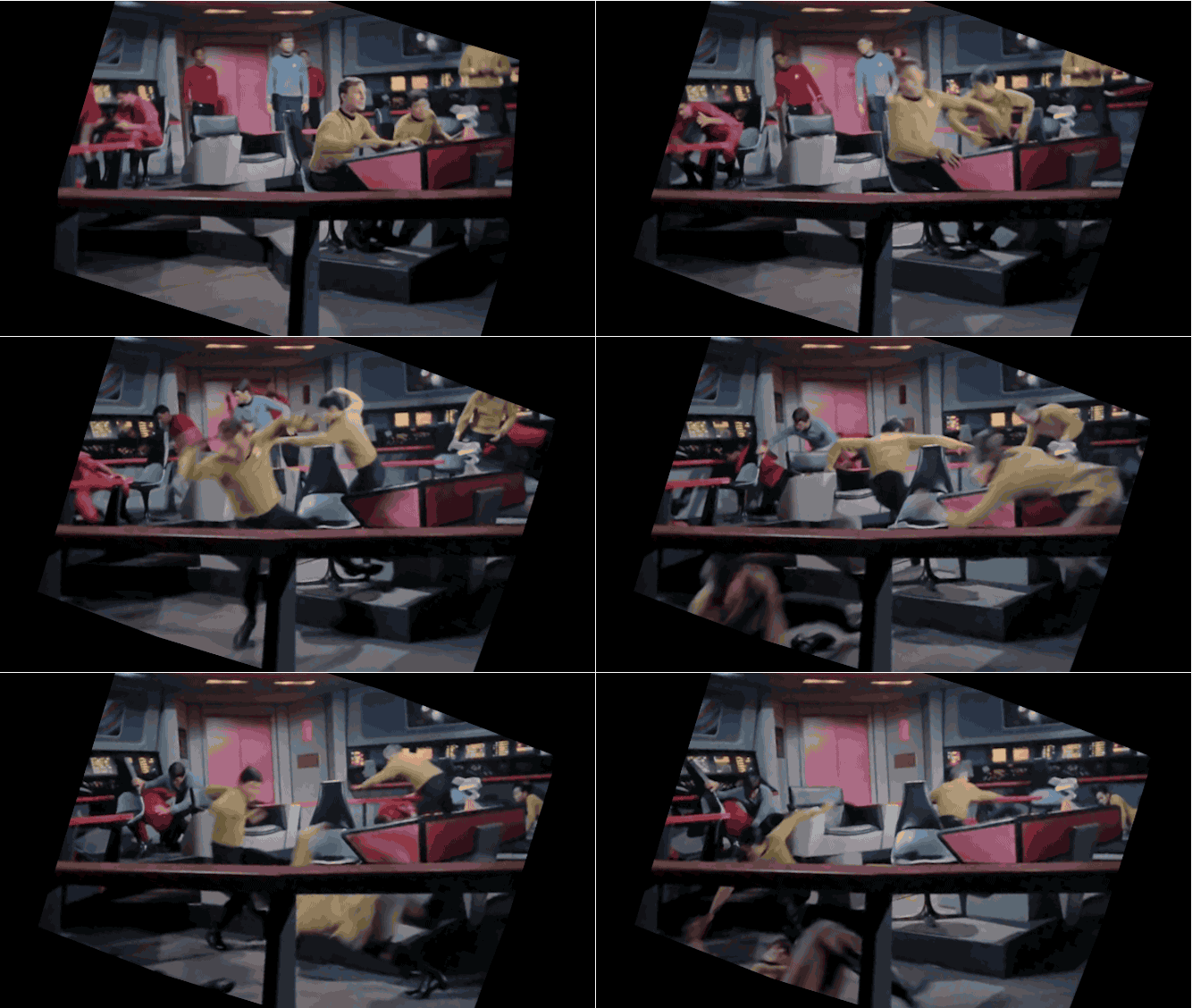
This page may take a few moments to load, but if you’re a Star Trek fan like I am, it’s worth it. Some geeks recently trained their image stabilization software towards the decks of the Starship Enterprise with hilarious results. These animated GIF’s show what the director and crew saw while filming these scenes for the various incarnations of Star Trek.

The original series used the shakey cam all the time so it’s really fun to see just how these shots were choreographed. I’m struck by the sheer number of people who were apparently on the bridge at the time of this impact. I love the blocking ballet that George Takei as Sulu has to do here to not only get out of his chair, but somehow hit the floor without breaking his neck. Well done, George, well done!

StableTOS2

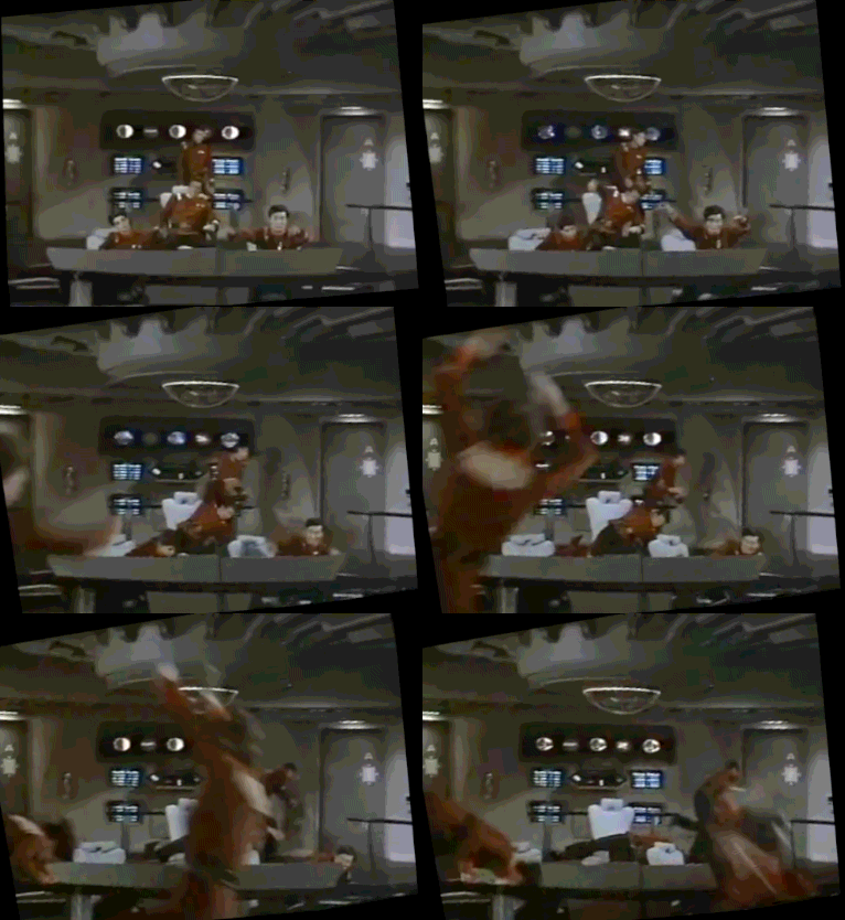
Meanwhile on the set of 1982’s Star Trek II: The Wrath of Khan, the Enterprise takes a hit and once again no one is wearing seat belts. DeForrest Kelly is in his usual position for bridge scenes (above and behind the Captain) and once again he goes flying on cue, but this time to the right. It is me or is Kirstie Alley kinda phoning it in here as Savvik? So much fun!

StableWOK

Fast forward to S7 of Star Trek: The Next Generation’s episode Force of Nature. I could watch this stabilized clip on a loop for days. I love how everyone’s doing their own little stylized dance to convey the rocking of the Enterprise. Jonathan Frakes clutches his chair and appears to simultaneously steady himself AND rock the chair convincingly for the camera. The Hekaran scientist with Worf on the 2nd level struggles to hold on while the ensign in the back lurches, helping to complete the illusion. Oh, and Patrick Stewart may be the only person I know who can make shaking for the camera actually look cool. Okay, maybe not.

StableTNG

I love this hilarious gif of Next Generation’s Brent Spiner as Data pilots the Enterprise through a particularly violent jolt. You can imagine the crew member standing just off camera waiting to give his chair and console a good WHACK! when the director calls action. I wonder how many takes this took to get through without Brent cracking up.

StableData

This last GIF is from the Original Series but it’s almost 5mb, so if you want to take a gander, click here. Classic TOS fun!

1 Comment

Go Buy Monument Valley. Now.

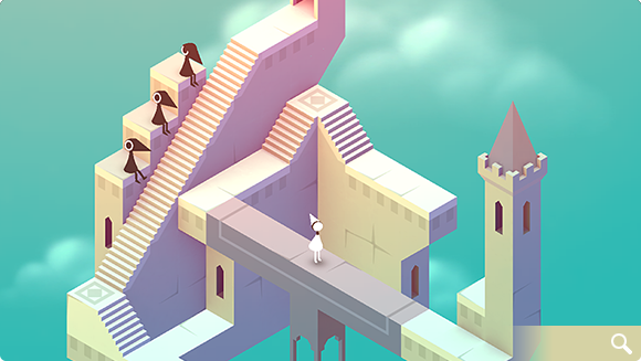
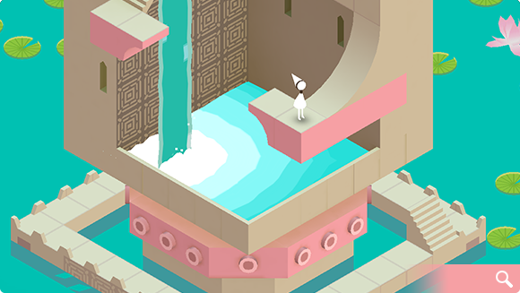
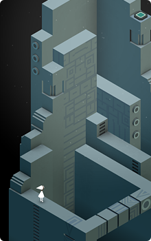
Chances are you’ve probably already heard all about the stunning new game from developer ustwo – Monument Valley that was released today. If the game is new to you, then let’s just clear the air right now – go buy it on the app store for your iOS device. Now. This is one of those instances where a piece of software is so stunningly beautiful, and provides such an incredibly rich experience, you’re really missing something if you take a pass. Here are just some of the things you’ll see in this amazing casual puzzler:

There’s a great deal to love in Monument Valley. From it’s rich, varied color palettes that change from level to level, to the extremely clever, M.C. Escher-like design of its levels, to the gorgeous soundtrack and audio effects, Monument Valley delivers at every turn. From the moment you start to play, it’s obvious how much love and attention the folks at ustwo have put into their creation. They’ve managed to design a complete gaming experience and bring it to you via the App Store for a minimal price. Too often games these days are filled with in-app purchases that prey on instant gratification to keep players interested. Monument Valley eschews all that in favor of creating a compelling, finite and beautiful environment for you to get lost in for a few hours of your life. The last few levels in particular are wildly inventive and especially challenging.

If you’ve read the reviews, then you probably know that Monument Valley’s play time is short. It took me a total of about 3 hours (off and on) from start to finish to complete all of the levels, and for some, that length may be a deal breaker. If you feel that way I have news for you – many awesome things in life are short but that doesn’t make them any less worthy of your time or money. You’ll probably spend more on your next meal out than you would on Monument Valley but that doesn’t mean you can’t enjoy both while they last. The game creators have said they focused on making a concise title that can be completed in a short amount of time on purpose. While this may be true, it doesn’t really matter to me because I know if the game is a success (which I certainly hope it is) then we’ll probably be seeing a great deal more of the mystical world of Monument Valley. Show your support of their efforts to bring you something wonderful and head over to the App Store and buy it, gift it and help spread the word by leaving a review today.

2 Comments

They Wouldn’t Know Good TV If It Shambled Up & Bit Them

SPOILER WARNING: This post contains spoilers for AMC’s The Walking Dead. If you’ve not watched the season 4 finale yet, back away from the blog post! I’m about to talk about stuff you probably don’t wanna know. You’ve been warned!

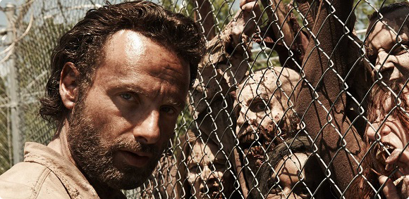
Last night I watched the season 4 finale of one of my favorite shows, AMC’s The Walking Dead and it did not disappoint. The show proved once again why I and other fans still enjoy tuning in week after week. The finale was a perfect blend of tense action, rich character development and satisfying resolutions with just enough un-answered questions to get us to return in October. Despite this, as I read some of the reviews of “A”, it’s apparent some critics feel The Walking Dead is about as exciting as one of its re-animated corpses.

The A.V. Club’s Zack Handlen rated the finale a meh-erific “B+”, lamenting the crucial flashbacks that gave Rick’s extreme cruelness on the dark road that much more bite. These flashbacks work, if for nothing else but to remind us of a time when Rick and Herschel had hope for the future, something that we’re constantly reminded has to be fought for. I enjoyed seeing Herschel again and loved how the flashbacks acted as an important contrast for what the group experiences when they finally reach Terminus.

Meanwhile, over at TV.com, reviewer Tim Surette called the finale a “pretty crummy season-ender” that was anti-climatic and would have served better as the penultimate entry. Personally, I think Tim’s off his apocalyptic rocker. The finale HAD to end with the arrival at Terminus anything less would have been anti-climatic. This was the mistake Game of Thrones made last season by not making The Red Wedding the finale it deserved to be. Critics like Zack and Tim have missed the entire point of S4’s journey not to mention dramatic plot structure and it’s pissing me off.

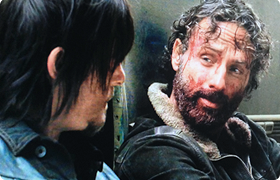
Critics often take stabs at The Walking Dead when the show veers into character studies with “nothing happening” in the zombie department. The thing is however that in order for us to care about what happens to these characters, we need down time with them to learn where they came from and what drives them. Season 4’s mini-stories have been great at letting viewers get inside the heads of characters like Darryl, Carol, Tyreese and Michonne. The Walking Dead’s terrifying moments can’t possibly hold our attention unless we emotionally invest in Rick, Carl, Maggie and the others week after week. One of the ways we invest are through quiet scenes like the one in “A” between Rick and Darryl as they sit against the car. Rick finally tells Darryl that he is his “brother”, something the audience has felt for a long time but Rick’s never come out and said. In this moment, the audience is rewarded in spades because we all know Darryl is far more Rick’s brother than Shane ever was. It was a brilliant and satisfying emotional moment and I loved it.

Other highlights included the foreshadowing of the rabbit snare and the one at Terminus, Michonne and Carl’s “monster” exchange in the forest and Rick “hulking-out” on Joe’s gang, gutting the guy who was about to rape his son. Here we are reminded yet again just what lengths Rick is willing to go to to protect Carl and the others in his “family”. It was a visceral, heart-pounding scene worthy of the finale as was Rick’s parting line “They’re screwing with the wrong people.” When he exclaimed that, I practically jumped from the couch, yelling “F*ck YEAH!“.

One day, The Walking Dead will cease to be exciting. We’ll have had enough of the hopelessness, enough of the roaming hoards eating the characters we love. For some the show seems to have jumped the zombie shark long ago, but for fans like myself, there are lots of stories left to tell, more secrets to be revealed and tons of brains left to eat. As far as I’m concerned, the undead (and the critics) can bite me!

The Rise of Mobile Games

The rise of mobile gaming is of interest to many people, both technology lovers and historians. In the last 20 years mobile gaming has really taken off, especially gaming on tablets. Whether it be Angry Birds or poker, the majority of us have played on a mobile device. This info-graphic from www.jackpotcity.co.uk details the rise in mobile gaming in geeky fashion. It’s impossible to say for certain what the future of mobile gaming holds, but from the looks of it, it’s going to be exciting. Click the image to see the entire info graphic.

3 Comments

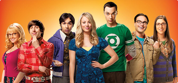
The Big Bang Theory Expands

SPOILER WARNING: This post contains minor spoilers for CBS’ Big Bang Theory. If you’re not caught up on season 7, you might not want to read. Then again maybe you’re okay with it. It’s up to you. What I’m saying here is you’ve been warned!


One of my all-time favorite TV shows, The Big Bang Theory, has been picked up for not just one, but three additional seasons. Yesterday CBS announced the multi-season deal to the delight of geeks everywhere. It’s really not surprising considering “Big Bang” has been ranked as the No. 1 sitcom since the 2010-11 season, and continues to hold the top spot in key demographics for the second straight year. Drawing that many key viewers each week is a huge deal for Big Bang and I wish the show continued success, although I do have some reservations.

Writing a weekly sitcom is a massive challenge but none more so than keeping the plot lines fresh and interesting. Ten seasons is a *ton* of stories to tell and even though the cast expanded to seven actors a few years back, there’s only so many character dynamics they can introduce. This year’s stories between Penny and Leonard have sometimes seemed forced and even mean-spirited. Leonard’s wavering support of Penny’s career in The Hesitation Ramification really didn’t bode well for their relationship and was rough to watch. Then we have Sheldon and Amy. Their relationship has moved forward a great deal this season including their very first kiss in The Locomotion Manipulation, but if the show is to survive they need to grow even further. The trick for the writers is not to jump the Shamy shark too soon. We’re all waiting for the episode where Amy and Sheldon finally have “coitus” as Sheldon would say, but once it happens where do they go from there? Will the so-called “Big Bang” be anti-climatic once it finally happens? And what about Howard and Bernadette? Their stories seem to have been put on the back burner lately, hopefully with 3 new seasons we’ll see more of them and maybe even a glimpse at Howard’s mom. And don’t get me started on Raj, that poor boy.

As a fan I’m delighted that my favorite comedy will be around for years to come. I especially enjoy this year’s guest stars like Bill Nye and Bob Newhart, I hope we see more of them. If anyone can continue to give us stories that make us laugh, squee with geeky delight and tear up week after week, it’s the Big Bang team. I know a lot of people don’t like the show and it’s over-the-top style, studio audience howling and nerd-centric jokes. But for those of us who tune in each week, The Big Bang Theory brightens our day, eases our stress and let’s us see a little bit of our geeky selves in the lives of Dr. Sheldon Cooper and Lenoard Hofstadter. It’s like a comforting, warm beverage served up by a close, funny friend and who doesn’t like that?

The Bezel’s the Thing

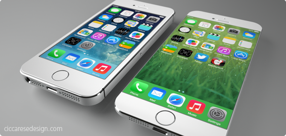
It doesn’t take tea leaves or even a leaked report from the Wall St. Journal to figure out Apple will probably release a new model of iPhone with a larger screen later this year. Users have been begging for more screen real estate, especially with the increased attention of larger-screened devices like the Samsung Galaxy. Also, Apple typically does full product revisions on a 2-year cycle which just happens to hit for the iPhone this fall. All of these factors may create the “perfect iStorm” that users have been patiently waiting for. From a personal standpoint, I would love an iPhone with something around a 4.75″ screen because the older I get, the more I seem to squint and miss-tap at the tiny interface elements of my iPhone 5c.

The report from the Journal seems to hint at two new sizes of iPhones, one somewhere around 4.75″ and another, larger device possibly measuring 5.5″ diagonally. I freely admit that speculating about the screen sizes of these non-existant devices is mostly wishful thinking, but that’s part of the fun. What would your ultimate iPhone look like? What size screen would it sport and more importantly, what’s the new form factor going to be like? For all the talk about screen size, I think the more important aspect of the next iPhone will be the design of the bezel. The bezel is the border around the screen that offsets the display from the edge of the device. Recent rumors suggest that the new iPhone 6 will have little or no bezel between the screen and the left and right edge. If true, this is a far more exciting development, at least for me, than just upping the screen size.

It’s no secret that the industrial design team at Apple has long sought to create a display that’s essentially a continuous piece of solid glass, edge to edge when held in the hand. Such a design would result in a screen that seems to end where your hand begins. Now with advances in Sapphire glass technology and with 7 years of experience under Apple’s belt, the dream of a nearly invisible bezel may soon become a reality. Removing the bezel won’t be a slam dunk however, as there are most certainly software considerations that need to be worked out. Accidental taps and swipes at the edge of the screen would probably increase without some kind of UI “neutral zone” at the perimeter of the display. Designing protective cases that don’t interfere with touching or swiping would also be a challenge, but hardly impossible.

If the rumors are true and the iPhone 6 will have a bezel of around 1mm, it will certainly make for a stunning, refreshed visual appearance at a time when the iPhone seems stagnant. Apple’s supporters note the company is selling record numbers of iPhones even though the form factor hasn’t changed for several years and that is true. It is also true however that users have been hungry for larger devices as well as ones that look and feel different from the existing models to help set them apart from their peers. From the stunning introduction of the retina display to the increased security and cool factor of Touch ID, Apple fans love owning the new hotness. Come this fall, I’m willing to bet a big part of the “heat” won’t be what Apple has added, but rather what they’ve removed – the bezel.

The Worf of Starfleet

I love this fan trailer for The Worf of Starfleet for a couple reasons. First, it’s just well made. It makes Worf from Star Trek: The Next Generation look totally bad-ass. Second, it highlights how badly Next Generation wants to be shown in widescreen. Seeing the TV show formatted like this makes it 1000x more epic. It’s a shame the new blu ray discs of Next Generation are still formatted 4:3 for the small screen, but that’s not their fault. Next generation really was before its time. In the meantime, you can never have enough honor. Enjoy!

(hat tip @davidcaolo for the link)

1 Comment

The Cosmic Voyage Begins

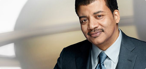
I first wrote about the upcoming reboot of Carl Sagan’s landmark PBS series, Cosmos, back in July of 2013. To say I’ve been waiting patiently is an understatement. The new series is set to air this Sunday night, March 9th at 9pm and is hosted by noted astronomer Neil DeGrasse Tyson. The trailers we’ve seen over the last few months look impressive and both Fox and the show’s producers have been in full PR mode on Twitter and social media promoting the series premiere.

When the series first aired back in 1980 I was enthralled by its scope and soaked up every bit of spacey goodness in the 13 part series. Like the original, the new Cosmos series promises to take us both to the far reaches of the universe as well as examine the human condition right here on Earth. We’ll examine how life on our planet started, where we’re headed and beyond. As I’ve learned about this new series I’ve gained a new respect for producer, Seth McFarlane who was also a huge fan of the original series and wanted to help bring its message of discovery to a whole new generation. The fact that he and Ann Druyan, Sagan’s widow, were able to convince Fox to broadcast Cosmos during prime time is nothing less than a minor miracle. I sincerely hope fans everywhere tune and and prove to Fox their faith in an educational series in the meat of their line-up was not misplaced.

Tyson and McFarlane have said that the series contains a bounty of new information about our universe so this won’t simply be a re-telling of Carl’s original journey. The series will draw inspiration from his teachings but the state of human knowledge has advanced considerably in the last 30 years so there should be plenty of new ground to explore. I also hope that the show’s creators take their time and explain complex concepts in ways that average people can understand. One of the best parts of the original Cosmos were segments when Sagan would simply sit and tell a historic story or explain the origins of complex theories like evolution or the formulation of the Drake Equation. I’m really hoping the new Cosmos isn’t edited like a music video, going from cut to cut trying to keep kids from losing interest in the face of all that science.

As a fan I’m glad our wait is finally over and the journey is about to begin. Tyson and company have some huge shoes to fill but something tells me they’ll do just fine. If you’re a fan of science, NASA, the human condition or you are looking for a great way to spend some time with your kids, tune into Cosmos: A Spacetime Odyssey this Sunday night on Fox. Then be sure to leave a comment here and let me know how you liked it.

UPDATE: You can now buy the soundtrack to Cosmos: A Spacetime Odyssey by Alan Silvestri on iTunes. Cool!

1 Comment

Percussive Maintenance

Anyone who can find commonality between Deep Space Nine, Hogan’s Heroes, Back to the Future and Happy Days is okay in my book. I love TV and movie supercuts and this is one of the most clever I’ve seen. Take all those times when characters fix broken equipment with a good whack and what you get is percussive perfection. Enjoy!

(via Collossal)

7 Comments

iObservations

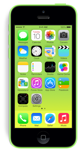
This week I finally upgraded to a brand new iPhone 5c after almost 2 full years of use on my trusty iPhone 4s. I’ve now spent a couple days with the new device running iOS 7 and wanted to share some random observations (both good and bad) for what they’re worth. As with anything, your milage may vary.

The Good

AT&T LTE – I mean just look at it!

Siri’s new voice – It’s so much better than before. Feels very Star Trek.

New ring and alert tones – There’s been some fun made of these but overall I really like them. The majority have a light, fun feel that seems to fit perfectly with the new iOS 7. My ringtone is currently set to Sencha and my alert tone is Chord. Groovy!

OS 7’s folders – Worlds better than the one in use in iOS 5 & 6 the new folders are clean, easy to manage & hold more apps.

Background refreshing – We implemented it in Twitterrific and I can already tell it will be one of my favorite features of the new OS. Having content ready for you when you wake the device is killer. Jury’s still out on how it will affect battery life however.

The feel – The feel of the 5c in the hand is just as I imagined it would be. It has the smooth, comfy feel of the 3gs without the extra bezels. It feels rock solid in your hand, not like you’d expect from a plastic phone.

Use of color – Much has been made of the, let’s just say “bold” use of color in iOS 7, some good, but mostly bad. Personally I love it. I love the way your wallpaper setting for instance changes how interfaces like the dialer screen looks. Make an overall change here and the whole user experience feels fresh. Bravo Apple.

Command Center – Being able to turn off blue tooth at will as well as quick access to a flashlight (don’t laugh, it’s useful!) is just great. I can’t wait until I have a use for sharing a file via AirDrop.

Multi-image emails – The ease of use selecting multiple images from your camera roll to attach to a single email is simply fabulous.

The Not-So-Good

Missing share buttons – Apple removed the ability to tweet and post to Facebook right from Notification Center for some reason. I’m not sure why, but this was a great way to quickly get a tweet out without any fuss. You can still do it via Siri, but it’s too prone to errors. Hopefully these controls will be coming back.

Multiple chargers – I like the new smaller, 10 pin charger but my iPad 3 still uses the old 30-pin version. This means I have to keep two different kinds of cords around my home to charge my devices. This stinks. Speaking of charging…

RIP iHome Clock – It will no longer work with my new iPhone 5c’s 10-pin charger port. This makes me very very sad.

RIP Olloclip – Designed for my iPhone 4, my Olloclip is now a useless hunk of metal and glass sitting on my desk. Again, sad.

The feel – Yes, I love the feel of the new 5c, but even though it feels super awesome, it’s also super slippery in the hand. As my wife said, it feels like it’s “coated in butter”. I immediately went out and bought an ugly Apple case for it simply because I just knew I’d eventually drop it. I hate to cover the wonderful plastic up but i’m scared it will slip right out of my hand. I sat it on the arm of my couch and watched it sloooowly slide right off into my lap. It’s crazy smooth.

Ugly icons – I realize I’m being a kind of icon snob here, but I just can’t warm up to the horrible Settings and Safari icons. The fact that they are two of the most important destinations on my iPhone means I have to look at them all the time and I just cringe when I do. Really hope the designers at Apple re-visit these at some point.

Overall I’m extremely happy with with my iPhone upgrade. There’s no doubt that it was time to replace my 4s. The only real choice was if I wanted to move to a 5s or a 5c. I’m extremely happy with how the new phone feels in my hands. The plastic case is top notch and doesn’t have the kinds of beveled edges that made my 4s hard to pick up and hold. Will I miss the finger print scanner, better camera and 64-bit processor of the 5s? Probably, but I’m betting a year from now we’ll see a new model that will have all of these things plus a larger screen and maybe the awesome case of the 5c. If you currently own an iPhone 5, then the 5c may not be the way to go, but if you’re like me coming from the previous model, you just might consider taking the colorful path to plastic town.
4 Comments

Why I’m Buying an iPhone 5c

I’ve owned an iPhone 4s for almost 2 years now and had been patiently awaiting the successor to the iPhone 5 until this week. When the 5 was first introduced, I was off-cycle for a discounted upgrade from AT&T and when I finally was eligible I thought I might as well just wait and see. I was hoping the increasing popularity of larger-screened smartphones would encourage Apple to release at least an iPhone with a 4.6″ screen in their next rev, but as I tweeted this past week, it seems Tim Cook’s pigs have yet to fly.

Now I have a choice to make. I can go with the fancy new iPhone 5s, complete with 64-bit hardware, a greatly improved camera and a cool fingerprint scanner, or I can “settle” for a 5 wrapped in a lickable, candy-coated plastic shell, the iPhone 5c. The gadget freak in me says to go with the snazzy 5s. After all, its increased speed would hold up better over the next 1.5-2 years and the pictures I took would no doubt be greatly improved from those I snap now. The 5s is more expensive, but that wasn’t the deciding factor, at least not for me.

I’ve chosen to go with the iPhone 5c for a couple reasons, but mainly because of comfort. For my money, the most comfortable smartphone to hold and use was the iPhone 3GS. Its slightly rounded back, smooth plastic construction and tight edges made it a joy to hold and use. When the iPhone 4 was introduced, I really didn’t like the device’s form factor. The metal band creates sharp edges that fatigue the fingers and collect dirt. In addition, to me the device is *too* thin to hold safely without a case. The new iPhone 5c’s smooth curves, and seamless sides call out to the scifi geek in me and the colors, oh the colors! It’s much more streamlined, minimal in appearance and seems easier to pick up off the table. I must admit however, if I could have the 5s’ guts inside the smooth, plastic shell of the 5c, I’d opt for that in a plastic heartbeat.

I know that no matter which model I pick, either will be a great upgrade from my 4s. Although it’s served me well these last two years, I’m more than ready for the increased screen size, faster processor power and increased battery life of a new iPhone. With any luck, around this time next year Apple will be introducing a 4.6″ iPhone that will sport an all new form-factor as well as all the neat-o gadgets that are sure to make the iPhone 5s a huge success. In the meantime, unlike Kermit, it’s easy being green.

PS – iOS 7 is awesome, you’re gonna love it!

1 Comment

Top Ten Things You Want This List To Be

I’ve decided to pull an IO9 and have my readers blog for me. What does that mean? It means some popular blogs like the sci-fi blog, IO9 have a lazy habit of writing non-posts. That is to say they pose a question and have their readers flush out the content in the comments section. This week’s example asks “What’s the most pointless rivalry in all of fandom?”. So my question to you, gentle readers is what list of top ten things would you like to see this blog post be about? Be sure to leave your ideas in the comments along with links, so I don’t have to bother thinking of these things myself. KTHXBAI!

UPDATE: Two in one week! Way to go, Charlie!

UPDATE II: This week Charlie Anders at IO9 asks her readers to write her blog post about the most epic friendship in science fiction. Keep it up, Charlie!

1 Comment

Doctor Meh

The Eleven Doctors

Today Doctor Who fans around the world learned that 55-year-old Peter Capaldi has been cast as the 12th incarnation of everyone’s favorite Time Lord. While the choice of Capaldi will no doubt prove to be serviceable, I can’t help thinking that Steven Moffat, Doctor Who’s lead writer and executive producer, blew a huge opportunity to take the show in fresh directions and gain scores of new viewers in the process.

One of the greatest character strengths the Doctor possesses is the ability to regenerate. When the Doctor dies, he is reborn and played by a new actor, sometimes for an entire generation of fans. Yet, in the entire illustrious 50-year history of the BBC show, the part has yet to be played by anyone other than a white male. The actors who play the Doctor have varied in age and style and each brought their own wonderful interpretation of the Doctor to the small screen, but the general dynamic is always the same. The Doctor is always male, and although his companions sometime vary, the are typically young, pretty females.

Imagine the storytelling possibilities that would present themselves if the Doctor regenerated as a woman. Thanks to the spirited portrayal of River Song by actress Alex Kingston, we have a hint at just what such casting could be like. Much like the Doctor, River was a strong-willed, cocky scientist who was always in the thick of trouble. But River is not the Doctor and a true portrayal of that ancient Time Lord by a woman would instantly add interest, drama and a breath of fresh air to the series. Moffat could have broken with tradition and cast a woman as the Doctor or gone even further and cast a new, male companion for her as well. Suddenly all the old stories would be turned on their head, new character interactions could be explored and we might even have a reversal of sexual tension in the TARDIS.

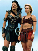
Even if Moffat chose not to explore those themes or kept a female companion for the Doctor, how much more interesting would a female / female dynamic be when chasing down Daleks and saving the universe (yet again)? I always loved the interplay between female leads on shows like Xena: Warrior Princess and Buffy the Vampire Slayer and I think it could work wonderfully on Doctor Who. It would also give girls the world over a new female role model that they could look up to and be inspired by.

The forward-looking nature of science fiction shows like Doctor Who, demand characters and stories that make us stop and think. Star Trek portrayed its first black Captain twenty years ago in 1993 when Avery Brooks played DS9’s Captain Sisko and just two years later Voyager cast Kate Mulgrew as Captain Kathryn Janeway. Sooner or later the character of the Doctor will be played by a woman. When that day comes I’ll stand up and cheer loudly for a show I’ve loved since childhood. With the news of Capaldi’s casting I’m buckling down for more of the same kinds of stories we’ve seen for the last 50 years, and that’s a shame. Today I wish I was shouting “Geronimo!” instead of merely muttering “Meh.”

COSMOS Is Coming

I’ve been a fan of the late Carl Sagan’s groundbreaking PBS TV series, Cosmos: A Personal Voyage, ever since it first aired in 1980. When the news came last year that FOX was teaming up with National Geographic, executive producers Seth MacFarlane, Ann Druyan, Sagan’s widow and Neil deGrasse Tyson to remake the series in 2014, I was over the moon. Now we have an official trailer that debuted at San Diego Comic-Con and it’s positively astounding. From the trailer we can see Neil will re-introduce viewers to the Spaceship of the Imagination, the cosmic calendar and other scientific concepts that made the original both fun and educational. Because the series will air in prime time, FOX is giving Cosmos: A Space-Time Odyssey an amped up, epic treatment that’s sure to lure new viewers both young and old. As far as I’m concerned, 2014 can’t get here fast enough!

25 Comments

Watershed Moment

Ever since Apple announced iOS 7 at WWDC, developers have been coming to grips with what the new operating system will mean for them. There’s little doubt iOS 7 represents a huge opportunity for developers to get their updated products in front of massive numbers of new users almost overnight. But there’s another opportunity here for developers, one that’s been largely ignored up until now – paid upgrades. To be more precise, all new, iOS 7 paid versions of existing applications.

I’m sure many users are expecting developers of popular applications to simply update interface elements, compile some code and easily drop a brand spanking new version of their app onto the App Store for free. There’s little doubt that the majority of iOS 7 updates to existing apps will be free (which will please Apple), but I suspect there will be a surprising number of developers who will use the launch of the new operating system to completely re-boot their app, and why not? The visual and interactive paradigms iOS 7 mark a natural breaking off point and a perfect opportunity to re-coup costs. Some existing paid apps might even adopt an iOS 7 only strategy which means they’ll have no choice but to charge again.

As any developer knows, software doesn’t magically grow on trees. Significant reworks of existing apps can represent hundreds of hours of development time and depending on the complexity of the apps in question, require much more than simply updating graphics. Taking full advantage of new APIs, designing new interactions and more can represent a healthy investment, time is money after all. At what point in the update process does a developer decide she needs to charge for it? How many users will be alienated by charging again? Will these users be offset by the *huge* influx of new people Apple brings to the table with the launch of the new OS?

Perhaps a better way to answer the question might be, how willing would you be to re-purchase your favorite apps if they are optimized for iOS 7? Look at your device’s home screen and go down the list of apps you use most and ask yourself if you could live without it once you upgrade. I think that most users (at least those that matter to developers) would answer that they would gladly pay again if it means having the latest and greatest version of their favorite apps, at least I would hope so.

With the full-priced launch of Logic Pro X, it’s now pretty clear Apple won’t be implementing a paid upgrade mechanism in the App Store. Developers are forced into either giving free upgrades for life, nickel-and-diming users with in-app purchases or occasionally launching new, paid versions of their apps. At the Iconfactory, we typically offer new paid version of our apps (xScope, Twitterrific) about every 18 months with many free upgrades in between. Though there are always users who will complain about having to pay for all-new versions, the vast majority know that in order for an app to survive and flourish, they occasionally have to do their part and support its development. Hopefully the upcoming wave of apps updated for iOS 7, both free and paid, will help people fall in love with their apps all over again.

UPDATE: Just when you thought there was hope, a new report out indicates that the average price of apps in the App Store is now at an all-time low of just $0.19. Consumers continue to expect world-class software experiences in exchange for basically nothing. The author says that the freemium model may be a “wiser business move” in the long run but I disagree. It is much harder to recoup the cost of development if you have to postpone revenue much beyond launch of your product, especially if you cannot even guarantee success. If the trend continues, I don’t see how developers can make a living on the App Store.

Massive LEGO Eva Unit-01 FTW

LEGO Master Builder Moko has been painstakingly working on a near 4ft tall LEGO replica of Evangelion’s Eva Unit-1 for the last 3 years. The artist finally unveiled the creation this week and the results are simply stunning. Fully articulated and containing no painted or modified bricks, the model weighs in at over 20lbs and perfectly captures the look of the Evas. Moko’s Flickr stream is full of awesome behind-the-scenes construction photos that detail just how much work actually went into this incredible creation. The scale shot of the artist standing next to Unit-01 is amazing. Check them out.

The User Interfaces of Oblivion

As an UI designer, I love seeing what artists come up with for fictional user interfaces. I’ve admired the work talented folks like Jayse Hansen has done for films like Iron Man and the Avengers for some time and secretly longed to do this kind of work. The latest work from Joseph Kosinski and Crater Lake Productions for the film Oblivion is pure magic. The level of detail, both animated and static, is staggering. I hadn’t intended to see Oblivion in the theater, but after seeing this wonderful work I just might. If you want to learn more, head over to GMUNK and check out their process.