A Sticker By Any Other Name Would Smell As Sweet

Sweet Stickypoo Sticker

So imagine that thing you’ve built your entire professional career on, something you love to create with a burning passion, slowly fades from popularity. Day by day people have less and less use for it, fewer and fewer people write you to make requests. You try to stay the course and keep doing your thing, but doubts inevitably creep in.

Then one day you find you’re just not doing it any more. You’re not really sure what happened but somewhere along the way it just… stopped. It pains you that people no longer love or even really need the thing you’ve honed your craft on for close to twenty years, but what can be done?

You go about your business, applying what you’ve learned to other areas of your discipline. Occasionally a project invites you to play in the fields you once roamed with glee, but they seem few and far between.

Then one day something comes along that turns the old thing you loved to do into something new and exciting. It presents that thing in a whole new, modern way and lets you express your creativity as never before to an entirely new audience. These people are too young to really remember you or where you’ve come from but that doesn’t matter. All that matters is that you’re standing in the middle of those lush, green fields once again and the sky is literally the limit. It may not last a year, a few months or even a week but for now, for right now, it’s just as fun, just as compelling and fulfilling as it ever was and it is glorious.

Those “things” are simply icons. Desktop icons, specifically.

They are what, since yesterday, we now call stickers in Messages but they’ll always be icons to me. Their introduction in iOS 10 represents a new era for icon artists like myself who once toiled for endless hours to create piles and piles of icons that people could download and use on their computer desktops. We created them because it was fun for us as artists and especially fun for those who collected them.

The advent of the iPhone and mobile era changed all that and desktop icons went out of fashion. People were glued to their tiny screens and didn’t have the time or attention span to customize their desktop folders and hard drives any longer. With the advent of iOS 10 however, people once again have a way to collect and share those tiny, iconic works of art in the form of iMessage stickers. Stickers, perhaps even more than emoji have the capacity to inspire and delight people as never before and I have completely enjoyed creating them during these precious weeks leading up to yesterday’s launch. I’ve been working with my friends at the Iconfactory to bring hundreds of icons stickers to life and it has been a blast. I’ve worked with outside artists as well and watching them create has been joyous.

Stickers may turn out to be another flash in the digital pan and fade quickly into the sunset but that hardly matters. Even if they do, for one brief moment, they allowed me to re-energize, create and dream what might be possible. In short, they have inspired me. As an artist I can truly say this matters more to me than all the tea in China. Thank you, Apple. I owe you one.

1 Comment

The Art of Doing ‘Nothing’


“When you do things right, people won’t be sure you’ve done anything at all.” This line from Futurama perfectly sums up how I often feel about my job. Designing, if done right, takes the challenge of communicating a complex idea effectively, and turns it into something that can be easily understood by the masses. When designers do their job right, the overall design fades into the background and you just “get” what you’re looking at. It speaks to you on a fundamental level, things just click and you usually see big smiles on the faces of those who interact with your work.

Through the years, I’ve learned the job of the programmer is much the same. Although my programming abilities are limited to rough forms of HTML and BASIC (yes, BASIC), through my position at the Iconfactory, I’ve learned much about what goes into making a successful software application. I see the challenges that our programmers tackle every single day and I for one am always impressed. This is particularly true of our latest effort, the retina compatible version of xScope for Mac OS X.

When Apple’s stunning new display was announced, I was excited about the increased level of detail and clarity the technology would bring to the desktop. The images are gorgeous, text is as crisp as the printed words and colors are deep and rich. Designing for this display means tools that can work correctly with it, giving you accurate and flawless information from which you can build your designs. From the get-go we knew that xScope, our utility for measuring and inspecting the screen, had to be updated for this new display. What we didn’t realize when we began was just how complicated that update would be.

I’m going to be completely honest here and say that even today, after several months, I still can’t get my head fully around the concept of pixels vs window points. Oh, I know what they are and why they exist, but from the time I first learned how to use a mouse, I’ve always dealt with pixels as the unit of measure on the screen. My entire professional career has revolved around the humble pixel and as such it’s been difficult coming to grips with the fact that the days of seeing exactly what you get on screen are pretty much over.

But all of this pales in comparison to the work that my friend, our lead engineer Craig Hockenberry, had to do in order to get xScope working properly with the new retina display. Whenever Craig starts waxing programatic about his coding, my eyes usually glaze over. That said, there were times during the xScope retina conversion when I thought I was going to go catatonic. If you’re the type of person who loves coding, or maybe needs something to read to send them off to sleep at night, head on over to Furbo.org and read Craig’s technical post on the problems with coding for retina. Suffice to say it’s beyond me. Also beyond me – all the math, logic and problem solving needed to surmount this incredible challenge. I have tons of respect for anyone who finds mathematics fun and exciting, and even more for friends like Craig who wield it like a weapon in the service of their job.

When designers and developers use xScope on a shiny new retina Macbook, all they’ll know, indeed all they’ll care about is that the app works as advertised. xScope will give them the data they need to make their apps and designs the best they can be and that is all that matters. Because of the efforts of Craig and Corey Marion, xScope’s lead UI designer, the app just “works” and it works well. Users won’t know all the algebra and bug finding that went into creating it, but I thought it was appropriate to take just a moment and recognize the hard work that went into making it a reality. I sincerely hope you find the new version of xScope as powerful and useful as all of us have. But the best part is if we’ve done our jobs right, you won’t be sure we’ve done anything at all.

1 Comment

You’re Gonna Need a Bigger Screen

Well not necessarily a *bigger* screen, but you will need one that sports more pixels per inch. That is to say if the predictions about the iPad 3 are true then your current desktop setup is about to feel very inadequate when developing for Apple’s mobile operating system, iOS. How so? It turns out that the new iPad’s predicted native screen resolution of 2048×1536 is larger than will fit comfortably on any of Apple’s current desktop hardware. At the Iconfactory I use a dual-display setup of a 30″ Cinema display and a 27″ iMac. Even my 30″ doesn’t support enough pixels to view the iPad 3’s screen (particularly in portrait) and that’s a problem.

When designing or coding for the iPhone and iPad, it’s critical to be able to view your work at a 1:1 ratio. It’s best not to view a Photoshop mockup or Xcode simulator window by zooming out, or compressing the pixels to fit the screen. Doing so makes it difficult to tell when interface elements like buttons, tabs and fields properly align or are positioned correctly. I could go into a long explanation of how the math for all of this works out, but TUAW’s Richard Gaywood and App Cubby’s David Barnard have already done that in fine style. If you’re interested in the ins and outs of screen resolutions then head on over and check them out. For my part, I just want to know how long I’ll have to limp along designing for a screen resolution I cannot see 1:1 without having to scroll around. David suggests that Apple won’t be in any particular hurry to bump up the resolutions of their desktop offerings and I have to say I agree with him.

To Apple, the customer comes first not the developer, which is how it should be. Higher resolution displays will eventually be a great selling point for new desktop Macs (and will solve developers’ iPad 3 problems), but they will undoubtedly take time to bring to market. Recent discoveries in Mountain Lion bolster the theory Apple has been planning higher density displays for some time but that doesn’t mean Tim Cook will be announcing them on March 7th. So if you’re a developer like me, be prepared to feel a bit cramped for a while. How long is anybody’s guess but I wouldn’t hold my breath.

6 Comments

You Complete Me

It’s been almost seven months since the release of the Apple iPad and in that time I’ve gotten to know the device very well. I know what the iPad is good at and what it could do better, and I’ve come to embrace the fact that I love the darned thing. Lately, I was struck by just how much it has changed my daily routines and work flow. Before the iPad, after work I would come home and spend some time relaxing before dinner. This usually involved watching some TV or surfing the web on my Mac in my home office. After dinner I would invariably end up back in front of the computer surfing, answering email, playing online games or just generally putzing around.

Just this past week I suddenly came to the realization that I had not sat down in front of my iMac for nearly a week. Honestly, at first I thought this had to have been a mistake, I mean comon, a week? Sure enough, if not for an automated email bill payment reminder I received, I might have gone even longer. Incredibly, the iPad has allowed me to do nearly everything I used to use my desktop Mac for on a nightly basis. I surf, check email and especially tweet, all from the comfort of my living room via my iPad. The typical routine of gravitating to the home office has transformed into one of relaxing in front of the TV, iPad in hand, playing a friendly game of Carcassonne or watching an episode of Babylon 5 via Netflix until I usually fall asleep on the couch.

There are still some things still I prefer to do on my iMac such as online banking, instant messaging with friends (the AIM app on the iPad just doesn’t cut it) and of course doing actual work in Photoshop and Illustrator. But aside from these tasks, which seem to come few and far between, the iPad gets the job done with style. Its super-long battery life, combined with my favorite applications mean that I have the power to do what I enjoy in a mobile setting that doesn’t involve a keyboard or burning my lap. The iPad hasn’t replaced my need for a desktop computer just yet, but it has unchained me from my desk and given me reason to pause when I start to head into the home office. I think to myself “Is this something I could do on my iPad?” It’s no wonder PC netbook makers are scared. They should be, this is the future of personal computing.

3 Comments

iFavorite Things

Unless you’ve been living on the far side of the island for the past 3 months, you’ve probably heard of the iPad. You’ve probably already read more than your fair share of reviews of the device and what to expect from Steve’s latest magic marvel. Two of my favorite reviews so far are Jason Snell’s wonderfully complete write up as well as Sean Blanc’s take on the iPad. However, rather than pile on my own full review I thought I’d go with the “less is more” approach. Here, in no particular order, are my favorite and least favorite things about the iPad. You’re milage may vary.

Good – The screen. It’s sharp, lush and super crisp.

Bad – The smudges. This thing shows fingerprints like a poor man’s crime scene.

Good – Speed. Holy crap this thing is fast. Apps launch, Safari scrolls and zooms, home screens load all tremendously fast. If you own an iPad and yours isn’t blazingly fast, you’ve either jailbroken it or offended it in some way. This thing flies.

Bad – The weight. It weighs about .5 – .75 more lbs than I would like. It’s not a huge deal, but holding it in one hand will quickly give you a workout. This is undoubtedly the handiwork of the super-long battery life which helps me deal, but I hope iPad 2.0 weighs less.

Good – Did I mention the battery life? It’s like crazy nutty awesome. I sat with my iPad on last night for about an hour using Twitterrific and Safari and went from 100% to about 97% battery. The iPad is doing some crazy ass power management.

Good – iBooks. The application is beautiful, thoughtfully designed and a joy to use. Almost makes me want to read more. Almost.

Good – Blue tooth keyboard pairing. This to me, is the killer feature. Once paired with my Apple wireless bluetooth keyboard my iPad effortlessly became a mini Twitter station next to my iMac. The keyboard can wake the iPad from sleep without the need to unlock and the function keys even control the iPad’s brightness, volume and media controls (play, ff, pause, rewind).

Good – Apps. There are tons of great apps out there for the iPad. In no particular order, my favorite apps so far include Articles, Things, Epicurious, At Bat 2010, Deliveries, Instapaper and my favorite of course is Twitterrific.

Holding and using the iPad makes all the difference in the world. Pictures, even video doesn’t do the device justice. It feels natural to manipulate and beats the hell out of a laptop for casual surfing, tweeting and replying to email. In the game department, the iPad will give all other mobile gaming platforms a serious run for their money. Watching movies & TV shows is light years better than watching them on my iPhone.

Overall the iPad is yet another feather in Steve Jobs’ and Apple’s cap. Even if I didn’t develop apps for a living, I’d still buy one for myself because its just so darned fun and effortless to use. The iPad is certainly a game changer and if nothing else has proven that despite Microsoft’s failed efforts to the contrary, tablet computing can be successful. Check it out.

9 Comments

Mr. Jobs, Domino’s Calling!

I’ve recently discovered creating a successful iPhone application is a lot like baking a pizza. Take the best ingredients, like skillfully crafted code, bold and flavorful interface design and combine with a dash of love and you may end up with a delicious dinner. Unfortunately for App Store developers, once you’ve rolled the dough, spooned the sauce and added the toppings, the delivery process itself can often be frustrating.

Apple’s process of getting apps reviewed and posted to the App Store leaves much to be desired. Once submitted, we developers must sit back, cross our fingers and hope everything is in order so that the “pizza” makes it to your device in a timely fashion. One of the criticisms of the App Store in recent months is that it can take more than 2 weeks to have an app make it’s way through the review process, sometimes only to end in rejection. When this happens, the problem must be corrected, the app resubmitted and the developer goes to “the back of the line” and starts all over again.

Since most developers would rather have too much feedback rather than too little, one way to ease the pain of the review process would be to add more feedback. Developers love feedback, whether it comes in the form of bug reports, reviews, emails or simple sales figures. In the world of home pizza delivery, when it comes to awesome feedback, no one beats Domino’s.

When a customer orders a pizza from Domino’s online, they receive instant feedback on the status of their order via Domino’s über-cool pizza tracker. The tracker tells you where in the cycle of delivery your pie is, what time it started the last phase and who’s currently working on it. It may sound corny, but this is exactly the kind of feedback developers need when submitting software to the Apple App Store. Imagine a meter that outlines each part of the approval process with time and date annotations for each step. The App Tracker would be of enormous assistance to developers, ensuring proper completion of each part of the submission process. A developer could track their “pizza” as it made its way to the store and get a better sense of when to expect final delivery. It could also help Apple internally so they know what phase a particular application was last in if a problem arises.

Such a system would allow companies to better plan their product’s marketing efforts and direct their resources more efficiently. Not to mention reduce the level of stress associated with being left in the dark regarding your application’s approval. Apple recently implemented a small counter for developers to let them know what the average approval time for their applications are in iTunes Connect. This was a great first start, but I suspect that with a bit of love, and a few lessons from the folks at Domino’s, getting through the app store approval process could be as easy as pie.

8 Comments

Losing Control

Anyone who’s worked for themselves knows the satisfaction of being in control of your own destiny. The perception that by sheer force of will and hard work, you can be successful at what you do. Those who take on the challenge of owning their own business are often considered “control freaks” and more often than not, perfectionists. I never really realized just how much of a control freak I was until this past weekend when, completely without warning, I had none.

Last Friday, the Iconfactory’s popular Twitter client, Twitterrific, fell victim to the so-called Twitpocalypse bug, which caused the mobile version of our application to suddenly stop working. Thanks to the efforts of our talented engineer, Craig Hockenberry, a fix for both versions of the client was submitted to the App Store within a day. To Apple’s credit, the free version of the fix was approved swiftly and allowed the majority of our users to continue tweeting with minimal interruption. And although the Premium version of the application was also approved in record time, the displeasure from our user base, not surprisingly, came even quicker.

From the moment the bug hit, both Talos and I had begun monitoring tweets of users mentioning Twitterrific in their posts. What started as a trickle, soon turned into a deluge of upset and frustrated users. We began responding to individual tweets and Travis, our project manager, responded to support emails. The Iconfactory is a small company, we’re not Adobe or Google or even the Omni Group. All three of us did our best to let users know what was going on, and thanks to hundreds of RTs, word started to spread about the bug and our efforts to combat it. Unfortunately, Twitter is a very big community and it was impossible to personally respond to everyone. Even now, there are many people on Twitter who don’t know why their copy of Twitterrific isn’t functioning and there is very little I can do about it.

The best we could hope for was that the majority of users followed @twitterrific and would eventually receive news about the fixes. The troublesome part is that although I know the majority of users now have a working version, I still feel uneasy knowing there are potentially thousands that don’t even know about the fix. Part of this is due to the lack of communication channels, and part is due to the nature of the App Store approval process. As developers, we must turn control of our applications over to Apple to have our iPhone software published. This process can take days or weeks and until it runs its course, our hands are quite literally tied. By the time updates are published it may already be too late.

All of us at the Iconfactory count ourselves lucky that Apple recognized the seriousness of the bug we were facing and pushed through the Twitterrific updates as quickly as they did. We know we messed up and we thank the App Store team for helping to pick us back up off the floor. That being said, I didn’t sleep much in the days after the bug hit because there was a part of me that knew hundreds of tweets were flying by every hour from Twitterrific users I was powerless to help. As with most control freaks this usually means even more work, more testing and more diligence to guard against these kinds of catastrophic failures in the future. But that’s okay with me since I’m not anxious to give up this level of control, or sleep, ever again.

6 Comments

Things I Learned at Macworld

Unlike most of the people I follow on Twitter, Macworld 2009 was my first expo in many years, and the only one where I’ve been one of the exhibitors. The week was fun, exciting and a lot of work. Now that I’m back home in Greensboro, I thought I’d impart some of the knowledge I gained during my experience. In no particular order, here are a few of the many things I took away from my trip to Macworld 2009:

• Expo food is over-priced – Ya know how they charge like $4.00 for a bag of popcorn at the movies? Macworld is like that but a x1000 worse. A pathetic bologna sandwich and a bottle of water came to $12.50.

• Floris Natural Benefits Soap – The Intercontinental San Francisco had some of this product line in our room and I couldn’t get enough of it. I must try and track down the Jabon hand soap for use at home!

• Craig has groupies – I mean I knew people loved Craig, but I didn’t realize they would actually wait in line to talk to him. Every day on the show floor was filled with people waiting to chat with Mr. Hockenberry, they just couldn’t get enough of him. All of that attention made me realize just how proud I am to be able to work with him.

• Mel’s Diner has the best lemonade – I’ve drank a lot of lemonade in my time, but the lemonade I enjoyed at Mel’s during the expo was, without a doubt, the best I’ve ever had. In my life. The perfect blend of sweet and tart that should not be missed.

• Chairs are precious – Our kiosk at the show only had one chair. I was told that to rent another for the week it would have cost $200. After spending almost 7 hours on your feet $200 didn’t seem that bad. When some bastard stole our one chair on Friday morning, we almost had a freak out. Luckily Travis was able to procure another in short order.

• Rickshaw computer bags – New product. CEO and owner gave me a demo of the bag and had me sold at like the 5th feature. If you are in the market for what could be the best computer bag you’ll ever own, check them out.

• Basil Thai on Folsom – Of all the wonderful places we ate while at Macworld, this little restaurant on Folsom Street was the best. From the appetizers to the wonderful desert and everything in between, it was to die for. Ged gives Basil Thai 5 stars!

• Meeting people – By far the best part about Macworld was simply meeting everyone. Tweeting with people is great, but Macworld reminded me that face to face contact can’t be beat. I met so many awesome people at the expo I can hardly keep track of them all. I especially enjoyed meeting the TUAW crew including Mike Rose, Christina Warren and Nik Fletcher. Other notable Mac heads I met during my week in San Fran included: Arlo Rose, Dan Moren, Rick Yaeger, Chris Pirillo, Rich Seigel, Michael Simmons, Scott McNulty and Arne Fismen.

10 Comments

Goodbye Flip, Hello Zi6!

News this week across the Internets that Kodak is getting into the portable video space in a big way with their supposed “Flip killer”, the Zi6 Pocket Video Camera. The news of this device is exploding onto the scene, almost like the original Flip Ultra did back in Sept. of 2007. I’m very excited about Kodak’s Zi6, but first a bit of history.

For months I had heard the hype surrounding the incredibly easy to use Flip Ultra. On blogs, in tweets and reviews, people everywhere were professing their love for the gadget. The Flip seemed to do for video recording what the iPod did for music listening – make it super easy and fun. I resisted jumping on the band wagon for months until I finally went to the Flip homepage and saw a sales pitch that I couldn’t resist. A man held up an old high-8 camcorder and said “You probably have one of these in the closet, but you don’t use it anymore, right? You have to find tape, charge it, lug it around, and by the time you do, the moment is over. It’s just not fun.”

I felt like a tool. How did he know me so well? I hadn’t shot video of anything in years because pulling out the camcorder was such a chore. Even worse were the hours of footage sitting on tape that no one would ever see because it was too difficult to capture and edit. From that moment on, I was committed. I ordered a cute, orange Flip Ultra and instantly felt like I was “back in the game”. However, over the next two weeks I came to realize that much of the hype surrounding the Flip, was just that… hype.

First, the good points about the Flip Ultra:

• Ease of use – It really is just point and shoot. It’s so easy I think even my mom could use it which is great.

• Picture quality – I found the picture quality to be good enough for almost all of my needs. The exception is medium to low light.

• Importing – Getting video onto my computer is fast and easy. The flip-out USB port means no cords to lug around.

But for each of these good points there are several bad ones as well:

• Fixed focus – You can’t shoot closer than about 1.5 feet from the lens. Sucks for tight shots, close-ups & forget about macro.

• Small screen – Because the 1.5 inch screen is so small, it’s difficult to tell when things are in focus or how they’re framed.

• Body shape – The lens protrudes from the body of the device and risks getting scratched. Sadly this is true of the new Flip Mino too. It also means the camera can’t sit properly on a flat surface.

• Encoding format – The flip encodes in MPEG-4 ASP (.avi) which means that it’s not ideal for Mac users. Feh.

Along comes Kodak, a company that used to be near and dear to my heart, to make a version of the Flip that addresses all of these negatives. According to the product specifications, the Zi6 will cost about the same as the Flip Mino (assuming they don’t immediately drop the price), and give you much more bang for your buck. Just take a gander at just some of the ways the Zi6 bests the Flip:

• HD video – Where the Flip is confined to 640×480 VGA, the Zi6 shoots in stunning HD 720p at 60 frames per second.

• Big screen – The Zi6’s 2.4 in. LCD screen is almost a full inch bigger than the flip which should make framing shots super easy.

• Mac love – The Zi6 encodes its clips with H264 compression as .mov files, perfect for use in iMovie on the Mac.

• Expandability – The camera has an SD/SDHC card slot that can hold up to an additional 32GB of video.

and the biggie for me:

• Focal range – The Zi6 has a “Close-up” mode that allows a minimum focal range of just 2 inches. Perfect for macro video captures of small objects like insects, LEGOs, etc.

The Zi6 webpage says the camera will be available sometime in August. However, when I placed my pre-order for the device on Amazon.com, their product page says the gadget will be shipping on October 1st. I’m not sure who’s date to believe, but since I waited to get one so long in the first place, I think I can live a few more months for the awesome Zi6. In the meantime, anyone wanna buy slightly used Flip Ultra? Come on, it’s orange!

UPDATE: Andy Ihnatko has started his testing of the Zi6. So far he’s only posted a single frame from one of the captured videos, but the results are pretty impressive. Check it out.

4 Comments

My Home Away From Home

It always fascinates me to see what people’s workspaces are like. I love getting an inside look at how artists, programmers and designers organize their desktops and select the tools they need to do their job. Some workspaces border on zen-like art, while others take on an air of controlled chaos. Some of us work in our homes like my friends Wolfgang Ante or Craig Hockenberry. But most of us spend the majority of our weekdays at “the office”.

And so, I thought I would throw my hat into the ring and give you a small peek at my workspace. My desk at the Iconfactory in Greensboro is where I do much of the pixel-pushing, writing, designing and illustrating that helps keep the bills paid and clients happy. Each and every day, I’m fortunate to work in a creative atmosphere surrounded by talented and dedicated people. Like many of us these days, I’ve tried working at home for extended periods, but it just doesn’t suit me. I love the bustle of the Iconfactory and the creativity our “open plan” offers the group (except when more than 3 of us are on the phone at the same time). I hope you enjoy this small behind-the-scenes look where I spend my days. Head on over to Flickr to check it out. Enjoy!

1 Comment

Unlock Your Inner Spore

Unless you’ve been living under an online rock, then you probably know about Spore, the new game coming from Electronic Arts. Spore lets you play “god” and engineer living creatures and then release them into the wild, and eventually the stars. The game is due to be released in its entirety this fall, but Electronic Art recently published a small demo of the Creature Creator this past week.

There’s been tons of hype leading up to Spore’s release, and frankly I’ve become wary of getting my hopes up too high with so many people singing its praises. Mirroring my disappointing experience with “Iron Man” is not something I want to repeat, so I’ve been intentionally avoiding the Spore Kool-Aid. That is until tonight. Tonight I watched Mindy as she gave the Creature Creator demo a run through from start to finish, and if the full game is 1/4 as fun as the demo, EA has themselves a winner.

No doubt a large portion of the enjoyment of the demo comes from how easy it is to create something that feels “alive”. The demo lets you select body parts, adjust them, rotate them, scale them, and more to form your creature. You can then paint on colors and textures at will until you arrive at your final critter. The controls are intuitive, easy to manipulate and just plain fun. In many ways it reminds me of the old Kai’s Power Tools version of Bryce. KPT Bryce let you instantly get your “hands” dirty generating alien terrains, skys and oceans. It was immediate, tactile and absorbing. Spore’s Creature Creator demo is similar in many respects and for players with a flair for the creative, it has loads to offer.

Perhaps the only downside is that until the full game is released, players can’t fully judge their creatures or how they’ll fair in the virtual world. I suspect Spore’s universe will be a “dog eat dog” world, and so selecting frog hands for your varmint instead of claws might be a fatal choice come September. I’ll give EA the benefit of the doubt for the time being and hope old “Figmon” shown above, brings both his A-game and his looks. In the meantime, head on over and check out the Spore Creature Creator demo, I think you’ll be pleasantly surprised. After all, it isn’t every day you get to play god.

12 Comments

The Little Blue Bird That Could

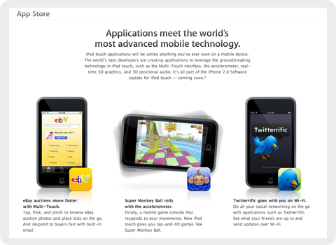
Today, at Apple’s World Wide Developer Conference in San Francisco, the computer maker unveiled its plans for the next generation of iPhones as well as a sneak peek into third party applications headed our way. Due to hit public airwaves July 11th, Apple’s new iPhone/iPod Touch “App Store” as it’s being called, will allow users to purchase third party mobile applications directly over the air. I speak for all of us at the Iconfactory when I say we were just as surprised and delighted as you probably were to find our very own application, Twitterrific, featured heavily on Apple’s website.

It seems after flying high and far, sometimes to shady destinations, the little blue bird has finally gone legit. I don’t think any of us at the factory realized just how popular Twitter, and in turn Twitterrific would become in this past year. We’ve been making various software applications for a decade now, and in all that time, none of us would have expected such an unassuming little app to become our most well recognized piece of code. Twitterrific’s success speaks volumes about the fine work of the folks over at Twitter, and the hunger for today’s users to stay in touch with friends, relatives and co-workers via new media like social networks.

We’re very pleased the Mac community took to Twitterrific so well and helped make it the success it is today. We’re looking forward to bringing the application to a whole new generation of users for the iPhone and iPod Touch, and would like to extend our thanks to Apple for giving the blue bird such a fine new home. We feel both excited and privileged to be a part of the new App Store and are committed to bringing our users the best software we can offer. We look forward to these first steps on what is sure to be, a fun journey for both users and developers alike.

5 Comments

Greensboro Gets a Slice of Apple

While we patiently wait for the new Apple Store to open at the Shops At Friendly Center here in Greensboro, a small bit of placation has appeared in the meantime. Yesterday when I walked into the Best Buy off of Stanely Road, low and behold part of the formerly all Windows PC section had been ripped out and replaced with an ultra-mini Apple Store. Right where Toshiba laptops, Dell desktops and other Microsoft loving hardware had stood was the familiar spartan trappings of Steve Jobs’ retail store. It was like the Borg had sliced out a 15×20 foot section of the Southpoint Apple Store in Raleigh, and transplanted it directly into the middle of Best Buy, carpeting and all.

While a surreal experience, it was great to finally see someplace in Greensboro where Apple products can be purchased. Since we lost our local CompUSA back in December, if you wanted to pick up a new MacBook or iMac, you had to make the trek to Raleigh or Charlotte. The inclusion of Apple goods in Best Buy is an impressive about face for two companies that have not always been on the best of terms. I think mini-stores like this one in Greensboro are a testament to Apple’s growing popularity and the strength of the brand. No matter what caused it, I’m just glad to see a tiny bit of Apple in Greensboro once again. Maybe now I can stop driving over to Friendly once a week to check on any signs of life. Nah!