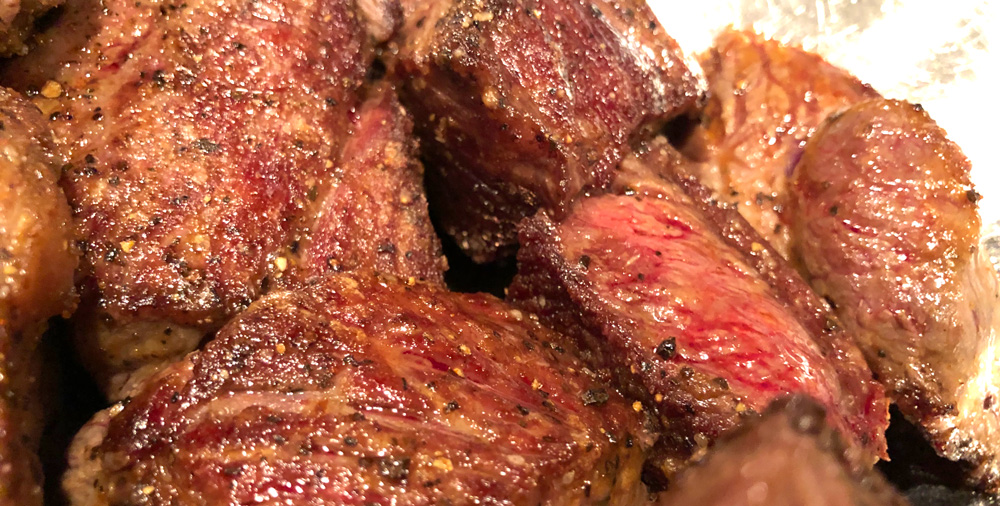
Bacon-Wrapped Jalapeño Poppers

Summer is great for grilling! There are a few recipes I return to again and again and these bacon-wrapped jalapeño poppers are one of my favorites. They’re easy, delicious and a great starter at dinner time.

If you give them a go please leave a comment on my YouTube video and let me know how they turned out. Enjoy!

•••

HARDWARE:

• Large bowl, spatula + tongs
• Grilling pan / tray
• Water squirt bottle (for grill flare-ups)

INGREDIENTS:

  • 5 large jalapeño peppers
  • 5 strips of thick bacon (pepper bacon)
  • 1/2 cup cream cheese
  • 1/4 cup grated sharp cheddar cheese
  • 1/4 cup parmesan Reggiano 
  • 1/4 tsp cumim
  • 1/2 tsp smoked paprika
  • 1 tsp granulated garlic
  • 1 tsp granulated onion
  • 1/2 tsp cayenne pepper
  • salt & pepper to taste

DIRECTIONS:

Set grill to medium-high heat.

In a large bowl, mix together the cream cheese, sharp cheddar, parmesan, cumin, paprika, garlic, onion and cayenne pepper. Add a few grounds of fresh black pepper to taste and set aside.

Cut the bacon length-wise to create 10 thin strips. These are easier for wrapping and will stay curled around the poppers on the grill.

Using a pairing knife, cut each jalapeño length-wise from tip to stem. Scoop out the ribs and seeds with a spoon. For extra heat you can dice the ribs and add it to the cream cheese mix. If you have sensitive skin, you may wish to wear food gloves for this step. If you don’t, just remember to wash your hands.

Add a heaping portion of the filling to each half of the peppers. Make sure all the peppers are filled evenly before wrapping with the bacon.

Wrap each pepper with a strip of bacon, starting at the stem end in a spiral. Make sure the twist it tight and press the bacon into the filling. Repeat until all the peppers are wrapped.

Place the peppers on your grill pan and grill for about 20-30 minutes being careful to watch for flareups. Keep a squirt bottle handy to extinguish flames and remember to move the poppers around so they cook evenly.

Serve immediately with the dip of your choice and enjoy!

Redesigning Iconfactory.com – Eighth Time’s a Charm!

Photo of an iPad Pro laying on a table displaying the new homepage of Iconfactory.com. A grid of colorful client icon work fills most of the screen.

If you had told me twenty five years ago that I’d be helping to launch no less than the eighth iteration of our beloved iconfactory.com, I never would have believed you, yet here we are.

I was just a kid back in 1996 when Talos, Corey and I launched the very first version of the factory. Back then it was hosted on AOL and was where we offered up pixel-clicked icons for the Mac desktop. The rest, as they say, is history.

Fast forward to 2023 and we found ourselves behind the eight ball, with an outdated website that didn’t put enough focus on what has kept us in business all these years – paying clients. Freeware icons, wallpapers and software has been our passion but providing top-flight design services for clients has been our bread and butter and it was time for a long-overdue update.

Screenshot of a software promotional graphic for The Iconfactory's flagship app - Triode. The design showcases 2 iPhones running Triode framed against a background of oranges and black.
Design detail view for Triode, one of the Iconfactory’s flagship apps.

The re-design of iconfactory.com took the better part of a year, working on and off as we balanced design and engineering resources among a half-dozen or so other projects. We started with the single premise of creating a website that showcases our award-winning design services and ran with it. Our goal was to communicate one thing: If you need stunning icon, app, or interface design, we can help.

We also intentionally stripped away any and all marketing speak to keep the language of the new site straightforward and easy to understand. Our amazing Project Manager, Cheryl Cicha deserves full credit – I’m particularly happy with this part as I detest agencies and their tendency to talk circles around clients as they attempt to justify their huge costs.

I took the lead designing both the overall layout as well as the client and app detail views which proved particularly challenging. Creating unique, engaging layouts for all of the portfolio entries, as well as our own flagship apps was difficult, but the result was personally rewarding. My hat’s off to Anthony and Craig for taking the final comps and implementing them so faithfully across both the desktop and responsive mobile versions.

Custom iconography by Anthony Piraino for the 2023 site redesign.

The new Iconfactory was long overdue but hopefully it will become a destination for those who need to bring their digital app ideas to life. Its new design is just the latest in a long line that has changed much over the years, but for the far better. I invite you to visit, explore, become inspired and if you have a need, to get in touch.

LCARS 2023 Star Trek Wallpapers

The third and final season of Star Trek: Picard reunites most of the original cast of the Next Generation and is currently airing on Paramount+. This seemed like the perfect time to once again my LCARS series of Star Trek wallpapers for the latest and greatest devices. If you are a Star Trek fan then you’re going to love this massive update.

LCARS 2023 includes over 48 individual wallpapers formatted for iPhone, iPad and macOS and offers tons of variants including the Starfleet insignia, star fields, a technical schematic of the USS Titan-A seen in Picard and more. Here are the details:

• Lock Screen iPhone variants for use with iOS widgets
• Home Screen variants for use on iPhone and iPad
• An ‘Red Alert’ theme exclusively for Patreon supporters
• Extra wide Mac Studio Display desktops variants for Patreon supporters

LCARS 2023 Star Trek Wallpapers are available via Wallaroo in the App Store or by subscribing to the Iconfactory’s Patreon account. Patreon gets you additional perks mentioned above plus lots of other goodies that we frequently offer there. I and the other designers at the factory work really hard to create quality content each month so I really hope you’ll check it out.

In the meantime I’m going to enjoy the final season of Star Trek: Picard and count the days until the return of Star Trek: Strange New Worlds which may have become my all-time favorite Star Trek series! It’s a great time to be a Star Trek fan, that’s for sure!

The Ragtag Titles of ‘A League of Their Own’

There’s a new television series streaming on Amazon Prime based on the 1992 comedy from director Penny Marshall ‘A League of Their Own’. The series is a re-telling, not a prequel or sequel and has its own brand of unique charm that fans of the film will appreciate.

There’s a lot to love in A League of Their Own including new a cast of diverse, realistic characters, a roster full of laughs, a spectacular big band soundtrack and some top-notch acting and visual effects. I really appreciate the visual style of the series with its period costumes, old fashion cars and 1940’s locations which all seem on point.

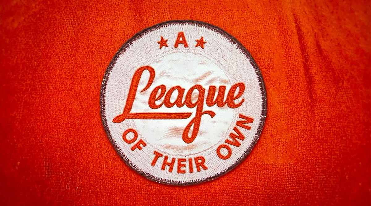
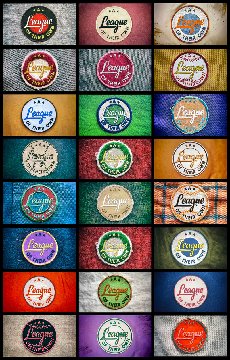
One of my favorite parts is the show’s opening credits. Lasting only three to five seconds, the title is displayed as a montage of homemade baseball patches in dozens (maybe hundreds?) of sewn styles. I went through and screen captured all of the patches from the opening of the first three episodes. To say they are amazing is an understatement.

Click for a closer view of some of the title sequence patches.

My mind boggles at the amount of work that went into these patches. Each looks to be hand-sewn (not CGI) with distinct color palettes, fabrics and thread patterns. I adore how much care went into making them look home grown and not machine-stitched perfect. They are absolutely charming and I look forward to seeing the rest of the patches at the start of each episode of season 1. I’d love to see a behind-the-scenes story of the production design explaining how they were created, how many total were fabricated, filmed and who designed them.

I’m really enjoying A League of Their Own on Prime. If you loved the original film but felt the characters lacked a bit of depth, or just want to chill out in some 1940’s nostalgia, you’ll most likely love the TV series. Check it out!

Roe’s Cruel Endgame

The news from Politico today that the Supreme Court stands to strike down Roe v Wade this June or July is outrageous, cruel and completely expected.

Legal scholars are already predicting if the right to privacy goes, which Row is based on, then same sex intimacy, interracial marriage, contraception and more will also be made illegal in Republican controlled states.

Of this I have no doubt.

The GOP will also make it a crime to cross state borders to have an abortion or to help anyone have an abortion. So if you’re thinking people can just travel and solve the problem, no, they won’t. If they do travel themselves, or act as accomplices to help others, they will face serious jail time. Texas is enacting such a law as we speak so don’t bother with the “That will never happen” excuses.

Many, many women will die due to this blatant destruction of 50 years of US legal precedent. The law this decision is based around also makes no exception for rape or incest. Fathom that for a moment. No recourse for women who’ve been raped, and even in some cases where the pregnancy could threaten the life of the mother. Others will be forced to carry an unviable fetus to term.

Just horrendously cruel. But that, as they say, is the point.

White Christian men want to return this country to the days when women were barefoot and pregnant, stayed home and raised their all-white, straight families. They’re about to make the women alive today have fewer rights than their mothers or grandmothers did.

It’s an abomination made possible by Trump, McConnel and Republican’s unceasing March towards control of the court. Plainly put, it’s why Merrick Garland was denied a hearing and Coney Barrett’s confirmation was rushed / crammed through at the very time people were already voting for President. It’s been the endgame all along. Getting rid of the filibuster also isn’t a solution until Manchin and Sinema are made irrelevant in the Senate with a greater Democratic majority so buckle up and get ready to get off the couch and march.

The only positive aspect here is this might possibly motivate progressives to vote and hold their slim majorities in Congress. If not, millions of American lives are fucked for generations to come. Even that is doubtful since the left spoke overwhelmingly in the last election and yet here we are. Between this and the GOP’s efforts to rig voting nation wide, faith in the vote is sinking rapidly.

I’m sure Republican Senator Susan Collins is “Very concerned.”

Own A Piece of Me Courtesy of Etsy

There’s a new shop on the block over on Etsy, Ged’s Art Depot. I’ve been thinking about selling some of my artwork online for years but kept putting it off month after month, year after year. No longer.

Like most artists, it takes time to build the confidence needed to put your creations out there for others to own. It’s quite possible I’ll sell only a handful of these prints of my work, but that really isn’t the point. The point is to keep pushing myself to create, to express myself and give me an incentive to keep producing the kinds of stuff I would personally like to own. Naturally my work centers around science fiction and popular culture because those are the things I personally love most, but I don’t intend to limit myself to those topics.

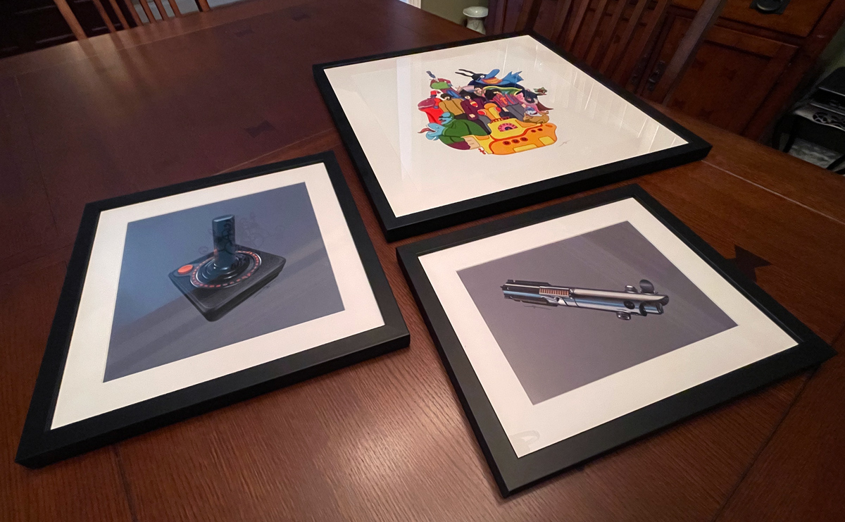
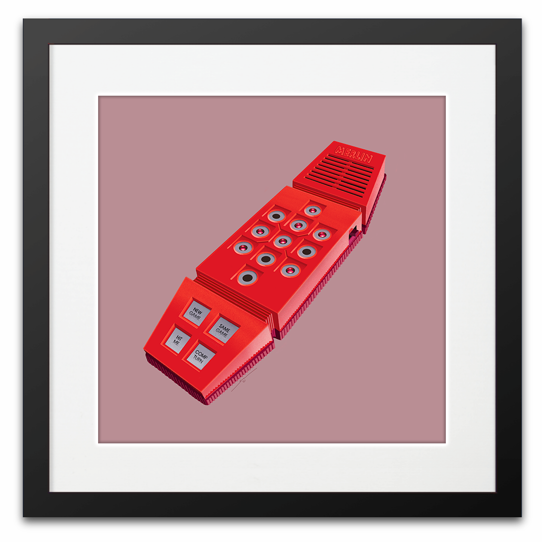
For now, I’m offering a small collection of hand-drawn pieces that I created on my iPad Pro with my Apple Pencil. Every one was lovingly crafted by me to capture some aspect of the subject, the play of light on unique materials, the exacting details of a fictional device or the feeling of nostalgia of a favorite toy from childhood.

I’m also trying to make these items as frictionless as possible. They arrive to you signed, framed and ready to be hung in your home or as a special gift for that geeky someone in your life. For now I can only ship to the United States but if things take off I may expand to include international shipping. One step at a time however.

Now through November 30th I’m offering a 10% discount to help celebrate the launch of my Etsy store. Click here to take advantage of the discount when ordering.

Warp on over and check out my listings. Hopefully you’ll find something there that sparks the kid in you. Perhaps a drawing that brings a smile to your face or evokes a special childhood memory.

I also want to offer a thank-you to everyone who’s supported my efforts over the years to get me to this point. I’m blessed with wonderful friends, some with cool Etsy shops of their own, talented peers and some of the best Twitter followers anyone could ever ask for. I appreciate all of your support more than you realize and can’t wait to see where all of this support takes me. Let’s do this.

One Perfect Shot: Star Trek’s ‘The Squire of Gothos’

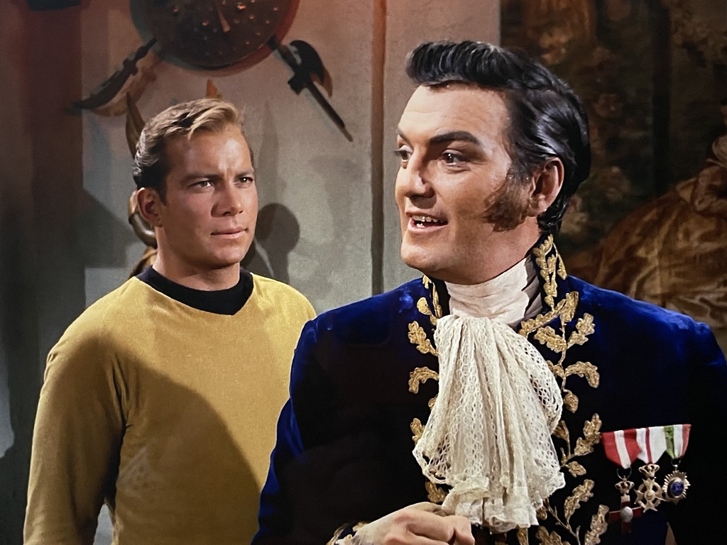
There are so many omnipotent aliens in Star Trek it’s hard even for a Trekker like myself to keep track of them all. One of the very first such super-beings Kirk and company encounter is Trelane of the planet Gothos. Trelane snatches Sulu and Captain Kirk from the bridge of the Enterprise to lure the crew to the planet and pick their brains about humanity’s barbaric nature. Trelane’s been observing Earth for some time but due to general relativity, he’s been spying on historical events some 900 years in the past.

Trelane is played with gleeful delight by actor William Campbell who would go on to play the Klingon Captain Koloth in the iconic original series episode ‘The Trouble With Tribbles’. Years later Campbell reprised his role as Koloth in Deep Space Nine’s second season episode ‘Blood Oath’, becoming one of the few actors to portray the same character on both the original series and on one of the spin-off series. According Memory Alpha, Campbell described his role on DS9’s ‘Blood Oath’ as his most difficult acting job, but one he would have liked to have had the chance to play again.

Watching Trelane prance around, tormenting the crew and ultimately even putting Captain Kirk on trial, one can’t help think of yet another mischievous being that tortured the crew of a different Starship Enterprise, namely Q.

Trelane might easily be mistaken for the younger cousin of Q, played brilliantly in Star Trek: The Next Generation by John Delancie. All the Q hallmarks are on display – limitless power, poor impulse control, even cosmic temper tantrums! Delancie even theorized in an interview that Gene Roddenberry drew inspiration from himself and Trelane when he created Q.

The apparent similarities between the characters draw to a close at the very end of the episode. Trelane has Kirk trapped and is about run our dear Captain through when we suddenly hear the voices his “parents” calling out to him. It turns out Trelane is just a mischievous boy who’s tortured his playthings a little too much and must be punished. Time to come in for dinner, Trelane! They apologize to Captain Kirk and send the Enterprise on its merry way.

Our one perfect shot comes as Kirk tries to size the alien up before him and decide just what he’s dealing with in the flamboyant ‘Squire of Gothos’.

Next up is one of my all-time favorite episodes of Star Trek, the iconic ‘Arena’ where Kirk fights for his life (and gets his tunic torn yet again) battling a walking, talking, hissing lizard.

Check out the entire series of perfect Star Trek shots to date.

Star Trek LCARS Wallpaper 2021

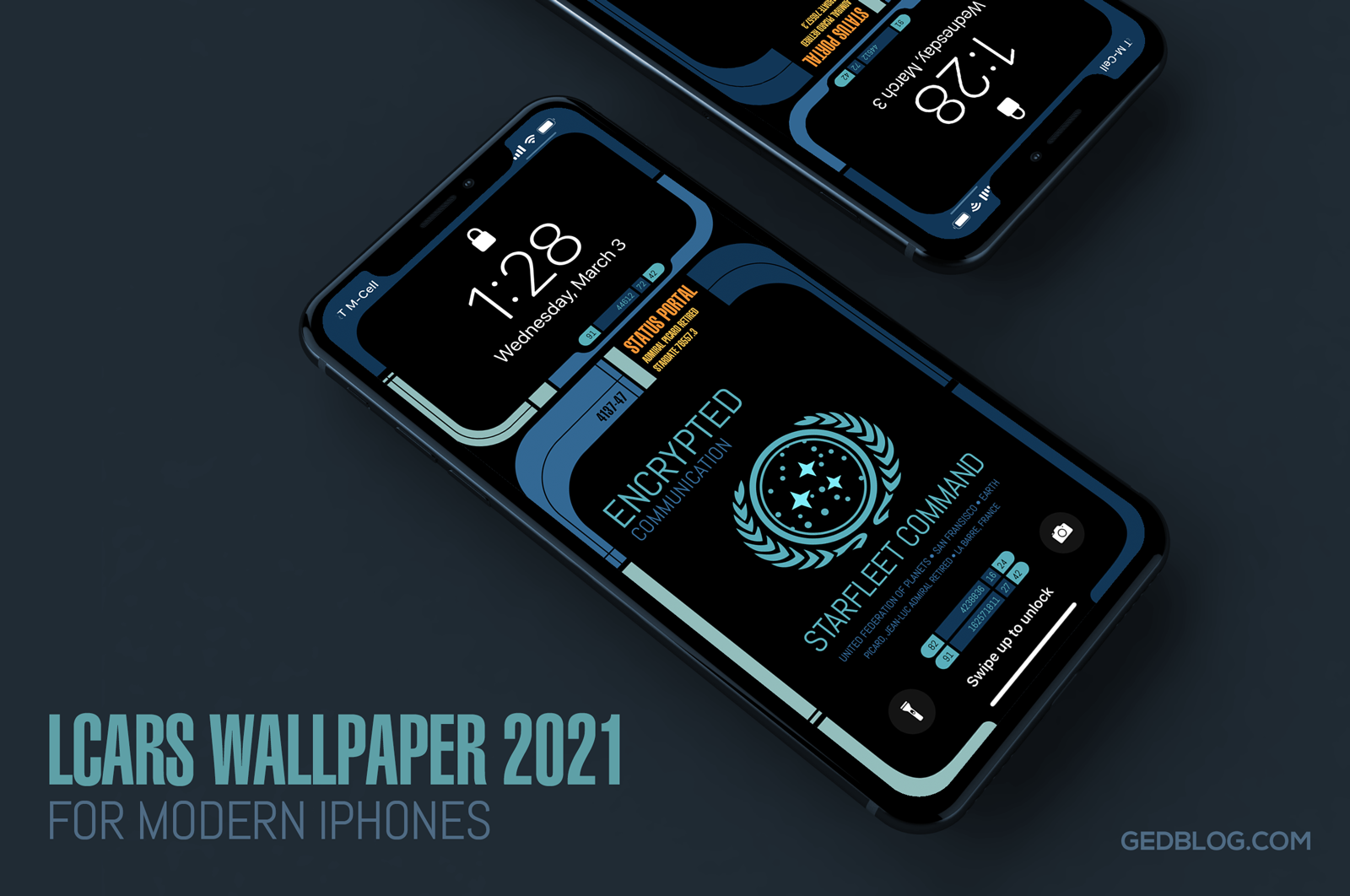
iPhone lock screen showing the Star Trek LCARS 2021 wallpaper

It’s been over six years since I released my original Star Trek LCARS wallpapers for iOS and today I’m happy to report yet another update for all you geeky Trek fans out there.

LCARS 2021 brings Star Trek’s futuristic user interface, designed by Michael Okuda, to modern iPhones. What’s more, I’ve done my best to future proof the wallpapers so when Apple adjusts the position of lock screen elements like the date, time, flashlight and camera buttons the wallpaper will fit properly and still look great with a minimum of setup.

The wallpaper re-design is inspired by Picard, the TV series that debuted last year on CBS All Access (soon become Paramount+). Season 2 of Picard will hopefully debut in late 2021 and so I wanted release this so fans could enjoy it prior to the premiere.

I took visual cues from on-screen elements such as button shapes, typographic refinements and the cooler color palettes seen in the show. The result feels more modern and looks great on the latest iPhones which is sure to put a smile on the face of any Star Trek fan.

I’m providing LCARS 2021 in two downloads that should cover all of the modern iPhone screen aspect ratios available today. There are subtle design differences so be sure to choose the right wall for your particular device:

• iPhone SE, 7, 8 & 9 – Picard LCARS
• iPhone XR, X, 11 & 12 – Picard LCARS

Select the download link of your device above to view it and then tap and hold on the image in Safari to save it to your camera roll. Next, view it in the roll and tap the sharing icon > Use as Wallpaper. Be sure to pinch out on the image and adjust vertical position if needed and finally turn perspective zooming OFF, tap Set and select Set Lock Screen to finish.

Want More?

If you’re looking for the full Montgomery Scott, then head on over to the Iconfactory’s Patreon account. When you subscribe to the Superheroes level ($10) a month, you’ll not only get two additional color ways (Next Generation + Star Trek: Lower Decks) of the iPhone wallpaper but you’ll also get snazzy, expanded iPad versions in these three color ways.

iPhone lock screen showing the Star Trek LCARS 2021 wallpaper

The iPad walls also comes with three, fun content variants to help turn your device into that Starfleet PADD you have always dreamt about.

I hope you enjoy these latest and greatest updates both here and over on Patreon. Please consider subscribing if you are inclined, we want to keep making kick-ass wallpapers for years to come and your generous support helps make it so.

Engage and enjoy!

Learning Linea

While I was studying to earn my master’s degree at R.I.T. I taught several undergrad classes in graphic design. I enjoyed teaching and always thought I might one day return to the field. That hasn’t happened (yet) but I did recently find time to create a new technique tutorial for our iPad drawing app, Linea Sketch.

This video is longer and more detailed than the others I’ve created for Linea but that’s a good thing. It gave me the chance to take my time and cover a wide range of features and techniques I personally use whenever I fire up the app.

I’ve always felt one of the best ways to learn new information is to watch other people demonstrating it, putting it to real-life use. I definitely want to do more of these types of tutorials in the future. I hope you’ll download Linea over on the App Store, pull up a chair, grab the Buck Rogers demo art and press play. Enjoy!

Hard G Fills the Mac GIF Gap Nicely

I’m a firm believer that if you want to write meaningful software, find a problem people have and solve it. My friend and fellow developer Aaron Vegh has done just that with his new app for macOS – Hard G. Despite it having the worst possible name a GIF app could have, Hard G is a helpful utility to make using animated GIFs on the Mac desktop the joy they were designed to be.

Powered by the GIPHY API, Hard G is a light-weight app that lets you quickly search for animated GIFs to use in social media posts, emails and other apps like iMessage. So what’s the problem Aaron has solved? The ability to quickly search AND effortlessly drag and drop them wherever you need. GIPHY makes it notoriously difficult to grab the actual animated GIF file from their site but with Hard G that issue falls like animated rain over David Tennant’s face as it washes down the drain forever.

Not only that, but the app also lets you save your favorite GIF’s for future quick reference, supports macOS Dark Mode and even can be used in the Mac Menu bar so it stays out of your way just until you need it. Aaron has some additional nice features planned for the future as well so if animated GIFs are your bag, baby head on over to the App Store and snap it up for just $14, a steal despite its name! 😉

Ged’s Pot Roast

If you are looking for the ultimate comfort food nothing beats good pot roast. I’ve tried many recipes over the years but always came back to my own version of the culinary favorite. Someone recently asked me to blog my recipe over on Twitter and it occurred to me that I’ve actually been winging it for years so it was probably a good time to get it written down.

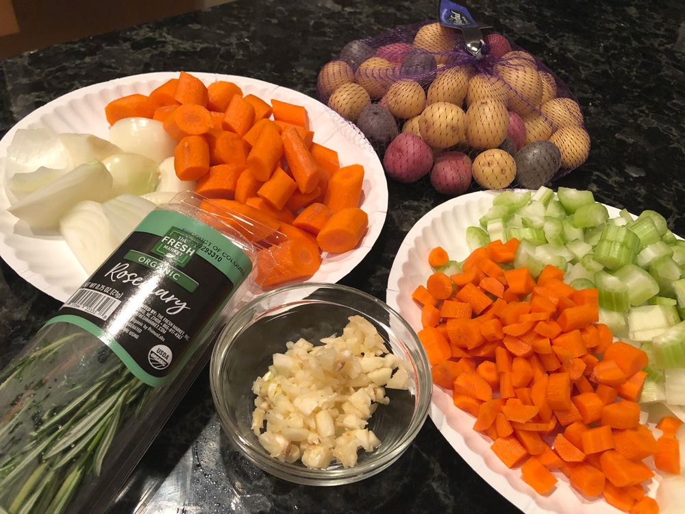
The prepped veggies for my pot roast recipe - carrots, celery, onions and potatoes

If there’s a secret to this recipe it lies in the two sets of veggies (one diced for flavor and the other sliced for eating) that gives the pot roast its depth of flavor. There’s an extra step or two compared to most recipes but trust me, it’s worth it.

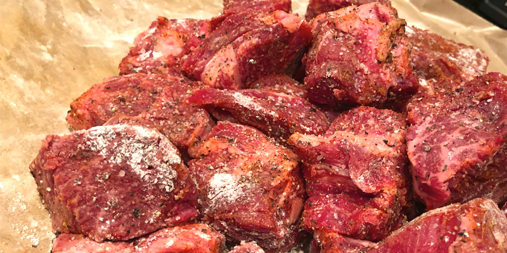
Also, by cubing the meat instead of leaving it whole, you get more surface area which means more browning which means more flavor! It also has the added benefit of cooking quite a bit quicker than most traditional pot roasts.

If you give it a go please drop me a line and let me know how it turned out. I’d love to get your opinion. Enjoy!

•••

HARDWARE:

Large bowl + tongs
Large dutch oven or high-sided oven-safe pot
Blender

INGREDIENTS:

1 (3-5lbs) Chuck Roast (cut into 2” cubes)
2-4 Tablespoons of Olive Oil
2 whole onions (1 diced, 1 frenched)
3 celery stalks (diced)
6 carrots (3 diced & 3 sliced into bit-sized pieces)
3/4lb of fingerling potatoes (or parsnips peeled & sliced into bite-size chunks)
8 cloves of garlic (finely chopped)
2 cups of red wine
3-4 cups of beef or chicken broth
3 sprigs of fresh thyme
3 sprigs of fresh rosemary
1/4 cup all purpose flour
2 Tablespoons of corn starch
2-3 Tablespoons of smoked (or regular paprika)
3 Tablespoons of of tomato paste
3 Tablespoons of Worcester Sauce
3 Tablespoons of balsamic vinegar
Salt & pepper to taste

DIRECTIONS:

Set oven to 325º

Slice chuck roast into 2” cubes and season them completely all over with salt, pepper and a sprinkling of paprika and flour. Coat well.

In a high-sided dutch oven or heavy oven-safe pot heat on pot with olive oil on stove top until shimmering. Working in batches, brown cubes of the meat on each side with your tongs until nice and brown. Don’t crowd the pan, turn them as needed getting each side nice and crusty. Remove browned pieces to a bowl. Continue until all meat is browned.

Combined diced carrots, celery and onions in pot and stir with pot meat drippings to loosen. Cook about 3 minutes or until the veggies soften. Add diced garlic and stir another minute or until garlic is aromatic.

Add tomato paste to the pot and mix in with the veggies. Add red wine and deglaze the pan – cook for another 1-2 minutes until wine mixture starts to simmer.

Return meat to pot on top of the veggie mix and add enough chicken or beef broth to barely cover. Reserve 2-4 tablespoons of broth for thickening later on.

Tie the rosemary and thyme sprigs into a bundle with butchers or kitchen string and add to the pot along with Worcester sauce & balsamic vinegar.

Bring to a simmer.

Put the lid on the pot and place in the oven. Cook at 325 for 1.5 hours.

Remove from oven and place meat cubes in a bowl. Discard the bundle of herbs.

If there are pools of fat on the surface of the liquid use a label and spoon off as much as you can or transfer the liquid to a de-fatter and discard the grease.

Transfer the remaining liquid plus cooked, diced veggies to a blender and blend well. Return the mixture to the pot along with the meat once again. Add sliced carrots, fingerling potatoes (or parsnips) and frenched onions to the pot and mix in well.

Return to the oven and cook for another 1 – 1.25 hrs or until meat is fork tender. Remove any grease on the top of the liquid once again with a ladle.

Move the pot to stove top and heat over med-low heat.

Mix the corn starch with the remaining chicken or beef broth (2-4 tablespoons) until throughly combined and then add to the stew. Bring to simmer to thicken.

Add salt, pepper & additional Worchester sauce to taste.

Serve with some crusty bread or with creamy polenta or whatever you want 🙂

YUMMIE!

Hey, Apple – The Activity App Needs Rest Days Like Right Now

It’s that time again. I woke up this morning and realized I’m once again starting a whole new month to try and keep my current move and exercise streaks alive in Apple’s Activity app. I’ve been really proud of myself for keeping the streak going for 3 whole months (I know people who have gone years!) but honestly, looking ahead at an empty September is daunting.

The problem only gets worse over time. The longer my streak continues, the more pressure there is not to break it. It can be so stressful in fact, some people have come up with clever hacks to work around breaking streaks. Contrary to what the folks on Apple’s Activity team may tell you, this isn’t actually healthy. It’s important to give your body (and mind) a break to recover and rebuild every now and then. Which is why iOS desperately needs to build in the concept of rest days into its Activity app.

Let’s just set aside the fact that the Activity app doesn’t even allow you to keep your streaks alive if you become sick or injured. That’s bad enough. But not to be able to give myself a much-needed break after many months of filling my rings is a poor decision on Apple’s part. I had really hoped iOS 13 would introduce Rest Days or Rain Checks or something that would allow us to take a day or two off a month and keep streaks alive, but that doesn’t seem to be the case.

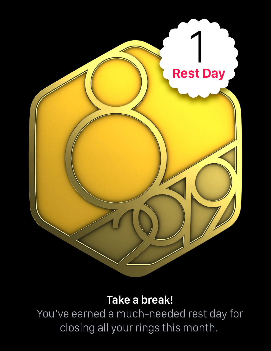
Concept for a perfect month badge that gives you a rest day as an award

The concept is simple – For every perfect month of activity award I complete, give me one rest day that I can use at any time to take an activity break and recuperate. Over time they would accrue like vacation days and I could even apply them for actual vacations so I don’t have to worry about filling my rings when I’m laying on the beach or waiting in line at Disney World. However Craig Federighi and his team decides to do it, we need something that takes the pressure off and lets us not be slaves to our Apple Watches every now and then.

I’m really happy iOS 13 will bring health advancements like the Noise app to monitor your hearing and Activity Trends to keep an eye on long-term exercise goals. Rest Days should be a part of a healthy lineup, other exercise apps in the store have had them for a long time. Apple needs to adopt them too because a little peace of mind goes a long way towards overall health.

Hey, Travis Crabtree, The Legend of Boggy Creek Is Getting Remastered!

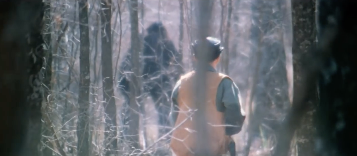
My favorite horror flick of all time, The Legend of Boggy Creek, has been lovingly restored and remastered and is coming to blu ray. The 1972 docudrama about the legendary “Fouke Monster”, or plain Bigfoot for you cryptozoological muggles out there, has been lovingly restored by the daughter of its creator, Pamula Pierce, and looks positively amazing.

I first saw Boggy Creek at a drive in theater with my parents as a kid and it made an impression on me that has lasted a lifetime. The film is the perfect mix of tall tales told by folksy locals, a cheesy soundtrack, out-of-focus monster shots and a vintage 70’s vibe that make it required viewing around Halloween each year. I’ve made Boggy wallpapers, written blog posts and enjoyed this flick since I was a kid (believe it or not it was rated “G” for general audiences) so I’m over the spooky moon with this news.

I’m a little concerned that cleaning up the film will detract from its overall feel of nostalgia but I’m willing to take that risk and support the efforts of the filmmakers. The film has never looked this good before so watching highlights from the restored version on YouTube is a bit surreal but to its credit still manages to give me goosebumps!

If you are a Boggy Creek fan like I am, be sure to head over to the official website and sign up to be notified when the film comes to blu ray sometime “this fall”. In the meantime, lock your doors, stay away from your windows and remember, he always travels the creek!

My New Favorite Thing: Birds Eye Cauliflower Tots

Birdseye's new cauliflower tots are super yummy

I’ve eaten quite a few tater tots in my day. I just love them which is why I’m so excited something new and better has finally come along. Imagine the best tater tot you ever had and then imagine it being a pale imitation of what tater tots are supposed to be, that’s Birds Eye Cauliflower Tots. They take everything you’ve ever loved about traditional tuber tots and raise the bar.

Made from just a few simple ingredients (unlike the 10+ ingredients in Ore-Ida Tater Tots), Birds Eye tots are slightly larger than your normal tot, but that’s not all. When baked they are very crispy on the outside and super creamy on the inside. If you’ve ever eaten a fondant potato from a fine dining restaurant, then you know what I’m talking about.

I was skeptical when Mindy suggested we try them, she’s been on a cauliflower kick for the past few months, but I have to say I’m so glad we did. About the only downside of course, is the price. Don’t get me wrong, they’re not that expensive – a bag of Cauliflower tots will run you just $3 at Target or $4 at your local grocery store but it only contains about 4 servings as compared to ten servings from Ore-Ida. So if you’re buying for a large family you’ll have to buy a few bags to stock up. The extra cost is well worth it however because they are simply delicious. They also have less sodium, less saturated fat and fewer carbs than regular tater tots.

Next time you’re grocery shopping pick up a bag (or two), try them out and let me know on Twitter how you liked them. I’m willing to bet you’ll never want to eat regular tater tots ever again.

One Perfect Shot: Star Trek’s ‘The Galileo Seven’

Back in 1967, fans of Star Trek were a little more than a dozen episodes into the new series and were craving to explore stories about one of their favorite new characters – the logical and enigmatic Mr. Spock. They got their wish in The Galileo Seven which thrust Spock into the command chair with his fellow Enterprise crew members in tow.

Kirk sends a shuttlecraft with a crew of seven to explore the Murasaki 312 quasar (re-rendered in spectacular fashion for the 2007 series remastering) when they are pulled off course and crash land on Taurus II, a lone planet at the heart of Murasaki 312. The planet is inhabited by a species of giant, “cave-man”-like humanoids who have a penchant for being just out of focus and throwing huge spears. Spock must solve problem after problem to try and save those under his command, all while dealing with an insubordinate junior office named Lt. Boma and of course the ever-cantackerous Dr. McCoy.

‘The Galileo Seven’ is notable primarily because it gave Leonard Nimoy center stage for the first time in the original series, something the actor later admitted he struggled with on the set. William Shatner’s Captain Kirk is sidelined from the main action, leading the search and rescue from his comfy chair on the bridge of the Enterprise. Meanwhile Spock, McCoy, Scotty and the rest of the shuttle crew are literally fighting for their lives back on Taurus II.

This was one of those episodes that kept me up late at night as a kid. The shadowy monsters, always lurking just out of sight of our heroes pushed all my fearful Bigfoot buttons as a boy. The fact that we never got a clear look at the creature’s faces only heightened the effect and was a happy accident during production. Special effects master Wah Chang created the ape-creature makeup to be shown on camera but it was considered by censors to be too grotesque to show in close-ups and so our imaginations are left to run wild.

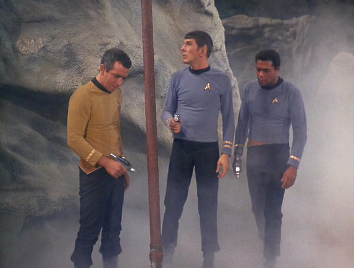
Spock and crew examine the dead and hidden body of Latimer

Apparently the censors were working overtime for this episode because the scene where Latimer is killed was considered too gruesome and an additional mist effect was added to obscure the giant spear protruding from his dead body. How times would change.

This episode also marks one of the first occurrences of a VIP coming onboard the Enterprise and seriously mucking things up. Galactic High Commissioner Ferris joins the ranks of Robert Fox from “A Taste of Armageddon’, Commodore Matt Decker from ‘The Doomsday Machine’ and Richard Daystrom from ‘The Ultimate Computer’ as people who just don’t know how to quit when standing on the bridge of the Starship Enterprise.

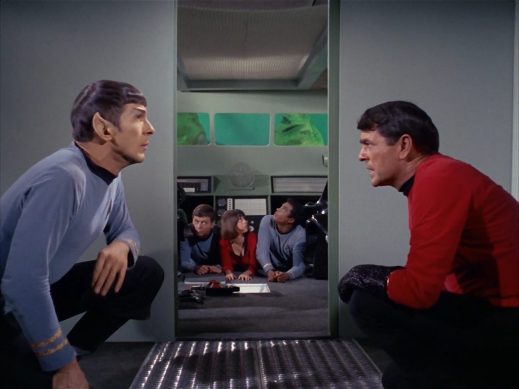
Our one perfect shot comes as Scotty, McCoy and the surviving crew of the Shuttlecraft Galileo do their very best duck and cover impression while Spock tries to methodically deduce why his Vulcan logic has not only failed to rescue them but also harbor resentment among the crew.

Next up Kirk and company meet the enigmatic, omni-powerful being Trelane in ‘The Squire of Gothos‘.

Check out the entire series of perfect Star Trek shots to date.

Testing the T-Shirt Waters

If you’re like me and like to create things, then you probably know what it’s like when you don’t get the opportunity to express yourself. If I go too long without having an outlet for my thoughts and ideas, I get frustrated, depressed and anxious. Over the years I’ve had many avenues for my creativity, from icons and making apps to writing, cooking and even gardening.

Now I’m trying something new in the form of fun t-shirt designs over at TeePublic. Inspired by the designs of my friend and co-worker, Anthony Piraino, I’ve worked up a bunch of fun t-shirts based on favorite television shows, movies and original artwork. If you’re familiar with my work, or are a geek, then many of these will probably appeal to you. The original shirts I’ve created based around the cult 80’s movies The Last Starfighter and Buckaroo Banzai: Across the 8th Dimension are among my favorites.

A modern version of the Star League logo from 'The Last Starfighter'

An adorable poo emoji gins widely back at you

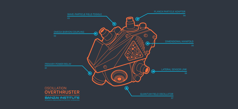
A cool technical schematic of the Oscillation Overthruster from the 80's movie Buckaroo Banzai

A fun smilie in dorky glasses with buck teeth

My own retro take on the Team Banzai logo from the 80's film Buckaroo Banzai

I have ideas for more shirt designs I’d like to post so if you like what you see, head on over to my store at TeePublic and grab a few. Nothing motivates an artist like knowing what they’ve done is enjoyed by others. T-shirts make great stocking stuffers too and if you hurry you can still get them delivered in time for Christmas. If you have an idea for a t-shirt you’d like to see, drop me an email or send me a suggestion on Twitter. You never know!

My 2018 Nissan Leaf: Three Days In

I recently turned in my venerable Ford C-MAX energi and leased a brand new 2018 Nissan Leaf EV. I test drove the Leaf in addition to the Chevy Bolt and ultimately went with the Leaf due to its lower cost and the fact that it wasn’t a GM brand car. I’ve wanted an all-electric vehicle for years and now I’ve finally taken the plunge. So far I’ve been very happy with how the Leaf has performed overall and I wanted to take just a few minutes and highlight my initial impressions about the car after my first three days owning it.

I’ll make more of these videos as I form opinions on other aspects of the car, but for now I hope you enjoy this brief glimpse into the Nissan Leaf.

iPhone X Wallpaper Updates

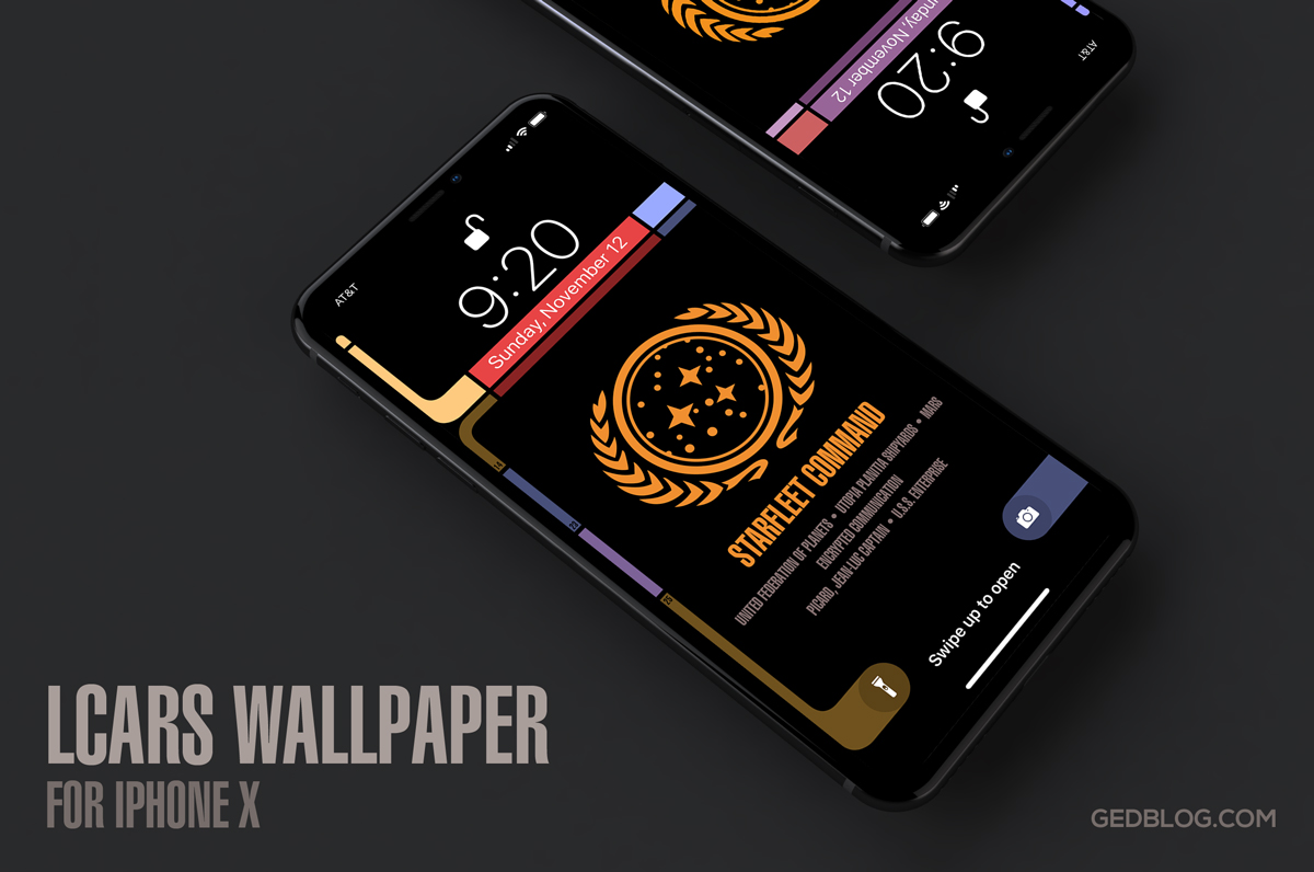
iPhone X lock screen showing the Star Trek LCARS wallpaper

If you’re the proud owner of a slick new iPhone X then I have some good news. I’ve updated three of my lock screen wallpapers for the new device and boy do they look great. The iPhone X’s new OLED screen means blacks are truly black resulting in a stunning appearance for lock screen designs like my popular Star Trek LCARS wallpaper. The design also seamlessly blends with the device’s bezel to create a fun Next Generation feel in your hands. The LCARS lock screen even comes in four variants so there’s lots options to try out.

I’ve also updated my Twin Peaks and Pokéwall wallpapers as well so be sure to check them out too. I’ll probably update the others (Westworld & Cosmos) in time but for now these three updates would make great additions to any iPhone X lock or home screen. Enjoy!

Reclaim Your Screen with Unobstruct

Unobstruct app iconRecently I had the pleasure of collaborating on a fun project with my friend and co-worker, Troy Gaul. Troy and I worked closely together to develop Linea and he asked if I could design the app icon for a new type of ad blocker he was developing which eventually became to be called Unobstruct. The concept behind the app is simple – get annoying social media banners that websites overlay on their content out of the way. Screen real estate, especially on mobile devices, is limited and the last thing users need are buttons for Twitter and Facebook cluttering up the view.

From the moment I took up the project I knew I wanted the app’s icon to be both fun and non-flat. Like many iOS developers these days, I’ve had my fill with two-dimensional glyph-type icons that seem to be piled as far as the eye can see in the App Store. I didn’t want to swing the pendulum all the way back to a full skeuomorphism but I didn’t want Unobstruct’s icon to be just another soulless geometric utility that no one would ever remember.

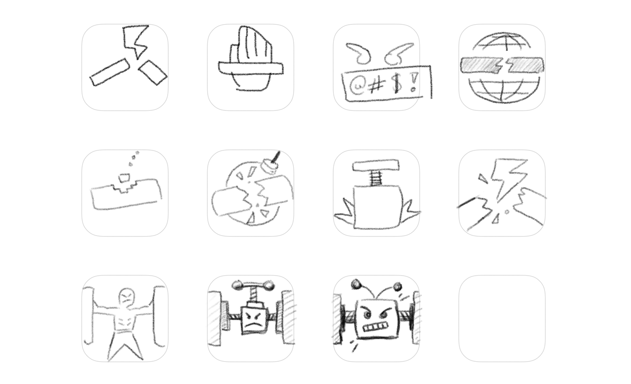
rough idea concepts for Unobstruct sketched in Linea on the iPad

I gathered the gang at the office for a quick brainstorming session and we sketched out a bunch of rough ideas (I have a fondness for the one that looked like a bare-chested Vladimir Putin but alas that was never meant to be). From those quick doodles in Linea, a concept formed of a tough little bot that pushes offending social media bars and banners off the screen. Once I drew his basic forms in Adobe Illustrator, I slowly built up shading and subtle gradients to give him an overall feel of tactility. You can see a similar approach in the xScope Mirror icon, creating subtle dimension through the strategic use of highlights and shadows.

The result is an adorable, tough-as-nails app that will never stop fighting to free up your screen from those annoying floating bars and let you read easier. Check out Troy’s Medium post detailing how he developed the app and what went into making it a reality. Unobstruct is available today in the App Store for .99¢. We hope you’ll give it a try, enjoy!

Twin Peaks Wallpapers for iPhone & iPad

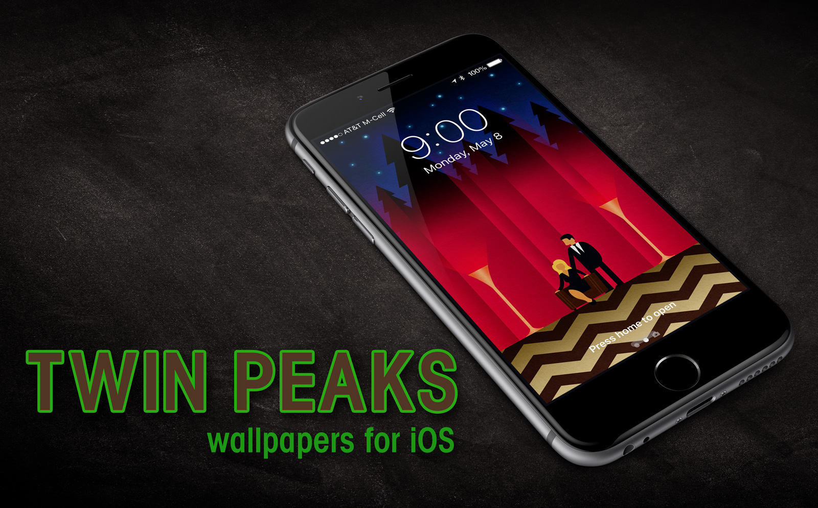
iPhone lock screen showing the Twin Peaks wallpaper

When Twin Peaks premiered in April of 1990, I quickly found myself caught up in the show’s intricate and mysterious plot to discover who killed High School sweetheart, Laura Palmer. The series was groundbreaking and paved the way for many of the “puzzle series” we take for granted today like ‘Lost’, ‘Stranger Things’ and ‘Westworld’. Twin Peaks’ writing, directing art direction and music all made it a cult classic that has been called by many one of the greatest TV dramas of all time.

As a die-hard Twin Peaks fan, I’m excited for the premiere of the new Limited Series coming to Showtime which airs on May 21st and will run for a full 18 episodes. Many of the original cast will return to reprise their rolls including Kyle MacLachlan, Mädchen Amick, Sherilyn Fenn, Sheryl Lee, Ray Wise, and several others. To help celebrate Twin Peak’s return to television I took inspiration from some cool artwork created by artist and illustrator Chris Bishop. Chris created a neat Twin Peaks tribute graphic that I instantly knew would make for a great iOS wallpaper. I contacted him and received his permission to remix his original art and came up with something fun that any Twin Peaks fan would be proud to display on their iPhone or iPad.

The wallpaper depicts Special Agent Dale Cooper and Laura Palmer in the mysterious Red Room, along with a few surprises. It comes in two variants – Lock Screen and Home Screen and is ready to download to your favorite iOS device. My thanks to Chris for allowing me to run with his creation and to Mark Frost and David Lynch for bringing one of my all-time favorite TV series back from the dead. I can’t wait to see what the sleepy, mysterious town of Twin Peaks has in store for us this time. Enjoy!

How to download and apply the wallpapers on iOS:

1) Click to view the wallpaper that best fits your device:

• iPhone SE – Twin Peaks Lock Screen
• iPhone 6,7 – Twin Peaks Lock Screen
• iPhone 6,7 Plus – Twin Peaks Lock Screen
• iPhone X – Twin Peaks Lock Screen

• iPhone SE – Twin Peaks Home Screen
• iPhone 6,7 – Twin Peaks Home Screen
• iPhone 6,7 Plus – Twin Peaks Home Screen
• iPhone X – Twin Peaks Home Screen

• iPad – Twin Peaks Lock Screen
• iPad – Twin Peaks Home Screen

2) Tap & hold on the image in mobile Safari & save it to your photo library

3) Open Photos, view the image then tap the Share button in the lower left

4) Scroll to the right in the Share menu and tap Use as Wallpaper

5) Pinch Zoom OUT on the image to size it exactly to the screen

6) Turn Perspective Zoom OFF

7) Tap Set > Set Lock Screen

That’s it! Next time you unlock your iPhone you can help Agent Cooper navigate the supernatural labyrinth called Twin Peaks and solve the mystery of who killed Laura Palmer. Be sure to check out my other iPhone wallpapers – Westworld, Star Trek LCARS, Pokéwall and more. Enjoy!

UPDATE: I’ve added 2 new iPhone X variants for use with iOS 11. The device’s tall format of means the wallpaper had to change to accommodate the new design. Enjoy!