LCARS 2023 Star Trek Wallpapers

The third and final season of Star Trek: Picard reunites most of the original cast of the Next Generation and is currently airing on Paramount+. This seemed like the perfect time to once again my LCARS series of Star Trek wallpapers for the latest and greatest devices. If you are a Star Trek fan then you’re going to love this massive update.

LCARS 2023 includes over 48 individual wallpapers formatted for iPhone, iPad and macOS and offers tons of variants including the Starfleet insignia, star fields, a technical schematic of the USS Titan-A seen in Picard and more. Here are the details:

• Lock Screen iPhone variants for use with iOS widgets
• Home Screen variants for use on iPhone and iPad
• An ‘Red Alert’ theme exclusively for Patreon supporters
• Extra wide Mac Studio Display desktops variants for Patreon supporters

LCARS 2023 Star Trek Wallpapers are available via Wallaroo in the App Store or by subscribing to the Iconfactory’s Patreon account. Patreon gets you additional perks mentioned above plus lots of other goodies that we frequently offer there. I and the other designers at the factory work really hard to create quality content each month so I really hope you’ll check it out.

In the meantime I’m going to enjoy the final season of Star Trek: Picard and count the days until the return of Star Trek: Strange New Worlds which may have become my all-time favorite Star Trek series! It’s a great time to be a Star Trek fan, that’s for sure!

Star Trek LCARS Wallpaper 2021

iPhone lock screen showing the Star Trek LCARS 2021 wallpaper

It’s been over six years since I released my original Star Trek LCARS wallpapers for iOS and today I’m happy to report yet another update for all you geeky Trek fans out there.

LCARS 2021 brings Star Trek’s futuristic user interface, designed by Michael Okuda, to modern iPhones. What’s more, I’ve done my best to future proof the wallpapers so when Apple adjusts the position of lock screen elements like the date, time, flashlight and camera buttons the wallpaper will fit properly and still look great with a minimum of setup.

The wallpaper re-design is inspired by Picard, the TV series that debuted last year on CBS All Access (soon become Paramount+). Season 2 of Picard will hopefully debut in late 2021 and so I wanted release this so fans could enjoy it prior to the premiere.

I took visual cues from on-screen elements such as button shapes, typographic refinements and the cooler color palettes seen in the show. The result feels more modern and looks great on the latest iPhones which is sure to put a smile on the face of any Star Trek fan.

I’m providing LCARS 2021 in two downloads that should cover all of the modern iPhone screen aspect ratios available today. There are subtle design differences so be sure to choose the right wall for your particular device:

• iPhone SE, 7, 8 & 9 – Picard LCARS
• iPhone XR, X, 11 & 12 – Picard LCARS

Select the download link of your device above to view it and then tap and hold on the image in Safari to save it to your camera roll. Next, view it in the roll and tap the sharing icon > Use as Wallpaper. Be sure to pinch out on the image and adjust vertical position if needed and finally turn perspective zooming OFF, tap Set and select Set Lock Screen to finish.

Want More?

If you’re looking for the full Montgomery Scott, then head on over to the Iconfactory’s Patreon account. When you subscribe to the Superheroes level ($10) a month, you’ll not only get two additional color ways (Next Generation + Star Trek: Lower Decks) of the iPhone wallpaper but you’ll also get snazzy, expanded iPad versions in these three color ways.

iPhone lock screen showing the Star Trek LCARS 2021 wallpaper

The iPad walls also comes with three, fun content variants to help turn your device into that Starfleet PADD you have always dreamt about.

I hope you enjoy these latest and greatest updates both here and over on Patreon. Please consider subscribing if you are inclined, we want to keep making kick-ass wallpapers for years to come and your generous support helps make it so.

Engage and enjoy!

Hey, Apple – The Activity App Needs Rest Days Like Right Now

It’s that time again. I woke up this morning and realized I’m once again starting a whole new month to try and keep my current move and exercise streaks alive in Apple’s Activity app. I’ve been really proud of myself for keeping the streak going for 3 whole months (I know people who have gone years!) but honestly, looking ahead at an empty September is daunting.

The problem only gets worse over time. The longer my streak continues, the more pressure there is not to break it. It can be so stressful in fact, some people have come up with clever hacks to work around breaking streaks. Contrary to what the folks on Apple’s Activity team may tell you, this isn’t actually healthy. It’s important to give your body (and mind) a break to recover and rebuild every now and then. Which is why iOS desperately needs to build in the concept of rest days into its Activity app.

Let’s just set aside the fact that the Activity app doesn’t even allow you to keep your streaks alive if you become sick or injured. That’s bad enough. But not to be able to give myself a much-needed break after many months of filling my rings is a poor decision on Apple’s part. I had really hoped iOS 13 would introduce Rest Days or Rain Checks or something that would allow us to take a day or two off a month and keep streaks alive, but that doesn’t seem to be the case.

Concept for a perfect month badge that gives you a rest day as an award

The concept is simple – For every perfect month of activity award I complete, give me one rest day that I can use at any time to take an activity break and recuperate. Over time they would accrue like vacation days and I could even apply them for actual vacations so I don’t have to worry about filling my rings when I’m laying on the beach or waiting in line at Disney World. However Craig Federighi and his team decides to do it, we need something that takes the pressure off and lets us not be slaves to our Apple Watches every now and then.

I’m really happy iOS 13 will bring health advancements like the Noise app to monitor your hearing and Activity Trends to keep an eye on long-term exercise goals. Rest Days should be a part of a healthy lineup, other exercise apps in the store have had them for a long time. Apple needs to adopt them too because a little peace of mind goes a long way towards overall health.

iPhone X Wallpaper Updates

iPhone X lock screen showing the Star Trek LCARS wallpaper

If you’re the proud owner of a slick new iPhone X then I have some good news. I’ve updated three of my lock screen wallpapers for the new device and boy do they look great. The iPhone X’s new OLED screen means blacks are truly black resulting in a stunning appearance for lock screen designs like my popular Star Trek LCARS wallpaper. The design also seamlessly blends with the device’s bezel to create a fun Next Generation feel in your hands. The LCARS lock screen even comes in four variants so there’s lots options to try out.

I’ve also updated my Twin Peaks and Pokéwall wallpapers as well so be sure to check them out too. I’ll probably update the others (Westworld & Cosmos) in time but for now these three updates would make great additions to any iPhone X lock or home screen. Enjoy!

Reclaim Your Screen with Unobstruct

Unobstruct app iconRecently I had the pleasure of collaborating on a fun project with my friend and co-worker, Troy Gaul. Troy and I worked closely together to develop Linea and he asked if I could design the app icon for a new type of ad blocker he was developing which eventually became to be called Unobstruct. The concept behind the app is simple – get annoying social media banners that websites overlay on their content out of the way. Screen real estate, especially on mobile devices, is limited and the last thing users need are buttons for Twitter and Facebook cluttering up the view.

From the moment I took up the project I knew I wanted the app’s icon to be both fun and non-flat. Like many iOS developers these days, I’ve had my fill with two-dimensional glyph-type icons that seem to be piled as far as the eye can see in the App Store. I didn’t want to swing the pendulum all the way back to a full skeuomorphism but I didn’t want Unobstruct’s icon to be just another soulless geometric utility that no one would ever remember.

rough idea concepts for Unobstruct sketched in Linea on the iPad

I gathered the gang at the office for a quick brainstorming session and we sketched out a bunch of rough ideas (I have a fondness for the one that looked like a bare-chested Vladimir Putin but alas that was never meant to be). From those quick doodles in Linea, a concept formed of a tough little bot that pushes offending social media bars and banners off the screen. Once I drew his basic forms in Adobe Illustrator, I slowly built up shading and subtle gradients to give him an overall feel of tactility. You can see a similar approach in the xScope Mirror icon, creating subtle dimension through the strategic use of highlights and shadows.

The result is an adorable, tough-as-nails app that will never stop fighting to free up your screen from those annoying floating bars and let you read easier. Check out Troy’s Medium post detailing how he developed the app and what went into making it a reality. Unobstruct is available today in the App Store for .99¢. We hope you’ll give it a try, enjoy!

Pokéwall Wallpaper for iOS

Pokewall Wallpaper on an iPhone 6

I designed these mobile wallpapers to work specifically with iOS, but there’s nothing that says you can’t use them with Android or Windows phone too. I’m just not going to make a bazillion size variants for all those devices 😛

There’s no denying that the new augmented reality game Pokémon GO from Nintendo and Niantic, Inc. has taken the world by storm. People of all ages are getting their butts up off the couch and heading out into the real world to try and capture as many of these cuddly, courageous animals as they can.

I thought it would be fun to whip up a mobile wallpaper that let’s you turn your smart phone lock screen into a Pokéball, and so Pokéwall was born. Now you can become the envy of all those shiny new friends you’ve made while you explore your community at all hours of the day and night!

How to download and apply the wallpapers on iOS:

1) Click to view the wallpaper that best fits your device:

• iPhone 5 Series – Original
• iPhone 6 – Original
• iPhone 6 Plus – Original
• iPhone X – Original
• iPad & iPad Pro – Original

2) Tap & hold on the image in mobile Safari & save it to your photo library

3) Open Photos, view the image then tap the Share button in the lower left

4) Scroll to the right in the Share menu and tap Use as Wallpaper

5) Pinch Zoom OUT on the image to size it exactly to the screen

6) Turn Perspective Zoom OFF

7) Tap Set > Set Lock Screen

That’s it! Sleep/lock your iPhone and the next time you activate it, you can pretend you’re about to catch that elusive epic Pokémon you’ve always wanted. I hope you enjoy this fun treat & help spread the word via Twitter and Facebook. Have fun and stay safe!

PS – If you liked Pokéwall, be sure to check out my Star Trek LCARS wallpapers as well.

The Best BitCam Review. Ever.

BitCam review from the app store: WHY? - In 2016, why in the world would I want an app that makes my photos look WORSE? why? WHY?! I downloaded this app just to tell you guys ya crazy for giving it 5 stars. BOOO BOOO BOOOOO. Go HOME. And if you're at home, go stick your head in the ground. 8 bit camera...sheesh, good grief. As long as we're throwing out dumb ideas how about soggy bread, it goes down so much smoother! And what about ants in your pants? Oh yeah sounds like a great idea too; 5 stars for both. Finally, WHYYYYYY?!?

I and everyone at the Iconfactory are grateful so many people have been enjoying our little photographic throwback to the 1990′s with our recent release of BitCam. For those who remember the era it’s a nostalgia trip that brings bittersweet memories of straining modems and ear-piercing dot-matrix printers flooding right back. Millennials are not old enough to understand this however. To many of them, a dot-matrix printer is the tool that was used to print the flower patterns on the out house toilet paper back before there was indoor plumbing and colors hadn’t been invented yet.

Someday about 20 or 30 years from now, ya boy jax may well pine for the days when images were taken on a physical device instead of inside his eyeball. A time when talking with his friends meant tapping on a glass-covered screen to launch an archaic app like Snapchat instead of projecting a hologram of himself from his floaty chair onto whatever the internet eventually becomes. On that glorious day, I will push back in my recliner at the old folks home and smile the smile of kings.

Super Tribes for iOS Walkthrough Plus Tips + Tricks

I’ve never actually done a video walkthrough of a mobile game before so this is new territory for me. As such, this review of the fun, turn-based iOS game Super Tribes is a bit longer than it probably should be but I’m still learning so go easy on me! My friend @Bigzaphod turned me onto Super Tribes and I’ve been playing it on and off for about a week. It’s really fun, light and doesn’t suck a huge amount of time which is perfect.

The best part about Super Tribes is that the game length is fixed to 30 individual turns which means a typical game can last anywhere from 20 minutes to about an hour and that’s it. You play against the AI, not other people or friends. Depending on your style of gaming this may be a plus or minus to you, but I personally enjoy it. There’s tons of stuff I didn’t cover in the walkthrough but what I do cover should be enough to get you up and exploring the flat, grid-shaped world of Super Tribes in no time.

The game is free to play in the App Store, but if you do try it and like it, I beg you to purchase at least one of the in-app tribe packs to help support the developer. Games of this quality take thousands of hours to design, produce, test and deploy and we want them to continue making them, they need to eat. That’s all I’m saying. Enjoy!

It’s Not a Tumor!

Apple's new extended life battery case

Today Apple introduced their new iPhone 6s Smart Battery Case and I feel pretty confident in saying it’s easily the ugliest piece of industrial design to come out of Cupertino in the past 15 years. While their efforts to bring iPhone users extended battery life are laudable, for the life of me I can’t imagine how this clunky eyesore of a case got all the way through design to arrive in Apple’s product line up.

Even worse, it seems as though the design and engineering teams at Apple forgot to talk to each other because the new case seems like a perfect opportunity to make use of Apple’s much-touted terraced battery technology. When the new Macbook was introduced, Phil Schiller made a big deal (and rightfully so) about how every millimeter of space in the new Macbook was able to be used to expand the total battery capacity. But looking at the new Smart Phone case, it seems like all that incredible design research just went out the window. The bottom and top of the battery bumps on the new case could have been terraced to both maximize battery capacity and at least try and display some elegant lines instead of what we got.

terracebattery

There are times when, for the briefest of moments, lose faith that Apple knows exactly what they’re doing. It doesn’t happen often but there’s no doubt the new case is going to be the object of ridicule and rightly so. As I sit and ponder just how bad this case looks, I just can’t get Arnold’s hilarious line from Kindergarten Cop out of my head. Apple missed an important opportunity to tout new technology in a stunningly beautiful way.

How Modern Game Engines Are Improving Mobile Gaming

Batman_Arkham_Full

The widening selection of game creation tools available to mobile developers have come a long way in improving players’ experiences when gaming on the go. Game engines are special software frameworks designed to augment the strengths of modern gaming hardware and aid the rapid development and creation of new and exciting titles. Modern game engines contain all the necessary tools for developers to be able to create their kick-ass games more quickly and easier than ever before and the results have been impressive.

Thanks to the advent of smartphones, tablets, phablets and now wearables like Apple Watch, the monetary worth of the gaming industry is enjoying exponential growth. The mobile gaming market alone is predicted to hit $9 billion in 2016. The convenience of playing both casual games like mobile bingo, as well as pulse-pounding, hyper-realistic racing games have all helped the industry set new records. With the continual improvements of next-generation of gaming platforms and quality titles like Splatoon and The Witcher 3 to go with them, gamers are enjoying a bright future packed with high-quality titles from a host of publishers, and powerful engines are driving their success.

The Unreal Engine has long been a favorite among developers and has been responsible for helping to create such popular titles such as Batman: Arkham City Lockdown, Injustice, Borderlands Legends and the Infinity Blade series. To date, the Unreal Engine 3 has been installed on some 2.25 million computers worldwide and comes complete with an integrated Unreal Editor suite which has helped revolutionize the way developers build and develop their mobile game projects.

Plants vs Zombies title screen

For PopCap Games’ popular tower defense game Plants vs Zombies and OMGPop’s rather addictive mobile app Draw Something, the Marmalade SDK helped provide the facility and resources needed to create cross-platform C++ games.

The software development kit gives developers the ability to compile their Xcode and Visual Studio projects for Android or iOS which helps cut development costs while widening their potential audiences at the same time. Marmalade also provides an acceleration tool called Marmalade Quick which provides an even more flexible, open environment for developers to experiment with. This is particularly useful for those companies looking to get their games up, running and monetized more quickly.

Other game engines such as Unity can make 3D development a breeze whilst the Corona SDK helps solves issues of cross-content publishing giving developers more freedom to concentrate on other aspects of their games.

There’s little doubt that the modern state of game engine development now offers something for every type of game developer and this means more and more players are reaping the rewards. From casual to hard-core and everything in-between, these advanced tools in the hands of talented studios can only lead to every-higher quality mobile gaming experiences. What a great time to be a gamer!

User Interfaces of the Week

picard_firstcontact

We’re less than a week away from Apple’s World Wide Developer Conference where Tim Cook and company will unveil the latest and greatest for OS X, Apple Watch and iOS. No doubt we’ll get a preview of iOS 9 and all it has to offer, but before we move forward, sometimes it’s best to reflect on where we’ve come from. I wish I could say the user interfaces featured here were but a distant App Store memory, but alas they all come from currently-shipping apps.

A few weeks ago I went looking for a well designed gas / milage tracking app in the App Store. I’ve been using Gas Cubby for years, but wanted something new to help me keep track of MPG with my new Ford C-MAX Energi plug-in hybrid. From my own experience, I knew that doing a general search in the App Store tends to yield less than optimum results. Even so, I just wasn’t prepared for the sloppy approach many of these apps tried to pass off as user interface design.

Being a UI designer myself, I have surrounded myself in my professional and digital life with talented designers and developers who consistently release top-notch apps. The problem with living in a bubble of roses is you sometimes forget what the real world smells like. As I paged through dozens of these milage trackers I was reminded just how many apps on the store are basically junk. Over at Daring Fireball, John Gruber has a recurring piece he calls “User interface of the Week” where he highlights some of the worst cases of user interface “design” he’s encountered. I don’t feel right calling these apps out by name, but if any apps deserved John’s moniker, these sure do.

Seeing what often passes for acceptable design in the App Store often reminds me of all the hard work that goes into creating my own well designed and executed apps. So many people think software just grows on trees, but it doesn’t. Designing and building best-in-class software requires a depth of knowledge and experience that a relative few possess.

I can’t wait to see what WWDC has in store for the future of my favorite software platforms. I’m hoping Apple inspires an entire new group of developers to strive for excellence and bring users apps that are truly worthy of these wonderful, futuristic devices. As for my milage tracker quest, I finally settled on Road Trip. It’s a bit more complex than I would like, but so far, so good.

You Will Adapt Your User Interfaces to Service Us!

picard_firstcontact

Everywhere you look, more and more people feel they are entitled to something they’re not. I and others have written about the obscene level of entitlement some users feel is owed them when they download apps from the App Store, and to be sure this is still a huge problem today. Lately however, I’ve been observing another form of app entitlement and honestly, it has got to stop – iPhone 6 Plus users who think all interfaces should be designed to both fit their jumbo phones AND still allow one-handed use.

When Apple introduced the iPhone 6 Plus and it’s enormous 5.5″ screen, it clearly filled a much-needed gap in the iOS universe. Users had been clamoring for more screen real estate for years and when it finally arrived, they rejoiced. Over time however, these users have developed a sense of entitlement that the apps they run should place all controls at or near the bottom of the screen where they can be reached by the thumb. Sorry, but like Captain Picard in First Contact, I’m drawing a line in the proverbial sand. No, iPhone 6 Plus users don’t get to dictate interface design for the rest of us.

Like it or not, buttons at the top of the screen are not going away any time soon. Developers need every bit of screen real estate to logically lay out controls consistently across a host of device ranges and configurations. From the tiny iPhone 4 to the popular iPhone 6 and the iPad there’s a method to our madness. It might seem like a great idea if every single button, tab, actionable element and control were within thumb’s reach, but that simply isn’t possible, nor is it actually desirable.

When Apple developed iOS, the experts charged with designing its interface laid out regions of the iOS screen for specific interactions. Since the entire navigation stack generally flows from left (where you were) to right (where you are going), the button for closing or going back a level is at the upper left. Creation of new content or taking action on that content, like adding a calendar event or sending an email or a tweet, is usually found at the upper right. Tab controls can be either at the top or the bottom, though generally they are usually found at the bottom. In this way, a user who picks up an iPhone 4 has a reasonable expectation that similar types of controls will appear in similar places when she picks up an iPhone 6 Plus. This helps maintain usability and UI consistency for all apps, not just those that run on jumbo phones.

screencontrols

There are ways that developers can help facilitate one-handed use when it’s appropriate. The swipe to go back gesture is a great innovation Apple introduced back in iOS 7 and is a thumb-saver on larger phones. Many apps no longer require you to reach up and tap “Back” to go back, you can simply swipe from the left edge of the screen to navigate back one level. Apple also implemented Reachability (double tap the Home button to lower the entire screen temporarily) to help reach interface elements at or near the top of the screen. But for some users, these gestures are simply not enough. The thing they forget is that by opting for a large device they gained a huge, highly readable screen but they also sacrificed some level of UI convenience. iPad users have been dealing with this trade-off for years, that’s the nature of the beast, like it or not.

When I first heard about the rumored existence of the iPhone 6 Plus and its huge screen, I wondered how Apple would reconcile its long-held tenet that one-handed use reigned supreme with that of it’s upcoming larger device. Apple even built an entire marketing campaign around the advantages of smaller iPhones vs their larger Android counterparts. But when the Plus was released, Apple quickly abandoned that philosophy in order to sell millions of 6 and 6 Plus’. Funny how that happened.

The problem with these users is that they often think like the Borg – they want the best of both worlds – larger screens and an interface that lets them use every app one-handed. As someone who designs for the screen, I’m here to tell them that until humans evolve longer thumbs that simply isn’t possible. At some point (iOS 10?) Apple may come up with a completely new interface paradigm for iOS, but in the meantime it’s best if they start dealing with reality. Whether it’s assimilating Starfleet personnel or playing with your apps, sometimes you just need to use two hands.

Four Innovations I love in Gaming

FarCry4_1

A lot of times, particularly where technology is concerned, we’re so focused on the future that we forget to enjoy the present. With ridiculously capable laptops, tablets, and smartphones at our disposal, many are looking ahead with hope to Iron Man-style hologram displays. With powerful cars setting new standards for safety and efficiency, we’re seeing advertisements for driverless vehicles. And in gaming, many seem to be turning their focus toward wearable, virtual reality options that will no doubt be widely available in a matter of years—not decades.

That’s all well and good, but as a bit of a gaming nut, I like to focus more on the present and what I can play today. Furthermore, there have been some pretty great innovations—some small, others large—throughout the gaming industry in the past few years. Here are a few I’ve enjoyed in particular.

The Spread Of Open World

Open world gaming is nothing new, but the concept has exploded in popularity over the past couple of years. A decade or two ago, a video game employing an open world format felt unique and special. For example, pretty much the only thing that made Skyrim remarkable (in my opinion) was the sheer size of its world. Well, now it’s just about the standard for action and adventure games. Look through this list of the 12 best open world games, and you’ll find a lot of releases from the past couple of years, such as Far Cry 3 and Grand Theft Auto V. To some extent, the concept has even extended to mobile platforms, with Minecraft Pocket Edition now offering a limitless world creative option!

Narrative Gaming

Narrative gaming is nothing new on the console level, other than that it’s gotten better. Not long ago, it was a common complaint among gamers when a game attempted to be too cinematic in nature, but that’s because it was usually done via interspersed, non-playable graphic clips used to move the story along. This is still a problem in some titles, but generally speaking most now have natural, free-flowing narratives that make them more interesting. Even in sports games, “My Player” and “My Career” modes let you play out the story of an athlete or franchise. The trend toward sharper narratives is also particularly prevalent in app gaming, where indie developers like Simogo focus as much on story as action. In my view, this is a positive trend.

Live Dealing & Interaction

This is a trend that exists primarily in the casino gaming industry. Given that this industry now occupies a significant portion of the video game business as a whole, it still feels noteworthy. Live interaction is nothing new. The best online casino sites allow players to face live competition, and even some of the popular poker and blackjack apps, most of which operate with play money, allow for live online games. But one fascinating trend that I first noticed here is the idea of using an actual video feed of a live dealer in roulette and card games. Naturally, this concept makes the games feel a great deal more realistic. While there’s not an obvious parallel in non-casino gaming, the implications of using a live feed in gaming are interesting. One can imagine in-game video chats with other players, Google Maps feeds of real geographical areas, etc. helping to make other games more realistic.

Retro Appreciation

And finally there’s this, my single favorite trend in modern gaming. As mentioned, we have a tendency to always look forward when it comes to technology. But thanks in large part to new-ish formats of gaming, such as mobile app stores and console download stores, there seems to be a broad recognition of retro games going on. In part, we see it through the continuation of old, beloved franchises, with the most relevant example being the coming Street Fighter V PS4 game from Capcom. But mostly, the retro appreciation is seen in apps and downloads. On modern consoles, players have access to huge libraries of old games, either for free or for just a few dollars. In app stores, we can play with all kinds of old characters such as Sonic the Hedgehog, the Street Fighter and Mortal Kombat fighters, and so on. According to ZDNet, we may even soon have a Mario game or two available on iPhones! This is a trend any serious gamer can get behind.

You Just Lost A Customer

News today that some businesses have begun disabling the NFC readers in their retail locations so as block customers from using Apple Pay. When I read this, I have to say it filled me with rage. I don’t yet own an iPhone 6 or 6 Plus, but I will soon and one of the reasons why I’ve been looking forward to owning one is the secure, easy transactions that Apple Pay represents. Now we learn that a group of merchants wants to introduce their own payment processing system, one that favors the merchants by eliminating credit card fees, but is most likely far less secure, and most certainly more difficult or confusing to use.

If you’re an iPhone owner who’s as upset as I am, I’ve designed this helpful flyer that you can print a stack of and hand to the clerk at CVS, Rite Aid or anywhere else that refuses to accept Apple Pay. Simply put, you’re telling them that you’re going to take your business elsewhere until they come to their senses and accept your money via Apple Pay. Why any business owner would actually refuse a customer’s money in this economy is bewildering to say the least, but we need to let the corporate owners know we have choices and we chose not to give them our money.

Download the PDF version. If you want, sign your name at the bottom and then see they get into the hands of businesses in your area that insist on doing what’s better for them, instead of what’s best for the consumer.

You can also contact CVS and Rite Aid electronically and tell them that they need to support Apple Pay or risk alienating millions of iPhone users. The more our voices are heard, the harder it will be for them to ignore us.

You’ve Come a Long Way, Ollie!

While preparing for the onslaught of technical support that accompanies new releases of our most popular app – Twitterrific, I was curious about just how many updates we’ve actually released over the years. I looked back through the app’s version history as well as a fun timeline of Iconfactory software releases I created a few years ago to find this week’s 5.8 update is the app’s 50th since its launch in the summer of 2008.

If you had told me back then that we would still be coding and improving the little blue bird that could almost seven years later, I probably would never have believed you. Back then Twitterrific 1.0 was a fun, but unproven app for the then newly released iPhone from Apple. It was released along with the launch of the brand new App Store where users could browse hundreds (yes hundreds) of apps for their shiny new phones. At that time there was no official Twitter mobile client, I’m not even sure there were ANY other Twitter apps in the store at launch*.

Fast forward to 2014 and 50 updates later and we arrive at v5.8 for iOS 8. Given the rocky history 3rd party developers and Twitter have gone through the last few years, I’m honestly surprised we’re still here today. Over the years Twitter has focused more and more on controlling their own user experience and branding. This meant imposing design and interaction guidelines on 3rd party devs like the Iconfactory as well as capping the number of total users who can actually own Twitterrific. Thankfully, since Twitterrific was there at the very beginning, our token pool (at least on iOS) is quite large and we can afford to continue developing the app as long as it makes money. The same can’t be said for so many other smaller 3rd party Twitter developers who have either given up or sold their apps to other larger developers. One of the reasons why the Mac version of Twitterrific still hasn’t been updated is due to the limited number of user tokens available to us on the Mac platform, a policy I sincerely hope Twitter re-examines one day.

When I think of all the hard work, hand-wringing and ultimately, satisfied customers, Twitterrific has gone through over the years it really boggles my mind. Knowing that so many people use and love something you’ve created day after day is a wonderful feeling. You keep downloading and sending us positive feedback, and that motivates us to refine and improve the app. Twitterrific would never have flown as far and wide as it has if it wasn’t for all of our loyal customers, and for that we are truly thankful. If you’ve not tried Twitterrific in a while, I invite you to check it out. Everything old is new once again!

* There was at least one other 3rd party Twitter app in the store at launch – Twinkle.

Troubleshooting Broken App Store Downloads

For the past several weeks I was unable to download any app, paid or free, from the iOS App Store. Every time I tried, once I tapped the button to buy an app and input my iTunes password, the App Store would display the progress indicator as if it was about to download and then return to its default state. The app itself was never downloaded to my device.

At first I thought it was a temporary problem that would resolve itself. I tried restarting my iPhone and iPad (it was happening on both of my iOS devices) several times but that didn’t fix the issue. I tried signing out and back into iTunes via iOS Settings, but that didn’t seem to fix the issue either. I waited several days and tried again and again with no luck. My patience finally ran out and I made an appointment to see an Apple genius at my local Apple Store and thankfully he helped me resolve the issue. I thought I would share the steps he took with me for all those out there that might be having the same problem.

Here’s how he corrected the issue and got me back downloading apps on iOS:

1) Open iOS Settings > iTunes & App Store > tap your Apple ID and sign out

2) iOS Settings > General > Reset > Reset Network Settings

NOTE: This step will clear all of your current network settings including wifi passwords. You’ll have to re-sign back into all of your saved networks, but unless you have a ton of them, it really isn’t a big deal.

3) Restart your iOS device

4) Re-connect to your current network by re-entering your password

5) iOS Settings > iTunes & App Store > log back into your Apple ID account

If all goes as well as it did for me, you should now be able to download any and all apps from the App Store once again. Before you go through the steps of resetting the network connection completely, you might simply want to try logging out and back into your Apple ID first. The genius told me that this sometimes solves the problem, as does logging out and back into your account from another (different) device like a Mac.

Hopefully this process will work as well for you as it did for me and save you a trip to the Genius Bar. Good luck!

Muting Messages in iOS 8

One of the most useful (and hidden) features I’ve come across in iOS 8 is the ability to mute IM threads in Messages. Think of it like Do Not Disturb but on a case by case basis. I first noticed it by accident when a tiny crescent moon icon appeared next to one of my IM threads and so I Googled it to figure out what exactly it was.


When do not disturb is turned on for a particular message thread, you won’t be notified when that person(s) replies via text or iMessage. This can be really great if you want a way to ignore a person or group discussion that’s gotten out of hand. It can also be really frustrating if you happen to activate it by accident as I apparently I did without realizing it (or perhaps a bug in iOS 8?).

To turn Do Not Disturb for individual message threads on or off, tap the Details text at the top right of the Messages window to open that thread’s detail view. Next, scroll down to Do Not Disturb and toggle on or off as desired. When this feature is turned on, you won’t receive notifications when the person sends text messages or IM’s and you can go about your life notification free.

The Details view also gives you quick access to all the images that person has shared with you, as well as the ability to share your location information with the people you’re chatting with which is a nice feature as well.

The more I play with iOS 8, the more little things I find that truly set it apart from iOS 7. It’s wonderful that Apple is giving us more control over our digital world, I can’t wait to see what else is in store.

PS – I love Louie to death and would never mute his IM’s. He was gracious enough to let me use our conversation as an example. Thanks Louie! 🙂

iOS 8 Favorite Features

On the surface, users coming from iOS 7 may not notice the myriad of changes and improvements Apple has made in their latest mobile operating system, iOS 8. Visually, iOS 8 is almost identical to its immediate predecessor, but under the hood there’s a great deal to like and even some to really love.

Much has been written about the new OS, but now having used it for a few weeks, I thought I would write about my own personal observations from the user’s perspective. I could write an entire other post about the good and bad parts of iOS 8 as they relate to developers (and perhaps I will), but for now, here are the parts of the new operating system that I’ve been enjoying the most.

3rd Party Extensions

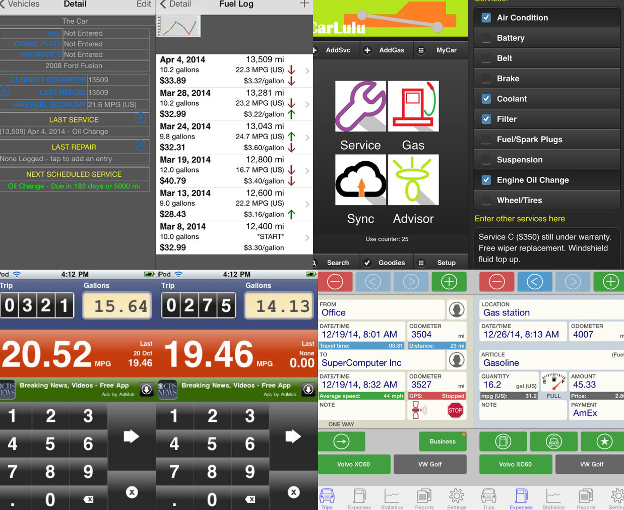
Without a doubt, iOS 8’s single greatest feature is the ability to extend the system via 3rd party extensions. Early iPhone adopters will probably remember what the device was like before the advent of the App Store – it was cool, but killer apps made it a “must have”. I liken extensions in iOS 8 to that early invitation of 3rd party devs to the iPhone party. The most well received extension so far as been Agile Bit’s amazing security utility, 1Password. Thanks to iOS 8’s extensions you now can access your secure passwords directly within apps reducing friction and making your information more secure.

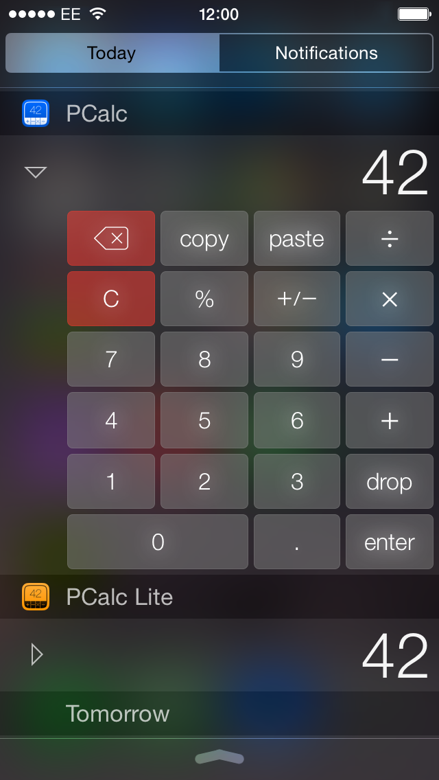
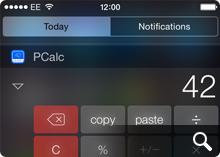
Other notable extensions include PCalc’s Today View which gives you handy computation abilities right from your iPhone’s lock screen and another personal favorite of mine – Add to Wunderlist which lets you add web pages directly to new or existing lists. Perhaps the most exciting part is that we’re just in the early days of iOS 8 extensions so we’re only seeing a fraction of the potential that 3rd party extensions represent. More great stuff is sure to come and I for one am very excited.

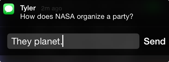
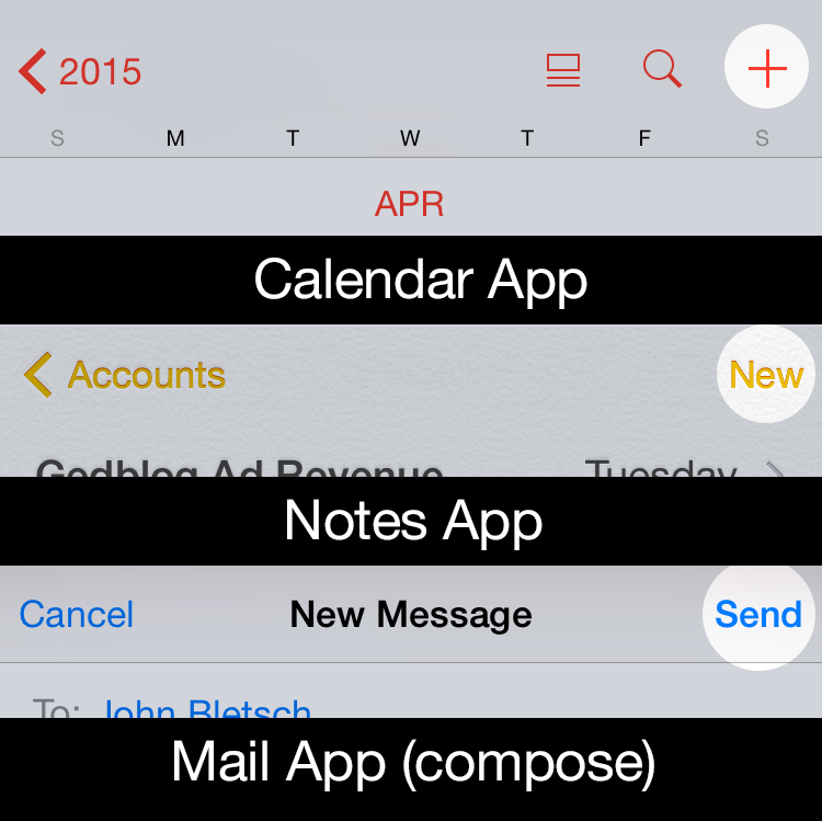
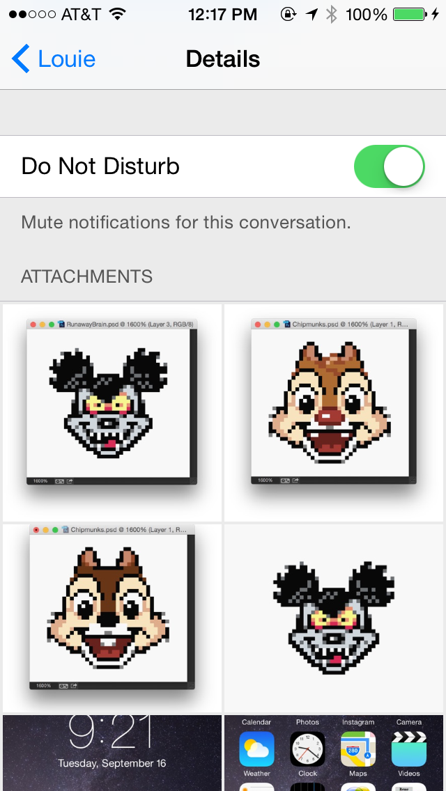
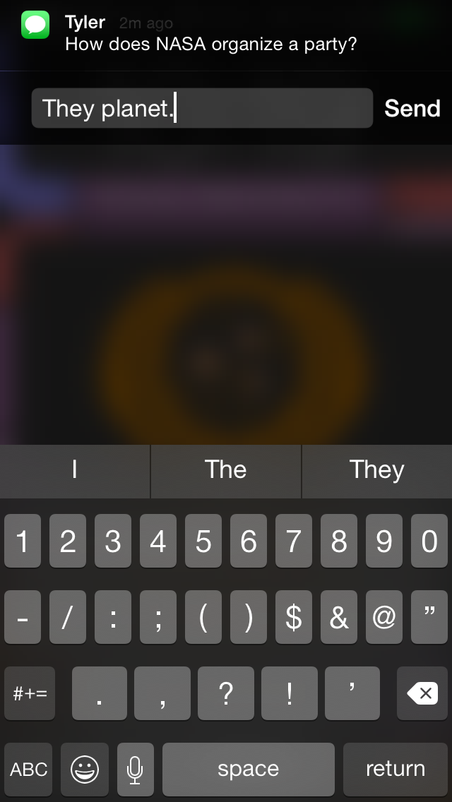
Directly Replying to Notifications

Swipe left on a notification on your device’s lock screen or downward from a notification within iOS 8 itself to reveal the ability to reply directly to instant messages. I have to admit that I’ve found myself using this one more and more. It saves so much time being able to reply directly it’s incredible. This is one feature I really wish Apple had implemented earlier, but I’ll surely take it now that it’s here.

Siri’s Visual Feedback

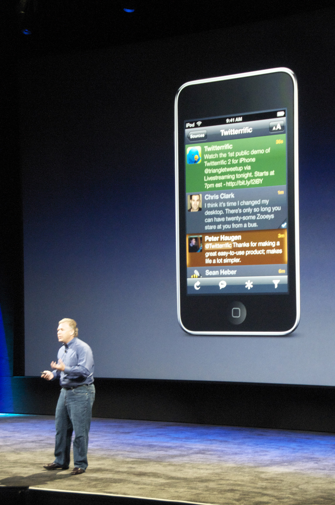
Apple’s digital assistant, Siri, has taken a cue from other popular voice-activated services like Google Voice Search and now displays helpful visual feedback when dictating text or commands in iOS 8. This really comes in handy when you have long blocks of text you want to enter and can see in real time how well (or how badly) you’re doing. It’s still not as fast or precise as Google’s version, and I don’t know how Siri stacks up against Windows Phone’s new assistant, Cortana, but it’s a big improvement none-the-less. Siri’s real-time dictation even works within 3rd party apps like Twitterrific, which was an unexpected and delightful surprise!

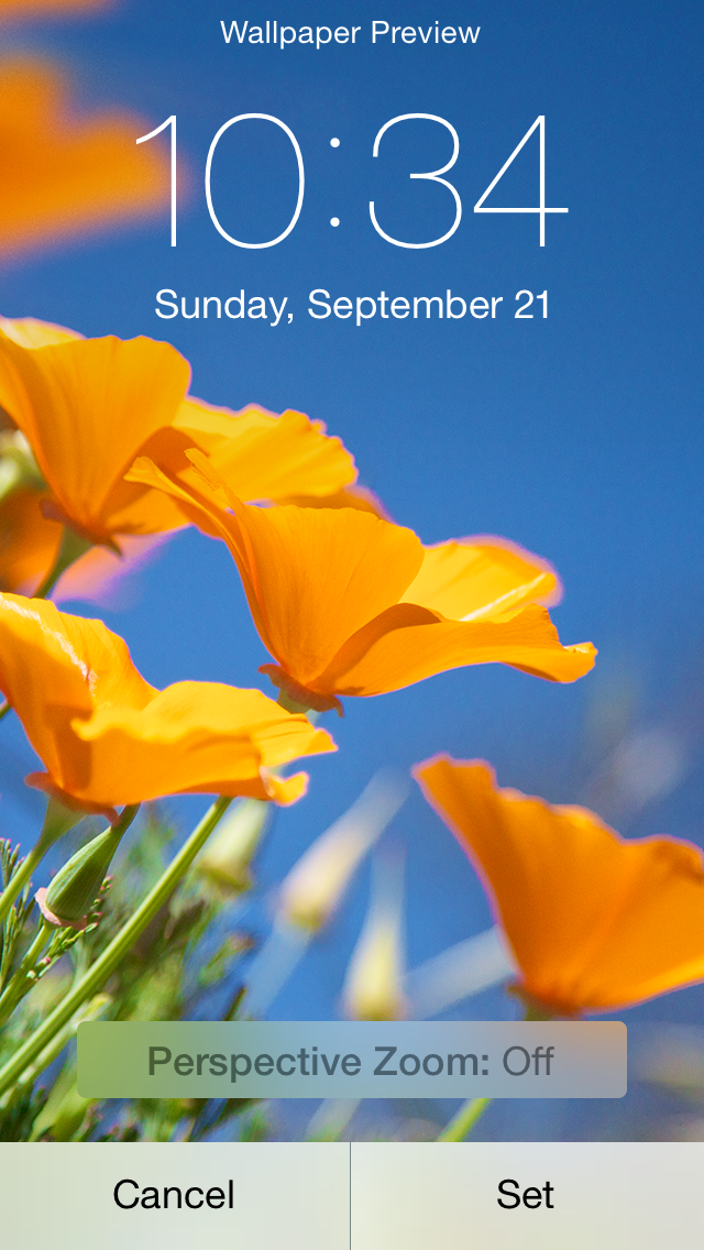
Perspective Zoom: OFF

Remember the old “Genie Effect” from Mac OS X where minimizing an app would make it snake down into the magic lamp of the Dock? It was kinda neat the first few times you tried it, but if you were like millions of other OS X users, you probably turned it off pretty quickly. The 3D parallax effect in iOS 7 was the Genie effect reborn for iPhone and was one of the very first things I turned off when I went from iOS 6 to iOS 7.

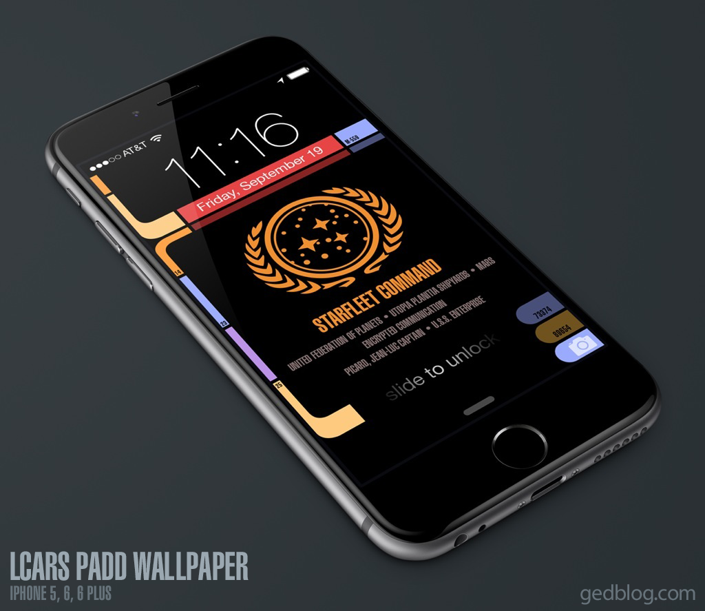
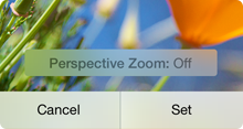
Now, thankfully in iOS 8 you have even greater control over the parallax effect and can turn it on or off for just the Lock Screen, the Home Screen or both. When you go into Settings > Wallpaper and choose an image to use as your Lock or Home screen, iOS 8 gives you the ability to turn Perspective Zoom on or off when you confirm the choice. Why anyone would choose to leave it turned on is beyond me, but at least now you have granularity when it comes to these cutting-edge, effects that can cause motion sickness in some people. Yay!
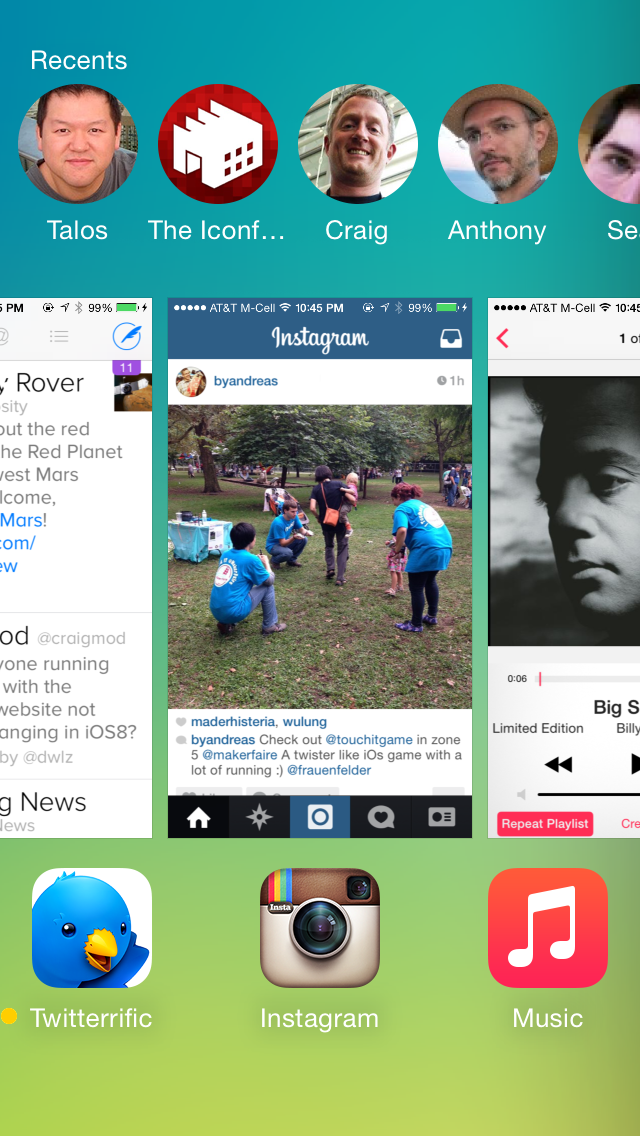
Recent Contact List

With fewer and fewer people using the built in Phone app, Apple wisely added a row of recent & favorite contacts to the top of the multi-tasking view. This handy list of people and places you’ve called, IM’d or written is a great way to initiate contact with them quickly and easily.

The only downside is that since I’m seeing their faces a whole lot more, I feel compelled to assign all my contacts decent looking photos for their avatars. Needless to say, not all of my friends have great pictures of themselves and this, as they say, has proven to be “challenging” to say the least. I guess we can’t all look like models from a GAP ad :-/

There are still more than a few rough edges that need sanding in iOS 8. Transition animations can be jerky, apps are prone to crash more often than in iOS 7 and devices can have problems staying connected to local WiFi networks. If history is any indication however, Apple should iron out these wrinkles in pretty short order. In the meantime there’s plenty of cool, useful new features in iOS 8 to keep all of us busy for some time and we haven’t even experienced Apple Pay or Continuity yet. The best, I suspect, is yet to come.

Star Trek: Next Gen Wallpapers for iPhone 6

UPDATE: Four new variants have been created for Apple’s new iPhone X. The device’s OLED screen means the LCARS design blends seamlessly into the bezel like never before. So much fun!

If you enjoy Star Trek as much as I do then you’ll love these free, Next Generation mobile wallpapers I designed for use with iOS. I’ve updated my original LCARS Star Trek lock screen for the brand new iPhone 6 and 6 Plus so you can be the geeky envy of all your friends. For those of you still running the smaller iPhone 5, don’t worry, there’s even a version here for you!

I’ve been a huge fan of Star Trek Production Designer, Michael Okuda since day one and this project was my way of saying “Thank you!” for the wonderful, futuristic operating system that Next Gen fans know and love as LCARS. With the iPhone 6 Plus approaching the size of actual padds from Next Gen, it only made sense to bring this amazing aesthetic to the palm of our hands.

How to download and apply the wallpapers on iOS:

1) Click to view the wallpaper that best fits your device:

• iPhone 5 Series (iOS 8 & 9) – Original / TNG Colors / Janeway Alt / Janeway TNG
• iPhone 6 (iOS 8 & 9) – Original / TNG Colors / Janeway Alt / Janeway TNG
• iPhone 6 Plus (iOS 8 & 9) – Original / TNG Colors / Janeway Alt / Janeway TNG
• iPhone SE Series (iOS 10) – Original / TNG Colors / Janeway Alt / Janeway TNG
• iPhone 7 (iOS 10) – Original / TNG Colors / Janeway Alt / Janeway TNG
• iPhone X (iOS 11) – Original / TNG Colors / Janeway Alt / Janeway TNG
• iPhone Xs Max (iOS 12) – Original / TNG Colors / Janeway Alt / Janeway TNG

• Windows Phone – Original / TNG Colors
I don’t own a Windows Phone and make no promises about how this version will work for you. These are provided as is!

2) Tap & hold on the image in mobile Safari & save it to your photo library

3) Open Photos, view the image then tap the Share button in the lower left

4) Scroll to the right in the Share menu and tap Use as Wallpaper

5) Pinch Zoom OUT on the image to size it exactly to the screen. You want the date to be vertically centered within the sub-horizontal bar near the top.

6) Turn Perspective Zoom OFF

7) Tap Set > Set Lock Screen

That’s it! Sleep/lock your iPhone and the next time you activate it, you can pretend you’re Captain Picard himself receiving an important message from Starfeet Command. I hope you enjoy this fun treat & help spread the word via Twitter and Facebook. Engage and enjoy!

UPDATE: I’ve added 6 new variants of the lock screen for iPhone after a request from @keydiehhurst. Available in both original and TNG color schemes, these variants address the communique to fearless Captain Kathryn Janeway in the Delta Quadrant. Safe journey, Captain!

UPDATE 2: I’ve added 8 new iPhone SE & 7 variants for use with iOS 10. The lock screen in iOS 10 has moved controls around so the wallpaper had to change to accommodate the new design. Hope to add iPhone 7 Plus variants soon.

UPDATE 3: I’ve added 4 new iPhone X variants for use with iOS 11. The lock screen in iOS 11 puts controls in a different place plus the tall format of the iPhone X means the wallpaper had to change to accommodate the new design.

UPDATE 4: I’ve added 4 new iPhone Xs Max variants for use with iOS 12. This iPhone is freakin’ huge so the placement of the controls, date bar and message block all had to be adjusted again. The Max is about the size of a small TNG PADD!