Redesigning Iconfactory.com – Eighth Time’s a Charm!

Photo of an iPad Pro laying on a table displaying the new homepage of Iconfactory.com. A grid of colorful client icon work fills most of the screen.

If you had told me twenty five years ago that I’d be helping to launch no less than the eighth iteration of our beloved iconfactory.com, I never would have believed you, yet here we are.

I was just a kid back in 1996 when Talos, Corey and I launched the very first version of the factory. Back then it was hosted on AOL and was where we offered up pixel-clicked icons for the Mac desktop. The rest, as they say, is history.

Fast forward to 2023 and we found ourselves behind the eight ball, with an outdated website that didn’t put enough focus on what has kept us in business all these years – paying clients. Freeware icons, wallpapers and software has been our passion but providing top-flight design services for clients has been our bread and butter and it was time for a long-overdue update.

Screenshot of a software promotional graphic for The Iconfactory's flagship app - Triode. The design showcases 2 iPhones running Triode framed against a background of oranges and black.
Design detail view for Triode, one of the Iconfactory’s flagship apps.

The re-design of iconfactory.com took the better part of a year, working on and off as we balanced design and engineering resources among a half-dozen or so other projects. We started with the single premise of creating a website that showcases our award-winning design services and ran with it. Our goal was to communicate one thing: If you need stunning icon, app, or interface design, we can help.

We also intentionally stripped away any and all marketing speak to keep the language of the new site straightforward and easy to understand. Our amazing Project Manager, Cheryl Cicha deserves full credit – I’m particularly happy with this part as I detest agencies and their tendency to talk circles around clients as they attempt to justify their huge costs.

I took the lead designing both the overall layout as well as the client and app detail views which proved particularly challenging. Creating unique, engaging layouts for all of the portfolio entries, as well as our own flagship apps was difficult, but the result was personally rewarding. My hat’s off to Anthony and Craig for taking the final comps and implementing them so faithfully across both the desktop and responsive mobile versions.

Custom iconography by Anthony Piraino for the 2023 site redesign.

The new Iconfactory was long overdue but hopefully it will become a destination for those who need to bring their digital app ideas to life. Its new design is just the latest in a long line that has changed much over the years, but for the far better. I invite you to visit, explore, become inspired and if you have a need, to get in touch.

Reclaim Your Screen with Unobstruct

Unobstruct app iconRecently I had the pleasure of collaborating on a fun project with my friend and co-worker, Troy Gaul. Troy and I worked closely together to develop Linea and he asked if I could design the app icon for a new type of ad blocker he was developing which eventually became to be called Unobstruct. The concept behind the app is simple – get annoying social media banners that websites overlay on their content out of the way. Screen real estate, especially on mobile devices, is limited and the last thing users need are buttons for Twitter and Facebook cluttering up the view.

From the moment I took up the project I knew I wanted the app’s icon to be both fun and non-flat. Like many iOS developers these days, I’ve had my fill with two-dimensional glyph-type icons that seem to be piled as far as the eye can see in the App Store. I didn’t want to swing the pendulum all the way back to a full skeuomorphism but I didn’t want Unobstruct’s icon to be just another soulless geometric utility that no one would ever remember.

rough idea concepts for Unobstruct sketched in Linea on the iPad

I gathered the gang at the office for a quick brainstorming session and we sketched out a bunch of rough ideas (I have a fondness for the one that looked like a bare-chested Vladimir Putin but alas that was never meant to be). From those quick doodles in Linea, a concept formed of a tough little bot that pushes offending social media bars and banners off the screen. Once I drew his basic forms in Adobe Illustrator, I slowly built up shading and subtle gradients to give him an overall feel of tactility. You can see a similar approach in the xScope Mirror icon, creating subtle dimension through the strategic use of highlights and shadows.

The result is an adorable, tough-as-nails app that will never stop fighting to free up your screen from those annoying floating bars and let you read easier. Check out Troy’s Medium post detailing how he developed the app and what went into making it a reality. Unobstruct is available today in the App Store for .99¢. We hope you’ll give it a try, enjoy!

The Evolution of Linea

iMore Show artworkLast week, the Iconfactory launched its new simplified sketching app for iPad – Linea. We worked on the app for over a year and used it internally for client projects during its development. The response has been nothing short of amazing. We designed the app to be easy to use and immediately approachable for both advanced artists as well as novice users and that simplified philosophy seems to really have struck a chord with people.

Rene Richie invited me to come on episode 543 of the iMore Show and talk about Linea. We discussed how the app came to be, what went into bringing it to market and how it hopefully stands out in the crowded space of App Store sketch apps. I had a great time with Rene, Serenity Caldwell, Lory Gill and Georgia Dow talking about Linea and getting their insights into why they love sketching with it. As an aside, if you’ve not seen Serenity’s amazing video review of Linea, please do check it out, it’s one of the best product reviews I’ve ever seen.

A big thanks to the entire iMore crew for having me on to talk about Linea. It’s gratifying to see something you’ve worked so long and hard on be so loved by the iOS community. The Linea section of episode 543 starts around the 24 minute mark. Enjoy!

A Sticker By Any Other Name Would Smell As Sweet

Sweet Stickypoo Sticker

So imagine that thing you’ve built your entire professional career on, something you love to create with a burning passion, slowly fades from popularity. Day by day people have less and less use for it, fewer and fewer people write you to make requests. You try to stay the course and keep doing your thing, but doubts inevitably creep in.

Then one day you find you’re just not doing it any more. You’re not really sure what happened but somewhere along the way it just… stopped. It pains you that people no longer love or even really need the thing you’ve honed your craft on for close to twenty years, but what can be done?

You go about your business, applying what you’ve learned to other areas of your discipline. Occasionally a project invites you to play in the fields you once roamed with glee, but they seem few and far between.

Then one day something comes along that turns the old thing you loved to do into something new and exciting. It presents that thing in a whole new, modern way and lets you express your creativity as never before to an entirely new audience. These people are too young to really remember you or where you’ve come from but that doesn’t matter. All that matters is that you’re standing in the middle of those lush, green fields once again and the sky is literally the limit. It may not last a year, a few months or even a week but for now, for right now, it’s just as fun, just as compelling and fulfilling as it ever was and it is glorious.

Those “things” are simply icons. Desktop icons, specifically.

They are what, since yesterday, we now call stickers in Messages but they’ll always be icons to me. Their introduction in iOS 10 represents a new era for icon artists like myself who once toiled for endless hours to create piles and piles of icons that people could download and use on their computer desktops. We created them because it was fun for us as artists and especially fun for those who collected them.

The advent of the iPhone and mobile era changed all that and desktop icons went out of fashion. People were glued to their tiny screens and didn’t have the time or attention span to customize their desktop folders and hard drives any longer. With the advent of iOS 10 however, people once again have a way to collect and share those tiny, iconic works of art in the form of iMessage stickers. Stickers, perhaps even more than emoji have the capacity to inspire and delight people as never before and I have completely enjoyed creating them during these precious weeks leading up to yesterday’s launch. I’ve been working with my friends at the Iconfactory to bring hundreds of icons stickers to life and it has been a blast. I’ve worked with outside artists as well and watching them create has been joyous.

Stickers may turn out to be another flash in the digital pan and fade quickly into the sunset but that hardly matters. Even if they do, for one brief moment, they allowed me to re-energize, create and dream what might be possible. In short, they have inspired me. As an artist I can truly say this matters more to me than all the tea in China. Thank you, Apple. I owe you one.

Guest Judging Food Network’s ‘Cake Wars’ Was a Sweet Treat

Cake Wars Emoji Panel

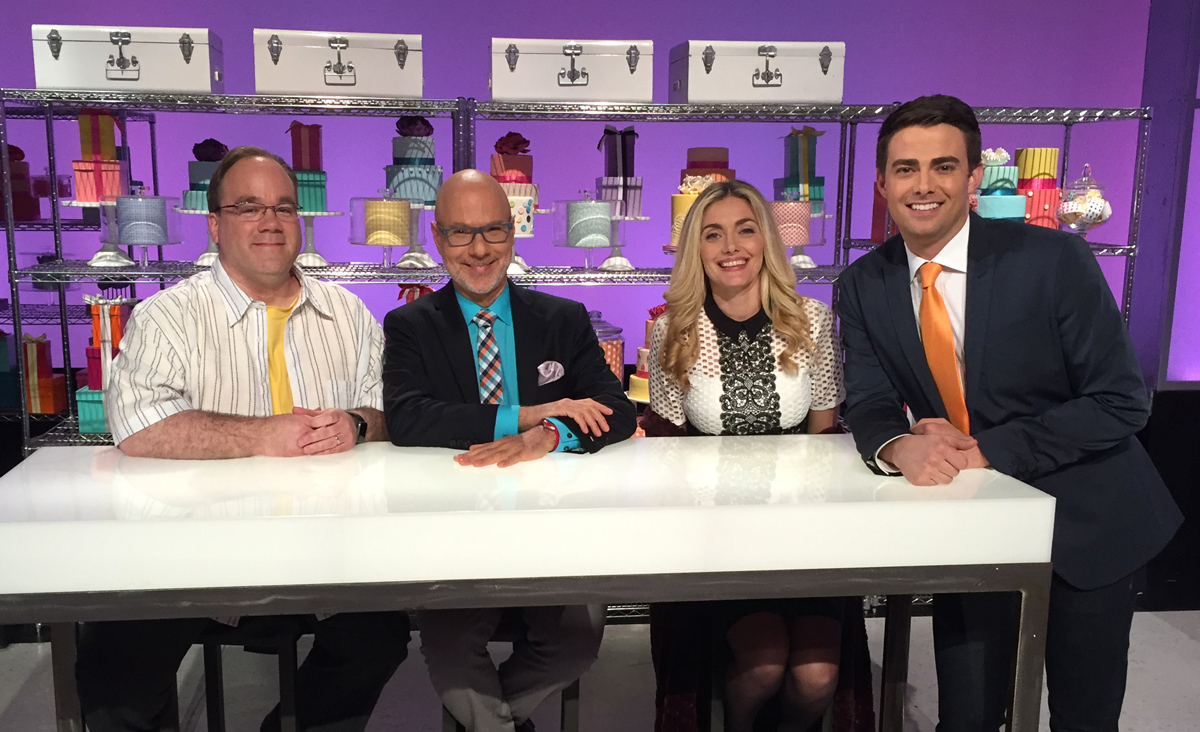
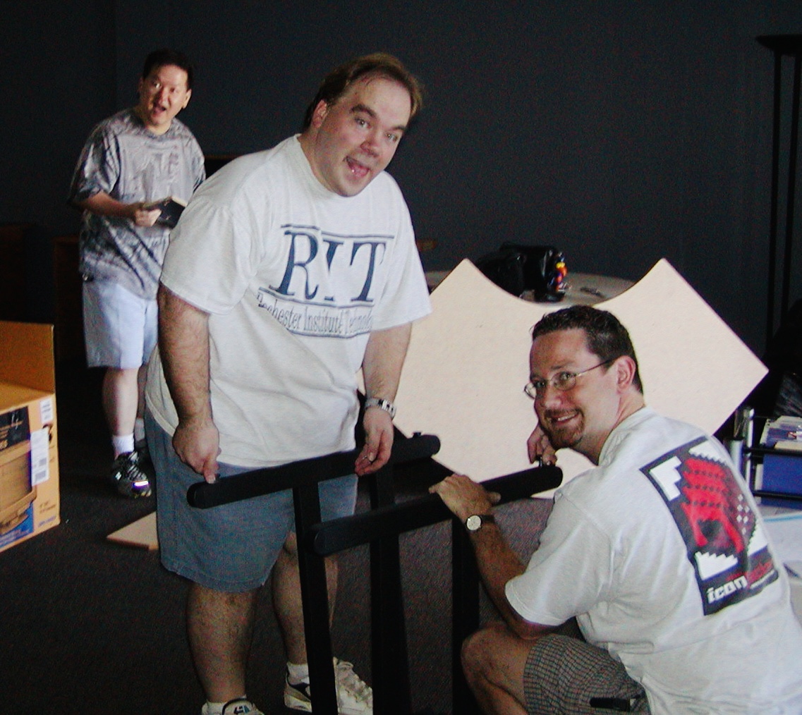
Pictured L to R: Myself, Cake Wars regular judges Ron Ben-Israel and Waylynn Lucas with host Jonathan Bennett

In my career as an icon artist I’ve had the privilege of working on tons of great projects, meeting fascinating people and participating in lots of wonderful events. This past March however, I was invited to appear on the Food Network’s reality baking competition, Cake Wars, as a guest judge and quite simply, it was an adventure of a lifetime. The theme of the episode I was to appear on was emoji, something I’ve become intimately familiar with these past few years. Needless to say when we received a request for one of us to fly to L.A. and participate as a judge I nearly fell out of my chair. From start to finish, my experience on Cake Wars was fantastic and so I just want to share some of those experiences with you.

The Journey

I’ve been a fan of reality TV cooking competitions for years with shows like Top Chef, Hell’s Kitchen, The Great British Baking Show and more recently Food Network’s Chopped and Cutthroat Kitchen. Over the years I’ve considered applying to a few of these shows in the hopes of showing off my amateur cooking skills but had never gotten off my butt to do it. So you can imagine how amazing it was to ultimately be sitting at the Cake Wars judging table next to the incredibly talented Ron Ben-Israel and Waylynn Lucas.

From our initial email exchanges to arranging the trip, all of the people from Super Delicious, the company that produces Cake Wars for Food Network, were positively wonderful and made my time on set a joy. My first surprise happened as soon as I stepped out of the car on the Cake Wars lot. Ron Ben-Israel had also just arrived and he immediately came over to greet me outside the main door. He stepped right up, introduced himself and said “You must be Gedeon!” As we entered the building, he proceeded to tell me all about myself, where I went to school, some of the projects I’ve worked on over the years and even how long I’ve been at the Iconfactory. “You see Gedeon, I do my homework!” The sheer fact that Ron warmly greeted me and knew all about me was such a thoughful way to be welcomed to the set that I could hardly believe it.

All throughout the day, Ron helped me to know where to look for the camera, gave me speaking tips and even signed an autograph for me which I now have hanging on my desk at work. He even took time to answer any and all questions I peppered him with like how he makes the incredible buttercream for his award-winning cakes! In exchange I showed him how to receive animated emoji on his iPhone and tried not to gush over sitting right next to him *too* much. I’d be remiss if I didn’t say for the record that Waylynn Lucas and host Jonathan Bennett were also both super nice to me as were the entire crew of over 60 people. It was easy to see they had all done their jobs dozens of times before and knew where they should be, how to speak, what the director was looking for and more from the start.

Judge’s Table

If you’ve ever watched TV and wondered what it must be like to sit behind the judge’s table to critique culinary creations, let me try and set the scene. Cake Wars is broken down into two rounds; a smaller initial round where one of the four contestant teams is eliminated at the end and then a big, show-stopping round with the winner receiving a $10,000 prize. I’m not going to spoil the episode and tell you who won (you’ll have to watch to find out) but I will say that watching the bakers work and tasting their creations was a privilege. Both Ron and Waylynn warned me to be prepared to taste both great and not-so-great cakes and naturally they were right. Some were moist and delicious, some were flavored perfectly and some were so sweet they made my toes curl.

All of the cakes arrived at the judge’s table via production assistants with perfectly cut slices, meticulously arranged on white flatware in front of me. Needless to say I took great care when handling my fork and made sure to take my time, taste everything and made mental notes on each as I went. Thankfully the producers explained my primary concern was to critique the overall design and visual appeal of the cakes, how well they conformed to the emoji theme of the challenges and if they had been executed well or poorly. Since I’m not a food critic I gratefully kept the majority of my comments focused on the designs of the cakes. The contestants seemed to appreciate my feedback through the various rounds.

Behind the Scenes

Between rounds, each of the judges had the opportunity to retreat to their dressing rooms while the contestants baked. The final round happens over the course of 4 hours and so there’s a lot of work on set for the contestants to get their show-stopping cakes completed before time expires. The production assistant explained to me they would come and get all of us for the final 30 minutes of baking but I asked if I could stay in my seat and watch while they worked. She allowed me to remain on set and I’m so glad I did. Not only did I get to see the inner workings of the show and how it’s filmed but I also was able to ask one of the floor directors a bunch of questions that he graciously answered.

One thing I asked was if the producers look forward to “food disasters”, i.e. when cakes fall or major mistakes occur on set. His answer was telling. He explained that of course most producers will say they think these unplanned problems make for great TV, but they also tend to push the production schedule later in the day, sometimes much later and that’s bad. Things have to be re-filmed, stations reset and it just throws a monkey wrench into the works which wastes time, money and makes the entire production crew cranky. Ultimately he explained that Food Network wants the contestants to succeed in their efforts and produce the best cakes they can so in reality, it’s better to have everything go as smoothly as possible in the end.

That’s a Wrap

From the moment I stepped onto the studio lot, just like the emoji I was there to judge, I wore a huge smile across my face. To say I was honored to be a part of Food Network’s Cake Wars emoji episode just doesn’t do it justice. It was quite literally a foodie’s dream come true to be able to travel to L.A. and participate in judging these amazing cakes from talented bakers across the country. One of the teams however was much closer to home than I ever suspected.

I learned just this week that one of the teams I judged is based right here in Greensboro, NC! I went to visit Taylor Kisselstein at Easy Peasy Decadent Desserts and ordered a dozen cupcakes (emoji of course!) for the viewing party I held at my home the night the episode aired. Thanks, Taylor!

When I think back on my experience I will always remember the excitement of being on the set, but I also warmly recall the people, especially Ron Ben-Israel. He is a professional in every sense of the word with an amazing talent for baking positively beautiful cakes. I’ve spoken with him a few times since filming and even now he continues to be just as warm, gracious and helpful as he was that day and has even encouraged me to audition for Chopped! To him, and all the other members of the cast, crew and production team, and to everyone at Food Network, thank you for having me on the show. It was an experience of a lifetime that I will never forget.

The Emoji episode of Cake Wars is available for purchase via iTunes. Enjoy!

Miscellaneous Thoughts & Observations

• Each of the judge’s chairs have a leather pouch hanging from the back of the seat for their cell phone should they wish to keep it handy but not on their person during filming

• The feeling you get when you see your own name on a dressing room door is just as amazeballs as you can imagine

• Ron Ben-Israel used to subscribe to MacAddict Magazine & was a huge Mac gear head back in the day

• Multiple people on set told me the “Minecraft” ep of Cake Wars was… challenging to film

• Each baking team has its own “story producer” who encourages them on set to be energetic, enthusiastic & speak clearly during the course of filming

• If all teams are in the weeds and are behind, the producers have been known to give them extra time to complete their cake creations

• Almost all of the judge’s dialog is unscripted. In contrast, nearly 100% of host Jonathan Bennett’s dialog is written for the camera. The script is edited in real time and constantly finessed and adjusted as events unfold during filming

• Fraternizing with the contestants prior to filming was strictly forbidden. Also, if one of the contestants approached me before filming began I was supposed to let the powers that be know O_o

• Having to eliminate people from possibly winning a $10,000 prize really stinks

• Awarding a $10,000 prize to a talented cake artist is incredibly awesome and more than makes up for the former 🙂

The Best BitCam Review. Ever.

BitCam review from the app store: WHY? - In 2016, why in the world would I want an app that makes my photos look WORSE? why? WHY?! I downloaded this app just to tell you guys ya crazy for giving it 5 stars. BOOO BOOO BOOOOO. Go HOME. And if you're at home, go stick your head in the ground. 8 bit camera...sheesh, good grief. As long as we're throwing out dumb ideas how about soggy bread, it goes down so much smoother! And what about ants in your pants? Oh yeah sounds like a great idea too; 5 stars for both. Finally, WHYYYYYY?!?

I and everyone at the Iconfactory are grateful so many people have been enjoying our little photographic throwback to the 1990′s with our recent release of BitCam. For those who remember the era it’s a nostalgia trip that brings bittersweet memories of straining modems and ear-piercing dot-matrix printers flooding right back. Millennials are not old enough to understand this however. To many of them, a dot-matrix printer is the tool that was used to print the flower patterns on the out house toilet paper back before there was indoor plumbing and colors hadn’t been invented yet.

Someday about 20 or 30 years from now, ya boy jax may well pine for the days when images were taken on a physical device instead of inside his eyeball. A time when talking with his friends meant tapping on a glass-covered screen to launch an archaic app like Snapchat instead of projecting a hologram of himself from his floaty chair onto whatever the internet eventually becomes. On that glorious day, I will push back in my recliner at the old folks home and smile the smile of kings.

You’ve Come a Long Way, Ollie!

While preparing for the onslaught of technical support that accompanies new releases of our most popular app – Twitterrific, I was curious about just how many updates we’ve actually released over the years. I looked back through the app’s version history as well as a fun timeline of Iconfactory software releases I created a few years ago to find this week’s 5.8 update is the app’s 50th since its launch in the summer of 2008.

If you had told me back then that we would still be coding and improving the little blue bird that could almost seven years later, I probably would never have believed you. Back then Twitterrific 1.0 was a fun, but unproven app for the then newly released iPhone from Apple. It was released along with the launch of the brand new App Store where users could browse hundreds (yes hundreds) of apps for their shiny new phones. At that time there was no official Twitter mobile client, I’m not even sure there were ANY other Twitter apps in the store at launch*.

Fast forward to 2014 and 50 updates later and we arrive at v5.8 for iOS 8. Given the rocky history 3rd party developers and Twitter have gone through the last few years, I’m honestly surprised we’re still here today. Over the years Twitter has focused more and more on controlling their own user experience and branding. This meant imposing design and interaction guidelines on 3rd party devs like the Iconfactory as well as capping the number of total users who can actually own Twitterrific. Thankfully, since Twitterrific was there at the very beginning, our token pool (at least on iOS) is quite large and we can afford to continue developing the app as long as it makes money. The same can’t be said for so many other smaller 3rd party Twitter developers who have either given up or sold their apps to other larger developers. One of the reasons why the Mac version of Twitterrific still hasn’t been updated is due to the limited number of user tokens available to us on the Mac platform, a policy I sincerely hope Twitter re-examines one day.

When I think of all the hard work, hand-wringing and ultimately, satisfied customers, Twitterrific has gone through over the years it really boggles my mind. Knowing that so many people use and love something you’ve created day after day is a wonderful feeling. You keep downloading and sending us positive feedback, and that motivates us to refine and improve the app. Twitterrific would never have flown as far and wide as it has if it wasn’t for all of our loyal customers, and for that we are truly thankful. If you’ve not tried Twitterrific in a while, I invite you to check it out. Everything old is new once again!

* There was at least one other 3rd party Twitter app in the store at launch – Twinkle.

1 Comment

The Art of Doing ‘Nothing’


“When you do things right, people won’t be sure you’ve done anything at all.” This line from Futurama perfectly sums up how I often feel about my job. Designing, if done right, takes the challenge of communicating a complex idea effectively, and turns it into something that can be easily understood by the masses. When designers do their job right, the overall design fades into the background and you just “get” what you’re looking at. It speaks to you on a fundamental level, things just click and you usually see big smiles on the faces of those who interact with your work.

Through the years, I’ve learned the job of the programmer is much the same. Although my programming abilities are limited to rough forms of HTML and BASIC (yes, BASIC), through my position at the Iconfactory, I’ve learned much about what goes into making a successful software application. I see the challenges that our programmers tackle every single day and I for one am always impressed. This is particularly true of our latest effort, the retina compatible version of xScope for Mac OS X.

When Apple’s stunning new display was announced, I was excited about the increased level of detail and clarity the technology would bring to the desktop. The images are gorgeous, text is as crisp as the printed words and colors are deep and rich. Designing for this display means tools that can work correctly with it, giving you accurate and flawless information from which you can build your designs. From the get-go we knew that xScope, our utility for measuring and inspecting the screen, had to be updated for this new display. What we didn’t realize when we began was just how complicated that update would be.

I’m going to be completely honest here and say that even today, after several months, I still can’t get my head fully around the concept of pixels vs window points. Oh, I know what they are and why they exist, but from the time I first learned how to use a mouse, I’ve always dealt with pixels as the unit of measure on the screen. My entire professional career has revolved around the humble pixel and as such it’s been difficult coming to grips with the fact that the days of seeing exactly what you get on screen are pretty much over.

But all of this pales in comparison to the work that my friend, our lead engineer Craig Hockenberry, had to do in order to get xScope working properly with the new retina display. Whenever Craig starts waxing programatic about his coding, my eyes usually glaze over. That said, there were times during the xScope retina conversion when I thought I was going to go catatonic. If you’re the type of person who loves coding, or maybe needs something to read to send them off to sleep at night, head on over to Furbo.org and read Craig’s technical post on the problems with coding for retina. Suffice to say it’s beyond me. Also beyond me – all the math, logic and problem solving needed to surmount this incredible challenge. I have tons of respect for anyone who finds mathematics fun and exciting, and even more for friends like Craig who wield it like a weapon in the service of their job.

When designers and developers use xScope on a shiny new retina Macbook, all they’ll know, indeed all they’ll care about is that the app works as advertised. xScope will give them the data they need to make their apps and designs the best they can be and that is all that matters. Because of the efforts of Craig and Corey Marion, xScope’s lead UI designer, the app just “works” and it works well. Users won’t know all the algebra and bug finding that went into creating it, but I thought it was appropriate to take just a moment and recognize the hard work that went into making it a reality. I sincerely hope you find the new version of xScope as powerful and useful as all of us have. But the best part is if we’ve done our jobs right, you won’t be sure we’ve done anything at all.

5 Comments

The Murky Future of 3rd Party Twitter Apps

Magic 8-Ball, it’s been a while but I have some questions about Twitter’s recent blog post. You know, the one where they talked about “stricter guidelines” for how the Twitter API is to be used by third party apps. Since Twitter isn’t talking, I was hoping you might be able to clear some stuff up for me. Can I ask you some questions now?

Yes

All this talk about stricter guidelines and a “consistent Twitter experience” seems pretty ominous, should developers of 3rd party Twitter apps like me be worried?

Reply hazy, try again

I mean some people are calling Twitter’s non-announcement a “bombshell”. Are things really that bad?

Better not tell you now

What do you mean? Are you saying that 3rd party apps are about to become extinct or that Twitter just wants each app to display the timeline in a similar fashion?

Concentrate and ask again

I know Twitter’s got to start making serious money to pay for it’s massive overhead, are we talking about ads in the timeline?

Outlook good

If we’re talking about ads, I can deal with that. I’d rather have promoted tweets in Twitterrific than being forced to stop developing it completely.

What about expanded tweets, will Twitter force us to build some form of them into our apps?

Signs point to yes

If we don’t, do you really think Twitter would restrict API access and hang 3rd party apps out to dry?

Better not tell you now

That’s very comforting, thanks.

Don’t you think Twitter’s users would revolt if they took away our Tweetbots, Hibaris and Twitterrifics?

As I see it, yes

Damn straight they would. There are many developers and companies who have build their livelihood around the Twitter API since 2007. We even helped Twitter evolve and grow to where it is today. Are you saying none of that matters now?

Without a doubt

Frak.

Some developers are already suggesting we start creating a web-based, open alternative to Twitter using something like RSS. Would that really work? Would users really switch away from Twitter for a grass-roots service?

Don’t count on it

Do you think it’s a good idea for developers like us to keep coding away on their apps for now?

Most likely

Could the folks at Twitter have done a better job with their blog post to help stop the spread of paralyzing FUD?

It is certain

You really haven’t been much help to me. One last question…

Is the golden age of 3rd party Twitter apps over?

Ask again later

Meh! What do you know, anyway!

6 Comments

Ramp Champ’s Ticket to Ride

Back when Ramp Champ was released for the iPhone in August of 2009, it was one of only a handful of boardwalk style games in the App Store. Although it had taken much longer to produce than we had initially thought, all of us at the Iconfactory and DS Media Labs were proud of the effort. From its pixel-perfect artwork, and the fantastic original soundtrack to the design of Ramp Champ’s in-app purchases, every part was crafted with love. I wrote back then that the game was a huge risk for us as developers, but no matter what happened, I wouldn’t trade the experience for the world. All of us had tons of fun creating the game and the effort was hugely rewarding. Fans loved the rich graphics and cleverly designed puzzles that brought back memories of arcades and boardwalks long gone.

Shortly after Ramp Champ’s release, Skee-Ball by Freeverse hit the App Store and quickly stole Ramp Champ’s momentum. Skee-Ball was limited in its game play and far less graphically rich than Ramp Champ, but thanks to its straight-forward approach and realistic 3D physics, it became a huge hit. With Skee-Ball’s success, dreams of hitting the top 25 of the App Store quickly faded and although the game held its own, it never rose to the level that we had hoped it would. We produced several new add-on ramp packs for the game, but both the Iconfactory’s and DS’s resources were limited and we each turned our attention to other projects.

With the advent of the iPhone 4’s retina display 4 in June of 2010, Ramp Champ fans clamored for an updated version of the game with new high-resoultion graphics. The problem was that most of the content for the game was produced using raster (bit-mapped) graphics, not scaleable vectors and re-creating the entire game for retina proved cost prohibitive. For a while there was talk of a sequel that would be designed around all new vector graphics, and an internal prototype was even built, but it just wasn’t in the cards. Sometimes it’s difficult for small companies to devote time and money to a project when success is far from assured and such was the case with Ramp Champ. Its future seemed bleak indeed.

Then near the end of 2011, Ben Stahlhood and I started talking about DS Media Labs taking the reins of our favorite gaming son. DS had gone through some restructuring and was hiring fresh new talent to position themselves well for 2012. It’s always tough handing one of your most treasured creations to another to foster, but with Ramp Champ the move made sense. DS had been a fantastic partner in the game’s creation and we knew that if anyone was going to give Ramp Champ a bright future it would be them. With our development efforts focused on xScope, Twitterrific and the upcoming Astronut for iPad, we finalized the arrangement and I’m pleased with the result. I don’t know what’s in store for Ramp Champ any more than you do, but DS’s recent press release promises at least updated retina graphics, and I’m confident there will be much more to come after that.

All of us at the Iconfactory wish Ben and the gang at DS Media Labs all the best in their success. We look forward to rolling balls, knocking down those damn ducks and collecting tickets for even bigger and better prizes when Ramp Champ ultimately gets the update it so badly deserves. Good luck gang!

29 Comments

Twitterrific’s Tough Love

When you love someone it’s hard to say no to them. You’ll usually do anything to please that person even if it goes against your better judgement. The inability to say no can also extend to the realm of software development. Companies can get so caught up in the desire to give users the best and brightest features they forget about the dangers of feature creep. They forget about good design. Such was the case with Twitterrific for the iPhone.

Somewhere during Twitterrific’s evolution from the desktop to the iPhone, we forgot how to say no. We said yes to too many of the latest features, 3rd party services and user requests. Eventually this “leap before you look” approach increased the complexity of the user interface and made the app’s settings too confusing for even us to figure out. A growing chorus of users told us the app was too hard to understand. We had lost our way.

The announcement of the iPad changed all that. Constrained by the 60 day launch deadline, we set about to create a fresh version of Twitterrific that would be dead simple, include all of Twitter’s core features and be a joy to use. The result was Twitterrific for iPad which is now available on the App Store. Many of the extraneous features from the iPhone version were initially removed including *all* of the app’s settings. There are no layout controls, body text compression, address book, themes and no tap shortcuts. What we present in exchange is simply the most friendly, easy to use Twitter client available anywhere. Like the iPad itself, Twitterrific is now designed for the masses. Those fabled 80% of users that Steve Jobs mentioned at the product’s launch are now our target audience. Early reaction to Twitterrific for iPad has been very positive. The app is decidedly easy to use and has a feature set that the majority of users want.

The result is a strong user experience that is influencing our efforts on the iPhone as well as the new upcoming Mac version of Twitterrific. Having eventual parity across all versions of the application will cut down on technical support requests and free up our development time, resulting in more regular updates and bring Twitterrific to a wider audience. Will we bring back some of the most heavily requested features? Yes, versions 1.0.1 and 1.1 for iPad have already added requested features like 3rd party push, reply all and picture uploading.

Twitterrific 3 for iPhone benefits from all the work that has already gone into the iPad including: proper retweets, lists, saved searches and more. Add to this the long-awaited full landscape support that our users have been crying out for and Twitterrific is a whole new experience on the iPhone. All these things aside, rebooting the app in this fashion has allowed us to evaluate each feature on its own merits. Free of the pressure to include everything but the kitchen sink, Twitterrific now starts fresh and will gain new users. Once all the versions are in sync, we can concentrate on bringing updates to Twitterrific across all platforms simultaneously. This will hopefully allow us to avoid the pitfalls of having one version wildly out of sync with the rest (like the current Mac version).

In the end, this approach benefits both the customer and the Iconfactory and makes for less frustration. We realize that some current users of Twitterrific for the iPhone may lose a few of their favorite features as we move towards these new versions. Some may even seek out other Twitter clients as a result and if that’s the case, I’m okay with it. It’s impossible to please everyone, so we’ve decided to focus on those like us who want a streamlined and straightforward Twitter experience. Our days of trying to be the everything-under-the-sun Twitter client are over. Tough love has taught us saying “no” leads to beautiful things. The best is yet to come, I hope you’ll join us.

Related posts:

For more information about the changes coming to Twitterrific, be sure to check out David Lanham’s post on optimizing the user experience (including more screen shots from version 3 for iPhone) as well as Craig Hockenberry’s piece on why simplifying a design is so important. Thanks!

100 Comments

Losing iReligion

A great deal has been written about the App Store, both good and bad, and much of it comes from developers I know and respect. It almost seems pointless to add my own thoughts to those who are more widely known and respected than I am, but given how my feelings have evolved regarding the App Store recently I think it’s worth a shot. If what I have to say gives a potential iPhone developer reason pause and re-examine their entry into the space then it will have been worth it.

The App Store is broken. I know from the outside glancing in, it may not look that way but it is. It also doesn’t seem like it’s broken from Apple’s point of view since the store and its tens of thousands of software titles have helped place the iPhone firmly at the head of the smart phone industry. But speaking as a small developer who’s been releasing Mac software for over a decade, the App Store is broken. The ironic part is that if you had asked me this a few months ago I would have denied it with my dying breath.

Since it first launched in July of 2008, the App Store has been evolving and changing to suit the needs of both Apple and consumers. Unfortunately for developers many of these changes have hurt more than they have helped. The utter race to the bottom of the pricing structure by thousands of developers has created tremendous pressure to set applications at either free or near free price points. I know this first hand because when Twitterrific for the iPhone first debuted we set it’s price at $9.95 which, by today’s App Store standards, is almost unheard of. It wasn’t long before lagging sales and increased pressure from competition forced the Iconfactory to lower the application’s price to $3.99, still “expensive” by App Store standards. Not only was the price lowered, but the feature set was more than doubled and yet many users still complain it costs too much. While these changes represent perks for users, it also means that sustaining profitability for a given piece of software in the App Store is nearly impossible unless you have a break-away hit.

This leads me to the next point of failure for the App Store – visibility. Everyone has heard about the so-called “gold rush” certain developers have experienced. Flight Control’s 1.5 mil sales record. Trism’s incredible $250,000 short-term bonanza. But for every one of these lottery wins in the store, there are hundreds, if not thousands of developers who see little if any return on their investments of time and money. What’s worse, the success or failure of a particular piece of software in the App Store depends as much on Apple deciding to feature your creation as the creation itself. One can shift the tables in one’s favor with a sizable advertising budget, but many of us like the Iconfactory don’t have such generous resources at our disposal.

When the Iconfactory & DS Media Labs released our latest iPhone game, Ramp Champ, we knew that we had to try and maximize exposure of the application at launch. We poured hundreds of hours into the game’s development and pulled out all the stops to not only make it beautiful and fun, but also something Apple would be proud to feature in the App Store. We designed an attractive website for the game, showed it to as many high-profile bloggers as we could prior to launch and made sure in-app purchases were compelling and affordable. When the moment came, Ramp Champ shot up the charts quickly but just as quick, it hit a brick wall. Within days the app that had peaked at #56 on the top paid chart fell off the top 100 despite receiving praise from users and reviewers alike. The lack of store front exposure combined with a sporadic 3G crashing bug conspired to keep Ramp Champ down for the count.

A new version that corrected crashing was completed quickly, but once again the App Store reared it’s broken head as the review process kept the fix out of user’s hands for almost two weeks. By this time it was too late and momentum had been lost. Despite a “What’s Hot” feature by Apple in the App Store, Ramp Champ’s sales have not lived up to expectations for either the Iconfactory or DS Media Labs. What’s worse, many of the future plans for the game (network play, online score boards, frequent add-on pack releases) are all in jeopardy because of the simple fact that Ramp Champ hasn’t returned on its investment.

In order for a developer to continue to produce, they must make money. It’s a pretty simple concept and one that tends to get lost in the excitement to write for the iPhone. It’s difficult for me to justify spending 20-50 hours designing and creating new 99¢ levels for Ramp Champ when I could be spending that time on paid client work instead. I would much rather be coming up with the sequel to Space Swarm than drawing my 200th version of a magnifying glass icon. But I’d also like to have some assurances from Apple about reducing the length of the App Store approval process, having the ability to respond to factually incorrect iTunes reviews, not be limited to 100 beta testers, or that large, prominent developers won’t always get preferential treatment. In short, I’d like to know things will be fixed and I don’t mean merely posting a page of marketing text in iTunes Connect.

It is a truism that everyone who creates content is a control freak. From fine artists that decide what gallery their work will hang in, to architects who scratch tooth and claw with stubborn clients about what materials will be used in construction. Software developers are no different. We all want as much control over our creations as we can possibly have and the App Store in it’s current state has removed a significant level of control from our hands. I’m not ready to throw my lot down with those who have renounced the platform just yet, but unless some significant changes come very soon, myself and others like me will have no choice but to focus our development efforts elsewhere.

UPDATE: Several developers have contacted me and told me privately that they think it isn’t so much the App Store that’s kept Ramp Champ from being a success as it is the game itself. Given the fact that Freeverse’s newly released and shallower ‘Skee Ball’ currently sits at #6 in Top Paid apps in the store, part of me wants to agree. I could second-guess myself about what didn’t go right with Ramp Champ but in my heart of hearts I know RC is better than 90% of the games that get to the top of the list. I have to keep telling myself that what doesn’t kill us will make us stronger in the end. Hopefully.

UPDATE II: Seems I’m not the only one cooling to the idea of developing for the iPhone. Macworld’s Dan Moren reporting from the C4 independent developers conference says many of the developers are frustrated at their lack of control in the App Store. I’m glad to know I’m not the only one.

UPDATE III: Marco Arment has written an excellent piece that addresses my post. I agree with much of the analysis there and tend to think that their may indeed be “two App Stores” so to speak. As a result of suggestions from both Marco and the commenters here, Ramp Champ’s vague app store description has been re-written and new screen shots posted to show more content. Thanks to everyone who suggested these changes, I think they will definitely help sales.

1 Comment

Rolling the Hard Six

This week marks the release of the Iconfactory’s third piece of software for the iPhone platform, and only our second game – Ramp Champ. Ramp Champ is a fun twist on some of the carnival games you’ll remember from your childhood. The game was designed with love by the gang at the Iconfactory and implemented with skill by the talented folks at DS Media Labs. It’s been in the making for the better half of a year and the time has finally come to release it into the wild.

I’d be lying if I told you I didn’t have a huge case of stomach butterflies right about now. We’ve invested a ton of time and money in Ramp Champ and its relative success or failure will be determined within the next 2 weeks. I always get nervous before software releases, but more so when it’s something completely new. Unlike some other large developers, we don’t have a huge well of funds to dip into to develop our apps which makes writing for the iPhone something akin to playing the lottery. We always do our best to design and implement applications that we think people will use and love, but until you actually get real feedback from users, you just don’t know.

When it comes to the App Store, it seems that the success of a particular application has as much to do with luck as it does with blood sweat and tears. I’ve seen apps I never thought even merited being in the store rise to the top despite poor quality or being based on a questionable premise. Meanwhile, defying all developer logic, some of the very best applications never rise above the top 25. Some are sandbagged by the perception of being “too expensive”, others get obscured by the meteoric rise of novelty “ringtoners” who inevitably take the App Store’s coveted top slots.

Talk to a bunch of iPhone developers and they’ll most likely tell you that everything being equal, success in the App Store is a crap shoot. You can push the odds in your favor by producing a high-quality piece of software, as well as offering it for next to nothing, but in the end fate feels like the final arbiter. I’m very proud of all of the guys, both at the Iconfactory and at DS Media Labs for putting together one heck of a fun game. Hopefully you will enjoy playing it just as much as we enjoyed creating it. No one would deny that producing applications for Apple’s iPhone isn’t risky, but as I’ve told myself again and again lately, without risk there can be no reward.

Now if you’ll excuse me, I’ve got to go chug a bottle of Pepto-Bismol.

UPDATE: Well, we’re over the release hurdle at this point and I’m feeling a lot better. Overall the reaction to Ramp Champ seems to be very positive, although we’re dealing with some memory issue that are causing crashes, particular for 1st Gen device users. The good news is we think we’ve ID’d the problem and should have a fix submitted to the App Store soon.

Thanks to everyone who’s posted or tweeted positive feedback about the game, it’s done my heart (and my stomach) a lot of good these past 2 days. If you’re interested in knowing what went into producing Ramp Champ, head on over to Louie’s blog for some insights. More to come!

9 Comments

Mr. Jobs, Domino’s Calling!

I’ve recently discovered creating a successful iPhone application is a lot like baking a pizza. Take the best ingredients, like skillfully crafted code, bold and flavorful interface design and combine with a dash of love and you may end up with a delicious dinner. Unfortunately for App Store developers, once you’ve rolled the dough, spooned the sauce and added the toppings, the delivery process itself can often be frustrating.

Apple’s process of getting apps reviewed and posted to the App Store leaves much to be desired. Once submitted, we developers must sit back, cross our fingers and hope everything is in order so that the “pizza” makes it to your device in a timely fashion. One of the criticisms of the App Store in recent months is that it can take more than 2 weeks to have an app make it’s way through the review process, sometimes only to end in rejection. When this happens, the problem must be corrected, the app resubmitted and the developer goes to “the back of the line” and starts all over again.

Since most developers would rather have too much feedback rather than too little, one way to ease the pain of the review process would be to add more feedback. Developers love feedback, whether it comes in the form of bug reports, reviews, emails or simple sales figures. In the world of home pizza delivery, when it comes to awesome feedback, no one beats Domino’s.

When a customer orders a pizza from Domino’s online, they receive instant feedback on the status of their order via Domino’s über-cool pizza tracker. The tracker tells you where in the cycle of delivery your pie is, what time it started the last phase and who’s currently working on it. It may sound corny, but this is exactly the kind of feedback developers need when submitting software to the Apple App Store. Imagine a meter that outlines each part of the approval process with time and date annotations for each step. The App Tracker would be of enormous assistance to developers, ensuring proper completion of each part of the submission process. A developer could track their “pizza” as it made its way to the store and get a better sense of when to expect final delivery. It could also help Apple internally so they know what phase a particular application was last in if a problem arises.

Such a system would allow companies to better plan their product’s marketing efforts and direct their resources more efficiently. Not to mention reduce the level of stress associated with being left in the dark regarding your application’s approval. Apple recently implemented a small counter for developers to let them know what the average approval time for their applications are in iTunes Connect. This was a great first start, but I suspect that with a bit of love, and a few lessons from the folks at Domino’s, getting through the app store approval process could be as easy as pie.

A Bird in the Hand…

The recent release of Twitterrific 2 for the iPhone has reminded me that software development is replete with truisms. The primary thing I have to constantly remind myself is that, no matter what you do, or how hard you work, you simply cannot please everyone. Anyone who works in a creative field knows that there will always be those who are unsatisfied with the result.

For iPhone developers, these people usually fall into the “if it just had feature X, I would use it” category, but every so often you get someone who just poo-poos your efforts. It’s easy for devs to fall into the trap of trying to keep everyone happy, but years of experience have taught me that this is a losing battle. Development quickly builds into a sort of “features arms race” that usually ends with bloated software and burnt out programmers. No, the answer is to design first and foremost for yourself. If you can produce a piece of software that you are happy with, then chances are the majority of your users will be too. The trick is trust your gut enough to tell the difference between constructive feedback and the nay-sayers so you can move beyond them when it’s appropriate.

The other truism I’ve found is that there’s always room for improvement. The new posting user interface for Twitterrific 2 demonstrates this point perfectly. All through beta testing, the posting UI was the same as it was in version 1. If you wanted to change your update from one type of tweet to another, you had to toggle the tweet type using a single icon on the post bar. Although this method had served well since our initial launch, neither us nor the beta users were satisfied. Their feedback, combined with Louie’s desire to improve the posting experience challenged us to do it better. The result was a re-designed UI that fulfilled user’s desires for posting clarity while giving the Iconfactory a big new feature to tout. The amount of work required to pull off the revised posting interface so close to the end of the beta was intense, but ultimately worth it.

Lastly, if there is one axiom that Twitter has proven beyond a shadow of a doubt it’s simply that if you give an inch, the Twitterverse takes a mile. Lately I’ve been seeing more than a few requests for Twitterrific to support Twitlonger, a service that allows you to “expand” on the 140 character limit that is at the very heart of Twitter. The argument goes that allowing long updates to be read directly in-app is preferable to having to post multiple tweets. This may indeed be true, but I hesitate to support any service that, for lack of a better term, subverts Twitter. Brevity is the soul of wit, and in Twitter’s case, its lifeblood.

In my opinion, any update that can’t be held within Twitter’s 140 character limit should be taken offline to email, Facebook or Friendfeed. What’s the harm in supporting a great service like Twitlonger you ask? Seemingly none, except that Twitlonger is a very slippery slope. Imagine typing a tweet of any length right in Twitterrific. When the message length exceeds 140 characters, the app automatically creates web page entry where your followers can read your magnum opus. Sounds great, except its no longer Twitter, it’s called a blog. Given how easily such a feature would be abused (as is evidenced by the Twitterverse’s aggressive adoption of RT), I don’t see Twitlonger support in Ollie’s future.

As developers, all we can do is our best. Sometimes our best is good enough and sometimes it doesn’t cut the mustard. I’ve been very pleased with the positive reaction that Twitterrific 2 has been receiving from the Twitter community. There are updates coming that address some of the most requested issues from the initial 2.0 launch, but I have no illusions that even these updates will satisfy everyone. Not to mention all those people out there who are patiently waiting for an update to the Mac version of Twitterrific. To them, I offer one last proverb – Good things come to those who wait.

1 Comment

The Value of a ‘Miracle’

One of the toughest parts about owning your own creative business is having to keep secrets. During my time at the Iconfactory, we’ve had to wear many projects close to our sleeves for months, sometimes even years until the day comes when we finally can talk about them. This philosophy doesn’t just extend to our paying clients however, it also covers our internal projects.

Over the years, I’ve learned the hard way what happens when you let competitors know what your up to. If you’re lucky they merely get a jump on your idea, but sometimes, for one reason or another, they manage to beat you to market. This is one reason why I subscribe to the Montgomery Scott school of thought when it comes to product announcements. Named after the famous engineer from my beloved Star Trek, the theory is simply this: Under sell and over deliver.

By setting realistic expectations in the minds of your customers, they are pleasantly surprised when you manage to exceed them. This is how Scotty got his reputation for being a “miracle worker” on Star Trek. It’s also why we don’t typically like to give sneak peeks or announce dates for freeware and software releases at the Iconfactory unless we’re very close to releasing something. By doing this we keep competitors guessing and limit dangerous over-hyping.

Taken to its logical conclusion, the best way to keep expectations in check is not to create them in the first place. Unfortunately, this approach fuels rumors and leads some to conclude total inaction. My response to these people can be summed up in a recent tweet from my friend and colleague, Craig Hockenberry who said “When I appear to be doing nothing is when I am doing the most.”

We always have something new coming down the assembly line at the factory. I’d love nothing more than to run shouting to Twitter what we’re up to on any given day, but that would only lead to user heartache. We also firmly believe that if you’re going to do something, it’s worth doing right. So remember – just because you don’t have access to engineering, it doesn’t mean we’re not busy installing the latest dilithium crystals.

3 Comments

Market Yourself An iParadigm

John Gruber over at Daring Fireball links to an intriguing piece by Paul Kafasis on the state of the App Store. The post compares Walmart’s strategy to sell disposable, cheap goods to those of App Store “ringtone” developers which are forcing down prices. My friend and business partner, Craig Hockenberry wrote about this very topic a few weeks ago in a piece that put him in the crosshairs of quite a few people.

After Craig’s piece was published, and indeed after reading the post by Kafasis, some are under the impression that more expensive “AAA” apps are doing just fine thank you very much. The theory goes that one only has to look at the App Store top 10 list to understand it’s not price that gets you into the top 10, but quality. This, plus marketing on the part of the developer are all that’s needed to boost your software into the top 10 of the App Store. Reading through the comment thread at Inside iPhone it all seems so simple. All a developer has to do is market their app and the rest will take care of itself! Why didn’t I think of that?

The part I love the most is that the people making the “just market your app!” comment have no real idea how much effective marketing costs. Oh sure, you can go far on viral and word-of-mouth marketing, but it all pales in comparison to even a small banner graphic in the App Store. The Iconfactory could spend tens of thousands of dollars buying up targeted advertising space to promote Frenzic, but it still wouldn’t be 1/10 as effective as the front page graphics that Dropship, Marley and Texas Hold’em are enjoying (for free) as I write this. Not only that, but I have no way to track metrics for advertising pointing at Frenzic in the App Store. I can’t gauge how effective a $75 blog ad versus a $2,600 DF sponsorship is because Apple doesn’t currently give me stats of people clicking through to my software. Anyone who says “Just market it!” doesn’t have a solid grasp on how the App Store works.

Another example is Rolando. People are holding this app up as the ultimate example of a quality, non ringtone app that is enjoying success in the store. It is true that Rolando is a fantastic game worthy of the top spot it once held. It is also true that Apple promoted Rolando from DAY ONE in the App Store with major graphics both in iTunes and on Apple.com. All that exposure helped to get Rolando into the top of the store when it launched. But its $9.99 price point is like an anchor. As I write this, Rolando sits at #30 in the top 100, and #10 in games. Let me repeat that. #10. In games.

So what is in the App Store top 10 right now? iFart Mobile is number one which is still riding high on a wave of PR thanks to being originally barred. Crash Bandicoot, which is featured in national Apple television spots is #2. Tetris, perhaps the most well-known video game in history, is #3. Three more ringtone apps come in as 4, 5 & 6 including the months old iBeer. Touchgrind, which also enjoyed prominent Apple billing, is #7. Bejeweled 2 is number 8, PocketGuitar ($.99) is #9 and SimCity rounds out the top 10. All of these apps either enjoyed uncommon press exposure, have a nationally known brand or are priced at $.99. Quality definitely plays a role in getting to the top, but price and “Apple love” play a larger part.

Does this all mean that developers like myself will abandon making quality iPhone applications like Twitterrific and Frenzic? Of course not. I just wish that people who think they know how the App Store works would admit that they really don’t. The App Store is still in flux and much is unknown. What I do know however is that there are key factors to getting to the top of the store, chief among them being price and exposure from Apple. No amount of 3rd party marketing, done on a small developer’s budget is going to change that simple fact. What’s worse (or better, depending on your point of view) is once you are in the top 10, even if you’re app is a “limited utility” ringtone app, because you’re in front of millions of eyeballs both on the device and in iTunes, you’re bound to stay there.

I don’t know exactly how to fix the App Store, but everyone I’ve spoken with agrees that it needs fixing. If not fixing, at least a change in how it favors certain apps while hindering others. The more we talk about this stuff, the better it will be for both developers and customers alike.

3 Comments

Switching Hats

Back on December 1st, I put on my artist’s hat and wrote a post about the importance of icon design and how it shouldn’t be taken for granted or seen as an afterthought. The post garnered a fair amount of exposure and I received a great deal of positive feedback from designers and developers alike on the importance of icon branding and standing out in the App Store.

Near the end of the piece, I offered up this unassuming little opinion which has caused me a fair amount of stress these last few days:

“Lately, developers have taken to plastering “SALE” or “60% OFF!” within their icons. They’ve become lazy and let the iPhone software mar their design with glossy highlights which obscure efforts to brand their software. Fight the urge to cheapen your brand and instead give your icons the love and attention they deserve. You’ll still sell boat loads of copies and your users just might end up thanking you at the same time.”

What is the source of my distress? Over the course of the past week, the Iconfactory and ARTIS Software jointly agreed to put our game Frenzic on sale for the Christmas holiday. From the moment we launched the product, we had always planned on temporarily lowering the price for the holiday rush. When I wrote the original post I was unaware of the importance the app’s icon plays in marketing an online sale. I’m guessing you can probably see where this is heading. As the app went on sale today, it reluctantly sported a new badge. The same type of badge that I railed against in my original post.

If you care as much about icons and design as I do, then you’re probably asking yourself how I could allow something like this to happen. At first I couldn’t figure it out myself, and then it became very simple. I took off my “designer hat” and put on my other one… the one that says “business owner”.

The business owner in me doesn’t wrestle with many of the lofty ideals that my inner designer aspires to. Being a partner in a successful company sometimes means doing what’s best for the health and growth of the business, especially in today’s unsure economy. It’s easy to criticize someone’s design decisions when you’re on the outside looking in. You think you’ve got everything figured out, but then your app starts to sink off the App Store and suddenly nothing’s as simple as you thought.

Although I initially resisted calls to slap a “For sale” badge on our icon, I came to realize that it was one of the most important ways to get people who had previously dismissed Frenzic due to its $4.99 price tag to take another look. The change may not affect sales at all, but on the other hand, it may help to get Frenzic in front of more people’s eyes than ever before. If that means that I have to eat a hefty helping of crow in order for us to maximize our exposure in the App Store, then I say pass the ketchup.

FOX 8 Profiles The Iconfactory

If you’ve ever wondered just what I do at my day job, then this awesome 2 minute profile of the Iconfactory explains it pretty darned well. We were proud to be considered for WGHP’s “Made in North Carolina” series broadcast right here in the Triad. The goal of the series is to highlight companies that you may not realize are in NC, but that make things you know and use every day.

I didn’t realize that Texas Pete or Crest Toothpaste were made in North Carolina, so its fun to see just what the good folks of the Tarheel state are up to. Stewart Pittman of Fox 8 came by this past Monday and interviewed us to find out more about what we do and how we got started. The resulting segment pretty much nails what goes on at the Iconfactory each and every day. Stewart said he had a blast filming our office with all our toys we have on hand to keep our creativity up, and I think that comes out in the video. If you didn’t know better, you’d think we design toys instead of icons for a living. Our thanks go out to Stewart and everyone at Fox 8 for having us, we had loads of fun.

UPDATE: I’ve gone ahead and put up a better version of the video over at Vimeo that includes the Fox 8 intro and outro bumpers. Enjoy!

4 Comments

What of Frenzic?

The launch of Apple’s App Store was one of those moments that developers live for. After weeks of coding, designing, testing, tweaking and debating, Twitterrific for the iPhone and iPod touch was released to overwhelmingly positive reviews. All of us at the Iconfactory, especially the big guy in Laguna, are all gratified that users seem genuinely happy with Twitterrific for the iPhone. Apple’s handheld hardware is a wonderful new development platform that’s bound to get better with time, and we were pleased to be present at launch.

However, throughout this whirlwind day, I kept receiving emails about another of our software products and why it wasn’t included in the App Store kick-off. That application of course, was Frenzic. More than a year ago, I posted on my blog asking users to write Apple in support of bringing a native version of our addictive Mac-based game to the iPhone. You showed your support for our efforts to bring the best possible version of Frenzic to the iPhone, and now thanks in-part to users like yourself, that native version is becoming a reality.

I’m here to tell you that Frenzic is definitely coming to Apple’s handheld party. Some of Craig’s coding buddies got an early sneak peek of Frenzic at WWDC, and it’s only gotten better since then. The mobile version of Frenzic is confirming my suspicions that this is how the game was always meant to be played. Placing pieces is fast, responsive and fun as all get out. There is a tactile sense of immediacy when playing Frenzic on the iPhone or touch that simply isn’t present in the desktop version. We still have tons of work to do, but trust me when I tell you it’ll be worth the wait.

In a way, I’m glad Frenzic wasn’t ready for today’s App Store launch. There are already tons of great games available for the iPhone. Pangea’s Enigmo and SEGA’s Super Monkey Ball both come to mind. Frenzic’s day will come, and when it does, all of us at ARTIS Software and the Iconfactory hope you’ll give it a try. The Mac desktop version’s slogan has always been “Addiction never felt so right.” Thanks to the App Store and iPhone, I think players everywhere are about to get addicted all over again. For now, hang tight and hone those reflexes. You’re gonna need it!