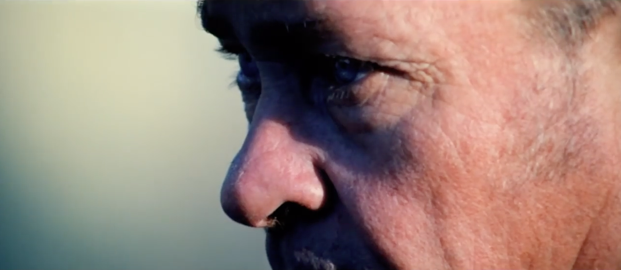
When Twin Peaks premiered in April of 1990, I quickly found myself caught up in the show’s intricate and mysterious plot to discover who killed High School sweetheart, Laura Palmer. The series was groundbreaking and paved the way for many of the “puzzle series” we take for granted today like ‘Lost’, ‘Stranger Things’ and ‘Westworld’. Twin Peaks’ writing, directing art direction and music all made it a cult classic that has been called by many one of the greatest TV dramas of all time.
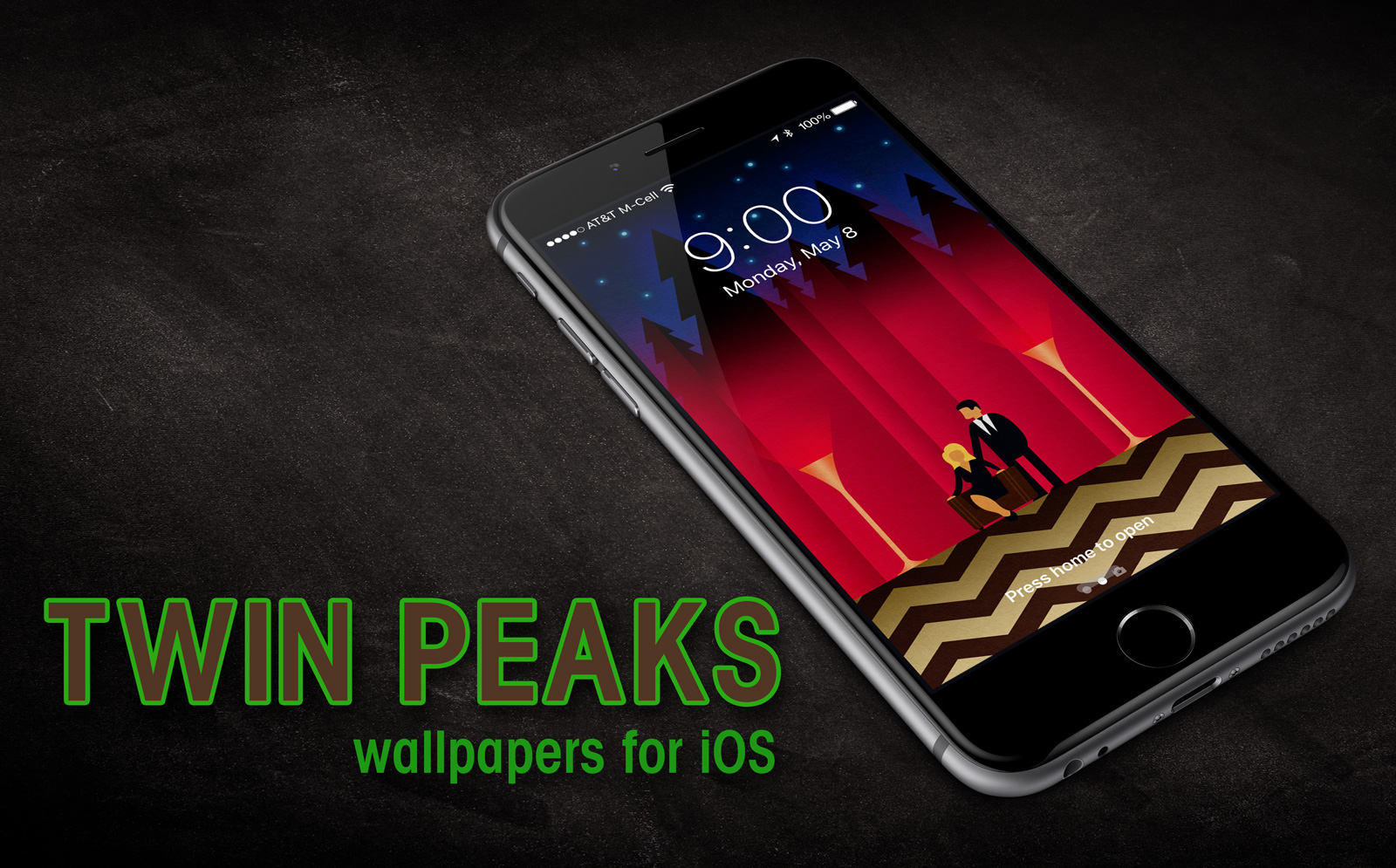
As a die-hard Twin Peaks fan, I’m excited for the premiere of the new Limited Series coming to Showtime which airs on May 21st and will run for a full 18 episodes. Many of the original cast will return to reprise their rolls including Kyle MacLachlan, Mädchen Amick, Sherilyn Fenn, Sheryl Lee, Ray Wise, and several others. To help celebrate Twin Peak’s return to television I took inspiration from some cool artwork created by artist and illustrator Chris Bishop. Chris created a neat Twin Peaks tribute graphic that I instantly knew would make for a great iOS wallpaper. I contacted him and received his permission to remix his original art and came up with something fun that any Twin Peaks fan would be proud to display on their iPhone or iPad.
The wallpaper depicts Special Agent Dale Cooper and Laura Palmer in the mysterious Red Room, along with a few surprises. It comes in two variants – Lock Screen and Home Screen and is ready to download to your favorite iOS device. My thanks to Chris for allowing me to run with his creation and to Mark Frost and David Lynch for bringing one of my all-time favorite TV series back from the dead. I can’t wait to see what the sleepy, mysterious town of Twin Peaks has in store for us this time. Enjoy!
How to download and apply the wallpapers on iOS:
1) Click to view the wallpaper that best fits your device:
• iPhone SE – Twin Peaks Lock Screen
• iPhone 6,7 – Twin Peaks Lock Screen
• iPhone 6,7 Plus – Twin Peaks Lock Screen
• iPhone X – Twin Peaks Lock Screen
• iPhone SE – Twin Peaks Home Screen
• iPhone 6,7 – Twin Peaks Home Screen
• iPhone 6,7 Plus – Twin Peaks Home Screen
• iPhone X – Twin Peaks Home Screen
• iPad – Twin Peaks Lock Screen
• iPad – Twin Peaks Home Screen
2) Tap & hold on the image in mobile Safari & save it to your photo library
3) Open Photos, view the image then tap the Share button in the lower left
4) Scroll to the right in the Share menu and tap Use as Wallpaper
5) Pinch Zoom OUT on the image to size it exactly to the screen
6) Turn Perspective Zoom OFF
7) Tap Set > Set Lock Screen
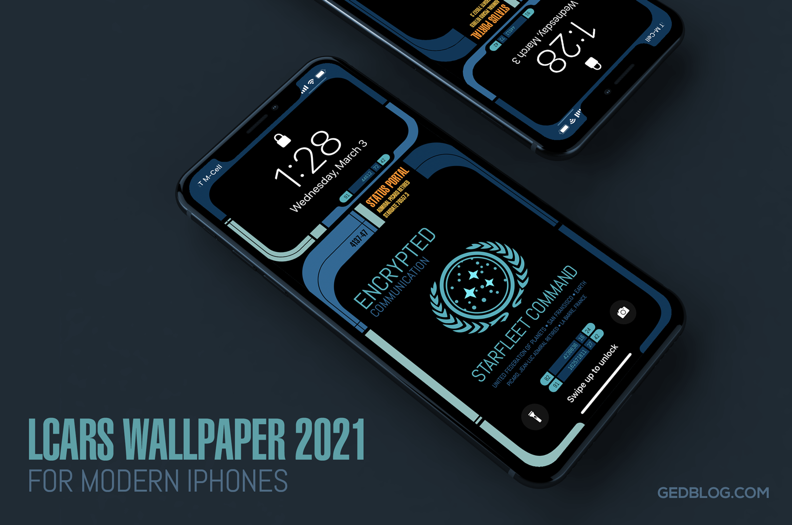
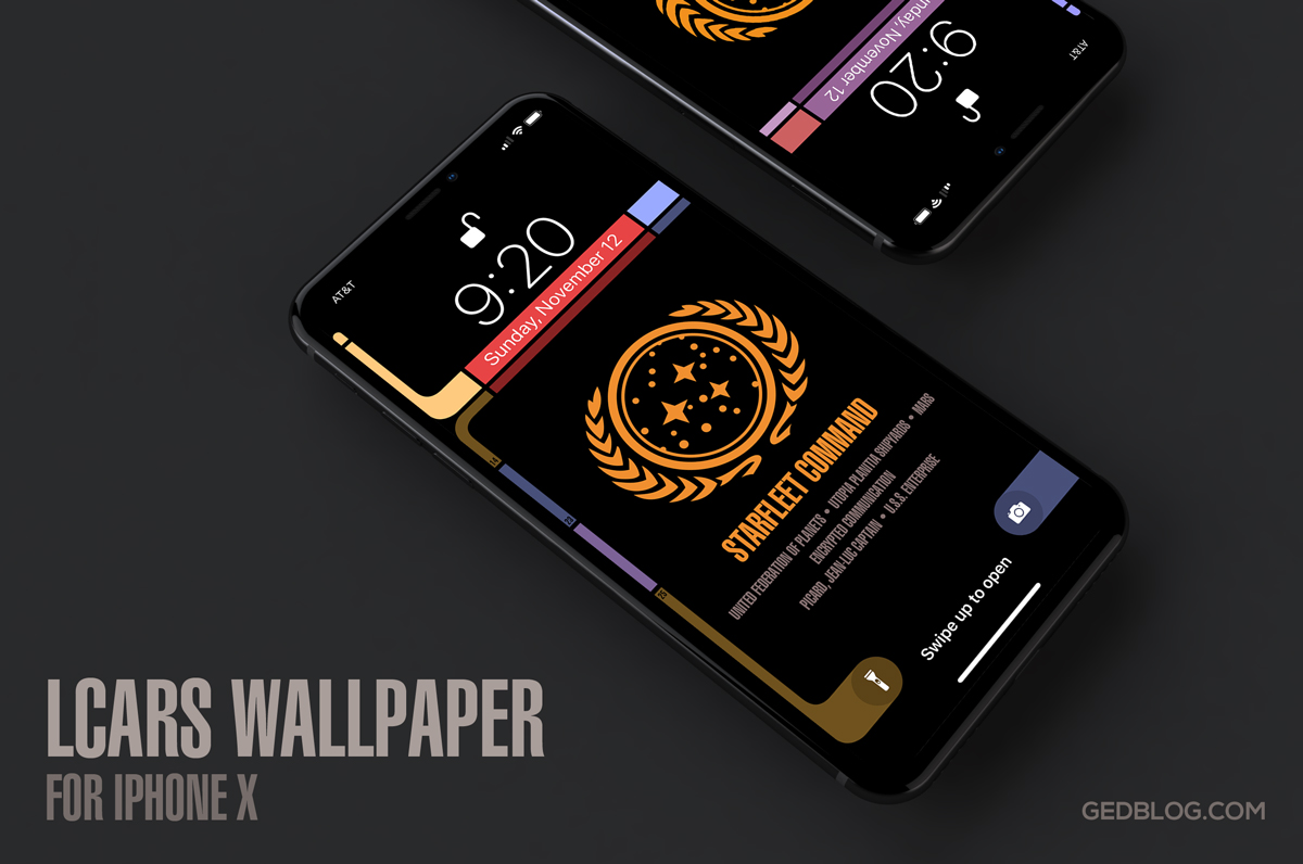
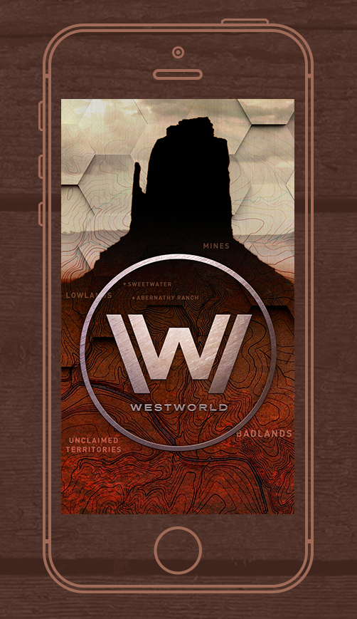
That’s it! Next time you unlock your iPhone you can help Agent Cooper navigate the supernatural labyrinth called Twin Peaks and solve the mystery of who killed Laura Palmer. Be sure to check out my other iPhone wallpapers – Westworld, Star Trek LCARS, Pokéwall and more. Enjoy!
UPDATE: I’ve added 2 new iPhone X variants for use with iOS 11. The device’s tall format of means the wallpaper had to change to accommodate the new design. Enjoy!


