29 Comments

Twitterrific’s Tough Love

When you love someone it’s hard to say no to them. You’ll usually do anything to please that person even if it goes against your better judgement. The inability to say no can also extend to the realm of software development. Companies can get so caught up in the desire to give users the best and brightest features they forget about the dangers of feature creep. They forget about good design. Such was the case with Twitterrific for the iPhone.

Somewhere during Twitterrific’s evolution from the desktop to the iPhone, we forgot how to say no. We said yes to too many of the latest features, 3rd party services and user requests. Eventually this “leap before you look” approach increased the complexity of the user interface and made the app’s settings too confusing for even us to figure out. A growing chorus of users told us the app was too hard to understand. We had lost our way.

The announcement of the iPad changed all that. Constrained by the 60 day launch deadline, we set about to create a fresh version of Twitterrific that would be dead simple, include all of Twitter’s core features and be a joy to use. The result was Twitterrific for iPad which is now available on the App Store. Many of the extraneous features from the iPhone version were initially removed including *all* of the app’s settings. There are no layout controls, body text compression, address book, themes and no tap shortcuts. What we present in exchange is simply the most friendly, easy to use Twitter client available anywhere. Like the iPad itself, Twitterrific is now designed for the masses. Those fabled 80% of users that Steve Jobs mentioned at the product’s launch are now our target audience. Early reaction to Twitterrific for iPad has been very positive. The app is decidedly easy to use and has a feature set that the majority of users want.

The result is a strong user experience that is influencing our efforts on the iPhone as well as the new upcoming Mac version of Twitterrific. Having eventual parity across all versions of the application will cut down on technical support requests and free up our development time, resulting in more regular updates and bring Twitterrific to a wider audience. Will we bring back some of the most heavily requested features? Yes, versions 1.0.1 and 1.1 for iPad have already added requested features like 3rd party push, reply all and picture uploading.

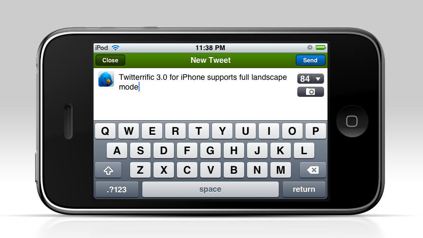
Twitterrific 3 for iPhone benefits from all the work that has already gone into the iPad including: proper retweets, lists, saved searches and more. Add to this the long-awaited full landscape support that our users have been crying out for and Twitterrific is a whole new experience on the iPhone. All these things aside, rebooting the app in this fashion has allowed us to evaluate each feature on its own merits. Free of the pressure to include everything but the kitchen sink, Twitterrific now starts fresh and will gain new users. Once all the versions are in sync, we can concentrate on bringing updates to Twitterrific across all platforms simultaneously. This will hopefully allow us to avoid the pitfalls of having one version wildly out of sync with the rest (like the current Mac version).

In the end, this approach benefits both the customer and the Iconfactory and makes for less frustration. We realize that some current users of Twitterrific for the iPhone may lose a few of their favorite features as we move towards these new versions. Some may even seek out other Twitter clients as a result and if that’s the case, I’m okay with it. It’s impossible to please everyone, so we’ve decided to focus on those like us who want a streamlined and straightforward Twitter experience. Our days of trying to be the everything-under-the-sun Twitter client are over. Tough love has taught us saying “no” leads to beautiful things. The best is yet to come, I hope you’ll join us.

Related posts:

For more information about the changes coming to Twitterrific, be sure to check out David Lanham’s post on optimizing the user experience (including more screen shots from version 3 for iPhone) as well as Craig Hockenberry’s piece on why simplifying a design is so important. Thanks!

3 Comments

iFavorite Things

Unless you’ve been living on the far side of the island for the past 3 months, you’ve probably heard of the iPad. You’ve probably already read more than your fair share of reviews of the device and what to expect from Steve’s latest magic marvel. Two of my favorite reviews so far are Jason Snell’s wonderfully complete write up as well as Sean Blanc’s take on the iPad. However, rather than pile on my own full review I thought I’d go with the “less is more” approach. Here, in no particular order, are my favorite and least favorite things about the iPad. You’re milage may vary.

Good – The screen. It’s sharp, lush and super crisp.

Bad – The smudges. This thing shows fingerprints like a poor man’s crime scene.

Good – Speed. Holy crap this thing is fast. Apps launch, Safari scrolls and zooms, home screens load all tremendously fast. If you own an iPad and yours isn’t blazingly fast, you’ve either jailbroken it or offended it in some way. This thing flies.

Bad – The weight. It weighs about .5 – .75 more lbs than I would like. It’s not a huge deal, but holding it in one hand will quickly give you a workout. This is undoubtedly the handiwork of the super-long battery life which helps me deal, but I hope iPad 2.0 weighs less.

Good – Did I mention the battery life? It’s like crazy nutty awesome. I sat with my iPad on last night for about an hour using Twitterrific and Safari and went from 100% to about 97% battery. The iPad is doing some crazy ass power management.

Good – iBooks. The application is beautiful, thoughtfully designed and a joy to use. Almost makes me want to read more. Almost.

Good – Blue tooth keyboard pairing. This to me, is the killer feature. Once paired with my Apple wireless bluetooth keyboard my iPad effortlessly became a mini Twitter station next to my iMac. The keyboard can wake the iPad from sleep without the need to unlock and the function keys even control the iPad’s brightness, volume and media controls (play, ff, pause, rewind).

Good – Apps. There are tons of great apps out there for the iPad. In no particular order, my favorite apps so far include Articles, Things, Epicurious, At Bat 2010, Deliveries, Instapaper and my favorite of course is Twitterrific.

Holding and using the iPad makes all the difference in the world. Pictures, even video doesn’t do the device justice. It feels natural to manipulate and beats the hell out of a laptop for casual surfing, tweeting and replying to email. In the game department, the iPad will give all other mobile gaming platforms a serious run for their money. Watching movies & TV shows is light years better than watching them on my iPhone.

Overall the iPad is yet another feather in Steve Jobs’ and Apple’s cap. Even if I didn’t develop apps for a living, I’d still buy one for myself because its just so darned fun and effortless to use. The iPad is certainly a game changer and if nothing else has proven that despite Microsoft’s failed efforts to the contrary, tablet computing can be successful. Check it out.

2 Comments

The Music of Ramp Champ

For designers and artists, the chance to collaborate with others who share your passion for creation is a wonderful event. Ideas feed off of each other and lead to new connections which can both surprise and delight. Such was the case while scoring Ramp Champ, the Iconfactory’s & DS Media Labs’ ode to the classic games of Skee-Ball and pinball for the iPhone. I’m pleased to report the game’s soundtrack was recently released on iTunes, something none of us at the factory could have dreamt of happening.

When we originally designed the game’s ramps, we knew we wanted the quality of the music to match the fidelity of the visual elements. Having a generic track repeat itself across multiple ramps, from outer space to under water, wasn’t going to be fun for the player. During the initial production phase of Ramp Champ, composer Noe Ruiz took the lead and created many of the tracks for the default levels such as Clown Town, Breakwater Bay and Space Swarm. Noe has a wonderful ear for rhythm and was able to incorporate these into the widely varied themes with ease. Of all the tracks he originally produced for Ramp Champ, Space Swarm (along with it’s dance and techno re-mixes) has to be my favorite of the bunch. Space Swarm is filled with old-school retro arcade sound effects that play perfectly into the look and feel of the ramp, helping to evoke the feel of a classic 80’s arcade game.

Atomicon’s David Weiner took up where Noe left off and came on board to help us produce the music for two of the game’s add-on packs. The Challenge Pack featured Molar Madness and Happy Place, both of which required a decidedly twisted approach when it came to the score. David’s work on Molar Madness is nothing short of brilliant. The samba-like piece he created for the ramp is both catchy and just the sort of thing you’d hear coming from the speakers of a dentist’s waiting room. Molar Madness is, without a doubt, one of my favorite pieces in all of Ramp Champ. Happy Place somehow managed to take the absurd notion of dolphins and unicorns floating in the sky and give them life. The track is zippy and light, but has decidedly dark undertones that foreshadows ominous events the player encounters within the level.

When it came time to write the music for our special Halloween add-on pack, David once again stepped up and gave us two wonderfully spooky tracks. When I approached him about Trick or Treat, I knew I wanted music that sounded both eerie as well as innocent. The ramp features children as they roam a neighborhood for candy on Halloween night. As we talked through our ideas, one of our inspirations was Vince Guaraldi’s classic Great Pumpkin Waltz from “It’s the Great Pumpkin Charlie Brown”. David’s final piece has this jazzy feel as well as elements that remind me of the creepy TV cult hit Twin Peaks, which worked out wonderfully. The other piece in the Halloween Pack, Grave Danger, draws obvious inspiration from Disney’s classic Haunted Mansion with all kinds of over the top scary sound effects like thunder, ghosts and werewolves.

For our 3rd release, David Weiner was already busy scoring the Challenge Pack as well as our other iPhone title, Pickin’ Time, and so we turned to composer Mike Weiser. Mike has created music for many iPhone games including Stick Wars and Tower Land and I was fortunate to be able to work with him on Plunderin’ Pirates and Star Struck. Mike’s score for Plunderin’ Pirates, inspired by Disney’s famous Pirates of the Caribbean ride, is one of the funnest pieces in the game and does a great job of evoking the high seas thanks to the use of instruments like the accordion and steel drums. The sound effects I produced for the ramp added to the overall feel and makes for what many players have called their favorite level in the game.

On Star Struck, both Mike and I decided to create something that reminded the player of space exploration, like you’d hear sitting in a planetarium. The “computerish” tones that come in at the start and end of the track were originally an ode from one of my favorite films ever, The Hitchhiker’s Guide to the Galaxy, although Mike masterfully made them his own in Star Struck. The album version of Star Struck that appears on the soundtrack is a specially composed version of the game’s track and is my favorite piece in all of Ramp Champ. You’ll be able to catch more of Mike’s work in the Iconfactory’s next software title, coming to the iPhone in the second quarter of 2010.

Collaborating with Noe, David and Mike on the music for Ramp Champ was, without a doubt, one of the most rewarding things I’ve done during my time at the Iconfactory. The talent these guys posses to take one’s creations and run with them musically is nothing short of astounding. Their work made our efforts that much better and for that, we are all grateful. With Atomicon’s help, we’re proud to finally be able to bring you the complete original soundtrack. I really encourage you to check it out and hopefully you’ll enjoy listening to it as much as we had bringing it to you.

1 Comment

All I ask is a tall ship…

Thanks to the generosity of a friend, I’ve been lucky enough to beta test the new MMO, Star Trek Online from Cryptic Studios. The game is set to launch in early February and at least for this Star Trek fan, it’s a winner. Playing around in Gene Roddenberry’s universe has given me a new appreciation for the art direction of designers such as Matt Jeffries and Michael Okuda. Designing anything is challenging, but designing interiors, user interfaces and uniforms of things that have yet to be must be especially difficult.

Most beloved of all the designs of Star Trek is perhaps the bridge of the Starship Enterprise itself. The bridge is the command center of the ship and is often the focus of action on both the big and small screens. Jeffries’ original utilitarian layout eventually gave way to more modern looking interiors, but the basic design (center command chair, flanking support positions) has withstood the test of time. The bridge is such an integral part of Star Trek that due to popular demand, the developers of Star Trek Online recently announced they were implementing them for individual ships within the game. Virtual captains told Cryptic they wanted their “big chair” and the game designers responded in kind.

All of this got me thinking about which starship bridge I liked the best. The answer has to be that of the Enterprise-D from Star Trek: The Next Generation. To many Trek fans this bridge seemed more like a hotel lobby than a high-tech command center, but I always admired its sleek curves, high-tech surfaces and muted colors. The original TV design was modified slightly for Star Trek Generations (seen here) to accommodate new science/tactical stations, giving the set a more cinematic feel.

Designed by Andrew Probert, the bridge of the Enterprise-D was the ultimate set for the weekly TV series. The layout was big enough to allow the actors room to move around comfortably as well as give characters space for private conversations, tucked away from prying ears. The raised back level provided an elevated platform that made Worf look even more imposing while offering Geordi and Data stations where they could work out solutions to the problem of the week. The set also introduced flanking seats to those of the Captain’s something that Star Trek Voyager would also adopt.

In contrast to The Next Generation’s warm earth tones, the bridge of the U.S.S. Voyager presented TV viewers with the cool grays and electric blues so often associated with science fiction. Created by production designer Richard D. James and illustrator Rick Sternbach, the interior design of the bridge of Voyager introduced subtle under lighting techniques that contributed to the “deep space feel” of the show. This design also reduced the traditional two-man con and navigator positions to a single console, putting emphasis on Captain Janeway.

I love the look of these two sets because they put the focus on the characters and their actions rather than the technology all around them. Some production designers tend to get out of hand with their creations and let the look of the set overpower its inhabitants. Voyager’s and Next Gen’s bridges are awesome examples of futuristic interior design precisely because they don’t go overboard. Compare these simple designs to the complex bridges of the Enterprise-E or the franchise reboot and you’ll see Star Trek art direction run amuck. Overlapping lines, textures and lens flares get in the way of the action and detract from the audience’s ability to focus on the characters.

Designing anything, even a fictional universe is an art form. More so when a large part of that universe’s appeal centers around details. Through the years, those entrusted with designing the bridges of Starfleet have evolved and molded it again and again. These talented artists have put their stamp on Gene Roddenberry’s original vision of the future and given Trek fans a place they could easily call home. Star Trek Online will soon give players a chance to roam the bridges of some of the most beloved starships in Star Trek history, all from the comfort of their computers. So until we can all afford to build a bridge in our basement, a virtual one has to be the next best thing.

6 Comments

Orba: My New iPhone Obsession

Every once in a while you run across a piece of software that’s so elegant and well done it makes you smile from ear to ear. Orba, the new free puzzle game from Kieffer Bros. is such an application. Released for the iPhone and iPod touch in late November, Orba is a great example of casual gaming in the spirit of Bejeweled or Tetris.

I love games that can be explained in 25 words or less and Orba’s just such a game. Clear as much of the board as possible by tapping chains of three or more same-colored orbs. The bigger the chain, the more you score. The premise is simple, but after playing just a few games it quickly becomes apparent tap mashing won’t get you very far. Each game starts with only 3 colored orbs shown on the board, so creating long chains of like colors is relatively easy. As you progress, more and more colors are introduced and it becomes quite difficult to clear enough of the board to be able to continue. When no chains can be cleared, the game is over.

As is the case with much of the software that lives on my iPhone, I first discovered Orba via a tweet from a friend, Jason Snell of Macworld. Since I know all too well how important it is to get the word out about great iPhone apps, I’m only too happy to recommend Orba to all of you iPhone and iPod touch users out there.

The game’s user interface is drool worthy. Everything about the game’s design just seems right from the user interaction and the help screens to the friendly “Hello Again.” message that greets you every time you begin. The UI is minimal, but elegant and does a wonderful job of not getting in the way as you play while still looking freakin’ cool. About the only thing I probably would have done differently are some of the sounds. They too are minimal, almost to a point of being non-existent. Despite the audio nit pick, the designers at Kieffer Bros have a well-earned reputation for beautiful software and their work on Orba is no exception.

As a causal gamer, I was surprised and delighted to find that Orba was being offered on the App Store absolutely free. As a fellow developer of iPhone titles, I would have gladly paid upwards of $4.99 for this wonderful piece of art masquerading as a casual game. Since my parents always taught me never to look a gift horse in the mouth, I won’t say any more regarding the decision to give away Orba except to say “Thank you” to the folks behind the orbs. I’ve already gotten many hours of enjoyment out of the download, and that will most likely continue for some time.

I love that I can play this game for a few minutes or hours on end, pause and come back at will. Since there is no time constraint, the only pressure to achieve higher scores are the ones you impose on yourself. Orba doesn’t have online scoreboards or social network boasting, but it doesn’t have to. It is what it is. If you’re looking for a well designed, friendly and casual game for your iPhone, Orba just might be the game for you. Head on over to the App Store, download a copy and let me know when you break the million point mark.

UPDATE: Of course on the very day I decide to publish this post, Orba goes from free to 99¢. I’m actually glad they made it paid since it’s worth 4-5x what they are asking for. You can still try the first 12 levels for free by downloading Orba lite so no harm, no foul.

4 Comments

The Domino’s Effect

Back in August I wrote a post about the need for increased feedback in the review process for Apple’s App Store. I made the thoughtful (and delicious, I might add) case for how the folks at Domino’s had the right idea when they unleashed their famed Pizza Tracker into the online world. The Pizza Tracker allows customer to see each step of the pizza making process thereby eliminating anxiety, fear and doubt in the mind of the hungry consumer. It stood to reason that one of the ways Apple could make the whole review process easier for the fragile psyche of today’s iPhone devs would be to supply more information when apps are submitted for review. I’d love to claim that it was my well-timed blog post that spurred Mr. Jobs into action, but alas I have no tangible proof.

What we do know however is that Apple has introduced a new status history to the review process thereby removing some of the mystery of where your app is on its road to public release. As Mashable reported this week, it may not tell you the actual name of the individual(s) reviewing your application, but it does let you know what stage your app is in, why it might have been rejected, how to correct and so on. This is certainly good news for iPhone developers like myself who no doubt take the change to mean Apple is listening to its critics. The change comes just a bit too late for famed iPhone developer Joe Hewitt however.

Hewitt, the noted dev behind the massively popular Facebook app, announced rather publicly this week he was abandoning the iPhone in favor of mobile web-based applications. Hewitt cited the restrictive policies of Apple’s app review process as the main reason he was leaving and it’s more than fair to say his departure has made other developers sit up and take notice. Overall I find Joe’s protest a good thing but considering his application had the App Store approval process wrapped around its little finger, more than a little ironic. At one point, the Facebook app had no less than 3 updates pushed to the App Store within 72 hours of each other. This is something unheard of in the iPhone development community, unless of course you’re a massive juggernaut like Facebook.

In the end, Apple’s addition of the new status history and even Joe’s rather public resignation from the App Store should help the platform. These developments can’t come soon enough. The staggering growth of applications for the iPhone has meant ever-decreasing visibility for publishers, longer wait times, mounting frustrations and increased competition. With this week’s update, Apple is doing what it can to help turn the tide of criticism before it snowballs out of control. I just wish they’d have delivered it in 30 minutes or less.

UPDATE: Add iPhone developers Rogue Amoeba to the list of developers who are quitting the platform. Four months of delays, roadblocks and black bag treatment by the App Store and it’s broken (yes, it really IS broken) review process has been enough for them. In my Losing iReligion blog post, I said that if things didn’t get better, we’d start to see developers head for greener pastures. Guess what? It’s really starting to happen. All those who commented that there’s nothing wrong with the App Store, go read RA’s post. Then read it again. Not surprisingly, it’s going to take more than a status history to make iPhone developers happy.

UPDATE II: Brett Archibald Jeff Lamarche offers a different view of the Rogue Amoeba situation and comes to the defense of Apple and the App Store. Jeff makes some good points, it’s certainly not a black and white issue. I think the thing that makes RA’s situation so bad is that it took 4 months to resolve. Three-four weeks inbetween submissions to know if your fix is correct is unacceptable in my book.

100 Comments

Losing iReligion

A great deal has been written about the App Store, both good and bad, and much of it comes from developers I know and respect. It almost seems pointless to add my own thoughts to those who are more widely known and respected than I am, but given how my feelings have evolved regarding the App Store recently I think it’s worth a shot. If what I have to say gives a potential iPhone developer reason pause and re-examine their entry into the space then it will have been worth it.

The App Store is broken. I know from the outside glancing in, it may not look that way but it is. It also doesn’t seem like it’s broken from Apple’s point of view since the store and its tens of thousands of software titles have helped place the iPhone firmly at the head of the smart phone industry. But speaking as a small developer who’s been releasing Mac software for over a decade, the App Store is broken. The ironic part is that if you had asked me this a few months ago I would have denied it with my dying breath.

Since it first launched in July of 2008, the App Store has been evolving and changing to suit the needs of both Apple and consumers. Unfortunately for developers many of these changes have hurt more than they have helped. The utter race to the bottom of the pricing structure by thousands of developers has created tremendous pressure to set applications at either free or near free price points. I know this first hand because when Twitterrific for the iPhone first debuted we set it’s price at $9.95 which, by today’s App Store standards, is almost unheard of. It wasn’t long before lagging sales and increased pressure from competition forced the Iconfactory to lower the application’s price to $3.99, still “expensive” by App Store standards. Not only was the price lowered, but the feature set was more than doubled and yet many users still complain it costs too much. While these changes represent perks for users, it also means that sustaining profitability for a given piece of software in the App Store is nearly impossible unless you have a break-away hit.

This leads me to the next point of failure for the App Store – visibility. Everyone has heard about the so-called “gold rush” certain developers have experienced. Flight Control’s 1.5 mil sales record. Trism’s incredible $250,000 short-term bonanza. But for every one of these lottery wins in the store, there are hundreds, if not thousands of developers who see little if any return on their investments of time and money. What’s worse, the success or failure of a particular piece of software in the App Store depends as much on Apple deciding to feature your creation as the creation itself. One can shift the tables in one’s favor with a sizable advertising budget, but many of us like the Iconfactory don’t have such generous resources at our disposal.

When the Iconfactory & DS Media Labs released our latest iPhone game, Ramp Champ, we knew that we had to try and maximize exposure of the application at launch. We poured hundreds of hours into the game’s development and pulled out all the stops to not only make it beautiful and fun, but also something Apple would be proud to feature in the App Store. We designed an attractive website for the game, showed it to as many high-profile bloggers as we could prior to launch and made sure in-app purchases were compelling and affordable. When the moment came, Ramp Champ shot up the charts quickly but just as quick, it hit a brick wall. Within days the app that had peaked at #56 on the top paid chart fell off the top 100 despite receiving praise from users and reviewers alike. The lack of store front exposure combined with a sporadic 3G crashing bug conspired to keep Ramp Champ down for the count.

A new version that corrected crashing was completed quickly, but once again the App Store reared it’s broken head as the review process kept the fix out of user’s hands for almost two weeks. By this time it was too late and momentum had been lost. Despite a “What’s Hot” feature by Apple in the App Store, Ramp Champ’s sales have not lived up to expectations for either the Iconfactory or DS Media Labs. What’s worse, many of the future plans for the game (network play, online score boards, frequent add-on pack releases) are all in jeopardy because of the simple fact that Ramp Champ hasn’t returned on its investment.

In order for a developer to continue to produce, they must make money. It’s a pretty simple concept and one that tends to get lost in the excitement to write for the iPhone. It’s difficult for me to justify spending 20-50 hours designing and creating new 99¢ levels for Ramp Champ when I could be spending that time on paid client work instead. I would much rather be coming up with the sequel to Space Swarm than drawing my 200th version of a magnifying glass icon. But I’d also like to have some assurances from Apple about reducing the length of the App Store approval process, having the ability to respond to factually incorrect iTunes reviews, not be limited to 100 beta testers, or that large, prominent developers won’t always get preferential treatment. In short, I’d like to know things will be fixed and I don’t mean merely posting a page of marketing text in iTunes Connect.

It is a truism that everyone who creates content is a control freak. From fine artists that decide what gallery their work will hang in, to architects who scratch tooth and claw with stubborn clients about what materials will be used in construction. Software developers are no different. We all want as much control over our creations as we can possibly have and the App Store in it’s current state has removed a significant level of control from our hands. I’m not ready to throw my lot down with those who have renounced the platform just yet, but unless some significant changes come very soon, myself and others like me will have no choice but to focus our development efforts elsewhere.

UPDATE: Several developers have contacted me and told me privately that they think it isn’t so much the App Store that’s kept Ramp Champ from being a success as it is the game itself. Given the fact that Freeverse’s newly released and shallower ‘Skee Ball’ currently sits at #6 in Top Paid apps in the store, part of me wants to agree. I could second-guess myself about what didn’t go right with Ramp Champ but in my heart of hearts I know RC is better than 90% of the games that get to the top of the list. I have to keep telling myself that what doesn’t kill us will make us stronger in the end. Hopefully.

UPDATE II: Seems I’m not the only one cooling to the idea of developing for the iPhone. Macworld’s Dan Moren reporting from the C4 independent developers conference says many of the developers are frustrated at their lack of control in the App Store. I’m glad to know I’m not the only one.

UPDATE III: Marco Arment has written an excellent piece that addresses my post. I agree with much of the analysis there and tend to think that their may indeed be “two App Stores” so to speak. As a result of suggestions from both Marco and the commenters here, Ramp Champ’s vague app store description has been re-written and new screen shots posted to show more content. Thanks to everyone who suggested these changes, I think they will definitely help sales.

1 Comment

Rolling the Hard Six

This week marks the release of the Iconfactory’s third piece of software for the iPhone platform, and only our second game – Ramp Champ. Ramp Champ is a fun twist on some of the carnival games you’ll remember from your childhood. The game was designed with love by the gang at the Iconfactory and implemented with skill by the talented folks at DS Media Labs. It’s been in the making for the better half of a year and the time has finally come to release it into the wild.

I’d be lying if I told you I didn’t have a huge case of stomach butterflies right about now. We’ve invested a ton of time and money in Ramp Champ and its relative success or failure will be determined within the next 2 weeks. I always get nervous before software releases, but more so when it’s something completely new. Unlike some other large developers, we don’t have a huge well of funds to dip into to develop our apps which makes writing for the iPhone something akin to playing the lottery. We always do our best to design and implement applications that we think people will use and love, but until you actually get real feedback from users, you just don’t know.

When it comes to the App Store, it seems that the success of a particular application has as much to do with luck as it does with blood sweat and tears. I’ve seen apps I never thought even merited being in the store rise to the top despite poor quality or being based on a questionable premise. Meanwhile, defying all developer logic, some of the very best applications never rise above the top 25. Some are sandbagged by the perception of being “too expensive”, others get obscured by the meteoric rise of novelty “ringtoners” who inevitably take the App Store’s coveted top slots.

Talk to a bunch of iPhone developers and they’ll most likely tell you that everything being equal, success in the App Store is a crap shoot. You can push the odds in your favor by producing a high-quality piece of software, as well as offering it for next to nothing, but in the end fate feels like the final arbiter. I’m very proud of all of the guys, both at the Iconfactory and at DS Media Labs for putting together one heck of a fun game. Hopefully you will enjoy playing it just as much as we enjoyed creating it. No one would deny that producing applications for Apple’s iPhone isn’t risky, but as I’ve told myself again and again lately, without risk there can be no reward.

Now if you’ll excuse me, I’ve got to go chug a bottle of Pepto-Bismol.

UPDATE: Well, we’re over the release hurdle at this point and I’m feeling a lot better. Overall the reaction to Ramp Champ seems to be very positive, although we’re dealing with some memory issue that are causing crashes, particular for 1st Gen device users. The good news is we think we’ve ID’d the problem and should have a fix submitted to the App Store soon.

Thanks to everyone who’s posted or tweeted positive feedback about the game, it’s done my heart (and my stomach) a lot of good these past 2 days. If you’re interested in knowing what went into producing Ramp Champ, head on over to Louie’s blog for some insights. More to come!

9 Comments

Mr. Jobs, Domino’s Calling!

I’ve recently discovered creating a successful iPhone application is a lot like baking a pizza. Take the best ingredients, like skillfully crafted code, bold and flavorful interface design and combine with a dash of love and you may end up with a delicious dinner. Unfortunately for App Store developers, once you’ve rolled the dough, spooned the sauce and added the toppings, the delivery process itself can often be frustrating.

Apple’s process of getting apps reviewed and posted to the App Store leaves much to be desired. Once submitted, we developers must sit back, cross our fingers and hope everything is in order so that the “pizza” makes it to your device in a timely fashion. One of the criticisms of the App Store in recent months is that it can take more than 2 weeks to have an app make it’s way through the review process, sometimes only to end in rejection. When this happens, the problem must be corrected, the app resubmitted and the developer goes to “the back of the line” and starts all over again.

Since most developers would rather have too much feedback rather than too little, one way to ease the pain of the review process would be to add more feedback. Developers love feedback, whether it comes in the form of bug reports, reviews, emails or simple sales figures. In the world of home pizza delivery, when it comes to awesome feedback, no one beats Domino’s.

When a customer orders a pizza from Domino’s online, they receive instant feedback on the status of their order via Domino’s über-cool pizza tracker. The tracker tells you where in the cycle of delivery your pie is, what time it started the last phase and who’s currently working on it. It may sound corny, but this is exactly the kind of feedback developers need when submitting software to the Apple App Store. Imagine a meter that outlines each part of the approval process with time and date annotations for each step. The App Tracker would be of enormous assistance to developers, ensuring proper completion of each part of the submission process. A developer could track their “pizza” as it made its way to the store and get a better sense of when to expect final delivery. It could also help Apple internally so they know what phase a particular application was last in if a problem arises.

Such a system would allow companies to better plan their product’s marketing efforts and direct their resources more efficiently. Not to mention reduce the level of stress associated with being left in the dark regarding your application’s approval. Apple recently implemented a small counter for developers to let them know what the average approval time for their applications are in iTunes Connect. This was a great first start, but I suspect that with a bit of love, and a few lessons from the folks at Domino’s, getting through the app store approval process could be as easy as pie.

8 Comments

Losing Control

Anyone who’s worked for themselves knows the satisfaction of being in control of your own destiny. The perception that by sheer force of will and hard work, you can be successful at what you do. Those who take on the challenge of owning their own business are often considered “control freaks” and more often than not, perfectionists. I never really realized just how much of a control freak I was until this past weekend when, completely without warning, I had none.

Last Friday, the Iconfactory’s popular Twitter client, Twitterrific, fell victim to the so-called Twitpocalypse bug, which caused the mobile version of our application to suddenly stop working. Thanks to the efforts of our talented engineer, Craig Hockenberry, a fix for both versions of the client was submitted to the App Store within a day. To Apple’s credit, the free version of the fix was approved swiftly and allowed the majority of our users to continue tweeting with minimal interruption. And although the Premium version of the application was also approved in record time, the displeasure from our user base, not surprisingly, came even quicker.

From the moment the bug hit, both Talos and I had begun monitoring tweets of users mentioning Twitterrific in their posts. What started as a trickle, soon turned into a deluge of upset and frustrated users. We began responding to individual tweets and Travis, our project manager, responded to support emails. The Iconfactory is a small company, we’re not Adobe or Google or even the Omni Group. All three of us did our best to let users know what was going on, and thanks to hundreds of RTs, word started to spread about the bug and our efforts to combat it. Unfortunately, Twitter is a very big community and it was impossible to personally respond to everyone. Even now, there are many people on Twitter who don’t know why their copy of Twitterrific isn’t functioning and there is very little I can do about it.

The best we could hope for was that the majority of users followed @twitterrific and would eventually receive news about the fixes. The troublesome part is that although I know the majority of users now have a working version, I still feel uneasy knowing there are potentially thousands that don’t even know about the fix. Part of this is due to the lack of communication channels, and part is due to the nature of the App Store approval process. As developers, we must turn control of our applications over to Apple to have our iPhone software published. This process can take days or weeks and until it runs its course, our hands are quite literally tied. By the time updates are published it may already be too late.

All of us at the Iconfactory count ourselves lucky that Apple recognized the seriousness of the bug we were facing and pushed through the Twitterrific updates as quickly as they did. We know we messed up and we thank the App Store team for helping to pick us back up off the floor. That being said, I didn’t sleep much in the days after the bug hit because there was a part of me that knew hundreds of tweets were flying by every hour from Twitterrific users I was powerless to help. As with most control freaks this usually means even more work, more testing and more diligence to guard against these kinds of catastrophic failures in the future. But that’s okay with me since I’m not anxious to give up this level of control, or sleep, ever again.

A Bird in the Hand…

The recent release of Twitterrific 2 for the iPhone has reminded me that software development is replete with truisms. The primary thing I have to constantly remind myself is that, no matter what you do, or how hard you work, you simply cannot please everyone. Anyone who works in a creative field knows that there will always be those who are unsatisfied with the result.

For iPhone developers, these people usually fall into the “if it just had feature X, I would use it” category, but every so often you get someone who just poo-poos your efforts. It’s easy for devs to fall into the trap of trying to keep everyone happy, but years of experience have taught me that this is a losing battle. Development quickly builds into a sort of “features arms race” that usually ends with bloated software and burnt out programmers. No, the answer is to design first and foremost for yourself. If you can produce a piece of software that you are happy with, then chances are the majority of your users will be too. The trick is trust your gut enough to tell the difference between constructive feedback and the nay-sayers so you can move beyond them when it’s appropriate.

The other truism I’ve found is that there’s always room for improvement. The new posting user interface for Twitterrific 2 demonstrates this point perfectly. All through beta testing, the posting UI was the same as it was in version 1. If you wanted to change your update from one type of tweet to another, you had to toggle the tweet type using a single icon on the post bar. Although this method had served well since our initial launch, neither us nor the beta users were satisfied. Their feedback, combined with Louie’s desire to improve the posting experience challenged us to do it better. The result was a re-designed UI that fulfilled user’s desires for posting clarity while giving the Iconfactory a big new feature to tout. The amount of work required to pull off the revised posting interface so close to the end of the beta was intense, but ultimately worth it.

Lastly, if there is one axiom that Twitter has proven beyond a shadow of a doubt it’s simply that if you give an inch, the Twitterverse takes a mile. Lately I’ve been seeing more than a few requests for Twitterrific to support Twitlonger, a service that allows you to “expand” on the 140 character limit that is at the very heart of Twitter. The argument goes that allowing long updates to be read directly in-app is preferable to having to post multiple tweets. This may indeed be true, but I hesitate to support any service that, for lack of a better term, subverts Twitter. Brevity is the soul of wit, and in Twitter’s case, its lifeblood.

In my opinion, any update that can’t be held within Twitter’s 140 character limit should be taken offline to email, Facebook or Friendfeed. What’s the harm in supporting a great service like Twitlonger you ask? Seemingly none, except that Twitlonger is a very slippery slope. Imagine typing a tweet of any length right in Twitterrific. When the message length exceeds 140 characters, the app automatically creates web page entry where your followers can read your magnum opus. Sounds great, except its no longer Twitter, it’s called a blog. Given how easily such a feature would be abused (as is evidenced by the Twitterverse’s aggressive adoption of RT), I don’t see Twitlonger support in Ollie’s future.

As developers, all we can do is our best. Sometimes our best is good enough and sometimes it doesn’t cut the mustard. I’ve been very pleased with the positive reaction that Twitterrific 2 has been receiving from the Twitter community. There are updates coming that address some of the most requested issues from the initial 2.0 launch, but I have no illusions that even these updates will satisfy everyone. Not to mention all those people out there who are patiently waiting for an update to the Mac version of Twitterrific. To them, I offer one last proverb – Good things come to those who wait.

1 Comment

The Value of a ‘Miracle’

One of the toughest parts about owning your own creative business is having to keep secrets. During my time at the Iconfactory, we’ve had to wear many projects close to our sleeves for months, sometimes even years until the day comes when we finally can talk about them. This philosophy doesn’t just extend to our paying clients however, it also covers our internal projects.

Over the years, I’ve learned the hard way what happens when you let competitors know what your up to. If you’re lucky they merely get a jump on your idea, but sometimes, for one reason or another, they manage to beat you to market. This is one reason why I subscribe to the Montgomery Scott school of thought when it comes to product announcements. Named after the famous engineer from my beloved Star Trek, the theory is simply this: Under sell and over deliver.

By setting realistic expectations in the minds of your customers, they are pleasantly surprised when you manage to exceed them. This is how Scotty got his reputation for being a “miracle worker” on Star Trek. It’s also why we don’t typically like to give sneak peeks or announce dates for freeware and software releases at the Iconfactory unless we’re very close to releasing something. By doing this we keep competitors guessing and limit dangerous over-hyping.

Taken to its logical conclusion, the best way to keep expectations in check is not to create them in the first place. Unfortunately, this approach fuels rumors and leads some to conclude total inaction. My response to these people can be summed up in a recent tweet from my friend and colleague, Craig Hockenberry who said “When I appear to be doing nothing is when I am doing the most.”

We always have something new coming down the assembly line at the factory. I’d love nothing more than to run shouting to Twitter what we’re up to on any given day, but that would only lead to user heartache. We also firmly believe that if you’re going to do something, it’s worth doing right. So remember – just because you don’t have access to engineering, it doesn’t mean we’re not busy installing the latest dilithium crystals.

1 Comment

For the Buckaroo In You

The Adventures of Buckaroo Banzai is one of those films. You know the ones I mean, you either love them to death or you hate them with the passion of a 1,000 burning suns. Being the child of the 80’s I am, I fall squarely into the former category when it comes to Peter Weller’s hero, Buckaroo.

I first watched this quirky film back at R.I.T. with my good friends David, Anna, Bob & Jiffy, all of whom still share my affinity for Team Banzai and their globetrotting, save-the-day antics. I got on a Buckaroo kick a few weeks back and whipped up a Team Banzai Patch icon that was released over at The Iconfactory as a QuickPix as well as the desktop I’m making available today. If you’re a fan of Buckaroo, then head over to my Goodies page and download Team Banzai for your iPhone, Mac or PC desktop and be the envy of all your buddies. Remember, no matter where you go, there you are!

2 Comments

Greensboro Joins the Cult of Mac

After several false starts, months (even years) of waiting, and disputes with their retail neighbors, the new Greensboro Apple Store finally opened this past weekend. Although I’ve done my fair share of waiting in line for openings, this time things were a bit different. The level of excitement and enthusiasm as we stood in line Saturday morning was surreal. We arrived a little after 7am and were about 20 people from the front of the line. We came prepared and dressed in layers to keep warm.

The morning was spent swapping Mac stories and meeting new people. The day before a group of my friends and I from the Iconfactory stopped by the unopened store and happened to run into a WXII News crew. They had asked us why we were looking forward to having our own Apple Store and we even managed to get in a plug for Twitterrific.

When the moment of truth arrived and the doors finally opened, we were greeted like rock stars courtesy of the whoops and cheers from the store employees. After running down the line and high-fiving over 20 people, I can start to understand why some think Mac users are part of a geeky “cult”. We browsed the hardware, and Talos even ended up becoming the 1st official paying customer in Greensboro. After about 30 minutes we made our way to the exit, went outside and was greeted with our first real glimpse of the true size of the line waiting to get in. Checking out the photo essay from the News & Record it’s easy to see just how many people had come for the opening. Absolutely incredible.

While the store opening itself was a wonderful and throughly geeky experience, I’m more gratified to finally have a place locally where I’ll be able to go and purchase new Apple hardware, learn new software and have repairs made. The staff at the Apple store are always on call to help users with any need and I plan to avail myself of their hospitality every chance I get. From all of us, to all of you, welcome to Greensboro, Apple!

4 Comments

Show Me Your Tweets and I’ll Show You Mine

One of the behaviors that the social networking site, Twitter, has employed since launch has been the ability of users to “protect” their updates. That is to say, a user can keep their tweets hidden from the rest of the world until they choose to let a particular follower “into the club” and allow them to be read. The theory goes that some users don’t want every Tom, Dick and Harry knowing what they are up to at any given moment, or perhaps they want to restrict information only to a select group of people like real friends and family. While I certainly understand the logic behind protecting one’s updates, the way Twitter has implemented the feature needs work.

On any given day, I receive from 5-10 notices that new people have begun to follow me on Twitter, which is awesome. Twitter is a social network after all and the more people that want to listen to what you have to tweet, the better. Whenever I receive a new follower notice, I visit their twitter page to see if they are the kind of user I would like to follow back. Typically this could be someone in the design field, or a big Mac geek like myself, or someone who is just plain funny. It helps if they have a custom page style or an interesting avatar, but what seals the deal are the last 20 or so tweets that I read on their landing page. I can tell from these tweets if they are posting updates I’m interested in, or if they are just tweeting junk.

But there’s a problem when a user starts following me who’s updates are protected. I can’t see their tweets. I have to “send a request” to gain access to the clubhouse before I know if I want to follow. This wastes everyone’s time and quite frankly is a little insulting. They can follow me on a whim but I have to ASK to follow them? I don’t think so.

This is a serious design flaw and Twitter needs to adjust the behavior of how protected users interact with those they follow. The good news is there is a relatively simple fix that would solve the annoyances of protected users and it is this: Accounts with protected updates should automatically allow their tweets to be viewed by those they chose to follow. In other words, if you’re gonna follow my updates, I automatically get to see yours without having to first ask permission. In my opinion, it’s only fair.

Personally, I wouldn’t mind if Twitter did away with protected updates all together. Although I’m sure my closest friends who protect their updates wouldn’t agree. They have chosen to limit the number of people who follow them by manually filtering all requests that come in. Are they friend or foe? Spammer or special someone? As far as I’m concerned it’s a lot less work to allow everyone to follow you than not. If I get followed by an account name that I consider “spammy” then I go and check them out. If they are a Facebook life coach or are hocking their blog non-stop then I block them. To everyone else I say, welcome to the Ged-fest! If you want to protect your updates, that’s fine, just don’t make me jump through hoops before I’ve even paid to see the show.

4 Comments

For Wii, Fun Trumps Flash

Video games are supposed to be fun. Any game’s primary purpose is to engage and entertain in ways that are new, exciting and challenging. Which is why early calls from critics and fan boys alike that the Nintendo Wii console was just a passing “fad” were out of their depth. The argument went that since the Wii didn’t have the horsepower, graphics or true HD support that the XBOX 360 or Playstation 3 had, it was doomed to failure.

In September of 2007, the Nintendo Wii surpassed sales of both its rivals and has never looked back. This year the Wii weathered its second holiday season with flying colors. According to VG Chartz the Wii sold an incredible 1.7 million units the week before Christmas. By comparison, Microsoft’s XBOX 360 sold 535,806 units and SONY’s struggling PlayStation 3 sold a mere 239,576. VG states that when December is done, Nintendo will have sold more than 3 million Wii’s for the month, an astounding number especially considering the current economy.

It is certainly true that most fads enter the market in a blaze of glory and then promptly burn themselves out. However, they also rarely have direct competition from similar products. Fans never had to consider “My Pet Log” when running out to the store to own their first “Pet Rock“. Fads are unique and unpredictable and by their very nature, a flash in the pan. From the very beginning, the Nintendo Wii was designed to be the very opposite of a fad.

From the Wii’s conception, Nintendo’s game designer Shigeru Miyamoto said the console was not about graphics or frame rates, but user interaction. He wanted to make a new way for players of all ages to interface with video games, and he succeeded. Unlike the XBOX or PS3, the Wii was the first video game platform that appealed to adults in large numbers. The Wii has become hugely successful in retirement homes where seniors play endless hours of Wii Bowling and even tone their aging muscles with Wii Fit. Hard core gamers can’t stand this aspect of the Wii. PS3 and XBOX fan boys argue that any console granny plays isn’t a “real” system, and is only geared for kids and old people. Somehow they say this with a straight face while SONY & Microsoft blatantly copy the parts of the Wii that people love like motion sensors and customizable player avatars.

Will the Nintendo Wii manage to stay off the competition for yet another Christmas? If I was a betting guy, my money would definitely be on Miyamoto and not Ballmer. That being said, eventually the Wii’s unique game play will lose its novelty and the console’s sales will slow. But rest assured, Nintendo has plans for the Wii’s successor that takes all the best parts and improves the rest. Nintendo didn’t become the giant of the video game world it is today by following others, Miyamoto and company had the vision to lead. They skillfully knew what the rest of the industry is only now figuring out – frame rates and flop cycles will only get you so far, but fun lasts forever.

3 Comments

Market Yourself An iParadigm

John Gruber over at Daring Fireball links to an intriguing piece by Paul Kafasis on the state of the App Store. The post compares Walmart’s strategy to sell disposable, cheap goods to those of App Store “ringtone” developers which are forcing down prices. My friend and business partner, Craig Hockenberry wrote about this very topic a few weeks ago in a piece that put him in the crosshairs of quite a few people.

After Craig’s piece was published, and indeed after reading the post by Kafasis, some are under the impression that more expensive “AAA” apps are doing just fine thank you very much. The theory goes that one only has to look at the App Store top 10 list to understand it’s not price that gets you into the top 10, but quality. This, plus marketing on the part of the developer are all that’s needed to boost your software into the top 10 of the App Store. Reading through the comment thread at Inside iPhone it all seems so simple. All a developer has to do is market their app and the rest will take care of itself! Why didn’t I think of that?

The part I love the most is that the people making the “just market your app!” comment have no real idea how much effective marketing costs. Oh sure, you can go far on viral and word-of-mouth marketing, but it all pales in comparison to even a small banner graphic in the App Store. The Iconfactory could spend tens of thousands of dollars buying up targeted advertising space to promote Frenzic, but it still wouldn’t be 1/10 as effective as the front page graphics that Dropship, Marley and Texas Hold’em are enjoying (for free) as I write this. Not only that, but I have no way to track metrics for advertising pointing at Frenzic in the App Store. I can’t gauge how effective a $75 blog ad versus a $2,600 DF sponsorship is because Apple doesn’t currently give me stats of people clicking through to my software. Anyone who says “Just market it!” doesn’t have a solid grasp on how the App Store works.

Another example is Rolando. People are holding this app up as the ultimate example of a quality, non ringtone app that is enjoying success in the store. It is true that Rolando is a fantastic game worthy of the top spot it once held. It is also true that Apple promoted Rolando from DAY ONE in the App Store with major graphics both in iTunes and on Apple.com. All that exposure helped to get Rolando into the top of the store when it launched. But its $9.99 price point is like an anchor. As I write this, Rolando sits at #30 in the top 100, and #10 in games. Let me repeat that. #10. In games.

So what is in the App Store top 10 right now? iFart Mobile is number one which is still riding high on a wave of PR thanks to being originally barred. Crash Bandicoot, which is featured in national Apple television spots is #2. Tetris, perhaps the most well-known video game in history, is #3. Three more ringtone apps come in as 4, 5 & 6 including the months old iBeer. Touchgrind, which also enjoyed prominent Apple billing, is #7. Bejeweled 2 is number 8, PocketGuitar ($.99) is #9 and SimCity rounds out the top 10. All of these apps either enjoyed uncommon press exposure, have a nationally known brand or are priced at $.99. Quality definitely plays a role in getting to the top, but price and “Apple love” play a larger part.

Does this all mean that developers like myself will abandon making quality iPhone applications like Twitterrific and Frenzic? Of course not. I just wish that people who think they know how the App Store works would admit that they really don’t. The App Store is still in flux and much is unknown. What I do know however is that there are key factors to getting to the top of the store, chief among them being price and exposure from Apple. No amount of 3rd party marketing, done on a small developer’s budget is going to change that simple fact. What’s worse (or better, depending on your point of view) is once you are in the top 10, even if you’re app is a “limited utility” ringtone app, because you’re in front of millions of eyeballs both on the device and in iTunes, you’re bound to stay there.

I don’t know exactly how to fix the App Store, but everyone I’ve spoken with agrees that it needs fixing. If not fixing, at least a change in how it favors certain apps while hindering others. The more we talk about this stuff, the better it will be for both developers and customers alike.

3 Comments

Switching Hats

Back on December 1st, I put on my artist’s hat and wrote a post about the importance of icon design and how it shouldn’t be taken for granted or seen as an afterthought. The post garnered a fair amount of exposure and I received a great deal of positive feedback from designers and developers alike on the importance of icon branding and standing out in the App Store.

Near the end of the piece, I offered up this unassuming little opinion which has caused me a fair amount of stress these last few days:

“Lately, developers have taken to plastering “SALE” or “60% OFF!” within their icons. They’ve become lazy and let the iPhone software mar their design with glossy highlights which obscure efforts to brand their software. Fight the urge to cheapen your brand and instead give your icons the love and attention they deserve. You’ll still sell boat loads of copies and your users just might end up thanking you at the same time.”

What is the source of my distress? Over the course of the past week, the Iconfactory and ARTIS Software jointly agreed to put our game Frenzic on sale for the Christmas holiday. From the moment we launched the product, we had always planned on temporarily lowering the price for the holiday rush. When I wrote the original post I was unaware of the importance the app’s icon plays in marketing an online sale. I’m guessing you can probably see where this is heading. As the app went on sale today, it reluctantly sported a new badge. The same type of badge that I railed against in my original post.

If you care as much about icons and design as I do, then you’re probably asking yourself how I could allow something like this to happen. At first I couldn’t figure it out myself, and then it became very simple. I took off my “designer hat” and put on my other one… the one that says “business owner”.

The business owner in me doesn’t wrestle with many of the lofty ideals that my inner designer aspires to. Being a partner in a successful company sometimes means doing what’s best for the health and growth of the business, especially in today’s unsure economy. It’s easy to criticize someone’s design decisions when you’re on the outside looking in. You think you’ve got everything figured out, but then your app starts to sink off the App Store and suddenly nothing’s as simple as you thought.

Although I initially resisted calls to slap a “For sale” badge on our icon, I came to realize that it was one of the most important ways to get people who had previously dismissed Frenzic due to its $4.99 price tag to take another look. The change may not affect sales at all, but on the other hand, it may help to get Frenzic in front of more people’s eyes than ever before. If that means that I have to eat a hefty helping of crow in order for us to maximize our exposure in the App Store, then I say pass the ketchup.

27 Comments

Why Icons Matter

I can’t tell you how many times in the course of my career as an icon artist that a client considered their icons to be an after thought. After spending hundreds of man hours and pouring thousands of dollars into software development, some clients just refuse to devote the attention needed to the glyphs that act as both button and branding. At the Iconfactory, we try and educate clients about the importance of icons and how they strengthen a company’s brand as well as communicate a product’s core concepts quickly and easily. It may sound like marketing fluff, but years of experience have taught me it’s the truth.

So when it comes to designing our icons for our own software products, we almost always end up obsessing over them. The redesign of the application icon for xScope went through nearly 20 different revisions before we settled on a final version. This time around, the drama was caused by the new icon for Frenzic for the iPhone.

Standing Out From The Crowd

When it came time to design the icon for Mobile Frenzic, we knew we wanted to use a 2D translation of the OS X version from the desktop. However, unlike Mac desktop icons which have a canvas size of 512×512 pixels, iPhone and iPod touch app icons are limited to 57×57 and look best when designed straight on. At first we decided to translate Frenzic.com’s fav icon which was a pie of green and orange wedges on a glossy black base. Early beta versions of Mobile Frenzic used this icon, but there was a problem. It just wasn’t eye catching.

Our artist, David Lanham, went back and added a neon-like inner glow that gave the impression of the icon being lit from within, like it was a piece of plexiglass. The results were effective and with the addition of a high-tech circuit board motif, I knew we had a winner. The icon both stood out on the iPhone’s home screen and did a wonderful job of branding “Frenzic” on the device. Despite these successes, there were those among us that thought it stood out a little too much.

As artists, we often get butterflies the first time we show a client our designs. In this case, the “client” was Frenzic creator and lead programmer, Wolfgang Ante. We’ve had a close working relationship with Wolfgang for years and even though he almost always loves everything we do “out of the box”, he was hesitant about the icon’s treatment. Both he, and our own lead programmer, Craig Hockenberry played devil’s advocate and thought that the glowing, high-tech icon might be too dissimilar to be effective. The design didn’t seem to follow conventional wisdom for iPhone app icons and we debated the pros and cons of the design.

In Expertise We Trust

The great thing about working at the Iconfactory is that we play to each other’s strengths. While I may have ideas about how a particular software feature might work, I trust in the skill and expertise of Craig and Wolfgang to pull off the actual programming. I often put my faith in their hands when it comes to coding, and likewise, they do the same for us when it comes to design. This is more than I can say for many of our clients who think they know best when it comes to icon design. Despite a client’s lack of experience of how icons communicate, where they are seen, or the technical details needed to pull them off, I often get lectured on how they should be rendered or what form they should take.

So, in their wisdom, Wolfgang and Craig set their hesitations aside and let the designers do their job. The result was a unique and compelling application icon that was simple to understand, easy to spot and visually unique from all other iPhone application icons. Maybe its even helped sell a few extra copies at the same time.

All too often icons are treated as second-class citizens, especially in the App Store. Lately, developers have taken to plastering “SALE” or “60% OFF!” within their icons. They’ve become lazy and let the iPhone software mar their design with glossy highlights which obscure efforts to brand their software. They use dull colors or pile on heaps of detail that just adds unwanted noise to an already cluttered array of choices. After the flashy ad pitches have faded, the icon still has to live on the user’s device and is often the first line of interaction with the product. Fight the urge to cheapen your brand and instead give your icons the love and attention they deserve. You’ll still sell boat loads of copies and your users just might end up thanking you at the same time.