5 Comments

2009 Honda Fit Review Is Go!

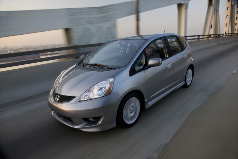
Back in August I wrote that I had test driven a 2006 Honda Fit and was in a holding pattern for the brand new 2009 model to come to Honda dealers before I made my final purchasing decision. Those of you who follow me on Twitter know that I took the plunge in early October and I’m pleased to report that it was the right decision. I’ve now been driving my new car for over a month and have a good handle on how the Fit drives, my likes, dislikes and quirks. The review that follows isn’t an exhaustive play by play, but rather what I’ve come to learn that might help other buyers like myself decide if the Fit is right for them. If you’re in the market for a new fuel efficient vehicle and have been thinking about the 2009 Honda Fit, then read on.

The Good

Having been an owner of three previous Honda CRV’s, I was really worried about how much space I would have in the new Fit. I’m not a small guy and I do feel cramped in my wife’s Civic. But one of the first things you notice is that it is surprisingly roomy. It feels like it’s just big enough for me without having the extra size and weight of an SUV. The magic back seats are much better than my old CRV seats and fold down 100% flush with the storage compartment in the back. I can already tell this will come in handy when loading big items into the cargo area.

Honda’s advertisements for the Fit tout its fuel economy and with good reason. My Fit’s gas tank is a full 3 gallons smaller than my CRV’s, but now I’m getting an average of 31.5 mpg as opposed to 21 before. This means I’m getting roughly the same number of miles out of a full tank as I was with the CRV, but for less fuel and less money. Totally wonderful!

The car is super fun to drive. Unlike my CRV, the Fit takes corners tightly, hugs the road like a semi-real sports car and does an admirable job of shifting both up and down. There are many winding roads around where I live and I’ve rediscovered the joy of driving on them thanks to my new Fit. Other nice things include:

• Daytime running lights for safety

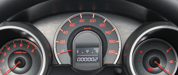
• Real time MPG indicator as you drive

• Two glove boxes instead of just one

• Hidden iPod adapter in the upper glove box

• Audio controls on the steering column

• GPS navigation system shows ATMs, restaurants & more

The Not So Good

I’ve never run across a car that was perfect and the 2009 Honda Fit is no exception. There will always be things that, for one reason or another, you wish were different about the vehicle. Thankfully, I don’t consider any of the items below to be deal breakers from a buyer’s perspective. I do think they are things that Honda should look at improving in future revisions.

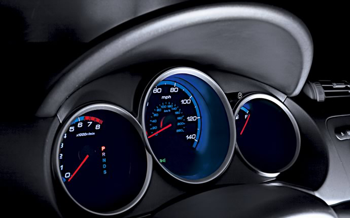
My single biggest problem with the 2009 Honda fit is the lack of useable dash space. What exactly is useable dash space you ask? It’s those places where you can put loose change, a pen, maybe a receipt the bank teller just handed you, etc. Because the Fit’s dash features sports style gauges, there is no place above the steering column to throw things. My CRV’s gauges were flat and therefore there was a small “shelf” that I often used for just this purpose. What’s worse, the passenger seat pretends to have such a shelf, but it lacks a rubber foot like the CRV did which renders it useless as objects simply slide right off when you turn a corner.

Honda also touts the fact that the interior of the Fit has no less than 10 cup holders, but this isn’t so much of a feature as it is a waste of space. Even seating 5 people, each person would have to have 2 drinks each to make use of all those cup holders. Note to Honda: I’d rather have utility space rather than so many cup holders in the future, thank you very much.

Being an user interface designer, I can’t help but critique the audio and navigation system too. On the surface the hands-free GPS seems great, but after using it for more than a few minutes, you really start to learn how poorly it is designed. Every single time you turn the ignition on, you’re confronted with a disclaimer screen that you must manually dismiss. Every. Single. Time. If you don’t, the system will default to a giant digital clock. Sure, you can get to the audio controls, but you won’t be able to use the GPS portion unless you hit that damned “Okay” button. Bad Honda, bad! Other things that need improving include:

• Honda’s iPod interface doesn’t see “Podcasts”, only playlists

• Turning off auto-door locking isn’t obvious or easy

• Too many hands-free voice commands to remember

• Cloth materials on doors seems to scuff easily

Conclusions

Overall, I love my new car. I managed to lower my car payments significantly while keeping much of the cargo space of my old CRV. The Fit’s gas mileage is great for a non-hybrid vehicle and has cut way down on my fuel costs. The 2009 Fit is fun to drive, has sleek lines and nice styling. While I would love for the interior to make better use of space, and some of the quirks of the audio / navigation system to be ironed out, I none-the-less can recommend the 2009 Honda Fit whole heartedly for anyone looking to buy one.

Vote For Hope

An incredible music video with a message that I feel very strongly about. It’s a great example of how good design can communicate an idea effectively.

Hat tip to Andy Brewer for this.

8 Comments

iPhone Wallpaper Problems Persist

I’ve written before about the problems the iPhone has regarding synched photos and wallpapers. Basically, in order to save HD space, Apple employs a custom dithering algorithm to compress any image that is synched to an iPhone or iPod touch. This has the effect of adding a slight grain to images that contain smooth gradients. I previously posted a workaround for this problem, but it only was effective if you were willing to jailbreak your device.

With the release of the 2.0 version of the iPhone firmware, I was hoping Apple would have improved the quality of synched images, but sadly that didn’t happen. I also got my hopes up too high when a new feature arrived in 2.0 allowing users to save images displayed in Mobile Safari to the photo library. Press and hold on any image and you will receive a dialog to save the image for later use, including as iPhone wallpapers. However, as I recently discovered, this new feature mangles images even worse than synching them.

You can see in the above example three magnified portions of a free wallpaper we offer at the Iconfactory. The image on the far left is the original JPG image saved with 100% quality from Photoshop. The second version is what happens to your wallpaper once it is synched via iTunes to your photo library on the device. While this version isn’t optimum, it is passable (barely) thanks in part to the dense pixel density of the iPhone’s display. The third example illustrates what happens when using the new “Save Image” option after you surf to a graphic, tap and hold. Due to high JPEG compression, image quality drops dramatically. Artifacts abound and for some reason, the OS even scales the picture up from its original dimensions creating interpolated pixels and a fuzzy image.

While the new option of saving images directly from the web is quicker and easier than manually saving and then synching images via iTunes, in my opinion, the poor quality negates the ease of use. Until Apple gets its act together regarding photos on the iPhone, users will have to put up with sub-standard images. This is a problem made all-together more frustrating considering the iPhone was lovingly designed to display stunning graphics, be they photos or videos.

4 Comments

I’m turning Japanese!

A few months ago I came across a great website called Cooking Cute. The site gives tips and tricks for creating imaginative and beautiful bento box lunches. I’m a big fan of all things Japanese and am fascinated by the level of detail and creativity on display there.

One of the typical ingredients in a Japanese bento box are hard boiled eggs, but not just any old eggs. Cooking Cute shows how to use plastic egg molds to shape your lunch into cute objects like cars, fish and stars. Turns out you can’t get them in the U.S. (at least that I found) and so I turned to eBay and ordered them directly from Japan. Click the image to visit my Flickr page and see how the whole thing turned out.

The process is relatively simple and straight forward. Hard boil some eggs as you normally would, but peel them while they are still hot. This turned out to be the most difficult part. You have to get the eggs into the molds as quickly as possible, while they are still pliable. Be careful not to burn yourself! This part should definitely not be done by children. Next, stuff them into the molds and lock them shut. If there is overflow, don’t worry, you actually want as much egg in the mold as possible. Next, float them in an ice water bath for about 10 minutes to set and cool them. If all goes according to plan, you’ll have a cute bunny where a plain old egg used to be!

Egg molds can be great fun, especially if you have children in the house. It’s a nice project that isn’t nearly as messy as creating Easter Eggs. Just be sure you buy extra large, jumbo eggs. If you don’t, some of the parts of the mold don’t get filled and you’ll end up with failed eggtemps (sorry!). Check eBay for the latest egg molds and then get ready to bring a little slice of Japan into your kitchen.

5 Comments

Beijing Takes Home the Gold

I’ll admit that I never really got into the 2004 Athens Olympics. If I watch the games at all, they’re usually the winter variety, but this summer something is different. The Beijing 2008 Summer Olympics have sparked the interest of people across the globe and grabbed hold of me like never before. There are a number of great things being done by the host country, the IOC and NBC’s coverage that have set these games apart from any I can remember. Here’s a list of just some of the things I’ve throughly enjoyed this time around. Bravo Beijing!

The Opening Ceremonies

Right from the start I knew the opening ceremony of the 2008 summer games was going to be something special. I distinctly remember how disappointed I was with the start of the 2004 Athens games and so I almost didn’t tune in this time. Boy, am I glad I did. The artistry, depth and intricacy of the spectacle set the bar far above anything I’ve ever seen. From the huge animated scroll, to the wonderful 2,008 Tai Chi demonstrators all moving in unison, Beijing did the Olympic tradition proud and put on a visual feast that won’t soon be forgotten.

Incredible HD Coverage

The Beijing games are the first Olympics I consider to be truly broadcast in high definition. There are hundreds of hours of HD coverage from NBC and her sister networks and it is simply wonderful. Watching the opening ceremonies, the epic spanning shots of Beijing and the incredible sports action in the pool and on the track in HD cannot be beat. If we can’t be court-side for beach volley ball or high up in the Bird’s Nest for the parade of nations, NBC’s Beijing HD broadcasts have to be the next best thing.

The Design

I love the look of these games. Every single visual aspect of the 2008 Beijing Games has been masterfully designed to evoke emotion, Chinese tradition and technical perfection. From Herzog & De Meuron’s famous “Bird’s Nest” stadium and PTW Architects’ exciting “Water Cube” swimming center, to the elegant design of the wave pattern employed on banners, posters and even the medals themselves, Beijing looks simply stunning. By contrast, London’s designers come off as hacks.

Compelling Athletic Drama

The thrill of victory and the agony of defeat are all in play in Beijing. I’ve really enjoyed watching Michael Phelps make Olympic history with his eight gold medals. I’ve also been rooting for the Chinese every chance I get from rowing (they won their first golds!) to women’s beach volley ball, the incredible women’s marathon and beyond. And who could forget Usain Bolt’s incredible and cocky performance in the men’s 100 meter dash? The 2008 Summer Games have been a dream come true for sports fans around the globe, and it isn’t over yet.

The Commercials

Yes, even the ads kick ass. The commercials during the games have put those over-hyped, over-priced train wrecks we see during the Super Bowl to shame. I especially love VISA’s simple, narrated ads with Morgan Freeman and the always inspiring creations of United Airlines. Between the games and the commercials, I can barely break myself away from the TV long enough to grab a snack!

8 Comments

Waiting for the 2009 Honda Fit

So the lease on my 2005 Honda CRV was up this past July and like millions of other Americans who are dealing with high gas prices, I started looking for a smaller car this time around. Enter the Honda Fit. One of the best selling cars in its class, the Fit seemed just like what I was looking for both in gas mileage and price. I set up an appointment to test drive a Fit and found that I really did like it. Surprisingly it drives much more like my CRV than I expected. I thought I would feel very low to the ground, but I didn’t. And when Honda says the Fit is one of the roomiest cars for its size, they are not kidding. I didn’t feel cramped at all. There’s only one problem – a new model is coming in just a few months.

After a quick bit of research, I’m glad the sales person at Crown Honda didn’t manage to pressure me into walking off the lot with the current model. The 2009 Honda Fit has improvements in almost every area that make waiting worth it. Here’s a list of just some of those improvements:

• Tire pressure monitoring system

• Voice activated GPS

• Apple iPod adapter now standard

• Two new engines: a 1.3 liter i-VTEC or a 1.5 liter i-VTEC

• Overall length, width and wheelbase have been increased

• Windshield moved forward, A-pillar is smaller for better visibility

• More storage space

With all of the focus on gas mileage these days, I was really happy to see that the Fit includes a built-in tire pressure sensor. That small addition should help owners immensely when it comes to getting the most miles from each fill up. The Fit also forgoes the standard addition of a spare tire and includes a tire patch kit instead. By doing so, the car frees up space for other things like those wonderful “magic seats” while also lightening the load, again increasing gas mileage. You gotta give Honda credit, in today’s world every bit helps.

I’ve also noticed some nice things about the new Fit that Honda doesn’t tout, but are none-the-less important to a CRV driver like myself. One of these features is the ability to control the sound system from the steering wheel. I’ve really grown to love this feature in my CRV and every time I climb into my wife’s Civic, I instantly miss it. These controls are absent on the current Fit, but you can see in close-ups of the 2009’s dash, that they are there. Another is the modified gauges including a non-recessed speedometer. I really don’t like the current “sports” look of today’s gauges with deep wells that hold the instrumentation. While the 2009 Fit doesn’t totally remove these recessed gauges, the primary one is once again flat and easy to read which is a big help. Lastly, there is an extra storage well on on the passenger’s side above the glove box and a swing down storage tray between the front seats. Both are obviously lifted from the design of the CRV which is just fantastic.

if I didn’t know better, I’d swear Honda had designed the new 2009 Fit just for me. Of course, there are always downsides to any car and advanced reviews suggest that the car’s pick-up isn’t as good as the current model. This, combined with higher levels of noise at highway speeds seem to dictate an informative test drive is in order before I make my final decision. For now, I’m happy going month-to-month on my current lease and biding my time. Of course, when the new models arrive, they’ll probably be in short supply, so that “autumn” release may eventually turn into a winter purchase. If the 2009 Fit turns out to be 1/2 as good as it looks however, I think I’ll have made the right decision. Wish me luck!

UPDATE: Due to popular demand, Honda decided to release the new Fit a month early. It’s being released to dealers on August 26th so if you’re in the market, prick up your ears people!

FOX 8 Profiles The Iconfactory

If you’ve ever wondered just what I do at my day job, then this awesome 2 minute profile of the Iconfactory explains it pretty darned well. We were proud to be considered for WGHP’s “Made in North Carolina” series broadcast right here in the Triad. The goal of the series is to highlight companies that you may not realize are in NC, but that make things you know and use every day.

I didn’t realize that Texas Pete or Crest Toothpaste were made in North Carolina, so its fun to see just what the good folks of the Tarheel state are up to. Stewart Pittman of Fox 8 came by this past Monday and interviewed us to find out more about what we do and how we got started. The resulting segment pretty much nails what goes on at the Iconfactory each and every day. Stewart said he had a blast filming our office with all our toys we have on hand to keep our creativity up, and I think that comes out in the video. If you didn’t know better, you’d think we design toys instead of icons for a living. Our thanks go out to Stewart and everyone at Fox 8 for having us, we had loads of fun.

UPDATE: I’ve gone ahead and put up a better version of the video over at Vimeo that includes the Fox 8 intro and outro bumpers. Enjoy!

4 Comments

Top Ten Things I Learned in NYC

David Lanham and I traveled to New York over the 4th of July weekend, 2008. We were invited by our friend Von Glitschka as guest speakers at the ICON5 Illustration conference. I had not been to NYC in years and it was great to meet talented artists, designers and see the city. While there I learned some important facts about the Big Apple that I thought I would share with all of my loyal readers.

• • •

10. Everyone either listens to an iPod or talks on a cell phone.

9. If I lived in NYC, I think I’d like to live in Greenwich Village.

8. Yankees fans get really upset when you tell them “Go Sox!”

7. No one in NYC bothers to read signs.

6. The line for the Empire State Building is really, really long.

5. There is a place to eat every few feet.

4. I need to buy more Apple stock.

3. Tell your traveling companion to call if he’ll be out after 2am.

2. Despite what you see in movies and TV, the people are friendly.

1. A cab ride through the heart of Manhattan is just as thrilling, nerve-wracking and expensive as a trip on Space Mountain.

1 Comment

Serenity Now!

To say things have been a little hectic at work lately would be an understatement. For the past several months, we’ve all been working hard to get you-know-what for the iPhone in ship shape. With the impending launch of the App Store, all of us have had our hands full and then some. In the midst of this massive effort, this 4th of July weekend, David and I travel to New York City to give a talk at the ICON5 Illustration Conference at the invitation of our friend and fellow artist, Von Glitschka. I can’t remember the last time I flew on a holiday and I can only imagine the travel nightmares that await us. My iPhone will be good and charged and packed with plenty of episodes of Futurama and Deep Space Nine.

Then there’s the little matter of day-to-day work at the factory. We’ve been snowed under at the office for months with a huge project that has kept us all busy every minute of every day. Having constant work is great, but it also makes it difficult to focus on internal projects like [REDACTED] and certain freeware releases that were only supposed to go on for a month, but due to forces outside our control, inevitably stretched into the future. If we could just get the R&D lab to perfect that cloning machine they’ve been teasing us with, everything would be peachy. However, as of this writing, there’s no word yet. Those bastards.

Somehow in the middle of all this madness, the gang at the Iconfactory managed to pull off an elegant punking of our dear friend and co-worker, Craig Hockenberry. See, back at WWDC Mr. Hockenberry came away with an ADA for his incredible work on Twitterrific for the iPhone and being the gracious man he is, he let Corey bring it back to North Carolina so the rest of us could get a fleeting glimpse of the “cube” before its return to Laguna Beach. Well, we thought it would be fun to create our own DIY ADA and mail that back to him just for kicks. We documented the creation process which you can find on the Iconfactory’s Flickr page. Needless to say the prank succeeded in putting a big smile on Craig’s face while relieving some stress around the office.

The good part of all this mayhem is that it keeps life interesting. There’s always a new challenge on the horizon, be it software, freeware or paying projects. Believe it or not, client work can sometimes provide a respite every now and then from the pressures we end up imposing on ourselves. Personally, if I can just get through July, I think I’l be just fine. Serenity now! Serenity now!

4 Comments

My Home Away From Home

It always fascinates me to see what people’s workspaces are like. I love getting an inside look at how artists, programmers and designers organize their desktops and select the tools they need to do their job. Some workspaces border on zen-like art, while others take on an air of controlled chaos. Some of us work in our homes like my friends Wolfgang Ante or Craig Hockenberry. But most of us spend the majority of our weekdays at “the office”.

And so, I thought I would throw my hat into the ring and give you a small peek at my workspace. My desk at the Iconfactory in Greensboro is where I do much of the pixel-pushing, writing, designing and illustrating that helps keep the bills paid and clients happy. Each and every day, I’m fortunate to work in a creative atmosphere surrounded by talented and dedicated people. Like many of us these days, I’ve tried working at home for extended periods, but it just doesn’t suit me. I love the bustle of the Iconfactory and the creativity our “open plan” offers the group (except when more than 3 of us are on the phone at the same time). I hope you enjoy this small behind-the-scenes look where I spend my days. Head on over to Flickr to check it out. Enjoy!

1 Comment

Unlock Your Inner Spore

Unless you’ve been living under an online rock, then you probably know about Spore, the new game coming from Electronic Arts. Spore lets you play “god” and engineer living creatures and then release them into the wild, and eventually the stars. The game is due to be released in its entirety this fall, but Electronic Art recently published a small demo of the Creature Creator this past week.

There’s been tons of hype leading up to Spore’s release, and frankly I’ve become wary of getting my hopes up too high with so many people singing its praises. Mirroring my disappointing experience with “Iron Man” is not something I want to repeat, so I’ve been intentionally avoiding the Spore Kool-Aid. That is until tonight. Tonight I watched Mindy as she gave the Creature Creator demo a run through from start to finish, and if the full game is 1/4 as fun as the demo, EA has themselves a winner.

No doubt a large portion of the enjoyment of the demo comes from how easy it is to create something that feels “alive”. The demo lets you select body parts, adjust them, rotate them, scale them, and more to form your creature. You can then paint on colors and textures at will until you arrive at your final critter. The controls are intuitive, easy to manipulate and just plain fun. In many ways it reminds me of the old Kai’s Power Tools version of Bryce. KPT Bryce let you instantly get your “hands” dirty generating alien terrains, skys and oceans. It was immediate, tactile and absorbing. Spore’s Creature Creator demo is similar in many respects and for players with a flair for the creative, it has loads to offer.

Perhaps the only downside is that until the full game is released, players can’t fully judge their creatures or how they’ll fair in the virtual world. I suspect Spore’s universe will be a “dog eat dog” world, and so selecting frog hands for your varmint instead of claws might be a fatal choice come September. I’ll give EA the benefit of the doubt for the time being and hope old “Figmon” shown above, brings both his A-game and his looks. In the meantime, head on over and check out the Spore Creature Creator demo, I think you’ll be pleasantly surprised. After all, it isn’t every day you get to play god.

12 Comments

The Little Blue Bird That Could

Today, at Apple’s World Wide Developer Conference in San Francisco, the computer maker unveiled its plans for the next generation of iPhones as well as a sneak peek into third party applications headed our way. Due to hit public airwaves July 11th, Apple’s new iPhone/iPod Touch “App Store” as it’s being called, will allow users to purchase third party mobile applications directly over the air. I speak for all of us at the Iconfactory when I say we were just as surprised and delighted as you probably were to find our very own application, Twitterrific, featured heavily on Apple’s website.

It seems after flying high and far, sometimes to shady destinations, the little blue bird has finally gone legit. I don’t think any of us at the factory realized just how popular Twitter, and in turn Twitterrific would become in this past year. We’ve been making various software applications for a decade now, and in all that time, none of us would have expected such an unassuming little app to become our most well recognized piece of code. Twitterrific’s success speaks volumes about the fine work of the folks over at Twitter, and the hunger for today’s users to stay in touch with friends, relatives and co-workers via new media like social networks.

We’re very pleased the Mac community took to Twitterrific so well and helped make it the success it is today. We’re looking forward to bringing the application to a whole new generation of users for the iPhone and iPod Touch, and would like to extend our thanks to Apple for giving the blue bird such a fine new home. We feel both excited and privileged to be a part of the new App Store and are committed to bringing our users the best software we can offer. We look forward to these first steps on what is sure to be, a fun journey for both users and developers alike.

1 Comment

How To Spot A Cylon

Just in time to help the crew of the Battlestar Galactica divine the identity of the final five cylons, comes this helpful PSA style poster from Quantum Mechanix. It reminds me a lot of the infamous Wii Safety stuff we did over at the Iconfactory a couple years back and would make a fine addition to any geek’s wall.

Some of the funnier tips include:

• Do they seem unusually strong, smart or self-assured?
• Do they say God instead of Gods?
• Do you see them hanging around secured or restricted areas?
• Do they seem to hear music that no one else can hear?
• Are they unusually adept, almost empathic, with machines?
• Does their spine glow red when they get… excited?

Be sure to also check out the über-cool retro BSG propaganda posters they’re offering. And before you ask, no, I don’t get a kickback on this stuff 🙂

3 Comments

For the Love of the Game

When was the last time you played a game of pinball? If you’re anything like me, it’s been years since you plunked quarters into one of those classic arcade contraptions. The plight of the pinball machine is one, that in today’s modern world, has grown more and more familiar. What once captured the money and imagination of players across the country, has become relegated to collector’s garages and played by a small group of enthusiasts who look back on pinball with fond memories through neon colored glasses. The story of pinball’s origins and how one company tried to re-invent it, is being told via a new documentary written, produced and directed by my friend and designer Greg Maletic.

Tilt: The Battle to Save Pinball tells the story of the Williams company and their dedicated team of designers who were tasked with nothing less than single-handedly saving the entire pinball industry. The DVD can be ordered via the Tilt homepage, and is a wonderfully produced documentary spanning the entire history of the game. Tilt takes the viewer on a light-hearted and fascinating journey from pinball’s humble beginnings as merely a game of luck, to the industry changing era of classic video games, and the creation of Pinball 2000.

The DVD’s production values are top notch and are marked by retro style graphics (all created in Adobe Illustrator and animated in After Effects), an easy to follow narrative and some of the best music I’ve ever heard written for a documentary by composer Skip Heller. Much more than just “talking heads”, Greg’s film gives special insights into the world of the penny arcade that eventually morphed into the electronic palaces of the 60’s 70’s & 80’s that so many of us spent our childhood in. Watching Tilt, it’s easy to see how much a labor of love this film has been for him. Case in point comes in a scene discussing Baby Pac Man, an unsuccessful fusion of pinball and video games. The director’s audio commentary reveals he was unable to find a functioning Baby Pac Man unit to film, so he decided to animate the entire cabinet in After Effects. An impressive feat to be sure, and one that I would never have realized had I not listened to the commentary. Tilt is full of these kinds of subtle treats which bring both eye candy and visual interest to a subject that some might consider boring.

Over 2 and a half years in the making, Tilt: The Battle to Save Pinball, not only serves up an interesting slice of history, but also provides insight into problems that designers face every single day. How do you make something old and familiar, new and fresh? How do talented individuals leverage their skills to create a unique new experience even in the face of tremendous industry pressure? All of these questions, and many more are tackled in Tilt. It’s a fun journey for pinball fans and lay people alike that I highly recommend. Check out the trailer available on the Tilt homepage or via YouTube.

10 Comments

One-Way Street

Let me just say up front that the engineers, programmers and developers I work with are some of the most talented people in the industry. They manage to write software and code few others have the skill to create, and I am often in awe of their abilities. That being said, I’ve recently been reminded of an inequity between designers and programmers which I have to get off my chest.

Last week I watched the excellent video from the C4 developer’s conference with my friend Cabel Sasser of Panic fame called Coda Confidential. Something he said in his presentation struck home. At the 22 minute mark Cabel starts talking about Coda’s “Toolbar of Doom” and the implications the toolbar had on his developers. If you’re not familiar with the story, you can listen to the description of the problem from the C4 video, or check out Cabel’s blog post on the subject. The short version is that Cabel designed Coda’s toolbar to appear a certain way, the way he knew it looked best. But it turned out that designing it this way was hard. Very hard. After trying to bend the Cocoa toolbar implementation to their will, they decided instead to throw in the towel. And when Cabel says “throw in the towel” he means write their own toolbar code. From scratch.

Despite their impressive ability to solve the toolbar design problem, Cabel makes the point that he’s constantly “choosing his battles” between himself and the programmers at Panic. They don’t always have the luxury of writing code from the ground up to solve a particular design problem. They are constantly asking themselves is this particular design decision worth the time and effort it will take to implement? As I know from personal experience, sometimes the answer to that question is unfortunately, “No”. As a co-owner of my company, like Cabel, I’m constantly looking at the “big picture” to determine if a difficult design is worth the time and money required to implement it.

But from a creative point of view, purely as a designer, I still find it frustrating that the ideas and creations I come up don’t always get implemented. Some are considered “too difficult” or “too time consuming” to put into practice and therefore must be abandoned. I consider this to be a double-standard in our industry between designers and developers. As a designer, I’ve almost never told a developer I’m working with that a particular icon, user interface or web design is “too difficult” to implement. In my entire career, I think I’ve said “no” a grand total of 2 or 3 times. And that only happened because someone asked for something physically impossible, like making a 5 letter word legible at 16×16 pixels. I realize the programmers reading this will probably say “that’s because coding is more difficult than designing”. This may or may not be true, but that’s a whole other topic for discussion.

I know that even programmers themselves can’t always create the software or features they dream up, but it seems like they often have “outs” that simply don’t exist for us designers. We’re always expected to push through and solve the problem, while for them, something is either technically not feasible, would take too long to implement, or is simply a bad idea due to poor user behavior. Just once, I’d love to be able to tell a developer who’s asked me to solve a design problem “Nope, it’s too hard. Not gonna happen.”

I know that given enough time and money, pretty much anything is possible, and unfortunately most small software companies are not made of gold. We must therefore attempt to balance our desires as designers with what is best for the success of the product. I also know that the balance between a talented designer and a skilled programmer can transform mediocre titles into outstanding apps. I just wish I had the ability to even the score every now and then. I take solace in the fact that often as designers, we’re usually only limited by our imaginations rather than API’s or function calls. Our relationship may indeed be a one way street, but for developers, it’s often littered with road blocks.

4 Comments

Design Disconnects

This week I was confronted by no less than two glaring examples of poor or lazy design that I just had to share with you. I think they really illustrate how important our job is as communicators and how easily information can be miss-conveyed when designers don’t do their jobs well.

The first comes in the form of the DVD box art for the Oscar winning film, No Country for Old Men. I rushed out this week to snap up my copy of this fabulous tale starring Tommy Lee Jones, Javier Bardem and Josh Brolin, only to find a glaring design error. Although not all of us are schooled in design principals like the Gestalt Law of Proximity, we can still determine when things aren’t “quite right”.

Apparently the designer accidently or intentionally miss-matched Tommy Lee Jones’ and Josh Brolin’s portraits with their names. Because it seems to be such an obvious mistake, some might try and argue that it can only be intentional. As I learned from our experience with the official War of the World’s icon set a few years back, movie studios have many rules about who’s name can appear first, second, and so on. Given that, plus the fact that Javier Bardem’s face is associated correctly with his name directly below, why not match Tommy Lee and Josh as well? There’s simply no good reason for it and I’m forced to conclude that the juxtaposition of Jones’ and Brolin’s images are a mistake. Apparently design accidents happen, even on multi-million dollar marketing campaigns.

The second example comes from the world of television, and if I didn’t know better, seems anything but accidental. The season 4 premiere of Bravo’s hit show, Top Chef, featured a typical audience poll via text message. Season 4 features a pair of female chefs that are not only competing against each other, but are also a couple. They’ve been together for 3 years and the question to viewers was “Do Zoi and Jen have an advantage in the show because they’re a couple?”. After several commercial breaks the results were displayed as you see in this screen capture. The graphic was not accompanied by any informational voice over of any kind and so you are left to determine the results in a fleeting glimpse of 10-15 seconds of actual screen time.

At first glance, the majority of viewers seem to think, yes, the couple does have an advantage since that result is circled and highlighted. But upon closer inspection, poll results reveal that a full 78% of viewers in fact think, no, Zoi and Jen do not have an advantage. For some reason, the graphic strangely highlights the minority opinion. Why would Top Chef want to highlight the losing segment? Could we be looking at yet another error (perhaps generated automatically by faulty poll software)? I think it’s far more likely that the show’s producers wanted to drum up controversy by highlighting the most dramatic result, no matter how small. If I was a guy who wore tin-foil hats, I’d say there could be other reasons for what they did, but I’ll just leave that to your imagination instead.

Although these issues don’t amount to the proverbial “hill of beans” in most people’s world, they do illustrate the kinds of problems that designers face all the time. As a wise man once said, “With great power, comes great responsibility.” Remember that as you use your design powers for good and not evil… like making scores of fans think Tommy Lee Jones is really Josh Brolin.

UPDATE: This week’s cell phone poll on Top Chef correctly highlighted the viewer choice with the most votes. As suspected the example I posted here is an error of some kind.

1 Comment

Real Life Wait Cursor

This funky watch has to be the coolest thing to come out of Korea since Kalbi. A company named Funshop has released this wonderful, retro accessory much to the delight of pixel geeks everywhere. I especially love how the face is true to form and forgoes any numbers which would only detract from the pixelish illusion. Not sure if you can order it yet, but even if you could, you’d have to be a huge nerd to actually wear it in public. Something tells me this would be better off on a shelf as a great conversation piece, at least until they come out with the inevitable Marble of Doom inspired pocket watch.

Hat tip to: NOTCOT.

2 Comments

Next Up: Arcade Daze System

They say you never forget your first true loves. I think that’s one of the reasons why I’ve recently gravitated to the pixel-click world of Arcade Daze once again. When I released the first Arcade Daze set back in August of 2006, it managed to combine two of my favorite things: video games and icons. I’m not talking about the photo-illustrative, super real creations that pass for icons today. I’m talking about good old fashion 16×16 and 32×32 pixel-clicked pieces of hand crafted art. Back before some of you who are reading this used a computer, icons were limited in the number of pixels AND colors they could contain. Placing each dot in the canvas was critical to the success of the final icon and something I thoroughly enjoyed doing.

Over the holiday break I started working on a new system replacement icon set for CandyBar based on Arcade Daze and I have to say it’s been a blast. I still have a way to go until it is completed, but I can already tell it will be one of my favorite sets. Every item in the collection is based off a 14×15 pixel click icon that then gets super-scaled up by various factors to flesh out all the sizes up to Leopard’s 512x512s. With Anthony’s help, I managed to create a series of Photoshop actions that take a lot of the grunt work out of creating Arcade Daze System. Thanks to these actions I’ll be able to include more icons in this collection than I’ve ever done before.

So stay tuned to the Iconfactory and in the meantime, head on over to my Flickr page for a sneak peek at what the pixelated future holds. This is gonna be fun!

5 Comments

You Know, for Spite!

This is the true story of how MarbleofDoom.com was born. Those of you with weak constitutions should look away now because it’s not going to be pretty. As any artist knows, the creative process can often be sparked by a number of things; a bit of music, a friend’s comment, a favorite photograph or even just the desire to fill an empty niche. However, in the case of the MOD, no such nobel pursuits came into play. Nope, what we have here is a good ‘ol fashion case of spite. Yes, spite.

Before I get into all that however, I should back up just a little bit. If you don’t know what MarbleofDoom.com is, go check it out. It’s basically a fun, website where Mac users can enter how much time they’ve collectively wasted waiting for the spinning beach ball of death cursor. Users enter time and the site reports on the total number of hours wasted. What’s the point? I’m glad you asked.

The spinning beach ball has been something that Mac users have been dealing with in one form or another since the platform was launched. Back in the early days, Mac users knew it as the dreaded wrist watch cursor that would spin until a process had finished loading. When Mac OS X came along, Apple decided to spruce it up. I guess they figured if you had to wait, why not wait in style? With the advent of the Adobe CS suite of apps, Mac users saw the frequency and duration of the beach ball increase dramatically. I know what you’re thinking. MOD was created to spite Adobe, right? Nope, not by a long shot cupcake. Now sit back down and let me finish the story.

Back in June, two of my long-time friends, Bob & Jiffy Burke, told me via Twitter that at Jiffy’s office, they referred to the beach ball as the “Marble of Doom”. The name really struck a chord with all of us at the Iconfactory and we started referring to it by its new name all the time. We loved the name so much that in September, I decided to add the lexicon to the official Wikipedia entry for the spinning beach ball of death. This is the part where the spite comes in. I was so proud of contributing to the mythos of the beach ball, that when my addition was removed a little over an hour later by a user named Sdfisher, I could hardly believe it. I mean, it was just another name for the cursor, what harm could there possibly be in adding it? According to Sdfisher:

“marble of doom” has 10 google hits, only one of which is Mac related. Removed.

Ask any one of my friends and they’ll tell you I’m not a vindictive person. I don’t fly into fits of anger or wish ill-will on anyone. But when I read that Wikipedia edit from Sdfisher, something inside me snapped. I immediately formed a geeky plan to leverage Mac users everywhere and get “Marble of Doom” back up on Wikipedia. After all, I owed Jiffy no less. Or at least that’s what I kept telling myself.

Months earlier, I had decided to actually record marble spin time using the excellent time tracking utility, On the Job. Every time I’d see the Marble of Doom, I’d immediately add the time to the fake MOD project. After one month of tracking the cursor, I was shocked to find that I was kept waiting a grand total of almost 1 hour. This experience gave me the brainchild for what would eventually become MarbleofDoom.com. All of the guys at work got excited about the project and I even enlisted the help of the talented Wolfgang Ante, our Frenzic and xScope partner, along with our own Craig Hockenberry, to help code the back end. The MOD website became a fun side project that we worked on in the down time between client work. We launched it on 10/19/07 and its popularity soared as Mac users everywhere could finally vent their frustrations with their glassy overlord.

“Marble of Doom” now has over 40,000 Google hits and has given more than a few people a good laugh while they wait for their Macs to return from la-la land. The best part however, was that on 10/30/07, a user named Rory O’Kane re-entered “marble of doom” as one of the names for the spinning beach ball cursor on Wikipedia. Take that Sdfisher! I told you this wasn’t going to be pretty, and now you know. God, I love the Internet 🙂