Super Tribes for iOS Walkthrough Plus Tips + Tricks

I’ve never actually done a video walkthrough of a mobile game before so this is new territory for me. As such, this review of the fun, turn-based iOS game Super Tribes is a bit longer than it probably should be but I’m still learning so go easy on me! My friend @Bigzaphod turned me onto Super Tribes and I’ve been playing it on and off for about a week. It’s really fun, light and doesn’t suck a huge amount of time which is perfect.

The best part about Super Tribes is that the game length is fixed to 30 individual turns which means a typical game can last anywhere from 20 minutes to about an hour and that’s it. You play against the AI, not other people or friends. Depending on your style of gaming this may be a plus or minus to you, but I personally enjoy it. There’s tons of stuff I didn’t cover in the walkthrough but what I do cover should be enough to get you up and exploring the flat, grid-shaped world of Super Tribes in no time.

The game is free to play in the App Store, but if you do try it and like it, I beg you to purchase at least one of the in-app tribe packs to help support the developer. Games of this quality take thousands of hours to design, produce, test and deploy and we want them to continue making them, they need to eat. That’s all I’m saying. Enjoy!

How Modern Game Engines Are Improving Mobile Gaming

Batman_Arkham_Full

The widening selection of game creation tools available to mobile developers have come a long way in improving players’ experiences when gaming on the go. Game engines are special software frameworks designed to augment the strengths of modern gaming hardware and aid the rapid development and creation of new and exciting titles. Modern game engines contain all the necessary tools for developers to be able to create their kick-ass games more quickly and easier than ever before and the results have been impressive.

Thanks to the advent of smartphones, tablets, phablets and now wearables like Apple Watch, the monetary worth of the gaming industry is enjoying exponential growth. The mobile gaming market alone is predicted to hit $9 billion in 2016. The convenience of playing both casual games like mobile bingo, as well as pulse-pounding, hyper-realistic racing games have all helped the industry set new records. With the continual improvements of next-generation of gaming platforms and quality titles like Splatoon and The Witcher 3 to go with them, gamers are enjoying a bright future packed with high-quality titles from a host of publishers, and powerful engines are driving their success.

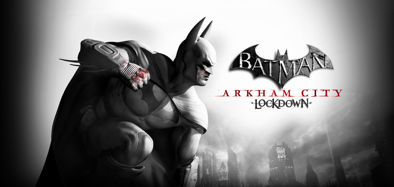
The Unreal Engine has long been a favorite among developers and has been responsible for helping to create such popular titles such as Batman: Arkham City Lockdown, Injustice, Borderlands Legends and the Infinity Blade series. To date, the Unreal Engine 3 has been installed on some 2.25 million computers worldwide and comes complete with an integrated Unreal Editor suite which has helped revolutionize the way developers build and develop their mobile game projects.

Plants vs Zombies title screen

For PopCap Games’ popular tower defense game Plants vs Zombies and OMGPop’s rather addictive mobile app Draw Something, the Marmalade SDK helped provide the facility and resources needed to create cross-platform C++ games.

The software development kit gives developers the ability to compile their Xcode and Visual Studio projects for Android or iOS which helps cut development costs while widening their potential audiences at the same time. Marmalade also provides an acceleration tool called Marmalade Quick which provides an even more flexible, open environment for developers to experiment with. This is particularly useful for those companies looking to get their games up, running and monetized more quickly.

Other game engines such as Unity can make 3D development a breeze whilst the Corona SDK helps solves issues of cross-content publishing giving developers more freedom to concentrate on other aspects of their games.

There’s little doubt that the modern state of game engine development now offers something for every type of game developer and this means more and more players are reaping the rewards. From casual to hard-core and everything in-between, these advanced tools in the hands of talented studios can only lead to every-higher quality mobile gaming experiences. What a great time to be a gamer!

Four Innovations I love in Gaming

FarCry4_1

A lot of times, particularly where technology is concerned, we’re so focused on the future that we forget to enjoy the present. With ridiculously capable laptops, tablets, and smartphones at our disposal, many are looking ahead with hope to Iron Man-style hologram displays. With powerful cars setting new standards for safety and efficiency, we’re seeing advertisements for driverless vehicles. And in gaming, many seem to be turning their focus toward wearable, virtual reality options that will no doubt be widely available in a matter of years—not decades.

That’s all well and good, but as a bit of a gaming nut, I like to focus more on the present and what I can play today. Furthermore, there have been some pretty great innovations—some small, others large—throughout the gaming industry in the past few years. Here are a few I’ve enjoyed in particular.

The Spread Of Open World

Open world gaming is nothing new, but the concept has exploded in popularity over the past couple of years. A decade or two ago, a video game employing an open world format felt unique and special. For example, pretty much the only thing that made Skyrim remarkable (in my opinion) was the sheer size of its world. Well, now it’s just about the standard for action and adventure games. Look through this list of the 12 best open world games, and you’ll find a lot of releases from the past couple of years, such as Far Cry 3 and Grand Theft Auto V. To some extent, the concept has even extended to mobile platforms, with Minecraft Pocket Edition now offering a limitless world creative option!

Narrative Gaming

Narrative gaming is nothing new on the console level, other than that it’s gotten better. Not long ago, it was a common complaint among gamers when a game attempted to be too cinematic in nature, but that’s because it was usually done via interspersed, non-playable graphic clips used to move the story along. This is still a problem in some titles, but generally speaking most now have natural, free-flowing narratives that make them more interesting. Even in sports games, “My Player” and “My Career” modes let you play out the story of an athlete or franchise. The trend toward sharper narratives is also particularly prevalent in app gaming, where indie developers like Simogo focus as much on story as action. In my view, this is a positive trend.

Live Dealing & Interaction

This is a trend that exists primarily in the casino gaming industry. Given that this industry now occupies a significant portion of the video game business as a whole, it still feels noteworthy. Live interaction is nothing new. The best online casino sites allow players to face live competition, and even some of the popular poker and blackjack apps, most of which operate with play money, allow for live online games. But one fascinating trend that I first noticed here is the idea of using an actual video feed of a live dealer in roulette and card games. Naturally, this concept makes the games feel a great deal more realistic. While there’s not an obvious parallel in non-casino gaming, the implications of using a live feed in gaming are interesting. One can imagine in-game video chats with other players, Google Maps feeds of real geographical areas, etc. helping to make other games more realistic.

Retro Appreciation

And finally there’s this, my single favorite trend in modern gaming. As mentioned, we have a tendency to always look forward when it comes to technology. But thanks in large part to new-ish formats of gaming, such as mobile app stores and console download stores, there seems to be a broad recognition of retro games going on. In part, we see it through the continuation of old, beloved franchises, with the most relevant example being the coming Street Fighter V PS4 game from Capcom. But mostly, the retro appreciation is seen in apps and downloads. On modern consoles, players have access to huge libraries of old games, either for free or for just a few dollars. In app stores, we can play with all kinds of old characters such as Sonic the Hedgehog, the Street Fighter and Mortal Kombat fighters, and so on. According to ZDNet, we may even soon have a Mario game or two available on iPhones! This is a trend any serious gamer can get behind.

Muting Messages in iOS 8

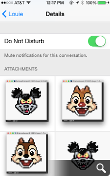
One of the most useful (and hidden) features I’ve come across in iOS 8 is the ability to mute IM threads in Messages. Think of it like Do Not Disturb but on a case by case basis. I first noticed it by accident when a tiny crescent moon icon appeared next to one of my IM threads and so I Googled it to figure out what exactly it was.


When do not disturb is turned on for a particular message thread, you won’t be notified when that person(s) replies via text or iMessage. This can be really great if you want a way to ignore a person or group discussion that’s gotten out of hand. It can also be really frustrating if you happen to activate it by accident as I apparently I did without realizing it (or perhaps a bug in iOS 8?).

To turn Do Not Disturb for individual message threads on or off, tap the Details text at the top right of the Messages window to open that thread’s detail view. Next, scroll down to Do Not Disturb and toggle on or off as desired. When this feature is turned on, you won’t receive notifications when the person sends text messages or IM’s and you can go about your life notification free.

The Details view also gives you quick access to all the images that person has shared with you, as well as the ability to share your location information with the people you’re chatting with which is a nice feature as well.

The more I play with iOS 8, the more little things I find that truly set it apart from iOS 7. It’s wonderful that Apple is giving us more control over our digital world, I can’t wait to see what else is in store.

PS – I love Louie to death and would never mute his IM’s. He was gracious enough to let me use our conversation as an example. Thanks Louie! 🙂

The Bezel’s the Thing

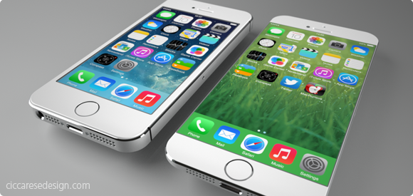
It doesn’t take tea leaves or even a leaked report from the Wall St. Journal to figure out Apple will probably release a new model of iPhone with a larger screen later this year. Users have been begging for more screen real estate, especially with the increased attention of larger-screened devices like the Samsung Galaxy. Also, Apple typically does full product revisions on a 2-year cycle which just happens to hit for the iPhone this fall. All of these factors may create the “perfect iStorm” that users have been patiently waiting for. From a personal standpoint, I would love an iPhone with something around a 4.75″ screen because the older I get, the more I seem to squint and miss-tap at the tiny interface elements of my iPhone 5c.

The report from the Journal seems to hint at two new sizes of iPhones, one somewhere around 4.75″ and another, larger device possibly measuring 5.5″ diagonally. I freely admit that speculating about the screen sizes of these non-existant devices is mostly wishful thinking, but that’s part of the fun. What would your ultimate iPhone look like? What size screen would it sport and more importantly, what’s the new form factor going to be like? For all the talk about screen size, I think the more important aspect of the next iPhone will be the design of the bezel. The bezel is the border around the screen that offsets the display from the edge of the device. Recent rumors suggest that the new iPhone 6 will have little or no bezel between the screen and the left and right edge. If true, this is a far more exciting development, at least for me, than just upping the screen size.

It’s no secret that the industrial design team at Apple has long sought to create a display that’s essentially a continuous piece of solid glass, edge to edge when held in the hand. Such a design would result in a screen that seems to end where your hand begins. Now with advances in Sapphire glass technology and with 7 years of experience under Apple’s belt, the dream of a nearly invisible bezel may soon become a reality. Removing the bezel won’t be a slam dunk however, as there are most certainly software considerations that need to be worked out. Accidental taps and swipes at the edge of the screen would probably increase without some kind of UI “neutral zone” at the perimeter of the display. Designing protective cases that don’t interfere with touching or swiping would also be a challenge, but hardly impossible.

If the rumors are true and the iPhone 6 will have a bezel of around 1mm, it will certainly make for a stunning, refreshed visual appearance at a time when the iPhone seems stagnant. Apple’s supporters note the company is selling record numbers of iPhones even though the form factor hasn’t changed for several years and that is true. It is also true however that users have been hungry for larger devices as well as ones that look and feel different from the existing models to help set them apart from their peers. From the stunning introduction of the retina display to the increased security and cool factor of Touch ID, Apple fans love owning the new hotness. Come this fall, I’m willing to bet a big part of the “heat” won’t be what Apple has added, but rather what they’ve removed – the bezel.

3 Comments

The Art of the Ringtone

Although modern smart phones can play a wide variety of musical and audio files as ringtones, very few work well. Popular songs are great for entertainment but aren’t written as attention getters from inside your pants pocket. Ever since the iPhone debuted, I’ve been using Marimba as my ringtone. Not because I’m a technophobe who doesn’t enjoy customizing his phone, but because nothing I tried managed to catch my attention like Apple’s default setting.

A couple of weeks ago, I had a brainstorm to ask friend and one of the composers behind Ramp Champ, Mike Weiser, to create a custom ringtone for me based on Marimba. I asked him to take the main theme from one of my favorite films and “Marimba-ize” it, with the following awesome results:

Please don’t ask me to post the Marimba-TRON ringtone. It’s based off music by Wendy Carlos written for the Disney movie and I had it made for my personal use. The last thing I’d want is to get myself or Mike in any trouble by re-distributing it. If you’d like your own custom designed ringtone, be sure to head on over to Mike’s website and learn all about the music-based services he provides, which now includes ringtones. Now if you’ll excuse me I’ve got to go watch that TRON Legacy trailer for like the 50 billionth time. Is it December yet??

27 Comments

Why Icons Matter

I can’t tell you how many times in the course of my career as an icon artist that a client considered their icons to be an after thought. After spending hundreds of man hours and pouring thousands of dollars into software development, some clients just refuse to devote the attention needed to the glyphs that act as both button and branding. At the Iconfactory, we try and educate clients about the importance of icons and how they strengthen a company’s brand as well as communicate a product’s core concepts quickly and easily. It may sound like marketing fluff, but years of experience have taught me it’s the truth.

So when it comes to designing our icons for our own software products, we almost always end up obsessing over them. The redesign of the application icon for xScope went through nearly 20 different revisions before we settled on a final version. This time around, the drama was caused by the new icon for Frenzic for the iPhone.

Standing Out From The Crowd

When it came time to design the icon for Mobile Frenzic, we knew we wanted to use a 2D translation of the OS X version from the desktop. However, unlike Mac desktop icons which have a canvas size of 512×512 pixels, iPhone and iPod touch app icons are limited to 57×57 and look best when designed straight on. At first we decided to translate Frenzic.com’s fav icon which was a pie of green and orange wedges on a glossy black base. Early beta versions of Mobile Frenzic used this icon, but there was a problem. It just wasn’t eye catching.

Our artist, David Lanham, went back and added a neon-like inner glow that gave the impression of the icon being lit from within, like it was a piece of plexiglass. The results were effective and with the addition of a high-tech circuit board motif, I knew we had a winner. The icon both stood out on the iPhone’s home screen and did a wonderful job of branding “Frenzic” on the device. Despite these successes, there were those among us that thought it stood out a little too much.

As artists, we often get butterflies the first time we show a client our designs. In this case, the “client” was Frenzic creator and lead programmer, Wolfgang Ante. We’ve had a close working relationship with Wolfgang for years and even though he almost always loves everything we do “out of the box”, he was hesitant about the icon’s treatment. Both he, and our own lead programmer, Craig Hockenberry played devil’s advocate and thought that the glowing, high-tech icon might be too dissimilar to be effective. The design didn’t seem to follow conventional wisdom for iPhone app icons and we debated the pros and cons of the design.

In Expertise We Trust

The great thing about working at the Iconfactory is that we play to each other’s strengths. While I may have ideas about how a particular software feature might work, I trust in the skill and expertise of Craig and Wolfgang to pull off the actual programming. I often put my faith in their hands when it comes to coding, and likewise, they do the same for us when it comes to design. This is more than I can say for many of our clients who think they know best when it comes to icon design. Despite a client’s lack of experience of how icons communicate, where they are seen, or the technical details needed to pull them off, I often get lectured on how they should be rendered or what form they should take.

So, in their wisdom, Wolfgang and Craig set their hesitations aside and let the designers do their job. The result was a unique and compelling application icon that was simple to understand, easy to spot and visually unique from all other iPhone application icons. Maybe its even helped sell a few extra copies at the same time.

All too often icons are treated as second-class citizens, especially in the App Store. Lately, developers have taken to plastering “SALE” or “60% OFF!” within their icons. They’ve become lazy and let the iPhone software mar their design with glossy highlights which obscure efforts to brand their software. They use dull colors or pile on heaps of detail that just adds unwanted noise to an already cluttered array of choices. After the flashy ad pitches have faded, the icon still has to live on the user’s device and is often the first line of interaction with the product. Fight the urge to cheapen your brand and instead give your icons the love and attention they deserve. You’ll still sell boat loads of copies and your users just might end up thanking you at the same time.

12 Comments

The Little Blue Bird That Could

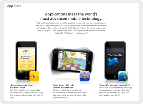
Today, at Apple’s World Wide Developer Conference in San Francisco, the computer maker unveiled its plans for the next generation of iPhones as well as a sneak peek into third party applications headed our way. Due to hit public airwaves July 11th, Apple’s new iPhone/iPod Touch “App Store” as it’s being called, will allow users to purchase third party mobile applications directly over the air. I speak for all of us at the Iconfactory when I say we were just as surprised and delighted as you probably were to find our very own application, Twitterrific, featured heavily on Apple’s website.

It seems after flying high and far, sometimes to shady destinations, the little blue bird has finally gone legit. I don’t think any of us at the factory realized just how popular Twitter, and in turn Twitterrific would become in this past year. We’ve been making various software applications for a decade now, and in all that time, none of us would have expected such an unassuming little app to become our most well recognized piece of code. Twitterrific’s success speaks volumes about the fine work of the folks over at Twitter, and the hunger for today’s users to stay in touch with friends, relatives and co-workers via new media like social networks.

We’re very pleased the Mac community took to Twitterrific so well and helped make it the success it is today. We’re looking forward to bringing the application to a whole new generation of users for the iPhone and iPod Touch, and would like to extend our thanks to Apple for giving the blue bird such a fine new home. We feel both excited and privileged to be a part of the new App Store and are committed to bringing our users the best software we can offer. We look forward to these first steps on what is sure to be, a fun journey for both users and developers alike.