Breaking Bad’s Swimming Pool Symbolism

SPOILER WARNING: This post contains major spoilers for AMC’s Breaking Bad. If you’ve not watched through the first half of season 5 and don’t want to know spoil some of the major plot points, then you should really stop reading now. You’ve been warned.

The cult TV hit, Breaking Bad, wraps tonight on AMC in what is sure to be one of the best series finales ever to hit TV. I only recently started watching the series on Netflix and have come to appreciate the complex web of plot, character development, drama and awesomeness that is Breaking Bad. Watching the entire 5 seasons in a little over a month gives one a fresh perspective on the show that long-time fans may have missed, especially the subtle use of signs and symbols that are a favorite of the show’s creator, Vince Gilligan.

One of the re-curring symbols that shows up in Breaking Bad is water, and more specifically swimming pools. Chemistry teacher turned master meth cook, Walter White, has one in his backyard and throughout the show’s run, action frequently takes place in and around these small aquatic jewels. Fans of the show know that the pools themselves often portend ominous happenings in the world of Breaking Bad. In fact, I don’t think I can recall a single scene where people were actually having a good time in a swimming pool in the entire 5-year run of the show. No, in Walter White’s world swimming pools and the water that fills them represents something else entirely and it’s the single plot point that propels the show.

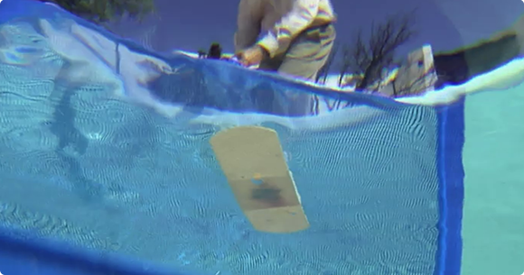
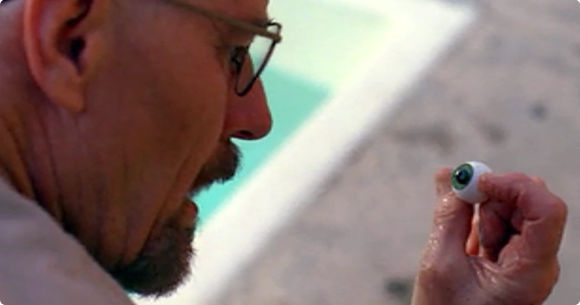
There are lots of different interpretations of what swimming pools mean in Breaking Bad, but the one that is the most obvious, indeed the one that hits us over the head by season 5’s “Fifty-One” is that they are a metaphor for Heisenberg’s blue meth. In the S3 episode ‘Caballo Sin Nombre‘ we see Walt fish a bandaid out of a swimming pool (see above). Walt’s always been a problem solver as well as a perfectionist and this small scene I think highlights Walt’s need to always improve his addictive product. He’s forever trying to keep contaminants out of the cook, something we’re reminded again just a few episodes later in “Fly“. It also symbolizes his desire to keep his family clear and “clean” of his seedy, second life.
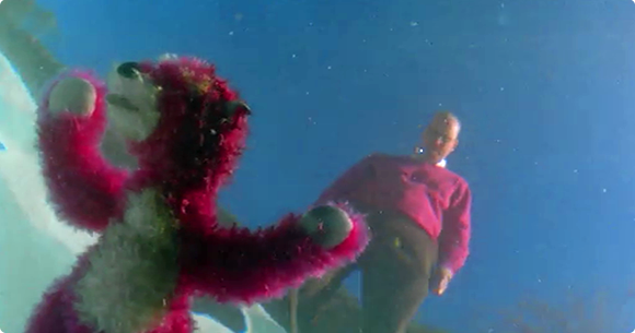
Then there is the air disaster that marks the brutal end of season 2 when Jane’s father and air traffic controller, stricken with grief over losing his daughter to a drug overdose, accidentally collides two passenger jets in the skies over Albuquerque. The image of the pink bear haunts us in the cold opens for most of season 2, a horrible reminder of the unforeseen consequences of Walt’s actions.
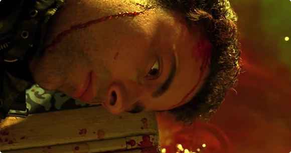
In season 4’s ‘Hermanos‘ we visit the lavish home of Mexican drug lord Don Eladio. The home once again features a swimming pool that soon features prominently as the final resting place of Gus Fring’s partner as he’s laid waste by the ruthless cartel. In an ironic twist of fate, this same swimming pool becomes the tomb of Eladio as Gus returns to Mexico in S4’s ‘Salud‘ to exact revenge on those that killed his friend. The drug cartel reaps what it sows as we see lives slip away in the cool, blue waters.

Gillian also slips subtle references about the symbolic blue meth into the show’s dialog in several episodes including S5’s ‘Dead Freight‘. When Walt, Jessie and Mike plan to heist hundreds of gallons of methylamine, the crucial chemical needed to cook meth, Lydia explains that the train they’ll be hitting holds enough of the compound to “fill a swimming pool.”
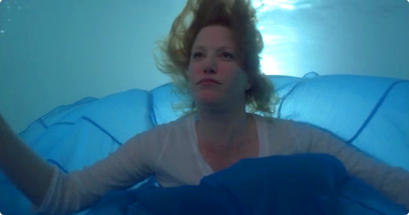
Lest there be any more doubt about what pools represent, we have S5’s incredible episode ‘Fifty-One‘. The entire White clan gathers to celebrate Walt’s fifty-first birthday poolside. As Walt talks to his in-laws at a nearby table, his wife Skyler stands staring into the bright blue water, filled with dispair. She fears for the safety of herself and her children because of the monster her husband has become. As Walt speaks, Skyler slowly steps, fully dressed into the family pool. She descends to the bottom, floating like an angel in the cool water, literally drowning in the blue poison Walt has forced upon her and her family. Her sister and brother in-law beg her to get out, to save herself but they’re voices are muffled by the water and Skyler’s contentment with her plans to get her children out of the house and to safety.

There are lots of other examples of the meth/pool symbolism in the series, but one of my favorites is the cold open for S5’s ‘Blood Money‘. In a flash forward, Walt, deposed from his drug lord throne, returns to his condemned home to find his house in ruins. He watches a band of kids use his now empty swimming pool for skateboarding. He stares helplessly as strangers run rampant on his former property, his crystal-blue empire has turned to dust and he his powerless to stop it.

I love symbolism in television and films. Clever use of symbolism adds depth and meaning to storytelling and Breaking Bad has been one hell of an awesome story. I still have a few episodes to go before tonight’s finale (hopefully I’ll catch up in time!) but I hope this small insight into the shimmering blue waters of Walter White’s world has increased your appreciation for what Vince Gilligan and his Breaking Bad team of writers has given us these past five seasons. I for one am glad I decided to dip my foot in Breaking Bad’s pool.
7 Comments

iObservations

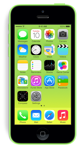
This week I finally upgraded to a brand new iPhone 5c after almost 2 full years of use on my trusty iPhone 4s. I’ve now spent a couple days with the new device running iOS 7 and wanted to share some random observations (both good and bad) for what they’re worth. As with anything, your milage may vary.

The Good

AT&T LTE – I mean just look at it!

Siri’s new voice – It’s so much better than before. Feels very Star Trek.

New ring and alert tones – There’s been some fun made of these but overall I really like them. The majority have a light, fun feel that seems to fit perfectly with the new iOS 7. My ringtone is currently set to Sencha and my alert tone is Chord. Groovy!

OS 7’s folders – Worlds better than the one in use in iOS 5 & 6 the new folders are clean, easy to manage & hold more apps.

Background refreshing – We implemented it in Twitterrific and I can already tell it will be one of my favorite features of the new OS. Having content ready for you when you wake the device is killer. Jury’s still out on how it will affect battery life however.

The feel – The feel of the 5c in the hand is just as I imagined it would be. It has the smooth, comfy feel of the 3gs without the extra bezels. It feels rock solid in your hand, not like you’d expect from a plastic phone.

Use of color – Much has been made of the, let’s just say “bold” use of color in iOS 7, some good, but mostly bad. Personally I love it. I love the way your wallpaper setting for instance changes how interfaces like the dialer screen looks. Make an overall change here and the whole user experience feels fresh. Bravo Apple.

Command Center – Being able to turn off blue tooth at will as well as quick access to a flashlight (don’t laugh, it’s useful!) is just great. I can’t wait until I have a use for sharing a file via AirDrop.

Multi-image emails – The ease of use selecting multiple images from your camera roll to attach to a single email is simply fabulous.

The Not-So-Good

Missing share buttons – Apple removed the ability to tweet and post to Facebook right from Notification Center for some reason. I’m not sure why, but this was a great way to quickly get a tweet out without any fuss. You can still do it via Siri, but it’s too prone to errors. Hopefully these controls will be coming back.

Multiple chargers – I like the new smaller, 10 pin charger but my iPad 3 still uses the old 30-pin version. This means I have to keep two different kinds of cords around my home to charge my devices. This stinks. Speaking of charging…

RIP iHome Clock – It will no longer work with my new iPhone 5c’s 10-pin charger port. This makes me very very sad.

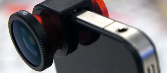
RIP Olloclip – Designed for my iPhone 4, my Olloclip is now a useless hunk of metal and glass sitting on my desk. Again, sad.

The feel – Yes, I love the feel of the new 5c, but even though it feels super awesome, it’s also super slippery in the hand. As my wife said, it feels like it’s “coated in butter”. I immediately went out and bought an ugly Apple case for it simply because I just knew I’d eventually drop it. I hate to cover the wonderful plastic up but i’m scared it will slip right out of my hand. I sat it on the arm of my couch and watched it sloooowly slide right off into my lap. It’s crazy smooth.

Ugly icons – I realize I’m being a kind of icon snob here, but I just can’t warm up to the horrible Settings and Safari icons. The fact that they are two of the most important destinations on my iPhone means I have to look at them all the time and I just cringe when I do. Really hope the designers at Apple re-visit these at some point.

Overall I’m extremely happy with with my iPhone upgrade. There’s no doubt that it was time to replace my 4s. The only real choice was if I wanted to move to a 5s or a 5c. I’m extremely happy with how the new phone feels in my hands. The plastic case is top notch and doesn’t have the kinds of beveled edges that made my 4s hard to pick up and hold. Will I miss the finger print scanner, better camera and 64-bit processor of the 5s? Probably, but I’m betting a year from now we’ll see a new model that will have all of these things plus a larger screen and maybe the awesome case of the 5c. If you currently own an iPhone 5, then the 5c may not be the way to go, but if you’re like me coming from the previous model, you just might consider taking the colorful path to plastic town.

4 Comments

Why I’m Buying an iPhone 5c

I’ve owned an iPhone 4s for almost 2 years now and had been patiently awaiting the successor to the iPhone 5 until this week. When the 5 was first introduced, I was off-cycle for a discounted upgrade from AT&T and when I finally was eligible I thought I might as well just wait and see. I was hoping the increasing popularity of larger-screened smartphones would encourage Apple to release at least an iPhone with a 4.6″ screen in their next rev, but as I tweeted this past week, it seems Tim Cook’s pigs have yet to fly.

Now I have a choice to make. I can go with the fancy new iPhone 5s, complete with 64-bit hardware, a greatly improved camera and a cool fingerprint scanner, or I can “settle” for a 5 wrapped in a lickable, candy-coated plastic shell, the iPhone 5c. The gadget freak in me says to go with the snazzy 5s. After all, its increased speed would hold up better over the next 1.5-2 years and the pictures I took would no doubt be greatly improved from those I snap now. The 5s is more expensive, but that wasn’t the deciding factor, at least not for me.

I’ve chosen to go with the iPhone 5c for a couple reasons, but mainly because of comfort. For my money, the most comfortable smartphone to hold and use was the iPhone 3GS. Its slightly rounded back, smooth plastic construction and tight edges made it a joy to hold and use. When the iPhone 4 was introduced, I really didn’t like the device’s form factor. The metal band creates sharp edges that fatigue the fingers and collect dirt. In addition, to me the device is *too* thin to hold safely without a case. The new iPhone 5c’s smooth curves, and seamless sides call out to the scifi geek in me and the colors, oh the colors! It’s much more streamlined, minimal in appearance and seems easier to pick up off the table. I must admit however, if I could have the 5s’ guts inside the smooth, plastic shell of the 5c, I’d opt for that in a plastic heartbeat.

I know that no matter which model I pick, either will be a great upgrade from my 4s. Although it’s served me well these last two years, I’m more than ready for the increased screen size, faster processor power and increased battery life of a new iPhone. With any luck, around this time next year Apple will be introducing a 4.6″ iPhone that will sport an all new form-factor as well as all the neat-o gadgets that are sure to make the iPhone 5s a huge success. In the meantime, unlike Kermit, it’s easy being green.

PS – iOS 7 is awesome, you’re gonna love it!

1 Comment

Top Ten Things You Want This List To Be

I’ve decided to pull an IO9 and have my readers blog for me. What does that mean? It means some popular blogs like the sci-fi blog, IO9 have a lazy habit of writing non-posts. That is to say they pose a question and have their readers flush out the content in the comments section. This week’s example asks “What’s the most pointless rivalry in all of fandom?”. So my question to you, gentle readers is what list of top ten things would you like to see this blog post be about? Be sure to leave your ideas in the comments along with links, so I don’t have to bother thinking of these things myself. KTHXBAI!

UPDATE: Two in one week! Way to go, Charlie!

UPDATE II: This week Charlie Anders at IO9 asks her readers to write her blog post about the most epic friendship in science fiction. Keep it up, Charlie!

1 Comment

Doctor Meh

The Eleven Doctors

Today Doctor Who fans around the world learned that 55-year-old Peter Capaldi has been cast as the 12th incarnation of everyone’s favorite Time Lord. While the choice of Capaldi will no doubt prove to be serviceable, I can’t help thinking that Steven Moffat, Doctor Who’s lead writer and executive producer, blew a huge opportunity to take the show in fresh directions and gain scores of new viewers in the process.

One of the greatest character strengths the Doctor possesses is the ability to regenerate. When the Doctor dies, he is reborn and played by a new actor, sometimes for an entire generation of fans. Yet, in the entire illustrious 50-year history of the BBC show, the part has yet to be played by anyone other than a white male. The actors who play the Doctor have varied in age and style and each brought their own wonderful interpretation of the Doctor to the small screen, but the general dynamic is always the same. The Doctor is always male, and although his companions sometime vary, the are typically young, pretty females.

Imagine the storytelling possibilities that would present themselves if the Doctor regenerated as a woman. Thanks to the spirited portrayal of River Song by actress Alex Kingston, we have a hint at just what such casting could be like. Much like the Doctor, River was a strong-willed, cocky scientist who was always in the thick of trouble. But River is not the Doctor and a true portrayal of that ancient Time Lord by a woman would instantly add interest, drama and a breath of fresh air to the series. Moffat could have broken with tradition and cast a woman as the Doctor or gone even further and cast a new, male companion for her as well. Suddenly all the old stories would be turned on their head, new character interactions could be explored and we might even have a reversal of sexual tension in the TARDIS.

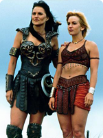
Even if Moffat chose not to explore those themes or kept a female companion for the Doctor, how much more interesting would a female / female dynamic be when chasing down Daleks and saving the universe (yet again)? I always loved the interplay between female leads on shows like Xena: Warrior Princess and Buffy the Vampire Slayer and I think it could work wonderfully on Doctor Who. It would also give girls the world over a new female role model that they could look up to and be inspired by.

The forward-looking nature of science fiction shows like Doctor Who, demand characters and stories that make us stop and think. Star Trek portrayed its first black Captain twenty years ago in 1993 when Avery Brooks played DS9’s Captain Sisko and just two years later Voyager cast Kate Mulgrew as Captain Kathryn Janeway. Sooner or later the character of the Doctor will be played by a woman. When that day comes I’ll stand up and cheer loudly for a show I’ve loved since childhood. With the news of Capaldi’s casting I’m buckling down for more of the same kinds of stories we’ve seen for the last 50 years, and that’s a shame. Today I wish I was shouting “Geronimo!” instead of merely muttering “Meh.”

COSMOS Is Coming

I’ve been a fan of the late Carl Sagan’s groundbreaking PBS TV series, Cosmos: A Personal Voyage, ever since it first aired in 1980. When the news came last year that FOX was teaming up with National Geographic, executive producers Seth MacFarlane, Ann Druyan, Sagan’s widow and Neil deGrasse Tyson to remake the series in 2014, I was over the moon. Now we have an official trailer that debuted at San Diego Comic-Con and it’s positively astounding. From the trailer we can see Neil will re-introduce viewers to the Spaceship of the Imagination, the cosmic calendar and other scientific concepts that made the original both fun and educational. Because the series will air in prime time, FOX is giving Cosmos: A Space-Time Odyssey an amped up, epic treatment that’s sure to lure new viewers both young and old. As far as I’m concerned, 2014 can’t get here fast enough!

25 Comments

Watershed Moment

Ever since Apple announced iOS 7 at WWDC, developers have been coming to grips with what the new operating system will mean for them. There’s little doubt iOS 7 represents a huge opportunity for developers to get their updated products in front of massive numbers of new users almost overnight. But there’s another opportunity here for developers, one that’s been largely ignored up until now – paid upgrades. To be more precise, all new, iOS 7 paid versions of existing applications.

I’m sure many users are expecting developers of popular applications to simply update interface elements, compile some code and easily drop a brand spanking new version of their app onto the App Store for free. There’s little doubt that the majority of iOS 7 updates to existing apps will be free (which will please Apple), but I suspect there will be a surprising number of developers who will use the launch of the new operating system to completely re-boot their app, and why not? The visual and interactive paradigms iOS 7 mark a natural breaking off point and a perfect opportunity to re-coup costs. Some existing paid apps might even adopt an iOS 7 only strategy which means they’ll have no choice but to charge again.

As any developer knows, software doesn’t magically grow on trees. Significant reworks of existing apps can represent hundreds of hours of development time and depending on the complexity of the apps in question, require much more than simply updating graphics. Taking full advantage of new APIs, designing new interactions and more can represent a healthy investment, time is money after all. At what point in the update process does a developer decide she needs to charge for it? How many users will be alienated by charging again? Will these users be offset by the *huge* influx of new people Apple brings to the table with the launch of the new OS?

Perhaps a better way to answer the question might be, how willing would you be to re-purchase your favorite apps if they are optimized for iOS 7? Look at your device’s home screen and go down the list of apps you use most and ask yourself if you could live without it once you upgrade. I think that most users (at least those that matter to developers) would answer that they would gladly pay again if it means having the latest and greatest version of their favorite apps, at least I would hope so.

With the full-priced launch of Logic Pro X, it’s now pretty clear Apple won’t be implementing a paid upgrade mechanism in the App Store. Developers are forced into either giving free upgrades for life, nickel-and-diming users with in-app purchases or occasionally launching new, paid versions of their apps. At the Iconfactory, we typically offer new paid version of our apps (xScope, Twitterrific) about every 18 months with many free upgrades in between. Though there are always users who will complain about having to pay for all-new versions, the vast majority know that in order for an app to survive and flourish, they occasionally have to do their part and support its development. Hopefully the upcoming wave of apps updated for iOS 7, both free and paid, will help people fall in love with their apps all over again.

UPDATE: Just when you thought there was hope, a new report out indicates that the average price of apps in the App Store is now at an all-time low of just $0.19. Consumers continue to expect world-class software experiences in exchange for basically nothing. The author says that the freemium model may be a “wiser business move” in the long run but I disagree. It is much harder to recoup the cost of development if you have to postpone revenue much beyond launch of your product, especially if you cannot even guarantee success. If the trend continues, I don’t see how developers can make a living on the App Store.

The Talking (Badly) Dead

SPOILER WARNING: If you’ve not seen all three seasons of The Walking Dead, this video may contain some minor spoilers for you. Watch at your own risk.

I’ve enjoyed the Bad Lip Reading parody videos for some time, but this new one based on AMC’s The Walking Dead is by far the best yet. It’s amazingly well done, especially the voice acting which makes it even funnier. If you love The Walking Dead, you’re in for a treat. The Governor’s finale alone is worth the price of admission.

Massive LEGO Eva Unit-01 FTW

LEGO Master Builder Moko has been painstakingly working on a near 4ft tall LEGO replica of Evangelion’s Eva Unit-1 for the last 3 years. The artist finally unveiled the creation this week and the results are simply stunning. Fully articulated and containing no painted or modified bricks, the model weighs in at over 20lbs and perfectly captures the look of the Evas. Moko’s Flickr stream is full of awesome behind-the-scenes construction photos that detail just how much work actually went into this incredible creation. The scale shot of the artist standing next to Unit-01 is amazing. Check them out.

The User Interfaces of Oblivion

As an UI designer, I love seeing what artists come up with for fictional user interfaces. I’ve admired the work talented folks like Jayse Hansen has done for films like Iron Man and the Avengers for some time and secretly longed to do this kind of work. The latest work from Joseph Kosinski and Crater Lake Productions for the film Oblivion is pure magic. The level of detail, both animated and static, is staggering. I hadn’t intended to see Oblivion in the theater, but after seeing this wonderful work I just might. If you want to learn more, head over to GMUNK and check out their process.

My God, It’s Full of Stitches!


What do you get when you combine subjects like science and crafting? If you’re tumblr user pardalote, then you turn your considerable embroidery talents towards the heavens and the results speak for themselves. The level of detail contained in this amazing chain stitched version of the planet Jupiter was recently featured in MAKE craft zine and it’s easy to see why. The creator used images from NASA as a reference to capture the subtle colors and swirls of the gas giant in way that reminds me of van Gogh’s Starry Night. Even though the work is not for sale it’s safe to say any space geek would be proud to display this in their home. Check it out. Wonderful!

2 Comments

Owning Your App Store Review

There are basically two kinds of people who leave software reviews in the App Store. The first are users who genuinely want to add their voice to the chorus of users who have downloaded the software. They want to let other potential users know what they’ve learned in the hopes of helping them make an informed buying decision. They may encounter problems with the app, but overall they try to be open minded, fair and leave generally helpful reviews. If an app is good they generally say so. If a piece of software is poorly designed or implemented and deserves a low rating these users will go out of their way to describe why, which is great.

The second type of people who leave reviews do so for a simple reason – spite. They feel slighted by their purchase and want to do their very best to try and punish the developer in their small way by assigning a single star. They often accompany such reviews with unhelpful prose like “This app sucks, fix it!” or “Worst app I ever bought!” and so on and so on. These kinds of reviews are less than helpful to the developer of course, especially since Apple doesn’t currently provide a way for an app’s developer to easily get in contact with a review’s author.

As a developer, I’d love to be able to get in touch with both of these kinds of users to find out what I could be doing better with my software. Sometimes it’s possible to google someone’s App Store user name and track down a contact link, but more often it’s not. That’s why I recently decided I was going to start leaving my Twitter username in all my reviews I wrote on the App Store. Leaving a tangible point of contact for a developer gives them a way to reach out to you if you have specific issues with an app. Contacting them directly with your concerns is always best of course, but if you do leave a review, consider leaving your Twitter / contact info in the body of the review.

If you’re the type of user that wants to help improve an app, who wants to support the development of quality software through meaningful dialog, then owning your review would seem to be a no-brainer. And to all the one-star trolls who call the App Store home, I leave this sage piece of advice from my mom – If you can’t say something helpful, shut your damn pie hole!*

* I’m paraphrasing here

3 Comments

Jesus, Grandpa!

I recently purchased Game of Thrones season 2 and have been trying to catch up on the series before season 3 airs on HBO. I’m reminded just how great the show’s been, but also just how frustrating some of the plot lines have been. I’m half way through season 2 as I write this and I can’t help but feel a little like the Grandson from The Princess Bride as I watch. In this scenario, I imagine George R.R. Martin as Grandpa.

“Stop Grandpa, you’re reading it wrong.”

“What? What do you mean?”

“Who kills Prince Joffrey in the end? Is it Robb? Is it Sansa, who?”

“No one kills him. He lives.”

“Jesus, Grandpa, what did you read me this for!?”

I truly don’t know how Game of Thrones will turn out (no spoilers please) but I swear if Joffrey doesn’t end up with his head on a pike, I may have to hire a brute squad.

Dumb Ways to Die

I love it when artists manage to mix the adorable and the horrible with style. This disturbingly cute PSA announcement hits the nail square on the animated head and the results tickled me pink. The song in the video, by Tangerine Kitty, is even available on iTunes! Enjoy.

Our American President

This past Tuesday, Barack Obama handily won re-election to hold his title as President of the United States. I must admit that going into the election on Tuesday I was confident but still nervous. Nate Silver’s pragmatic election forecasting had kept me calm and reasonable during the entire campaign but when CNN started showing red states populating the electoral college map, I must admit my stomach did summersaults.

We now know that Nate was right all along for as the night drew onward, the polls of the last few months bore out his math and Obama won state after battleground state. In fact the only one he lost was my own of North Carolina. While NC did go red this time around, the decision here was extremely close which honestly surprised me. In the end NC’s electoral votes didn’t matter as Barack won Ohio, Virginia, Wisconsin, and yes, even Florida. I must admit I did enjoy tuning in FOX News throughout the night just to see the next four years slipping away from Sean Hannity, Bill O’Reilly and Karl Rove. As Rachel Maddow pointed out this week, and as many pundits have rightfully written, Tuesday’s election results hit Team Romney, and many on the right as a complete and utter shock. For months they had deluded themselves into thinking the exit polls were wrong and that victory was the only possible result. Heck, Romney didn’t even have a concession speech ready to go. Who does that anyway? What kind of man running for the President doesn’t prepare for every eventuality? Evidently Mitt Romney, that’s who.

I face the next four years with hope and a huge sense of relief. We will not have new conservative supreme court justices. Roe v. Wade will not be overturned. The Affordable Care Act is here to stay (thank GOD), and world leaders will continue to respect our President. Obama hasn’t been a perfect President by any stretch of the imagination. There have been many issues he’s been unwilling or unable to tackle such as immigration reform and climate change. He’s also done things I’m not proud of such as the continued detaining of prisoners without due process. But in the end his pluses far outweigh his minuses. Despite the faux outrage from the right-wing elements in our country this past week, the United States is indeed on the road to recovery. We’ve not turned into a socialist state overnight and we won’t be one tomorrow. And no, Barack Obama didn’t kill the country this past Tuesday, Nov. 6th., he actually saved it. Saved it from regressing 50 years in policy and mindset. Saved it from extremist, conservative ideology that threatened to destroy a woman’s right to choose and American’s access to affordable health insurance. And in a small way, he saved this country from the rampant racism and hate that has reared its ugly head during his first term. A vote for Obama re-affirmed that he was no fluke, he was here to stay despite the efforts of the dwindling, white majority who has tried to paint him as “different from us” and “un-American”.

I’m very proud of my President and my country for making the right choice this past Tuesday. I wish I knew what the next four years will bring, but I feel confident that Barack will meet the challenges head-on and do what’s in our collective best interests. I sincerely hope he listens to the will of those who elected him and grows a spine when dealing with Republican obstructionism, thankfully there are signs of this already. Above all, I’m grateful that we’re moving forward as a country instead of backwards, making laws instead of repealing them. I wish our President good luck and God speed because unfortunately as history has demonstrated, he’s going to need it.

Stop, Obama Time!

Of all the political videos this election season, this skillful take off of MC Hammer’s U Can’t Touch This has to be my favorite. It’s awesome on so many levels it’s difficult to describe but I love seeing Michelle grooving and Barack crooning. It also highlights the media’s obsession with playing the “gotcha!” game with our politicians, especially the President. The fading commentary at the end is particularly cringe worthy. “There’s no taking Obama out of context!” and my personal favorite – “Obama should have known better. You don’t put the subject apart from the predicate!” Yes, he should have known better. Enjoy.

1 Comment

The Art of Doing ‘Nothing’


“When you do things right, people won’t be sure you’ve done anything at all.” This line from Futurama perfectly sums up how I often feel about my job. Designing, if done right, takes the challenge of communicating a complex idea effectively, and turns it into something that can be easily understood by the masses. When designers do their job right, the overall design fades into the background and you just “get” what you’re looking at. It speaks to you on a fundamental level, things just click and you usually see big smiles on the faces of those who interact with your work.

Through the years, I’ve learned the job of the programmer is much the same. Although my programming abilities are limited to rough forms of HTML and BASIC (yes, BASIC), through my position at the Iconfactory, I’ve learned much about what goes into making a successful software application. I see the challenges that our programmers tackle every single day and I for one am always impressed. This is particularly true of our latest effort, the retina compatible version of xScope for Mac OS X.

When Apple’s stunning new display was announced, I was excited about the increased level of detail and clarity the technology would bring to the desktop. The images are gorgeous, text is as crisp as the printed words and colors are deep and rich. Designing for this display means tools that can work correctly with it, giving you accurate and flawless information from which you can build your designs. From the get-go we knew that xScope, our utility for measuring and inspecting the screen, had to be updated for this new display. What we didn’t realize when we began was just how complicated that update would be.

I’m going to be completely honest here and say that even today, after several months, I still can’t get my head fully around the concept of pixels vs window points. Oh, I know what they are and why they exist, but from the time I first learned how to use a mouse, I’ve always dealt with pixels as the unit of measure on the screen. My entire professional career has revolved around the humble pixel and as such it’s been difficult coming to grips with the fact that the days of seeing exactly what you get on screen are pretty much over.

But all of this pales in comparison to the work that my friend, our lead engineer Craig Hockenberry, had to do in order to get xScope working properly with the new retina display. Whenever Craig starts waxing programatic about his coding, my eyes usually glaze over. That said, there were times during the xScope retina conversion when I thought I was going to go catatonic. If you’re the type of person who loves coding, or maybe needs something to read to send them off to sleep at night, head on over to Furbo.org and read Craig’s technical post on the problems with coding for retina. Suffice to say it’s beyond me. Also beyond me – all the math, logic and problem solving needed to surmount this incredible challenge. I have tons of respect for anyone who finds mathematics fun and exciting, and even more for friends like Craig who wield it like a weapon in the service of their job.

When designers and developers use xScope on a shiny new retina Macbook, all they’ll know, indeed all they’ll care about is that the app works as advertised. xScope will give them the data they need to make their apps and designs the best they can be and that is all that matters. Because of the efforts of Craig and Corey Marion, xScope’s lead UI designer, the app just “works” and it works well. Users won’t know all the algebra and bug finding that went into creating it, but I thought it was appropriate to take just a moment and recognize the hard work that went into making it a reality. I sincerely hope you find the new version of xScope as powerful and useful as all of us have. But the best part is if we’ve done our jobs right, you won’t be sure we’ve done anything at all.

Bring It


Prior to the 2008 election, I was understandably nervous about the possible outcome. The potential of President John McCain and Vice President Sarah Palin shook me to my core and I followed the political scene very closely. I blogged about politics quite a bit, every chance I got actually and set out to do my part to try and help get Barack Obama elected. The thought of another four years of republican policies and control combined with Palin being just one step away from the Oval Office often kept me up at night. I was anxious, nervous and worried.

Looking back now, I probably shouldn’t have been so stressed. In hindsight, the country longed for a new direction, a vision to lead us away from the war in Iraq, away from torture as an official U.S. policy, and away from the leadership disasters of Katrina and a tailspinning economy. Obama stepped in at the right moment, won the nomination and then the Presidency and made history in the process. I remember wondering the night before the first presidential debate if Barack really had what it took to lead the nation. He was young and full of hope an enthusiasm, but would it be enough? Would the elder, more experienced statesman win the debate and the presidency? No, he would not.

Now, four years later my thoughts return to that election and how I felt leading up to it. Hate for this President has run deep, deeper than even I have thought possible. Almost since the day he took office, republicans have been blocking, obstructing and denigrating him and his position in the hopes of getting the upper hand this November 4th. Questions about his birth certificate still circulate in right-wing circles. Cries of socialism and a “government takeover” of healthcare have rallied the conservative base. Billionaires, backed by the Supreme Court’s mis-guided Citizen’s United decision have poured gobs of money into Karl Rove’s coffers and flooded the airwaves with negative ads all designed to convince the country that Obama hasn’t done enough to turn the economy and the country around fast enough. These last few months I’ve started to wonder, could Romney actually win this thing? I mean, Mr. Bland, Mr. RomneyCare, Mr. Also-ran Mitt Romney?

No, I don’t think so. In fact, the closer we get to election day, the more I think Barack will prove his worth with voters and handily win re-election. He now has a laundry list of accomplishments that he will be able to wield like Batman wields his utility belt. Want to talk about terrorism? He’s ended the war in Afghanistan, killed dozens of Al Qaida operatives and oh, Osama Bin Laden has shuffled off that mortal coil. Obama’s fought for the rights of gays and lesbians repealing Don’t Ask, Don’t Tell, and signed laws designed to help give women equal pay for equal work. Obama’s administration saved the auto industry. Mitt didn’t even want to touch the problem with a ten-foot pole, preferring instead to let the industry go belly up, and thousands upon thousands of Michigan jobs with it.

And then there’s health care. The right sees it as their war cry. “We’ll repeal Obamacare! Socialism! Socialism!” but more and more Americans’ agree that the fundamental principals that the Affordable Care Act provides (insurance for pre-existing conditions, more of your dollars paying for care instead of overhead, etc) are good ones. Just this week Romney, in a bid for independent voters said that there are parts of Obamacare he wants to keep. This flies directly in the face of his fellow hard-line conservatives who have said they want the entire act repealed. Nothing less will do. That’s the problem with extremism, it doesn’t win elections. I’ve said it before and I’ll say it again, politics is rarely a black and white endeavor. It takes compromise and a willingness to walk in the other guy’s shoes in order to get things done. This simple principal has been Washington’s way since its inception, but it’s also seemingly been abandoned by the right in their bid to regain control of the White House. Indeed, no other congress has stymied the lawmaking process as much as this one has. In order to get anything done, the President has had to take some unusual measures which, predictably, has only increased right-wing cries that he’s “power hungry” and refuses to work with republicans.

I have no delusions that Barack Obama has fulfilled all his promises as President. Obama’s White House isn’t nearly as transparent as he had promised it would be. We still hold prisoners without hope of ever getting a fair trial before their peers. He was naive to pretend he could make bipartisanship a household word. Perhaps most distressingly he’s been unable to communicate effectively to the American people just why he’s done some of the things he’s done. Then I look at the other side of the coin, all that he’s accomplished despite the massive pile of dung he was handed by his predecessor, and I look forward with hope. The country is indeed in a better place today than it was when he took office. I absolutely cannot WAIT for the political debates which being October 2nd. I believe Barack will wipe the proverbial floor with Mitt and seal the deal in the process. I also think deep down inside, conservatives won’t mind because like McCain, most of them don’t like Romney anyway. I’m starting to get excited about this election, and while there is still a huge level of uncertainty, (much can happen in two months) I look across the aisle to my conservative counterparts and think – “Bring it.”

UPDATE: As if almost on cue, conservatives have started to publicly decry Romney’s anemic campaign. Like I said in the post, things are still early but it’s obvious that Romney is an also-ran for the GOP. He was really the only viable choice to contend with Obama, but he’s failed to bring the “right-wing goods” as it were and therefore the knives are showing. I have a feeling things are about to get very ugly for the republican party as they face some unpleasant truths.

Rooting for Shamy

My favorite television comedy, The Big Bang Theory, returns to TV on Thursday, Sept 27th on CBS. To get ready, I’ve been going back and re-watching many of the season 4 and 5 episodes that I love the most. The Alien Parasite Hypothesis (the one where Amy gets the hots for Penny’s friend Zach) and The Shiny Trinket Maneuver in which Sheldon buys Amy a tiara as a transparent attempt to sooth her relationship anger (the ep earned her an Emmy nomination) are two stand-outs. As the series has progressed, my favorite part of the show has morphed from watching the male leads interact to the relationship that has developed between the three female leads – Penny, Amy and Bernadette. The way Penny and Bernadette adopted the socially awkward Amy into their group is adorable, as is the crush Amy has on Kaley Cuoco’s character, Penny.
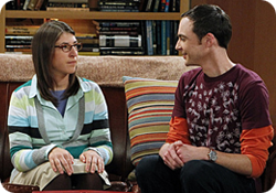
Of all the relationships Big Bang has featured, I think the Sheldon / Amy duo has to be the best. They are two wallflowers who are brilliant in their respective fields but who are children when it comes to their emotions. This has changed over the course of the show as the writers took definite steps to move Sheldon & Amy’s (Shamy for short) relationship forward. Over time, Sheldon has elevated Amy from a “Girl who happens to be his friend” to his actual girlfriend. In the season 5 finale, Sheldon incredibly took Amy’s hand as they watched their friend Howard boldy travel into space. If you are a fan of Big Bang, this moment probably gave you goose bumps as it did me.

I love The Big Bang Theory because I can often relate to the geeky jokes and situations the writers create for the characters. The show is ripe with Star Trek, comics and video game references, but it is the characters and their relationships that give the show the deep, emotional satisfaction I love so much. Like many fans, I’ve been rooting for Sheldon Cooper and Amy Farrah Folwer to get together, and I believe that one day they will.

In a wonderful season 4 interview between Jim Parsons and Mayim Bialik, they reveal their working relationship, how they prepare to film a script and that they too are rooting for their characters to make it. Often times we as fans forget that an actor ultimately doesn’t have the final say in what happens to the characters they portray, the writers and producers do. If any of the show’s writers are reading this, all I can say is keep up the great work. We love how Amy & Sheldon have grown closer towards each other and we want more. Just not too fast, getting there is more than half the fun! Tune in to the season 6 premiere of The Big Bang Theory on CBS on Thursday, Sept 27th. Go Team #Shamy!

2 Comments

Olloclip: Up Close & Personal


The Olloclip is a handy 3-in-one lens attachment for the iPhone 4 and 4S that lets you take wide angle, fisheye or macro shots rather easily. The clip itself is small enough to fit in the palm of your hand or your pocket and is easily attached simply by sliding it directly over the lens of iPhone’s built-in camera. The Olloclip contains a funky fisheye lens on one side and a wide angle lens on the other. This wide angle lens can be unscrewed to reveal the macro lens which allows you to take super close-ups (12-15mm) which are great for getting shots of insects, fauna or surface textures.

I’ve been using my Olloclip for the past few months and I have to say I’ve really enjoyed it. I’ve always been interested in macro photography but didn’t want to spend hundreds of dollars on expensive SLR’s and associated lenses. While the images the Olloclip produces may not be National Geographic quality, I’ve found them to be quite good, and certainly good enough to satisfy my hobby. I initially bought the clip to photograph a few Swallowtail caterpillars who had made their home on some parsley I had planted. The shots came out so good, I was soon hooked and have found myself constantly looking for fun macro subject matter. Head over to my Flickr set of Olloclip macro shots to see some examples I’ve posted.

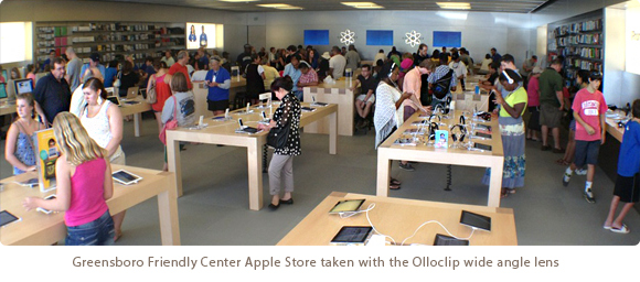
While the macro lens is by far my favorite feature of the Olloclip, the wide angle has also come in handy. I love being able to get a more complete image when snapping a picture of a room or a group of people with the Olloclip, although I have found that the resulting images seem dimmed at the very fringe of the optics. I’ve read that real estate agents LOVE the Olloclip’s wide angle feature and I can understand why. The fisheye lens is fun for unique occasions, but too funky for every day use. Every picture taken with the fisheye looks like you’re looking out a peephole, great as a novelty but the resulting images are too strange for every day use.

About the only downside I can see to the product is that it can only be used when your iPhone is naked. If you keep your iPhone in a case (even an extremely thin one) then you must remove it from the case in order to slip on the Olloclip. I completely understand why this is necessary, it just increases the time and effort it takes to get the shot you want, especially if you’re shooting a finicky subject like bugs. By the time you get your case off, the Olloclip on and the wide angle lens unscrewed, your butterfly may be long gone. I also wish it was “universal” in design and worked on both the iPhone and the iPad, although admittedly I don’t see how a single design could accommodate both devices.

The Olloclip started life as a Kickstarter campaign that raised the necessary funding and began production in June of 2011. It can be purchased in Apple retail stores or online for around $65 and is well worth the price. Considering similar SLR lenses will set you back hundreds of dollars, the Olloclip is a great way for amateurs to have their photographic cake and eat it too. Macworld gave the Olloclip four out of five mice, and the rating was well deserved. It’s a joy to use and has increased my love of digital photography by an order of magnitude. I highly recommend it.