 iTunes Home Sharing is a wonderful feature that’s designed to let you share media libraries between multiple Macs, iOS devices and Apple TV. If you have Home Sharing turned on and a solid Wi-Fi connection, you don’t need to fill your iPad with movies and TV shows you’ve downloaded to watch them. Simply connect to your Mac’s media library via the Videos app, select the shared library and iTunes will present you with a list of all of your movies and TV shows. I own lots of TV show episodes, some I’ve ripped from my DVDs and some purchased directly from iTunes. Home Sharing should allow me to get quick access to all of them any time I want. At least that’s the theory.
The Problem
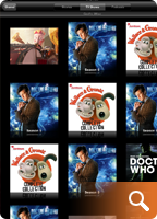
When browsing music and movies via iTunes Home Sharing, media is displayed as one would expect. Movies are listed alphabetically by title and music arranged into playlists that can be navigated and played easily either via Apple TV or an iDevice. Unfortunately, TV shows are a whole different story. TV shows don’t always display in the proper order when browsed on Apple TV or iDevices via Home Sharing. Furthermore, certain TV show seasons will display multiple times or even worse, simply not appear at all. When this happens, it’s impossible to select the series and episode you want to watch making Home Sharing effectively useless. So what’s going on?
The Cause
 I recently spent several long nights experimenting with my iTunes media library learning what was causing some TV shows to appear multiple times, others appear out of order and some just not at all. I read several support threads at Apple that explained how a TV show’s meta data can confuse iTunes’ Home Sharing feature if not set correctly. What is metadata? It’s the information that is assigned to a file in iTunes such as the show’s title, season number, episode ID and so on. Selecting a song, movie or TV show in iTunes and then getting information on it (cmd-I) will reveal the file’s metadata and allow you to edit it.
The root of the trouble seems to be that unlike movies which are stand alone entities, and songs, which can be part of an album, TV shows are not only broken down by series title (the TV version of an “Album”), but also by season. This two-tierd level of sorting can be extremely confusing for the user since it’s not always obvious how iTunes decides what comes first, second, third and so on. In addition, there appears to be a quirk in iTunes where if values of a television show’s metadata (like episode ID) conflict with other episodes of that same TV show, the series simply won’t display in Home Sharing. Finally, to make matters worse, often times the metadata of a TV show isn’t set consistently by the publisher from season to season or even from episode to episode. Mis-numbered or conflicting episode ID’s, especially within the same TV series across multiple seasons, throws iTunes into a tailspin and leads to problems.
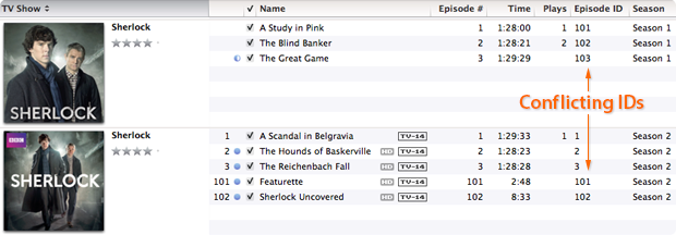
In the above example you can see that I have downloaded two seasons of the BBC series Sherlock. Both season 1 and season 2 have the correct season metadata set, but the individual episodes have duplicate episode ID’s. Season two’s episode ID’s are labeled “1, 2, 3, 101 and 102” when they should be labeled “201, 202, 203, 204 and 205”. Because the season 2 episodes use ID numbers that conflict with those in season 1, Home Sharing freaks out and in this instance displays the series out of order. Making matters worse, some publishers include the season number in the name of a show’s title, like “The Walking Dead; Season 2” which causes problems when an iPhone or iPad polls for how to display the program.
Lastly, the strangest thing I learned in my investigations was that it appears improperly labeled metadata for one show can affect the display properties of a completely different television show as well. So until you correct the metadata of every single TV episode in your iTunes library, random problems may persist when trying to display them. It really makes no sense, but in my testing this was the case.
The Fix
The solution to the problem lies in making the show’s title, season numbers and episode ID’s logical and consistent throughout your entire iTunes library. If you have a fairly large collection of television show episodes it will take you some time to edit them and correct the display problems, but it is indeed fixable.
Follow these steps:
• Select tv episodes (one at a time or in batches) & press command-I
• Select the “Info” tab
• Set the show’s “Name” field to the title of the episode itself
• Set the “Album” field to the name of the series
Note: When naming a series with multiple seasons, it’s important to use the same naming on each episode. For instance, don’t name one episode’s Album “The Big Bang Theory” and another’s “Big Bang Theory”. Pick a naming convention and use it for all episodes of that television program to help eliminate problems.
Next:
• Select the “Video” tab
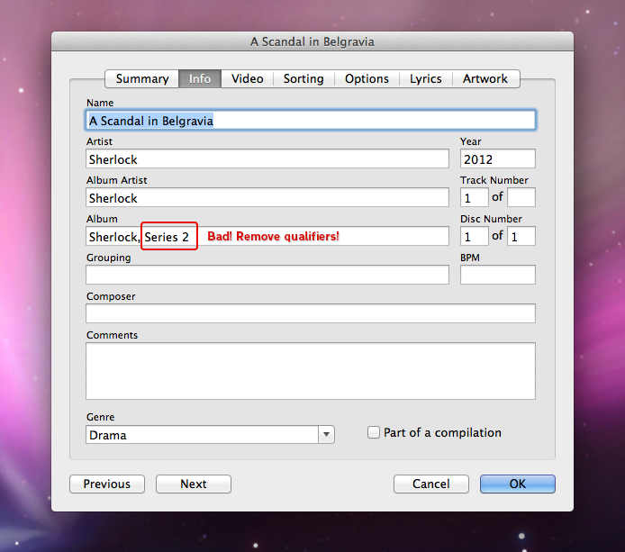
• Set the “Show” field to the name of the series (the same one used in the Album field) & remove any qualifiers like “Season 1” etc
• Set the “Season Number”, episode ID and episode number to their proper values
Note: When setting episode ID’s, each one should be unique to that series. Typically, 101 would be season 1, episode 1. 202 would be season 2, episode 2 and so on. It’s crucial that each episode within each TV show has a unique, and logical ID number or the show won’t display correctly and could affect other show’s listings as well.
Lastly:
• Select the “Sorting” tab
• Make sure that the Album name matches that in the Video tab
• As a precaution I also removed any information contained in any of the sorting fields of this tab. The album name seems to be enough for iTunes to find and display the show correctly so the rest is unnecessary
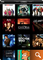 Once you have updated all of the metadata on all of your TV shows, each series should appear only once and in the proper season order in Home Sharing. You may need to exit and kill the video app, relaunch it and re-connect to your shared media library to actually see the changes take effect. If a show is still out of order, or doesn’t appear, then an offending bit of metadata is still out there. You’ll need to hunt it down and correct it, but when all is said and done your TV show library should look something like this.
Conclusions
As frustrating and time consuming as this process can be, seeing a properly ordered, shared TV show library is extremely satisfying, especially if you’re as obsessed with organization as I am. I’d write a developer radar report for these issues but honestly, I’m not even sure why it occurs, or even if it’s really a bug. It seems more likely iTunes is just finicky about logical, non-conflicting metadata. Unfortunately, each file has so many fields of data it’s difficult to tell which one should be set to what value, resulting in user frustration. The good news is that armed with the information above, and a little patience, you too can whip your Home Sharing library into tip-top shape. Just be sure to bring along some popcorn and a sense of humor.
 Magic 8-Ball, it’s been a while but I have some questions about Twitter’s recent blog post. You know, the one where they talked about “stricter guidelines” for how the Twitter API is to be used by third party apps. Since Twitter isn’t talking, I was hoping you might be able to clear some stuff up for me. Can I ask you some questions now?

 Lately I’ve been playing a great deal of
 Then near the end of 2011,


 There are only a handful of games on my iDevices that have withstood the test of time and clung to my home screen. Some of these games include
 Well not necessarily a *bigger* screen, but you will need one that sports more pixels per inch. That is to say if the
 Blame the ailing economy if you like, but in recent years businesses have become more and more willing to experiment in order to get a leg up on the competition. Seeking to capitalize on the increasingly tech-savvy public, the

 It’s been almost seven months since the release of the


 Every once in a while you run across a piece of software that’s so elegant and well done it makes you smile from ear to ear.
 Back in August I
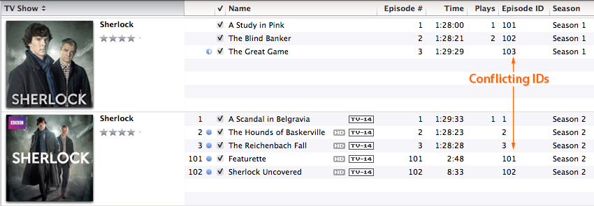