You Will Adapt Your User Interfaces to Service Us!

picard_firstcontact

Everywhere you look, more and more people feel they are entitled to something they’re not. I and others have written about the obscene level of entitlement some users feel is owed them when they download apps from the App Store, and to be sure this is still a huge problem today. Lately however, I’ve been observing another form of app entitlement and honestly, it has got to stop – iPhone 6 Plus users who think all interfaces should be designed to both fit their jumbo phones AND still allow one-handed use.

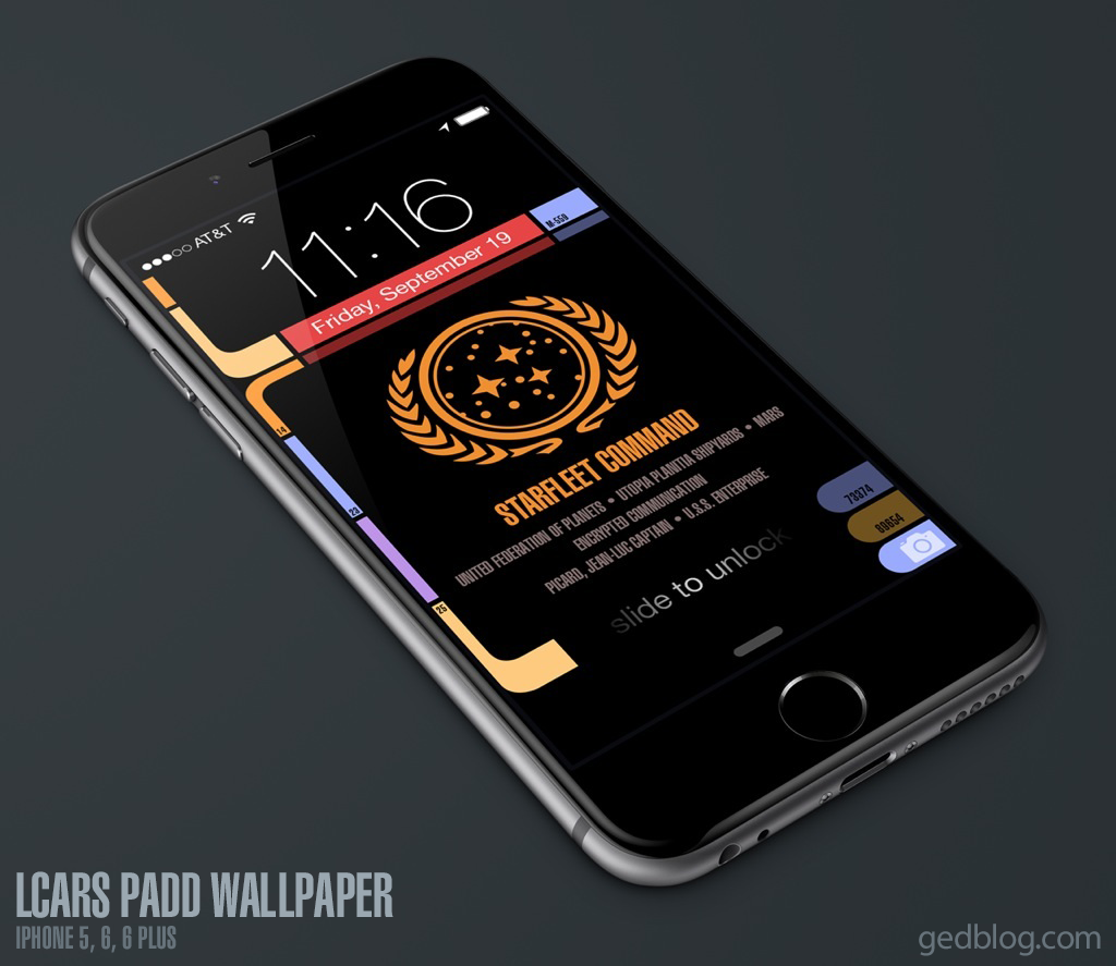
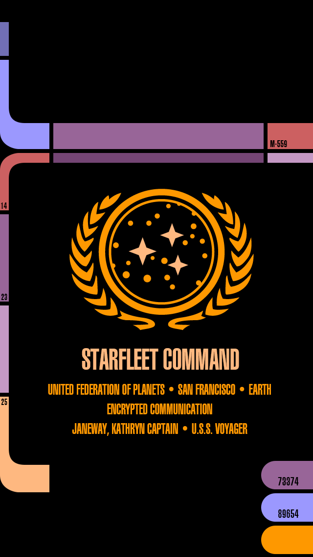
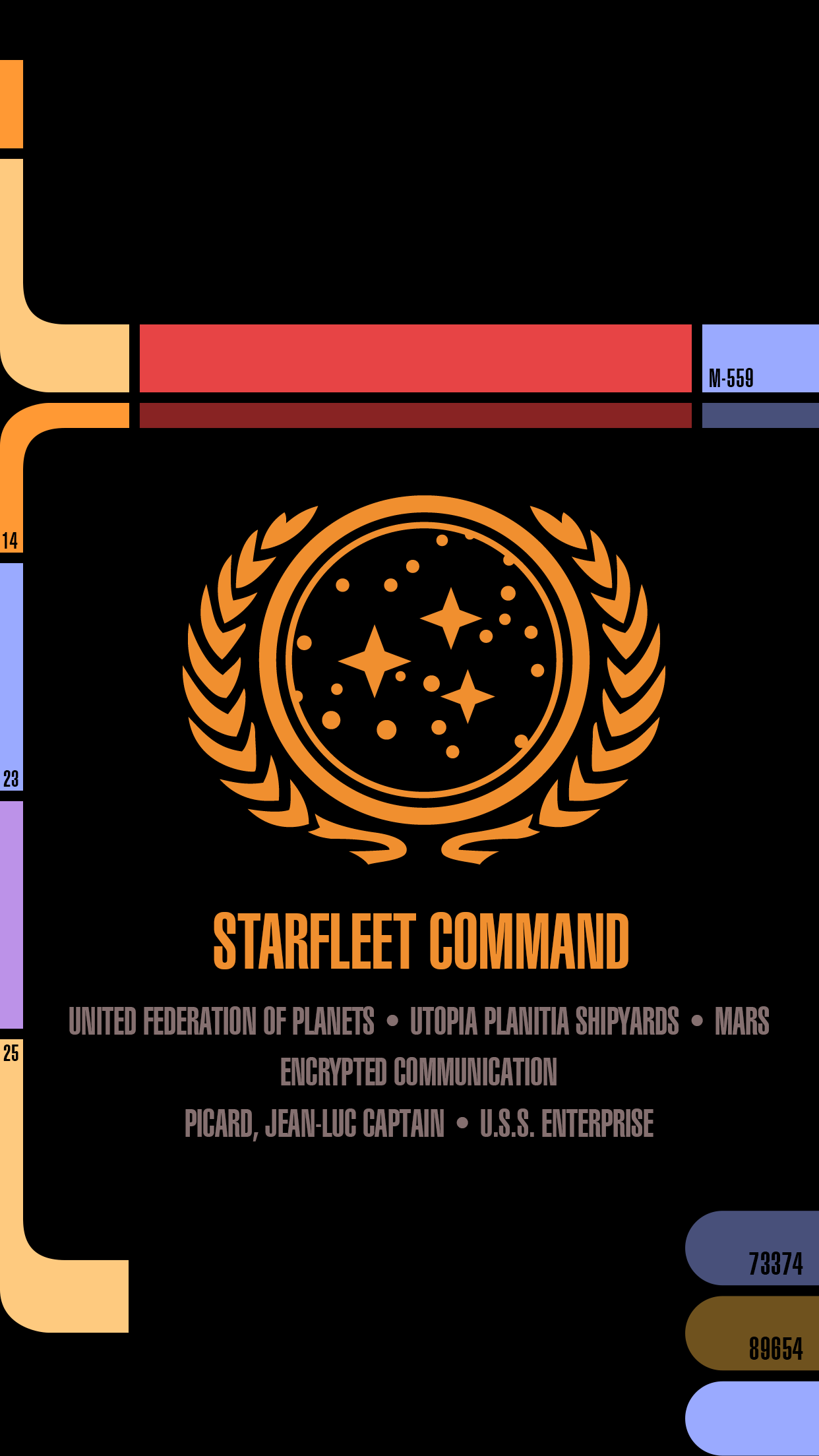
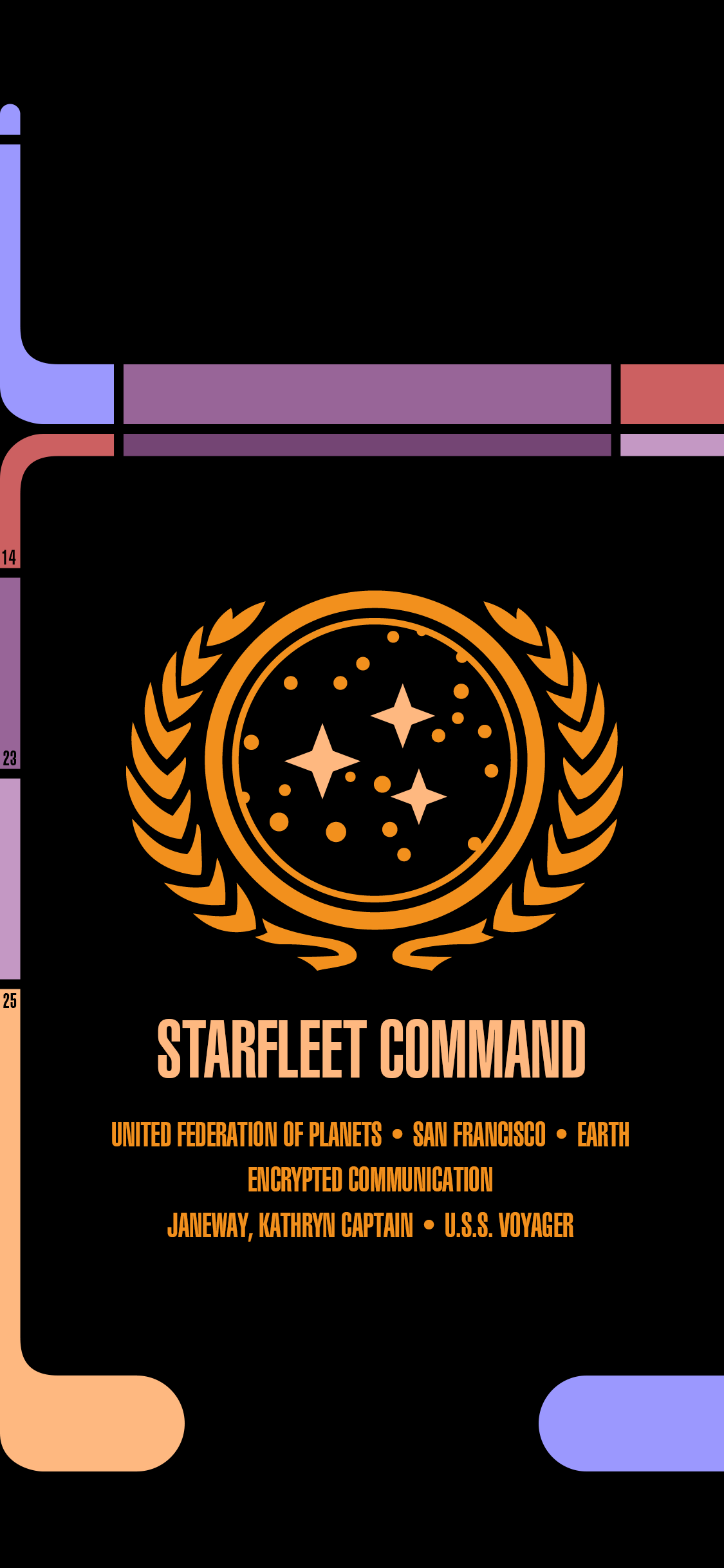
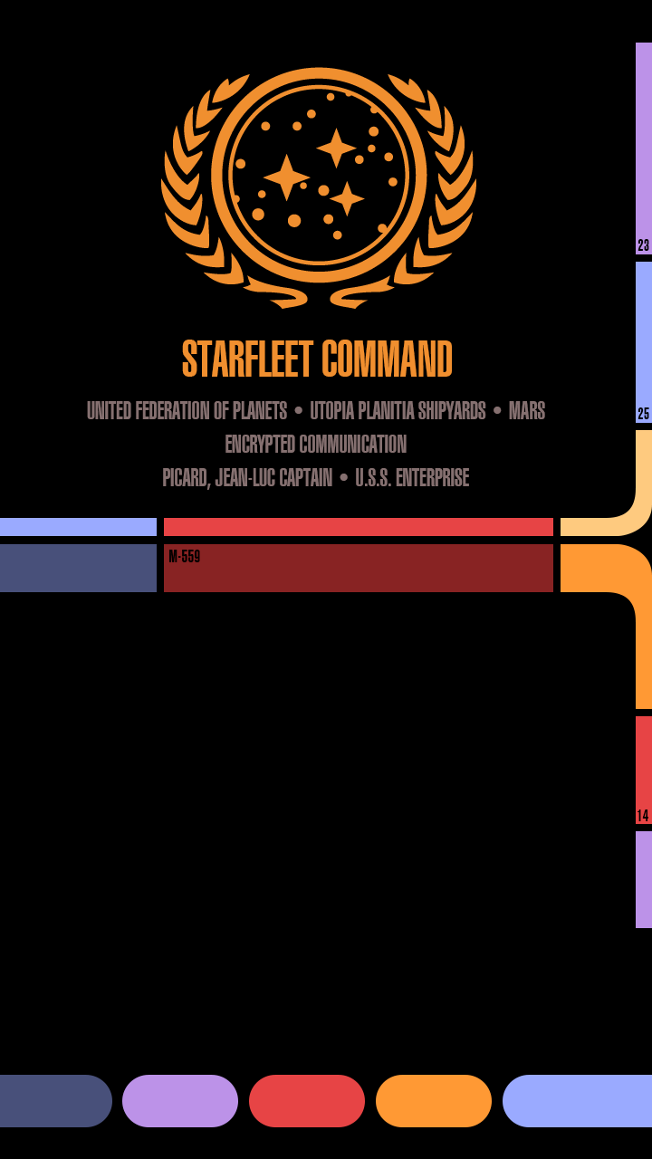
When Apple introduced the iPhone 6 Plus and it’s enormous 5.5″ screen, it clearly filled a much-needed gap in the iOS universe. Users had been clamoring for more screen real estate for years and when it finally arrived, they rejoiced. Over time however, these users have developed a sense of entitlement that the apps they run should place all controls at or near the bottom of the screen where they can be reached by the thumb. Sorry, but like Captain Picard in First Contact, I’m drawing a line in the proverbial sand. No, iPhone 6 Plus users don’t get to dictate interface design for the rest of us.

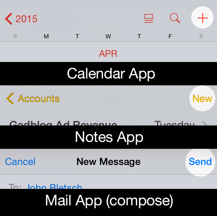
Like it or not, buttons at the top of the screen are not going away any time soon. Developers need every bit of screen real estate to logically lay out controls consistently across a host of device ranges and configurations. From the tiny iPhone 4 to the popular iPhone 6 and the iPad there’s a method to our madness. It might seem like a great idea if every single button, tab, actionable element and control were within thumb’s reach, but that simply isn’t possible, nor is it actually desirable.

When Apple developed iOS, the experts charged with designing its interface laid out regions of the iOS screen for specific interactions. Since the entire navigation stack generally flows from left (where you were) to right (where you are going), the button for closing or going back a level is at the upper left. Creation of new content or taking action on that content, like adding a calendar event or sending an email or a tweet, is usually found at the upper right. Tab controls can be either at the top or the bottom, though generally they are usually found at the bottom. In this way, a user who picks up an iPhone 4 has a reasonable expectation that similar types of controls will appear in similar places when she picks up an iPhone 6 Plus. This helps maintain usability and UI consistency for all apps, not just those that run on jumbo phones.

screencontrols

There are ways that developers can help facilitate one-handed use when it’s appropriate. The swipe to go back gesture is a great innovation Apple introduced back in iOS 7 and is a thumb-saver on larger phones. Many apps no longer require you to reach up and tap “Back” to go back, you can simply swipe from the left edge of the screen to navigate back one level. Apple also implemented Reachability (double tap the Home button to lower the entire screen temporarily) to help reach interface elements at or near the top of the screen. But for some users, these gestures are simply not enough. The thing they forget is that by opting for a large device they gained a huge, highly readable screen but they also sacrificed some level of UI convenience. iPad users have been dealing with this trade-off for years, that’s the nature of the beast, like it or not.

When I first heard about the rumored existence of the iPhone 6 Plus and its huge screen, I wondered how Apple would reconcile its long-held tenet that one-handed use reigned supreme with that of it’s upcoming larger device. Apple even built an entire marketing campaign around the advantages of smaller iPhones vs their larger Android counterparts. But when the Plus was released, Apple quickly abandoned that philosophy in order to sell millions of 6 and 6 Plus’. Funny how that happened.

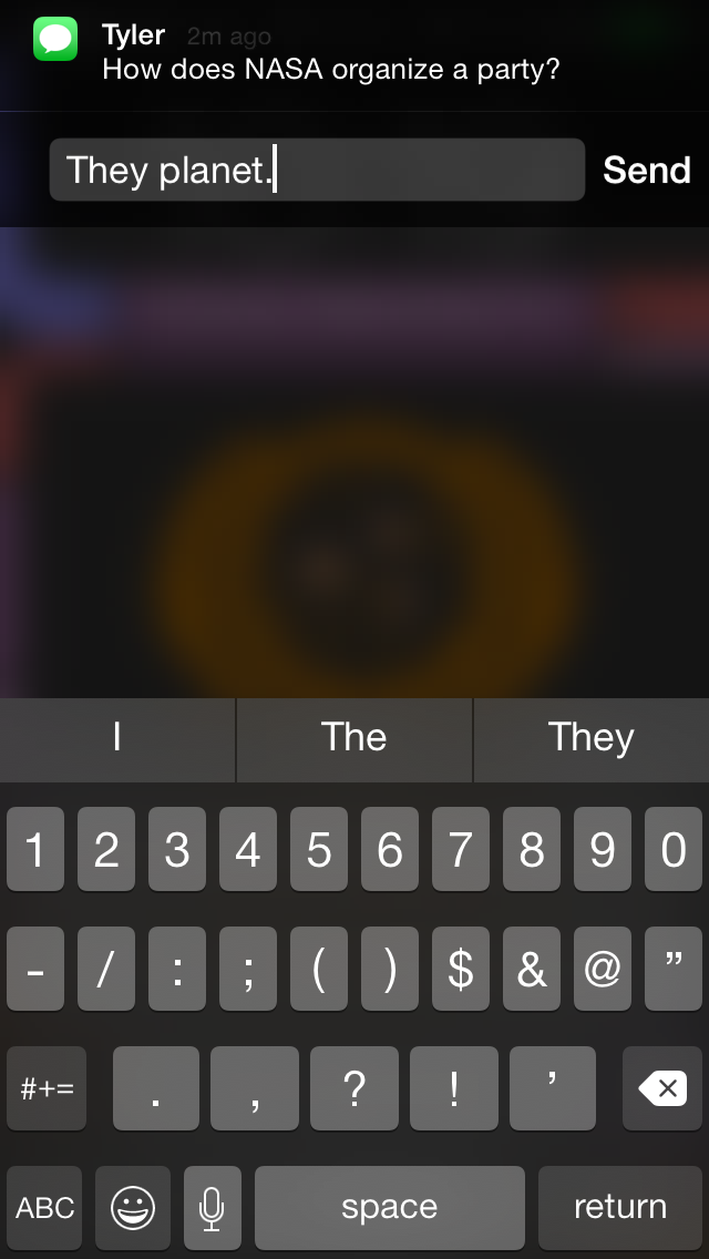
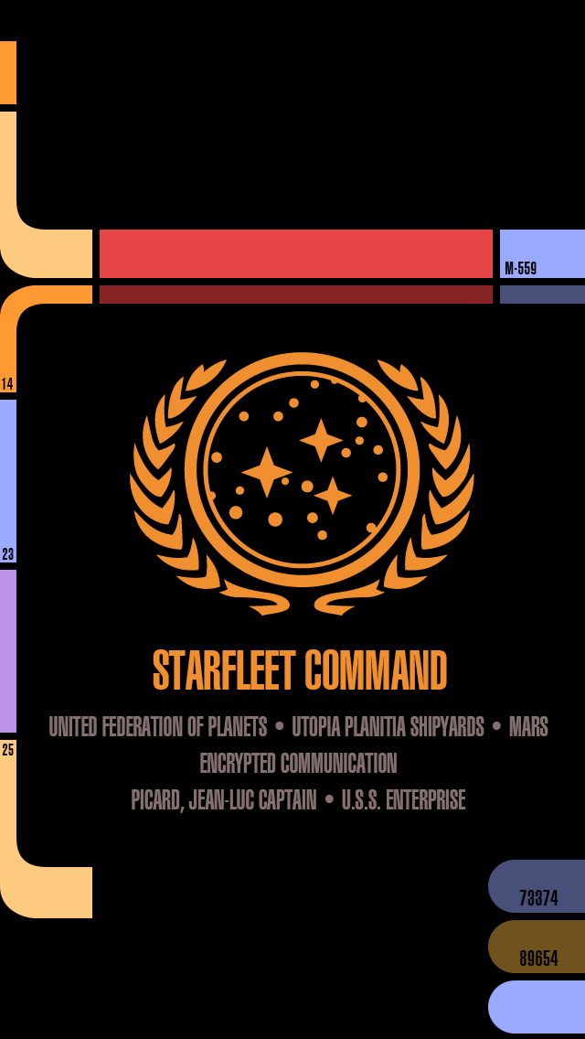
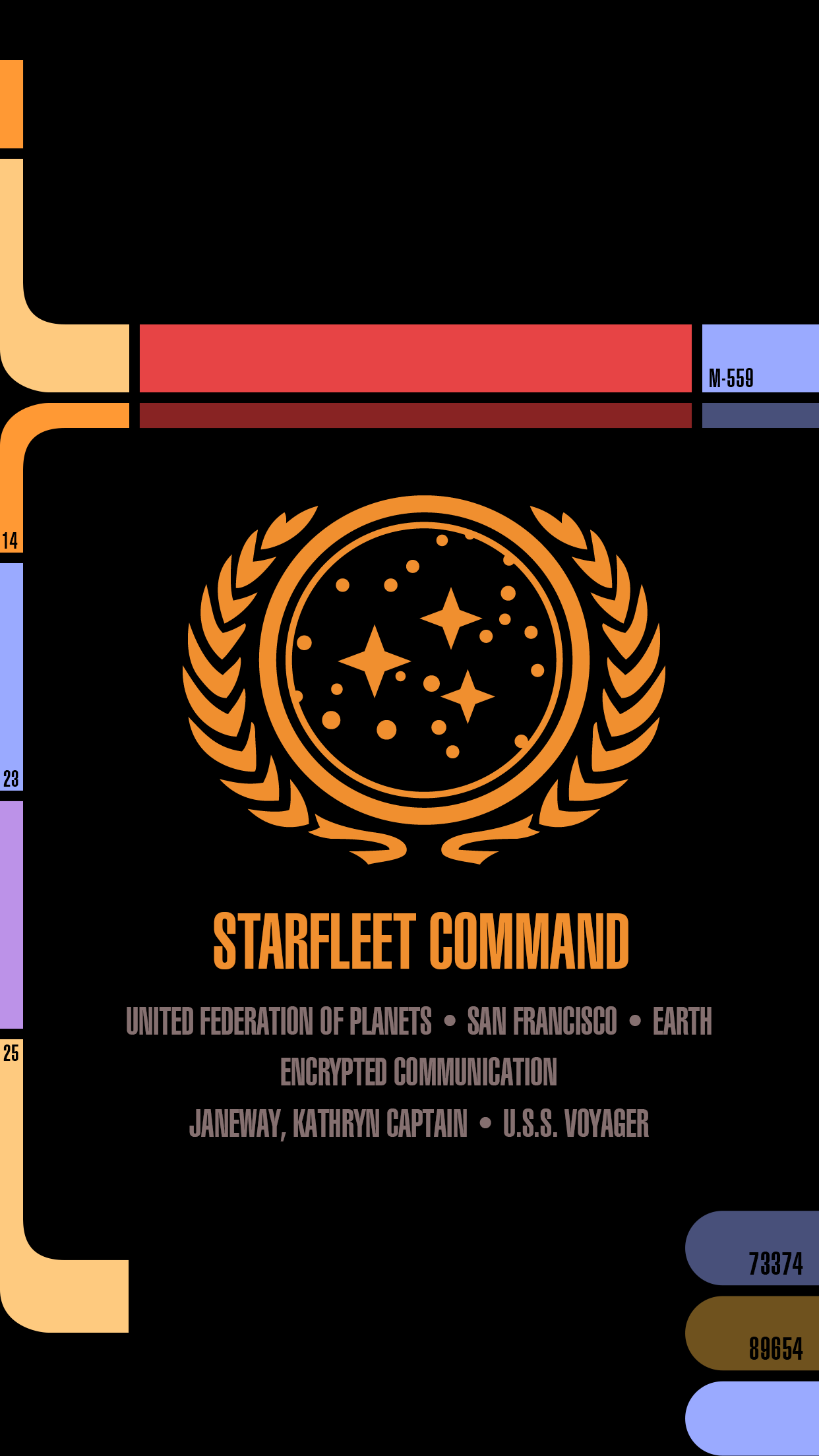
The problem with these users is that they often think like the Borg – they want the best of both worlds – larger screens and an interface that lets them use every app one-handed. As someone who designs for the screen, I’m here to tell them that until humans evolve longer thumbs that simply isn’t possible. At some point (iOS 10?) Apple may come up with a completely new interface paradigm for iOS, but in the meantime it’s best if they start dealing with reality. Whether it’s assimilating Starfleet personnel or playing with your apps, sometimes you just need to use two hands.

Star Trek: Next Gen Wallpapers for iPad

iPad_LCARS_Hero

A few months ago I released several iPhone wallpapers that Star Trek fans have really been enjoying. The response to these LCARS-style graphics was tremendous and almost immediately I started receiving requests for iPad versions of them. The problem was there’s no way to design a square LCARS wallpaper that works both in portrait and landscape mode on the iPad. All of the major elements on-screen (the time, date, slide to unlock & camera icon) are positioned differently when you rotate your device.

A big part of the charm of the iPhone LCARS wallpapers is that the iOS elements flow right into the design and become part of it, but this just isn’t possible to do with a single image for iPad. The solution was to not even try and to design separate wallpapers that can be used in either landscape or portrait, not both. The result is the landscape Next Gen iPad versions I’ve created here. I may create portrait versions at some point, but the majority of iPad owners use the device in landscape mode primarily so that’s what I went with.

I’ve been a huge fan of Star Trek Production Designer, Michael Okuda since day one and like the iPhone versions, this project is my ongoing way of saying “Thank you!” for the wonderful, futuristic operating system that Next Gen fans know and love as LCARS. With these new iPad versions, you can definitely feel like you’re using a real Next Gen PADD when you unlock your tablet, it’s super fun!

How to download and apply the wallpapers on iOS 8:

1) Click to view the version of the iPad wallpaper you like best:

• iPad landscape – Original / TNG Colors
• iPad Pro landscape – Original / TNG Colors
• iPad landscape (Starship Schematic) – Original / TNG Colors
• iPad Pro landscape (Starship Schematic) – Original / TNG Colors

2) Tap & hold on the image in mobile Safari & save it to your photo library

3) Open Photos, view the image then tap the Share button in the lower left

4) In the Share menu tap Use as Wallpaper

5) Pinch Zoom OUT on the image to size it exactly to the screen

6) Turn Perspective Zoom OFF

7) Position the image so the Lock Screen’s date line is centered inside the thinner, red upper bar

8) Tap Set > Set Lock Screen

That’s it! Sleep/lock your iPad and the next time you activate it, you can pretend you’re Captain Picard himself receiving an important message from Starfeet Command. I hope you enjoy this fun treat & help spread the word via Twitter and Facebook.

Be sure to visit my Goodies page to download other fun desktop wallpapers for iPhone, iPad & Mac. Engage and enjoy!

UPDATE: Added new sizes of both variants of the LCARS lock screen for the new iPad Pro.

Muting Messages in iOS 8

One of the most useful (and hidden) features I’ve come across in iOS 8 is the ability to mute IM threads in Messages. Think of it like Do Not Disturb but on a case by case basis. I first noticed it by accident when a tiny crescent moon icon appeared next to one of my IM threads and so I Googled it to figure out what exactly it was.


When do not disturb is turned on for a particular message thread, you won’t be notified when that person(s) replies via text or iMessage. This can be really great if you want a way to ignore a person or group discussion that’s gotten out of hand. It can also be really frustrating if you happen to activate it by accident as I apparently I did without realizing it (or perhaps a bug in iOS 8?).

To turn Do Not Disturb for individual message threads on or off, tap the Details text at the top right of the Messages window to open that thread’s detail view. Next, scroll down to Do Not Disturb and toggle on or off as desired. When this feature is turned on, you won’t receive notifications when the person sends text messages or IM’s and you can go about your life notification free.

The Details view also gives you quick access to all the images that person has shared with you, as well as the ability to share your location information with the people you’re chatting with which is a nice feature as well.

The more I play with iOS 8, the more little things I find that truly set it apart from iOS 7. It’s wonderful that Apple is giving us more control over our digital world, I can’t wait to see what else is in store.

PS – I love Louie to death and would never mute his IM’s. He was gracious enough to let me use our conversation as an example. Thanks Louie! 🙂

iOS 8 Favorite Features

On the surface, users coming from iOS 7 may not notice the myriad of changes and improvements Apple has made in their latest mobile operating system, iOS 8. Visually, iOS 8 is almost identical to its immediate predecessor, but under the hood there’s a great deal to like and even some to really love.

Much has been written about the new OS, but now having used it for a few weeks, I thought I would write about my own personal observations from the user’s perspective. I could write an entire other post about the good and bad parts of iOS 8 as they relate to developers (and perhaps I will), but for now, here are the parts of the new operating system that I’ve been enjoying the most.

3rd Party Extensions

Without a doubt, iOS 8’s single greatest feature is the ability to extend the system via 3rd party extensions. Early iPhone adopters will probably remember what the device was like before the advent of the App Store – it was cool, but killer apps made it a “must have”. I liken extensions in iOS 8 to that early invitation of 3rd party devs to the iPhone party. The most well received extension so far as been Agile Bit’s amazing security utility, 1Password. Thanks to iOS 8’s extensions you now can access your secure passwords directly within apps reducing friction and making your information more secure.

Other notable extensions include PCalc’s Today View which gives you handy computation abilities right from your iPhone’s lock screen and another personal favorite of mine – Add to Wunderlist which lets you add web pages directly to new or existing lists. Perhaps the most exciting part is that we’re just in the early days of iOS 8 extensions so we’re only seeing a fraction of the potential that 3rd party extensions represent. More great stuff is sure to come and I for one am very excited.

Directly Replying to Notifications

Swipe left on a notification on your device’s lock screen or downward from a notification within iOS 8 itself to reveal the ability to reply directly to instant messages. I have to admit that I’ve found myself using this one more and more. It saves so much time being able to reply directly it’s incredible. This is one feature I really wish Apple had implemented earlier, but I’ll surely take it now that it’s here.

Siri’s Visual Feedback

Apple’s digital assistant, Siri, has taken a cue from other popular voice-activated services like Google Voice Search and now displays helpful visual feedback when dictating text or commands in iOS 8. This really comes in handy when you have long blocks of text you want to enter and can see in real time how well (or how badly) you’re doing. It’s still not as fast or precise as Google’s version, and I don’t know how Siri stacks up against Windows Phone’s new assistant, Cortana, but it’s a big improvement none-the-less. Siri’s real-time dictation even works within 3rd party apps like Twitterrific, which was an unexpected and delightful surprise!

Perspective Zoom: OFF

Remember the old “Genie Effect” from Mac OS X where minimizing an app would make it snake down into the magic lamp of the Dock? It was kinda neat the first few times you tried it, but if you were like millions of other OS X users, you probably turned it off pretty quickly. The 3D parallax effect in iOS 7 was the Genie effect reborn for iPhone and was one of the very first things I turned off when I went from iOS 6 to iOS 7.

Now, thankfully in iOS 8 you have even greater control over the parallax effect and can turn it on or off for just the Lock Screen, the Home Screen or both. When you go into Settings > Wallpaper and choose an image to use as your Lock or Home screen, iOS 8 gives you the ability to turn Perspective Zoom on or off when you confirm the choice. Why anyone would choose to leave it turned on is beyond me, but at least now you have granularity when it comes to these cutting-edge, effects that can cause motion sickness in some people. Yay!

Recent Contact List

With fewer and fewer people using the built in Phone app, Apple wisely added a row of recent & favorite contacts to the top of the multi-tasking view. This handy list of people and places you’ve called, IM’d or written is a great way to initiate contact with them quickly and easily.

The only downside is that since I’m seeing their faces a whole lot more, I feel compelled to assign all my contacts decent looking photos for their avatars. Needless to say, not all of my friends have great pictures of themselves and this, as they say, has proven to be “challenging” to say the least. I guess we can’t all look like models from a GAP ad :-/

There are still more than a few rough edges that need sanding in iOS 8. Transition animations can be jerky, apps are prone to crash more often than in iOS 7 and devices can have problems staying connected to local WiFi networks. If history is any indication however, Apple should iron out these wrinkles in pretty short order. In the meantime there’s plenty of cool, useful new features in iOS 8 to keep all of us busy for some time and we haven’t even experienced Apple Pay or Continuity yet. The best, I suspect, is yet to come.

Star Trek: Next Gen Wallpapers for iPhone 6

UPDATE: Four new variants have been created for Apple’s new iPhone X. The device’s OLED screen means the LCARS design blends seamlessly into the bezel like never before. So much fun!

If you enjoy Star Trek as much as I do then you’ll love these free, Next Generation mobile wallpapers I designed for use with iOS. I’ve updated my original LCARS Star Trek lock screen for the brand new iPhone 6 and 6 Plus so you can be the geeky envy of all your friends. For those of you still running the smaller iPhone 5, don’t worry, there’s even a version here for you!

I’ve been a huge fan of Star Trek Production Designer, Michael Okuda since day one and this project was my way of saying “Thank you!” for the wonderful, futuristic operating system that Next Gen fans know and love as LCARS. With the iPhone 6 Plus approaching the size of actual padds from Next Gen, it only made sense to bring this amazing aesthetic to the palm of our hands.

How to download and apply the wallpapers on iOS:

1) Click to view the wallpaper that best fits your device:

• iPhone 5 Series (iOS 8 & 9) – Original / TNG Colors / Janeway Alt / Janeway TNG
• iPhone 6 (iOS 8 & 9) – Original / TNG Colors / Janeway Alt / Janeway TNG
• iPhone 6 Plus (iOS 8 & 9) – Original / TNG Colors / Janeway Alt / Janeway TNG
• iPhone SE Series (iOS 10) – Original / TNG Colors / Janeway Alt / Janeway TNG
• iPhone 7 (iOS 10) – Original / TNG Colors / Janeway Alt / Janeway TNG
• iPhone X (iOS 11) – Original / TNG Colors / Janeway Alt / Janeway TNG
• iPhone Xs Max (iOS 12) – Original / TNG Colors / Janeway Alt / Janeway TNG

• Windows Phone – Original / TNG Colors
I don’t own a Windows Phone and make no promises about how this version will work for you. These are provided as is!

2) Tap & hold on the image in mobile Safari & save it to your photo library

3) Open Photos, view the image then tap the Share button in the lower left

4) Scroll to the right in the Share menu and tap Use as Wallpaper

5) Pinch Zoom OUT on the image to size it exactly to the screen. You want the date to be vertically centered within the sub-horizontal bar near the top.

6) Turn Perspective Zoom OFF

7) Tap Set > Set Lock Screen

That’s it! Sleep/lock your iPhone and the next time you activate it, you can pretend you’re Captain Picard himself receiving an important message from Starfeet Command. I hope you enjoy this fun treat & help spread the word via Twitter and Facebook. Engage and enjoy!

UPDATE: I’ve added 6 new variants of the lock screen for iPhone after a request from @keydiehhurst. Available in both original and TNG color schemes, these variants address the communique to fearless Captain Kathryn Janeway in the Delta Quadrant. Safe journey, Captain!

UPDATE 2: I’ve added 8 new iPhone SE & 7 variants for use with iOS 10. The lock screen in iOS 10 has moved controls around so the wallpaper had to change to accommodate the new design. Hope to add iPhone 7 Plus variants soon.

UPDATE 3: I’ve added 4 new iPhone X variants for use with iOS 11. The lock screen in iOS 11 puts controls in a different place plus the tall format of the iPhone X means the wallpaper had to change to accommodate the new design.

UPDATE 4: I’ve added 4 new iPhone Xs Max variants for use with iOS 12. This iPhone is freakin’ huge so the placement of the controls, date bar and message block all had to be adjusted again. The Max is about the size of a small TNG PADD!

1 Comment

Go Buy Monument Valley. Now.

Chances are you’ve probably already heard all about the stunning new game from developer ustwo – Monument Valley that was released today. If the game is new to you, then let’s just clear the air right now – go buy it on the app store for your iOS device. Now. This is one of those instances where a piece of software is so stunningly beautiful, and provides such an incredibly rich experience, you’re really missing something if you take a pass. Here are just some of the things you’ll see in this amazing casual puzzler:

There’s a great deal to love in Monument Valley. From it’s rich, varied color palettes that change from level to level, to the extremely clever, M.C. Escher-like design of its levels, to the gorgeous soundtrack and audio effects, Monument Valley delivers at every turn. From the moment you start to play, it’s obvious how much love and attention the folks at ustwo have put into their creation. They’ve managed to design a complete gaming experience and bring it to you via the App Store for a minimal price. Too often games these days are filled with in-app purchases that prey on instant gratification to keep players interested. Monument Valley eschews all that in favor of creating a compelling, finite and beautiful environment for you to get lost in for a few hours of your life. The last few levels in particular are wildly inventive and especially challenging.

If you’ve read the reviews, then you probably know that Monument Valley’s play time is short. It took me a total of about 3 hours (off and on) from start to finish to complete all of the levels, and for some, that length may be a deal breaker. If you feel that way I have news for you – many awesome things in life are short but that doesn’t make them any less worthy of your time or money. You’ll probably spend more on your next meal out than you would on Monument Valley but that doesn’t mean you can’t enjoy both while they last. The game creators have said they focused on making a concise title that can be completed in a short amount of time on purpose. While this may be true, it doesn’t really matter to me because I know if the game is a success (which I certainly hope it is) then we’ll probably be seeing a great deal more of the mystical world of Monument Valley. Show your support of their efforts to bring you something wonderful and head over to the App Store and buy it, gift it and help spread the word by leaving a review today.

2 Comments

Ollie Flies Free(mium)

Today marks a new beginning for Twitterrific, the venerable third party Twitter client from the Iconfactory. Today we’re announcing the app is now free to download from it’s normal price of $2.99. We’ve added several in-app purchases to the app to help cover the cost of push notifications and tweet translation, but the bulk of the revenue to continue development will now come from Deck Network ads that will appear above the timeline. Twitterrific has been available in the App Store since day one and we’ve experimented with both paid and free revenue models. Why are we returning to the freemium model now? Simply put, we’re hoping that by making the app free to download and use, we’ll get Twitterrific into the hands of thousands more people and those additional users will help support development via the increased ad revenue far into the future. The best part is that thanks to new App Store receipt handling in iOS 7, existing paid users are grandfathered into the new model and don’t have to restore any purchases. The app, with all it’s features, just works.

There are lots of risks with moving to this type of revenue model, but version 4 of Twitterrific was by far our most successful and that version was supported by ad revenue from The Deck. No doubt levels of support will increase dramatically for us but that’s part of the trade-off of having successful, thriving software. I’m also personally curious to see if moving to the free model and increasing the app’s downloads by at least 1 or 2 orders of magnitude will improve Twitterrific’s search results in the App Store. Having the very first 3rd party Twitter app in the App Store returned after non-twitter clients in a search has never seemed right to me. If you’ve never tried Twitterrific in the past, there’s no reason left not to give it a go now and we also hope you’ll help us spread the word!

The Bezel’s the Thing

It doesn’t take tea leaves or even a leaked report from the Wall St. Journal to figure out Apple will probably release a new model of iPhone with a larger screen later this year. Users have been begging for more screen real estate, especially with the increased attention of larger-screened devices like the Samsung Galaxy. Also, Apple typically does full product revisions on a 2-year cycle which just happens to hit for the iPhone this fall. All of these factors may create the “perfect iStorm” that users have been patiently waiting for. From a personal standpoint, I would love an iPhone with something around a 4.75″ screen because the older I get, the more I seem to squint and miss-tap at the tiny interface elements of my iPhone 5c.

The report from the Journal seems to hint at two new sizes of iPhones, one somewhere around 4.75″ and another, larger device possibly measuring 5.5″ diagonally. I freely admit that speculating about the screen sizes of these non-existant devices is mostly wishful thinking, but that’s part of the fun. What would your ultimate iPhone look like? What size screen would it sport and more importantly, what’s the new form factor going to be like? For all the talk about screen size, I think the more important aspect of the next iPhone will be the design of the bezel. The bezel is the border around the screen that offsets the display from the edge of the device. Recent rumors suggest that the new iPhone 6 will have little or no bezel between the screen and the left and right edge. If true, this is a far more exciting development, at least for me, than just upping the screen size.

It’s no secret that the industrial design team at Apple has long sought to create a display that’s essentially a continuous piece of solid glass, edge to edge when held in the hand. Such a design would result in a screen that seems to end where your hand begins. Now with advances in Sapphire glass technology and with 7 years of experience under Apple’s belt, the dream of a nearly invisible bezel may soon become a reality. Removing the bezel won’t be a slam dunk however, as there are most certainly software considerations that need to be worked out. Accidental taps and swipes at the edge of the screen would probably increase without some kind of UI “neutral zone” at the perimeter of the display. Designing protective cases that don’t interfere with touching or swiping would also be a challenge, but hardly impossible.

If the rumors are true and the iPhone 6 will have a bezel of around 1mm, it will certainly make for a stunning, refreshed visual appearance at a time when the iPhone seems stagnant. Apple’s supporters note the company is selling record numbers of iPhones even though the form factor hasn’t changed for several years and that is true. It is also true however that users have been hungry for larger devices as well as ones that look and feel different from the existing models to help set them apart from their peers. From the stunning introduction of the retina display to the increased security and cool factor of Touch ID, Apple fans love owning the new hotness. Come this fall, I’m willing to bet a big part of the “heat” won’t be what Apple has added, but rather what they’ve removed – the bezel.

7 Comments

iObservations

This week I finally upgraded to a brand new iPhone 5c after almost 2 full years of use on my trusty iPhone 4s. I’ve now spent a couple days with the new device running iOS 7 and wanted to share some random observations (both good and bad) for what they’re worth. As with anything, your milage may vary.

The Good

AT&T LTE – I mean just look at it!

Siri’s new voice – It’s so much better than before. Feels very Star Trek.

New ring and alert tones – There’s been some fun made of these but overall I really like them. The majority have a light, fun feel that seems to fit perfectly with the new iOS 7. My ringtone is currently set to Sencha and my alert tone is Chord. Groovy!

OS 7’s folders – Worlds better than the one in use in iOS 5 & 6 the new folders are clean, easy to manage & hold more apps.

Background refreshing – We implemented it in Twitterrific and I can already tell it will be one of my favorite features of the new OS. Having content ready for you when you wake the device is killer. Jury’s still out on how it will affect battery life however.

The feel – The feel of the 5c in the hand is just as I imagined it would be. It has the smooth, comfy feel of the 3gs without the extra bezels. It feels rock solid in your hand, not like you’d expect from a plastic phone.

Use of color – Much has been made of the, let’s just say “bold” use of color in iOS 7, some good, but mostly bad. Personally I love it. I love the way your wallpaper setting for instance changes how interfaces like the dialer screen looks. Make an overall change here and the whole user experience feels fresh. Bravo Apple.

Command Center – Being able to turn off blue tooth at will as well as quick access to a flashlight (don’t laugh, it’s useful!) is just great. I can’t wait until I have a use for sharing a file via AirDrop.

Multi-image emails – The ease of use selecting multiple images from your camera roll to attach to a single email is simply fabulous.

The Not-So-Good

Missing share buttons – Apple removed the ability to tweet and post to Facebook right from Notification Center for some reason. I’m not sure why, but this was a great way to quickly get a tweet out without any fuss. You can still do it via Siri, but it’s too prone to errors. Hopefully these controls will be coming back.

Multiple chargers – I like the new smaller, 10 pin charger but my iPad 3 still uses the old 30-pin version. This means I have to keep two different kinds of cords around my home to charge my devices. This stinks. Speaking of charging…

RIP iHome Clock – It will no longer work with my new iPhone 5c’s 10-pin charger port. This makes me very very sad.

RIP Olloclip – Designed for my iPhone 4, my Olloclip is now a useless hunk of metal and glass sitting on my desk. Again, sad.

The feel – Yes, I love the feel of the new 5c, but even though it feels super awesome, it’s also super slippery in the hand. As my wife said, it feels like it’s “coated in butter”. I immediately went out and bought an ugly Apple case for it simply because I just knew I’d eventually drop it. I hate to cover the wonderful plastic up but i’m scared it will slip right out of my hand. I sat it on the arm of my couch and watched it sloooowly slide right off into my lap. It’s crazy smooth.

Ugly icons – I realize I’m being a kind of icon snob here, but I just can’t warm up to the horrible Settings and Safari icons. The fact that they are two of the most important destinations on my iPhone means I have to look at them all the time and I just cringe when I do. Really hope the designers at Apple re-visit these at some point.

Overall I’m extremely happy with with my iPhone upgrade. There’s no doubt that it was time to replace my 4s. The only real choice was if I wanted to move to a 5s or a 5c. I’m extremely happy with how the new phone feels in my hands. The plastic case is top notch and doesn’t have the kinds of beveled edges that made my 4s hard to pick up and hold. Will I miss the finger print scanner, better camera and 64-bit processor of the 5s? Probably, but I’m betting a year from now we’ll see a new model that will have all of these things plus a larger screen and maybe the awesome case of the 5c. If you currently own an iPhone 5, then the 5c may not be the way to go, but if you’re like me coming from the previous model, you just might consider taking the colorful path to plastic town.

4 Comments

Why I’m Buying an iPhone 5c

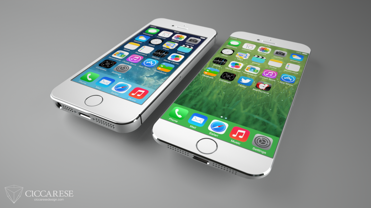
I’ve owned an iPhone 4s for almost 2 years now and had been patiently awaiting the successor to the iPhone 5 until this week. When the 5 was first introduced, I was off-cycle for a discounted upgrade from AT&T and when I finally was eligible I thought I might as well just wait and see. I was hoping the increasing popularity of larger-screened smartphones would encourage Apple to release at least an iPhone with a 4.6″ screen in their next rev, but as I tweeted this past week, it seems Tim Cook’s pigs have yet to fly.

Now I have a choice to make. I can go with the fancy new iPhone 5s, complete with 64-bit hardware, a greatly improved camera and a cool fingerprint scanner, or I can “settle” for a 5 wrapped in a lickable, candy-coated plastic shell, the iPhone 5c. The gadget freak in me says to go with the snazzy 5s. After all, its increased speed would hold up better over the next 1.5-2 years and the pictures I took would no doubt be greatly improved from those I snap now. The 5s is more expensive, but that wasn’t the deciding factor, at least not for me.

I’ve chosen to go with the iPhone 5c for a couple reasons, but mainly because of comfort. For my money, the most comfortable smartphone to hold and use was the iPhone 3GS. Its slightly rounded back, smooth plastic construction and tight edges made it a joy to hold and use. When the iPhone 4 was introduced, I really didn’t like the device’s form factor. The metal band creates sharp edges that fatigue the fingers and collect dirt. In addition, to me the device is *too* thin to hold safely without a case. The new iPhone 5c’s smooth curves, and seamless sides call out to the scifi geek in me and the colors, oh the colors! It’s much more streamlined, minimal in appearance and seems easier to pick up off the table. I must admit however, if I could have the 5s’ guts inside the smooth, plastic shell of the 5c, I’d opt for that in a plastic heartbeat.

I know that no matter which model I pick, either will be a great upgrade from my 4s. Although it’s served me well these last two years, I’m more than ready for the increased screen size, faster processor power and increased battery life of a new iPhone. With any luck, around this time next year Apple will be introducing a 4.6″ iPhone that will sport an all new form-factor as well as all the neat-o gadgets that are sure to make the iPhone 5s a huge success. In the meantime, unlike Kermit, it’s easy being green.

PS – iOS 7 is awesome, you’re gonna love it!

The User Interfaces of Oblivion

As an UI designer, I love seeing what artists come up with for fictional user interfaces. I’ve admired the work talented folks like Jayse Hansen has done for films like Iron Man and the Avengers for some time and secretly longed to do this kind of work. The latest work from Joseph Kosinski and Crater Lake Productions for the film Oblivion is pure magic. The level of detail, both animated and static, is staggering. I hadn’t intended to see Oblivion in the theater, but after seeing this wonderful work I just might. If you want to learn more, head over to GMUNK and check out their process.

1 Comment

The Art of Doing ‘Nothing’


“When you do things right, people won’t be sure you’ve done anything at all.” This line from Futurama perfectly sums up how I often feel about my job. Designing, if done right, takes the challenge of communicating a complex idea effectively, and turns it into something that can be easily understood by the masses. When designers do their job right, the overall design fades into the background and you just “get” what you’re looking at. It speaks to you on a fundamental level, things just click and you usually see big smiles on the faces of those who interact with your work.

Through the years, I’ve learned the job of the programmer is much the same. Although my programming abilities are limited to rough forms of HTML and BASIC (yes, BASIC), through my position at the Iconfactory, I’ve learned much about what goes into making a successful software application. I see the challenges that our programmers tackle every single day and I for one am always impressed. This is particularly true of our latest effort, the retina compatible version of xScope for Mac OS X.

When Apple’s stunning new display was announced, I was excited about the increased level of detail and clarity the technology would bring to the desktop. The images are gorgeous, text is as crisp as the printed words and colors are deep and rich. Designing for this display means tools that can work correctly with it, giving you accurate and flawless information from which you can build your designs. From the get-go we knew that xScope, our utility for measuring and inspecting the screen, had to be updated for this new display. What we didn’t realize when we began was just how complicated that update would be.

I’m going to be completely honest here and say that even today, after several months, I still can’t get my head fully around the concept of pixels vs window points. Oh, I know what they are and why they exist, but from the time I first learned how to use a mouse, I’ve always dealt with pixels as the unit of measure on the screen. My entire professional career has revolved around the humble pixel and as such it’s been difficult coming to grips with the fact that the days of seeing exactly what you get on screen are pretty much over.

But all of this pales in comparison to the work that my friend, our lead engineer Craig Hockenberry, had to do in order to get xScope working properly with the new retina display. Whenever Craig starts waxing programatic about his coding, my eyes usually glaze over. That said, there were times during the xScope retina conversion when I thought I was going to go catatonic. If you’re the type of person who loves coding, or maybe needs something to read to send them off to sleep at night, head on over to Furbo.org and read Craig’s technical post on the problems with coding for retina. Suffice to say it’s beyond me. Also beyond me – all the math, logic and problem solving needed to surmount this incredible challenge. I have tons of respect for anyone who finds mathematics fun and exciting, and even more for friends like Craig who wield it like a weapon in the service of their job.

When designers and developers use xScope on a shiny new retina Macbook, all they’ll know, indeed all they’ll care about is that the app works as advertised. xScope will give them the data they need to make their apps and designs the best they can be and that is all that matters. Because of the efforts of Craig and Corey Marion, xScope’s lead UI designer, the app just “works” and it works well. Users won’t know all the algebra and bug finding that went into creating it, but I thought it was appropriate to take just a moment and recognize the hard work that went into making it a reality. I sincerely hope you find the new version of xScope as powerful and useful as all of us have. But the best part is if we’ve done our jobs right, you won’t be sure we’ve done anything at all.

Ode to the Federation

Fashionably Geek is quickly becoming one of my favorite blogs thanks to gems like this. This wonderful silver necklace is the perfect gift for that stylish Trekker in your life. Created by the Rice Hat Samurai Studio, the necklace is an elegant graphic translation of both the Star Trek combadge and the Vulcan Idic symbol. Their Etsy shop also offers something for Doctor Who fans as well, so beam on over and scoop these prizes up before it’s too late.

[Via Fashionably Geek]

All-Aboard for Tricky Tracks

Tricky Tracks is a stunningly beautiful and deceptively simple web-based game by Maxomedia Design Agency. If you’ve ever played with toy train sets, love building things out of LEGO bricks, or just appreciate beautiful game design, Tricky Tracks is for you. Sponsored by the SBB Swiss Federal Railway, the game’s 15 levels are broken up into groups or “boxes” of tracks, each set on gorgeous, 3D wedges of the Swiss countryside.

The object of the game is simple – Get your passenger train from station A to station B. You do this by simply pulling a pinball-style plunger in the upper-right corner of the browser window. Pull with too little force and your train won’t reach the other station. Pull too hard and your train along with all its passengers will fly right off the tracks in a spectacular wreck (yes, I’ve done this intentionally just to see what would happen). Points are awarded based on how many attempts it takes to complete a level, total time spent and special bonuses in the form of achievements that you rack up along the way.

As you progress through the beautifully rendered levels, you’ll encounter ever more difficult challenges such as railroad switches, car crossings, tunnels and steep inclines. Both the timing and power of your shot has to be perfect if your tiny train is to make it safely from one side of the level to the other. The game play is highly addictive, but for my money, the best part of Tricky Tracks are the visuals. From the moment the game loads, you know you are in for a special experience. The user interface is classic Swiss design – simple and elegant. The camera controls are easy to master and give you a soaring view of the tiny hills, valleys and towns that you’ll be visiting while you play.

I’m told that many of the locations used in the game are based on actual places in Switzerland, which after playing, just makes me want to ride the Swiss Railway even more. The scenes are gorgeous and the extremely narrow depth of focus is reminiscent of tilt-shift photography which enhances the illusion of playing with toy trains. Some levels like Genhimmelen (seen left) seem impossibly difficult, but with enough persistence and a little luck, you’ll be pulling into stations perched high atop mountain cliffs and braving pesky downtown traffic jams like a real pro.

Tricky Tracks makes use of the Unity 3D Web Player plug-in so you’ll need to download and install it for your favorite web browser before you can play. I’m not sure of the minimum system requirements, but I ran Tricky Tracks on my Core i7 iMac with 8Gb of RAM and the game played fine, at least until the last few levels. The complexity of the maps in the 3rd box of levels seemed to make camera rotation a bit jerky, but it was still very playable.

Perhaps the very best part of this wonderful effort is that Tricky Tracks is absolutely free to play. All of the initial 15 levels are included on the game’s website with the promise of a new box of 5 more “coming soon”. It took me about 2 hours to play through every level but it could probably be done in less time. Admittedly, I spent a much of my time enraptured with the look of each level. From the bright, overwhelming city lights of Knetikon (seen right) to the miniature majesty of Chateau Obersbach and the picturesque sea-side town of Sunnikon, the visual wonders in Tricky Tracks delight the eye and bring out the kid in all of us. I can’t wait to see what other challenges the game’s designers have in store, but in the meantime steam on over and give Tricky Tracks a go today. You won’t be disappointed.

Star Trek: TNG 25th Anniversary Posters

If you’re heading to San Diego Comic-Con this year, then be sure to stop by CBS’s booth (#4129) for some awesome Star Trek related goodies. To help celebrate the 25th anniversary of The Next Generation and release of season 1 on blu ray, CBS has released a set of graphic posters any Trek fan is sure to love. You can follow the official StarTrek.com twitter account for updates on when they’ll be giving away postcards and prints at SDCC or just order them online. The posters come in different sizes and although they seem a bit pricy, they just may be your cup of tea.. Earl Gray, hot. Engage!

6 Comments

Ramp Champ’s Ticket to Ride

Back when Ramp Champ was released for the iPhone in August of 2009, it was one of only a handful of boardwalk style games in the App Store. Although it had taken much longer to produce than we had initially thought, all of us at the Iconfactory and DS Media Labs were proud of the effort. From its pixel-perfect artwork, and the fantastic original soundtrack to the design of Ramp Champ’s in-app purchases, every part was crafted with love. I wrote back then that the game was a huge risk for us as developers, but no matter what happened, I wouldn’t trade the experience for the world. All of us had tons of fun creating the game and the effort was hugely rewarding. Fans loved the rich graphics and cleverly designed puzzles that brought back memories of arcades and boardwalks long gone.

Shortly after Ramp Champ’s release, Skee-Ball by Freeverse hit the App Store and quickly stole Ramp Champ’s momentum. Skee-Ball was limited in its game play and far less graphically rich than Ramp Champ, but thanks to its straight-forward approach and realistic 3D physics, it became a huge hit. With Skee-Ball’s success, dreams of hitting the top 25 of the App Store quickly faded and although the game held its own, it never rose to the level that we had hoped it would. We produced several new add-on ramp packs for the game, but both the Iconfactory’s and DS’s resources were limited and we each turned our attention to other projects.

With the advent of the iPhone 4’s retina display 4 in June of 2010, Ramp Champ fans clamored for an updated version of the game with new high-resoultion graphics. The problem was that most of the content for the game was produced using raster (bit-mapped) graphics, not scaleable vectors and re-creating the entire game for retina proved cost prohibitive. For a while there was talk of a sequel that would be designed around all new vector graphics, and an internal prototype was even built, but it just wasn’t in the cards. Sometimes it’s difficult for small companies to devote time and money to a project when success is far from assured and such was the case with Ramp Champ. Its future seemed bleak indeed.

Then near the end of 2011, Ben Stahlhood and I started talking about DS Media Labs taking the reins of our favorite gaming son. DS had gone through some restructuring and was hiring fresh new talent to position themselves well for 2012. It’s always tough handing one of your most treasured creations to another to foster, but with Ramp Champ the move made sense. DS had been a fantastic partner in the game’s creation and we knew that if anyone was going to give Ramp Champ a bright future it would be them. With our development efforts focused on xScope, Twitterrific and the upcoming Astronut for iPad, we finalized the arrangement and I’m pleased with the result. I don’t know what’s in store for Ramp Champ any more than you do, but DS’s recent press release promises at least updated retina graphics, and I’m confident there will be much more to come after that.

All of us at the Iconfactory wish Ben and the gang at DS Media Labs all the best in their success. We look forward to rolling balls, knocking down those damn ducks and collecting tickets for even bigger and better prizes when Ramp Champ ultimately gets the update it so badly deserves. Good luck gang!

Retina iPad Roundtable

Rene Ritchie, Seth Clifford and Marc Edwards invited myself and App Cubby’s David Barnard to discuss the new retina iPad last week. Ep. 18 of the IterateTV podcast ended up being a smart discussion of the new devices’s strengths and weaknesses, tools and processes we use to develop for it and our take on the future of resolution independence. I spend some time talking about the Iconfactory’s upcoming retina work on Carcassonne and generally try to keep up with the huge brains of the fine fellows gathered around the microphone. If you design for iOS or just want to hear our take on Apple’s new hardware, check it out.

5 Comments

Effortless Unboxing

Apple already has one of the best unboxing experiences of any company on the planet. The industrial, packaging and graphic designers have gone to considerable pains to make sure that customers are extremely satisfied when they first open and activate their new Apple hardware. With iOS 5’s ‘PC Free’ technology, in combination with iCloud, Apple’s customers no longer need to attach their new iPhone or iPad to a desktop computer to start using it. All this is wonderful, but could Apple’s unboxing experience be even better?

Yes it could.

Imagine opening your new iPad that arrives by FedEx this morning, turning on the device and finding it already ready to use. No input of your Apple ID, no syncing of contacts, bookmarks or even apps. You turn the iPad on and it’s ready to go. Using the online ordering service via Apple.com in conjunction with your existing Apple ID, this kind of effortless unboxing experience could easily become reality. Ask any Kindle owner how awesome it is power on their new device and find all their books already there, ready to read. I could easily see an option at the end of Apple’s online ordering system that would give permission to use your Apple ID to pre-sync your new iDevice with your iCloud content.

There’s something to be said for the actual process of setting up your gadgets. The geek in us loves the discovery and rush we get from seeing, touching and exploring new technology and in that way, perhaps the current unboxing experience is superior. It gives Apple a chance to highlight just how elegant the process really is. That said, Apple is always designing for the 80%, not the geek and if that means giving customers the ability to simply open the box and go, I’m sure we’ll see it in the very near future.

[Hat tip: @BigZaphod @dlanham and @TandyQ contributed to this post]

Snow Circles

It never fails to astound me what people can do given enough time and determination. In this case, take a pair of snow shoes and a fresh coat of powder and the result is one of the most beautiful outdoor displays you’re ever likely to see. These snow drawings by Sonja Hinrichsen take cues from their crop circle cousins sans the pseudo-science, to create a sprawling visual canvas. In a year when we’ve seen so little snow here in North Carolina, this video and the accompanying images over on Flickr are a sight for sorry eyes.

[Hat tip to Andrew Sullivan]