If you had told me twenty five years ago that I’d be helping to launch no less than the eighth iteration of our beloved iconfactory.com, I never would have believed you, yet here we are.
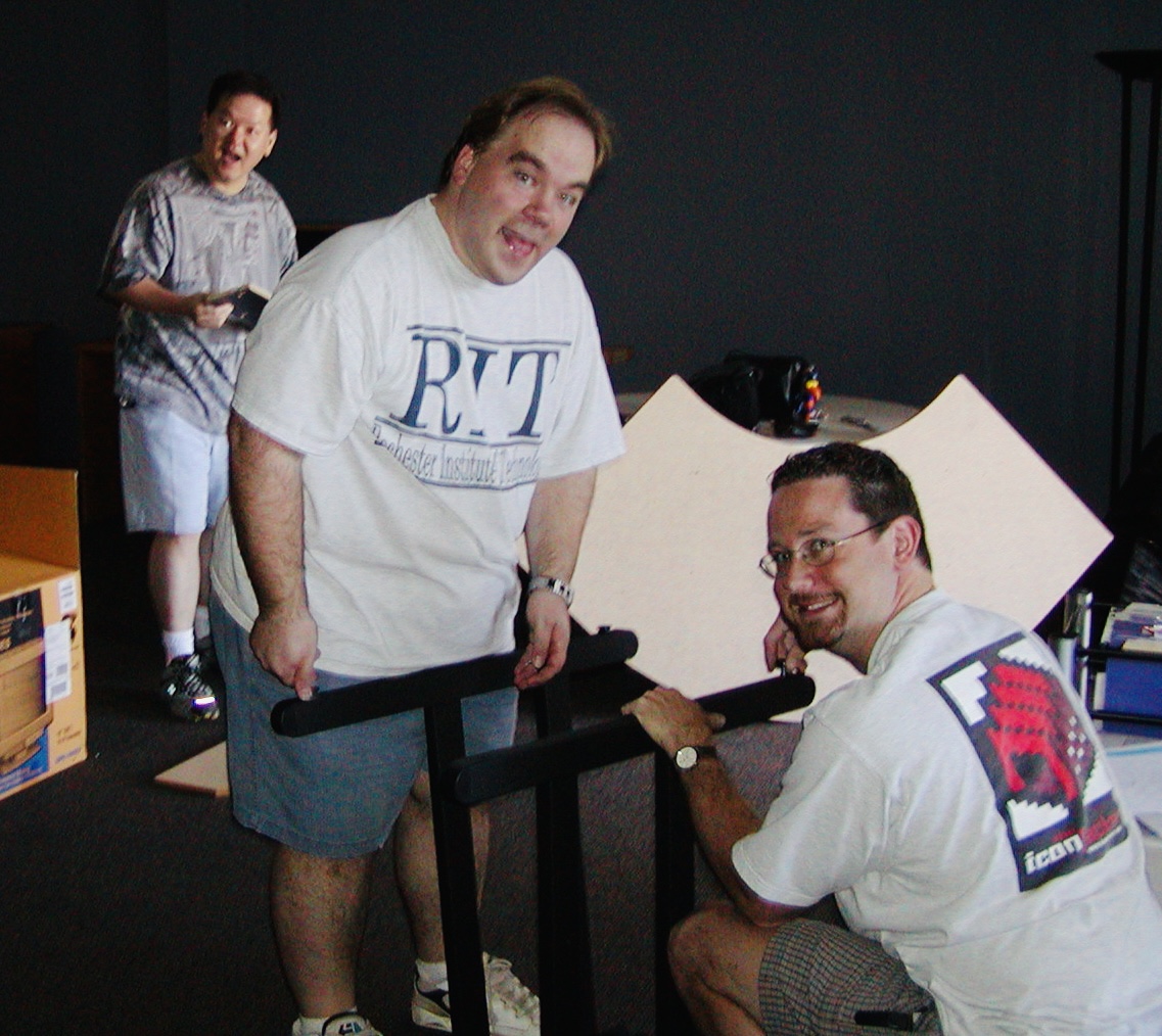
I was just a kid back in 1996 when Talos, Corey and I launched the very first version of the factory. Back then it was hosted on AOL and was where we offered up pixel-clicked icons for the Mac desktop. The rest, as they say, is history.
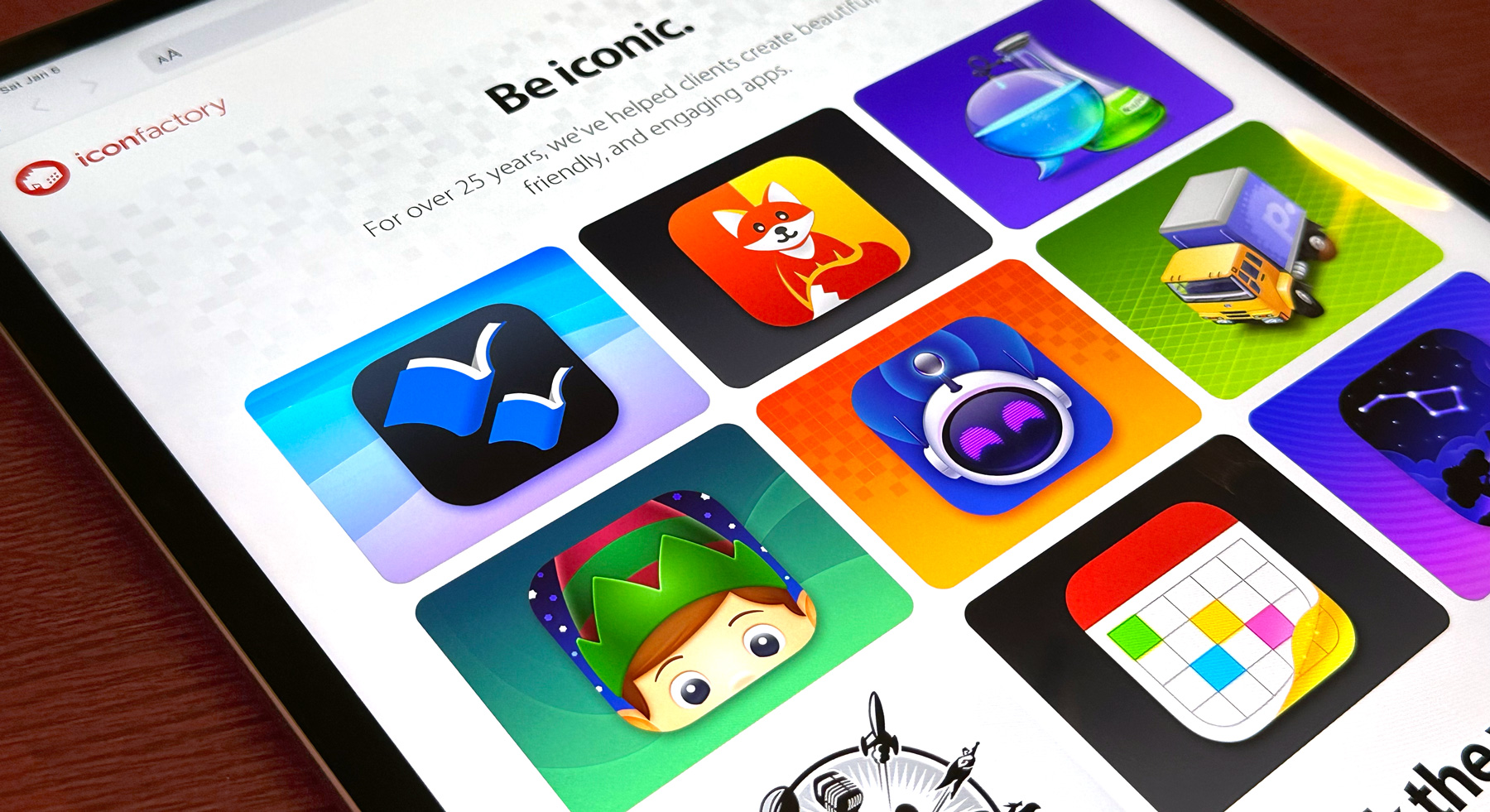
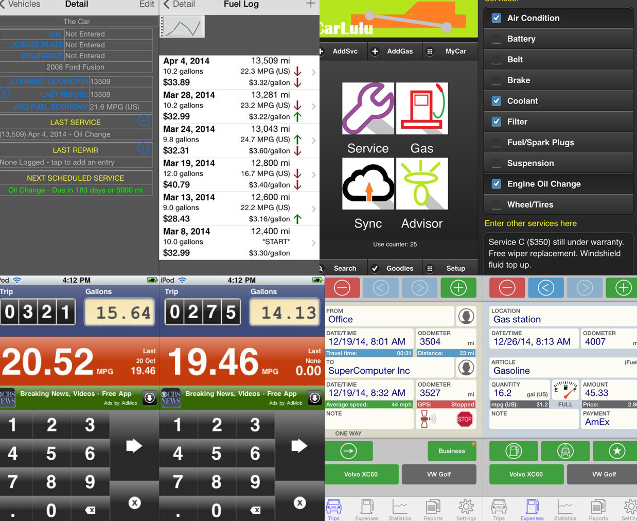
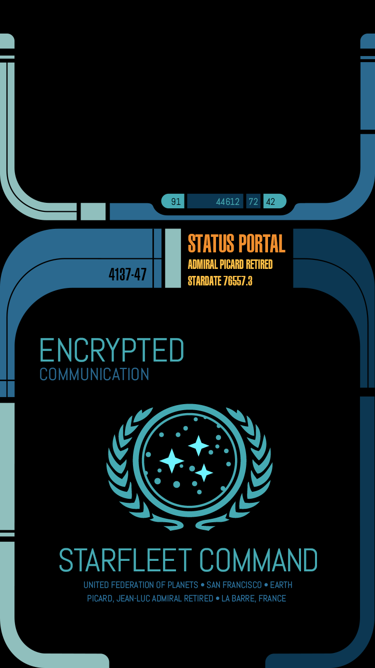
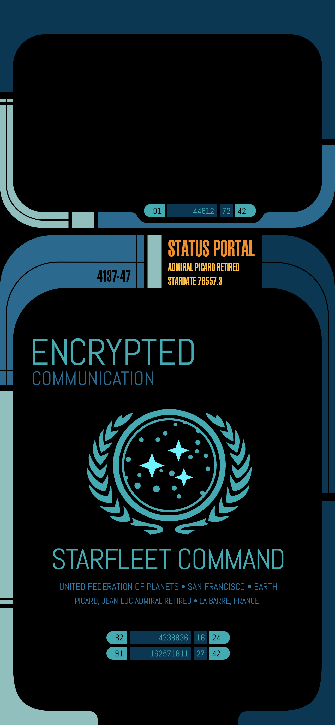
Fast forward to 2023 and we found ourselves behind the eight ball, with an outdated website that didn’t put enough focus on what has kept us in business all these years – paying clients. Freeware icons, wallpapers and software has been our passion but providing top-flight design services for clients has been our bread and butter and it was time for a long-overdue update.
The re-design of iconfactory.com took the better part of a year, working on and off as we balanced design and engineering resources among a half-dozen or so other projects. We started with the single premise of creating a website that showcases our award-winning design services and ran with it. Our goal was to communicate one thing: If you need stunning icon, app, or interface design, we can help.
We also intentionally stripped away any and all marketing speak to keep the language of the new site straightforward and easy to understand. Our amazing Project Manager, Cheryl Cicha deserves full credit – I’m particularly happy with this part as I detest agencies and their tendency to talk circles around clients as they attempt to justify their huge costs.
I took the lead designing both the overall layout as well as the client and app detail views which proved particularly challenging. Creating unique, engaging layouts for all of the portfolio entries, as well as our own flagship apps was difficult, but the result was personally rewarding. My hat’s off to Anthony and Craig for taking the final comps and implementing them so faithfully across both the desktop and responsive mobile versions.
The new Iconfactory was long overdue but hopefully it will become a destination for those who need to bring their digital app ideas to life. Its new design is just the latest in a long line that has changed much over the years, but for the far better. I invite you to visit, explore, become inspired and if you have a need, to get in touch.


