Star Trek LCARS Wallpaper 2021

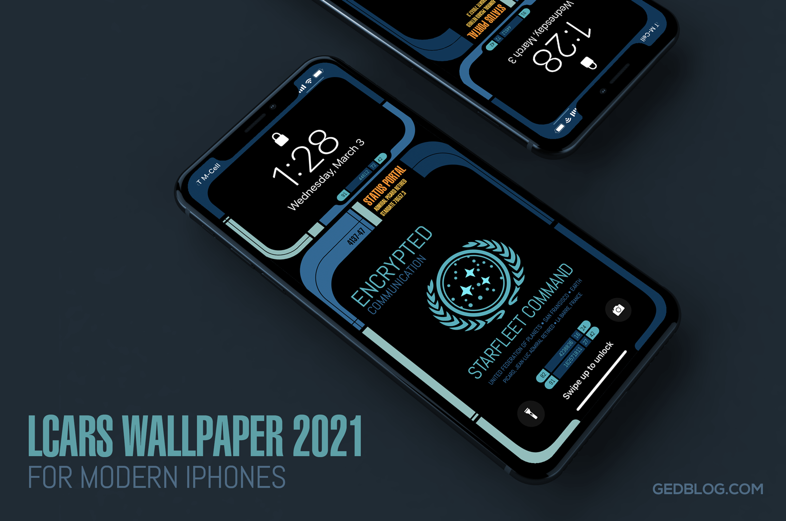
iPhone lock screen showing the Star Trek LCARS 2021 wallpaper

It’s been over six years since I released my original Star Trek LCARS wallpapers for iOS and today I’m happy to report yet another update for all you geeky Trek fans out there.

LCARS 2021 brings Star Trek’s futuristic user interface, designed by Michael Okuda, to modern iPhones. What’s more, I’ve done my best to future proof the wallpapers so when Apple adjusts the position of lock screen elements like the date, time, flashlight and camera buttons the wallpaper will fit properly and still look great with a minimum of setup.

The wallpaper re-design is inspired by Picard, the TV series that debuted last year on CBS All Access (soon become Paramount+). Season 2 of Picard will hopefully debut in late 2021 and so I wanted release this so fans could enjoy it prior to the premiere.

I took visual cues from on-screen elements such as button shapes, typographic refinements and the cooler color palettes seen in the show. The result feels more modern and looks great on the latest iPhones which is sure to put a smile on the face of any Star Trek fan.

I’m providing LCARS 2021 in two downloads that should cover all of the modern iPhone screen aspect ratios available today. There are subtle design differences so be sure to choose the right wall for your particular device:

• iPhone SE, 7, 8 & 9 – Picard LCARS
• iPhone XR, X, 11 & 12 – Picard LCARS

Select the download link of your device above to view it and then tap and hold on the image in Safari to save it to your camera roll. Next, view it in the roll and tap the sharing icon > Use as Wallpaper. Be sure to pinch out on the image and adjust vertical position if needed and finally turn perspective zooming OFF, tap Set and select Set Lock Screen to finish.

Want More?

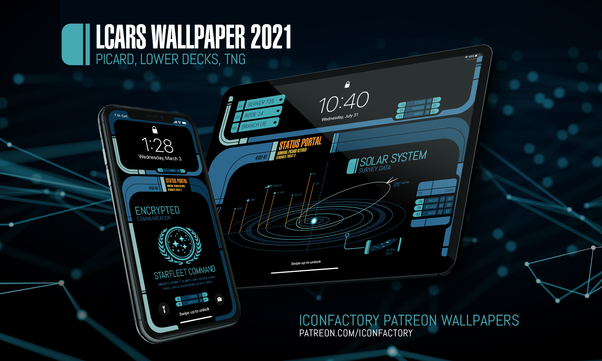
If you’re looking for the full Montgomery Scott, then head on over to the Iconfactory’s Patreon account. When you subscribe to the Superheroes level ($10) a month, you’ll not only get two additional color ways (Next Generation + Star Trek: Lower Decks) of the iPhone wallpaper but you’ll also get snazzy, expanded iPad versions in these three color ways.

iPhone lock screen showing the Star Trek LCARS 2021 wallpaper

The iPad walls also comes with three, fun content variants to help turn your device into that Starfleet PADD you have always dreamt about.

I hope you enjoy these latest and greatest updates both here and over on Patreon. Please consider subscribing if you are inclined, we want to keep making kick-ass wallpapers for years to come and your generous support helps make it so.

Engage and enjoy!
iPhone X Wallpaper Updates

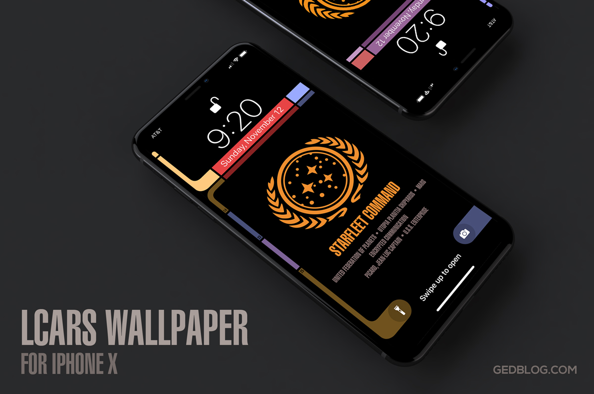
iPhone X lock screen showing the Star Trek LCARS wallpaper

If you’re the proud owner of a slick new iPhone X then I have some good news. I’ve updated three of my lock screen wallpapers for the new device and boy do they look great. The iPhone X’s new OLED screen means blacks are truly black resulting in a stunning appearance for lock screen designs like my popular Star Trek LCARS wallpaper. The design also seamlessly blends with the device’s bezel to create a fun Next Generation feel in your hands. The LCARS lock screen even comes in four variants so there’s lots options to try out.

I’ve also updated my Twin Peaks and Pokéwall wallpapers as well so be sure to check them out too. I’ll probably update the others (Westworld & Cosmos) in time but for now these three updates would make great additions to any iPhone X lock or home screen. Enjoy!

User Interfaces of the Week

picard_firstcontact

We’re less than a week away from Apple’s World Wide Developer Conference where Tim Cook and company will unveil the latest and greatest for OS X, Apple Watch and iOS. No doubt we’ll get a preview of iOS 9 and all it has to offer, but before we move forward, sometimes it’s best to reflect on where we’ve come from. I wish I could say the user interfaces featured here were but a distant App Store memory, but alas they all come from currently-shipping apps.

A few weeks ago I went looking for a well designed gas / milage tracking app in the App Store. I’ve been using Gas Cubby for years, but wanted something new to help me keep track of MPG with my new Ford C-MAX Energi plug-in hybrid. From my own experience, I knew that doing a general search in the App Store tends to yield less than optimum results. Even so, I just wasn’t prepared for the sloppy approach many of these apps tried to pass off as user interface design.

Being a UI designer myself, I have surrounded myself in my professional and digital life with talented designers and developers who consistently release top-notch apps. The problem with living in a bubble of roses is you sometimes forget what the real world smells like. As I paged through dozens of these milage trackers I was reminded just how many apps on the store are basically junk. Over at Daring Fireball, John Gruber has a recurring piece he calls “User interface of the Week” where he highlights some of the worst cases of user interface “design” he’s encountered. I don’t feel right calling these apps out by name, but if any apps deserved John’s moniker, these sure do.

Seeing what often passes for acceptable design in the App Store often reminds me of all the hard work that goes into creating my own well designed and executed apps. So many people think software just grows on trees, but it doesn’t. Designing and building best-in-class software requires a depth of knowledge and experience that a relative few possess.

I can’t wait to see what WWDC has in store for the future of my favorite software platforms. I’m hoping Apple inspires an entire new group of developers to strive for excellence and bring users apps that are truly worthy of these wonderful, futuristic devices. As for my milage tracker quest, I finally settled on Road Trip. It’s a bit more complex than I would like, but so far, so good.

You Will Adapt Your User Interfaces to Service Us!

picard_firstcontact

Everywhere you look, more and more people feel they are entitled to something they’re not. I and others have written about the obscene level of entitlement some users feel is owed them when they download apps from the App Store, and to be sure this is still a huge problem today. Lately however, I’ve been observing another form of app entitlement and honestly, it has got to stop – iPhone 6 Plus users who think all interfaces should be designed to both fit their jumbo phones AND still allow one-handed use.

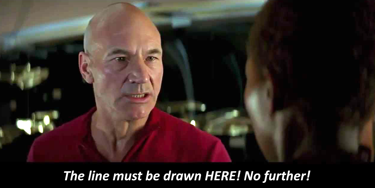
When Apple introduced the iPhone 6 Plus and it’s enormous 5.5″ screen, it clearly filled a much-needed gap in the iOS universe. Users had been clamoring for more screen real estate for years and when it finally arrived, they rejoiced. Over time however, these users have developed a sense of entitlement that the apps they run should place all controls at or near the bottom of the screen where they can be reached by the thumb. Sorry, but like Captain Picard in First Contact, I’m drawing a line in the proverbial sand. No, iPhone 6 Plus users don’t get to dictate interface design for the rest of us.

Like it or not, buttons at the top of the screen are not going away any time soon. Developers need every bit of screen real estate to logically lay out controls consistently across a host of device ranges and configurations. From the tiny iPhone 4 to the popular iPhone 6 and the iPad there’s a method to our madness. It might seem like a great idea if every single button, tab, actionable element and control were within thumb’s reach, but that simply isn’t possible, nor is it actually desirable.

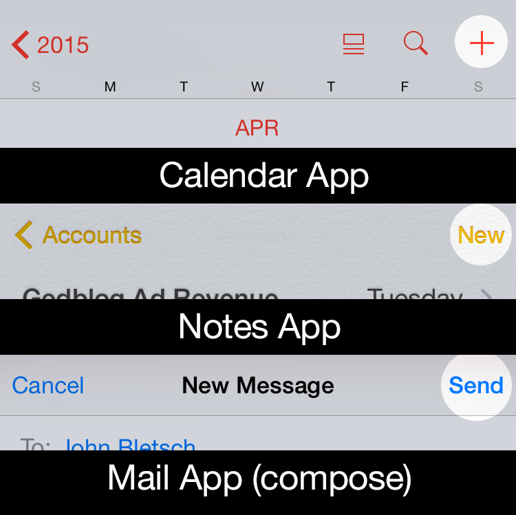
When Apple developed iOS, the experts charged with designing its interface laid out regions of the iOS screen for specific interactions. Since the entire navigation stack generally flows from left (where you were) to right (where you are going), the button for closing or going back a level is at the upper left. Creation of new content or taking action on that content, like adding a calendar event or sending an email or a tweet, is usually found at the upper right. Tab controls can be either at the top or the bottom, though generally they are usually found at the bottom. In this way, a user who picks up an iPhone 4 has a reasonable expectation that similar types of controls will appear in similar places when she picks up an iPhone 6 Plus. This helps maintain usability and UI consistency for all apps, not just those that run on jumbo phones.

screencontrols

There are ways that developers can help facilitate one-handed use when it’s appropriate. The swipe to go back gesture is a great innovation Apple introduced back in iOS 7 and is a thumb-saver on larger phones. Many apps no longer require you to reach up and tap “Back” to go back, you can simply swipe from the left edge of the screen to navigate back one level. Apple also implemented Reachability (double tap the Home button to lower the entire screen temporarily) to help reach interface elements at or near the top of the screen. But for some users, these gestures are simply not enough. The thing they forget is that by opting for a large device they gained a huge, highly readable screen but they also sacrificed some level of UI convenience. iPad users have been dealing with this trade-off for years, that’s the nature of the beast, like it or not.

When I first heard about the rumored existence of the iPhone 6 Plus and its huge screen, I wondered how Apple would reconcile its long-held tenet that one-handed use reigned supreme with that of it’s upcoming larger device. Apple even built an entire marketing campaign around the advantages of smaller iPhones vs their larger Android counterparts. But when the Plus was released, Apple quickly abandoned that philosophy in order to sell millions of 6 and 6 Plus’. Funny how that happened.

The problem with these users is that they often think like the Borg – they want the best of both worlds – larger screens and an interface that lets them use every app one-handed. As someone who designs for the screen, I’m here to tell them that until humans evolve longer thumbs that simply isn’t possible. At some point (iOS 10?) Apple may come up with a completely new interface paradigm for iOS, but in the meantime it’s best if they start dealing with reality. Whether it’s assimilating Starfleet personnel or playing with your apps, sometimes you just need to use two hands.

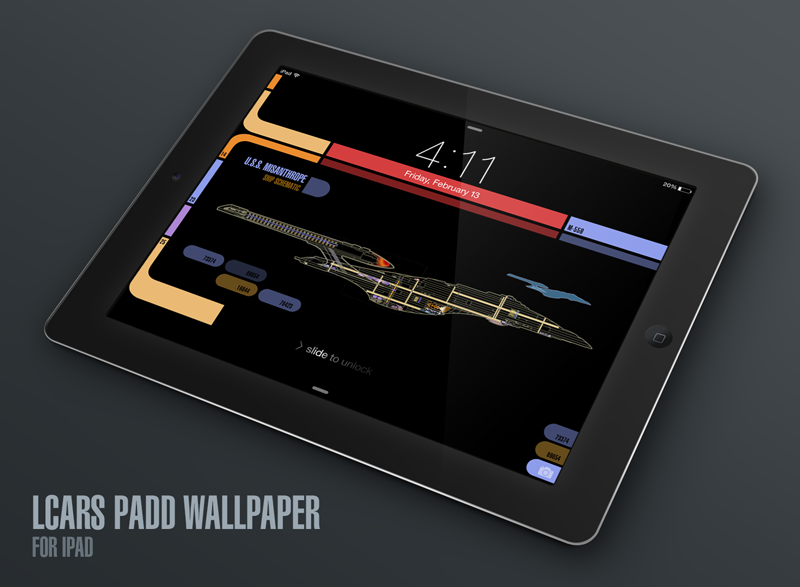
Star Trek: Next Gen Wallpapers for iPad

iPad_LCARS_Hero

A few months ago I released several iPhone wallpapers that Star Trek fans have really been enjoying. The response to these LCARS-style graphics was tremendous and almost immediately I started receiving requests for iPad versions of them. The problem was there’s no way to design a square LCARS wallpaper that works both in portrait and landscape mode on the iPad. All of the major elements on-screen (the time, date, slide to unlock & camera icon) are positioned differently when you rotate your device.

A big part of the charm of the iPhone LCARS wallpapers is that the iOS elements flow right into the design and become part of it, but this just isn’t possible to do with a single image for iPad. The solution was to not even try and to design separate wallpapers that can be used in either landscape or portrait, not both. The result is the landscape Next Gen iPad versions I’ve created here. I may create portrait versions at some point, but the majority of iPad owners use the device in landscape mode primarily so that’s what I went with.

I’ve been a huge fan of Star Trek Production Designer, Michael Okuda since day one and like the iPhone versions, this project is my ongoing way of saying “Thank you!” for the wonderful, futuristic operating system that Next Gen fans know and love as LCARS. With these new iPad versions, you can definitely feel like you’re using a real Next Gen PADD when you unlock your tablet, it’s super fun!

How to download and apply the wallpapers on iOS 8:

1) Click to view the version of the iPad wallpaper you like best:

• iPad landscape – Original / TNG Colors
• iPad Pro landscape – Original / TNG Colors
• iPad landscape (Starship Schematic) – Original / TNG Colors
• iPad Pro landscape (Starship Schematic) – Original / TNG Colors

2) Tap & hold on the image in mobile Safari & save it to your photo library

3) Open Photos, view the image then tap the Share button in the lower left

4) In the Share menu tap Use as Wallpaper

5) Pinch Zoom OUT on the image to size it exactly to the screen

6) Turn Perspective Zoom OFF

7) Position the image so the Lock Screen’s date line is centered inside the thinner, red upper bar

8) Tap Set > Set Lock Screen

That’s it! Sleep/lock your iPad and the next time you activate it, you can pretend you’re Captain Picard himself receiving an important message from Starfeet Command. I hope you enjoy this fun treat & help spread the word via Twitter and Facebook.

Be sure to visit my Goodies page to download other fun desktop wallpapers for iPhone, iPad & Mac. Engage and enjoy!

UPDATE: Added new sizes of both variants of the LCARS lock screen for the new iPad Pro.

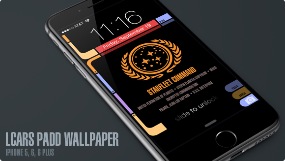
Star Trek: Next Gen Wallpapers for iPhone 6

UPDATE: Four new variants have been created for Apple’s new iPhone X. The device’s OLED screen means the LCARS design blends seamlessly into the bezel like never before. So much fun!

If you enjoy Star Trek as much as I do then you’ll love these free, Next Generation mobile wallpapers I designed for use with iOS. I’ve updated my original LCARS Star Trek lock screen for the brand new iPhone 6 and 6 Plus so you can be the geeky envy of all your friends. For those of you still running the smaller iPhone 5, don’t worry, there’s even a version here for you!

I’ve been a huge fan of Star Trek Production Designer, Michael Okuda since day one and this project was my way of saying “Thank you!” for the wonderful, futuristic operating system that Next Gen fans know and love as LCARS. With the iPhone 6 Plus approaching the size of actual padds from Next Gen, it only made sense to bring this amazing aesthetic to the palm of our hands.

How to download and apply the wallpapers on iOS:

1) Click to view the wallpaper that best fits your device:

• iPhone 5 Series (iOS 8 & 9) – Original / TNG Colors / Janeway Alt / Janeway TNG
• iPhone 6 (iOS 8 & 9) – Original / TNG Colors / Janeway Alt / Janeway TNG
• iPhone 6 Plus (iOS 8 & 9) – Original / TNG Colors / Janeway Alt / Janeway TNG
• iPhone SE Series (iOS 10) – Original / TNG Colors / Janeway Alt / Janeway TNG
• iPhone 7 (iOS 10) – Original / TNG Colors / Janeway Alt / Janeway TNG
• iPhone X (iOS 11) – Original / TNG Colors / Janeway Alt / Janeway TNG
• iPhone Xs Max (iOS 12) – Original / TNG Colors / Janeway Alt / Janeway TNG

• Windows Phone – Original / TNG Colors
I don’t own a Windows Phone and make no promises about how this version will work for you. These are provided as is!

2) Tap & hold on the image in mobile Safari & save it to your photo library

3) Open Photos, view the image then tap the Share button in the lower left

4) Scroll to the right in the Share menu and tap Use as Wallpaper

5) Pinch Zoom OUT on the image to size it exactly to the screen. You want the date to be vertically centered within the sub-horizontal bar near the top.

6) Turn Perspective Zoom OFF

7) Tap Set > Set Lock Screen

That’s it! Sleep/lock your iPhone and the next time you activate it, you can pretend you’re Captain Picard himself receiving an important message from Starfeet Command. I hope you enjoy this fun treat & help spread the word via Twitter and Facebook. Engage and enjoy!

UPDATE: I’ve added 6 new variants of the lock screen for iPhone after a request from @keydiehhurst. Available in both original and TNG color schemes, these variants address the communique to fearless Captain Kathryn Janeway in the Delta Quadrant. Safe journey, Captain!

UPDATE 2: I’ve added 8 new iPhone SE & 7 variants for use with iOS 10. The lock screen in iOS 10 has moved controls around so the wallpaper had to change to accommodate the new design. Hope to add iPhone 7 Plus variants soon.

UPDATE 3: I’ve added 4 new iPhone X variants for use with iOS 11. The lock screen in iOS 11 puts controls in a different place plus the tall format of the iPhone X means the wallpaper had to change to accommodate the new design.

UPDATE 4: I’ve added 4 new iPhone Xs Max variants for use with iOS 12. This iPhone is freakin’ huge so the placement of the controls, date bar and message block all had to be adjusted again. The Max is about the size of a small TNG PADD!

The User Interfaces of Oblivion

As an UI designer, I love seeing what artists come up with for fictional user interfaces. I’ve admired the work talented folks like Jayse Hansen has done for films like Iron Man and the Avengers for some time and secretly longed to do this kind of work. The latest work from Joseph Kosinski and Crater Lake Productions for the film Oblivion is pure magic. The level of detail, both animated and static, is staggering. I hadn’t intended to see Oblivion in the theater, but after seeing this wonderful work I just might. If you want to learn more, head over to GMUNK and check out their process.