Super Tribes for iOS Walkthrough Plus Tips + Tricks

I’ve never actually done a video walkthrough of a mobile game before so this is new territory for me. As such, this review of the fun, turn-based iOS game Super Tribes is a bit longer than it probably should be but I’m still learning so go easy on me! My friend @Bigzaphod turned me onto Super Tribes and I’ve been playing it on and off for about a week. It’s really fun, light and doesn’t suck a huge amount of time which is perfect.

The best part about Super Tribes is that the game length is fixed to 30 individual turns which means a typical game can last anywhere from 20 minutes to about an hour and that’s it. You play against the AI, not other people or friends. Depending on your style of gaming this may be a plus or minus to you, but I personally enjoy it. There’s tons of stuff I didn’t cover in the walkthrough but what I do cover should be enough to get you up and exploring the flat, grid-shaped world of Super Tribes in no time.

The game is free to play in the App Store, but if you do try it and like it, I beg you to purchase at least one of the in-app tribe packs to help support the developer. Games of this quality take thousands of hours to design, produce, test and deploy and we want them to continue making them, they need to eat. That’s all I’m saying. Enjoy!

How to Get Sh*t-Faced Watching SyFy’s ‘Faceoff’

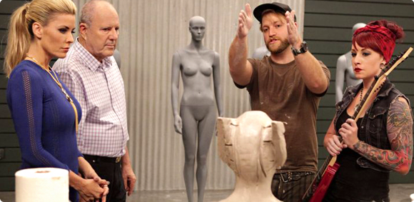
I admit to loving the SyFy network’s makeup reality show Faceoff. Budding young artists square off against each other each week to try and create the most elaborate, fantastic and convincing characters they can. In the last few seasons however, Faceoff has slipped into a formulaic approach where we repeatedly experience the same tropes over and over again.

It’s gotten so bad I started thinking it might actually make a great drinking game. I’m not a drinking man by nature, but if I was, a Faceoff Drinking Game would get me shit-faced (see what I did there?) super-quick. Next time you host a party and want to get sloshed with your friends, cue up any episode of Faceoff and drink whenever you spy any of the show’s oh-so-familiar trappings. You might even get drunk enough not to care that SyFy cancelled Jim Henson’s Creature Shop Challenge. 🙁

• A contestant is “excited” about this week’s Spotlight Challenge

• Two contestants who don’t work well together, naturally get paired up

• One person on a team strongly disagrees with the design direction of the other but is too timid to say anything until it’s too late

• Contestant’s makeup specialty is the very subject of this week’s challenge – zombies, vampires, steampunk, etc. (this person usually ends up being the one to go home)

• A contestant doesn’t have a “clear idea” for the direction of their makeup

• Contestant listens to sage advice from makeup master, Michael Westmore, but decides to ignore it and proceed with their own poorly designed creation

• Contestant uses a material / process they have little or no experience with

• One of the contestant’s molds “gets stuck” (take a bonus shot if said contestant starts crying on camera)

• Stuck mold miraculously freed in the last few minutes of day 2

• One of the models has an allergic reaction to a material used in their makeup

• Contestant leaves painting until Last Looks

Glenn Hetrick’s outfit is especially goth/vampire/over the top

• One of the judges complains about the poor asymmetry of a makeup

• One of the judges points out a contestant’s makeup has little or nothing to do with this week’s challenge

• The rest of the contestants give out a collective sign of “Oh no!” when they find out which one of their talent-less peers is going home this week

UPDATED: Reader Ross Crabtree sent in some additional suggestions for our little Faceoff drinking game and they were just too good not to post, so here they are. Thanks Ross!

• Anytime Fun Fur is used in a makeup

• A contestant talks about how there are certain they are going home this week

• A contestant gushes about how they are a big fan of a guest judge

• A Contestant’s makeup appliance has a tear that needs to be repaired

• A contestant decided to not use a mold because they are running out of time

1 Comment

Go Buy Monument Valley. Now.

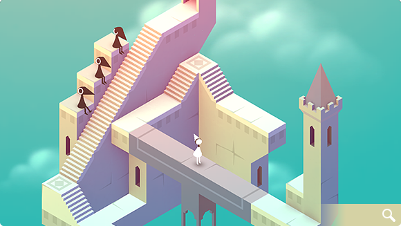
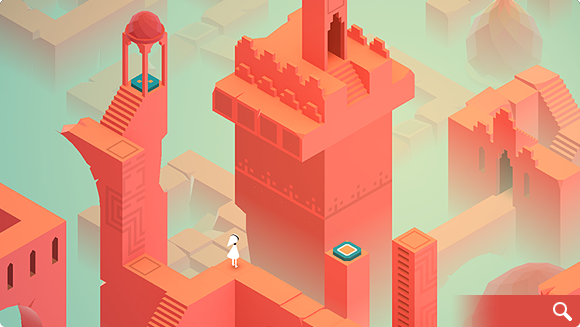
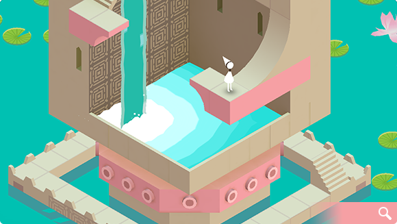
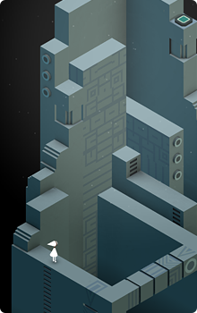
Chances are you’ve probably already heard all about the stunning new game from developer ustwo – Monument Valley that was released today. If the game is new to you, then let’s just clear the air right now – go buy it on the app store for your iOS device. Now. This is one of those instances where a piece of software is so stunningly beautiful, and provides such an incredibly rich experience, you’re really missing something if you take a pass. Here are just some of the things you’ll see in this amazing casual puzzler:

There’s a great deal to love in Monument Valley. From it’s rich, varied color palettes that change from level to level, to the extremely clever, M.C. Escher-like design of its levels, to the gorgeous soundtrack and audio effects, Monument Valley delivers at every turn. From the moment you start to play, it’s obvious how much love and attention the folks at ustwo have put into their creation. They’ve managed to design a complete gaming experience and bring it to you via the App Store for a minimal price. Too often games these days are filled with in-app purchases that prey on instant gratification to keep players interested. Monument Valley eschews all that in favor of creating a compelling, finite and beautiful environment for you to get lost in for a few hours of your life. The last few levels in particular are wildly inventive and especially challenging.

If you’ve read the reviews, then you probably know that Monument Valley’s play time is short. It took me a total of about 3 hours (off and on) from start to finish to complete all of the levels, and for some, that length may be a deal breaker. If you feel that way I have news for you – many awesome things in life are short but that doesn’t make them any less worthy of your time or money. You’ll probably spend more on your next meal out than you would on Monument Valley but that doesn’t mean you can’t enjoy both while they last. The game creators have said they focused on making a concise title that can be completed in a short amount of time on purpose. While this may be true, it doesn’t really matter to me because I know if the game is a success (which I certainly hope it is) then we’ll probably be seeing a great deal more of the mystical world of Monument Valley. Show your support of their efforts to bring you something wonderful and head over to the App Store and buy it, gift it and help spread the word by leaving a review today.

3 Comments

Lost Cities Tips & Tricks

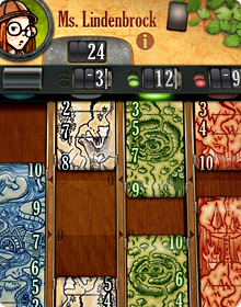
Lost Cities is a new game for iPhone from TheCodingMonkeys, publishers of the hugely popular Carcassonne. Based on the award winning card game by Reiner Knizia, Lost Cities takes elements of solitaire and combines them with vibes of Uno and Go Fish into a compelling game for two people or a single player vs any one of four AI opponents.
The game is easy to learn (I won’t go into the full rules here) thanks to the wonderful spoken in-game tutorials, but the basic object is to score points by playing cards of increasing value in any one of five, colored channels. Whichever player has the most points when all the cards from the draw pile have been played, wins. Since the Iconfactory did much of the graphical work for Lost Cities, I was generously given early access to the pre-release and have been playing a great deal this past week. I’ve learned a lot in that time and I wanted to share some of the insights I’ve had with would-be challengers.

Practice Against the AI

It may seem straight forward but playing the various computer opponents is a great way to get a feel for Lost Cities. Playing the AI means the game proceeds quickly since you don’t have to wait for a human friend to move. Getting into a rhythm in LC really helps you to understand how points are scored, cards are held or discarded and what to watch for.

Watch the Draw Pile

The game continues only as long as there are cards to draw so keep a close eye on the number of cards left in the pile in the lower right of the interface. When that number reaches zero, the game is over so it’s important to know how many turns are left. Don’t wait until the last few turns to play your big cards if you can help it. Also, remember that the number of turns is just about one half of the number of cards left in the deck. It’s easy to look at 18 on the deck and think you have that many turns left, but you really don’t, you have approximately 9!

Ditch the 2’s and 3’s

Unless you’re trying to make a run and score 8+ cards in a channel, you might want to start a channel with a 4 or even a 5. Low cards don’t yield many points anyway and probably won’t make a huge difference in the final outcome. This isn’t always the case of course, but games can easily be won by just playing the higher number cards alone.

Remember to Look Up

It’s easy to get so focused on what cards you have in your own hand that you forget to pay attention to what your opponent is doing. You’re not the only one at the table who has a strategy! Don’t forget to pay attention to what cards she is pulling from the discard piles or what color channels they seem to be favoring. You may be holding some great cards, but always remember Lost Cities isn’t just about scoring your own points, but also trying to block your opponent’s as well.

The Nitty Gritty

Don’t forget that you can re-draw from the discard pile if a card you previously got rid of is now needed. This can come in quite handy when cards of certain colors start to present themselves. Also, listen for the audio cues in the game like the little “tink” sound that lets you know a channel has just crossed the boundary from negative to positive point totals. Lastly, when playing the AI, don’t forget you can pause at any time and take a break. Maybe a refreshing drink or walk around the block will clear your head and help you crush Ms. Lindenbrock.

I love games like Carcassonne and Lost Cities because they combine elements of skill and luck in fun and engaging ways. They are also played at your own pace which is wonderful, especially in the age of first-person shooters and nerve-wracking puzzlers. TheCodingMonkeys have gone above and beyond to make Lost Cities both addictive and fun to play. It takes all of the best elements of Reiner Knizia’s original card game and adds wonderful features like automatic score keeping, tough AI opponents, beautifully rich graphics and and soundtrack that feels like it belongs in the cinema instead of a game. If you enjoy turn-based strategy or card games, I urge you to check out Lost Cities for the iPhone today. Enjoy!

All-Aboard for Tricky Tracks

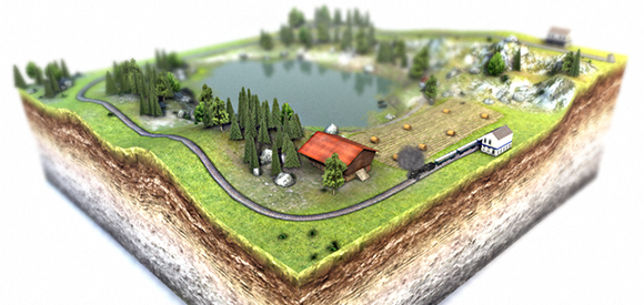
Tricky Tracks is a stunningly beautiful and deceptively simple web-based game by Maxomedia Design Agency. If you’ve ever played with toy train sets, love building things out of LEGO bricks, or just appreciate beautiful game design, Tricky Tracks is for you. Sponsored by the SBB Swiss Federal Railway, the game’s 15 levels are broken up into groups or “boxes” of tracks, each set on gorgeous, 3D wedges of the Swiss countryside.

The object of the game is simple – Get your passenger train from station A to station B. You do this by simply pulling a pinball-style plunger in the upper-right corner of the browser window. Pull with too little force and your train won’t reach the other station. Pull too hard and your train along with all its passengers will fly right off the tracks in a spectacular wreck (yes, I’ve done this intentionally just to see what would happen). Points are awarded based on how many attempts it takes to complete a level, total time spent and special bonuses in the form of achievements that you rack up along the way.

As you progress through the beautifully rendered levels, you’ll encounter ever more difficult challenges such as railroad switches, car crossings, tunnels and steep inclines. Both the timing and power of your shot has to be perfect if your tiny train is to make it safely from one side of the level to the other. The game play is highly addictive, but for my money, the best part of Tricky Tracks are the visuals. From the moment the game loads, you know you are in for a special experience. The user interface is classic Swiss design – simple and elegant. The camera controls are easy to master and give you a soaring view of the tiny hills, valleys and towns that you’ll be visiting while you play.

I’m told that many of the locations used in the game are based on actual places in Switzerland, which after playing, just makes me want to ride the Swiss Railway even more. The scenes are gorgeous and the extremely narrow depth of focus is reminiscent of tilt-shift photography which enhances the illusion of playing with toy trains. Some levels like Genhimmelen (seen left) seem impossibly difficult, but with enough persistence and a little luck, you’ll be pulling into stations perched high atop mountain cliffs and braving pesky downtown traffic jams like a real pro.

Tricky Tracks makes use of the Unity 3D Web Player plug-in so you’ll need to download and install it for your favorite web browser before you can play. I’m not sure of the minimum system requirements, but I ran Tricky Tracks on my Core i7 iMac with 8Gb of RAM and the game played fine, at least until the last few levels. The complexity of the maps in the 3rd box of levels seemed to make camera rotation a bit jerky, but it was still very playable.

Perhaps the very best part of this wonderful effort is that Tricky Tracks is absolutely free to play. All of the initial 15 levels are included on the game’s website with the promise of a new box of 5 more “coming soon”. It took me about 2 hours to play through every level but it could probably be done in less time. Admittedly, I spent a much of my time enraptured with the look of each level. From the bright, overwhelming city lights of Knetikon (seen right) to the miniature majesty of Chateau Obersbach and the picturesque sea-side town of Sunnikon, the visual wonders in Tricky Tracks delight the eye and bring out the kid in all of us. I can’t wait to see what other challenges the game’s designers have in store, but in the meantime steam on over and give Tricky Tracks a go today. You won’t be disappointed.

1 Comment

Ski Safari: 007 Edition

Lately I’ve been playing a great deal of Ski Safari, a wonderful casual game from Defiant Development for iOS. The game is a high score climber similar to the awesome Tiny Wings, in which you play play Sven, a skier trying to stay ahead of an ever-approaching avalanche. The object of the game is to simply get as far as possible, picking up coins, speed boosts and various forms of animals like penguins and even Yeti’s in a high-paced race to stay alive. Developers Brendan Watts & Shawn Eustace have done a marvelous job of making Ski Safari fun, addictive and immensely satisfying to play. I have a bit of a competition going on with a few of my friends as we play a high-stakes game of one-upmanship on the snowy slopes of the high Alps.

The game is pretty awesome as it’s designed, but I recently discovered I could make amp up the coolness by a factor of 10 or so simply by turning off the default music in the game and substituting my own action-packed soundtrack. And what soundtracks are best suited for racing down snow-covered mountains at breakneck speeds? Why none other than the ultimate spy, James Bond, of course! If you own any of theme tracks from the James Bond films, simply start them playing on loop and then turn off the in-game music to give yourself the ultimate action sequence experience. I’ve found that “Runaway” from Roger Moore’s For Your Eyes Only and “Bond 77” from The Spy Who Loved Me, are the perfect Ski Safari tracks, but your death-defying milage may vary.

Maybe the developers of Ski Safari will eventually see fit to make a James Bond-esque version of their game complete with bad guys on black snowmobiles, machine guns and deadly helicopters chasing you, but until they do, this is the next next best thing. Have fun and do try and come back in one piece, 007!

1 Comment

Charadium II, I Love You!

There are only a handful of games on my iDevices that have withstood the test of time and clung to my home screen. Some of these games include Carcassonne, Plants vs. Zombies, Orba, Tiny Wings and now Charadium II. Charadium is a classic Pictionary type game where players take turns drawing a word and guessing each other’s creations for points. There are a bunch of games of this genre in the App Store, but Charadium is far and away the best of breed I’ve played, and much of that is due to the attention to detail developer On5 has put into the app.

There are two main modes of play, Classic and Ping Pong. Classic lets you join a room with other random players or friends and compete in a round-robin, timed competition to guess words. The play is fast and furious and tons of fun. Drawings don’t have to be pretty they just need to communicate quickly. The faster someone guesses your word, the more points you will score. The other mode, Ping Pong, is my favorite when playing Charadium. Here you play with a friend and take turns drawing words from a list of three choices (easy, medium and hard). The harder the concept to draw, the more points you’ll net, but you also risk your opponent not guessing correctly at all. Incorrect guesses hurt your overall point total and can push your opponent to victory. I love Ping Pong games because they are not timed, you can play multiple games at once (like Carcassonne), and you get to choose the difficulty of the word to draw. Also, you’re not usually playing against random strangers so cheating (drawing words) is not an issue.

On5 makes a free and paid version of the app so you really have no excuse not to give it a try. Of course even the $2.99 iPad version is well worth the price and gives players full access to fun extras like more colors, more brushes and of course, no in-app advertising. This is a similar model we use at the Iconfactory for Twitterrific and it really is the best of both worlds. Charadium is also a great example of an app that improves measurably with each new update. In recent point releases, the game has added new brushes, new colors, the ability to play back all drawings (LOVE THIS), saving drawings to the camera roll and much more. There are still a few features I hope On5 adds like a paint bucket to quickly fill large areas with color, and a “Redo” command as well as undo, but overall the game play can’t be beat. Perhaps the App’s biggest failing, if there is one, is the need for greater stability. Ping Pong games sometimes get stuck and won’t advance, drawing previews are not always available or in-game chatting won’t dismiss. If the developers can find a way to make Charadium a bit more reliable, it would become one of my all-time favorite games for iOS.

If you love to draw, are looking for a fun, social game you can play in your spare time or like seeing how other players solve visual problems, Charadium II is for you. I enjoyed the game so much I bought a Cosmonaut Stylus from Studio Neat for my iPad just so I could draw better while playing. No matter what your level of artistic skill, there’s something for everyone to love in Charadium. Check it out!

13 Comments

Tiny Wings: Tips & Tricks

Tiny Wings is an iOS game for the iPhone and iPod touch by programmer and artist Andreas Illiger. When it was released in February of 2011, it immediately earned praise as one of the most fun and addictive games to ever hit the App Store. Being a developer of iOS games myself, I’m always skeptical about such claims, but after having spent some quality time with Tiny Wings over the past few weeks, I have to say I agree.

The game is not without some level of frustration which is made worse by the fact that there is but a single interaction method – Touch the screen or don’t. Given such simple controls you’d think the game would be easy to master. Not so. The player slides over hills and vales and either taps to increase their decent or lets up to slow their decent to the ground. Where they land on a slope depends on how well they slide up the next hill and back into the air once again. Tiny Wings is a “height climber” style game ala Doodle Jump where the player tries to get as far as they can in a single session. When the game ends, the player must return all the way to the beginning and start over. The great thing about Tiny Wings is that it’s so engaging and addictive you really don’t mind starting over each time.

By far the greatest challenge in Tiny Wings is mastering the art of sliding. In order to succeed in the game, you’ll need to practice and become really good at hitting just the proper point on hills in order to achieve maximum momentum. Learning this skill can be tricky and when I first started playing I was so frustrated I was minutes away from deleting the game. Trust me when I say stick with it because once you figure out how to slide properly, the entire game’s fun quotient gets amped up by a factor of x1000.

Each hill has a small landing window on the backside that you can hit which results in a perfect slide. This keeps your momentum going and if you stack three perfect slides in a row, you’ll enter fever mode where every point you earn is doubled. Mastering perfect slides is key to climbing the leader boards in Tiny Wings. The more perfect slides you make in a game, the faster you’ll go, the more likely you’ll be to touch the clouds (bonus points) and the longer you’ll be in fever mode. All of these factors add up and when combined with coin collection, result in a higher final score.

In addition to mastering perfect slides, there are a few tips and tricks I’ve learned that may help you get further and score higher in Tiny Wings. As with anything, your milage may vary but as School House Rock taught me, knowledge is power, so here you go:

Nest Up – Take time early on and knock off some of the game’s achievements in order to “Nest Up” to the next level. Every time you increase your nest level you increase your score multiplier. For the first upgrade, you will need to perform 7 Perfect Slides, gather 100 coins in total across all games, and reach the fourth island in at least one game.

Touch the Sky – Try and touch the sky as often as you can because doing so earns you 20 points times your multiplier. Each touch represents an ever-increasing award of bonus points towards your final tally.

Reset Button – If you don’t leave the first island in fever mode, start over. In fact, if I’m not in fever mode one half way through the first island I usually kill my game and begin again. Since you’re so close to the start you don’t lose a lot of time for trying this technique. Trust me, you’ll be glad you did.

Play on an iPad – If you own an iPad I urge you to play on it instead of the iPhone. As of this writing, the game isn’t universal but it doesn’t matter. The iPad’s large, roomy screen makes seeing the oncoming terrain much easier and gives you plenty of space to place your finger that’s out of the way.

The main thing to remember when playing Tiny Wings is to try and stay calm and remain focused. If you miss a slide and start to lose momentum don’t panic just keep at it and get back into the groove as quickly as you can. If you spot a speed coin, gobble it up to quickly get air back under your wings and get going again.

All in all, Tiny Wings is a masterful creation that is sure to give you hours of entertainment and enjoyment. I have to hand it to Illiger because there aren’t many iPhone games that hang around on my home screen for more than a few days. Tiny Wings has joined Parachute Panic, Orba, Plants vs Zombies, Hot Plates and Carcassonne as one of my all-time favorite iOS games. Have fun and fly far my tiny-winged friends!

2 Comments

The Music of Ramp Champ

For designers and artists, the chance to collaborate with others who share your passion for creation is a wonderful event. Ideas feed off of each other and lead to new connections which can both surprise and delight. Such was the case while scoring Ramp Champ, the Iconfactory’s & DS Media Labs’ ode to the classic games of Skee-Ball and pinball for the iPhone. I’m pleased to report the game’s soundtrack was recently released on iTunes, something none of us at the factory could have dreamt of happening.

When we originally designed the game’s ramps, we knew we wanted the quality of the music to match the fidelity of the visual elements. Having a generic track repeat itself across multiple ramps, from outer space to under water, wasn’t going to be fun for the player. During the initial production phase of Ramp Champ, composer Noe Ruiz took the lead and created many of the tracks for the default levels such as Clown Town, Breakwater Bay and Space Swarm. Noe has a wonderful ear for rhythm and was able to incorporate these into the widely varied themes with ease. Of all the tracks he originally produced for Ramp Champ, Space Swarm (along with it’s dance and techno re-mixes) has to be my favorite of the bunch. Space Swarm is filled with old-school retro arcade sound effects that play perfectly into the look and feel of the ramp, helping to evoke the feel of a classic 80’s arcade game.

Atomicon’s David Weiner took up where Noe left off and came on board to help us produce the music for two of the game’s add-on packs. The Challenge Pack featured Molar Madness and Happy Place, both of which required a decidedly twisted approach when it came to the score. David’s work on Molar Madness is nothing short of brilliant. The samba-like piece he created for the ramp is both catchy and just the sort of thing you’d hear coming from the speakers of a dentist’s waiting room. Molar Madness is, without a doubt, one of my favorite pieces in all of Ramp Champ. Happy Place somehow managed to take the absurd notion of dolphins and unicorns floating in the sky and give them life. The track is zippy and light, but has decidedly dark undertones that foreshadows ominous events the player encounters within the level.

When it came time to write the music for our special Halloween add-on pack, David once again stepped up and gave us two wonderfully spooky tracks. When I approached him about Trick or Treat, I knew I wanted music that sounded both eerie as well as innocent. The ramp features children as they roam a neighborhood for candy on Halloween night. As we talked through our ideas, one of our inspirations was Vince Guaraldi’s classic Great Pumpkin Waltz from “It’s the Great Pumpkin Charlie Brown”. David’s final piece has this jazzy feel as well as elements that remind me of the creepy TV cult hit Twin Peaks, which worked out wonderfully. The other piece in the Halloween Pack, Grave Danger, draws obvious inspiration from Disney’s classic Haunted Mansion with all kinds of over the top scary sound effects like thunder, ghosts and werewolves.

For our 3rd release, David Weiner was already busy scoring the Challenge Pack as well as our other iPhone title, Pickin’ Time, and so we turned to composer Mike Weiser. Mike has created music for many iPhone games including Stick Wars and Tower Land and I was fortunate to be able to work with him on Plunderin’ Pirates and Star Struck. Mike’s score for Plunderin’ Pirates, inspired by Disney’s famous Pirates of the Caribbean ride, is one of the funnest pieces in the game and does a great job of evoking the high seas thanks to the use of instruments like the accordion and steel drums. The sound effects I produced for the ramp added to the overall feel and makes for what many players have called their favorite level in the game.

On Star Struck, both Mike and I decided to create something that reminded the player of space exploration, like you’d hear sitting in a planetarium. The “computerish” tones that come in at the start and end of the track were originally an ode from one of my favorite films ever, The Hitchhiker’s Guide to the Galaxy, although Mike masterfully made them his own in Star Struck. The album version of Star Struck that appears on the soundtrack is a specially composed version of the game’s track and is my favorite piece in all of Ramp Champ. You’ll be able to catch more of Mike’s work in the Iconfactory’s next software title, coming to the iPhone in the second quarter of 2010.

Collaborating with Noe, David and Mike on the music for Ramp Champ was, without a doubt, one of the most rewarding things I’ve done during my time at the Iconfactory. The talent these guys posses to take one’s creations and run with them musically is nothing short of astounding. Their work made our efforts that much better and for that, we are all grateful. With Atomicon’s help, we’re proud to finally be able to bring you the complete original soundtrack. I really encourage you to check it out and hopefully you’ll enjoy listening to it as much as we had bringing it to you.

6 Comments

Orba: My New iPhone Obsession

Every once in a while you run across a piece of software that’s so elegant and well done it makes you smile from ear to ear. Orba, the new free puzzle game from Kieffer Bros. is such an application. Released for the iPhone and iPod touch in late November, Orba is a great example of casual gaming in the spirit of Bejeweled or Tetris.

I love games that can be explained in 25 words or less and Orba’s just such a game. Clear as much of the board as possible by tapping chains of three or more same-colored orbs. The bigger the chain, the more you score. The premise is simple, but after playing just a few games it quickly becomes apparent tap mashing won’t get you very far. Each game starts with only 3 colored orbs shown on the board, so creating long chains of like colors is relatively easy. As you progress, more and more colors are introduced and it becomes quite difficult to clear enough of the board to be able to continue. When no chains can be cleared, the game is over.

As is the case with much of the software that lives on my iPhone, I first discovered Orba via a tweet from a friend, Jason Snell of Macworld. Since I know all too well how important it is to get the word out about great iPhone apps, I’m only too happy to recommend Orba to all of you iPhone and iPod touch users out there.

The game’s user interface is drool worthy. Everything about the game’s design just seems right from the user interaction and the help screens to the friendly “Hello Again.” message that greets you every time you begin. The UI is minimal, but elegant and does a wonderful job of not getting in the way as you play while still looking freakin’ cool. About the only thing I probably would have done differently are some of the sounds. They too are minimal, almost to a point of being non-existent. Despite the audio nit pick, the designers at Kieffer Bros have a well-earned reputation for beautiful software and their work on Orba is no exception.

As a causal gamer, I was surprised and delighted to find that Orba was being offered on the App Store absolutely free. As a fellow developer of iPhone titles, I would have gladly paid upwards of $4.99 for this wonderful piece of art masquerading as a casual game. Since my parents always taught me never to look a gift horse in the mouth, I won’t say any more regarding the decision to give away Orba except to say “Thank you” to the folks behind the orbs. I’ve already gotten many hours of enjoyment out of the download, and that will most likely continue for some time.

I love that I can play this game for a few minutes or hours on end, pause and come back at will. Since there is no time constraint, the only pressure to achieve higher scores are the ones you impose on yourself. Orba doesn’t have online scoreboards or social network boasting, but it doesn’t have to. It is what it is. If you’re looking for a well designed, friendly and casual game for your iPhone, Orba just might be the game for you. Head on over to the App Store, download a copy and let me know when you break the million point mark.

UPDATE: Of course on the very day I decide to publish this post, Orba goes from free to 99¢. I’m actually glad they made it paid since it’s worth 4-5x what they are asking for. You can still try the first 12 levels for free by downloading Orba lite so no harm, no foul.

1 Comment

Rolling the Hard Six

This week marks the release of the Iconfactory’s third piece of software for the iPhone platform, and only our second game – Ramp Champ. Ramp Champ is a fun twist on some of the carnival games you’ll remember from your childhood. The game was designed with love by the gang at the Iconfactory and implemented with skill by the talented folks at DS Media Labs. It’s been in the making for the better half of a year and the time has finally come to release it into the wild.

I’d be lying if I told you I didn’t have a huge case of stomach butterflies right about now. We’ve invested a ton of time and money in Ramp Champ and its relative success or failure will be determined within the next 2 weeks. I always get nervous before software releases, but more so when it’s something completely new. Unlike some other large developers, we don’t have a huge well of funds to dip into to develop our apps which makes writing for the iPhone something akin to playing the lottery. We always do our best to design and implement applications that we think people will use and love, but until you actually get real feedback from users, you just don’t know.

When it comes to the App Store, it seems that the success of a particular application has as much to do with luck as it does with blood sweat and tears. I’ve seen apps I never thought even merited being in the store rise to the top despite poor quality or being based on a questionable premise. Meanwhile, defying all developer logic, some of the very best applications never rise above the top 25. Some are sandbagged by the perception of being “too expensive”, others get obscured by the meteoric rise of novelty “ringtoners” who inevitably take the App Store’s coveted top slots.

Talk to a bunch of iPhone developers and they’ll most likely tell you that everything being equal, success in the App Store is a crap shoot. You can push the odds in your favor by producing a high-quality piece of software, as well as offering it for next to nothing, but in the end fate feels like the final arbiter. I’m very proud of all of the guys, both at the Iconfactory and at DS Media Labs for putting together one heck of a fun game. Hopefully you will enjoy playing it just as much as we enjoyed creating it. No one would deny that producing applications for Apple’s iPhone isn’t risky, but as I’ve told myself again and again lately, without risk there can be no reward.

Now if you’ll excuse me, I’ve got to go chug a bottle of Pepto-Bismol.

UPDATE: Well, we’re over the release hurdle at this point and I’m feeling a lot better. Overall the reaction to Ramp Champ seems to be very positive, although we’re dealing with some memory issue that are causing crashes, particular for 1st Gen device users. The good news is we think we’ve ID’d the problem and should have a fix submitted to the App Store soon.

Thanks to everyone who’s posted or tweeted positive feedback about the game, it’s done my heart (and my stomach) a lot of good these past 2 days. If you’re interested in knowing what went into producing Ramp Champ, head on over to Louie’s blog for some insights. More to come!

3 Comments

Switching Hats

Back on December 1st, I put on my artist’s hat and wrote a post about the importance of icon design and how it shouldn’t be taken for granted or seen as an afterthought. The post garnered a fair amount of exposure and I received a great deal of positive feedback from designers and developers alike on the importance of icon branding and standing out in the App Store.

Near the end of the piece, I offered up this unassuming little opinion which has caused me a fair amount of stress these last few days:

“Lately, developers have taken to plastering “SALE” or “60% OFF!” within their icons. They’ve become lazy and let the iPhone software mar their design with glossy highlights which obscure efforts to brand their software. Fight the urge to cheapen your brand and instead give your icons the love and attention they deserve. You’ll still sell boat loads of copies and your users just might end up thanking you at the same time.”

What is the source of my distress? Over the course of the past week, the Iconfactory and ARTIS Software jointly agreed to put our game Frenzic on sale for the Christmas holiday. From the moment we launched the product, we had always planned on temporarily lowering the price for the holiday rush. When I wrote the original post I was unaware of the importance the app’s icon plays in marketing an online sale. I’m guessing you can probably see where this is heading. As the app went on sale today, it reluctantly sported a new badge. The same type of badge that I railed against in my original post.

If you care as much about icons and design as I do, then you’re probably asking yourself how I could allow something like this to happen. At first I couldn’t figure it out myself, and then it became very simple. I took off my “designer hat” and put on my other one… the one that says “business owner”.

The business owner in me doesn’t wrestle with many of the lofty ideals that my inner designer aspires to. Being a partner in a successful company sometimes means doing what’s best for the health and growth of the business, especially in today’s unsure economy. It’s easy to criticize someone’s design decisions when you’re on the outside looking in. You think you’ve got everything figured out, but then your app starts to sink off the App Store and suddenly nothing’s as simple as you thought.

Although I initially resisted calls to slap a “For sale” badge on our icon, I came to realize that it was one of the most important ways to get people who had previously dismissed Frenzic due to its $4.99 price tag to take another look. The change may not affect sales at all, but on the other hand, it may help to get Frenzic in front of more people’s eyes than ever before. If that means that I have to eat a hefty helping of crow in order for us to maximize our exposure in the App Store, then I say pass the ketchup.

27 Comments

Why Icons Matter

I can’t tell you how many times in the course of my career as an icon artist that a client considered their icons to be an after thought. After spending hundreds of man hours and pouring thousands of dollars into software development, some clients just refuse to devote the attention needed to the glyphs that act as both button and branding. At the Iconfactory, we try and educate clients about the importance of icons and how they strengthen a company’s brand as well as communicate a product’s core concepts quickly and easily. It may sound like marketing fluff, but years of experience have taught me it’s the truth.

So when it comes to designing our icons for our own software products, we almost always end up obsessing over them. The redesign of the application icon for xScope went through nearly 20 different revisions before we settled on a final version. This time around, the drama was caused by the new icon for Frenzic for the iPhone.

Standing Out From The Crowd

When it came time to design the icon for Mobile Frenzic, we knew we wanted to use a 2D translation of the OS X version from the desktop. However, unlike Mac desktop icons which have a canvas size of 512×512 pixels, iPhone and iPod touch app icons are limited to 57×57 and look best when designed straight on. At first we decided to translate Frenzic.com’s fav icon which was a pie of green and orange wedges on a glossy black base. Early beta versions of Mobile Frenzic used this icon, but there was a problem. It just wasn’t eye catching.

Our artist, David Lanham, went back and added a neon-like inner glow that gave the impression of the icon being lit from within, like it was a piece of plexiglass. The results were effective and with the addition of a high-tech circuit board motif, I knew we had a winner. The icon both stood out on the iPhone’s home screen and did a wonderful job of branding “Frenzic” on the device. Despite these successes, there were those among us that thought it stood out a little too much.

As artists, we often get butterflies the first time we show a client our designs. In this case, the “client” was Frenzic creator and lead programmer, Wolfgang Ante. We’ve had a close working relationship with Wolfgang for years and even though he almost always loves everything we do “out of the box”, he was hesitant about the icon’s treatment. Both he, and our own lead programmer, Craig Hockenberry played devil’s advocate and thought that the glowing, high-tech icon might be too dissimilar to be effective. The design didn’t seem to follow conventional wisdom for iPhone app icons and we debated the pros and cons of the design.

In Expertise We Trust

The great thing about working at the Iconfactory is that we play to each other’s strengths. While I may have ideas about how a particular software feature might work, I trust in the skill and expertise of Craig and Wolfgang to pull off the actual programming. I often put my faith in their hands when it comes to coding, and likewise, they do the same for us when it comes to design. This is more than I can say for many of our clients who think they know best when it comes to icon design. Despite a client’s lack of experience of how icons communicate, where they are seen, or the technical details needed to pull them off, I often get lectured on how they should be rendered or what form they should take.

So, in their wisdom, Wolfgang and Craig set their hesitations aside and let the designers do their job. The result was a unique and compelling application icon that was simple to understand, easy to spot and visually unique from all other iPhone application icons. Maybe its even helped sell a few extra copies at the same time.

All too often icons are treated as second-class citizens, especially in the App Store. Lately, developers have taken to plastering “SALE” or “60% OFF!” within their icons. They’ve become lazy and let the iPhone software mar their design with glossy highlights which obscure efforts to brand their software. They use dull colors or pile on heaps of detail that just adds unwanted noise to an already cluttered array of choices. After the flashy ad pitches have faded, the icon still has to live on the user’s device and is often the first line of interaction with the product. Fight the urge to cheapen your brand and instead give your icons the love and attention they deserve. You’ll still sell boat loads of copies and your users just might end up thanking you at the same time.

3 Comments

Mini-Review of The Force Unleashed for the Nintendo Wii

I like it, you should go buy it. How’s that for “mini”? In all seriousness, I picked up The Force Unleashed for the Nintento Wii last weekend and it’s turned out to be a great purchase. Much has been written about the game, so I’m not going to outline the plot or bore you with technical details about frame rates. I bought the game because I wanted to discover if all the hype that has been spun around the Force Unleashed was deserved. Incredibly enough, it is.

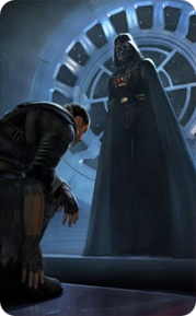
After running through the tutorial, the game quickly earned major geek points as I was able to play as Darth Vader himself! Any game that has the balls to put you in the evil driver’s seat up front isn’t messing around. Although you soon become Vader’s apprentice “Starkiller”, the ability to manipulate the dark side of the Force and wreak havoc on those around you was just as potent as playing as the Dark Lord himself.

Pick up huge objects and hurl them toward your enemies. Toss droids and storm troopers like rag dolls. Hurl your lightsaber across a hanger bay with pin point accuracy to impale your latest victim. After playing for just a few minutes, the appeal of The Force Unleashed becomes clear. Even on the Wii, with it’s less than perfect graphical engine, game play is immersive and tactile. The Wiimote and nunchuck controllers make dueling hand to hand immensely satisfying and almost second nature. The music, story line and straight forward controls all contribute to make The Force Unleashed the first Star Wars game in years I’ve actually liked. I have had to fight with the camera on occasion, and defeating bosses seems too easy for my tastes, but overall it’s a winner.

Unfortunately IGN says the single player levels only took them a total of 6 to complete which is disappointing. I have a feeling that just when I start to really get into it, the game will be over. At least playing on the Wii, I have the Duel VS mode to look forward to which isn’t available on the PS3 or XBOX versions of the game. If you own a Wii and are a Star Wars fan, then I definitely recommend picking up a copy of Force Unleashed. It may not be as good as Nintendo’s home-grown offerings, but it is still solid fun for wannabe Jedi of all ages.

19 Comments

Let’s Play Palin VP Bingo!

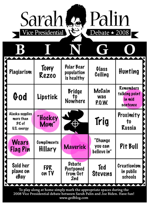
With the eagerly anticipated Vice Presidential debate between Alaska Govenor Sarah Palin and Senator Joe Biden, I thought now would be a good time for Sarah Palin Bingo. Although Sarah came on like gangbusters, lately her star has been falling. From the get-go she has lied about her record on the “bridge to nowhere”, Alaska’s energy contribution to the United States, her position on climate change and a whole host of other subjects. And although she’s conducted only a handful of interviews, her answers have made conservatives increasingly cringe.

Given all this and the fact that a growing number of right-wing strategists have said she should resign from McCain’s campaign, I thought it would be fun to keep track of the items sure to pop up during the debate on October 2nd. You can download and print out the PDF version of Palin VP Bingo so you can play along at home, or just check the Palin Bingo Page following the debate to see how we did.

NOTE: If for some strange reason the VP debate gets cancelled, it’s an instant Bingo. Now go download and have fun!

UPDATE: Well the debate is now one for the history books (thank goodness). I’m sorry to say we didn’t manage to call a Bingo! but it was fun none-the-less. If every space on the board had been filled with “maverick” then we all would have easily won. Sarah seemed to mention it ALOT in the last half of the event, especially in the closing minutes. And while she held her ground and didn’t provide the train wreck that I think so many on the left were hoping for, I think it’s pretty clear she doesn’t have the stuff to be one heart beat away from the Presidency. She didn’t answer questions, kept falling back on talking points, repeatedly mispronounced names and relied too heavily on “folksy” sayings.

Biden for his part seemed off-stride for the first half, but picked up steam in the end. He didn’t put his foot in his mouth as I expected he would (which was great) and gave more solid answers to a number of questions than Palin did. In the end, I don’t think this debate changed much, and after the right’s relief that Sarah didn’t screw up wears off, I think people will realize how little she actually said.

4 Comments

What of Frenzic?

The launch of Apple’s App Store was one of those moments that developers live for. After weeks of coding, designing, testing, tweaking and debating, Twitterrific for the iPhone and iPod touch was released to overwhelmingly positive reviews. All of us at the Iconfactory, especially the big guy in Laguna, are all gratified that users seem genuinely happy with Twitterrific for the iPhone. Apple’s handheld hardware is a wonderful new development platform that’s bound to get better with time, and we were pleased to be present at launch.

However, throughout this whirlwind day, I kept receiving emails about another of our software products and why it wasn’t included in the App Store kick-off. That application of course, was Frenzic. More than a year ago, I posted on my blog asking users to write Apple in support of bringing a native version of our addictive Mac-based game to the iPhone. You showed your support for our efforts to bring the best possible version of Frenzic to the iPhone, and now thanks in-part to users like yourself, that native version is becoming a reality.

I’m here to tell you that Frenzic is definitely coming to Apple’s handheld party. Some of Craig’s coding buddies got an early sneak peek of Frenzic at WWDC, and it’s only gotten better since then. The mobile version of Frenzic is confirming my suspicions that this is how the game was always meant to be played. Placing pieces is fast, responsive and fun as all get out. There is a tactile sense of immediacy when playing Frenzic on the iPhone or touch that simply isn’t present in the desktop version. We still have tons of work to do, but trust me when I tell you it’ll be worth the wait.

In a way, I’m glad Frenzic wasn’t ready for today’s App Store launch. There are already tons of great games available for the iPhone. Pangea’s Enigmo and SEGA’s Super Monkey Ball both come to mind. Frenzic’s day will come, and when it does, all of us at ARTIS Software and the Iconfactory hope you’ll give it a try. The Mac desktop version’s slogan has always been “Addiction never felt so right.” Thanks to the App Store and iPhone, I think players everywhere are about to get addicted all over again. For now, hang tight and hone those reflexes. You’re gonna need it!

1 Comment

Unlock Your Inner Spore

Unless you’ve been living under an online rock, then you probably know about Spore, the new game coming from Electronic Arts. Spore lets you play “god” and engineer living creatures and then release them into the wild, and eventually the stars. The game is due to be released in its entirety this fall, but Electronic Art recently published a small demo of the Creature Creator this past week.

There’s been tons of hype leading up to Spore’s release, and frankly I’ve become wary of getting my hopes up too high with so many people singing its praises. Mirroring my disappointing experience with “Iron Man” is not something I want to repeat, so I’ve been intentionally avoiding the Spore Kool-Aid. That is until tonight. Tonight I watched Mindy as she gave the Creature Creator demo a run through from start to finish, and if the full game is 1/4 as fun as the demo, EA has themselves a winner.

No doubt a large portion of the enjoyment of the demo comes from how easy it is to create something that feels “alive”. The demo lets you select body parts, adjust them, rotate them, scale them, and more to form your creature. You can then paint on colors and textures at will until you arrive at your final critter. The controls are intuitive, easy to manipulate and just plain fun. In many ways it reminds me of the old Kai’s Power Tools version of Bryce. KPT Bryce let you instantly get your “hands” dirty generating alien terrains, skys and oceans. It was immediate, tactile and absorbing. Spore’s Creature Creator demo is similar in many respects and for players with a flair for the creative, it has loads to offer.

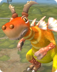
Perhaps the only downside is that until the full game is released, players can’t fully judge their creatures or how they’ll fair in the virtual world. I suspect Spore’s universe will be a “dog eat dog” world, and so selecting frog hands for your varmint instead of claws might be a fatal choice come September. I’ll give EA the benefit of the doubt for the time being and hope old “Figmon” shown above, brings both his A-game and his looks. In the meantime, head on over and check out the Spore Creature Creator demo, I think you’ll be pleasantly surprised. After all, it isn’t every day you get to play god.

Ninja Warrior Returns!

This Sunday night at 8pm marks the return of my absolute favorite television show. Ninja Warrior, G4’s ultimate TV competition of determination, athletic prowess and endurance, is back! This incredible game show import from Japan has been taking the U.S. by storm and is known there as Sasuke. The show pits 100 competitors against some of the toughest obstacles you’re ever likely to see in what can only be described as a no holds barred mad dash to stay dry and finish first. What makes Ninja Warrior so great? The show manages to take a simple premise (who can finish the course the quickest) and turn it into 1/2 hour blocks of some of the most compelling human drama you’re ever likely to see.

Without giving too much away, there have been only a handful of competitors who have actually made it all the way to the end to claim the coveted title of “Ninja Warrior”. Now in its 20th season, the show features seasoned veterans, green newbies, TV personalities and even the occasional comic relief thrown in for good measure. Players race, swing, climb and dive through 4 grueling stages to try and obtain Japan’s version of “fortune and glory”. If you’ve not checked out Ninja Warrior yet, do yourself and your TiVo a favor and set a season pass for the all new ninja block starting this weekend on G4. You won’t be disappointed.

1 Comment

Playing In Hell

First there was Cooking Mama, and then my friend Dave Miller blogged about the upcoming Iron Chef game for the Nintendo Wii and DS. Now the genre comes to full circle thanks to the controversial but always entertaining Gordon Ramsay. His hit show Hell’s Kitchen, is being transformed into a digital arena where wannabe chefs can hone their culinary skills or face ultimate humiliation in the comfort of their own homes. According to the Hell’s Kitchen website, the game includes “Career Mode” and “Arcade Mode”, kitchen and dining room challenges and even includes recipes you can try at home! I fancy myself an amateur chef and I have to say the game seems to capture the manic feel of the TV show without all the hassle of actually becoming a reality TV contestant. If you’ve always wanted to feel Gordon’s wrath after ruining his famous risotto for the 10th time (as I have), then this is the game for you.

A video preview of the game includes a virtual Gordon complete with his famous potty mouth, digital Jean Philipe and much more. Although the release date has not been published, thankfully the HK site reports the game will be available for both the PC and Macintosh operating systems. From the looks of the screen shots and the illustrated nature of the settings, the graphics seems to be a cut above most games of this type. Hopefully game play will be interactive, fun and challenging enough to keep players chopping, sauteing, and plating for days. If you’re interested, there is a sign-up available that will keep you posted about the game and when we can expect it to hit shelves. In the meantime, sharpen your knives and harden your ego, because apparently virtual Gordon, like his namesake, takes no prisoners!