What do you get when you combine subjects like science and crafting? If you’re tumblr user pardalote, then you turn your considerable embroidery talents towards the heavens and the results speak for themselves. The level of detail contained in this amazing chain stitched version of the planet Jupiter was recently featured in MAKE craft zine and it’s easy to see why. The creator used images from NASA as a reference to capture the subtle colors and swirls of the gas giant in way that reminds me of van Gogh’s Starry Night. Even though the work is not for sale it’s safe to say any space geek would be proud to display this in their home. Check it out. Wonderful!
Category: Geek
Dumb Ways to Die
I love it when artists manage to mix the adorable and the horrible with style. This disturbingly cute PSA announcement hits the nail square on the animated head and the results tickled me pink. The song in the video, by Tangerine Kitty, is even available on iTunes! Enjoy.
The Art of Doing ‘Nothing’

“When you do things right, people won’t be sure you’ve done anything at all.” This line from Futurama perfectly sums up how I often feel about my job. Designing, if done right, takes the challenge of communicating a complex idea effectively, and turns it into something that can be easily understood by the masses. When designers do their job right, the overall design fades into the background and you just “get” what you’re looking at. It speaks to you on a fundamental level, things just click and you usually see big smiles on the faces of those who interact with your work.
Through the years, I’ve learned the job of the programmer is much the same. Although my programming abilities are limited to rough forms of HTML and BASIC (yes, BASIC), through my position at the Iconfactory, I’ve learned much about what goes into making a successful software application. I see the challenges that our programmers tackle every single day and I for one am always impressed. This is particularly true of our latest effort, the retina compatible version of xScope for Mac OS X.
When Apple’s stunning new display was announced, I was excited about the increased level of detail and clarity the technology would bring to the desktop. The images are gorgeous, text is as crisp as the printed words and colors are deep and rich. Designing for this display means tools that can work correctly with it, giving you accurate and flawless information from which you can build your designs. From the get-go we knew that xScope, our utility for measuring and inspecting the screen, had to be updated for this new display. What we didn’t realize when we began was just how complicated that update would be.
I’m going to be completely honest here and say that even today, after several months, I still can’t get my head fully around the concept of pixels vs window points. Oh, I know what they are and why they exist, but from the time I first learned how to use a mouse, I’ve always dealt with pixels as the unit of measure on the screen. My entire professional career has revolved around the humble pixel and as such it’s been difficult coming to grips with the fact that the days of seeing exactly what you get on screen are pretty much over.
 But all of this pales in comparison to the work that my friend, our lead engineer Craig Hockenberry, had to do in order to get xScope working properly with the new retina display. Whenever Craig starts waxing programatic about his coding, my eyes usually glaze over. That said, there were times during the xScope retina conversion when I thought I was going to go catatonic. If you’re the type of person who loves coding, or maybe needs something to read to send them off to sleep at night, head on over to Furbo.org and read Craig’s technical post on the problems with coding for retina. Suffice to say it’s beyond me. Also beyond me – all the math, logic and problem solving needed to surmount this incredible challenge. I have tons of respect for anyone who finds mathematics fun and exciting, and even more for friends like Craig who wield it like a weapon in the service of their job.
When designers and developers use xScope on a shiny new retina Macbook, all they’ll know, indeed all they’ll care about is that the app works as advertised. xScope will give them the data they need to make their apps and designs the best they can be and that is all that matters. Because of the efforts of Craig and Corey Marion, xScope’s lead UI designer, the app just “works” and it works well. Users won’t know all the algebra and bug finding that went into creating it, but I thought it was appropriate to take just a moment and recognize the hard work that went into making it a reality. I sincerely hope you find the new version of xScope as powerful and useful as all of us have. But the best part is if we’ve done our jobs right, you won’t be sure we’ve done anything at all.
Rooting for Shamy
 My favorite television comedy, The Big Bang Theory, returns to TV on Thursday, Sept 27th on CBS. To get ready, I’ve been going back and re-watching many of the season 4 and 5 episodes that I love the most. The Alien Parasite Hypothesis (the one where Amy gets the hots for Penny’s friend Zach) and The Shiny Trinket Maneuver in which Sheldon buys Amy a tiara as a transparent attempt to sooth her relationship anger (the ep earned her an Emmy nomination) are two stand-outs. As the series has progressed, my favorite part of the show has morphed from watching the male leads interact to the relationship that has developed between the three female leads – Penny, Amy and Bernadette. The way Penny and Bernadette adopted the socially awkward Amy into their group is adorable, as is the crush Amy has on Kaley Cuoco’s character, Penny.
Of all the relationships Big Bang has featured, I think the Sheldon / Amy duo has to be the best. They are two wallflowers who are brilliant in their respective fields but who are children when it comes to their emotions. This has changed over the course of the show as the writers took definite steps to move Sheldon & Amy’s (Shamy for short) relationship forward. Over time, Sheldon has elevated Amy from a “Girl who happens to be his friend” to his actual girlfriend. In the season 5 finale, Sheldon incredibly took Amy’s hand as they watched their friend Howard boldy travel into space. If you are a fan of Big Bang, this moment probably gave you goose bumps as it did me.
I love The Big Bang Theory because I can often relate to the geeky jokes and situations the writers create for the characters. The show is ripe with Star Trek, comics and video game references, but it is the characters and their relationships that give the show the deep, emotional satisfaction I love so much. Like many fans, I’ve been rooting for Sheldon Cooper and Amy Farrah Folwer to get together, and I believe that one day they will.
In a wonderful season 4 interview between Jim Parsons and Mayim Bialik, they reveal their working relationship, how they prepare to film a script and that they too are rooting for their characters to make it. Often times we as fans forget that an actor ultimately doesn’t have the final say in what happens to the characters they portray, the writers and producers do. If any of the show’s writers are reading this, all I can say is keep up the great work. We love how Amy & Sheldon have grown closer towards each other and we want more. Just not too fast, getting there is more than half the fun! Tune in to the season 6 premiere of The Big Bang Theory on CBS on Thursday, Sept 27th. Go Team #Shamy!
Olloclip: Up Close & Personal
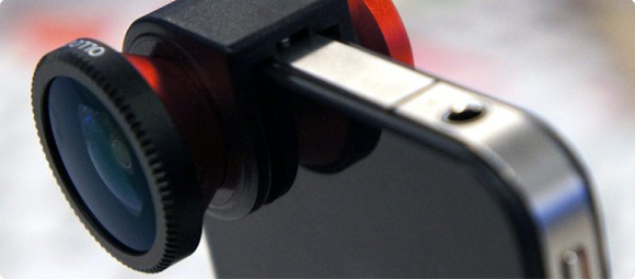
The Olloclip is a handy 3-in-one lens attachment for the iPhone 4 and 4S that lets you take wide angle, fisheye or macro shots rather easily. The clip itself is small enough to fit in the palm of your hand or your pocket and is easily attached simply by sliding it directly over the lens of iPhone’s built-in camera. The Olloclip contains a funky fisheye lens on one side and a wide angle lens on the other. This wide angle lens can be unscrewed to reveal the macro lens which allows you to take super close-ups (12-15mm) which are great for getting shots of insects, fauna or surface textures.
 I’ve been using my Olloclip for the past few months and I have to say I’ve really enjoyed it. I’ve always been interested in macro photography but didn’t want to spend hundreds of dollars on expensive SLR’s and associated lenses. While the images the Olloclip produces may not be National Geographic quality, I’ve found them to be quite good, and certainly good enough to satisfy my hobby. I initially bought the clip to photograph a few Swallowtail caterpillars who had made their home on some parsley I had planted. The shots came out so good, I was soon hooked and have found myself constantly looking for fun macro subject matter. Head over to my Flickr set of Olloclip macro shots to see some examples I’ve posted.
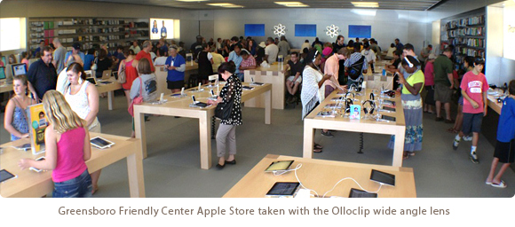
While the macro lens is by far my favorite feature of the Olloclip, the wide angle has also come in handy. I love being able to get a more complete image when snapping a picture of a room or a group of people with the Olloclip, although I have found that the resulting images seem dimmed at the very fringe of the optics. I’ve read that real estate agents LOVE the Olloclip’s wide angle feature and I can understand why. The fisheye lens is fun for unique occasions, but too funky for every day use. Every picture taken with the fisheye looks like you’re looking out a peephole, great as a novelty but the resulting images are too strange for every day use.
About the only downside I can see to the product is that it can only be used when your iPhone is naked. If you keep your iPhone in a case (even an extremely thin one) then you must remove it from the case in order to slip on the Olloclip. I completely understand why this is necessary, it just increases the time and effort it takes to get the shot you want, especially if you’re shooting a finicky subject like bugs. By the time you get your case off, the Olloclip on and the wide angle lens unscrewed, your butterfly may be long gone. I also wish it was “universal” in design and worked on both the iPhone and the iPad, although admittedly I don’t see how a single design could accommodate both devices.
The Olloclip started life as a Kickstarter campaign that raised the necessary funding and began production in June of 2011. It can be purchased in Apple retail stores or online for around $65 and is well worth the price. Considering similar SLR lenses will set you back hundreds of dollars, the Olloclip is a great way for amateurs to have their photographic cake and eat it too. Macworld gave the Olloclip four out of five mice, and the rating was well deserved. It’s a joy to use and has increased my love of digital photography by an order of magnitude. I highly recommend it.
Entrenched
Over the past few years, there’s been a significant increase in the polarization of people’s opinions in this country. More and more, folks are unwilling to put themselves in other people’s shoes, to see their side of the story or even just listen to what they have to say. Increasingly, we as a society are either unwilling or unable to compromise on important topics that affect the vast majority of us. I’m not sure where or when this started, but I do think much of it has to do with the Internet.
Since it came into wide-spread adoption, the Internet has been a way for people of widely varied viewpoints to express themselves on any number of topics. We can read, post, blog and tweet all from the comfort of our own homes and what we say is seen by hundreds, thousands or even millions of people. More importantly, when we say something online we do so from the relative safety of digital anonymity. Although some people hide behind pseudonyms online, these days it’s more common to see people representing themselves honestly and openly. Just because they do however, doesn’t mean that we “know” them or are friends with them or even have met them in real life and I think that is an important distinction.
When we sit down and have a conversation with our family, friends or even acquaintances, we often censor ourselves for the good of our relationships. We may think someone’s opinion isn’t valid or is something we consider to be foolish, but we probably won’t tell them that to their face. Instead we often try and steer those we disagree with towards mutual understanding, we give and take, we compromise. I love my family very much but I disagree heartedly with many of their political viewpoints. When I get into a discussion about these topics with them, I don’t call my Uncle an idiot or a bozo, I calmly listen to his opinion, and if I’m feeling feisty I’ll attempt to convey some opposing viewpoints. If he listens great, if he entrenches himself and refuses to hear what I’m saying I often change the subject and move on. I love him too much to risk hurting him or his feelings and so I censor myself to some degree. I firmly believe it’s for the best.
But when I frequent political blogs and forums and told I’m an “ignorant liberal” or when I tweet about Apple’s court victory over Samsung and am called a “typical Apple fanboi”, the people that do so have no pretenses about censoring themselves. Indeed, I too am more likely to let loose when I’m exchanging ideas and thoughts with someone I’ve only met online than I would if I were sitting with them face-to-face in a restaurant or coffee shop. Yesterday, Macworld editor Dan Frakes tweeted this about Apple’s original iPhone:
When the iPhone debuted, it was widely criticized for having no buttons/keys. Now people think the iPhone’s design is “obvious.”
— Dan Frakes (@danfrakes) August 25, 2012
As soon as I saw that tweet, I knew Dan was in for an earful. I had tweeted several times on Friday about the $1.01B judgement against Samsung by Apple and was not prepared for the amount of staunch anti-Apple sentiment that flowed into my Twitter timeline as a result. It seems that in platforms, as in politics, people have firmly chosen sides. You’re either with us or your against us and for some reason there can be no middle ground. I make my living using Apple products and have enjoyed them for well over 20 years so I have a strong affinity for technology that comes out of Cupertino. I also like to think that I’m fairly objective and have criticized Apple when I strongly disagree with a position they take. Sadly, some don’t see it this way. Apple is either the perfect corporate citizen who can do no wrong or a demon that is out to destroy open standards and lock all smartphone users into walled gardens manned by underage Chinese workers from Foxconn.
The reality, of course, is somewhere in-between. Apple’s victory over Samsung can be right and just in accordance with U.S. patent law but that doesn’t mean they “invented rounded rectangles”. It also shouldn’t mean that you and I can’t have a friendly discussion on the topic without it devolving into the digital equivalent of the Jerry Springer Show. Admittedly, when we are so entrenched in our positions it is difficult to give up any ground, especially when one feels passionately about something. However, if we are to survive and flourish as a society and have meaningful conversations, we all need to try and make a concerted effort to climb out of our fox holes and meet somewhere in the middle.
One Small Step…

Aldrin took this picture of Armstrong in the cabin after the Apollo 11 EVA
Sad news today that the first man ever to set foot on the surface of the moon, Neil Armstrong, has died at the age of 82. Armstrong recently underwent surgery to relieve blocked coronary arteries but died today as a result of complications. Ever since I was a boy and first learned of he and Edwin “Buzz” Aldrin’s voyage to the moon, I’ve been fascinated with all things NASA. Both his name and the famous words he spoke as he stepped off the lunar module will forever be taught to children around the world. Indeed, the name of Neil Armstrong is surely one of the most recognized in human history along with other men of discovery such as Sir Francis Drake, Christopher Columbus and Charles Lindbergh.
The historic irony is that for the last 20 years of his life, he did his best to stay out of the lime light. He refused to sign autographs after 1994 and in 2005 became embroiled in a legal battle with his barber after Armstrong discovered the man sold a lock of his hair to a collector for $3,000 without Neil’s knowledge. Many have sought to use his name, and likeness for their own personal agendas but in the end Neil remained a man of dignity and quiet restraint. I can’t imagine what it what was like for him to become one of the most famous men in history overnight, but I’m sure the pressures to live up to other people’s expectations were intense.
It is also ironic in that Armstrong might not have been first to set foot on the moon if it were not for a series of random factors that resulted in he and Aldrin’s mission being selected to actually land. There’s a wonderful scene in Tom Hanks and Ron Howard’s epic mini series, From the Earth to the Moon, where Deke Slaton gathers all of the astronauts to let them know that one of them will be the man to actually be first. Although he did not know it at the time, Neil Armstrong was to be that man. The sense of history and significance that this realization represents is incredible and if you’ve never seen the mini series before, now would be the perfect time to check it out.
Today Armstrong passes from the realm of the living into those remembered, but even as he does so, it is certain his name and deeds will never be forgotten. I hope we one day set foot in the Sea of Tranquility again or perhaps upon the plains of Olympus Mons and remember all the small steps taken by men like Armstrong. Isaac Newton famously said “If I can see further than anyone else, it is only because I am standing on the shoulders of giants”. Armstrong was one such giant. Farewell Neil, we’ll miss you.
Ode to the Federation
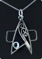 Fashionably Geek is quickly becoming one of my favorite blogs thanks to gems like this. This wonderful silver necklace is the perfect gift for that stylish Trekker in your life. Created by the Rice Hat Samurai Studio, the necklace is an elegant graphic translation of both the Star Trek combadge and the Vulcan Idic symbol. Their Etsy shop also offers something for Doctor Who fans as well, so beam on over and scoop these prizes up before it’s too late.
[Via Fashionably Geek]
Lost Cities Tips & Tricks
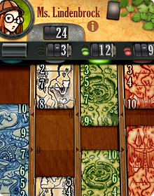 Lost Cities is a new game for iPhone from TheCodingMonkeys, publishers of the hugely popular Carcassonne. Based on the award winning card game by Reiner Knizia, Lost Cities takes elements of solitaire and combines them with vibes of Uno and Go Fish into a compelling game for two people or a single player vs any one of four AI opponents.
The game is easy to learn (I won’t go into the full rules here) thanks to the wonderful spoken in-game tutorials, but the basic object is to score points by playing cards of increasing value in any one of five, colored channels. Whichever player has the most points when all the cards from the draw pile have been played, wins. Since the Iconfactory did much of the graphical work for Lost Cities, I was generously given early access to the pre-release and have been playing a great deal this past week. I’ve learned a lot in that time and I wanted to share some of the insights I’ve had with would-be challengers.
Practice Against the AI
It may seem straight forward but playing the various computer opponents is a great way to get a feel for Lost Cities. Playing the AI means the game proceeds quickly since you don’t have to wait for a human friend to move. Getting into a rhythm in LC really helps you to understand how points are scored, cards are held or discarded and what to watch for.
Watch the Draw Pile
The game continues only as long as there are cards to draw so keep a close eye on the number of cards left in the pile in the lower right of the interface. When that number reaches zero, the game is over so it’s important to know how many turns are left. Don’t wait until the last few turns to play your big cards if you can help it. Also, remember that the number of turns is just about one half of the number of cards left in the deck. It’s easy to look at 18 on the deck and think you have that many turns left, but you really don’t, you have approximately 9!
Ditch the 2’s and 3’s
Unless you’re trying to make a run and score 8+ cards in a channel, you might want to start a channel with a 4 or even a 5. Low cards don’t yield many points anyway and probably won’t make a huge difference in the final outcome. This isn’t always the case of course, but games can easily be won by just playing the higher number cards alone.
Remember to Look Up
It’s easy to get so focused on what cards you have in your own hand that you forget to pay attention to what your opponent is doing. You’re not the only one at the table who has a strategy! Don’t forget to pay attention to what cards she is pulling from the discard piles or what color channels they seem to be favoring. You may be holding some great cards, but always remember Lost Cities isn’t just about scoring your own points, but also trying to block your opponent’s as well.
The Nitty Gritty
Don’t forget that you can re-draw from the discard pile if a card you previously got rid of is now needed. This can come in quite handy when cards of certain colors start to present themselves. Also, listen for the audio cues in the game like the little “tink” sound that lets you know a channel has just crossed the boundary from negative to positive point totals. Lastly, when playing the AI, don’t forget you can pause at any time and take a break. Maybe a refreshing drink or walk around the block will clear your head and help you crush Ms. Lindenbrock.
I love games like Carcassonne and Lost Cities because they combine elements of skill and luck in fun and engaging ways. They are also played at your own pace which is wonderful, especially in the age of first-person shooters and nerve-wracking puzzlers. TheCodingMonkeys have gone above and beyond to make Lost Cities both addictive and fun to play. It takes all of the best elements of Reiner Knizia’s original card game and adds wonderful features like automatic score keeping, tough AI opponents, beautifully rich graphics and and soundtrack that feels like it belongs in the cinema instead of a game. If you enjoy turn-based strategy or card games, I urge you to check out Lost Cities for the iPhone today. Enjoy!
Game of Bones
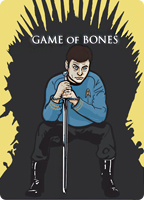 I love word play and puns probably more than I should and so when I see a funny bit of merchandise combining two of my favorite franchises in a clever way, I spring into action to snap it up. Such is the case with this hilarious t-shirt from Redbubble featuring Star Trek’s Leonard McCoy posing as Ned Stark from George R.R. Martin’s Game of Thrones. If you’re a fan of either series then I’m sure you’ll want to hightail it over and grab it while you can. Dammnit Jim, I’m a doctor, not a king!
[Via Fashionably Geek]
Finding Bigfoot. Stuff.
 Being the huge Bigfoot freak that I am, I recently went on an expedition of discovery. This sojourn wasn’t to traverse the American Northwest in search of Sasquatch, (I would love to do that someday BTW) but to find the latest and greatest Bigfoot bling. I know there have got to be geeks like myself out there that can’t get enough of the huge, mythic ape-man and so I fired up Google and trekked off into the digital wilderness. If you have a Bigfoot fan in your life, maybe some of these items will come in handy as a future birthday, Christmas or bar mitzvah present.
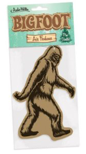
• Bigfoot Air Freshener – Patterned after the big guy in the famous Patterson-Gimlin film. Personally I think it would have been much cooler to go all authentic and replicate the infamous Bigfoot stench for this one, but I guess the scent of pine trees goes over better with the ladies. [$6.95 via Amazon]
• Bigfoot Garden Yeti Statue – The promotional text for this resin garden statue of the legendary Sasquatch says visitors will do a “double take” it’s so life-like. Yes, because everyone knows Bigfoot isn’t 8-12 feet tall, he’s really just 2. Still, it’s kinda cute. One thing PR dudes, he’s either a Bigfoot OR a Yeti, not both! [ONLY $125 via Design Toscano]
• Bigfoot, the Bashful Yeti Tree Sculpture – Our friends at Design Toscano are at it again, this time with a resin sculpt “Painstakingly hand-painted to make passers-by look twice” that you can hang in your favorite tree. This one looks a bit too “Planet of the Apes” for my tastes but your Bigfoot buddy will probably love it. Probably. [$69.95 via Design Toscano]
 • Fisher-Price Imaginext Big Foot The Monster – What kid wouldn’t want a 14″ animatronic robot of a creature that has been known to break into houses, kill hogs and scare kitty cats to death? This adorable toy may not come with livestock accessories but he can pound his fists, walk forward and back and even does somersaults! [$74.99 via Amazon]
• Sasquatch’s Big, Hairy Drawing Book – How do we market a notepad of 120 almost blank pages to kids and parents? Easy! We’ll slap Sasquatch on the cover and watch the money roll in! Featuring “page after page of off-the-wall gags and fillin doodle prompts” Sasquatch’s Big, Hairy Drawing Book could be the ultimate discovery for that Bigfoot lover in your life, or it could be the biggest fun-time hoax of all time. Your call. [$12.95 via Amazon]
• ‘Gone Sasquatchin’ Gear – Nothing says “Hey, I’m a huge, hairy nerd!” like Animal Planet’s Finding Bigfoot t-shirts, hoodies and baseball caps. If you order within the next 24 hours, they’ll also throw in their Backyard Bigfoot Recipe Book. Perfect for all those redneck BBQ’s down at the ol’ swamp. [Assorted prices via DiscoveryStore.com]
And finally…
• Patterson-Gimlin Film Site Track Cast – Okay, call off the hunt! If you’re looking for the perfect gift for that Bigfoot fan in your life, it doesn’t get any better than this plaster replica of a Sasquatch track from Bluff Creek. Taken from one of the footprints left at the 1967 Patterson Gimlin film site, it even comes with a certificate of authenticity. I bet it’s even notarized. Seriously, who’s buying me this? [$40 via BigfootSurplus.com]
Star Trek: TNG 25th Anniversary Posters
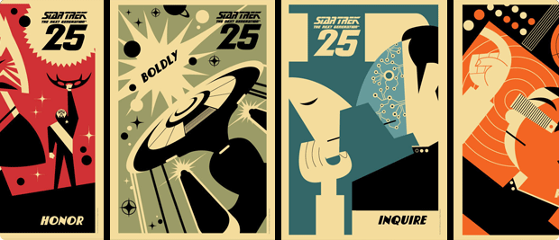
If you’re heading to San Diego Comic-Con this year, then be sure to stop by CBS’s booth (#4129) for some awesome Star Trek related goodies. To help celebrate the 25th anniversary of The Next Generation and release of season 1 on blu ray, CBS has released a set of graphic posters any Trek fan is sure to love. You can follow the official StarTrek.com twitter account for updates on when they’ll be giving away postcards and prints at SDCC or just order them online. The posters come in different sizes and although they seem a bit pricy, they just may be your cup of tea.. Earl Gray, hot. Engage!
To Boldly Build…
Being the geek that I am, there are things I would like to own and then there are things that I want. This incredible hand-crafted LEGO set of gear from Star Trek: The Original Series definitely falls into the later category. Created by master builder Tommy Williamson, the amount of detail and precision on these pieces is really stunning, especially on the phaser (HA! Get it?!). If I could buy the plans and parts for these models I would do it in a vulcan heartbeat. You can see more images on Williamson’s Flickr page, and be sure to check out the promo video for the Tricorder for a neat surprise!
[Hat tip: @iconmaster for this post]
The Murky Future of 3rd Party Twitter Apps
 Magic 8-Ball, it’s been a while but I have some questions about Twitter’s recent blog post. You know, the one where they talked about “stricter guidelines” for how the Twitter API is to be used by third party apps. Since Twitter isn’t talking, I was hoping you might be able to clear some stuff up for me. Can I ask you some questions now?
Yes
All this talk about stricter guidelines and a “consistent Twitter experience” seems pretty ominous, should developers of 3rd party Twitter apps like me be worried?
Reply hazy, try again
I mean some people are calling Twitter’s non-announcement a “bombshell”. Are things really that bad?
Better not tell you now
What do you mean? Are you saying that 3rd party apps are about to become extinct or that Twitter just wants each app to display the timeline in a similar fashion?
Concentrate and ask again
I know Twitter’s got to start making serious money to pay for it’s massive overhead, are we talking about ads in the timeline?
Outlook good
If we’re talking about ads, I can deal with that. I’d rather have promoted tweets in Twitterrific than being forced to stop developing it completely.
What about expanded tweets, will Twitter force us to build some form of them into our apps?
Signs point to yes
If we don’t, do you really think Twitter would restrict API access and hang 3rd party apps out to dry?
Better not tell you now
That’s very comforting, thanks.
Don’t you think Twitter’s users would revolt if they took away our Tweetbots, Hibaris and Twitterrifics?
As I see it, yes
Damn straight they would. There are many developers and companies who have build their livelihood around the Twitter API since 2007. We even helped Twitter evolve and grow to where it is today. Are you saying none of that matters now?
Without a doubt
Frak.
Some developers are already suggesting we start creating a web-based, open alternative to Twitter using something like RSS. Would that really work? Would users really switch away from Twitter for a grass-roots service?
Don’t count on it
Do you think it’s a good idea for developers like us to keep coding away on their apps for now?
Most likely
Could the folks at Twitter have done a better job with their blog post to help stop the spread of paralyzing FUD?
It is certain
You really haven’t been much help to me. One last question…
Is the golden age of 3rd party Twitter apps over?
Ask again later
Meh! What do you know, anyway!
A Good Day for Physics
 Amazing, historical news today from the European Organization for Nuclear Research (CERN), who says a new particle they’ve discovered fits the description of the elusive Higgs boson. If true (scientists are almost 100% certain), the discovery will likely unlock new age in the field of physics and greatly expand our understanding of how mass and gravity work. The so-called “God Particle” has implications for scientific discovery that I don’t pretend to even *begin* to understand, but I do appreciate the magnitude of today’s announcement. Although researchers stressed the preliminary nature of the results, the findings will most likely be supported by more data later this year.
The geek in me is overjoyed that the efforts of the CERN team in Europe have been realized, and that the discovery, first proposed by physicist Peter Higgs in the 1960’s has been made within his lifetime. I can only imagine how satisfying it must have been to see the results of these experiments confirm a theory you’ve held your entire life. About the only question left in my mind is how producer/writer Bill Prady will work the announcement into next season of The Big Bang Theory. Doctor Sheldon Cooper will be beside himself, and that’s no bazinga!
Missing Soundtracks: From the Earth to the Moon
 When the award winning mini-series From the Earth to the Moon premiered on HBO in 1998, producers Tom Hanks and Ron Howard were flying high off the recent success of Apollo 13. Not content with simply telling the story of Jim Lovell, John “Jack” Swigert and Fred W. Haise’s near tragic NASA mission, Hanks, Howard and Brian Grazer set about filling in the missing NASA narrative of the agency’s monumental effort to put a man on the moon. The result was a spectacular 12-part series that landed an Emmy Award and Golden Globe for Best TV Mini Series. The show is hailed for its honest account of the Apollo program, ground breaking special effects and soaring musical score by composers Michael Kamen and Mason Daring.
When I first saw From the Earth to the Moon I instantly fell in love with the soundtrack. The opening and closing themes by the late Michael Kamen are full of hope and epic discovery. Individual episodes are chocked full of wonderful 50 & 60’s tunes, especially ep. 4 – 1968 and my personal favorite ep. 5 – Spider about the design and production of the Lunar Module. Kamen was a talented composer and has penned some of the most well-known television and movie themes of recent years including Band of Brothers, Mr. Holland’s Opus and Brazil. Mason Daring’s contributions to From the Earth to the Moon are not as grand in scope as the main themes, but his work on Spider is just wonderful and always makes me mindful of the people who dedicated their lives to building the Apollo spacecraft.
Unfortunately, HBO never released an official soundtrack to the series when it aired, at least not one that contained orchestral themes. There was a half-baked attempt at a soundtrack later, but it consists of mainly pop numbers, many of which never even appeared in the series. I’ve re-watched my copy of From the Earth to the Moon at least a dozen times and each time I did, it made me sad I didn’t have the music from the series at hand. Recently I decided to do something about it by scouring the internet and iTunes to construct my own personal soundtrack. All of the music I’ve chosen is significant to the show in one way or another. I’ve linked to the tracks that are available for purchase on iTunes so you can go buy them yourself if you wish. The rest are downloadable for your personal use. Enjoy them, but I ask you to please not redistribute them on file sharing services.
The Missing Soundtrack:
1 – From the Earth to the Moon – Main Theme – Michael Kamen
2 – Beyond the Sea – Bobby Darin (iTunes)
3 – It’s Not My Cross to Bear – The Allman Brothers Band (iTunes)
4 – Whipping Post- The Allman Brothers Band (iTunes)
5 – The Christmas Song – Nat “King” Cole (iTunes)
6 – My Favorite Things – Tony Bennett (iTunes)
7 – Fireball XL-5
8 – Let’s Go – The Routers (iTunes)
9 – Spider / Eagle – Mason Daring
10 – Camera Moon – Mason Daring
11 – From the Earth to the Moon – End Credits – Michael Kamen
If you’ve not seen From the Earth to the Moon and love space exploration, history or anything NASA related, I urge you to check it out. Unfortunately the television series is not currently available either on iTunes or Netflix, but signature edition DVD’s are available on Amazon and are well worth the price. Trust me, you’ll enjoy every minute of this epic space adventure. Go, flight!
Ski Safari: 007 Edition
 Lately I’ve been playing a great deal of Ski Safari, a wonderful casual game from Defiant Development for iOS. The game is a high score climber similar to the awesome Tiny Wings, in which you play play Sven, a skier trying to stay ahead of an ever-approaching avalanche. The object of the game is to simply get as far as possible, picking up coins, speed boosts and various forms of animals like penguins and even Yeti’s in a high-paced race to stay alive. Developers Brendan Watts & Shawn Eustace have done a marvelous job of making Ski Safari fun, addictive and immensely satisfying to play. I have a bit of a competition going on with a few of my friends as we play a high-stakes game of one-upmanship on the snowy slopes of the high Alps.
The game is pretty awesome as it’s designed, but I recently discovered I could make amp up the coolness by a factor of 10 or so simply by turning off the default music in the game and substituting my own action-packed soundtrack. And what soundtracks are best suited for racing down snow-covered mountains at breakneck speeds? Why none other than the ultimate spy, James Bond, of course! If you own any of theme tracks from the James Bond films, simply start them playing on loop and then turn off the in-game music to give yourself the ultimate action sequence experience. I’ve found that “Runaway” from Roger Moore’s For Your Eyes Only and “Bond 77” from The Spy Who Loved Me, are the perfect Ski Safari tracks, but your death-defying milage may vary.
Maybe the developers of Ski Safari will eventually see fit to make a James Bond-esque version of their game complete with bad guys on black snowmobiles, machine guns and deadly helicopters chasing you, but until they do, this is the next next best thing. Have fun and do try and come back in one piece, 007!
Scaramouche! Scaramouche!
Evidently this family rocks out to Queen’s “Bohemian Rhapsody” every morning on the way to school. Pretty darned awesome, but it’s the little tike in the car seat that really makes it.
Wel-l-l-l-l-l-l! Dick Orkin’s ‘Chickenman’ on iTunes
 A hundred years or so ago when I was attending RIT, my friend and college professor Steve Loar, introduced my classmates and I to one of his personal loves, an old radio show named Chickenman. Created by broadcast hall of fame inductee Dick Orkin in 1966 for Chicago’s WCFL, Chickenman was inspired by the popular TV series “Batman”. Originally scheduled to run just two weeks, the show’s popularity took flight and eventually became nationally syndicated, ensuring its success. Today Chickenman remains the longest running radio show in history and can be heard on XM Radio’s Channel 151 and American Forces Radio and Television Service (AFRTS).
Each episode checks in around 2 minutes long and tells the tale of Midland City’s Fantastic Feathered Fowl, an anti-hero who roams Midland City seeking criminals in his yellow crime-fighting car, the Chicken Coupe. He has a secret headquarters, the Chicken Cave, accessible through a trap door in his bedroom closet and when his duties as shoe store manager keeps him busy, his mother Mildred fills in as the “Maternal Marauder“.
Back when Steve introduced us to Chickenman in 1990, there were only a handful of episodes were released on vinyl, but every one of them managed to bring a smile to my face. I used to love listening to the White Winged Warrior hang out in the mayor’s office, generally annoying the almost-unflappable Miss Helfinger, performed to acerbic perfection by Jane Roberts.
I recently discovered that all 273 episodes of Chickenman are available via iTunes for download and I’ve been in poultry heaven ever since. If you love snarky, quick-paced humor, comics or just want to have a good laugh, wing your way over to iTunes and check out Dick Orkin’s Chickenman. Just remember evil doers, he’s everywhere! He’s everywhere!
Review: Paper for iPad
 There are literally dozens of drawing/painting apps for iOS. Some of my favorites include Procreate, Penultimate, ArtRage and now Paper from FiftyThree, Inc. This new app burst onto the App Store recently and has been receiving a great deal of attention for its fresh approach to the genre of the sketch app. Much has already been written about Paper and so I’m going to try and cut right to the chase with my review by detailing things the app does well and areas where it’s lacking. If you want to know how Paper may or may not fit into your work flow, then by all means read on.
The Good
Simplicity
Above everything else, Paper keeps the interaction between the app and the user simple. This design decision is by far its greatest asset, but it is also its greatest weakness (more on this later). Getting into your sketchbook and starting work is dead simple. Thumb through drawings, access tools, and draw away. You can also add pages to your sketchbooks and share your work via Facebook, Twitter, Tumblr or email. There doesn’t seem to be a way to send drawings to the camera roll, but taking a quick screen shot does the job in a pinch. The entire app feels light, easy to get around in and, for the most part, doesn’t suffer from being over-designed.
Brushes
Paper has one of the best media engines I’ve ever encountered in a painting or drawing app. The pencil tool as well as the watercolor brush behave almost like their real world counterparts and are a sheer joy to use. Drawing speed helps determine stroke width with certain tools, and opacity with others. The overall effect is wonderful.
In-App Purchases
Some will say this isn’t a plus for an app like Paper. Many users don’t appreciate having to unlock functionality inside of an app that they thought was initially free, but Paper’s implementation of their in-app purchases is extremely well done. You buy only the tools you want and the app even lets you test drive the brushes prior to purchase so you can get a feel for them. Finally, there is an “Essentials” bundle that gives a small discount compared to buying all of the individual tools separately. If I find an app compelling, I certainly don’t mind paying for it and Paper’s in-app purchase model lets me pick and choose the parts I like most.
The Details
Customize the cover of your sketchbooks. Blend colors with the paint brush. Effortlessly flip between drawings that beautifully highlight your work. The devil is in the details and Paper does a deft job of getting them right.
Could Be Better
Rewind/Undo
The two-fingered gesture to step back (or forward) through your drawing is clumsy. Often times it takes me far longer to get to just the proper undo point with the gesture than it would if undoing was a simple button. I also sometimes make stray marks on the page when attempting to make the undo gesture. In addition, the number of undo states is far too small, especially when using techniques like cross-hatching. I also wish that rewinding would take you back through drawing a stroke little by little, but it doesn’t, it removes the last stroke in its entirety.
Colors
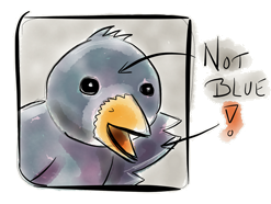 The selection of colors in Paper is extremely limited. There are a total of nine to choose from and of those, none of them are any shade of blue. The developer encourages users to go old school and mix colors to form new ones but the inability to select custom colors is a major deal breaker. I can’t use the app to sketch concepts for clients (or even myself) if I don’t have access to the entire range of colors I need, especially ones like blue and red.
Landscape
The app is perpetually locked in landscape mode and it’s extremely frustrating. I presume the developers did this to accommodate the wide screen design of the main menu, but I sincerely hope they add the ability to use Paper in portrait eventually.
Immutable Drawings
Unlike many other drawing/painting apps, once you place a mark on the page, that’s where it stays. There is no way to re-position a drawing or even a portion of one once it’s made. Some would say this simply echos a real-life sketch pad, but if I wanted a real sketch pad I would use one. I use Paper and apps like it because they give me additional flexibility when creating. Not being able to re-position elements on the page is frustrating and feels antithetical to the app’s overall design.
The Bad
Zooming
I want the ability to be able to zoom in and add details to my sketches or out and fill larger areas with colors quickly. Adding zooming would almost eliminate the need for various brush sizes, so if I had to choose between the two I’d take zooming. In addition, my brand new retina iPad has millions of pixels at its disposal. Paper’s lack of pinch zoom means a good many of them are going to waste.
Fills
The app desperately needs a fill tool. The watercolor brush does an inadequate job of filling large areas with solid colors and sometimes that’s just what you need. I’d love to be able to sketch in white pencil on black paper, but that isn’t possible in Paper. A fill tool would rectify this glaring deficiency rather nicely.
Layers
Adding layers ala Photoshop would significantly increase the app’s complexity and FiftyThree may be unwilling to go there just yet which is fine. I do hope it comes eventually however because I often wish for the ability to erase or tweak individual elements of a sketch independently of the rest. I’m sure the talented folks there could find a way to add drawing layers to Paper in a simple and elegant fashion. I’d also like a way to lock a sketch once it’s done so I don’t accidentally add stray marks, which seems to happen often.
Conclusions
If you’re looking for a simple, straight forward tool for sketching you’ll probably find Paper both fun and elegant. I suspect this is what Daring Fireball author John Gruber meant when he said the app was “Exquisitely well-done”. I wouldn’t go that far but there’s a great deal to like in FifthThree’s initial effort. The app is a testament to beautiful user interface design, unfortunately it lacks too many features in my opinion to be used as anything more than a simple notebook. Paper’s limited undo states, narrow color palette, in-ability to re-position elements on the page and lack of zooming all force me to turn to other drawing apps when I want to truly create.
The good news is that Paper is a 1.0 product and as such I’m confident that improvements will come quickly. If the app simply added a long tap on color wells to bring up a picker and the ability to zoom in and out of a drawing, Paper would instantly become about 10x as useful as it is now. Since the app is free to try with the built-in quill pen, there’s no reason not to download and check it out yourself. I’ve definitely enjoyed exploring the app and it’s given me new reasons to try drawing with various styluses, but that’s blog post for another day.
My friend Dave Caolo recently told me that his kids love Paper. They each have their own sketchbooks and enjoy doodling and coloring very much. This comment is telling because right now Paper feels very much like a kids app. It has lots of potential but it’s too immature to really be useful. In their quest to make a dead simple iPad sketch app, FiftyThree may have sacrificed a bit too much functionality. Paper may be just what you’re looking for to jot down notes and quick sketches on the go, but I personally hope FiftyThree eventually lets Paper sit at the grown-up table.
