1 Comment

Go Buy Monument Valley. Now.

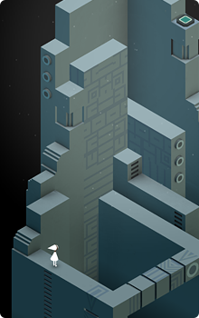
Chances are you’ve probably already heard all about the stunning new game from developer ustwo – Monument Valley that was released today. If the game is new to you, then let’s just clear the air right now – go buy it on the app store for your iOS device. Now. This is one of those instances where a piece of software is so stunningly beautiful, and provides such an incredibly rich experience, you’re really missing something if you take a pass. Here are just some of the things you’ll see in this amazing casual puzzler:

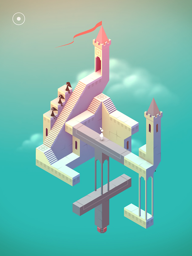
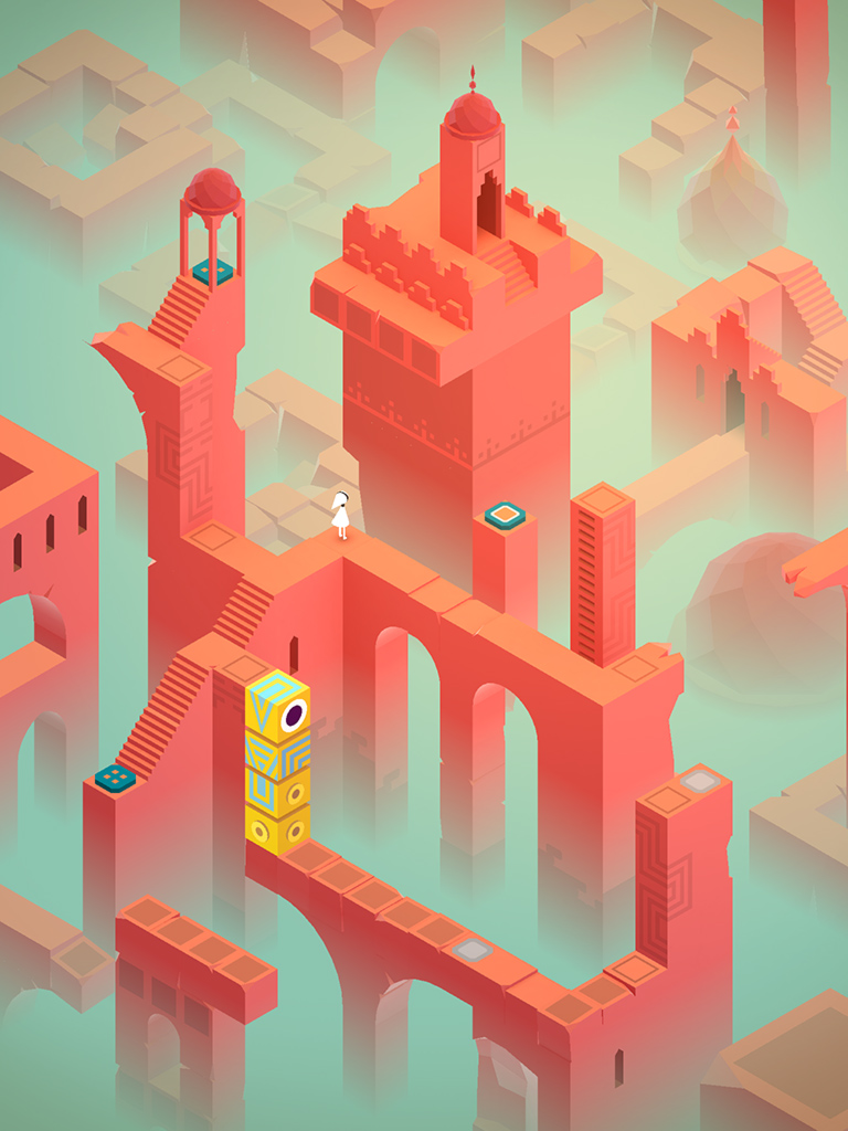
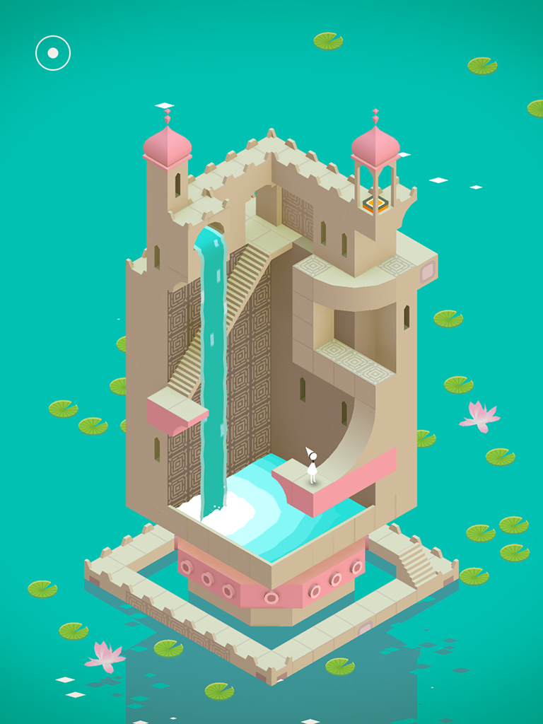
There’s a great deal to love in Monument Valley. From it’s rich, varied color palettes that change from level to level, to the extremely clever, M.C. Escher-like design of its levels, to the gorgeous soundtrack and audio effects, Monument Valley delivers at every turn. From the moment you start to play, it’s obvious how much love and attention the folks at ustwo have put into their creation. They’ve managed to design a complete gaming experience and bring it to you via the App Store for a minimal price. Too often games these days are filled with in-app purchases that prey on instant gratification to keep players interested. Monument Valley eschews all that in favor of creating a compelling, finite and beautiful environment for you to get lost in for a few hours of your life. The last few levels in particular are wildly inventive and especially challenging.

If you’ve read the reviews, then you probably know that Monument Valley’s play time is short. It took me a total of about 3 hours (off and on) from start to finish to complete all of the levels, and for some, that length may be a deal breaker. If you feel that way I have news for you – many awesome things in life are short but that doesn’t make them any less worthy of your time or money. You’ll probably spend more on your next meal out than you would on Monument Valley but that doesn’t mean you can’t enjoy both while they last. The game creators have said they focused on making a concise title that can be completed in a short amount of time on purpose. While this may be true, it doesn’t really matter to me because I know if the game is a success (which I certainly hope it is) then we’ll probably be seeing a great deal more of the mystical world of Monument Valley. Show your support of their efforts to bring you something wonderful and head over to the App Store and buy it, gift it and help spread the word by leaving a review today.

6 Comments

Orba: My New iPhone Obsession

Every once in a while you run across a piece of software that’s so elegant and well done it makes you smile from ear to ear. Orba, the new free puzzle game from Kieffer Bros. is such an application. Released for the iPhone and iPod touch in late November, Orba is a great example of casual gaming in the spirit of Bejeweled or Tetris.

I love games that can be explained in 25 words or less and Orba’s just such a game. Clear as much of the board as possible by tapping chains of three or more same-colored orbs. The bigger the chain, the more you score. The premise is simple, but after playing just a few games it quickly becomes apparent tap mashing won’t get you very far. Each game starts with only 3 colored orbs shown on the board, so creating long chains of like colors is relatively easy. As you progress, more and more colors are introduced and it becomes quite difficult to clear enough of the board to be able to continue. When no chains can be cleared, the game is over.

As is the case with much of the software that lives on my iPhone, I first discovered Orba via a tweet from a friend, Jason Snell of Macworld. Since I know all too well how important it is to get the word out about great iPhone apps, I’m only too happy to recommend Orba to all of you iPhone and iPod touch users out there.

The game’s user interface is drool worthy. Everything about the game’s design just seems right from the user interaction and the help screens to the friendly “Hello Again.” message that greets you every time you begin. The UI is minimal, but elegant and does a wonderful job of not getting in the way as you play while still looking freakin’ cool. About the only thing I probably would have done differently are some of the sounds. They too are minimal, almost to a point of being non-existent. Despite the audio nit pick, the designers at Kieffer Bros have a well-earned reputation for beautiful software and their work on Orba is no exception.

As a causal gamer, I was surprised and delighted to find that Orba was being offered on the App Store absolutely free. As a fellow developer of iPhone titles, I would have gladly paid upwards of $4.99 for this wonderful piece of art masquerading as a casual game. Since my parents always taught me never to look a gift horse in the mouth, I won’t say any more regarding the decision to give away Orba except to say “Thank you” to the folks behind the orbs. I’ve already gotten many hours of enjoyment out of the download, and that will most likely continue for some time.

I love that I can play this game for a few minutes or hours on end, pause and come back at will. Since there is no time constraint, the only pressure to achieve higher scores are the ones you impose on yourself. Orba doesn’t have online scoreboards or social network boasting, but it doesn’t have to. It is what it is. If you’re looking for a well designed, friendly and casual game for your iPhone, Orba just might be the game for you. Head on over to the App Store, download a copy and let me know when you break the million point mark.

UPDATE: Of course on the very day I decide to publish this post, Orba goes from free to 99¢. I’m actually glad they made it paid since it’s worth 4-5x what they are asking for. You can still try the first 12 levels for free by downloading Orba lite so no harm, no foul.

3 Comments

Switching Hats

Back on December 1st, I put on my artist’s hat and wrote a post about the importance of icon design and how it shouldn’t be taken for granted or seen as an afterthought. The post garnered a fair amount of exposure and I received a great deal of positive feedback from designers and developers alike on the importance of icon branding and standing out in the App Store.

Near the end of the piece, I offered up this unassuming little opinion which has caused me a fair amount of stress these last few days:

“Lately, developers have taken to plastering “SALE” or “60% OFF!” within their icons. They’ve become lazy and let the iPhone software mar their design with glossy highlights which obscure efforts to brand their software. Fight the urge to cheapen your brand and instead give your icons the love and attention they deserve. You’ll still sell boat loads of copies and your users just might end up thanking you at the same time.”

What is the source of my distress? Over the course of the past week, the Iconfactory and ARTIS Software jointly agreed to put our game Frenzic on sale for the Christmas holiday. From the moment we launched the product, we had always planned on temporarily lowering the price for the holiday rush. When I wrote the original post I was unaware of the importance the app’s icon plays in marketing an online sale. I’m guessing you can probably see where this is heading. As the app went on sale today, it reluctantly sported a new badge. The same type of badge that I railed against in my original post.

If you care as much about icons and design as I do, then you’re probably asking yourself how I could allow something like this to happen. At first I couldn’t figure it out myself, and then it became very simple. I took off my “designer hat” and put on my other one… the one that says “business owner”.

The business owner in me doesn’t wrestle with many of the lofty ideals that my inner designer aspires to. Being a partner in a successful company sometimes means doing what’s best for the health and growth of the business, especially in today’s unsure economy. It’s easy to criticize someone’s design decisions when you’re on the outside looking in. You think you’ve got everything figured out, but then your app starts to sink off the App Store and suddenly nothing’s as simple as you thought.

Although I initially resisted calls to slap a “For sale” badge on our icon, I came to realize that it was one of the most important ways to get people who had previously dismissed Frenzic due to its $4.99 price tag to take another look. The change may not affect sales at all, but on the other hand, it may help to get Frenzic in front of more people’s eyes than ever before. If that means that I have to eat a hefty helping of crow in order for us to maximize our exposure in the App Store, then I say pass the ketchup.

27 Comments

Why Icons Matter

I can’t tell you how many times in the course of my career as an icon artist that a client considered their icons to be an after thought. After spending hundreds of man hours and pouring thousands of dollars into software development, some clients just refuse to devote the attention needed to the glyphs that act as both button and branding. At the Iconfactory, we try and educate clients about the importance of icons and how they strengthen a company’s brand as well as communicate a product’s core concepts quickly and easily. It may sound like marketing fluff, but years of experience have taught me it’s the truth.

So when it comes to designing our icons for our own software products, we almost always end up obsessing over them. The redesign of the application icon for xScope went through nearly 20 different revisions before we settled on a final version. This time around, the drama was caused by the new icon for Frenzic for the iPhone.

Standing Out From The Crowd

When it came time to design the icon for Mobile Frenzic, we knew we wanted to use a 2D translation of the OS X version from the desktop. However, unlike Mac desktop icons which have a canvas size of 512×512 pixels, iPhone and iPod touch app icons are limited to 57×57 and look best when designed straight on. At first we decided to translate Frenzic.com’s fav icon which was a pie of green and orange wedges on a glossy black base. Early beta versions of Mobile Frenzic used this icon, but there was a problem. It just wasn’t eye catching.

Our artist, David Lanham, went back and added a neon-like inner glow that gave the impression of the icon being lit from within, like it was a piece of plexiglass. The results were effective and with the addition of a high-tech circuit board motif, I knew we had a winner. The icon both stood out on the iPhone’s home screen and did a wonderful job of branding “Frenzic” on the device. Despite these successes, there were those among us that thought it stood out a little too much.

As artists, we often get butterflies the first time we show a client our designs. In this case, the “client” was Frenzic creator and lead programmer, Wolfgang Ante. We’ve had a close working relationship with Wolfgang for years and even though he almost always loves everything we do “out of the box”, he was hesitant about the icon’s treatment. Both he, and our own lead programmer, Craig Hockenberry played devil’s advocate and thought that the glowing, high-tech icon might be too dissimilar to be effective. The design didn’t seem to follow conventional wisdom for iPhone app icons and we debated the pros and cons of the design.

In Expertise We Trust

The great thing about working at the Iconfactory is that we play to each other’s strengths. While I may have ideas about how a particular software feature might work, I trust in the skill and expertise of Craig and Wolfgang to pull off the actual programming. I often put my faith in their hands when it comes to coding, and likewise, they do the same for us when it comes to design. This is more than I can say for many of our clients who think they know best when it comes to icon design. Despite a client’s lack of experience of how icons communicate, where they are seen, or the technical details needed to pull them off, I often get lectured on how they should be rendered or what form they should take.

So, in their wisdom, Wolfgang and Craig set their hesitations aside and let the designers do their job. The result was a unique and compelling application icon that was simple to understand, easy to spot and visually unique from all other iPhone application icons. Maybe its even helped sell a few extra copies at the same time.

All too often icons are treated as second-class citizens, especially in the App Store. Lately, developers have taken to plastering “SALE” or “60% OFF!” within their icons. They’ve become lazy and let the iPhone software mar their design with glossy highlights which obscure efforts to brand their software. They use dull colors or pile on heaps of detail that just adds unwanted noise to an already cluttered array of choices. After the flashy ad pitches have faded, the icon still has to live on the user’s device and is often the first line of interaction with the product. Fight the urge to cheapen your brand and instead give your icons the love and attention they deserve. You’ll still sell boat loads of copies and your users just might end up thanking you at the same time.

4 Comments

What of Frenzic?

The launch of Apple’s App Store was one of those moments that developers live for. After weeks of coding, designing, testing, tweaking and debating, Twitterrific for the iPhone and iPod touch was released to overwhelmingly positive reviews. All of us at the Iconfactory, especially the big guy in Laguna, are all gratified that users seem genuinely happy with Twitterrific for the iPhone. Apple’s handheld hardware is a wonderful new development platform that’s bound to get better with time, and we were pleased to be present at launch.

However, throughout this whirlwind day, I kept receiving emails about another of our software products and why it wasn’t included in the App Store kick-off. That application of course, was Frenzic. More than a year ago, I posted on my blog asking users to write Apple in support of bringing a native version of our addictive Mac-based game to the iPhone. You showed your support for our efforts to bring the best possible version of Frenzic to the iPhone, and now thanks in-part to users like yourself, that native version is becoming a reality.

I’m here to tell you that Frenzic is definitely coming to Apple’s handheld party. Some of Craig’s coding buddies got an early sneak peek of Frenzic at WWDC, and it’s only gotten better since then. The mobile version of Frenzic is confirming my suspicions that this is how the game was always meant to be played. Placing pieces is fast, responsive and fun as all get out. There is a tactile sense of immediacy when playing Frenzic on the iPhone or touch that simply isn’t present in the desktop version. We still have tons of work to do, but trust me when I tell you it’ll be worth the wait.

In a way, I’m glad Frenzic wasn’t ready for today’s App Store launch. There are already tons of great games available for the iPhone. Pangea’s Enigmo and SEGA’s Super Monkey Ball both come to mind. Frenzic’s day will come, and when it does, all of us at ARTIS Software and the Iconfactory hope you’ll give it a try. The Mac desktop version’s slogan has always been “Addiction never felt so right.” Thanks to the App Store and iPhone, I think players everywhere are about to get addicted all over again. For now, hang tight and hone those reflexes. You’re gonna need it!