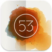
 There are literally dozens of drawing/painting apps for iOS. Some of my favorites include Procreate, Penultimate, ArtRage and now Paper from FiftyThree, Inc. This new app burst onto the App Store recently and has been receiving a great deal of attention for its fresh approach to the genre of the sketch app. Much has already been written about Paper and so I’m going to try and cut right to the chase with my review by detailing things the app does well and areas where it’s lacking. If you want to know how Paper may or may not fit into your work flow, then by all means read on.
The Good
Simplicity
Above everything else, Paper keeps the interaction between the app and the user simple. This design decision is by far its greatest asset, but it is also its greatest weakness (more on this later). Getting into your sketchbook and starting work is dead simple. Thumb through drawings, access tools, and draw away. You can also add pages to your sketchbooks and share your work via Facebook, Twitter, Tumblr or email. There doesn’t seem to be a way to send drawings to the camera roll, but taking a quick screen shot does the job in a pinch. The entire app feels light, easy to get around in and, for the most part, doesn’t suffer from being over-designed.
Brushes
Paper has one of the best media engines I’ve ever encountered in a painting or drawing app. The pencil tool as well as the watercolor brush behave almost like their real world counterparts and are a sheer joy to use. Drawing speed helps determine stroke width with certain tools, and opacity with others. The overall effect is wonderful.
In-App Purchases
Some will say this isn’t a plus for an app like Paper. Many users don’t appreciate having to unlock functionality inside of an app that they thought was initially free, but Paper’s implementation of their in-app purchases is extremely well done. You buy only the tools you want and the app even lets you test drive the brushes prior to purchase so you can get a feel for them. Finally, there is an “Essentials” bundle that gives a small discount compared to buying all of the individual tools separately. If I find an app compelling, I certainly don’t mind paying for it and Paper’s in-app purchase model lets me pick and choose the parts I like most.
The Details
Customize the cover of your sketchbooks. Blend colors with the paint brush. Effortlessly flip between drawings that beautifully highlight your work. The devil is in the details and Paper does a deft job of getting them right.
Could Be Better
Rewind/Undo
The two-fingered gesture to step back (or forward) through your drawing is clumsy. Often times it takes me far longer to get to just the proper undo point with the gesture than it would if undoing was a simple button. I also sometimes make stray marks on the page when attempting to make the undo gesture. In addition, the number of undo states is far too small, especially when using techniques like cross-hatching. I also wish that rewinding would take you back through drawing a stroke little by little, but it doesn’t, it removes the last stroke in its entirety.
Colors
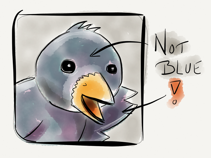
 The selection of colors in Paper is extremely limited. There are a total of nine to choose from and of those, none of them are any shade of blue. The developer encourages users to go old school and mix colors to form new ones but the inability to select custom colors is a major deal breaker. I can’t use the app to sketch concepts for clients (or even myself) if I don’t have access to the entire range of colors I need, especially ones like blue and red.
Landscape
The app is perpetually locked in landscape mode and it’s extremely frustrating. I presume the developers did this to accommodate the wide screen design of the main menu, but I sincerely hope they add the ability to use Paper in portrait eventually.
Immutable Drawings
Unlike many other drawing/painting apps, once you place a mark on the page, that’s where it stays. There is no way to re-position a drawing or even a portion of one once it’s made. Some would say this simply echos a real-life sketch pad, but if I wanted a real sketch pad I would use one. I use Paper and apps like it because they give me additional flexibility when creating. Not being able to re-position elements on the page is frustrating and feels antithetical to the app’s overall design.
The Bad
Zooming
I want the ability to be able to zoom in and add details to my sketches or out and fill larger areas with colors quickly. Adding zooming would almost eliminate the need for various brush sizes, so if I had to choose between the two I’d take zooming. In addition, my brand new retina iPad has millions of pixels at its disposal. Paper’s lack of pinch zoom means a good many of them are going to waste.
Fills
The app desperately needs a fill tool. The watercolor brush does an inadequate job of filling large areas with solid colors and sometimes that’s just what you need. I’d love to be able to sketch in white pencil on black paper, but that isn’t possible in Paper. A fill tool would rectify this glaring deficiency rather nicely.
Sortable, editable layers would have been nice here.
Layers
Adding layers ala Photoshop would significantly increase the app’s complexity and FiftyThree may be unwilling to go there just yet which is fine. I do hope it comes eventually however because I often wish for the ability to erase or tweak individual elements of a sketch independently of the rest. I’m sure the talented folks there could find a way to add drawing layers to Paper in a simple and elegant fashion. I’d also like a way to lock a sketch once it’s done so I don’t accidentally add stray marks, which seems to happen often.
Conclusions
If you’re looking for a simple, straight forward tool for sketching you’ll probably find Paper both fun and elegant. I suspect this is what Daring Fireball author John Gruber meant when he said the app was “Exquisitely well-done”. I wouldn’t go that far but there’s a great deal to like in FifthThree’s initial effort. The app is a testament to beautiful user interface design, unfortunately it lacks too many features in my opinion to be used as anything more than a simple notebook. Paper’s limited undo states, narrow color palette, in-ability to re-position elements on the page and lack of zooming all force me to turn to other drawing apps when I want to truly create.
The good news is that Paper is a 1.0 product and as such I’m confident that improvements will come quickly. If the app simply added a long tap on color wells to bring up a picker and the ability to zoom in and out of a drawing, Paper would instantly become about 10x as useful as it is now. Since the app is free to try with the built-in quill pen, there’s no reason not to download and check it out yourself. I’ve definitely enjoyed exploring the app and it’s given me new reasons to try drawing with various styluses, but that’s blog post for another day.
My friend Dave Caolo recently told me that his kids love Paper. They each have their own sketchbooks and enjoy doodling and coloring very much. This comment is telling because right now Paper feels very much like a kids app. It has lots of potential but it’s too immature to really be useful. In their quest to make a dead simple iPad sketch app, FiftyThree may have sacrificed a bit too much functionality. Paper may be just what you’re looking for to jot down notes and quick sketches on the go, but I personally hope FiftyThree eventually lets Paper sit at the grown-up table.

 If you’ve
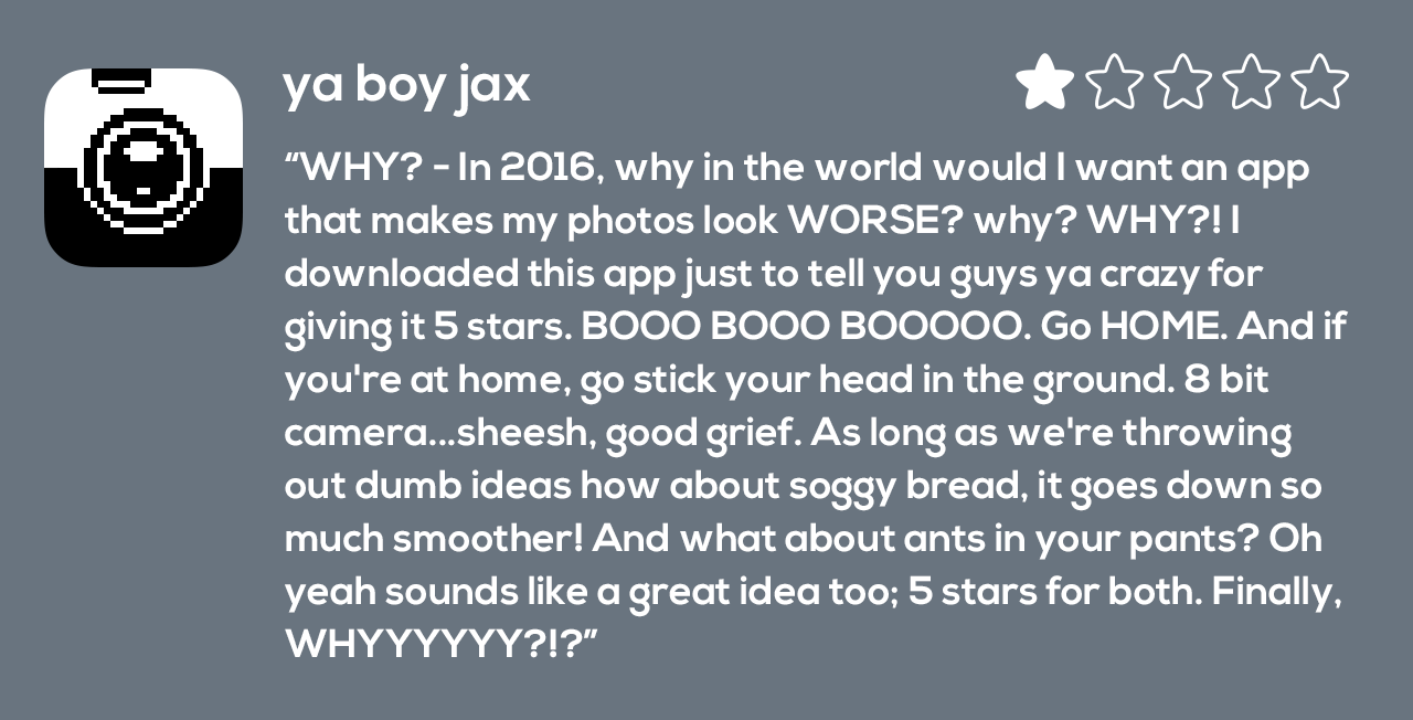
  The second type of people who leave reviews do so for a simple reason – spite. They feel slighted by their purchase and want to do their very best to try and punish the developer in their small way by assigning a single star. They often accompany such reviews with
 Then near the end of 2011,
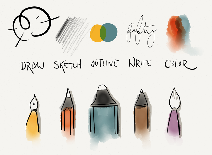
 There are only a handful of games on my iDevices that have withstood the test of time and clung to my home screen. Some of these games include

