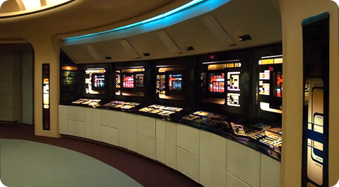
LCARS 2023 Star Trek Wallpapers

The third and final season of Star Trek: Picard reunites most of the original cast of the Next Generation and is currently airing on Paramount+. This seemed like the perfect time to once again my LCARS series of Star Trek wallpapers for the latest and greatest devices. If you are a Star Trek fan then you’re going to love this massive update.

LCARS 2023 includes over 48 individual wallpapers formatted for iPhone, iPad and macOS and offers tons of variants including the Starfleet insignia, star fields, a technical schematic of the USS Titan-A seen in Picard and more. Here are the details:

• Lock Screen iPhone variants for use with iOS widgets
• Home Screen variants for use on iPhone and iPad
• An ‘Red Alert’ theme exclusively for Patreon supporters
• Extra wide Mac Studio Display desktops variants for Patreon supporters

LCARS 2023 Star Trek Wallpapers are available via Wallaroo in the App Store or by subscribing to the Iconfactory’s Patreon account. Patreon gets you additional perks mentioned above plus lots of other goodies that we frequently offer there. I and the other designers at the factory work really hard to create quality content each month so I really hope you’ll check it out.

In the meantime I’m going to enjoy the final season of Star Trek: Picard and count the days until the return of Star Trek: Strange New Worlds which may have become my all-time favorite Star Trek series! It’s a great time to be a Star Trek fan, that’s for sure!

One Perfect Shot: TOS ‘The Corbomite Maneuver’

Back in 2006 CBS Home Video began airing the first episodes of Star Trek: The Original Series in their newly re-mastered format. These episodes featured improved CGI effects, HD picture quality and professional sound mixing and have become my absolute favorite examples of how remastering a classic property such as Star Trek, should be approached. Mike Okuda and the team at CBS focused on creating visuals that enhanced the originals; more realistic planets, more detail on the Enterprise and beautifully rendered alien landscapes. The team produced the kinds of shots the original show creators would have used themselves if possible. The remastered original series is a testament to restraint and good visual design and if you want a great example, look no further than ‘The Corbomite Maneuver’.

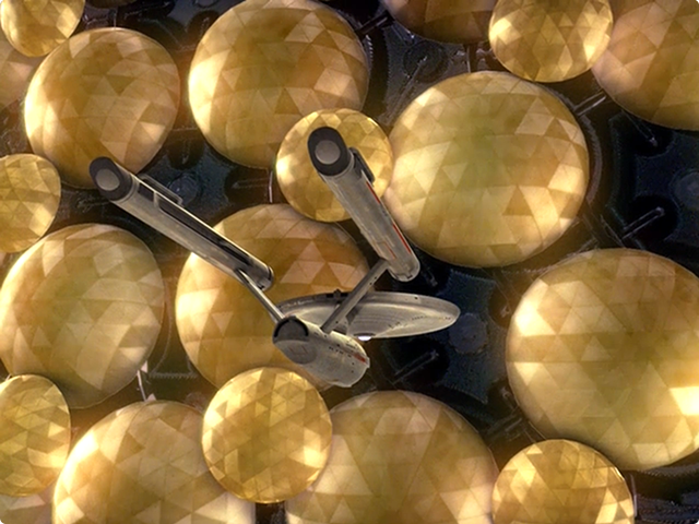
Our one perfect shot features the Enterprise dwarfed by the Fesarius, the flagship of the “First Federation”, an immense ship of size and power. Captain Kirk and crew make first contact with Balok, commander of the Fesarius and employ a cunning bluff to avoid certain destruction. As a kid, this shot of the Enterprise and Fesarius always gave me chills and the newly remastered version adds a definite sense of wonder and awe. The detail on the surface of the Fesarius is now geometric in nature and the entire ship seems to pulse with limitless energy. I also love how we can see some of the internal structure of Balok’s craft which takes visual cues from geodesic dome designs like EPCOT’s Spaceship Earth. The re-mastered special effects in The Corbomite Maneuver are impressive, beautiful and purposeful which adds up to the perfect combination for one perfect shot.

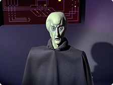
Notably, the other shot I considered for this episode depicts one of the most iconic (and low-tech) aliens from the entire series, the puppet of Balok’s alter ego himself. Created by production designer Wah Chang, this supremely alien character could have easily been replaced with a CG version of the primitive puppet, but Okuda and team wisely let him stand in his original form. Chang’s original concept sketch for Balok is wonderful and his depiction on the small screen was often featured in the closing credits of Star Trek episodes each week. I almost chose Balok for this episode’s one perfect shot, but in the end the beauty and attention to detail of the remastered Fesarius won out.

Next up, Spock kidnaps the Enterprise in a bold attempt to help his former Captain in ‘The Menagerie Pt. I & II

Fine Art from the Future

File this one away for that Star Trek fan in your life who has everything. Artist Charity Wood has launched a new website called Bye Bye, Robot which aims to bring officially licensed Star Trek prints to a living room near you. These beautiful, hand-signed and numbered fine art prints are bold, campy and bring the best of the Original Star Trek Series to vibrant life. Via a press release at StarTrek.com, Wood promises these pieces are just the first in a series that will eventually depict imagery from TNG, DS9, Voyager and Enterprise.

Personally, I can’t wait to see what Wood eventually plans to offer. I’d give my last Tribble for a fine art print of The Defiant from Deep Space Nine, but honestly, what Trek fan wouldn’t want a giant Gorn portrait hanging in their ready room? Make it so!

1 Comment

All I ask is a tall ship…

Thanks to the generosity of a friend, I’ve been lucky enough to beta test the new MMO, Star Trek Online from Cryptic Studios. The game is set to launch in early February and at least for this Star Trek fan, it’s a winner. Playing around in Gene Roddenberry’s universe has given me a new appreciation for the art direction of designers such as Matt Jeffries and Michael Okuda. Designing anything is challenging, but designing interiors, user interfaces and uniforms of things that have yet to be must be especially difficult.

Most beloved of all the designs of Star Trek is perhaps the bridge of the Starship Enterprise itself. The bridge is the command center of the ship and is often the focus of action on both the big and small screens. Jeffries’ original utilitarian layout eventually gave way to more modern looking interiors, but the basic design (center command chair, flanking support positions) has withstood the test of time. The bridge is such an integral part of Star Trek that due to popular demand, the developers of Star Trek Online recently announced they were implementing them for individual ships within the game. Virtual captains told Cryptic they wanted their “big chair” and the game designers responded in kind.

All of this got me thinking about which starship bridge I liked the best. The answer has to be that of the Enterprise-D from Star Trek: The Next Generation. To many Trek fans this bridge seemed more like a hotel lobby than a high-tech command center, but I always admired its sleek curves, high-tech surfaces and muted colors. The original TV design was modified slightly for Star Trek Generations (seen here) to accommodate new science/tactical stations, giving the set a more cinematic feel.

Designed by Andrew Probert, the bridge of the Enterprise-D was the ultimate set for the weekly TV series. The layout was big enough to allow the actors room to move around comfortably as well as give characters space for private conversations, tucked away from prying ears. The raised back level provided an elevated platform that made Worf look even more imposing while offering Geordi and Data stations where they could work out solutions to the problem of the week. The set also introduced flanking seats to those of the Captain’s something that Star Trek Voyager would also adopt.

In contrast to The Next Generation’s warm earth tones, the bridge of the U.S.S. Voyager presented TV viewers with the cool grays and electric blues so often associated with science fiction. Created by production designer Richard D. James and illustrator Rick Sternbach, the interior design of the bridge of Voyager introduced subtle under lighting techniques that contributed to the “deep space feel” of the show. This design also reduced the traditional two-man con and navigator positions to a single console, putting emphasis on Captain Janeway.

I love the look of these two sets because they put the focus on the characters and their actions rather than the technology all around them. Some production designers tend to get out of hand with their creations and let the look of the set overpower its inhabitants. Voyager’s and Next Gen’s bridges are awesome examples of futuristic interior design precisely because they don’t go overboard. Compare these simple designs to the complex bridges of the Enterprise-E or the franchise reboot and you’ll see Star Trek art direction run amuck. Overlapping lines, textures and lens flares get in the way of the action and detract from the audience’s ability to focus on the characters.

Designing anything, even a fictional universe is an art form. More so when a large part of that universe’s appeal centers around details. Through the years, those entrusted with designing the bridges of Starfleet have evolved and molded it again and again. These talented artists have put their stamp on Gene Roddenberry’s original vision of the future and given Trek fans a place they could easily call home. Star Trek Online will soon give players a chance to roam the bridges of some of the most beloved starships in Star Trek history, all from the comfort of their computers. So until we can all afford to build a bridge in our basement, a virtual one has to be the next best thing.

17 Comments

One Fan’s Perspective on Star Trek

SPOILER WARNING: This post contains major spoilers for J.J. Abrams’ new film Star Trek. I mean really, really big spoilers. If you don’t want to know about things that might ruin your enjoyment of this movie, then you really should stop reading now and go somewhere else.

So much has been said and written about the new Star Trek film from J.J. Abrams that it seems to make little sense to write my own thoughts up. But seeing as Star Trek has been such a big part of my life ever since I was a little boy, and given that I’ve often written about Trek in the past, I figured what the heck.

Overwhelming consensus seems to be that the film is “Great!”, “Fantastic!” and “Fabulous!” Of all the guys from work that I went to see the movie with, I think I was the only one who came out of the theater not jazzed. I think Corey might have had some reservations too, but overall he was very excited about it. Did I like it? Yes I did. Did I love it? No I didn’t, at least not yet.

The Good

There are tons of things in the new film that I liked and others I even loved. In no particular order they include:

The cast: Every actor in the film did a wonderful job of translating their character for a new generation. I especially enjoyed Quinto and Pine as Spock and Kirk, but also thought Simon Pegg as Scotty was wonderful and was surprised by the turns put in by the actors behind Checkov, Sulu and Uhura.

The twists: I had seen so much of the movie in the commercials and trailers leading up to its debut that I thought I knew what was going to happen. I was surprised and delighted therefore when Kirk wasn’t the one under Uhura’s bed, but was under her Orion roommate’s instead. Same goes for the scene with Kirk sitting in the Captain’s chair with his black shirt where Spock tells him to “Get out of the chair.” It was wonderful and went against what I thought was going to happen going in.

Spock rejecting the Vulcan Science Academy: Loved this scene to death. Quinto played it to a perfect Spock “T” when he asked the elders about his “disadvantage” and basically told them to go to hell. If you had put Nimoy in that scene instead, it wouldn’t have played any differently. Brilliant stuff.

The action: It was quite a roller coaster romp from start to finish and had great pacing. The time seemed to fly by while we were in the theatre which is always a good sign.

Uhura & Spock: I thought the scenes with Uhura and Spock becoming close would bother me, but they didn’t at all. They were played very well by both actors and Abrams’ direction here was wonderful. I can’t wait to see where this goes in the sequel.

The Meh

• The music: Totally didn’t live up to Star Trek standards. The main theme (which Louie pointed out was used in almost every track of the film) seemed like it *wanted* to be Star Trek, but was just slightly off. I kept expecting to hear the familiar Next Gen theme at points in the movie, but didn’t.

• Engineering: Being the die-hard Trekkie I am, I didn’t really appreciate the way Engineering looked more like a chemical plant from 24 than the heart of the flagship of the Federation.

Enterprise in Iowa: Sorry, but the Enterprise was never built on the ground. It just wasn’t and the entire ship was never intended to land either. If Roddenberry was around today he would have told J.J. this small fact to his face. A totally unnecessary and pointless scene that would have at least been semi-credible if it had taken place in San Francisco instead of Iowa.

The Bad

Abrams’ wanting to have it both ways: The studio promised us that this wasn’t “Your father’s Star Trek” and made a big deal about how everything was different. In reality, the only things that were different were the things Abrams wanted changed. There were so many TOS classic references that when they were thrown in, they seemed oddly out of place. More than a few of them seemed gratuitous. If you’re going to promote the film as all new Trek, have the space balls to see it through to the end.

The Kobayashi Maru: As a huge fan, this was the scene I was looking forward to the most. I had run this classic tale of how Kirk beat the no-win scenario in my head dozens of times. I had always imagined it that Kirk reprogrammed the simulation just enough to make it seem like the rescue was plausible through heroic actions or sheer guile. What we got instead was a smug, overly-cocky Kirk eating an apple while everyone around him is astounded to find that the simulation has been reprogrammed. The most throughly unsatisfying bit in the entire movie.

The destruction of Vulcan & death of Spock’s Mom: Listen, I get that this probably only matters to geeks like myself, but it does. The destruction of Vulcan negates HUGE portions of Star Trek history and cannon. Sure, this is an “alternate reality”, and it was probably necessary for several of the plot points, but that doesn’t mean I have to like it. You know how you felt when Lucas made Greedo shoot first? The loss of Vulcan is like that for me.

In the end, it doesn’t really matter what I think of Star Trek. Everyone seems to love it and have hailed it as a wonderful re-boot of the series. To be honest, I’d rather have new Star Trek movies than not, so I can live with the parts I didn’t like, at least for now. I think by the time the inevitable sequel comes I’ll have come to terms with the disappointing parts of Star Trek and learned to see only the good stuff. After all, there is a great deal in the new film to like especially since I don’t enjoy being called a dickhead.
2 Comments

Star Trek Boldy Goes Blu Ray

In their seemingly never-ending mission to get fans to buy more stuff, Paramount will soon be releasing a new blu ray box set aimed right at Trekkers. Although the ‘Star Trek Motion Picture Trilogy’ does not contain Star Trek: The Motion Picture, as the name would seem to suggest, it does contain re-mastered versions of The Wrath of Kahn, The Search for Spock and The Voyage Home in glorious HD.

According to Amazon.com the box set will be released May 12th, will retail around $50 and come complete with loads of extras. A quick glance at the product specs reveal commentary by William Shatner, Leonard Nimoy, Nicholas Meyer, Ronald Moore (of BSG fame) and many others as well as stacks of shorts, trailers and other goodies. It’s difficult to say if these new high-def versions are worth enough to replace any older copies you may have on DVD, but I suspect that given the amount of bang for the buck Paramount’s packing, updating your collection just might be the logical thing to do.

Hat tip to @Talosman for this post.