The Evolution of Linea

iMore Show artworkLast week, the Iconfactory launched its new simplified sketching app for iPad – Linea. We worked on the app for over a year and used it internally for client projects during its development. The response has been nothing short of amazing. We designed the app to be easy to use and immediately approachable for both advanced artists as well as novice users and that simplified philosophy seems to really have struck a chord with people.

Rene Richie invited me to come on episode 543 of the iMore Show and talk about Linea. We discussed how the app came to be, what went into bringing it to market and how it hopefully stands out in the crowded space of App Store sketch apps. I had a great time with Rene, Serenity Caldwell, Lory Gill and Georgia Dow talking about Linea and getting their insights into why they love sketching with it. As an aside, if you’ve not seen Serenity’s amazing video review of Linea, please do check it out, it’s one of the best product reviews I’ve ever seen.

A big thanks to the entire iMore crew for having me on to talk about Linea. It’s gratifying to see something you’ve worked so long and hard on be so loved by the iOS community. The Linea section of episode 543 starts around the 24 minute mark. Enjoy!

A Sticker By Any Other Name Would Smell As Sweet

Sweet Stickypoo Sticker

So imagine that thing you’ve built your entire professional career on, something you love to create with a burning passion, slowly fades from popularity. Day by day people have less and less use for it, fewer and fewer people write you to make requests. You try to stay the course and keep doing your thing, but doubts inevitably creep in.

Then one day you find you’re just not doing it any more. You’re not really sure what happened but somewhere along the way it just… stopped. It pains you that people no longer love or even really need the thing you’ve honed your craft on for close to twenty years, but what can be done?

You go about your business, applying what you’ve learned to other areas of your discipline. Occasionally a project invites you to play in the fields you once roamed with glee, but they seem few and far between.

Then one day something comes along that turns the old thing you loved to do into something new and exciting. It presents that thing in a whole new, modern way and lets you express your creativity as never before to an entirely new audience. These people are too young to really remember you or where you’ve come from but that doesn’t matter. All that matters is that you’re standing in the middle of those lush, green fields once again and the sky is literally the limit. It may not last a year, a few months or even a week but for now, for right now, it’s just as fun, just as compelling and fulfilling as it ever was and it is glorious.

Those “things” are simply icons. Desktop icons, specifically.

They are what, since yesterday, we now call stickers in Messages but they’ll always be icons to me. Their introduction in iOS 10 represents a new era for icon artists like myself who once toiled for endless hours to create piles and piles of icons that people could download and use on their computer desktops. We created them because it was fun for us as artists and especially fun for those who collected them.

The advent of the iPhone and mobile era changed all that and desktop icons went out of fashion. People were glued to their tiny screens and didn’t have the time or attention span to customize their desktop folders and hard drives any longer. With the advent of iOS 10 however, people once again have a way to collect and share those tiny, iconic works of art in the form of iMessage stickers. Stickers, perhaps even more than emoji have the capacity to inspire and delight people as never before and I have completely enjoyed creating them during these precious weeks leading up to yesterday’s launch. I’ve been working with my friends at the Iconfactory to bring hundreds of icons stickers to life and it has been a blast. I’ve worked with outside artists as well and watching them create has been joyous.

Stickers may turn out to be another flash in the digital pan and fade quickly into the sunset but that hardly matters. Even if they do, for one brief moment, they allowed me to re-energize, create and dream what might be possible. In short, they have inspired me. As an artist I can truly say this matters more to me than all the tea in China. Thank you, Apple. I owe you one.

The Joy of Creation

I count myself fortunate that I have the ability to create. On any given day I create digital artwork in the form of icons, interfaces, logos, illustrations or even just doodles and I have a grand time doing it. I also enjoy whipping up culinary creations in the kitchen which is extremely satisfying to me since unlike most of my work, my food takes physical form (at least until it’s eaten :-)). So I can only imagine what it must be like to be able to take a stack of wood and in the span of a few hours and create something as physically beautiful as the nightstand seen in this video.

Add to that the fact the woodworker has cleverly added a secret compartment into his design and you really have something special. Trust me and take a few minutes out of your busy day to just sit back and watch this table take joyous shape. Seeing the final product really is wonderful, it makes me wish I had taken wood working during my days at RIT.

The Bezel’s the Thing

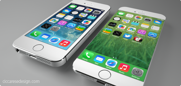
It doesn’t take tea leaves or even a leaked report from the Wall St. Journal to figure out Apple will probably release a new model of iPhone with a larger screen later this year. Users have been begging for more screen real estate, especially with the increased attention of larger-screened devices like the Samsung Galaxy. Also, Apple typically does full product revisions on a 2-year cycle which just happens to hit for the iPhone this fall. All of these factors may create the “perfect iStorm” that users have been patiently waiting for. From a personal standpoint, I would love an iPhone with something around a 4.75″ screen because the older I get, the more I seem to squint and miss-tap at the tiny interface elements of my iPhone 5c.

The report from the Journal seems to hint at two new sizes of iPhones, one somewhere around 4.75″ and another, larger device possibly measuring 5.5″ diagonally. I freely admit that speculating about the screen sizes of these non-existant devices is mostly wishful thinking, but that’s part of the fun. What would your ultimate iPhone look like? What size screen would it sport and more importantly, what’s the new form factor going to be like? For all the talk about screen size, I think the more important aspect of the next iPhone will be the design of the bezel. The bezel is the border around the screen that offsets the display from the edge of the device. Recent rumors suggest that the new iPhone 6 will have little or no bezel between the screen and the left and right edge. If true, this is a far more exciting development, at least for me, than just upping the screen size.

It’s no secret that the industrial design team at Apple has long sought to create a display that’s essentially a continuous piece of solid glass, edge to edge when held in the hand. Such a design would result in a screen that seems to end where your hand begins. Now with advances in Sapphire glass technology and with 7 years of experience under Apple’s belt, the dream of a nearly invisible bezel may soon become a reality. Removing the bezel won’t be a slam dunk however, as there are most certainly software considerations that need to be worked out. Accidental taps and swipes at the edge of the screen would probably increase without some kind of UI “neutral zone” at the perimeter of the display. Designing protective cases that don’t interfere with touching or swiping would also be a challenge, but hardly impossible.

If the rumors are true and the iPhone 6 will have a bezel of around 1mm, it will certainly make for a stunning, refreshed visual appearance at a time when the iPhone seems stagnant. Apple’s supporters note the company is selling record numbers of iPhones even though the form factor hasn’t changed for several years and that is true. It is also true however that users have been hungry for larger devices as well as ones that look and feel different from the existing models to help set them apart from their peers. From the stunning introduction of the retina display to the increased security and cool factor of Touch ID, Apple fans love owning the new hotness. Come this fall, I’m willing to bet a big part of the “heat” won’t be what Apple has added, but rather what they’ve removed – the bezel.

1 Comment

The Art of Doing ‘Nothing’


“When you do things right, people won’t be sure you’ve done anything at all.” This line from Futurama perfectly sums up how I often feel about my job. Designing, if done right, takes the challenge of communicating a complex idea effectively, and turns it into something that can be easily understood by the masses. When designers do their job right, the overall design fades into the background and you just “get” what you’re looking at. It speaks to you on a fundamental level, things just click and you usually see big smiles on the faces of those who interact with your work.

Through the years, I’ve learned the job of the programmer is much the same. Although my programming abilities are limited to rough forms of HTML and BASIC (yes, BASIC), through my position at the Iconfactory, I’ve learned much about what goes into making a successful software application. I see the challenges that our programmers tackle every single day and I for one am always impressed. This is particularly true of our latest effort, the retina compatible version of xScope for Mac OS X.

When Apple’s stunning new display was announced, I was excited about the increased level of detail and clarity the technology would bring to the desktop. The images are gorgeous, text is as crisp as the printed words and colors are deep and rich. Designing for this display means tools that can work correctly with it, giving you accurate and flawless information from which you can build your designs. From the get-go we knew that xScope, our utility for measuring and inspecting the screen, had to be updated for this new display. What we didn’t realize when we began was just how complicated that update would be.

I’m going to be completely honest here and say that even today, after several months, I still can’t get my head fully around the concept of pixels vs window points. Oh, I know what they are and why they exist, but from the time I first learned how to use a mouse, I’ve always dealt with pixels as the unit of measure on the screen. My entire professional career has revolved around the humble pixel and as such it’s been difficult coming to grips with the fact that the days of seeing exactly what you get on screen are pretty much over.

But all of this pales in comparison to the work that my friend, our lead engineer Craig Hockenberry, had to do in order to get xScope working properly with the new retina display. Whenever Craig starts waxing programatic about his coding, my eyes usually glaze over. That said, there were times during the xScope retina conversion when I thought I was going to go catatonic. If you’re the type of person who loves coding, or maybe needs something to read to send them off to sleep at night, head on over to Furbo.org and read Craig’s technical post on the problems with coding for retina. Suffice to say it’s beyond me. Also beyond me – all the math, logic and problem solving needed to surmount this incredible challenge. I have tons of respect for anyone who finds mathematics fun and exciting, and even more for friends like Craig who wield it like a weapon in the service of their job.

When designers and developers use xScope on a shiny new retina Macbook, all they’ll know, indeed all they’ll care about is that the app works as advertised. xScope will give them the data they need to make their apps and designs the best they can be and that is all that matters. Because of the efforts of Craig and Corey Marion, xScope’s lead UI designer, the app just “works” and it works well. Users won’t know all the algebra and bug finding that went into creating it, but I thought it was appropriate to take just a moment and recognize the hard work that went into making it a reality. I sincerely hope you find the new version of xScope as powerful and useful as all of us have. But the best part is if we’ve done our jobs right, you won’t be sure we’ve done anything at all.

Movie Poster Makeovers

Ïve Bastrash, a Canadian-based illustrator has been busy pumping out stylish renditions of some of his favorite sci-fi, fantasy and action movie posters. The results are charming and bold and remind me a great deal of one of my all-time favorite artist’s work, Bruce Timm. Head on over to the post at DesignTaxi to see more, and then visit Bastrash’s Deviant Art page to see other work from this very talented artist. Well done sir, well done!

Vote For Hope

An incredible music video with a message that I feel very strongly about. It’s a great example of how good design can communicate an idea effectively.

Hat tip to Andy Brewer for this.