The Real Thing
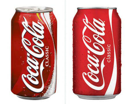
Notice anything different on the soda aisle of your local grocery store? Fans of Coca-Cola and graphic design in general may have recently noticed a change in the packaging for America’s favorite soda pop. Gone are the superfluous swooshes, bubbles and halftone tints that have been creeping onto Coke’s cans these last few years. In their place is one of the strongest treatments of the company’s brand I’ve ever seen.
The can is now a simple field of red with the Coca-Cola logo popped out in white. No drop shadows, no fake drops of water, nothing. In addition, the soda’s “Classic” text has gone from a formal, stuffy serif treatment to a modern, simple sans-serif face that expertly compliments the new logo. Over at his blog, Creative Director Jon Berry wonders how such a straight forward design ever made it past the suits in Atlanta. However it happened, he likes it and I have to say I whole-heartedly agree. The new design is wonderfully simple, clear and feels extremely retro. Maybe others will take a cue from the Coca-Cola company and remember to KISS. Lord knows some companies can use all the help they can get.
Yeah, I noticed that too — wish the clean, simple, icongraphy would spread to Coke’s other flavors. Their Coke Vanilla can looks like butt (tastes pretty good, tho).
//k
Now if they’d just eliminate that annoying “Classic”, it’d be perfect. Isn’t it about time to put the “New Coke” fiasco behind us for good?
I disagree: I miss the yellow stripe, which gave it a little character. White and red are classic, true, but a little boring. (Actually, the designs here are a little flamboyant, with “The Coke Side of Life” campaign. See http://www.flickr.com/photos/arsidubu/872169757/ for a creative take on the can.) Coke also changed the design of the plastic bottles: gone are the grooves at the top, in favour of a flatter surface.
At exactly the same time, they seem to have rejiggered the formula of the drink, at least as bottled here in the Lower Mainland of British Columbia, and possibly elsewhere. There’s a lot less bite, and I no longer get the satisfying single hiccup I used to get from the first sip. Maybe I need start drinking the Mexican Coke I’ve been hearing so much about.
I think they’ll retain the Classic nomenclature because the other product lines also use ‘Coke’. Classic is the exact product, as opposed to the Coke Product family.
We’re experiencing the difficulty at my work, where we purchased a copule of brands that play in the same market as a slice of our ‘in-house’ products, and now we’ve got to figure out how to get the in-house branded products re-branded for the public…
Now if they’d just stop using corn to sweeten Coke and go back to cane sugar like in the good old days. Or like in modern days in countries that don’t have massive Archers Daniels Midland subsidies.
The ‘Dynamic curve’ has always been underrated by Coke, it’s as distinctive as the type and this re-design which is very similar to the 70’s version I remember as a child strengthens the brand more than any of the superfluous eye candy that took the eye away form the curve.
If I remember correctly, the curve was introduced when the drink became canned to evoke the classic Coke bottle and then was applied to the Coke bottle as part of the brand retrospectively. Please correct me if I’m wrong
The new red colour (if the picture is correct in rendering it) is blank and a bit boring in comparison with the previous dynamic shade of red.
I like everything but the sans serif type. If, as you point out, it highlights a retro tone, the sans serif has no place here.
The choice of CLASSIC using an OPTIMA like typeface is also an odd choice – maybe trying to get it so bland so don’t even read it.
Mexican Coke details;
http://2aday.wordpress.com/2007/05/04/the-real-coke-classic-mexico-coke-at-costco/
Just googled higher res, thought others might want them too:
(new-can)http://www.thecoca-colacompany.com/presscenter/img/imagebrands/downloads/lg_cocacola_can.jpg
(old-can)http://disfunctionalich.files.wordpress.com/2007/04/lg_cocacola_can.jpg
(new-diet)http://www.thecoca-colacompany.com/presscenter/img/imagebrands/downloads/lg_diet_coke_splenda.jpg
(old-diet)http://www.thecoca-colacompany.com/presscenter/img/imagebrands/downloads/lg_dc_with_splenda_can.jpg
(new-logo)http://www.thecoca-colacompany.com/presscenter/img/imagebrands/downloads/lg_new_coke_logo.jpg
(old-logo)http://excelsior-online.de/images/cocacola.jpg
I noticed the redesign of Diet Coke last night when I brought home a case of Diet Cokes.
The new lower-case ‘classic’ looks quite Apple-esqe and reminds me of when they dropped their version of Garamond for Myriad .
I love this. The only thing I miss from the old logo is the black shadow around the words “Coca-Cola”, and I’m even starting to get used to that.
It’s still “sans serif” (without serif), according to OED…
Actually, the redesign has spread at least to Diet Coke (with similarly pleasing results, in my opinion).
Here’s an analysis that compares the new design to Jupiter fading in the movie 2010:
http://fixyourthinking.com/2007/02/i-hate-pepsi.html
The ‘Dynamic curve’ is actually trademarked as the ‘dynamic ribbon device’ and has been around since 1969.
http://www.thecoca-colacompany.com/heritage/pdf/cokelore/Heritage_CokeLore_trademarkchronology.pdf
Somebody needs to show this to the UPS people!
🙂
An isle is an island. An aisle is a row, as in a grocery store.
Tob & Dan, thanks for the eagle eyes. I’ve fixed those typos! 🙂
“Yeah, I noticed that too — wish the clean, simple, icongraphy would spread to Coke’s other flavors. Their Coke Vanilla can looks like butt (tastes pretty good, tho).”
Coke Cherry’s new design sucks too. Basically, they took a huge dump all over every one of their brands EXCEPT Coke Classic, which somehow came out beautifully.
The can’s fixed, now if they’d use sugar, in place of corn sweetener, I’d drink it again.
There’s no such thing as soda pop. Soda is one thing, and ‘pop’ is a made up term for soda. The correct name for these drinks is ‘carbonated beverage’. Yes, it could be a regional thing to call it soda, pop, or soda pop, but I’m only interested in the proper term.
Contrary to your post, there is no new logo; this is just a new packaging design. There’s a big difference between the two. The ‘superfluous swooshes’ you refer to are known as the Dynamic Ribbon Device, which makes the Coke brand recognizable even without the word Coke. That ribbon is also trademarked.
Some people think the package has a new color, but that’s doubtful. More likely, the apparent difference is the lighting of the image, or normal variations of color in the printing process. Coke uses their own color, Coca-Cola Red, for their package designs.
Whao, Mulder! Sounds like you’re on a graphic design bender here. Sorry if you don’t like the term “soda pop”, but a heck of a lot of people use it, so deal.
The “Dynamic Ribbon Device” is indeed trademarked, but it is also a fact that Coke has been adding secondary ribbons and swooshes to the can that clutter the brand and add noise to the packaging. I’d also LOVE to see an example of an advertisement for Coca-Cola that just used the ribbon and not the words. Let me know if you find one.
I think you’re taking this post a bit too seriously. Have a Coke and a Smile™.
Great article, but you do know that the MS Video you linked to was a joke/parody from inside Microsoft, right?
Funny thing. In Canada, “classic” isn’t printed on the can at all.
http://s211.photobucket.com/albums/bb177/ggferal/?action=view¤t=July2007004.jpg
Ged: I know many people use the term “soda pop”, but I don’t, and it grates on my nerves.
Yes, Coca-Cola has added secondary ribbons to their packaging in the past, which may bother some people. It doesn’t bother me unless they take it too, far, which they have. The “bubbles” they added to some designs I think adds to the overall package. YMMV.
I have seen billboards and signage on the sides of buildings using just the Dynamic Ribbon Device. I don’t remember exactly where or when, and I don’t carry a camera with me everywhere I go.
I agree with B. Minich – whilst it’s nice to have a lot of the visual clutter gone, I think the drop shadow added eye-pleasing depth. It looks a tiny bit old-fashioned and flat.
yes… clean and simple makes items pop on a shelf and stage. I agree that the ‘can’ is fixed- I wish that they would go back to sugar instead of corn syrup. Many people suffer from allergies that keep them away from corn products.
When I noticed this a few days ago, my first thought was, “Yes! It IS classic!”
Terri
I really like it. It has a more “brushed aluminium” look to it; less plastic-y.
Of course that could be because of the photo.
complicated does not always equal modern
There’s something wrong with touting the typeface of the the word “Classic” as being “modern”, don’t you think?
I think I would have preferred a serif typeface and a shadow on/under the main logotype, myself.
It has to be called Classic, because it is not the real thing, which uses cane sugar, it is the fake recalled by popular demand “Classic’, post New Coke, which was all just a wiggle to get out of bottling contracts that insisted on Sugar being used in Syrup for a product called Coke or Coca-Cola.
Coke (and Pepsi of course) is sugared horse urine for fatass Americans so WTF cares what’s on the can of this swine sweat.
hello i want a picture of a can of coke,recycled or not still okay…..
I’m doina project on this for design at school, and I think that the new design is indeed eyecatching. The older design is a little complicated. In my design class, simple equals good work, but it does have to be creative. The new design isn’t all that creative. I have a mixed opinion.
yes kula, anything with calories = for fatass americans. eating disordered much?