3 Comments

Switching Hats

Back on December 1st, I put on my artist’s hat and wrote a post about the importance of icon design and how it shouldn’t be taken for granted or seen as an afterthought. The post garnered a fair amount of exposure and I received a great deal of positive feedback from designers and developers alike on the importance of icon branding and standing out in the App Store.

Near the end of the piece, I offered up this unassuming little opinion which has caused me a fair amount of stress these last few days:

“Lately, developers have taken to plastering “SALE” or “60% OFF!” within their icons. They’ve become lazy and let the iPhone software mar their design with glossy highlights which obscure efforts to brand their software. Fight the urge to cheapen your brand and instead give your icons the love and attention they deserve. You’ll still sell boat loads of copies and your users just might end up thanking you at the same time.”

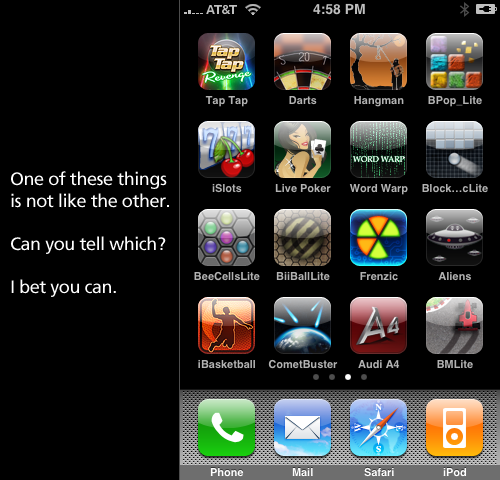
What is the source of my distress? Over the course of the past week, the Iconfactory and ARTIS Software jointly agreed to put our game Frenzic on sale for the Christmas holiday. From the moment we launched the product, we had always planned on temporarily lowering the price for the holiday rush. When I wrote the original post I was unaware of the importance the app’s icon plays in marketing an online sale. I’m guessing you can probably see where this is heading. As the app went on sale today, it reluctantly sported a new badge. The same type of badge that I railed against in my original post.

If you care as much about icons and design as I do, then you’re probably asking yourself how I could allow something like this to happen. At first I couldn’t figure it out myself, and then it became very simple. I took off my “designer hat” and put on my other one… the one that says “business owner”.

The business owner in me doesn’t wrestle with many of the lofty ideals that my inner designer aspires to. Being a partner in a successful company sometimes means doing what’s best for the health and growth of the business, especially in today’s unsure economy. It’s easy to criticize someone’s design decisions when you’re on the outside looking in. You think you’ve got everything figured out, but then your app starts to sink off the App Store and suddenly nothing’s as simple as you thought.

Although I initially resisted calls to slap a “For sale” badge on our icon, I came to realize that it was one of the most important ways to get people who had previously dismissed Frenzic due to its $4.99 price tag to take another look. The change may not affect sales at all, but on the other hand, it may help to get Frenzic in front of more people’s eyes than ever before. If that means that I have to eat a hefty helping of crow in order for us to maximize our exposure in the App Store, then I say pass the ketchup.

27 Comments

Why Icons Matter

I can’t tell you how many times in the course of my career as an icon artist that a client considered their icons to be an after thought. After spending hundreds of man hours and pouring thousands of dollars into software development, some clients just refuse to devote the attention needed to the glyphs that act as both button and branding. At the Iconfactory, we try and educate clients about the importance of icons and how they strengthen a company’s brand as well as communicate a product’s core concepts quickly and easily. It may sound like marketing fluff, but years of experience have taught me it’s the truth.

So when it comes to designing our icons for our own software products, we almost always end up obsessing over them. The redesign of the application icon for xScope went through nearly 20 different revisions before we settled on a final version. This time around, the drama was caused by the new icon for Frenzic for the iPhone.

Standing Out From The Crowd

When it came time to design the icon for Mobile Frenzic, we knew we wanted to use a 2D translation of the OS X version from the desktop. However, unlike Mac desktop icons which have a canvas size of 512×512 pixels, iPhone and iPod touch app icons are limited to 57×57 and look best when designed straight on. At first we decided to translate Frenzic.com’s fav icon which was a pie of green and orange wedges on a glossy black base. Early beta versions of Mobile Frenzic used this icon, but there was a problem. It just wasn’t eye catching.

Our artist, David Lanham, went back and added a neon-like inner glow that gave the impression of the icon being lit from within, like it was a piece of plexiglass. The results were effective and with the addition of a high-tech circuit board motif, I knew we had a winner. The icon both stood out on the iPhone’s home screen and did a wonderful job of branding “Frenzic” on the device. Despite these successes, there were those among us that thought it stood out a little too much.

As artists, we often get butterflies the first time we show a client our designs. In this case, the “client” was Frenzic creator and lead programmer, Wolfgang Ante. We’ve had a close working relationship with Wolfgang for years and even though he almost always loves everything we do “out of the box”, he was hesitant about the icon’s treatment. Both he, and our own lead programmer, Craig Hockenberry played devil’s advocate and thought that the glowing, high-tech icon might be too dissimilar to be effective. The design didn’t seem to follow conventional wisdom for iPhone app icons and we debated the pros and cons of the design.

In Expertise We Trust

The great thing about working at the Iconfactory is that we play to each other’s strengths. While I may have ideas about how a particular software feature might work, I trust in the skill and expertise of Craig and Wolfgang to pull off the actual programming. I often put my faith in their hands when it comes to coding, and likewise, they do the same for us when it comes to design. This is more than I can say for many of our clients who think they know best when it comes to icon design. Despite a client’s lack of experience of how icons communicate, where they are seen, or the technical details needed to pull them off, I often get lectured on how they should be rendered or what form they should take.

So, in their wisdom, Wolfgang and Craig set their hesitations aside and let the designers do their job. The result was a unique and compelling application icon that was simple to understand, easy to spot and visually unique from all other iPhone application icons. Maybe its even helped sell a few extra copies at the same time.

All too often icons are treated as second-class citizens, especially in the App Store. Lately, developers have taken to plastering “SALE” or “60% OFF!” within their icons. They’ve become lazy and let the iPhone software mar their design with glossy highlights which obscure efforts to brand their software. They use dull colors or pile on heaps of detail that just adds unwanted noise to an already cluttered array of choices. After the flashy ad pitches have faded, the icon still has to live on the user’s device and is often the first line of interaction with the product. Fight the urge to cheapen your brand and instead give your icons the love and attention they deserve. You’ll still sell boat loads of copies and your users just might end up thanking you at the same time.