Thoughts on the Tesla Model 3

The Tesla Model 3

Full disclosure: I own stock in Tesla Motors. Now you know!

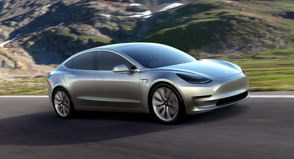
Last week Elon Musk finally announced the long-awaited Tesla Model 3. The Model 3 is the final step in the company’s “Master Plan” to bring affordable electric vehicles to the masses and judging from the number of pre-orders I’d say it’s about to become a reality. There’s a lot to love about the Model 3 including a minimum driving distance of 215 miles on a single charge and a base starting price of $35,000.

There’s also many unknowns including how many of the over 250K pre-orders Tesla will convert into actual sales. With a promised delivery of somewhere around the “end of 2017” it’s unclear if the government’s $7,500 EV tax credit will still apply to the Model 3 at the time of its release. The credit only covers the first 200,000 units of a given model which means some 53,000+ buyers may not be eligible. In addition, thanks to an anti-electric vehicle assault the Koch brothers plan to mount this year, the entire tax credit structure may not survive in Congress long enough for owners to take advantage of purchasing a Model 3.

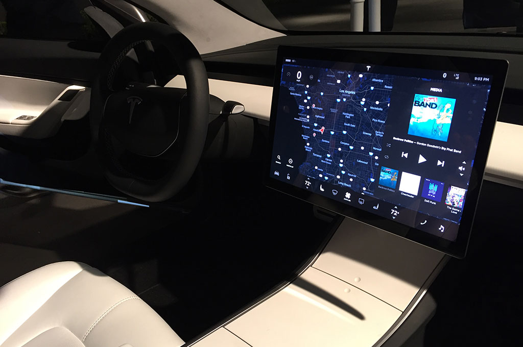
Tesla Model 3 Interior'

I’ve read lots of strong opinions on the Model 3’s styling; from its strange lack of a front grill to the huge flat-panel display that seems overly distracting when sitting behind the wheel. The smooth nose I understand and I think I could get used to, but the large, center-mounted instrumentation panel does seem like a deal breaker, at least to me. I’m curious to see how the display looks when driving at night as well as how responsive it is to touch commands. The entire interior of the Model 3 seems overly minimalistic which isn’t necessarily a bad thing I just feel like I’ll be sitting inside Flynn’s home from TRON: Legacy.

Without a doubt the most appealing aspect of the Model 3 is its range of at least 215 miles on a single charge. Having owned a Ford C-MAX for almost a year now, which has a maximum distance of just over 24 miles on a charge, I can’t wait for the rest of the industry to catch up to Tesla. Whenever my car switches from EV mode to combustion I feel disheartened, like I’ve somehow let the environment down. Having the freedom to travel great distances without worrying about re-charging will be a huge selling point for Tesla and makes hybrid car owners like myself seriously consider it for their next vehicle.

Although I didn’t put a pre-order in for a Model 3, I am enthusiastic for those who did. The entire world will be watching to see if Tesla launches the Model 3 on time and on budget. Meanwhile, other companies like Nissan, Chevy and even Apple are eager to see where Elon Musk’s vision takes us all next. The company’s success or failure will undoubtedly influence the direction of sustainable transport around the world for decades to come. Personally, with the threat of climate change worsening day-by-day, I’m rooting for Tesla to succeed and drag us all into a cleaner, greener future whether we like like how it looks or not.
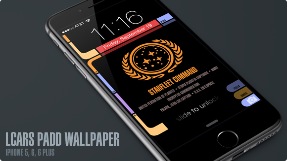
Star Trek: Next Gen Wallpapers for iPhone 6

UPDATE: Four new variants have been created for Apple’s new iPhone X. The device’s OLED screen means the LCARS design blends seamlessly into the bezel like never before. So much fun!

If you enjoy Star Trek as much as I do then you’ll love these free, Next Generation mobile wallpapers I designed for use with iOS. I’ve updated my original LCARS Star Trek lock screen for the brand new iPhone 6 and 6 Plus so you can be the geeky envy of all your friends. For those of you still running the smaller iPhone 5, don’t worry, there’s even a version here for you!

I’ve been a huge fan of Star Trek Production Designer, Michael Okuda since day one and this project was my way of saying “Thank you!” for the wonderful, futuristic operating system that Next Gen fans know and love as LCARS. With the iPhone 6 Plus approaching the size of actual padds from Next Gen, it only made sense to bring this amazing aesthetic to the palm of our hands.

How to download and apply the wallpapers on iOS:

1) Click to view the wallpaper that best fits your device:

• iPhone 5 Series (iOS 8 & 9) – Original / TNG Colors / Janeway Alt / Janeway TNG
• iPhone 6 (iOS 8 & 9) – Original / TNG Colors / Janeway Alt / Janeway TNG
• iPhone 6 Plus (iOS 8 & 9) – Original / TNG Colors / Janeway Alt / Janeway TNG
• iPhone SE Series (iOS 10) – Original / TNG Colors / Janeway Alt / Janeway TNG
• iPhone 7 (iOS 10) – Original / TNG Colors / Janeway Alt / Janeway TNG
• iPhone X (iOS 11) – Original / TNG Colors / Janeway Alt / Janeway TNG
• iPhone Xs Max (iOS 12) – Original / TNG Colors / Janeway Alt / Janeway TNG

• Windows Phone – Original / TNG Colors
I don’t own a Windows Phone and make no promises about how this version will work for you. These are provided as is!

2) Tap & hold on the image in mobile Safari & save it to your photo library

3) Open Photos, view the image then tap the Share button in the lower left

4) Scroll to the right in the Share menu and tap Use as Wallpaper

5) Pinch Zoom OUT on the image to size it exactly to the screen. You want the date to be vertically centered within the sub-horizontal bar near the top.

6) Turn Perspective Zoom OFF

7) Tap Set > Set Lock Screen

That’s it! Sleep/lock your iPhone and the next time you activate it, you can pretend you’re Captain Picard himself receiving an important message from Starfeet Command. I hope you enjoy this fun treat & help spread the word via Twitter and Facebook. Engage and enjoy!

UPDATE: I’ve added 6 new variants of the lock screen for iPhone after a request from @keydiehhurst. Available in both original and TNG color schemes, these variants address the communique to fearless Captain Kathryn Janeway in the Delta Quadrant. Safe journey, Captain!

UPDATE 2: I’ve added 8 new iPhone SE & 7 variants for use with iOS 10. The lock screen in iOS 10 has moved controls around so the wallpaper had to change to accommodate the new design. Hope to add iPhone 7 Plus variants soon.

UPDATE 3: I’ve added 4 new iPhone X variants for use with iOS 11. The lock screen in iOS 11 puts controls in a different place plus the tall format of the iPhone X means the wallpaper had to change to accommodate the new design.

UPDATE 4: I’ve added 4 new iPhone Xs Max variants for use with iOS 12. This iPhone is freakin’ huge so the placement of the controls, date bar and message block all had to be adjusted again. The Max is about the size of a small TNG PADD!

One Perfect Shot: TOS ‘The Man Trap’

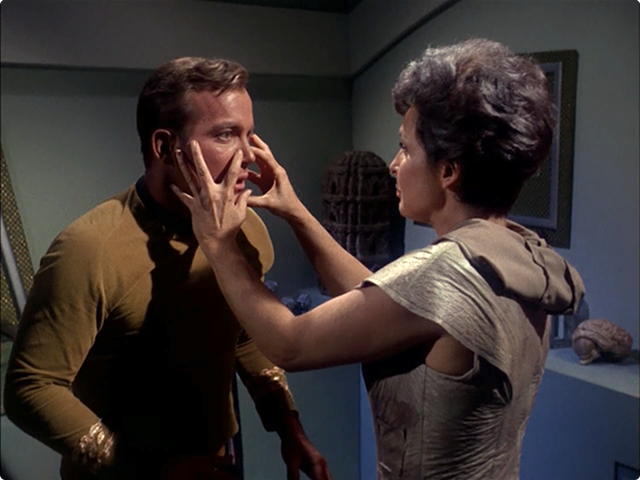
This episode of classic Star Trek always creeped me out as a kid, and with good reason. An alien creature who can assume the appearance of anyone, roaming the halls of the Enterprise in search of its next victim. The original series’ ‘The Man Trap’ oozes with mystery and horror and saves the best bit until the very end when the Nancy Crater, otherwise known as the Salt Vampire, reveals herself to the crew and the audience. Our perfect shot takes place just prior to that bizarre ending as Nancy has tossed Spock aside like a rag doll and has Captain Kirk firmly in her hypnotic gaze.

I always found it a bit of a stretch that Professor Crater could survive for almost two years alone on M-113 with Nancy and not get the salt sucked right out of him. Given how many crew members end up dead, you’d think her appetite was almost insatiable. Then again I guess it’s kinda like fasting for weeks, once you’re surrounded by food after having gone so long with so little, you kinda want to put your big pants on and sail right on into salt-town.

Next up is one of my least-favorite Star Trek episodes – ‘Charlie X‘. This should be interesting. :-/

The User Interfaces of Oblivion

As an UI designer, I love seeing what artists come up with for fictional user interfaces. I’ve admired the work talented folks like Jayse Hansen has done for films like Iron Man and the Avengers for some time and secretly longed to do this kind of work. The latest work from Joseph Kosinski and Crater Lake Productions for the film Oblivion is pure magic. The level of detail, both animated and static, is staggering. I hadn’t intended to see Oblivion in the theater, but after seeing this wonderful work I just might. If you want to learn more, head over to GMUNK and check out their process.

1 Comment

All I ask is a tall ship…

Thanks to the generosity of a friend, I’ve been lucky enough to beta test the new MMO, Star Trek Online from Cryptic Studios. The game is set to launch in early February and at least for this Star Trek fan, it’s a winner. Playing around in Gene Roddenberry’s universe has given me a new appreciation for the art direction of designers such as Matt Jeffries and Michael Okuda. Designing anything is challenging, but designing interiors, user interfaces and uniforms of things that have yet to be must be especially difficult.

Most beloved of all the designs of Star Trek is perhaps the bridge of the Starship Enterprise itself. The bridge is the command center of the ship and is often the focus of action on both the big and small screens. Jeffries’ original utilitarian layout eventually gave way to more modern looking interiors, but the basic design (center command chair, flanking support positions) has withstood the test of time. The bridge is such an integral part of Star Trek that due to popular demand, the developers of Star Trek Online recently announced they were implementing them for individual ships within the game. Virtual captains told Cryptic they wanted their “big chair” and the game designers responded in kind.

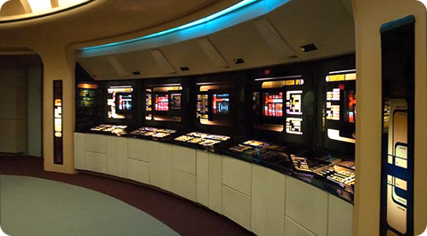
All of this got me thinking about which starship bridge I liked the best. The answer has to be that of the Enterprise-D from Star Trek: The Next Generation. To many Trek fans this bridge seemed more like a hotel lobby than a high-tech command center, but I always admired its sleek curves, high-tech surfaces and muted colors. The original TV design was modified slightly for Star Trek Generations (seen here) to accommodate new science/tactical stations, giving the set a more cinematic feel.

Designed by Andrew Probert, the bridge of the Enterprise-D was the ultimate set for the weekly TV series. The layout was big enough to allow the actors room to move around comfortably as well as give characters space for private conversations, tucked away from prying ears. The raised back level provided an elevated platform that made Worf look even more imposing while offering Geordi and Data stations where they could work out solutions to the problem of the week. The set also introduced flanking seats to those of the Captain’s something that Star Trek Voyager would also adopt.

In contrast to The Next Generation’s warm earth tones, the bridge of the U.S.S. Voyager presented TV viewers with the cool grays and electric blues so often associated with science fiction. Created by production designer Richard D. James and illustrator Rick Sternbach, the interior design of the bridge of Voyager introduced subtle under lighting techniques that contributed to the “deep space feel” of the show. This design also reduced the traditional two-man con and navigator positions to a single console, putting emphasis on Captain Janeway.

I love the look of these two sets because they put the focus on the characters and their actions rather than the technology all around them. Some production designers tend to get out of hand with their creations and let the look of the set overpower its inhabitants. Voyager’s and Next Gen’s bridges are awesome examples of futuristic interior design precisely because they don’t go overboard. Compare these simple designs to the complex bridges of the Enterprise-E or the franchise reboot and you’ll see Star Trek art direction run amuck. Overlapping lines, textures and lens flares get in the way of the action and detract from the audience’s ability to focus on the characters.

Designing anything, even a fictional universe is an art form. More so when a large part of that universe’s appeal centers around details. Through the years, those entrusted with designing the bridges of Starfleet have evolved and molded it again and again. These talented artists have put their stamp on Gene Roddenberry’s original vision of the future and given Trek fans a place they could easily call home. Star Trek Online will soon give players a chance to roam the bridges of some of the most beloved starships in Star Trek history, all from the comfort of their computers. So until we can all afford to build a bridge in our basement, a virtual one has to be the next best thing.

2 Comments

Biff’s Question Song

To be fair to actor Tom Wilson, who played the infamous bully Biff from the Back to the Future films, I’d probably ask him all of these questions too. That’s why I’m so glad I discovered this gem of a clip where Tom puts all of the answers to song. The result is something that should somehow be worked into the next season of Big Bang Theory. Enjoy!

Hat tip to IO9 for this post

6 Comments

Where There’s A Will, There’s a Way

I was watching Fox Sunday when Chris Wallace brought up Obama’s “McCain doesn’t know how to use a computer” campaign spot to strategist Karl Rove. Rove, who regularly advises the McCain camp, took the position that the critique was offensive and “over the line”. The argument goes that McCain is incapable of using a computer due to his injuries suffered as a prisoner of war – he can’t raise his hands above his chest and his fingers lack the dexterity to type on a standard keyboard. Rove felt Obama owed McCain an apology for such an out of bounds attack.

I’ve got news for Mr. Rove. There are millions of people in this country who do not have the use of their arms, hands or even their body and who use a computer every single day. One such man is Professor Stephen Hawking. Hawking is the Lucasian Professor of Mathematics at the University of Cambridge, England. Hawking suffers from Lou Gehrig’s disease and does not have use of the majority of his neural functions. He communicates via a computer system attached to his wheelchair which is operated via an infra-red ‘blink switch’ clipped onto Hawking’s glasses. By scrunching his right cheek up, he is able to talk, compose speeches and research papers, browse the World Wide Web, and write e-mails.

So when Karl Rove and says John McCain “can’t” use a computer because of his war injuries, what he really mean is that John McCain “won’t” use a computer. There are plenty of ways to do so besides standard input devices, as is evidenced by Professor Hawking. No, this isn’t about physical limitations, this is about mind set. John McCain doesn’t see the need to surf the web, organize thoughts and send emails. He has staff that does all that for him. He lacks the will to do these basic tasks for himself. Why does this matter? For me it makes all the difference.

All during George Bush’s Presidency we kept hearing about how American’s wanted a President they can relate to, a man they could “sit down and have a beer with”. I don’t drink, but I sure as hell use a computer, and so do millions of Americans every single day. I want a President who is curious enough about the world to use the World Wide Web on his own. I want a President who has an intricate understanding of technology, where it’s heading and what challenges we are likely to face. I want a President that computer users can finally relate to.

How can I expect John McCain to really understand the threat of anti-Net Neutrality legislation when he doesn’t deal with his own Internet providers? How can McCain fathom the threat of anti-spam laws getting struck down if he doesn’t send and receive his own email? Now more than ever, we need a President that is in tune with the world we live in, not one that makes excuses about why he can’t click a mouse.

5 Comments

Writing On The WALL•E

So like millions of Americans, I went to see PIXAR & Disney’s latest animated film, WALL•E this weekend. For those of you living under a rock, the film tells the tale of a brave little robot who is left to clean up the Earth after mankind dumps so much trash that he can’t live here anymore. Adventure, romance and of course humor ensue for the tiny bot with a Johnny 5 complex.

Reviews from critics and the movie-going public have been overwhelmingly favorable, and it’s easy to see why. Behind the futuristic facade of WALL•E lies basically a love story between WALL•E himself and the angelic EVE. The story also cleverly taps into an topical issue that is sure to raise the ire of some of the more conservative audience members – environmentalism.

Back in August of 2007, I wrote a post about PIXAR’s advanced PR for the film, via the Buy n Large viral website. Buy n Large is the company responsible for the vast consumerism that ultimately makes the Earth uninhabitable to the human race in the film. The message in WALL•E is clear – if things keep going the way they’re going, we won’t have a planet left to live on. This moral imperative is one of the major plot points of the film, and I’m betting it won’t be very long until we see right-wingers railing against Disney and PIXAR for “green propaganda”.

I’m willing to bet that by no later than this Wednesday, Michelle Malkin, Bill O’Reilly, Neil Boortz or some other misguided blowhard will do their best to alter WALL•E’s portrayal as lovable protagonist to that of a mechanized propaganda bot intent on brainwashing your kids. Rest assured it will happen, and when it does, I’ll update this post with which offender was first to pull the trigger.

In the end, nothing these people can say will diminish the movie’s endearing success. WALL•E is nothing short of an animated masterpiece that has its heart and message in exactly the right place. There is plenty of emotion and humor to keep audience goers smiling and parents safely content. And if kids get interested in recycling or gardening, let’s just say it wouldn’t be the end of the world.

UPDATE: Here’s a tweet that illustrates what I’m talking about. It’s starting.

UPDATE II: DING! DING! We have a winner, or rather a big, fat ignorant loser… in the form of everybody’s favorite shill from CNN, Glenn Beck. Think Progress has more too boot. To quote Weird Al, “Man, I hate it when I’m right.”