The Best BitCam Review. Ever.

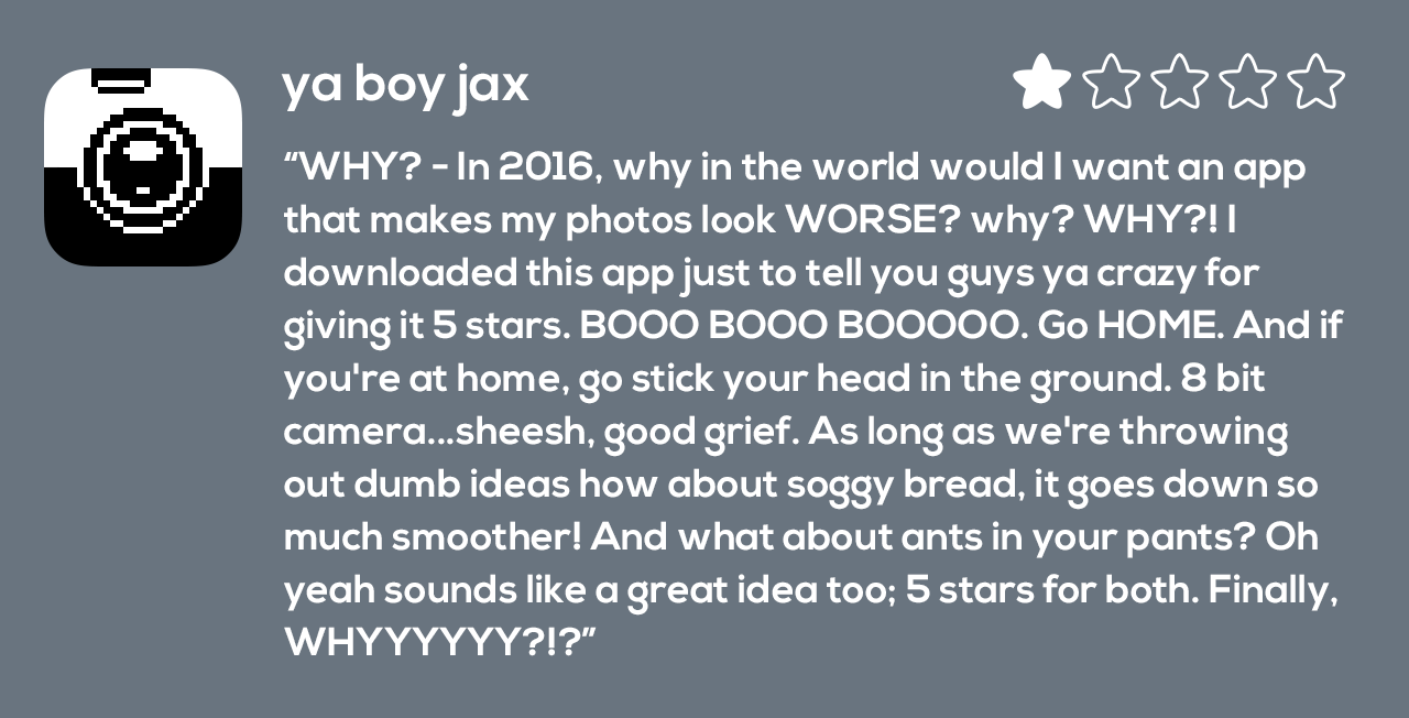
BitCam review from the app store: WHY? - In 2016, why in the world would I want an app that makes my photos look WORSE? why? WHY?! I downloaded this app just to tell you guys ya crazy for giving it 5 stars. BOOO BOOO BOOOOO. Go HOME. And if you're at home, go stick your head in the ground. 8 bit camera...sheesh, good grief. As long as we're throwing out dumb ideas how about soggy bread, it goes down so much smoother! And what about ants in your pants? Oh yeah sounds like a great idea too; 5 stars for both. Finally, WHYYYYYY?!?

I and everyone at the Iconfactory are grateful so many people have been enjoying our little photographic throwback to the 1990′s with our recent release of BitCam. For those who remember the era it’s a nostalgia trip that brings bittersweet memories of straining modems and ear-piercing dot-matrix printers flooding right back. Millennials are not old enough to understand this however. To many of them, a dot-matrix printer is the tool that was used to print the flower patterns on the out house toilet paper back before there was indoor plumbing and colors hadn’t been invented yet.

Someday about 20 or 30 years from now, ya boy jax may well pine for the days when images were taken on a physical device instead of inside his eyeball. A time when talking with his friends meant tapping on a glass-covered screen to launch an archaic app like Snapchat instead of projecting a hologram of himself from his floaty chair onto whatever the internet eventually becomes. On that glorious day, I will push back in my recliner at the old folks home and smile the smile of kings.

User Interfaces of the Week

picard_firstcontact

We’re less than a week away from Apple’s World Wide Developer Conference where Tim Cook and company will unveil the latest and greatest for OS X, Apple Watch and iOS. No doubt we’ll get a preview of iOS 9 and all it has to offer, but before we move forward, sometimes it’s best to reflect on where we’ve come from. I wish I could say the user interfaces featured here were but a distant App Store memory, but alas they all come from currently-shipping apps.

A few weeks ago I went looking for a well designed gas / milage tracking app in the App Store. I’ve been using Gas Cubby for years, but wanted something new to help me keep track of MPG with my new Ford C-MAX Energi plug-in hybrid. From my own experience, I knew that doing a general search in the App Store tends to yield less than optimum results. Even so, I just wasn’t prepared for the sloppy approach many of these apps tried to pass off as user interface design.

Being a UI designer myself, I have surrounded myself in my professional and digital life with talented designers and developers who consistently release top-notch apps. The problem with living in a bubble of roses is you sometimes forget what the real world smells like. As I paged through dozens of these milage trackers I was reminded just how many apps on the store are basically junk. Over at Daring Fireball, John Gruber has a recurring piece he calls “User interface of the Week” where he highlights some of the worst cases of user interface “design” he’s encountered. I don’t feel right calling these apps out by name, but if any apps deserved John’s moniker, these sure do.

Seeing what often passes for acceptable design in the App Store often reminds me of all the hard work that goes into creating my own well designed and executed apps. So many people think software just grows on trees, but it doesn’t. Designing and building best-in-class software requires a depth of knowledge and experience that a relative few possess.

I can’t wait to see what WWDC has in store for the future of my favorite software platforms. I’m hoping Apple inspires an entire new group of developers to strive for excellence and bring users apps that are truly worthy of these wonderful, futuristic devices. As for my milage tracker quest, I finally settled on Road Trip. It’s a bit more complex than I would like, but so far, so good.

Troubleshooting Broken App Store Downloads

For the past several weeks I was unable to download any app, paid or free, from the iOS App Store. Every time I tried, once I tapped the button to buy an app and input my iTunes password, the App Store would display the progress indicator as if it was about to download and then return to its default state. The app itself was never downloaded to my device.

At first I thought it was a temporary problem that would resolve itself. I tried restarting my iPhone and iPad (it was happening on both of my iOS devices) several times but that didn’t fix the issue. I tried signing out and back into iTunes via iOS Settings, but that didn’t seem to fix the issue either. I waited several days and tried again and again with no luck. My patience finally ran out and I made an appointment to see an Apple genius at my local Apple Store and thankfully he helped me resolve the issue. I thought I would share the steps he took with me for all those out there that might be having the same problem.

Here’s how he corrected the issue and got me back downloading apps on iOS:

1) Open iOS Settings > iTunes & App Store > tap your Apple ID and sign out

2) iOS Settings > General > Reset > Reset Network Settings

NOTE: This step will clear all of your current network settings including wifi passwords. You’ll have to re-sign back into all of your saved networks, but unless you have a ton of them, it really isn’t a big deal.

3) Restart your iOS device

4) Re-connect to your current network by re-entering your password

5) iOS Settings > iTunes & App Store > log back into your Apple ID account

If all goes as well as it did for me, you should now be able to download any and all apps from the App Store once again. Before you go through the steps of resetting the network connection completely, you might simply want to try logging out and back into your Apple ID first. The genius told me that this sometimes solves the problem, as does logging out and back into your account from another (different) device like a Mac.

Hopefully this process will work as well for you as it did for me and save you a trip to the Genius Bar. Good luck!

The Bezel’s the Thing

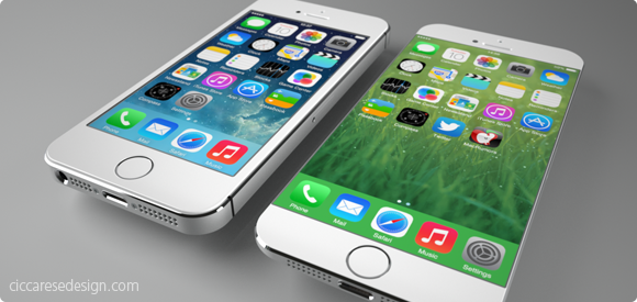
It doesn’t take tea leaves or even a leaked report from the Wall St. Journal to figure out Apple will probably release a new model of iPhone with a larger screen later this year. Users have been begging for more screen real estate, especially with the increased attention of larger-screened devices like the Samsung Galaxy. Also, Apple typically does full product revisions on a 2-year cycle which just happens to hit for the iPhone this fall. All of these factors may create the “perfect iStorm” that users have been patiently waiting for. From a personal standpoint, I would love an iPhone with something around a 4.75″ screen because the older I get, the more I seem to squint and miss-tap at the tiny interface elements of my iPhone 5c.

The report from the Journal seems to hint at two new sizes of iPhones, one somewhere around 4.75″ and another, larger device possibly measuring 5.5″ diagonally. I freely admit that speculating about the screen sizes of these non-existant devices is mostly wishful thinking, but that’s part of the fun. What would your ultimate iPhone look like? What size screen would it sport and more importantly, what’s the new form factor going to be like? For all the talk about screen size, I think the more important aspect of the next iPhone will be the design of the bezel. The bezel is the border around the screen that offsets the display from the edge of the device. Recent rumors suggest that the new iPhone 6 will have little or no bezel between the screen and the left and right edge. If true, this is a far more exciting development, at least for me, than just upping the screen size.

It’s no secret that the industrial design team at Apple has long sought to create a display that’s essentially a continuous piece of solid glass, edge to edge when held in the hand. Such a design would result in a screen that seems to end where your hand begins. Now with advances in Sapphire glass technology and with 7 years of experience under Apple’s belt, the dream of a nearly invisible bezel may soon become a reality. Removing the bezel won’t be a slam dunk however, as there are most certainly software considerations that need to be worked out. Accidental taps and swipes at the edge of the screen would probably increase without some kind of UI “neutral zone” at the perimeter of the display. Designing protective cases that don’t interfere with touching or swiping would also be a challenge, but hardly impossible.

If the rumors are true and the iPhone 6 will have a bezel of around 1mm, it will certainly make for a stunning, refreshed visual appearance at a time when the iPhone seems stagnant. Apple’s supporters note the company is selling record numbers of iPhones even though the form factor hasn’t changed for several years and that is true. It is also true however that users have been hungry for larger devices as well as ones that look and feel different from the existing models to help set them apart from their peers. From the stunning introduction of the retina display to the increased security and cool factor of Touch ID, Apple fans love owning the new hotness. Come this fall, I’m willing to bet a big part of the “heat” won’t be what Apple has added, but rather what they’ve removed – the bezel.

3 Comments

iFavorite Things

Unless you’ve been living on the far side of the island for the past 3 months, you’ve probably heard of the iPad. You’ve probably already read more than your fair share of reviews of the device and what to expect from Steve’s latest magic marvel. Two of my favorite reviews so far are Jason Snell’s wonderfully complete write up as well as Sean Blanc’s take on the iPad. However, rather than pile on my own full review I thought I’d go with the “less is more” approach. Here, in no particular order, are my favorite and least favorite things about the iPad. You’re milage may vary.

Good – The screen. It’s sharp, lush and super crisp.

Bad – The smudges. This thing shows fingerprints like a poor man’s crime scene.

Good – Speed. Holy crap this thing is fast. Apps launch, Safari scrolls and zooms, home screens load all tremendously fast. If you own an iPad and yours isn’t blazingly fast, you’ve either jailbroken it or offended it in some way. This thing flies.

Bad – The weight. It weighs about .5 – .75 more lbs than I would like. It’s not a huge deal, but holding it in one hand will quickly give you a workout. This is undoubtedly the handiwork of the super-long battery life which helps me deal, but I hope iPad 2.0 weighs less.

Good – Did I mention the battery life? It’s like crazy nutty awesome. I sat with my iPad on last night for about an hour using Twitterrific and Safari and went from 100% to about 97% battery. The iPad is doing some crazy ass power management.

Good – iBooks. The application is beautiful, thoughtfully designed and a joy to use. Almost makes me want to read more. Almost.

Good – Blue tooth keyboard pairing. This to me, is the killer feature. Once paired with my Apple wireless bluetooth keyboard my iPad effortlessly became a mini Twitter station next to my iMac. The keyboard can wake the iPad from sleep without the need to unlock and the function keys even control the iPad’s brightness, volume and media controls (play, ff, pause, rewind).

Good – Apps. There are tons of great apps out there for the iPad. In no particular order, my favorite apps so far include Articles, Things, Epicurious, At Bat 2010, Deliveries, Instapaper and my favorite of course is Twitterrific.

Holding and using the iPad makes all the difference in the world. Pictures, even video doesn’t do the device justice. It feels natural to manipulate and beats the hell out of a laptop for casual surfing, tweeting and replying to email. In the game department, the iPad will give all other mobile gaming platforms a serious run for their money. Watching movies & TV shows is light years better than watching them on my iPhone.

Overall the iPad is yet another feather in Steve Jobs’ and Apple’s cap. Even if I didn’t develop apps for a living, I’d still buy one for myself because its just so darned fun and effortless to use. The iPad is certainly a game changer and if nothing else has proven that despite Microsoft’s failed efforts to the contrary, tablet computing can be successful. Check it out.

A Bird in the Hand…

The recent release of Twitterrific 2 for the iPhone has reminded me that software development is replete with truisms. The primary thing I have to constantly remind myself is that, no matter what you do, or how hard you work, you simply cannot please everyone. Anyone who works in a creative field knows that there will always be those who are unsatisfied with the result.

For iPhone developers, these people usually fall into the “if it just had feature X, I would use it” category, but every so often you get someone who just poo-poos your efforts. It’s easy for devs to fall into the trap of trying to keep everyone happy, but years of experience have taught me that this is a losing battle. Development quickly builds into a sort of “features arms race” that usually ends with bloated software and burnt out programmers. No, the answer is to design first and foremost for yourself. If you can produce a piece of software that you are happy with, then chances are the majority of your users will be too. The trick is trust your gut enough to tell the difference between constructive feedback and the nay-sayers so you can move beyond them when it’s appropriate.

The other truism I’ve found is that there’s always room for improvement. The new posting user interface for Twitterrific 2 demonstrates this point perfectly. All through beta testing, the posting UI was the same as it was in version 1. If you wanted to change your update from one type of tweet to another, you had to toggle the tweet type using a single icon on the post bar. Although this method had served well since our initial launch, neither us nor the beta users were satisfied. Their feedback, combined with Louie’s desire to improve the posting experience challenged us to do it better. The result was a re-designed UI that fulfilled user’s desires for posting clarity while giving the Iconfactory a big new feature to tout. The amount of work required to pull off the revised posting interface so close to the end of the beta was intense, but ultimately worth it.

Lastly, if there is one axiom that Twitter has proven beyond a shadow of a doubt it’s simply that if you give an inch, the Twitterverse takes a mile. Lately I’ve been seeing more than a few requests for Twitterrific to support Twitlonger, a service that allows you to “expand” on the 140 character limit that is at the very heart of Twitter. The argument goes that allowing long updates to be read directly in-app is preferable to having to post multiple tweets. This may indeed be true, but I hesitate to support any service that, for lack of a better term, subverts Twitter. Brevity is the soul of wit, and in Twitter’s case, its lifeblood.

In my opinion, any update that can’t be held within Twitter’s 140 character limit should be taken offline to email, Facebook or Friendfeed. What’s the harm in supporting a great service like Twitlonger you ask? Seemingly none, except that Twitlonger is a very slippery slope. Imagine typing a tweet of any length right in Twitterrific. When the message length exceeds 140 characters, the app automatically creates web page entry where your followers can read your magnum opus. Sounds great, except its no longer Twitter, it’s called a blog. Given how easily such a feature would be abused (as is evidenced by the Twitterverse’s aggressive adoption of RT), I don’t see Twitlonger support in Ollie’s future.

As developers, all we can do is our best. Sometimes our best is good enough and sometimes it doesn’t cut the mustard. I’ve been very pleased with the positive reaction that Twitterrific 2 has been receiving from the Twitter community. There are updates coming that address some of the most requested issues from the initial 2.0 launch, but I have no illusions that even these updates will satisfy everyone. Not to mention all those people out there who are patiently waiting for an update to the Mac version of Twitterrific. To them, I offer one last proverb – Good things come to those who wait.