LCARS 2023 Star Trek Wallpapers

The third and final season of Star Trek: Picard reunites most of the original cast of the Next Generation and is currently airing on Paramount+. This seemed like the perfect time to once again my LCARS series of Star Trek wallpapers for the latest and greatest devices. If you are a Star Trek fan then you’re going to love this massive update.

LCARS 2023 includes over 48 individual wallpapers formatted for iPhone, iPad and macOS and offers tons of variants including the Starfleet insignia, star fields, a technical schematic of the USS Titan-A seen in Picard and more. Here are the details:

• Lock Screen iPhone variants for use with iOS widgets
• Home Screen variants for use on iPhone and iPad
• An ‘Red Alert’ theme exclusively for Patreon supporters
• Extra wide Mac Studio Display desktops variants for Patreon supporters

LCARS 2023 Star Trek Wallpapers are available via Wallaroo in the App Store or by subscribing to the Iconfactory’s Patreon account. Patreon gets you additional perks mentioned above plus lots of other goodies that we frequently offer there. I and the other designers at the factory work really hard to create quality content each month so I really hope you’ll check it out.

In the meantime I’m going to enjoy the final season of Star Trek: Picard and count the days until the return of Star Trek: Strange New Worlds which may have become my all-time favorite Star Trek series! It’s a great time to be a Star Trek fan, that’s for sure!
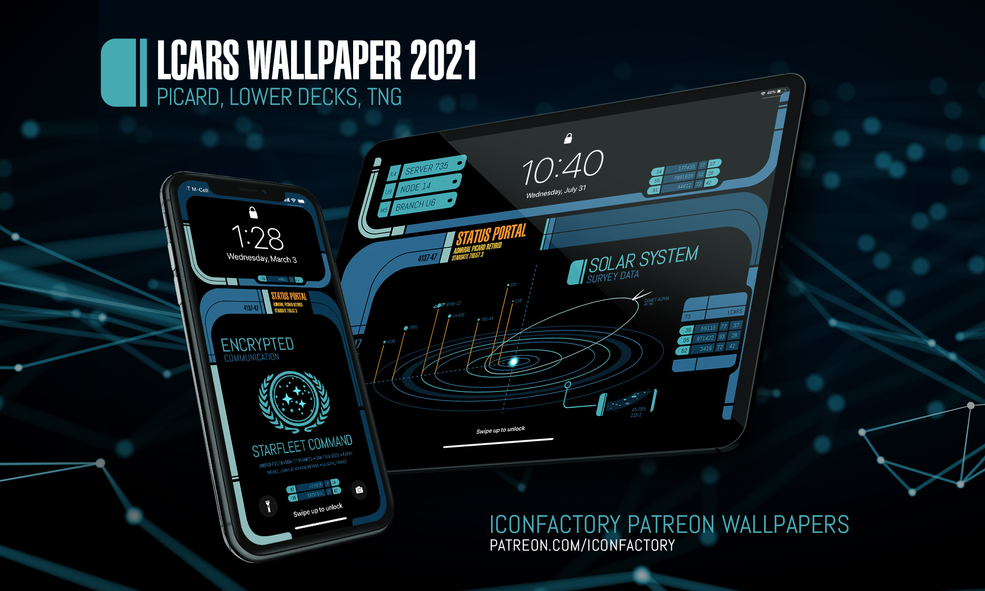
Star Trek LCARS Wallpaper 2021

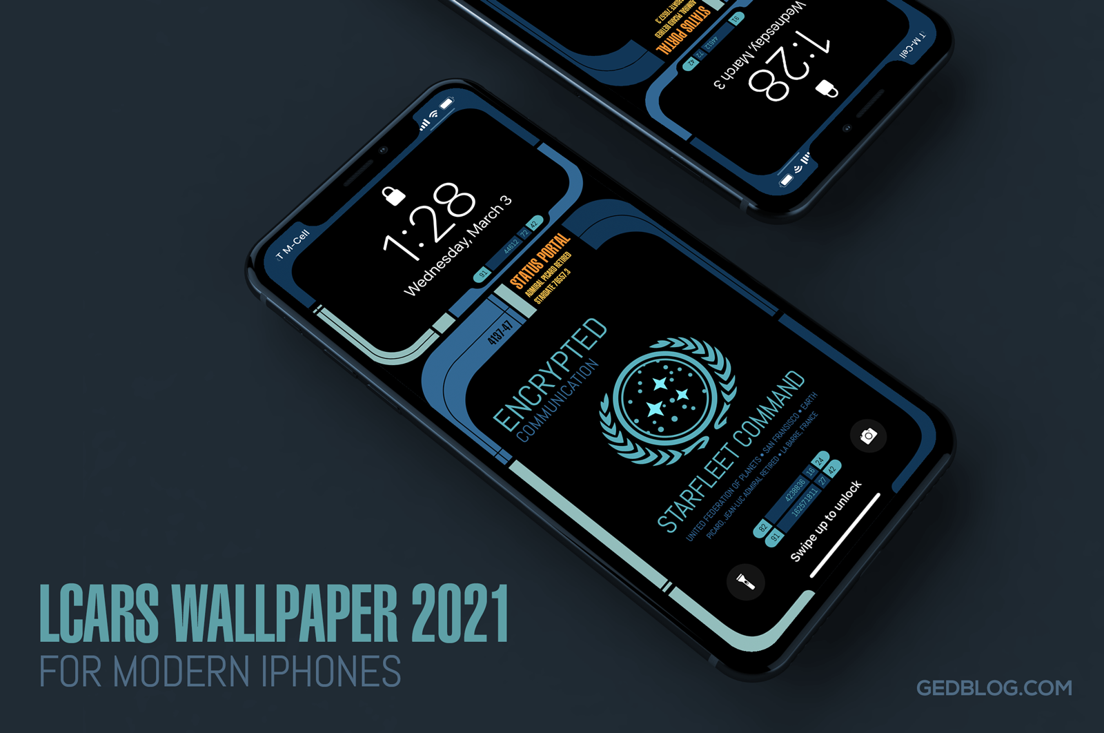
iPhone lock screen showing the Star Trek LCARS 2021 wallpaper

It’s been over six years since I released my original Star Trek LCARS wallpapers for iOS and today I’m happy to report yet another update for all you geeky Trek fans out there.

LCARS 2021 brings Star Trek’s futuristic user interface, designed by Michael Okuda, to modern iPhones. What’s more, I’ve done my best to future proof the wallpapers so when Apple adjusts the position of lock screen elements like the date, time, flashlight and camera buttons the wallpaper will fit properly and still look great with a minimum of setup.

The wallpaper re-design is inspired by Picard, the TV series that debuted last year on CBS All Access (soon become Paramount+). Season 2 of Picard will hopefully debut in late 2021 and so I wanted release this so fans could enjoy it prior to the premiere.

I took visual cues from on-screen elements such as button shapes, typographic refinements and the cooler color palettes seen in the show. The result feels more modern and looks great on the latest iPhones which is sure to put a smile on the face of any Star Trek fan.

I’m providing LCARS 2021 in two downloads that should cover all of the modern iPhone screen aspect ratios available today. There are subtle design differences so be sure to choose the right wall for your particular device:

• iPhone SE, 7, 8 & 9 – Picard LCARS
• iPhone XR, X, 11 & 12 – Picard LCARS

Select the download link of your device above to view it and then tap and hold on the image in Safari to save it to your camera roll. Next, view it in the roll and tap the sharing icon > Use as Wallpaper. Be sure to pinch out on the image and adjust vertical position if needed and finally turn perspective zooming OFF, tap Set and select Set Lock Screen to finish.

Want More?

If you’re looking for the full Montgomery Scott, then head on over to the Iconfactory’s Patreon account. When you subscribe to the Superheroes level ($10) a month, you’ll not only get two additional color ways (Next Generation + Star Trek: Lower Decks) of the iPhone wallpaper but you’ll also get snazzy, expanded iPad versions in these three color ways.

iPhone lock screen showing the Star Trek LCARS 2021 wallpaper

The iPad walls also comes with three, fun content variants to help turn your device into that Starfleet PADD you have always dreamt about.

I hope you enjoy these latest and greatest updates both here and over on Patreon. Please consider subscribing if you are inclined, we want to keep making kick-ass wallpapers for years to come and your generous support helps make it so.

Engage and enjoy!

Star Trek: The Next Generation S7 on Blu Ray

All good things must come to an end (see what I did there?) and such is the case with the high-definition conversion of Star Trek: The Next Generation on blu-ray. The final season 7 has just been announced and to geeks like myself, this is positively great news. Not so much for the episodes in S7, but hopefully because this means CBS will be that much closer to starting work on HD versions of my favorite Trek series – Deep Space Nine. All kidding aside, there are some great stories in season 7 including ‘The Pegasus’ ‘Attached’ and of course ‘All Good Things’. This final set also promises to be chock full of cast extras that should be worth the price of admission.

Head over to Amazon to pre-order your copy of Next Generation, season 7 on blu-ray today. Yes, this is an affiliate link and yes, I’d really appreciate it if you pre-ordered from my blog. Thanks for your support! 🙂

Star Trek: TNG 25th Anniversary Posters

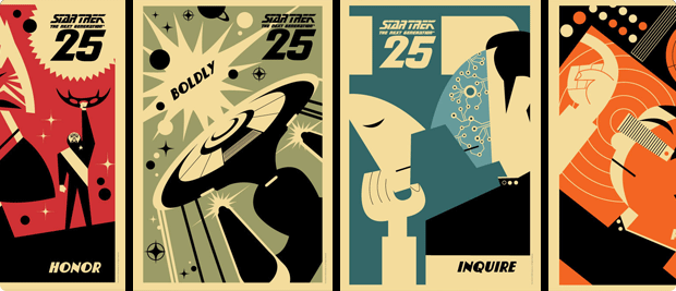
If you’re heading to San Diego Comic-Con this year, then be sure to stop by CBS’s booth (#4129) for some awesome Star Trek related goodies. To help celebrate the 25th anniversary of The Next Generation and release of season 1 on blu ray, CBS has released a set of graphic posters any Trek fan is sure to love. You can follow the official StarTrek.com twitter account for updates on when they’ll be giving away postcards and prints at SDCC or just order them online. The posters come in different sizes and although they seem a bit pricy, they just may be your cup of tea.. Earl Gray, hot. Engage!

2 Comments

Star Trek: The Sexed Generation

Totally immature, totally tasteless and absolutely hilarious! When I hit the play button I was sure this Trek parody would end up being too long, but by the time it was over, I didn’t want it to end. Can’t imagine the effort it took to find & edit all these clips. The bits with Geordi & Wesley are my favorite, the 4:13 and 6:30 marks almost made me fall out of my chair. Engage and enjoy!

1 Comment

All I ask is a tall ship…

Thanks to the generosity of a friend, I’ve been lucky enough to beta test the new MMO, Star Trek Online from Cryptic Studios. The game is set to launch in early February and at least for this Star Trek fan, it’s a winner. Playing around in Gene Roddenberry’s universe has given me a new appreciation for the art direction of designers such as Matt Jeffries and Michael Okuda. Designing anything is challenging, but designing interiors, user interfaces and uniforms of things that have yet to be must be especially difficult.

Most beloved of all the designs of Star Trek is perhaps the bridge of the Starship Enterprise itself. The bridge is the command center of the ship and is often the focus of action on both the big and small screens. Jeffries’ original utilitarian layout eventually gave way to more modern looking interiors, but the basic design (center command chair, flanking support positions) has withstood the test of time. The bridge is such an integral part of Star Trek that due to popular demand, the developers of Star Trek Online recently announced they were implementing them for individual ships within the game. Virtual captains told Cryptic they wanted their “big chair” and the game designers responded in kind.

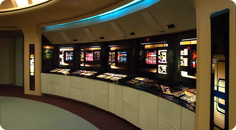
All of this got me thinking about which starship bridge I liked the best. The answer has to be that of the Enterprise-D from Star Trek: The Next Generation. To many Trek fans this bridge seemed more like a hotel lobby than a high-tech command center, but I always admired its sleek curves, high-tech surfaces and muted colors. The original TV design was modified slightly for Star Trek Generations (seen here) to accommodate new science/tactical stations, giving the set a more cinematic feel.

Designed by Andrew Probert, the bridge of the Enterprise-D was the ultimate set for the weekly TV series. The layout was big enough to allow the actors room to move around comfortably as well as give characters space for private conversations, tucked away from prying ears. The raised back level provided an elevated platform that made Worf look even more imposing while offering Geordi and Data stations where they could work out solutions to the problem of the week. The set also introduced flanking seats to those of the Captain’s something that Star Trek Voyager would also adopt.

In contrast to The Next Generation’s warm earth tones, the bridge of the U.S.S. Voyager presented TV viewers with the cool grays and electric blues so often associated with science fiction. Created by production designer Richard D. James and illustrator Rick Sternbach, the interior design of the bridge of Voyager introduced subtle under lighting techniques that contributed to the “deep space feel” of the show. This design also reduced the traditional two-man con and navigator positions to a single console, putting emphasis on Captain Janeway.

I love the look of these two sets because they put the focus on the characters and their actions rather than the technology all around them. Some production designers tend to get out of hand with their creations and let the look of the set overpower its inhabitants. Voyager’s and Next Gen’s bridges are awesome examples of futuristic interior design precisely because they don’t go overboard. Compare these simple designs to the complex bridges of the Enterprise-E or the franchise reboot and you’ll see Star Trek art direction run amuck. Overlapping lines, textures and lens flares get in the way of the action and detract from the audience’s ability to focus on the characters.

Designing anything, even a fictional universe is an art form. More so when a large part of that universe’s appeal centers around details. Through the years, those entrusted with designing the bridges of Starfleet have evolved and molded it again and again. These talented artists have put their stamp on Gene Roddenberry’s original vision of the future and given Trek fans a place they could easily call home. Star Trek Online will soon give players a chance to roam the bridges of some of the most beloved starships in Star Trek history, all from the comfort of their computers. So until we can all afford to build a bridge in our basement, a virtual one has to be the next best thing.