Thanks to the generosity of a friend, I’ve been lucky enough to beta test the new MMO, Star Trek Online from Cryptic Studios. The game is set to launch in early February and at least for this Star Trek fan, it’s a winner. Playing around in Gene Roddenberry’s universe has given me a new appreciation for the art direction of designers such as Matt Jeffries and Michael Okuda. Designing anything is challenging, but designing interiors, user interfaces and uniforms of things that have yet to be must be especially difficult.
Most beloved of all the designs of Star Trek is perhaps the bridge of the Starship Enterprise itself. The bridge is the command center of the ship and is often the focus of action on both the big and small screens. Jeffries’ original utilitarian layout eventually gave way to more modern looking interiors, but the basic design (center command chair, flanking support positions) has withstood the test of time. The bridge is such an integral part of Star Trek that due to popular demand, the developers of Star Trek Online recently announced they were implementing them for individual ships within the game. Virtual captains told Cryptic they wanted their “big chair” and the game designers responded in kind.
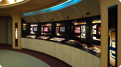
All of this got me thinking about which starship bridge I liked the best. The answer has to be that of the Enterprise-D from Star Trek: The Next Generation. To many Trek fans this bridge seemed more like a hotel lobby than a high-tech command center, but I always admired its sleek curves, high-tech surfaces and muted colors. The original TV design was modified slightly for Star Trek Generations (seen here) to accommodate new science/tactical stations, giving the set a more cinematic feel.
Designed by Andrew Probert, the bridge of the Enterprise-D was the ultimate set for the weekly TV series. The layout was big enough to allow the actors room to move around comfortably as well as give characters space for private conversations, tucked away from prying ears. The raised back level provided an elevated platform that made Worf look even more imposing while offering Geordi and Data stations where they could work out solutions to the problem of the week. The set also introduced flanking seats to those of the Captain’s something that Star Trek Voyager would also adopt.
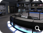
In contrast to The Next Generation’s warm earth tones, the bridge of the U.S.S. Voyager presented TV viewers with the cool grays and electric blues so often associated with science fiction. Created by production designer Richard D. James and illustrator Rick Sternbach, the interior design of the bridge of Voyager introduced subtle under lighting techniques that contributed to the “deep space feel” of the show. This design also reduced the traditional two-man con and navigator positions to a single console, putting emphasis on Captain Janeway.
I love the look of these two sets because they put the focus on the characters and their actions rather than the technology all around them. Some production designers tend to get out of hand with their creations and let the look of the set overpower its inhabitants. Voyager’s and Next Gen’s bridges are awesome examples of futuristic interior design precisely because they don’t go overboard. Compare these simple designs to the complex bridges of the Enterprise-E or the franchise reboot and you’ll see Star Trek art direction run amuck. Overlapping lines, textures and lens flares get in the way of the action and detract from the audience’s ability to focus on the characters.
Designing anything, even a fictional universe is an art form. More so when a large part of that universe’s appeal centers around details. Through the years, those entrusted with designing the bridges of Starfleet have evolved and molded it again and again. These talented artists have put their stamp on Gene Roddenberry’s original vision of the future and given Trek fans a place they could easily call home. Star Trek Online will soon give players a chance to roam the bridges of some of the most beloved starships in Star Trek history, all from the comfort of their computers. So until we can all afford to build a bridge in our basement, a virtual one has to be the next best thing.

