iOS 8 Favorite Features

On the surface, users coming from iOS 7 may not notice the myriad of changes and improvements Apple has made in their latest mobile operating system, iOS 8. Visually, iOS 8 is almost identical to its immediate predecessor, but under the hood there’s a great deal to like and even some to really love.

Much has been written about the new OS, but now having used it for a few weeks, I thought I would write about my own personal observations from the user’s perspective. I could write an entire other post about the good and bad parts of iOS 8 as they relate to developers (and perhaps I will), but for now, here are the parts of the new operating system that I’ve been enjoying the most.

3rd Party Extensions

Without a doubt, iOS 8’s single greatest feature is the ability to extend the system via 3rd party extensions. Early iPhone adopters will probably remember what the device was like before the advent of the App Store – it was cool, but killer apps made it a “must have”. I liken extensions in iOS 8 to that early invitation of 3rd party devs to the iPhone party. The most well received extension so far as been Agile Bit’s amazing security utility, 1Password. Thanks to iOS 8’s extensions you now can access your secure passwords directly within apps reducing friction and making your information more secure.
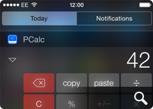
Other notable extensions include PCalc’s Today View which gives you handy computation abilities right from your iPhone’s lock screen and another personal favorite of mine – Add to Wunderlist which lets you add web pages directly to new or existing lists. Perhaps the most exciting part is that we’re just in the early days of iOS 8 extensions so we’re only seeing a fraction of the potential that 3rd party extensions represent. More great stuff is sure to come and I for one am very excited.

Directly Replying to Notifications

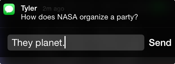
Swipe left on a notification on your device’s lock screen or downward from a notification within iOS 8 itself to reveal the ability to reply directly to instant messages. I have to admit that I’ve found myself using this one more and more. It saves so much time being able to reply directly it’s incredible. This is one feature I really wish Apple had implemented earlier, but I’ll surely take it now that it’s here.
Siri’s Visual Feedback

Apple’s digital assistant, Siri, has taken a cue from other popular voice-activated services like Google Voice Search and now displays helpful visual feedback when dictating text or commands in iOS 8. This really comes in handy when you have long blocks of text you want to enter and can see in real time how well (or how badly) you’re doing. It’s still not as fast or precise as Google’s version, and I don’t know how Siri stacks up against Windows Phone’s new assistant, Cortana, but it’s a big improvement none-the-less. Siri’s real-time dictation even works within 3rd party apps like Twitterrific, which was an unexpected and delightful surprise!

Perspective Zoom: OFF

Remember the old “Genie Effect” from Mac OS X where minimizing an app would make it snake down into the magic lamp of the Dock? It was kinda neat the first few times you tried it, but if you were like millions of other OS X users, you probably turned it off pretty quickly. The 3D parallax effect in iOS 7 was the Genie effect reborn for iPhone and was one of the very first things I turned off when I went from iOS 6 to iOS 7.

Now, thankfully in iOS 8 you have even greater control over the parallax effect and can turn it on or off for just the Lock Screen, the Home Screen or both. When you go into Settings > Wallpaper and choose an image to use as your Lock or Home screen, iOS 8 gives you the ability to turn Perspective Zoom on or off when you confirm the choice. Why anyone would choose to leave it turned on is beyond me, but at least now you have granularity when it comes to these cutting-edge, effects that can cause motion sickness in some people. Yay!

Recent Contact List

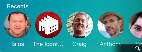
With fewer and fewer people using the built in Phone app, Apple wisely added a row of recent & favorite contacts to the top of the multi-tasking view. This handy list of people and places you’ve called, IM’d or written is a great way to initiate contact with them quickly and easily.

The only downside is that since I’m seeing their faces a whole lot more, I feel compelled to assign all my contacts decent looking photos for their avatars. Needless to say, not all of my friends have great pictures of themselves and this, as they say, has proven to be “challenging” to say the least. I guess we can’t all look like models from a GAP ad :-/

There are still more than a few rough edges that need sanding in iOS 8. Transition animations can be jerky, apps are prone to crash more often than in iOS 7 and devices can have problems staying connected to local WiFi networks. If history is any indication however, Apple should iron out these wrinkles in pretty short order. In the meantime there’s plenty of cool, useful new features in iOS 8 to keep all of us busy for some time and we haven’t even experienced Apple Pay or Continuity yet. The best, I suspect, is yet to come.
2 Comments

Owning Your App Store Review

There are basically two kinds of people who leave software reviews in the App Store. The first are users who genuinely want to add their voice to the chorus of users who have downloaded the software. They want to let other potential users know what they’ve learned in the hopes of helping them make an informed buying decision. They may encounter problems with the app, but overall they try to be open minded, fair and leave generally helpful reviews. If an app is good they generally say so. If a piece of software is poorly designed or implemented and deserves a low rating these users will go out of their way to describe why, which is great.

The second type of people who leave reviews do so for a simple reason – spite. They feel slighted by their purchase and want to do their very best to try and punish the developer in their small way by assigning a single star. They often accompany such reviews with unhelpful prose like “This app sucks, fix it!” or “Worst app I ever bought!” and so on and so on. These kinds of reviews are less than helpful to the developer of course, especially since Apple doesn’t currently provide a way for an app’s developer to easily get in contact with a review’s author.
As a developer, I’d love to be able to get in touch with both of these kinds of users to find out what I could be doing better with my software. Sometimes it’s possible to google someone’s App Store user name and track down a contact link, but more often it’s not. That’s why I recently decided I was going to start leaving my Twitter username in all my reviews I wrote on the App Store. Leaving a tangible point of contact for a developer gives them a way to reach out to you if you have specific issues with an app. Contacting them directly with your concerns is always best of course, but if you do leave a review, consider leaving your Twitter / contact info in the body of the review.

If you’re the type of user that wants to help improve an app, who wants to support the development of quality software through meaningful dialog, then owning your review would seem to be a no-brainer. And to all the one-star trolls who call the App Store home, I leave this sage piece of advice from my mom – If you can’t say something helpful, shut your damn pie hole!*

* I’m paraphrasing here

5 Comments

The Murky Future of 3rd Party Twitter Apps

Magic 8-Ball, it’s been a while but I have some questions about Twitter’s recent blog post. You know, the one where they talked about “stricter guidelines” for how the Twitter API is to be used by third party apps. Since Twitter isn’t talking, I was hoping you might be able to clear some stuff up for me. Can I ask you some questions now?

Yes

All this talk about stricter guidelines and a “consistent Twitter experience” seems pretty ominous, should developers of 3rd party Twitter apps like me be worried?

Reply hazy, try again

I mean some people are calling Twitter’s non-announcement a “bombshell”. Are things really that bad?

Better not tell you now

What do you mean? Are you saying that 3rd party apps are about to become extinct or that Twitter just wants each app to display the timeline in a similar fashion?

Concentrate and ask again

I know Twitter’s got to start making serious money to pay for it’s massive overhead, are we talking about ads in the timeline?

Outlook good

If we’re talking about ads, I can deal with that. I’d rather have promoted tweets in Twitterrific than being forced to stop developing it completely.

What about expanded tweets, will Twitter force us to build some form of them into our apps?

Signs point to yes

If we don’t, do you really think Twitter would restrict API access and hang 3rd party apps out to dry?

Better not tell you now

That’s very comforting, thanks.

Don’t you think Twitter’s users would revolt if they took away our Tweetbots, Hibaris and Twitterrifics?

As I see it, yes

Damn straight they would. There are many developers and companies who have build their livelihood around the Twitter API since 2007. We even helped Twitter evolve and grow to where it is today. Are you saying none of that matters now?

Without a doubt

Frak.

Some developers are already suggesting we start creating a web-based, open alternative to Twitter using something like RSS. Would that really work? Would users really switch away from Twitter for a grass-roots service?

Don’t count on it

Do you think it’s a good idea for developers like us to keep coding away on their apps for now?

Most likely

Could the folks at Twitter have done a better job with their blog post to help stop the spread of paralyzing FUD?

It is certain

You really haven’t been much help to me. One last question…

Is the golden age of 3rd party Twitter apps over?

Ask again later

Meh! What do you know, anyway!

6 Comments

For a Small Fee

There’s been increasing talk about how unscrupulous developers have gamed the App Store in recent weeks. Typically, shady devs will submit apps to the store that have similar names and app icons to top ten titles and in the confusion (and perhaps the additional hype from all the attention) users download these “scam” apps and push them ever higher. For honest developers who play by the rules, it’s a serious problem, and one that Apple needs to do a better job addressing.

There’s another way to get your app into the App Store’s Top Ten list however. With enough money, and a faulty ethical compass, you too can be sitting pretty atop the mountain of App Store competition. This morning the Iconfactory’s webmaster account received the following email from an address in China. The person (or persons) purported the ability to get your app to the top, fast. We were just one address of perhaps 100 or more in the “To” field including lockerz.com, skout.com, tumblr.com, okcupid and many more. Why they didn’t bcc the list is beyond me, but at any rate for a mere $10,000 USD, using thousands of “legally” registered iTunes accounts, they will download your app and help boost it into the top ten. How long it stays there just depends on how much you’re willing to pay.

We have large quantity of USA ,UK,CA itunes accounts, registered legally, we can promote your free app in the US, UK, CA store.Don’t waste time in promoting,leave it to us! We are professional team for you and we are the most powerful team for app promotion in China.

10,000 downloads in one store, need 1000USD

If you want the ranking, here is the price list for weekday only,please check:
—————iPhone app———————
US top10 24 hours 10000USD
US top10 48 hours is 15000USD
US top10 3 days is 20000USD
Each additional day the need to increase $ 5,000, up to 5 days,only for weekday

UK top10 24hours 3000USD
UK top10 48hours 5500USD
UK top10 3days is 8000USD
Each additional day the need to increase $ 2,500, up to 5 days,only for weekday

CA top10 24hours 2500USD
CA top10 48hours 4500USD
CA top10 3days 6500USD

————–ipad app only for separate app———————
US top10 24 hours 4000USD
US top10 48 hours is 6000USD
US top10 3 days is 8000USD
Each additional day the need to increase $ 2,000, up to 5 days,only for weekday

UK top10 24hours 1200USD
UK top10 48hours 2200USD
UK top10 3days is 3200USD
Each additional day the need to increase $ 1,000, up to 5 days,only for weekday

CA top10 24hours 1000USD
CA top10 48hours 1800USD
CA top10 3days 2600USD

Weekend day, subject to 20%

The problem of scam apps seems like a relatively easy one to solve compared to this sort of App Store gaming. Apple should simply do a better job identifying and rejecting offending scam apps at the review level. But with enough legitimate iTunes accounts there’s no real way for Apple to identify “fake” downloads from real downloads and keep bogus apps from rising to the top. Perhaps if it happens often enough Apple can develop algorithms to help identify offending accounts and close them, but I’m skeptical.

It seems clear that a re-work of the entire top ten system is in order, and not just because of the recent rash of scamming. Some apps like Angry Birds can stay atop the Top Ten list for months on end making it harder for other awesome, smaller apps to see the light of day. Perhaps Apple’s recent purchase of Chomp will help solve the problem of discoverability, but until then unfortunately there will always be shady individuals willing to prey on people’s greed and desire to succeed.

UPDATE: Matt Ryan over on LockerGnome reports a possible explanation for how these app “promoters” can secure thousands of iTunes accounts to artificially inflate apps – they steal them. Both Ryan’s PayPal and iTunes accounts were hijacked and then used to download copies of an app called iMobster. It should come as no surprise that when the promoter says he uses thousands of “legally registered” iTunes accounts, he means it except they’re not his. So not only do devs fork over tens of thousands of dollars, they’re most likely doing so to criminals who hijack legitimate iTunes accounts and milk them dry until they are caught and shut off. Alarming to say the least.

9 Comments

Mr. Jobs, Domino’s Calling!

I’ve recently discovered creating a successful iPhone application is a lot like baking a pizza. Take the best ingredients, like skillfully crafted code, bold and flavorful interface design and combine with a dash of love and you may end up with a delicious dinner. Unfortunately for App Store developers, once you’ve rolled the dough, spooned the sauce and added the toppings, the delivery process itself can often be frustrating.

Apple’s process of getting apps reviewed and posted to the App Store leaves much to be desired. Once submitted, we developers must sit back, cross our fingers and hope everything is in order so that the “pizza” makes it to your device in a timely fashion. One of the criticisms of the App Store in recent months is that it can take more than 2 weeks to have an app make it’s way through the review process, sometimes only to end in rejection. When this happens, the problem must be corrected, the app resubmitted and the developer goes to “the back of the line” and starts all over again.

Since most developers would rather have too much feedback rather than too little, one way to ease the pain of the review process would be to add more feedback. Developers love feedback, whether it comes in the form of bug reports, reviews, emails or simple sales figures. In the world of home pizza delivery, when it comes to awesome feedback, no one beats Domino’s.

When a customer orders a pizza from Domino’s online, they receive instant feedback on the status of their order via Domino’s über-cool pizza tracker. The tracker tells you where in the cycle of delivery your pie is, what time it started the last phase and who’s currently working on it. It may sound corny, but this is exactly the kind of feedback developers need when submitting software to the Apple App Store. Imagine a meter that outlines each part of the approval process with time and date annotations for each step. The App Tracker would be of enormous assistance to developers, ensuring proper completion of each part of the submission process. A developer could track their “pizza” as it made its way to the store and get a better sense of when to expect final delivery. It could also help Apple internally so they know what phase a particular application was last in if a problem arises.

Such a system would allow companies to better plan their product’s marketing efforts and direct their resources more efficiently. Not to mention reduce the level of stress associated with being left in the dark regarding your application’s approval. Apple recently implemented a small counter for developers to let them know what the average approval time for their applications are in iTunes Connect. This was a great first start, but I suspect that with a bit of love, and a few lessons from the folks at Domino’s, getting through the app store approval process could be as easy as pie.

8 Comments

Losing Control

Anyone who’s worked for themselves knows the satisfaction of being in control of your own destiny. The perception that by sheer force of will and hard work, you can be successful at what you do. Those who take on the challenge of owning their own business are often considered “control freaks” and more often than not, perfectionists. I never really realized just how much of a control freak I was until this past weekend when, completely without warning, I had none.

Last Friday, the Iconfactory’s popular Twitter client, Twitterrific, fell victim to the so-called Twitpocalypse bug, which caused the mobile version of our application to suddenly stop working. Thanks to the efforts of our talented engineer, Craig Hockenberry, a fix for both versions of the client was submitted to the App Store within a day. To Apple’s credit, the free version of the fix was approved swiftly and allowed the majority of our users to continue tweeting with minimal interruption. And although the Premium version of the application was also approved in record time, the displeasure from our user base, not surprisingly, came even quicker.

From the moment the bug hit, both Talos and I had begun monitoring tweets of users mentioning Twitterrific in their posts. What started as a trickle, soon turned into a deluge of upset and frustrated users. We began responding to individual tweets and Travis, our project manager, responded to support emails. The Iconfactory is a small company, we’re not Adobe or Google or even the Omni Group. All three of us did our best to let users know what was going on, and thanks to hundreds of RTs, word started to spread about the bug and our efforts to combat it. Unfortunately, Twitter is a very big community and it was impossible to personally respond to everyone. Even now, there are many people on Twitter who don’t know why their copy of Twitterrific isn’t functioning and there is very little I can do about it.

The best we could hope for was that the majority of users followed @twitterrific and would eventually receive news about the fixes. The troublesome part is that although I know the majority of users now have a working version, I still feel uneasy knowing there are potentially thousands that don’t even know about the fix. Part of this is due to the lack of communication channels, and part is due to the nature of the App Store approval process. As developers, we must turn control of our applications over to Apple to have our iPhone software published. This process can take days or weeks and until it runs its course, our hands are quite literally tied. By the time updates are published it may already be too late.

All of us at the Iconfactory count ourselves lucky that Apple recognized the seriousness of the bug we were facing and pushed through the Twitterrific updates as quickly as they did. We know we messed up and we thank the App Store team for helping to pick us back up off the floor. That being said, I didn’t sleep much in the days after the bug hit because there was a part of me that knew hundreds of tweets were flying by every hour from Twitterrific users I was powerless to help. As with most control freaks this usually means even more work, more testing and more diligence to guard against these kinds of catastrophic failures in the future. But that’s okay with me since I’m not anxious to give up this level of control, or sleep, ever again.

A Bird in the Hand…

The recent release of Twitterrific 2 for the iPhone has reminded me that software development is replete with truisms. The primary thing I have to constantly remind myself is that, no matter what you do, or how hard you work, you simply cannot please everyone. Anyone who works in a creative field knows that there will always be those who are unsatisfied with the result.

For iPhone developers, these people usually fall into the “if it just had feature X, I would use it” category, but every so often you get someone who just poo-poos your efforts. It’s easy for devs to fall into the trap of trying to keep everyone happy, but years of experience have taught me that this is a losing battle. Development quickly builds into a sort of “features arms race” that usually ends with bloated software and burnt out programmers. No, the answer is to design first and foremost for yourself. If you can produce a piece of software that you are happy with, then chances are the majority of your users will be too. The trick is trust your gut enough to tell the difference between constructive feedback and the nay-sayers so you can move beyond them when it’s appropriate.

The other truism I’ve found is that there’s always room for improvement. The new posting user interface for Twitterrific 2 demonstrates this point perfectly. All through beta testing, the posting UI was the same as it was in version 1. If you wanted to change your update from one type of tweet to another, you had to toggle the tweet type using a single icon on the post bar. Although this method had served well since our initial launch, neither us nor the beta users were satisfied. Their feedback, combined with Louie’s desire to improve the posting experience challenged us to do it better. The result was a re-designed UI that fulfilled user’s desires for posting clarity while giving the Iconfactory a big new feature to tout. The amount of work required to pull off the revised posting interface so close to the end of the beta was intense, but ultimately worth it.

Lastly, if there is one axiom that Twitter has proven beyond a shadow of a doubt it’s simply that if you give an inch, the Twitterverse takes a mile. Lately I’ve been seeing more than a few requests for Twitterrific to support Twitlonger, a service that allows you to “expand” on the 140 character limit that is at the very heart of Twitter. The argument goes that allowing long updates to be read directly in-app is preferable to having to post multiple tweets. This may indeed be true, but I hesitate to support any service that, for lack of a better term, subverts Twitter. Brevity is the soul of wit, and in Twitter’s case, its lifeblood.

In my opinion, any update that can’t be held within Twitter’s 140 character limit should be taken offline to email, Facebook or Friendfeed. What’s the harm in supporting a great service like Twitlonger you ask? Seemingly none, except that Twitlonger is a very slippery slope. Imagine typing a tweet of any length right in Twitterrific. When the message length exceeds 140 characters, the app automatically creates web page entry where your followers can read your magnum opus. Sounds great, except its no longer Twitter, it’s called a blog. Given how easily such a feature would be abused (as is evidenced by the Twitterverse’s aggressive adoption of RT), I don’t see Twitlonger support in Ollie’s future.

As developers, all we can do is our best. Sometimes our best is good enough and sometimes it doesn’t cut the mustard. I’ve been very pleased with the positive reaction that Twitterrific 2 has been receiving from the Twitter community. There are updates coming that address some of the most requested issues from the initial 2.0 launch, but I have no illusions that even these updates will satisfy everyone. Not to mention all those people out there who are patiently waiting for an update to the Mac version of Twitterrific. To them, I offer one last proverb – Good things come to those who wait.

1 Comment

The Value of a ‘Miracle’

One of the toughest parts about owning your own creative business is having to keep secrets. During my time at the Iconfactory, we’ve had to wear many projects close to our sleeves for months, sometimes even years until the day comes when we finally can talk about them. This philosophy doesn’t just extend to our paying clients however, it also covers our internal projects.

Over the years, I’ve learned the hard way what happens when you let competitors know what your up to. If you’re lucky they merely get a jump on your idea, but sometimes, for one reason or another, they manage to beat you to market. This is one reason why I subscribe to the Montgomery Scott school of thought when it comes to product announcements. Named after the famous engineer from my beloved Star Trek, the theory is simply this: Under sell and over deliver.

By setting realistic expectations in the minds of your customers, they are pleasantly surprised when you manage to exceed them. This is how Scotty got his reputation for being a “miracle worker” on Star Trek. It’s also why we don’t typically like to give sneak peeks or announce dates for freeware and software releases at the Iconfactory unless we’re very close to releasing something. By doing this we keep competitors guessing and limit dangerous over-hyping.

Taken to its logical conclusion, the best way to keep expectations in check is not to create them in the first place. Unfortunately, this approach fuels rumors and leads some to conclude total inaction. My response to these people can be summed up in a recent tweet from my friend and colleague, Craig Hockenberry who said “When I appear to be doing nothing is when I am doing the most.”

We always have something new coming down the assembly line at the factory. I’d love nothing more than to run shouting to Twitter what we’re up to on any given day, but that would only lead to user heartache. We also firmly believe that if you’re going to do something, it’s worth doing right. So remember – just because you don’t have access to engineering, it doesn’t mean we’re not busy installing the latest dilithium crystals.

3 Comments

Market Yourself An iParadigm

John Gruber over at Daring Fireball links to an intriguing piece by Paul Kafasis on the state of the App Store. The post compares Walmart’s strategy to sell disposable, cheap goods to those of App Store “ringtone” developers which are forcing down prices. My friend and business partner, Craig Hockenberry wrote about this very topic a few weeks ago in a piece that put him in the crosshairs of quite a few people.

After Craig’s piece was published, and indeed after reading the post by Kafasis, some are under the impression that more expensive “AAA” apps are doing just fine thank you very much. The theory goes that one only has to look at the App Store top 10 list to understand it’s not price that gets you into the top 10, but quality. This, plus marketing on the part of the developer are all that’s needed to boost your software into the top 10 of the App Store. Reading through the comment thread at Inside iPhone it all seems so simple. All a developer has to do is market their app and the rest will take care of itself! Why didn’t I think of that?

The part I love the most is that the people making the “just market your app!” comment have no real idea how much effective marketing costs. Oh sure, you can go far on viral and word-of-mouth marketing, but it all pales in comparison to even a small banner graphic in the App Store. The Iconfactory could spend tens of thousands of dollars buying up targeted advertising space to promote Frenzic, but it still wouldn’t be 1/10 as effective as the front page graphics that Dropship, Marley and Texas Hold’em are enjoying (for free) as I write this. Not only that, but I have no way to track metrics for advertising pointing at Frenzic in the App Store. I can’t gauge how effective a $75 blog ad versus a $2,600 DF sponsorship is because Apple doesn’t currently give me stats of people clicking through to my software. Anyone who says “Just market it!” doesn’t have a solid grasp on how the App Store works.

Another example is Rolando. People are holding this app up as the ultimate example of a quality, non ringtone app that is enjoying success in the store. It is true that Rolando is a fantastic game worthy of the top spot it once held. It is also true that Apple promoted Rolando from DAY ONE in the App Store with major graphics both in iTunes and on Apple.com. All that exposure helped to get Rolando into the top of the store when it launched. But its $9.99 price point is like an anchor. As I write this, Rolando sits at #30 in the top 100, and #10 in games. Let me repeat that. #10. In games.

So what is in the App Store top 10 right now? iFart Mobile is number one which is still riding high on a wave of PR thanks to being originally barred. Crash Bandicoot, which is featured in national Apple television spots is #2. Tetris, perhaps the most well-known video game in history, is #3. Three more ringtone apps come in as 4, 5 & 6 including the months old iBeer. Touchgrind, which also enjoyed prominent Apple billing, is #7. Bejeweled 2 is number 8, PocketGuitar ($.99) is #9 and SimCity rounds out the top 10. All of these apps either enjoyed uncommon press exposure, have a nationally known brand or are priced at $.99. Quality definitely plays a role in getting to the top, but price and “Apple love” play a larger part.

Does this all mean that developers like myself will abandon making quality iPhone applications like Twitterrific and Frenzic? Of course not. I just wish that people who think they know how the App Store works would admit that they really don’t. The App Store is still in flux and much is unknown. What I do know however is that there are key factors to getting to the top of the store, chief among them being price and exposure from Apple. No amount of 3rd party marketing, done on a small developer’s budget is going to change that simple fact. What’s worse (or better, depending on your point of view) is once you are in the top 10, even if you’re app is a “limited utility” ringtone app, because you’re in front of millions of eyeballs both on the device and in iTunes, you’re bound to stay there.

I don’t know exactly how to fix the App Store, but everyone I’ve spoken with agrees that it needs fixing. If not fixing, at least a change in how it favors certain apps while hindering others. The more we talk about this stuff, the better it will be for both developers and customers alike.