![]() Recently I had the pleasure of collaborating on a fun project with my friend and co-worker, Troy Gaul. Troy and I worked closely together to develop Linea and he asked if I could design the app icon for a new type of ad blocker he was developing which eventually became to be called Unobstruct. The concept behind the app is simple – get annoying social media banners that websites overlay on their content out of the way. Screen real estate, especially on mobile devices, is limited and the last thing users need are buttons for Twitter and Facebook cluttering up the view.
Recently I had the pleasure of collaborating on a fun project with my friend and co-worker, Troy Gaul. Troy and I worked closely together to develop Linea and he asked if I could design the app icon for a new type of ad blocker he was developing which eventually became to be called Unobstruct. The concept behind the app is simple – get annoying social media banners that websites overlay on their content out of the way. Screen real estate, especially on mobile devices, is limited and the last thing users need are buttons for Twitter and Facebook cluttering up the view.
From the moment I took up the project I knew I wanted the app’s icon to be both fun and non-flat. Like many iOS developers these days, I’ve had my fill with two-dimensional glyph-type icons that seem to be piled as far as the eye can see in the App Store. I didn’t want to swing the pendulum all the way back to a full skeuomorphism but I didn’t want Unobstruct’s icon to be just another soulless geometric utility that no one would ever remember.

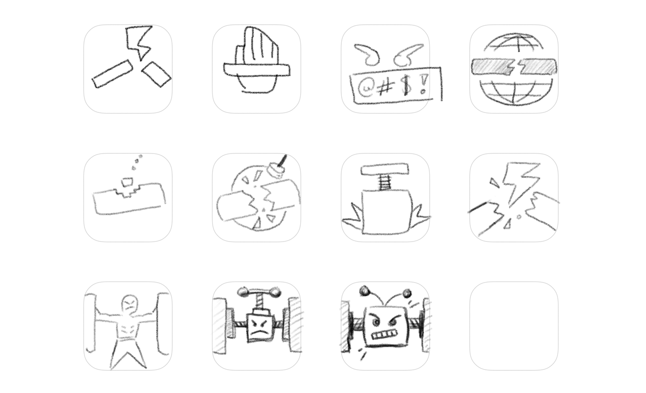
I gathered the gang at the office for a quick brainstorming session and we sketched out a bunch of rough ideas (I have a fondness for the one that looked like a bare-chested Vladimir Putin but alas that was never meant to be). From those quick doodles in Linea, a concept formed of a tough little bot that pushes offending social media bars and banners off the screen. Once I drew his basic forms in Adobe Illustrator, I slowly built up shading and subtle gradients to give him an overall feel of tactility. You can see a similar approach in the xScope Mirror icon, creating subtle dimension through the strategic use of highlights and shadows.
The result is an adorable, tough-as-nails app that will never stop fighting to free up your screen from those annoying floating bars and let you read easier. Check out Troy’s Medium post detailing how he developed the app and what went into making it a reality. Unobstruct is available today in the App Store for .99¢. We hope you’ll give it a try, enjoy!