It’s Not a Tumor!
Today Apple introduced their new iPhone 6s Smart Battery Case and I feel pretty confident in saying it’s easily the ugliest piece of industrial design to come out of Cupertino in the past 15 years. While their efforts to bring iPhone users extended battery life are laudable, for the life of me I can’t imagine how this clunky eyesore of a case got all the way through design to arrive in Apple’s product line up.
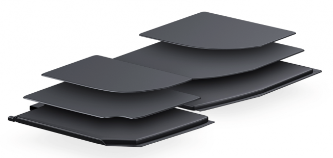
Even worse, it seems as though the design and engineering teams at Apple forgot to talk to each other because the new case seems like a perfect opportunity to make use of Apple’s much-touted terraced battery technology. When the new Macbook was introduced, Phil Schiller made a big deal (and rightfully so) about how every millimeter of space in the new Macbook was able to be used to expand the total battery capacity. But looking at the new Smart Phone case, it seems like all that incredible design research just went out the window. The bottom and top of the battery bumps on the new case could have been terraced to both maximize battery capacity and at least try and display some elegant lines instead of what we got.
There are times when, for the briefest of moments, lose faith that Apple knows exactly what they’re doing. It doesn’t happen often but there’s no doubt the new case is going to be the object of ridicule and rightly so. As I sit and ponder just how bad this case looks, I just can’t get Arnold’s hilarious line from Kindergarten Cop out of my head. Apple missed an important opportunity to tout new technology in a stunningly beautiful way.

