Design Disconnects
This week I was confronted by no less than two glaring examples of poor or lazy design that I just had to share with you. I think they really illustrate how important our job is as communicators and how easily information can be miss-conveyed when designers don’t do their jobs well.
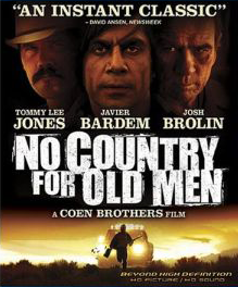
The first comes in the form of the DVD box art for the Oscar winning film, No Country for Old Men. I rushed out this week to snap up my copy of this fabulous tale starring Tommy Lee Jones, Javier Bardem and Josh Brolin, only to find a glaring design error. Although not all of us are schooled in design principals like the Gestalt Law of Proximity, we can still determine when things aren’t “quite right”.
Apparently the designer accidently or intentionally miss-matched Tommy Lee Jones’ and Josh Brolin’s portraits with their names. Because it seems to be such an obvious mistake, some might try and argue that it can only be intentional. As I learned from our experience with the official War of the World’s icon set a few years back, movie studios have many rules about who’s name can appear first, second, and so on. Given that, plus the fact that Javier Bardem’s face is associated correctly with his name directly below, why not match Tommy Lee and Josh as well? There’s simply no good reason for it and I’m forced to conclude that the juxtaposition of Jones’ and Brolin’s images are a mistake. Apparently design accidents happen, even on multi-million dollar marketing campaigns.
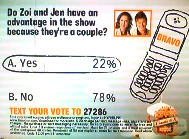
The second example comes from the world of television, and if I didn’t know better, seems anything but accidental. The season 4 premiere of Bravo’s hit show, Top Chef, featured a typical audience poll via text message. Season 4 features a pair of female chefs that are not only competing against each other, but are also a couple. They’ve been together for 3 years and the question to viewers was “Do Zoi and Jen have an advantage in the show because they’re a couple?”. After several commercial breaks the results were displayed as you see in this screen capture. The graphic was not accompanied by any informational voice over of any kind and so you are left to determine the results in a fleeting glimpse of 10-15 seconds of actual screen time.
At first glance, the majority of viewers seem to think, yes, the couple does have an advantage since that result is circled and highlighted. But upon closer inspection, poll results reveal that a full 78% of viewers in fact think, no, Zoi and Jen do not have an advantage. For some reason, the graphic strangely highlights the minority opinion. Why would Top Chef want to highlight the losing segment? Could we be looking at yet another error (perhaps generated automatically by faulty poll software)? I think it’s far more likely that the show’s producers wanted to drum up controversy by highlighting the most dramatic result, no matter how small. If I was a guy who wore tin-foil hats, I’d say there could be other reasons for what they did, but I’ll just leave that to your imagination instead.
Although these issues don’t amount to the proverbial “hill of beans” in most people’s world, they do illustrate the kinds of problems that designers face all the time. As a wise man once said, “With great power, comes great responsibility.” Remember that as you use your design powers for good and not evil… like making scores of fans think Tommy Lee Jones is really Josh Brolin.
UPDATE: This week’s cell phone poll on Top Chef correctly highlighted the viewer choice with the most votes. As suspected the example I posted here is an error of some kind.
The names don’t have to do with the faces, I’ve seen this before, but it’s because of the billing. The billing is based on the actors, and their agents, and who claims the first spot, might have to do with payment too…
Example: http://www.villagevoice.com/blogs/statusainthood/dreamgirls.jpg
I would hope that third woman is NOT Eddie Murphy. :\
Example 2: http://images.art.com/images/products/regular/10106000/10106388.jpg
This one is all messed up. 🙁
Thanks for the links Louie, but in my opinion these examples are not the same as what I’m talking about. I mentioned that the order of the names is probably dictated by the movies studios, I get that.
The Dream Girls poster doesn’t show anyone’s face, and the names are placed far, far away from the silhouettes as well making them not visually associated with the figure above. They are not trying to show Jamie Foxx, Knowles and Murphy here.
As for the pirates poster, the images in question are not symmetrical and so it would be much more difficult for the designer to place the actor’s photo above their name. It’s also obvious that legally, Depp’s name must have first billing, but the designer wanted his character to be the central focus of the poster, hence he’s the biggest of the four. You also want Knightly’s face near Bloom’s since they are romantically involved together in the story, and so the designer was forced to place these two next to each other on the right leaving Rush alone on the left.
All of this doesn’t apply to the No Country artwork. Bardem isn’t billed first, he’s billed second and so the designer was able to make his character the focus of the box by placing him in the middle. It would have been a simple matter for the designer to simply horizontally flip the two images of Brolin and Jones, and yet this didn’t happen. Why?
I highly doubt the studios had such specific rules as saying “So and so’s name must appear first, but his image must be third”. That seems highly illogical. I know there are lots of examples where this kind of out-of-order layout is standard, but my point is with No Country, it didn’t have to be that way. Seems like someone was lazy to me.
yeah I was just gonna say, they do that a TON with the names. You’ll start to notice it now. Like crazy.
I think it’s a way to equalize billing too since A’s name is first but C’s face is…
Maybe it’s intended to dis-associate the character from the actor. I think it would be harder to get absorbed in the story if you’re consciously watching Tommy Lee Jones instead of Sheriff Tom Bell.